Design System Checklist for 2024

Checklist what to do after launching a design system

A well-structured design system checklist guides your team through each essential step of creating a design system, ensuring that nothing gets overlooked—from auditing current design patterns to standardizing elements like typography, color palettes, and spacing. It serves as a roadmap that helps you prioritize what’s most important, streamline collaboration between designers and developers, and ensure that the design system evolves as your product grows.

By following a checklist, you can avoid common pitfalls, maintain consistency across your UI, and create a system that is scalable and adaptable to new challenges. A design system checklist is not just a to-do list—it’s a strategic tool that helps you build a robust, sustainable design system that empowers your team to work more efficiently and deliver high-quality user experiences every time.

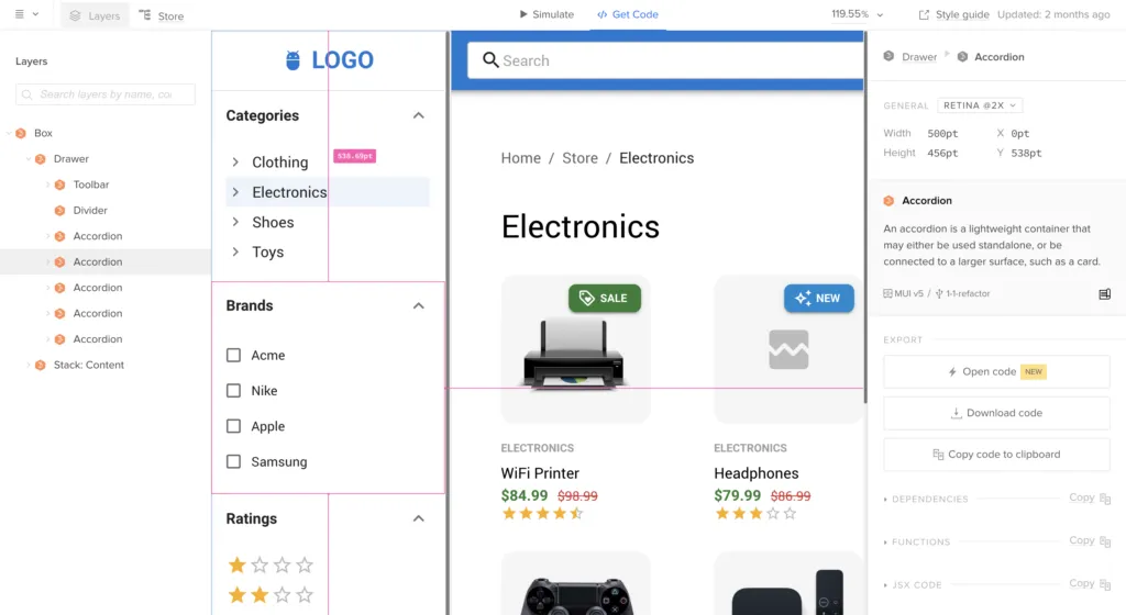
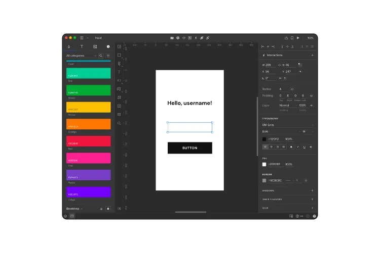
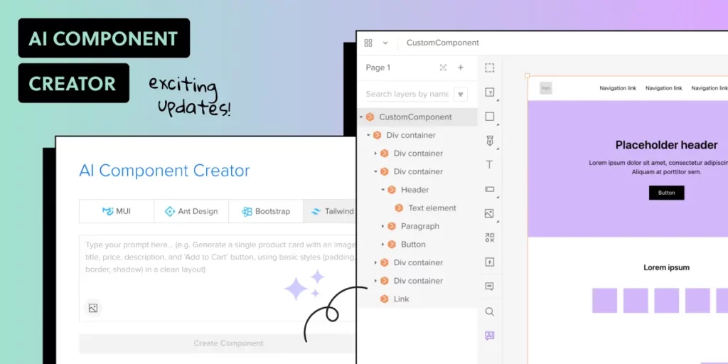
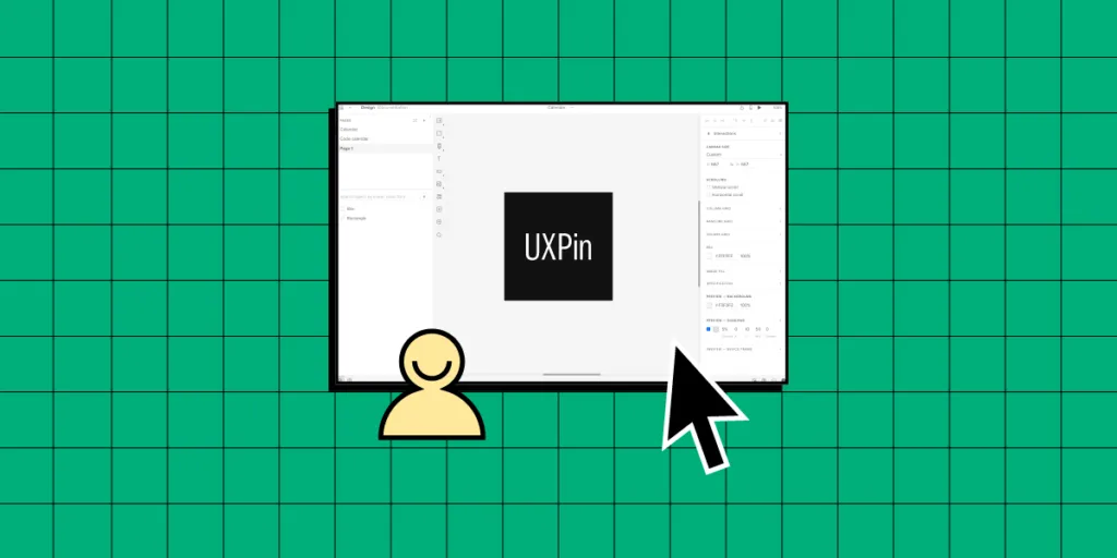
Manage your design system with UXPin’s code-to-design solution. Share your design system easily, document on the fly, and create advanced prototypes with interactive components. Discover UXPin Merge.

Reach a new level of prototyping

Design with interactive components coming from your team’s design system.

Checklist for Building an Effective Design System

Here’s a structured 14-step checklist that ensures you build an efficient, consistent, and scalable design system.

1. Create the Patterns Inventory

A patterns inventory in a design system is essentially a collection of all the design patterns or UI elements used across a product or set of products. It’s like a catalog or checklist that helps teams identify, organize, and evaluate the consistency of the various components within the interface. These patterns can include things like buttons, form fields, navigation elements, typography, colors, icons, and more.

The goal of this process is to create a foundation for building or refining the design system, ensuring that every component is accounted for, standardized, and reusable. It also serves as a reference point for designers and developers to maintain consistency across the product as it evolves.

Here’s a design system checklist for running patterns inventory:

  • Collect Design Patterns: Take screenshots of design patterns or collect them directly from design project files.
  • Organize Patterns: Categorize patterns based on your frontend architecture, if available. Common categories include elements, modules, and components.
  • Consult Developers: Check if the frontend architecture is modular, and use it to organize patterns into categories.
  • Categorize Without Modular Architecture: If there’s no modular architecture, manually categorize patterns (e.g., buttons, form fields, etc.) to identify inconsistencies.

2. Create the Colors Inventory

A color inventory in a design system is a comprehensive audit of all the colors used across a product or set of products. It involves identifying and cataloging every color used in the user interface, including variations in shades, tints, tones, and any color variables defined in the code (like in CSS or design tokens).

Here’s a design system checklist for color inventory:

  • List All Colors: Traverse code files and list all the color variables or colors used in CSS.
  • Organize by Common Denominators: Group colors by hue, shades, tones, or similarity (e.g., grays, reds, greens).
  • Identify Anomalies: Take note of anomalies, like too many shades of gray, and streamline the palette.

3. Create the Typography Inventory

A typography inventory is an essential step in ensuring that your design system maintains a consistent, scalable approach to text styles across your product or projects.

Here’s a design system checklist for typography inventory:

  • Review Text Styles: Walk through the UI, checking all text styles through the browser console.
  • Form a Typographic Scale: Organize text styles by their importance (e.g., from H1 to small text). Create multiple scales if necessary.
  • Match Code with Styles: If CSS preprocessors (e.g., Sass) are used, note mixins and variables used to generate text styles.

4. Create the Icons Inventory

An icons inventory in a design system is a comprehensive audit and cataloging of all the icons used across a product. It is designed to assess the consistency, quality, and relevance of the icons in the UI and to ensure that the icons adhere to the brand’s visual guidelines.

Here’s a design system checklist for icons inventory:

  • Inventory Icons: Identify all icon libraries used across the product.
  • Mark Inconsistencies: Look for mismatches (e.g., different icons for the same action or mismatched icon families).
  • Review Implementation Methods: Understand how icons are implemented (e.g., inline SVG, icon fonts) and note inconsistencies.

5. Create the Space Inventory

A space inventory helps standardize and streamline how space is used in the UI, making designs more consistent, scalable, and easier to maintain. It creates a solid foundation for your design system’s layout, ensuring that spacing remains predictable and intentional throughout the product.

Here’s a design system checklist for space inventory:

  • Document Grid Systems: List and document grid systems used across the product portfolio.
  • Check Padding and Spacing: Analyze container padding to spot inconsistencies.

6. Get the Support of the Organization

  • Team Presentation: Explain the inventory process, highlight key inconsistencies, and present the design system as the solution.
  • Stakeholder Presentation: Focus on how inconsistencies affect costs and development speed. Highlight measurable data (e.g., 62 shades of gray) to demonstrate the need for a design system.

7. Build a Multidisciplinary Systems Team

  • List Skills Needed: Identify the necessary skills for fixing inconsistencies and managing the design system long-term.
  • Allocate Time Realistically: Ensure that team members can allocate time to work on the design system, even if part-time.
  • Clarify Roles and Sprints: Define roles, decision-making processes, and the length of sprints (e.g., one or two weeks).

8. Make Key Decisions and Establish Rules

  • Decide on System Foundation: Choose whether to build the system from scratch or use an existing product as the foundation.
  • Technology Stack: Decide whether to use the existing tech stack or introduce new technology.
  • Define KPIs: Set measurable goals for the design system, such as improving consistency or speed of implementation.
  • Formulate Design Principles: Define shared values for the design system, such as consistency, craftsmanship, or accessibility.

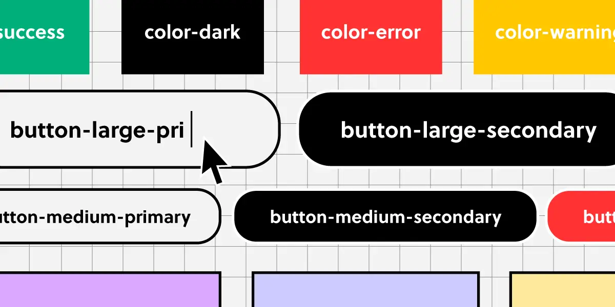
9. Build the Color Palette

  • Unify Colors: Use the color inventory to create a consistent color palette, ensuring no redundant or unused colors.
  • Naming Conventions: Choose between abstract, actual, or functional names for colors (e.g., pigeon-gray, silver-base).
  • Test the Palette: Ensure the palette works well across the UI and follows accessibility standards (WCAG).
  • Implement and Present: Implement the palette in CSS, test the changes, and present it to designers for feedback.

10. Build the Typographic Scale

  • Create a Consistent Typescale: Build a typographic scale that includes font size, weight, line-height, etc.
  • Test and Implement: Test the new scale across the UI, then implement it in CSS. Involve designers in the feedback process.
  • Finalize and Document: Finalize the scale, document it, and make it available in design tools (e.g., UXPin, Sketch).

11. Implement the Icons Library

  • Finalize the Icons: Decide which icons to include and how they’ll be implemented.
  • Test and Review: Thoroughly test icons on a test server and ensure consistency across the product.
  • Document and Deliver: Add icons to design system documentation and make them accessible in design tools.

12. Standardize Other Style Properties

  • Standardize Grid, Space, and Styles: Apply the same standardization process used for color, typography, and icons to grid systems, spacing, and other style properties.
  • Test and Implement: Ensure everything is tested and reviewed before finalizing and communicating to the company.

13. Build the First Design System Pattern

  • Decide on Pattern Architecture: Choose an architecture for your patterns (e.g., Atomic Design, modular components).
  • Build and Test: Implement one pattern (e.g., buttons), test it with developers and designers, and iterate based on feedback.
  • Finalize and Document: Add the pattern to the design system documentation and make it available in design tools.

14. Run a Sprint Retrospective

In the context of a design system, the retrospective focuses on assessing how the team handled the specific tasks related to the system’s development, such as creating new components, documenting guidelines, testing implementations, or aligning design with code.

  • Review the Sprint: Summarize the outcomes and KPIs from the sprint and reflect on improvements for future sprints.

What if You Need a Design System Fast?

If you need to create a design system fast and can’t afford to create a design system team, here’s what you can do.

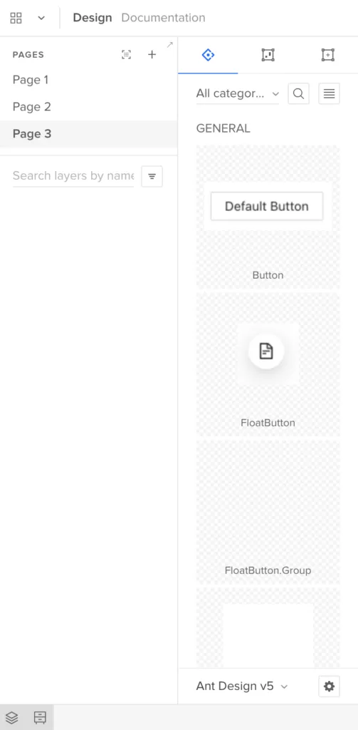
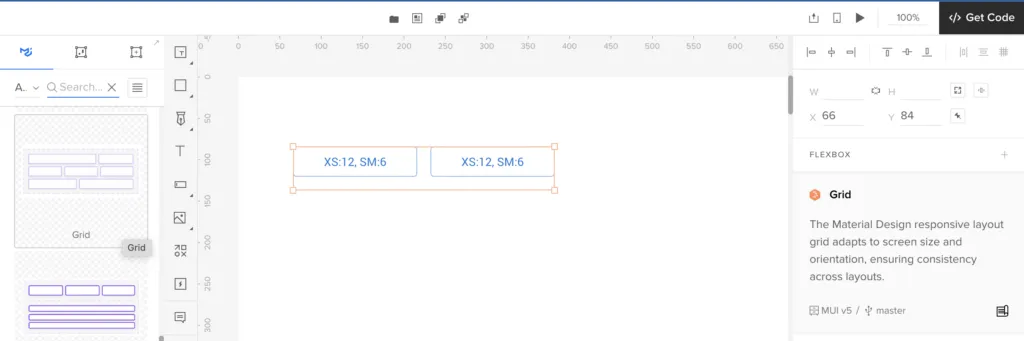
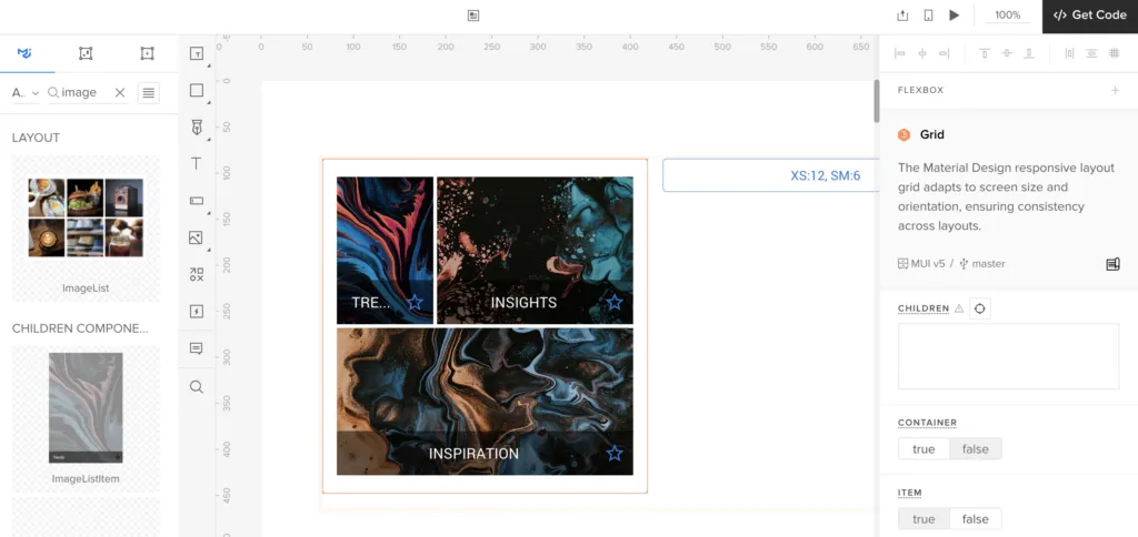
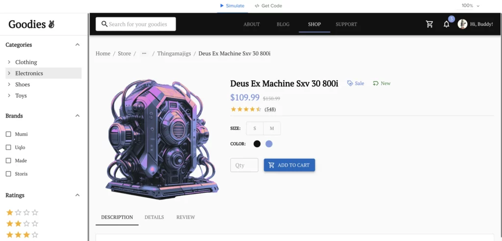
Take advantage of the pre-built component libraries in UXPin, like the MUI kit, Ant Design kit, or Tailwind kit. These libraries are integrated directly into UXPin and offer a great way to get started. They’re fully coded, so you can share them with your devs. They are well-documented, so you don’t need a design system documentation right away. And they’re fully customizable, so you can match them with your style guide.

Your team will be able to share the same components and they will be able to use components right away, and you can focus on making sure everything fits your brand’s style, like colors and typography. UXPin also allows you to apply themes to these components (with the use of AI), which means your designs can start looking like they belong to your product without a lot of heavy lifting.

If time’s a factor, you don’t have to redo everything at once. You can instruct developers to use existing components with specific properties, and since UXPin keeps everything dynamic, any changes you make later will automatically update across the system. This saves a ton of time down the line.

I’d also recommend focusing your energy on the style guide—getting your colors, typography, and visual feel in order. These are the foundations that will tie your system together. Plus, understanding how these libraries work will help you ensure everything fits nicely with how your product is built.

In the end, design systems can be tricky, but using UXPin’s pre-built libraries makes the whole process a lot more manageable. It’ll give you more room to focus on the fun part—actually designing great products.

Empower Your Team with a Robust Design System

Creating a design system might seem like a daunting task, but with the right approach, it becomes a strategic investment that will enhance collaboration, ensure consistency, and improve scalability across your product. By following the checklist outlined above—from building a patterns inventory to standardizing spacing, typography, and iconography—you can ensure that your design system is well-organized, effective, and aligned with both design and development needs.

One of the key elements to making this process smoother is using a powerful tool like UXPin Merge. With UXPin’s built-in code libraries (MUI, Ant Design, React-Bootstrap or Tailwind kits), seamless integration with design and development workflows, and dynamic components, your team can create a design system that’s not only cohesive but also adaptable to future growth.

By taking incremental steps, focusing on key priorities like style guides and component libraries, and leveraging UXPin to align your design and development teams, you can build a system that ensures long-term success. So, don’t wait—start building your design system with UXPin today, and empower your team to create scalable, efficient, and beautifully cohesive products! Request access to UXPin Merge.

Retool vs Bubble vs UXPin Merge Comparison

Product Page

Teams compare UXPin Merge, Retool vs Bubble because they all serve similar high-level goals: enabling teams or individuals to build functional, interactive applications or tools without the need for extensive front-end development. However, they approach this goal from different angles and are tailored to different types of users. Let’s explore that!

Build unique React interfaces with UXPin Merge. Pull UI components from Git repositories, npm packages or Storybook and use them to create production-ready prototypes. Increase alignment between designers and developers and launch products faster. Request access to UXPin Merge.

Reach a new level of prototyping

Design with interactive components coming from your team’s design system.


Retool

Retool is a platform for building internal tools quickly, allowing developers to connect to databases and APIs to create dashboards, admin panels, and other internal applications with drag-and-drop ease.

Who uses Retool?

Developers and teams who need to build and maintain internal tools (e.g., dashboards, CRMs, admin panels) quickly and efficiently.

What is Retool best for?

Retool is best for building internal tools to manage data, track metrics, or run operations efficiently. That’s why startups, small businesses, or enterprise teams love it.

Key Features

  • Pre-built Components: Retool offers a library of pre-built UI components like tables, buttons, and forms that can be dragged and dropped into apps.
  • Integrations: Easily integrates with APIs, databases, and third-party services (Postgres, REST APIs, Firebase, etc.).
  • Custom Scripting: Developers can add custom JavaScript to enhance logic, making Retool highly flexible for custom use cases.
  • Data Management: Retool excels at building tools that need to interact with various data sources, pulling and pushing data to manage workflows.

What are Pros and Cons?

  • Pros:
    • Quick prototyping of internal tools without needing a dedicated front-end team.
    • Powerful integrations with third-party services.
    • Flexible, developer-friendly environment that balances drag-and-drop ease with coding flexibility.
  • Cons:
    • Primarily focused on internal tools rather than public-facing applications.
    • Limited in creating more complex or highly customized UIs compared to full development environments.

Bubble

Bubble is a no-code platform that allows users to build fully functional web applications, from simple landing pages to complex SaaS platforms, without writing code.

Who uses Bubble?

Entrepreneurs, startups, and non-technical founders who want to build and launch web applications without needing a development team.

What is Bubble best for?

Bubble’s best for entrepreneurs or startups looking to quickly launch web applications without relying on a developer. It’s perfect for building MVPs, SaaS platforms, or customer-facing applications.

Key Features

  • Visual Development: Bubble allows users to build both the front-end and back-end of applications with a visual editor.
  • Database Management: Bubble includes a built-in database, allowing users to manage data without external services.
  • Workflows: Users can create complex logic and automate workflows without writing code.
  • Plugin Marketplace: A robust plugin ecosystem provides additional functionality (e.g., payment gateways, social logins).

What are Pros and Cons?

  • Pros:
    • True no-code solution—perfect for non-developers.
    • Allows for building both front-end and back-end without writing a single line of code.
    • Scalable for creating MVPs, launching products, or testing ideas.
  • Cons:
    • More limited in terms of performance and customization compared to fully coded solutions.
    • Can become complex for advanced functionality, despite being no-code.
    • Scaling a Bubble app for high performance in production environments can be challenging.

UXPin Merge

UXPin Merge is a design and prototyping tool that allows teams to build fully interactive prototypes using real production components. With Merge, designers and developers collaborate more effectively by working with the same code components in both design and development environments.

Who uses UXPin Merge?

Primarily designers and developers working in close collaboration. Merge is ideal for teams using a design system who want to reduce handoff friction between design and development.

What is UXPin Merge best for?

The tool is ideal for product teams focusing on high-fidelity prototyping with code components, or large enterprises wanting to leverage design systems for consistency across products.

Key Features

  • Design with Code Components: Merge allows you to import React components directly into UXPin, enabling designers to create fully functional prototypes using production-ready elements.
  • Real-Time Collaboration: Teams can work in sync using the same components, minimizing the gap between design and development.
  • Scalability: Merge is perfect for large organizations with established design systems that need to maintain consistency across multiple products.
  • Component Libraries: Seamlessly integrates with design systems like Material UI or custom React components.

What are Pros and Cons?

  • Pros:
    • Ensures design consistency with production code.
    • Reduces the gap between design and development, improving collaboration.
    • Allows for highly interactive, realistic prototypes.
  • Cons:
    • Requires some knowledge of coding (React) to experience full features.
    • Best suited for teams using React; may not be ideal for non-React projects.

Are all those tools drag and drop?

Yes, all of those tools incorporate drag-and-drop functionality. When compared, UXPin Merge is more advanced in terms of integrating code components, Retool combines drag-and-drop with coding for internal tools, and Bubble focuses on enabling non-developers to build apps entirely visually.

UXPin Merge

  • Drag-and-Drop: Yes, UXPin offers a drag-and-drop interface for designing prototypes. However, UXPin Merge goes beyond basic drag-and-drop functionality by allowing designers to use production-ready components (such as React components) within the design interface. So, while you can drag-and-drop components, setting up and managing these components may require some development knowledge, especially when importing code components from design systems.
  • Advanced Features: The drag-and-drop interaction is enhanced by the integration of real code, making it more powerful for high-fidelity prototyping.

Retool

  • Drag-and-Drop: Yes, Retool has a drag-and-drop interface for building internal tools. You can place pre-built UI components like buttons, forms, and tables on a canvas, and configure their properties via an interface.
  • Advanced Features: Retool also requires some coding for more complex logic and data management. Developers can write custom JavaScript to handle workflows, but the core UI elements are easily manipulated through drag-and-drop.

Bubble

  • Drag-and-Drop: Yes, Bubble is a fully drag-and-drop no-code platform for building web applications. You can visually construct both the front-end and back-end of your application by placing elements like text, buttons, and forms on the page, then linking them to workflows.
  • Advanced Features: Despite its drag-and-drop simplicity, Bubble allows for a lot of customization via its visual interface for creating workflows, data structures, and more advanced behaviors without coding.

Summary of Drag-and-Drop Functionality:

  • UXPin Merge: Drag-and-drop design with real code components for high-fidelity prototyping.
  • Retool: Drag-and-drop internal tool building, with custom logic via JavaScript for advanced functionality.
  • Bubble: Full drag-and-drop interface for building entire web applications, without any coding needed.

Why Would You Compare UXPin Merge vs Retool vs Bubble?

UXPin Merge, Retool, and Bubble serve similar high-level goals: enabling teams or individuals to build functional, interactive applications or tools without the need for extensive front-end development. However, they approach this goal from different angles and are tailored to different types of users. 

No-Code/Low-Code Movement

design system abstract

All three tools are part of the broader no-code/low-code movement, which aims to make application development more accessible by reducing or eliminating the need to write code. People comparing these tools are likely exploring solutions to reduce development time, improve collaboration, or empower non-developers to participate in building digital products.

  • Bubble is a pure no-code platform for building entire web applications.
  • Retool allows teams to quickly build internal tools with minimal front-end development.
  • UXPin Merge enables designers to prototype with actual code components, reducing the time spent on handoff between design and development.

Rapid Prototyping and Development

designops efficiency arrow

Users interested in quickly going from idea to functional product may compare these tools because each supports rapid prototyping and development in different ways.

  • UXPin Merge offers high-fidelity prototyping with real UI components, which can be quickly transformed into production-ready products.
  • Retool helps teams quickly create functional internal tools, like dashboards, without needing to build everything from scratch.
  • Bubble allows non-developers to build fully functioning web applications, making it ideal for rapid MVP development or testing ideas.

Collaboration and Workflow Integration

design and development collaboration process product

All three tools aim to improve collaboration and workflow efficiency, particularly for teams where design, development, and data management must come together:

  • UXPin Merge is great for design/development collaboration, as designers work with real components from the codebase.
  • Retool makes it easy for developers to integrate with APIs, databases, and services for internal applications without needing a full front-end development effort.
  • Bubble allows non-developers to collaborate on application creation, enabling teams with diverse skill sets to work together on building an application.

Which is Best – Retool vs Bubble vs UXPin Merge?

While UXPin Merge, Retool, and Bubble serve different specific purposes, people compare them because they all enable faster, more accessible digital product development. They differ in their focus—Bubble on fully no-code applications, Retool on internal tool creation, and UXPin Merge on bridging design and development workflows with production-ready code—but all reduce the complexity of creating functional applications. This makes them relevant for product teams, startups, and organizations looking to streamline app or tool creation processes.

Bubble and Retool simplify app-building, but both lack the power to connect your designs directly to production code. UXPin Merge lets you import actual React components from your design system, meaning your prototypes are 100% production-ready from the start. Request access to UXPin Merge.

How to Design a Product in 5 Steps

How to design a product

The quality of design is about more than offering a visually-appealing interface; it has a direct impact on the product’s commercial success. According to McKinsey & Company, using design thinking methods leads to a 35% increase in revenue. It also prompts a 56% increase in return compared to businesses that put product design in the back seat. But what does it take to get product design “right”? This is what we’re going to cover in this part.

Release products 10x faster with powerful design technology – UXPin Merge which makes it easy for designers to prototype with ready-made UI components that are fully interactive. Discover UXPin Merge.

Reach a new level of prototyping

Design with interactive components coming from your team’s design system.

How to Design a Product? – 5 Steps of Product Design

Irrespective of your design process, you must ensure it circles around usability. Below are the five steps of product design that you should follow as you roll out solutions. 

Bear in mind that – while it’s divided into stages – design isn’t an iterative process, so you engage in all of these actions on an ongoing basis as you refine your product.

Step 1: Empathize

Showing empathy is the first and, arguably, most crucial step of product design. It requires a deep understanding of your users, their experiences, and their needs. Essentially, you and the design team set aside your own assumptions and personal biases.

There are plenty of methods you can use to learn about your target users. For instance, you can collect qualitative data directly by asking them questions in surveys or interviews. Alternatively, you can decide to ‘sit back’ and observe how users interact with the product or service uninterrupted, in their natural environment. This can be done through unmoderated usability tests.

image

What to do if you’re designing for a group of users who seem inaccessible? Talk to experts in the field who can help you better understand the most common needs and problems in the niche. It’s not uncommon for designers to pair up with psychologists, sociologists, or even anthropologists. By doing so, you learn about the social and cultural background of the users, making your solution even more user-friendly.

Useful Tools and Resources:

Step 2: Define

The second step in learning how to design a product is creating a clear problem statement. At this stage, you use the insights gathered during the ‘Empathize’ phase and define the challenges you seek to solve with your product.

The statement needs to be:

  • Human-centered. Focus on the user’s perspective, emphasizing their needs and goals. The statement should resonate with the target user.
  • Balances between specificity and flexibility. While it should be specific enough to provide guidance, it must also guarantee enough flexibility to encourage creativity and innovative solutions. This helps designers have a clear direction without constraining their ability to generate ideas.

Problem statements can be short or take on a descriptive form. Some teams use the Point of View Madlib, which is a sentence that follows the template:

[User X] needs to/does [explanation of the action] because [the insight]. 

Others use 2-4 sentences to define the challenge and any unique circumstances. 

Here are some examples of well-defined problem statements:

  • We’re seeing an unexpected increase in people abandoning the signup process. Customers say that they’re frustrated with the number of forms they need to fill in to create an account. We need to streamline the sign-up process.
  • New customers say that they can’t understand our pricing scheme without asking customer support for help. The “pricing” page has a significant bounce rate because they don’t know how to easily compare features between tiers.
  • Streaming platform users say that they are missing a filtering option or – if it exists – they can’t find it. They can’t eliminate movies that have an IMDb score lower than 7/10 and have to check each rating movie by movie, on their phones. 

So, the Define step of product design zeroes in on a specific, user-centric issue statement. When designers grasp the issue they’re trying to solve, they’re more likely to create a solution that helps people.

Useful Tools and Resources:

Step 3: Ideate

Ideation, the third step in product design, inspires new ideas. The prior two stages—empathizing and defining—provide a solid basis for this phase. With this information, designers can question preconceptions and explore alternate problem-solving techniques.

Sketching facilitates this process, allowing designers to visualize ideas and iterate on concepts. 

It’s a good idea to turn to techniques like Google’s Crazy 8s and the 4-step Sketch exercise. They set time limits for each brainstorming session, which boosts your team’s focus (and, ultimately, productivity). 

image 2

After developing ideas and exploring them, you start eliminating those that aren’t viable. By the end, you’ll agree on the one idea to proceed with next. 

Next, you frame it as a user story. It’s quite similar to the previously mentioned Madlib problem statement, and follows the template below:

As a [user], I want to do [X], so that [Y].

For example:

“As a customer, I want to pay through the app, so that I don’t have to reach for my credit card every time I complete an order”.

It helps articulate the goal and defines an actionable task. Knowing the ‘what’, designers can now focus on the ‘how’.

As you can see, designing a successful product comes up to a lot of preliminary research, way before you create the first wireframe. The product design process lets you discover industry-changing breakthroughs by challenging the status quo. Tried-and-true methods like user stories help design teams create a clear roadmap for the prototyping step, discussed next.

Useful Tools and Resources:

Step 4: Prototype

In the product design process, the prototyping stage helps turn ideas into the first tangible, testable collateral. By developing scaled-down prototypes, design teams can check potential solutions and identify any limitations or problems the product might face. This step ensures the end product meets user expectations. 

Prototyping can be divided into two types: low-fidelity and high-fidelity.

Low-Fidelity Prototypes

Low-fidelity prototypes are simple, hand-drawn, or basic digital wireframes without color or content. They enable UX teams to visualize screen layouts, test navigation, and assess user flows. For example, a typical eCommerce checkout flow with a cart, delivery, and payment module can be represented as a low-fidelity prototype. 

According to the Nielsen Norman Group, low-fidelity prototyping helps designers iterate faster and facilitates stakeholder buy-in. Also, it encourages a focus on functionality rather than aesthetics.

High-Fidelity Prototypes

High-fidelity prototypes incorporate color, content, interactions, transitions, and animations. This assists in creating a more immersive user experience. In essence, they closely resemble the final product. And since they’re more relatable to users and stakeholders, they’re also likely to make the design feedback you collect more valuable.

What’s more, high-fidelity prototypes are great at pointing out usability issues. Remember that they might be missed or unaccounted for in low-fidelity versions. 

One powerful tool for creating high-fidelity prototypes is UXPin Merge. It enables designers to work with coded UI components, which can be imported from Storybook, NPM, or Git repositories. Using UXPin Merge, even small design teams can create life-like prototypes that adhere to design system guidelines. The imported components look and function like those in the final product, which helps streamline the prototyping process.

Useful Tools and Resources:

Step 5: Test

The fifth and last step in successful product design is the testing phase. Designers or evaluators rigorously assess the efficacy and viability of the product. This stage is a key ingredient of iterative design thinking, letting designers spot problems and brainstorm how to refine them.

The main goal of the testing phase is to determine how well the prototype solves the identified issue. It doesn’t involve implementing or synthesizing research. Instead, the focus lies on employing the most appropriate research methods. These approaches help gather detailed feedback, insights, and document findings.

image 1

While various usability testing methods exist, they can be roughly narrowed down to two categories:

  • Moderated tests. These involve direct interactions between the facilitator and the participant. Users are asked to complete a task, like downloading a PDF report from the user panel. They might either be asked to comment on what they’re doing at each step, or asked questions by the facilitator.
  • Unmoderated tests. These exclude the facilitator’s presence, but the participants still get a list of instructions they are to follow. 

The good news is that usability testing doesn’t require a large investment. According to Jakob Nielsen of the Nielsen Norman Group, you can spot as many as 85% of all issues by testing with just five users

Better yet, evaulating your product design doesn’t have to be limited to structured usability testing sessions. You can also do so asynchronously, for instance, by sharing a prototype and asking users and stakeholders to comment directly on the design.

They can place a pin on any elements that they want to comment or ask about. This makes it easy for users to comment either on the overall user experience and product ‘feel’, or zero-in on details like buttons or images.

This is possible with a tool like UXPin, which lets you design and collect specific user feedback directly on the prototype. This means fewer errors in the final product.

Useful Tools and Resources:

Getting the Product Design Process Right

There isn’t a single, one-size-fits-all answer to the question of how to design a product. Each product enters the market at a different time, and its target users have their own, unique challenges and goals. Still, regardless of any external factors, the key lies in following a well-thought-out product design process. 

Creating the right solution is about diving deep into the needs and emotions of your users. Before you create a first wireframe – even the most simple one – it’s important that you clearly define your users’ goals and know how to best serve them.

Also, remember that product design is a collaborative process. A large part of your success depends on whether your fellow team members – designers, product managers, and developers alike – can all work towards the same objective. Here’s where using prototyping tools like UXPin will do wonders, allowing you to design, collect feedback, and handle developer handoffs all with a single tool.

Powering UXPin with its Merge technology will speed up prototyping for you for about ten fold. Why? It makes it simple to bring your dev’s component library to UXPin and build prototypes that are fully interactive and easily translated to code. Discover UXPin Merge.

Problem Statement – How to Write One?  [+Template]

Problem Statement

A problem statement is a critical component of UX design that defines the user’s key challenges and helps guide the design process. Crafted early in the project, it ensures that the team is aligned and focused on solving the right problem. Without a clear problem statement, design solutions can become scattered or misaligned with user needs and business goals.

In this post, we’ll explore what a problem statement is, when it should be formulated, and why it’s essential for successful user-centered design. Build interactive prototypes that help you inspect your problem statements and find the perfect solutions through user tests. Try UXPin for free.

Build advanced prototypes

Design better products with States, Variables, Auto Layout and more.


Try UXPin

What is a Problem Statement?

A problem statement is a clear, concise description of the issue or challenge that needs to be addressed. It defines the gap between the current situation and the desired outcome.

In UX, a problem statement explains what’s preventing users from achieving their goals and highlights the significance of solving the problem for both users and the business. It serves as a foundation for the design process, ensuring the team remains focused on addressing the user’s needs and business objectives.

When to Formulate a Problem Statement

Problem statements are typically formulated early in the design process, often after conducting initial user research. During this phase, UX designers gather insights from methods such as user interviews, surveys, or usability testing to understand user pain points.

Once the research reveals a clear challenge or unmet need, the problem statement is crafted to define this issue clearly. It serves as a guide throughout the design process, ensuring the team’s solutions are focused on solving a specific, well-defined user problem.

Why Do We Need Problem Statements in UX?

We need problem statements in UX design because they provide a clear and focused definition of the user’s challenges. They help:

  1. Align the team: Ensures everyone on the project understands the core issue being addressed.
  2. Guide the design process: Keeps the team focused on solving the right problem.
  3. Support decision-making: Helps prioritize design solutions and features that directly address user needs.
  4. Measure success: Establishes a clear outcome to evaluate whether the solution solves the problem effectively.

This clarity ensures efficient, user-centered design solutions.

What is a Good Problem Statement vs Bad One?

Here are good and bad problem statements side by side. Take a look at them before moving further:

  • Good Problem Statement: “Users are abandoning the checkout process because it’s too complex, resulting in lost sales.”
  • Bad Problem Statement: “We need a better website.”

A good problem statement is clear, specific, and focused on the user’s challenge. It directly identifies the problem, its impact on users, and why solving it is important. It should guide the design process and align with business goals.

A bad problem statement is vague, lacks focus, and doesn’t address a clear user need or business outcome.

Problem Statement Examples

Here are problem statement examples based on popular products. Each statement in the “Good” examples is specific, user-focused, and highlights the problem’s impact on both users and the business:

Apple

  • Bad: “Our operating system needs improvement.”
  • Good: “Users find it difficult to navigate privacy settings on iOS, leading to confusion about data-sharing permissions.”

Spotify

  • Bad: “We need better playlists.”
  • Good: “Users struggle to discover new music aligned with their preferences, resulting in lower engagement with personalized playlists.”

Airbnb

  • Bad: “We need more bookings.”
  • Good: “Hosts find it challenging to communicate with guests effectively, leading to cancellations and reduced bookings.”

Amazon

  • Bad: “The checkout process is too slow.”
  • Good: “Customers are abandoning their carts during checkout due to a lengthy and complex payment process, causing lost sales.”

What is the Structure of a Problem Statement?

The structure of a problem statement typically includes:

  1. Current Situation: Describes the current state or context where the problem occurs.
  2. Problem: Clearly identifies the specific issue or challenge users face.
  3. Impact: Explains the consequences of the problem for users and the business.
  4. Goal/Desired Outcome: Defines what success looks like and what the ideal outcome would be after solving the problem.

This structure ensures the problem is well-defined, actionable, and aligned with user and business needs.

How to Write a Problem Statement

A well-crafted problem statement ensures your design process stays focused on solving the right problem. Here’s how to write one:

Step 1: Identify the Problem

The first step is to clearly define the issue that users are facing. Be specific about what’s preventing users from achieving their goals. This can come from various sources, such as user research, usability testing, or feedback. Focus on what frustrates users and where they encounter obstacles in completing tasks.

Example: “Users are abandoning the product discovery process because the search function is not returning relevant results.”

Here, you’ve zeroed in on a specific problem—irrelevant search results. Avoid general or vague descriptions like “The search function needs improvement.”

Step 2: Explain the Impact

Next, describe how the problem is affecting users. How does this issue create frustration, inefficiency, or lost opportunities for the users? Explain the emotional or practical toll the problem takes on them. This helps illustrate the severity of the problem.

Example: “As a result, users are spending excessive time filtering through unrelated products, causing frustration and a drop in conversion rates.”

Explaining the problem’s impact on both users and the business highlights why the issue is important to resolve.

Step 3: Contextualize the Business Goal

Align the problem with the company’s goals or broader business objectives. It’s important to show why solving this problem is critical for both the user experience and the business. Whether it’s increasing conversions, reducing churn, or improving engagement, tying the problem to a tangible business metric strengthens its importance.

Example: “Improving the relevance of search results could reduce abandonment rates and drive up sales, aligning with our business objective to boost product discovery efficiency.”

This part of the statement highlights the potential business benefits of solving the problem, showing that it’s not just a user issue but also affects the company’s success.

Step 4: Keep it Concise and Actionable

A good problem statement is focused and concise, avoiding unnecessary details or jargon. Aim for a short, clear statement that captures the essence of the problem. You want it to be easy for everyone—designers, developers, and stakeholders—to understand. Don’t overload it with too much information. The purpose is to lay out the problem in a way that sets the stage for ideation and solution-finding.

Example: “Users are abandoning the checkout process because it requires too many steps, leading to lost sales.”

This statement is concise, specific, and actionable, giving a clear problem that the team can work to solve. To make the wording appear more loyal and gentle and avoid causing distressing thoughts, you can use tools like an AI humanizer, which will soften the main message.

Tips on Writing Problem Statements

To improve a problem statement, follow these steps to go from a bad one to a good one:

  1. Be Specific: Instead of vague goals like “We need a better website,” specify the actual issue. For example, identify a user pain point: “Users struggle to find product details, leading to high drop-off rates.”
  2. Focus on the User: Center the statement around the user’s challenges, not just the company’s goals.
  3. Clarify the Impact: Highlight the consequences of the problem for users and the business.
  4. Add Context: Include details from user research to support the problem statement.

This process is very similar to how clarity and specificity improve paper writing – where vague theses and lack of focus can weaken arguments, well-defined problem statements strengthen the design narrative and guide the UX process toward more effective solutions.

By incorporating these elements, your problem statement will become clearer and more actionable.

Problem Statement Template to Copy

We’re giving you a template that ensures that problem statements are specific, user-focused, and aligned with business objectives.

  1. Current Situation:
    Describe the current state or context of the issue (e.g., a product, feature, or process).
  2. Problem:
    Clearly define the specific issue users are facing. Be user-centric and focus on what’s preventing them from achieving their goals.
  3. Impact:
    Explain how this problem affects users (e.g., frustration, inefficiency) and its business impact (e.g., drop in conversions, increased churn).
  4. Goal/Desired Outcome:
    Describe the ideal solution or what success looks like after solving the problem.

What Your Problem Statement Will Look Like with this Template?

  1. Current Situation: Mobile users have difficulty completing the checkout process.
  2. Problem: Users are abandoning their carts due to too many steps in the mobile checkout flow.
  3. Impact: This has resulted in a 15% drop in mobile conversions and increased frustration for users.
  4. Goal: Streamline the checkout process to reduce abandonment and improve conversion rates.

Test your UX or UI Problems with UXPin

Problem statements are crucial because they define the issue that users face and give direction to the design process. By clarifying user challenges and their impact on the business, problem statements keep the team focused on solving the right problem. They are especially helpful in the early stages of a project, after user research, to ensure the solution is user-centered.

In the bigger picture of UX, problem statements are part of a larger effort to understand user needs. They allow designers to prioritize solutions that address real issues, leading to more effective and impactful designs. Testing prototypes with actual users can reveal insights about revenue impact—metrics like conversion rates and churn are often tracked using tools like Baremetrics, which helps SaaS companies understand the business consequences of user problems.

UXPin prototypes allow you to test problem statements by creating interactive, high-fidelity prototypes that simulate real user interactions. This enables you to validate whether the design addresses the problem effectively. By testing prototypes with users, you can observe how they interact with the design, gather feedback on usability, and identify if the solution solves the stated problem. Try UXPin for free.


UX Case Study – Step-by-Step Guide [+Template]

how to write a ux case study


Would you believe that a good user experience case study has the potential to get your job application noticed in the eyes of recruiters in case you get that job interview? If you are all set to share your portfolio with the hiring managers, why not take the final plunge and include the element that can transform your overall impression as a candidate entirely? 

Case studies lay out a quick roadmap in front of your recruiters that lets them get a sneak peek into your analytical and creative mind. Reading a UX case study is like your hiring manager taking a walk with you through the design problem at hand. You get to explain the process that you followed to curb the user pain points with your unique design thinking process, which also captures the essence of what is a user-centered design.

Try UXPin. One of the best prototyping tools that allow users to create high-fidelity prototypes with real HTML, CSS, and JavaScript, making designs highly interactive and closer to the final product. Build prototype that you can share in your UX portfolio as a case study to hiring managers. Try UXPin for free.

Build advanced prototypes

Design better products with States, Variables, Auto Layout and more.

Try UXPin

What Are UX Case Studies?

A UX case study is a story that explains how you solved a design problem. It shows your design process step-by-step—from understanding user needs to creating solutions.

n a case study, you’ll typically explain the problem you faced, the research you did, the ideas you explored, how you tested your designs, and the final outcome. It’s a way to show your problem-solving skills and thinking as a UX designer, often used in portfolios to land jobs or impress clients.

Why Case Studies Should Be in Your Portfolio?

Case studies should reflect a curious and creative thinker within you. They should also let you demonstrate your ability to turn research and relevant insights into something concrete for design.

When you’re interviewing for an analytical position such as a UX role, you’re showing off your problem-solving skills because UX is problem-solving first and design second. Your case study should demonstrate not just your process but also your ability to tackle complex problems.

process

The Anatomy Of a Great UX Case Study

memorable UX case study explains in graphic detail the design process you follow throughout every stage of the design project. It pens out not only your research but also the reasoning for your ultimate design decisions while accentuating your design skills.  

Let’s begin with the structure you should follow to capture everything chronologically:-

Step-1: Start with “An Introduction”

Step-2: Familiarise with the “Process Followed”

Step-3: Lead with “The Research”

Step-4: Engage with “Design Iterations”

Step-5: Conclude with “Final Observations/Result”

The key here is to keep the content of the case study short, crisp and to the point for hiring managers and recruiters. No one’s going to sit there and sift through your case study for an hour. Reviewing case studies by experienced professionals means scanning them in mere minutes and knowing whether you have what it takes or not.

Also, make it a point to give each section an equal amount of attention when crafting your case study. You never know when recruiters and hiring managers might take notice of something you avoided.


How to Write a UX Case Study for Portfolio

UX Case Studies highlight challenges, research, ideation, prototyping, testing, and the final outcome. There are 5 steps that will help you write the best case study that you can include in your design portfolio.

Step-1: Introduction

If you don’t capture your reader’s attention in the introduction, they probably won’t continue reading. Make the introduction an engaging, concise way to set the stage for your article. Also, don’t forget to articulate the primary problem that you are aiming to solve.

Here are a few elements to include in the introduction that will make your content crisp and self-explanatory:-

i) Overview of the company: What is this company’s identity? What do they do, and what are their goals and mission statement?

ii) Challenge the company was facing: What was the pain point you decided to tackle? What was the ultimate question you were trying to answer? What difficulties do you encounter while addressing the problem at hand?

iii) How do you fit in the picture: What was your role in the project? What were the timelines? Were there any constraints that affected the project?

iv) Your Take: A methodology is a specified, systematic approach to solving problems or performing tasks. What methods did you use to comprehensively analyze your user data? What methods did you use to test your idea?

v) Conclusion: Elaborate on the conclusion for the end product and wrap up with a fully defined objective which you’ve completed and deliverables.

Reminder- Don’t go overboard with details in this section, we will get to it later.

Step-2: Process

When highlighting your process, make sure to be explicit about which UX research methods you used and how they helped influence your design decisions.

You should:
i) identify the UX design problems that you faced with a problem statement,
ii) show how you approached the project in terms of information architecture,
iii) show how you interacted with your users in order to gather relevant metrics and understand their needs through good ux
iv) show what research methods did you implement etc.

Explaining the methodology you used to accomplish a specific task is crucial for recruiters and hiring managers to know. 

testing observing user behavior 2

Step-3: User Research

Now is the time to walk everyone through your UX design case study process. It works like a hypothesis that can get approved or rejected based on your findings. So there’s no right or wrong answer to it. This gives you an opportunity to elaborate on the methods you came up with the former stage and bring action-oriented improvements to the process.  

The way to go about it is to briefly explain the design research techniques you used (card sorting, user persona, usability testing, etc.), why you chose these specific techniques, and what outcome you hoped to achieve. Ultimately, your research ends with how effective your UX design solution proved for the users.

What are research methods for UX case study?

When creating a UX case study, you’ll need to gather data to understand your users and the problem you’re solving. Here are a few research methods:

  1. User Interviews: Talk to real users to understand their needs, pain points, and goals.
  2. Surveys: Collect data from a larger group of users to spot trends.
  3. Usability Testing: Watch users interact with your design to identify areas for improvement.
  4. Competitor Analysis: Study competitors’ products to find strengths and weaknesses.

Each method helps you gather insights to create better user-centered designs.

Step-4: UX Design Decisions

When you start the design phase, you look back at your research and start thinking about how you could design to accommodate your findings. Use the results of your research to inform your design decisions. This is an important part of user-centered design. Take the findings from your user research and apply them to your designs.

If your project is to build a new website or landing page, make sure each iteration includes visual design mockups. You can include steps such as:

  • Sitemaps: A visual representation of a website’s structure, showing how pages are organized and linked together.
  • User Flows: Diagrams that map out the steps a user takes to complete a task on a website or app.
  • User Journeys: Visuals that tell the story of a user’s experience with a product, from start to finish.
  • Paper Wireframes: Simple sketches of a layout, often used to brainstorm ideas quickly.
  • Medium/High-Fidelity Wireframes: Detailed digital versions of wireframes, showing more precise layouts and design elements.
  • Prototypes: Interactive models of a design that simulate how the final product will work, allowing for user testing.


uxpin design color mobile

Step-5: Result

Employers should be able to quickly and easily find the content that’s most relevant to what they want to know about. To show your final UX design, you can use any tool that suits your needs. It can be a wireframe, high-fidelity mockup, or even something more sophisticated like an interactive prototype. Don’t forget to link to the source and voila! You’re done! If you want to show off your skills and use an intuitive tool for that, try out UXPin. Take your interactive prototyping to a higher level.

How to Pick up a Topic for UX Case Study

These points will help ensure the chosen project showcases your strengths and thought process effectively:

  1. Choose a project that highlights your skills: Pick a project where you played a key role and can show the depth of your design thinking.
  2. Focus on challenges and solutions: Select a project that had clear problems and how your design process solved them.
  3. User impact: Choose a case where your design made a measurable difference for users.
  4. Relevance: Select a topic relevant to the type of job or client you’re targeting.
  5. Complexity: Choose a project that had multiple stages (research, ideation, testing) to show your full range of skills.
  6. Collaboration: Highlight projects where you worked closely with other team members (e.g., developers, stakeholders), demonstrating teamwork and communication.
  7. Personal Growth: Pick a project that challenged you and helped you learn new skills or tools.
  8. Scalability: Consider projects that evolved over time or could be expanded, showing your ability to think long-term.

UX Case Study Template

Here’s a UX Case Study Template to help guide your readers:

1. Project Overview

  • Brief description of the project
  • Your role and responsibilities
  • Tools and methods used

2. Problem Statement

  • What problem were you solving?
  • Why was it important?

3. Research

  • Research methods (e.g., user interviews, surveys)
  • Key insights gathered

4. Design Process

  • Ideation and brainstorming
  • Wireframes (low/medium/high fidelity)
  • Prototypes

5. Testing and Iteration

  • Usability tests and feedback
  • Changes made based on insights

6. Final Design

  • Overview of the final solution
  • Screenshots or mockups

7. Results and Impact

  • Measurable outcomes
  • How the design improved the user experience

8. Key Learnings

  • Challenges faced
  • What you learned from the project

Summary

By following these steps, you can turn a good case study into a relevant design portfolio piece that showcases your problem-solving skills while bringing your creative side to the table to achieve maximum harmony between functionality and aesthetically fine design work. At the end of the day, the whole point behind a case study is to establish expertise in the area of UX research and design and be perceived as a UX professional in the eyes of potential prospects. Use an intuitive design tool that will help you show your skills – sign up for a 14-day trial.

How to Get Non-Designers to Use and Support the Design System?

How to get non designers to use and support the design system

Getting stakeholder and organizational support is crucial for ongoing investment and the future success of your design system. The DS team must prove that employees use the design system and that it delivers a positive return on investment.

In our January 2022 webinar, Defending Your Design System, Carola Cassaro talked about the challenges DS teams face, “We’re all dedicated to designing products that change people’s lives, but we don’t always have the right framework and vocabulary to communicate that impact, especially in the design system space.”

Many designers have a tough time explaining why they need resources to evolve and scale a design system. Tracking the design system’s impact and identifying successes and opportunities can help DS teams get stakeholders’ buy-in to improve and scale.

Design systems are usually a design team initiative. yet, they can help the whole organization. They also help developers in making sure that the front-end is consistent. Tools like UXPin Merge make it easy to use the interactive UI components from your team’s design system across design and development.

You can import Git, Storybook or NPM components to UXPin and create interactive prototypes that you can quickly hand off to developers. Request access to UXPin Merge.

Reach a new level of prototyping

Design with interactive components coming from your team’s design system.


Why do You Need Support from Non-Designers?

Design systems require time and resources to maintain and scale. The DS team must prove the design system’s value to acquire those resources. 

Demonstrating the design system’s value means team members must adopt it. So, the DS also needs to engage with teams across the organization to encourage usage and gather feedback for improvements.

Getting people to contribute to the design system gives them ownership, resulting in wider use, thus building your case for more resources and support.

How to Encourage Adoption of Your Design System

Many organizations use internal workshops and training sessions to demonstrate the design system, why it was created, how to use it, best practices, and other relevant information.

Invite representatives from all departments so you can generate organization-wide excitement and buy-in. These workshops are also a fantastic opportunity to invite teams outside of design and development to share feedback and ideas. Remember, contribution = ownership = adoption.

Don’t only use workshops to encourage feedback. Set up communication channels (Slack, Asana, Jira, etc.) for teams to submit feedback and ideas. 

Once teams start adopting and evangelizing your design system, it’s time to start measuring its impact across the organization.

Getting Support for Design Systems: Three Areas of Focus

process

The design system team must look at three areas to determine its impact on the product and organization:

  • Teams: How does the design system improve workflows?
  • Products: What is the design system’s impact on products and business value?
  • End-users: How does the design system impact usability?

Let’s look at these three areas in more detail.

Teams

There are three primary metrics you can use to evaluate a design system’s impact on teams:

  • Design system adoption
  • Saved resources
  • Time to market

You can evaluate a design system’s adoption by checking for elements present in repositories and determining the active use percentage–a strategy used by UK Gov Design outlined at GOVDESIGN 2020.

By regularly collecting and plotting this data, you can demonstrate the design system’s adoption over time. You can also plot uptake post workshops to determine their success.

It’s important to measure time on task and other performance metrics before implementing a design system to get a baseline. And then use this baseline to measure the design system’s impact. 

PayPal conducted similar tests when switching from image-based design tools to UXPin Merge. Building a single-page prototype using an image-based tool took over an hour vs. eight minutes with Merge–demonstrating an 8X increase in speed resulting in cost and time savings.

Time-to-market is critical for products to compete and stay within budgets. Reducing time-to-market demonstrates to stakeholders that investing and optimizing your design system can provide a competitive edge with fewer resources.

Products

Next, you want to identify design system wins in product performance. Again, we’ll look at three key metrics:

  • Component coverage
  • Stability
  • Brand value alignment

DS teams can test which components are used in products and which are not. These metrics determine the design system’s coverage and relevance across products.

Product stability impacts the entire organization, including the brand itself. DS teams can measure the number and severity of product defects before and after design system implementation to demonstrate how it reduces errors.

Measuring brand affinity is challenging, but in Defending Your Design System, Carola talks about how eBay tested brand alignment by asking customers to rate several brand attributes for page designs pre and post design system. eBay found that design system pages scored higher for overall brand affinity.

End-Users

Lastly, and most importantly, how does your design system impact customers and user experience? Here are three examples of end-user metrics relating to your design system:

  • Performance
  • Usability
  • Customer satisfaction

Load time is an excellent way to measure a product’s performance, a vital metric for customer satisfaction and user experience. Design system components are optimized for performance and reduce bloat, so you should notice faster load times after implementation.

DS teams can use time-on-task, conversion rates, and other task-related activities to test the design system’s impact on usability and accessibility. IBM tested user task completion rates before and after design system adoption and discovered a three-fold increase.

DS teams can use surveys, product reviews, interviews, and other customer feedback to create a trend for before vs. after the design system’s adoption. They can also use these metrics to measure the success of usability and accessibility releases to demonstrate how a design system fixes usability issues and increases customer satisfaction over time.

Pitching a Design System to Stakeholders

team collaboration talk communication 1

In our free download, Evangelizing a Design System, we share a proven template for getting executive and stakeholder buy-in. Here is a three-step process to evangelize your design system:

  1. Collect data to validate the design system’s impact
  2. Identify wins and create a compelling story
  3. Project what the company stands to gain

Step 1 – Collect Data

Collect data as outlined in the Three Areas of Focus above. If you’re unsure where to start, find resources and use cases from successful design systems relevant to your product and company.

Also, check out these resources from our blog for guidance and direction:

Collecting and analyzing data can be lengthy and time-consuming, but it’s a crucial part of building your design system success narrative.

Step 2 – Identify Wins and Create a Compelling Story

In our free download, Evangelizing a Design System, we share a 40+ slide template that’s ready for you to present to stakeholders and executives. 

We include actual data from successes at Dropbox, IBM, LinkedIn, Atlassian, and others to strengthen your case and demonstrate what the future holds for your organization.

Highlight your wins in the presentation and use storytelling to explain how you used objective testing to arrive at your final results.

Step 3 – Project What the Company Stands to Gain

To acquire investment, you must demonstrate what the company will gain from allocating resources to scale the design system, that is finding the return on investment (ROI). Combine future projections with case studies from other successful design systems to show the possible return on investment.

Investing in the Right Design System Tools

Investing in the right tools can improve many of the metrics outlined in the Three Areas of Focus above. UXPin Merge is a code-based design tool that allows you to sync a design system hosted in a repository to UXPin’s editor so designers can build prototypes using fully functional code components.

This single source of truth increases adoption and collaboration between departments, even among non-designers, as was the case with PayPal. PayPal also noticed a significant reduction in time-to-market and higher quality feedback from stakeholders who were able to interact with Merge prototypes better than previous image-based design tools.

With a single source of truth, companies also achieve higher rates of consistency and cohesion between design and development. Design handoffs are much smoother because designers use production-ready components to build prototypes, making it easy for engineers to copy/paste and begin development. When design system changes are made, platforms that provide governed API access to any data source can ensure your design assets and component metadata are properly synced across all enterprise applications and backend systems.

When the DS team changes the design system or introduces new patterns and components to the repository, UXPin automatically updates the editor and notifies team members of the latest release.

Discover Merge and take your design system and workflows to the next level with code-based design from UXPin Merge. Request access to UXPin Merge.

AI Design System – Are We There?

AI Tools for Designers

AI is set to revolutionize the way design systems are created, managed, and scaled. According to industry experts, AI’s efficiency in automating repetitive tasks like code generation, component resizing, and documentation can significantly reduce the time required to build and maintain design systems. Let’s see if we’re ready to implement Design Systems created and managed by AI.

Design systems powered by AI need to be flexible, data-driven, and scalable. UXPin Merge complements these requirements by providing a unified platform where AI-first design systems can be backed with real code, enhancing both design speed and accuracy. As design systems become increasingly complex, UXPin Merge bridges the gap between designers and developers. Request access to UXPin Merge.

Design UI with code-backed components.

Use the same components in design as in development. Keep UI consistency at scale.


What is an AI Design System?

An AI Design System is a type of design system built with artificial intelligence. Unlike traditional design systems that rely solely on designers to build and maintain consistency, AI design systems utilize machine learning algorithms and data-driven insights to automate repetitive tasks, create UI design elements, and ensure coherence across digital products.

Real-World Examples of AI Design Systems

Several companies are already leveraging AI to build and optimize their design systems, focusing on automating repetitive tasks, enhancing scalability, and improving overall efficiency. Here are some notable examples:

  1. GitHub: Diana Mounter, Head of Design at GitHub, mentioned that AI significantly accelerates building and developing design systems, making it easier to generate new layouts and ensure consistency across components. AI enables GitHub to automate tedious design tasks and focus on more strategic, creative work.
  2. Airbnb: Airbnb integrates AI into its design system by using machine learning algorithms to classify and understand its 150+ design components. This allows AI to automate the creation of prototypes based on user behavior and preferences, which reduces the manual effort needed to create and maintain their design system.
  3. Spotify: Spotify uses AI-driven predictive analytics to refine its design system and personalize user experiences. The company’s AI-powered DJ uses algorithms to analyze user data and generate design decisions that align with user preferences and expectations, making their design systems highly adaptive and personalized.
  4. IKEA: Through the IKEA Place app, the company utilizes AI to visualize furniture placements in users’ homes. This application not only helps customers see how items fit in their space but also automates the layout generation process, contributing to IKEA’s internal design system efficiency.
  5. Autodesk’s Spacemaker AI: Spacemaker AI, acquired by Autodesk, uses AI to optimize site planning and urban layouts. The tool automates the creation of complex design models, providing architects and planners with AI-generated suggestions for building layouts based on environmental data such as sunlight and noise levels. This AI-driven approach is integrated into Autodesk’s larger design system strategy, enhancing the scalability and accuracy of design decisions​.

These companies showcase how AI can be integrated into design systems to automate repetitive tasks, provide real-time insights, and personalize the user experience—all while maintaining consistency and scalability. As more organizations explore AI-driven design systems, we’re likely to see increased adoption and innovation in this area.

Key Benefits of Including AI in Design Systems

Automation of Repetitive Tasks

AI can handle mundane tasks like resizing components, generating layouts, and maintaining style consistency, freeing up designers to focus on strategic, creative work. This enables faster iteration and reduces the time spent on manual adjustments.

Scaling Existing Design Systems

AI can generate code-backed components that adhere to design system guidelines, making it easier to maintain design consistency across products. This ensures that AI-generated designs are aligned with existing design standards and development practices.

Building Multi-Brand Design Systems Fast

AI can analyze design systems to create UI components and design elements that adapt to specific brands. This capability allows designers to deliver unique experiences without compromising on quality or coherence.

Analysis and Predictions

Who has the time to measure design system effectiveness? This task can be delegated to artificial intelligence tools. AI can monitor user interactions in real-time, providing insights into usability issues and predicting how users will respond to different design elements. This helps designers make informed decisions and iterate faster, ensuring optimal user experiences.

Using Text Prompts to Generate UI Elements

AI can now generate foundational elements of a design system, such as spacing and typography scales, from basic text prompts. This significantly reduces the time needed for initial setup and helps teams maintain a structured and well-documented design system from the get-go.

Read about using ChatGPT in UI Design.

Challenges of AI in Design Systems

Accessibility and Ethical AI

Ensuring that AI-powered design tools are accessible to all users, including those with disabilities, remains a significant challenge. According to Google Design, AI must be trained carefully to avoid reinforcing biases and to ensure inclusivity for all users​.

Designers need to consider how their AI-generated components interact with diverse user groups and test for accessibility from the outset.

Maintaining Human-Centered Design

While AI is adept at handling routine tasks, it cannot replace human intuition, empathy, and emotional intelligence.

Dan Mall, founder of Design System University, emphasizes that AI “has not reached the point where it can judge what’s good and what’s not, what might be emotionally resonant with a human audience, and what might just be junk” (as in Webflow’s article about AI.) ​Therefore, designers must use AI as a complementary tool that supports their creativity rather than as a replacement for human decision-making.

Privacy and Data Security

AI systems often rely on large amounts of user data to generate insights and predict behaviors. Designers need to ensure that this data is collected, stored, and used responsibly to protect user privacy and build trust. AI-driven design systems should prioritize data security and maintain transparency around how user data is leveraged for design decisions​—a practice aligned with secure, self-hosted solutions like DreamFactory, which provides governed API access to data sources with role-based security—as stated by Adam Fard’s Design Studio.

Top 5 Tips to Address AI-Driven Design System Challenges

  1. Inclusive Training Data – Train AI models with diverse datasets that reflect various demographics, abilities, and cultural contexts. This reduces bias and ensures that generated components cater to a broad range of users, supporting the creation of accessible and inclusive design systems.
  2. Bias Audits and Continuous Monitoring – Regularly audit AI models for bias and ethical fairness. Implement continuous monitoring to detect and address any biased behaviors, ensuring your AI tools remain neutral and inclusive throughout their usage lifecycle.
  3. Iterative Design with Human Oversight – Adopt an iterative design process where AI provides initial suggestions or generates components, but human designers review and refine these outputs. This approach helps maintain human-centered design principles and ensures AI-generated elements resonate with users on an emotional level.
  4. Minimize Data Collection and Enhance Privacy – Limit data collection to what’s necessary for AI training and improvement. Apply anonymization techniques and encryption to protect user data, and clearly communicate data usage policies to maintain transparency and build user trust.
  5. Transparent Documentation and Communication – Document how AI models are trained, the data used, and the ethical steps taken to ensure inclusivity and security. Transparent documentation fosters trust and promotes responsible use of AI in design systems.

How to Build an AI Design System with UXPin

Many design tools on the market today, like Uizard or Framer, offer AI-powered features for prototyping and automating components, but they lack a unified platform that seamlessly integrates with development. While these tools are effective for quick iterations and ideation, they often fall short when it comes to maintaining design consistency and creating development-ready components at scale.

That’s where UXPin Merge stands out. Unlike other tools, UXPin Merge is an end-to-end design platform that enables designers and developers to work with real React or Web components within the design environment. The addition of the AI Component Creator further enhances this capability by automating the generation of code-backed components from text prompts or images, bridging the gap between design and development.

With UXPin, you’re not just designing in isolation—you’re creating a complete, scalable, and consistent design system that is in sync with your development codebase. Let’s explore how you can leverage these powerful features to build an AI-driven design system from scratch.

Step 1: Setting Up Your Design System in UXPin

Old but great explanation of how design systems work in UXPin.
  1. Create a New Design System
    • Open UXPin and navigate to the Design Systems tab at the top of your dashboard.
    • Click the Create Design System button. Choose the option to “Create from Scratch” to start with a clean slate.
    • Name your design system and define its purpose. For example, “AI-Powered Design System for Web Applications.”
  2. Define Core Elements
    • In the design system interface, set up the core elements such as colors, typography, and spacing.
    • Colors: Add your primary, secondary, and neutral colors. You can type in HEX codes or import colors directly from a website URL.
    • Typography: Define text styles like headings, paragraphs, and captions by adding font families, weights, and sizes.
    • Spacing and Grid: Set spacing values and grid structures to ensure design consistency.
  3. Create Design Tokens
    Design tokens are style values that represent the design decisions needed to build a UI—such as colors, typography, and spacing. Use design tokens in your design system to maintain consistency and scale your system across different platforms.

Step 2: Generating UI Components with AI Component Creator

blog header ai
  1. Enable AI Component Creator
    • If you are on the Merge AI plan or have Merge enabled, go to the AI Component Creator in UXPin’s Editor.
    • Enter your OpenAI API key in the Settings tab to enable the AI functionality.
  2. Generate Components from Text Prompts
    • Open the Prompt tab in the AI Component Creator.
    • Write a prompt describing the component you want to create. For example:
      “Create a primary button component with rounded corners, a blue background, and white text. The button should use the MUI library.”
    • Select the React library you want to use, such as MUI or Ant Design, and click Generate.
    • Review the generated component. If needed, make adjustments to its properties or styles directly in UXPin.
  3. Create Components from Uploaded Images
    • If you have a visual design that you want to turn into a code-backed component, use the Upload Image option in the AI Component Creator.
    • Upload the image, and the AI will analyze it to generate a fully coded component using your selected React library (MUI, Ant Design, or React-Bootstrap).
    • Review the generated code and structure, and integrate it into your design system’s component library.
  4. Transform Existing UXPin Components
    • If you already have existing static elements in UXPin, right-click on the component and choose the AI transformation option to convert it into a code-backed component.
    • The AI will apply the appropriate library (e.g., MUI) and generate code, making the component development-ready.

Step 3: Organizing Your AI-Driven Design System

  1. Create and Document UI Patterns
    • In the Design System interface, go to the UI Patterns section.
    • Group similar components (e.g., buttons, forms, modals) together and add descriptions to document usage guidelines, props, and variations.
    • Use the AI Component Creator to generate variations of these components based on text prompts. For example, creating variations of a button with different colors or icon placements.
  2. Add Accessibility Guidelines
    • Define accessibility standards for your components by adding descriptions and guidelines. For example, set minimum color contrast ratios and ensure keyboard navigation for interactive elements.
    • Use AI to test components against accessibility standards, such as checking for WCAG compliance or generating accessible labels and alt text.
  3. Set Up Component Variants
    • In UXPin, create component variants (e.g., primary, secondary, and disabled states for buttons) to cover various use cases.
    • Define responsive behaviors for components using UXPin’s interactions and breakpoint settings.

Step 4: Create Live Code Integration Using UXPin Merge

  1. Import Code Components with UXPin Merge
    • Import live code components from your repository using UXPin Merge. Merge allows you to sync your design system with code components, ensuring that the design system reflects the latest codebase.
  2. Document and Share Code-backed Components
    • Document your code-backed components directly in the design system, adding links to code repositories and usage guidelines for developers.
    • Use UXPin’s Spec Mode to allow developers to inspect code, view component props, and access documentation—all within UXPin.

Step 5: Maintaining and Scaling Your AI-Driven Design System

  1. Update Components with AI Assistance
    • As your design system evolves, use the AI Component Creator to update components or generate new ones. AI can help you maintain consistency by adhering to design system rules and standards.
  2. Use AI to Analyze and Optimize the Design System
    • Implement AI tools like UXPin’s AI Component Creator to analyze your design system for redundancies, inconsistencies, or gaps.
    • Use these insights to refine and optimize your design system, ensuring it remains scalable and relevant.
  3. Collaborate and Iterate with Stakeholders
    • Share the AI-driven design system with stakeholders for feedback and collaboration.
    • Use UXPin’s collaboration features to receive comments and iterate on the design system components quickly.

Ready to Use an AI-Driven Design System?

AI is poised to become a co-pilot in design systems, augmenting the abilities of designers and creating new opportunities for innovation. As AI continues to advance, it will enable more predictive design, personalized user experiences, and greater efficiency in managing and scaling design systems. Designers who embrace AI as a complementary tool will be better equipped to create the next generation of digital experiences that are both intuitive and scalable.

Creating an AI-driven design system in UXPin not only accelerates the design process but also ensures that your components are development-ready and aligned with best practices. By leveraging the AI Component Creator, you can automate repetitive tasks, maintain consistency, and create a scalable design system that bridges the gap between design and development.

Ready to build your own AI-powered design system? Request access to UXPin Merge and start transforming your design process today.

What is UX Writing and Why You Need a UX Writer?

What is UX Writing

Nowadays, pretty much everyone knows what content writing is. But the same can’t be said about UX writing. And yet this new role within the product design team has become ever so important. So, what is UX writing, how does it fit into the design and product teams and what are the key principles of good UX writing? Read on to find out.

Boost your UX team’s efficiency with UXPin. This cloud-based prototyping tool enables seamless collaboration between UX writers and designers through real-time editing and design sharing. With support for importing real data into your prototypes, UXPin helps bridge the gap between design and development.

Experience UXPin’s capabilities firsthand with a free 14-day trial—no commitments required. Sign up for free.

Build advanced prototypes

Design better products with States, Variables, Auto Layout and more.

Try UXPin

What is UX Writing?

UX writing – or user experience writing – is the process of creating user-friendly copy for all user-facing touchpoints, including user interface. And this is not just a decorative text. UX copy informs, guides, urges and helps users take action – and this only works effectively when it is created as a part of a formal product design process.

As great copy within an interactive UX design helps to create a great user experience – one of the keys for a successful product – no wonder it has become an important role on its own. 

What Does a UX Writer Do?

UX writers write microcopy used throughout digital products – whether it is a piece of software, a web application, or a mobile app. These pieces of copy are menu labels, buttons, calls-to-action, confirmation and error messages, security notes, etc. UX writers create a copy in such a way that users understand what and why they should do in order to achieve a certain result.

To create a great UX copy, UX writers not only need to create consistent, error- and typos-free copy but also have a thorough understanding of the end-user experience of the product they’re writing for. They need to make it easy for users to take the path that leads towards a particular outcome in a logical, intuitive manner.

For a very long time, it was software developers and graphic designers who would write the microcopy for digital products. Back then UX writing was underestimated and considered a luxury. As a result, the microcopy within the product was often inconsistent and confusing for the user, not to mention that it was sometimes filled with grammar errors and spelling mistakes.

And that’s understandable – nobody can excel at everything, and software developers or designers aren’t an exception to this rule. Especially that they know the product inside out and it’s hard for them to empathize with users.

…and what does UX writer not do

2 54

The role of UX writer should not be confused with that of:

  • technical writer – who does the technical writing and focuses on clarity and accuracy, not on user experience,
  • content strategist – who plans content strategy, i.e. content on a bigger scale, and doesn’t necessarily write copy,
  • information architect – who works on, well, information architecture, meaning that (s)he builds sustainable information structures and taxonomies,
  • content marketing copywriter – who writes marketing copy that attracts leads, converts them into customers and helps to retain them); check the difference between copywriter and UX writer.

UX Writing in a Design and Product Team

UX writers are members of UX teams, and as such they’re expected to conduct or collaborate on conducting the UX research. UX copy and UX design teams work together to discover options that improve the functionality, usability, and accessibility of the final product. As a result, they’re able to both streamline the design process and develop better digital experiences that attract more users.

UX writers also work closely with product developers, focusing on missing logic or a confusing interface, thus influencing the final product that is being developed. UX writers also collaborate with other teams within the organization, such as marketing, legal, and business development, in order to ensure that copy is aligned to brand voice, strengthens product’s UVP, and doesn’t get the company in trouble.

Types of UX Content

The specific types of UX content vary depending on the digital product, but generally speaking the most common types of UX content include:

UX Copywriting Principles

Great UX writing is all about clean, purposeful lines, making each word count. Superfluity and redundancy are its enemies. That’s why some people compare UX writing to… writing poetry! But great UX writers must also:

screens prototyping
  • Inform about what the product is capable of doing and guide users on how to do it in a logical, easy-to-follow manner.
  • Look critically at the product flows, anticipate user questions, preempt their frustrations with proactive help and guide them through tasks.
  • With the help of a summary tool, teams can create clear copy that highlights only the key points.
  • Be clear, concise, unambiguous, and – whenever necessary – break down complicated processes into easy to do steps. UX copy should only give the necessary or requested information at any given time.
  • Use brand voice and, whenever possible, reinforce the product’s Unique Value Proposition (UVP) to help it stand out from the competition.
  • Incorporate best content design principles based on research and always create copy in context, directly in a wireframing tool, that shows it with all the fonts, images, buttons etc. UX writers shouldn’t use Word documents or Excel sheets for their copywriting.

How to Use UXPin for UX Writing?

  1. Create Design Context: Use UXPin to design wireframes or prototypes, providing context for your content.
  2. Collaborate in Real-Time: UX writers can work directly within the design file, adding or modifying text while designers see updates instantly.
  3. Define Content Hierarchy: Utilize UXPin’s component system to create consistent content patterns for headers, buttons, and body text.
  4. Use Comments & Annotations: Leave comments to discuss content changes or ideas directly on the prototype.
  5. Prototype with Real Content: Import realistic data to simulate actual user scenarios, making the designs and content more aligned.

This approach enhances collaboration between UX writers and designers, leading to more cohesive and user-focused designs.

Summary

As you can see, having an experienced UX writer on board is the key to improve the overall quality of your product design. Remember that your user interface microcopy is there to help users accomplish their goals. And this is what ultimately will bring more customers to your digital product.

testing user behavior prototype interaction

If you’re looking for ways to improve work within your UX team, consider giving UXPin a try. It’s a cloud-based design tool that makes it easy for UX writers and UX designers to collaborate in real-time. It even allows you to import real data into your designs!

See how it works with a free 14-day trial – with no commitment to buy!

How Storybook Helps Developers With Design Systems?

how storybook helps developers with design system

Storybook has become THE DevOps tool for developing and maintaining design systems. The platform’s excellent documentation, intuitive UI, built-in testing, and collaborative features make it the perfect tool for building and releasing components.

Understanding how Storybook works can help designers collaborate with front-end devs better and leverage the platform’s features to improve prototyping and testing.

One of Storybooks best features for design teams is its ability to sync a component library with UXPin using Merge technology. Merge creates a drag-and-drop design environment for assembling layouts fast. Discover UXPin Merge.

Design UI with code-backed components.

Use the same components in design as in development. Keep UI consistency at scale.


What is Storybook?

Storybook is an open-source tool for building, developing, and testing UI components in isolation. It provides a dedicated environment where designers and developers can create, preview, and document components without dealing with the complexities of integrating business logic or data. This isolation allows teams to focus on designing UIs, exploring edge cases, and ensuring consistency across projects.

Storybook integrates with various tools, making it a versatile solution for component-based workflows in React, Vue, and Angular—ideal for teams using UXPin to build comprehensive design systems.

Why Do Devs use Storybook for Design Systems?

These are a few reasons why Storybook Design Systems are so popular among developers.

Reason #1: Developing and testing components in isolation

Storybook enables engineers to develop UI components in isolation. This development workflow is great for design systems and component-driven front-end frameworks like React–which many organizations use for their component libraries.

design system abstract

Before Storybook, engineers would use sandbox platforms like CodePen and CodeSandbox to build and test components in isolation. Storybook offers this sandbox-style development environment with an intuitive user interface for engineers and stakeholders to view, test, and approve UI elements. They can also combine components and build little prototype patterns for testing.

Reason #2: Quality Assurance

Developing in isolation also benefits design system quality assurance. Engineers can invite designers, product managers, and other stakeholders to test and submit feedback on new UI elements before release.

Reason #3: Documentation

Documentation is crucial for component libraries, but it’s often the last thing anyone wants to think about because it’s time-consuming.

file folder

Storybook’s DocsPage is a “zero-config default documentation” that automates basic doc creation. Product and engineering teams can expand this documentation to create usage and guideline information.

Reason #4: Single source of truth

Managing the codebase for cross-platform applications is challenging. Storybook provides a single source of truth for testing components and patterns for each platform from a centralized environment.

This centralized environment maximizes consistency, as engineers can view components and patterns side-by-side and collaborate with developers responsible for each platform–iOS, Web, Android, etc.

Reason #5: Accessibility

Storybook’s A11y Accessibility add-on enables engineers to automate accessibility testing. The add-on creates a new Accessibility tab for each element showing WCAG standards in three categories:

  • Violations: accessibility issues to resolve
  • Passed: standards met
  • Incomplete: A checklist of accessibility to-dos

How Do Devs Work With a Design System in Storybook?

Storybook’s docs outline a standard five-step design system workflow:

  1. Build
  2. Document
  3. Review
  4. Test
  5. Distribute

Build Storybook Design System

Once engineers have set up Storybook and connected to a GitHub repository, they begin developing each component and its variants. For example, a button might have several states, sizes, types, etc.

During the build process, engineers can install Storybook add-ons to automate workflows, integrate with other tools, or enhance the Storybook environment.

Document Storybook Design System

Engineers can add comments to components during the build process to enrich the automatically generated documentation. This example from Storybook’s docs demonstrates how these comments appear in your Storybook UI.

Storybook documentation for developers and designers
Storybook's docs for design system elemenets

This documentation is crucial for the next step, Review, because it shows stakeholders how front-end developers interpret designs and what each ‘prop’ represents.

Review Storybook Design System

The component is now staged and ready to be promoted to the design system. Engineers can invite designers, product managers, and other stakeholders to review the element to ensure it meets interactive and aesthetic expectations.

Traditionally, engineers would have to create a staging environment or meet with stakeholders to present the component. With Storybook, it’s as easy as visiting a website, making the review process more accessible. Stakeholders can log in on their own time, interact with the component, read the docs, and leave feedback.

If there are any changes, engineers may iterate steps one to three until the new components meet all stakeholder’s expectations.

Test Storybook Design System

Jest and Playwright power Storybook’s framework-agnostic testing. When engineers commit the component, Storybook tests its code to ensure there are no programming errors, including:

  • Visual tests (visual regression tests): creates screenshots of every commit and compares them to catch UI inconsistencies.
  • Accessibility tests: runs code against WCAG standards and reports any issues.
  • Interaction tests: checks interactivity and states to ensure there are issues with links or functionality.
  • Test coverage: examines code against industry standards, including conditions, logic branches, functions, and variables.
  • Snapshot tests: identifies markup changes by comparing rendered code to the baseline.

Distribute Storybook Design System

The final step is to update the design system package on GitHub. Once complete, it’ll automatically sync the changes to npm. Engineers can install the updated npm package to use the new component(s).

Syncing Design With Storybook Through UXPin Merge

If your design team works with UXPin Merge, these engineering changes will also be distributed to UXPin’s design editor and notify team members of the latest design system release.

uxpin merge git react storybook library

UXPin’s Version Control allows designers to change to the latest release whenever they choose and switch to earlier versions of the design system.

How to Sync Storybook Design System with UXPin

  1. Prepare Your Resources
    • Ensure you have access to UXPin’s Merge technology.
    • Obtain your Storybook URL (either public or private).
  2. Integrate with UXPin
    • Open a UXPin prototype and go to the Design System Libraries.
    • Click + New Library and select Import Components from Storybook.
  3. For Private Storybook
    • Install @uxpin/storybook-deployer:bashSkopiuj kodyarn add -D @uxpin/storybook-deployer npm install @uxpin/storybook-deployer --save-dev
    • Deploy using:bashSkopiuj kodnpx uxpin-storybook-deployer -t TOKEN -s path/to/your/storybook

For more details, visit UXPin Storybook Integration.

What is UXPin Merge?

UXPin Merge is a technology that bridges (or Merges) the gap between design and development. Organizations can sync a design system hosted in a repository to UXPin’s design editor so designers can use the same component library as engineers to build fully functioning prototypes.

Merge components are fully interactive and include React props (or Args for Storybook) defined by the design system, including colors, typography, states, sizes, etc. These props appear in UXPin’s Properties Panel so designers can adjust components to meet prototyping requirements while maintaining absolute consistency and zero drift.

Enhanced testing and stakeholder feedback

Merge prototypes look and function like the final product because they use the same components. For example, a button in Storybook will render exactly the same in UXPin, including interactivity and styling. 

Usability participants and stakeholders can interact with these UI elements and Merge prototypes like they would the final product, giving design teams accurate, actionable testing insights.

“It’s been so helpful for us to have these high-fidelity prototypes built with UXPin. We build high-fidelity prototypes much quicker, and we get immediate feedback after the session. If there’s something we can fix immediately, we make that change before the next participant and get feedback much faster than before.” Erica Rider – UX Lead EPX at PayPal, talking about how UXPin Merge enhances user testing.

Scaling component libraries with UXPin Patterns

Design systems evolve as products grow and scale. The design system team is constantly making changes and promoting new UI elements and patterns.

UXPin Patterns enables design teams to create new patterns for the design system–as one-offs or as a best new practice. Designers can combine UI elements (atoms and molecules) from the design system to create new patterns or use UXPin’s npm integration to import components from open-source libraries if the current library doesn’t support their needs.

designops efficiency arrow

Designers can save and share these patterns across the organization, so teams can continue prototyping while they wait for the DS team to follow governance procedures to develop and release the new component–following the five-step Storybook development process outlined above.

Stage four design system maturity with UXPin Merge

Iress achieved stage three design system maturity in 2017. For the next few years, the design system team searched for a design tool to take them to the next and final maturity levelStage Four – Fully Integrated:

  • Design in (no) code
  • No design drift
  • Consistent design
  • Seamless (no) handoff

Merge solves these four design system challenges by default.

  • Designers use ready-made components with styling and interactive properties–no designing from scratch. Drag and drop UI elements to design new products.
  • No code development. Engineers install a package and copy prototypes that use the exact same UI library. UXPin renders JSX for each component, so engineers copy/paste to apply styling and interactivity.
  • Drift is nonexistent when everyone uses the same component library (design and engineering teams) with the same constraints.
  • Using the same components with built-in constraints ensures ultimate consistency across design teams.
  • With Merge, there’s a seamless handoff because designers and engineers use the same single source of truth. Designers don’t have to explain UIs or provide endless documentation explaining their prototypes–they already look and function like the final product.

UXPin reduces the four stages of design system maturity to just two.

  1. Design your library using UXPin’s design editor.
  2. Convert designs to code components, add them to a repository, and sync back to UXPin using Merge. Iterate to scale.

Take your product development to the next level by Merging the two best design and engineering tools for design systems. Request access to UXPin Merge.

UXPin Tutorial for Beginners in 10 Steps

UXPin tutorial for beginners

UXPin is a versatile design and prototyping tool built to bridge the gap between design and development. With features that support high-fidelity prototyping, interactive components, and seamless developer handoffs, UXPin helps designers create prototypes that closely mimic the final product.

In this tutorial, we will cover the essential steps to get started with UXPin, including basic navigation, creating interactive prototypes, and leveraging advanced features like Auto Layout and Merge. Sign up for free to follow along.

Build advanced prototypes

Design better products with States, Variables, Auto Layout and more.

Try UXPin

About UXPin

Logo

To give you a little background, UXPin has been in the design space for over 10 years. It was co-founded by designers, so a lot of time and effort has gone into making a tool that truly bridges the gap between design and development.

The key differentiator between UXPin and other prototyping tools like Figma, Sketch, InVision, and Adobe XD is that those tools come from a print paradigm. You’re still working with vector or raster-based graphics and building static or flat designs using artboards. While they’re great for visual design, they often require creating multiple screens for different states and interactions.

This often leads to a disconnect between designers and developers, resulting in miscommunication, more feedback loops, and time spent aligning on what’s intended in design versus what’s built.

In contrast, UXPin is a code-based tool, meaning you can create dynamic interactions that allow prototypes to feel like real products. This enables better feedback and collaboration, whether it’s from stakeholders or user testing.

Step 1: Set up a UXPin account

UXPin can be used either through the web or desktop application. While the web version provides the same experience as the desktop version, downloading the desktop app allows offline work and helps mitigate any connectivity issues.

  1. Set up a trial account or choose your paid plan.
  2. Download the desktop application for Mac or Windows.

Step 2: Navigating UXPin’s Dashboard

When you first open UXPin, you’ll see a dashboard with three tabs:

uxpin get started guide

Focus primarily on the Projects and Design Systems tabs as you begin working on your projects.

Step 3: Getting Started in UXPin

To start a project:

uxpin get started tutorial new project button
  1. From the Project’s dashboard, click the + New Project button in the top left corner.
  2. Name your project and click Create New Project.
  3. Choose what you want to start with:
    • New Prototype: Open the UXPin design editor to create a new project from scratch.
    • Import Sketch, images, or documents: Upload files such as Sketch, PNG, JPG, PDF, or UXPin’s UXP files.
    • Design with Merge Components: Use a predefined Merge library to start your project.
Zrzut ekranu 2024 10 8 o 11.27.29

Select the middle option – New Prototype to access the design editor and build your first prototype.

Step 4: Exploring UXPin’s Design Editor

The design editor is divided into three main sections:

  1. Pages & Layers: Displayed on the left sidebar, this shows all layers and pages in your project. You can switch between layers, group elements, and view or add new pages.
  2. Design Canvas: The central area where you build your designs. This displays the width and height of your canvas, as set in the properties panel.
  3. Properties Panel: Located on the right, it allows you to adjust properties for selected elements and manage global canvas settings.

Our documentation provides a deeper dive into the design editor and its features.

1. Pages & Layers

uxpin tutorial pages and layers

Once you add elements to the canvas, they’ll appear in the Layers sidebar, allowing you to select, group, and rearrange them here. You can view Pages at the top of this sidebar or click the + icon to add more.

The Pages workflow is different from other design tools. In Sketch and Figma, you have all your screens for user flows on a single canvas; in UXPin, you have a separate Page per screen. You can click the Overview icon (OPTION+O) to view all your screens in one interface.

Design System Libraries displays the components and assets for each design system. You can drag these onto the canvas to start prototyping or switch between libraries at the bottom of the sidebar.

3. Design canvas

uxpin tutorial canvas

The design canvas displays your screen’s width and height set in the properties panel. This is where you build your prototypes.

4. Properties Panel

uxpin tutorial properties panel

The Properties Panel is where you control properties and interactions for components on the canvas. You can also set the grids, change the background color, and other global canvas settings.

Step 5: Building Your First Prototype

To get started with a basic prototype:

uxpin tutorial new prototype
  1. Use the toolbar to add elements to the canvas, such as text boxes, buttons, images, or shapes.
  2. Arrange and group these elements using the Layers panel.
  3. Set up interactions and states using the Properties Panel.

For an in-depth tutorial, follow: How to Build a Dashboard in 15 Minutes.

Step 6: Adding Interactivity

Interactive prototyping is what sets UXPin apart from other design tools. Here’s how to get started:

  1. Creating States: Define different visual states for a component, such as a button that changes color when hovered over or clicked.
  2. Adding Interactions: Set up actions based on triggers like clicks or hover events. Choose from various options, including navigation to another page, changing component properties, or triggering an animation.
  3. Using Variables: Store and manipulate data within your prototype. For example, capture a user’s input and display it on another page.
  4. Conditional Logic: Create complex interactions with if-then or if-else conditions, enabling different outcomes based on user actions.

1. States

UXPin’s States allow you to create component states comparable to code. For example, you can program a button to have a default, active, disabled, and hover state, each one triggered by a separate user or system action.

You can also use States to create complex UI components, like Carousels, Accordion Menus, and Multilevel Dropdown Navigation.

2. Interactions

UXPin’s Interactions allow you to define what happens when users engage with your prototype. Triggers, including desktop and mobile, enable you to create realistic, intuitive prototypes.

Actions determine what happens after the trigger. UXPin provides 20+ actions, including API requests, changing states, navigation, component property adjustments, playing video/audio content, and more. 

UXPin also has Conditional Interactions which allow you to set if-then and if-else conditions, similar to Javascript. These conditions set the rules to trigger different scenarios based on user and system actions. 

For example, you can set up multiple form conditions to trigger error messages for incomplete required fields or incorrect data, like an invalid email address. If all this data is correct, only then will the prototype allow the user to submit the form successfully.

4. Variables

Unlike image-based tools, UXPin’s forms are fully functional out of the box. You can use Variables to capture data from these forms and use them elsewhere in the prototype. For example, capturing a user’s information during a checkout process and displaying it on a confirmation screen for them to verify.

5. Expressions

UXPin’s Expressions are the closest you’ll get to Javascript without writing any code. With Expressions, you can add another layer of complexity, including validating forms, checking password criteria, or building computational components for shopping carts

When combined, these four advanced prototyping features allow you to create realistic, dynamic prototyping experiences indistinguishable from the final product.

Check out UXPin’s example apps and patterns to see what’s possible using States, Interactions, Variables, and Expressions. You can download these and import them to a UXPin project to look under the hood and see how these features work.

Step 7: Advanced Features – Auto Layout & Merge

Auto Layout

  • Auto Layout helps organize elements dynamically. Select your components and use the Auto Layout feature to maintain consistent spacing, alignment, and sizing.

How to use Auto Layout:

  1. Select a group of elements.
  2. Click Auto Layout in the Properties Panel.
  3. Adjust spacing, alignment, and padding as needed.

Merge Technology

  • Merge brings real, coded components into UXPin’s design environment. This helps reduce drift between design and development and allows designers to build with the same components used in production.

How to use Merge

  1. Import components from your Git repo or bring ones from Storybook.
  2. Drag and drop these components onto the canvas.
  3. Modify properties using the same interface developers use in code.

If you’re using UXPin’s free trial, you can access three built-in Merge components:

While these look like regular design elements from a UI kit, they’re actually React components pulled from a repository. We’ll use two seemingly identical buttons to illustrate the difference between Merge and a UI kit.

Both are Material Design buttons. The purple one is from Google’s Material Design UI kit, and the bottom one is from the MUI Design System–which uses Material Design as a foundation.

When we click the purple Material Design button, it displays UXPin’s standard Properties Panel, where you can create the component’s styling and interactions.

When we click the blue MUI button, the Properties Panel changes to the Merge variation. Instead of creating properties, you select them based on the React component’s available propsor Args if you’re working with the Storybook Integration.

For example, opening the color dropdown displays the MUI button’s color properties which match MUI’s documentation.

These properties give product teams the necessary constraints to build prototypes with minimal drift or inconsistencies.

Step 8: Using Figma Integration

If you’re already working in Figma, you can import your designs directly into UXPin.

How to import Figma designs:

  1. In Figma, right-click on a frame and go to Plugins > Development > Export to UXPin.
  2. Copy and paste the Figma frame into UXPin.
  3. All your Figma layers and assets will be imported, allowing you to add UXPin’s interactivity and advanced features.

Note: While UXPin will import layers and assets from Figma, it won’t transfer Figma’s native interactions. You’ll need to recreate these using UXPin’s interaction tools.

Step 9: Collaborating & Sharing Prototypes

Collaboration is seamless in UXPin.

redlining
  • Preview Links: Share a preview link with stakeholders. They don’t need a UXPin account to view the prototype.
  • Comments: Collect feedback using public or team comments. Public comments are visible to anyone with the link, while team comments are internal.
  • Get Code Mode: Use Spec Mode for developer handoff, giving developers access to component details like spacing, color, and CSS properties.

Step 10: Finalizing Your Prototype and Handoff

Once you’ve completed your prototype, you can prepare it for handoff:

  1. Use Get Code Mode: Developers can see the properties and specifications of each component.
  2. Merge & Handoff: If you’re using Merge, developers can copy JSX code directly from the prototype.

Get Started with UXPin

We hope you’ve enjoyed this UXPin beginner tutorial. If you haven’t got an account, sign up for a free trial. Build prototypes that can be easily translated to code. Enjoy a better design workflow. Get started here.

Best Design Conferences in 2024

Design conferences

One of the best things about being a part of the design community is that most designers love to exchange ideas, spread knowledge, and share their experiences regardless of their seniority level. You can be a starting designer or an established thought leader, and it’s almost a given that you find a design conference that may teach you something new.

What’s also great about UX conferences is that not all of them target the UX/UI community, but the people who work with them on a daily basis. Product managers, developers and other professionals who work closely with design can find an event for themselves.

Increase design maturity with UXPin Merge. Build a more collaborative design process and bridge the gap between designers and devs by using a single source of truth in your prototypes: interactive components. Discover more about UXPin Merge.

Reach a new level of prototyping

Design with interactive components coming from your team’s design system.


January 2024 Conferences

 QRCA 2024 Annual Conference

QRCA stands for Qualitative Research Consultants Association. The conference covers research methods, tools, and lessons that will prepare designers for the next era of qualitative research.

  • Date: Jan 22-25, 2024
  • Free: No
  • Where: Virtual & Denver
  • Audience: UX researchers, marketing researchers
  • Common topics: qualitative research, research methods, research tools

UX360 Research Summit 2024

We will welcome the third edition of a conference dedicated entirely to research. The line up includes UX researchers from top companies: Google, Meta, Dropbox, Delivery Hero, and more.

  • Date: Jan 30-31, 2023
  • Free: No
  • Where: Virtual
  • Audience: UX researchers, UI designers, UX designers
  • Common topics: research, design strategy, human-centered design

Design Matters Mexico

Join Design Matters and listen to Mexican designers telling you about local design and the intersection between technology and humanity.

  • Date: Jan 31-Feb 1, 2023
  • Free: No
  • Where: Mexico City
  • Audience: UX researchers, UI designers, UX designers
  • Common topics: inclusivity, design future, technology

February 2024 Conferences

What about the second month of the year? We’ve found a couple of conferences that may catch your eye. Let’s see them.

AXE CON 2024

Sign up to attend a virtual accessibility conference focused on building, testing, and maintaining accessible digital experiences.

  • Date: Feb 20-22, 2024
  • Free: No
  • Where: Virtual
  • Audience: designers
  • Common topics: accessibility, UX

Product World [Hybrid]

Product conference that concerns itself with sharing the product success stories from tech product professionals at Silicon Valley’s top tech companies.

  • Date: Feb 21-29, 2024
  • Free: No
  • Where: Virtual and San Francisco Bay Area
  • Audience: product managers, developers, product designers
  • Common topics: collaboration, leadership, growth

ConveyUX 2024 [Hybrid]

Learn about what is going on in the world of user experience in this AI-driven era. 

  • Date: Feb 27-29, 2024
  • Free: No
  • Where: Virtual and Seattle, US
  • Audience: product managers, developers, product designers
  • Common topics: design process, design future, AI

HUCCAP 2024 [Hybrid]

At the same time as ConveyUX, there’s a Human-Computer Interaction Conference hosted in Rome, Italy. Join to discuss HCI matters in an interdisciplinary environment.

  • Date: Feb 27-29, 2024
  • Free: No
  • Where: Virtual and Seattle, US
  • Audience: product managers, developers, product designers
  • Common topics: human-computer interaction.

March 2024 Conferences

DDX Dubai

A great meeting place for people interested in discussing the impact technology has on our daily lives and UX meaning.

  • Date: March 2, 2024
  • Free: No
  • Where: Dubai
  • Audience: UX designers and product managers
  • Common topics: artificial innovation, innovation, design process

Leading Design New York

One of the design conferences by Clearleft will be hosted in New York.

  • Date: Mar 20-21, 2024
  • Free: No
  • Where: New York, US
  • Audience: UX designers
  • Common topics: career, leadership, future of design

UX Copenhagen [Hybrid]

It’s the 10th edition of annual “Human Experience” conference. This year it will examine overconsumption and tackle de-growth.

  • Date: Mar 20-21, 2024
  • Free: No
  • Where: Virtual & Copenhagen, Denmark
  • Audience: UX designers, UX researchers
  • Common topics: UX design, leadership, future

ACM IUI 2024

Interested in AI for design? If so, you can’t miss out on this conference! It focuses on the advances at the intersection of Artificial Intelligence (AI) and Human-Computer Interaction (HCI).

  • Date: Mar 18-21, 2024
  • Free: No
  • Where: Sydney, Australia 
  • Audience: product designers, researchers
  • Common topics: information architecture, artificial intelligence

April 2024 Conferences

AI in Web Design Conference’24

Join other professionals who design websites and web apps and learn about weaving artificial intelligence into the process beyond using ChatGPT in UI design.

  • Date: Apr 2-3, 2024
  • Free: No
  • Where: Virtual 
  • Audience: product designers, researchers, product managers
  • Common topics: design process, artificial intelligence

Web Con

Who said university conferences are for students only? Join an online 2-day event organized by University of Illinois.

  • Date: Apr 4-5, 2024
  • Free: No
  • Where: Virtual 
  • Audience: UX designers, UI designers, product managers
  • Common topics: design process, artificial intelligence

Information Architecture Conference

It’s one of the leading conferences for information architects, designers, and others who create and manage UI and information environments. This year theme is to examine the impact of AI on information architecture.

  • Date: Apr 9-13, 2024
  • Free: No
  • Where: Virtual 
  • Audience: product designers, researchers, product managers
  • Common topics: information architecture, artificial intelligence

UX Research Festival [Hybrid]

Being a brainchild of UXInsights, the largest UX research communities in Europe, UX Research Festival invites you to Breda (in the Netherlands) to hear out amazing talks about UX research.

  • Date: Apr 15-17, 2024
  • Free: No
  • Where: Virtual and Breda, Netherlands
  • Audience: researchers, designers
  • Common topics: UX research, artificial intelligence

Prompt UX

April is full of AI conferences and Prompt UX is one of it! Travel to Berlin and discuss the impact of artifical intelligence yet again this month.

  • Date: Apr 17-18, 2024
  • Free: No
  • Where: Berlin, Germany
  • Audience: UX designers
  • Common topics: design process, artificial intelligence

May 2024 Conferences

DDX Conference Munich

If you’re interested in subjects such as sustainability, future-oriented design, ethical design, this conference will be your cup of tea. Discuss innovative ideas and solutions during 1-day stay in Munich.

  • Date: May 11, 2024
  • Free: No
  • Where: Munich
  • Audience: UX designers and product managers
  • Common topics: artificial innovation, innovation, design process

CHI 2024 [Hybrid]

This year’s annual ACM Computer Human Interaction conference is hosted in beautiful Hawaii. It embraces the theme of Surfing the World – which means reflecting the focus on pushing forth the wave of cutting-edge technology and riding the tide of new developments in human-computer interaction. 

  • Date: May 11-16, 2024
  • Free: No
  • Where: Virtual & Honolulu, Hawaii
  • Audience: researchers
  • Common topics: research tools, research methods

UXDX Community USA [Hybrid]

UXDX is a popular conference for UX designers, developers and product people around the world, sharing with them collaboration ideas.

  • Date: May 15-17, 2024
  • Free: Yes
  • Where: Virtual and on site
  • Audience: UX designers, UX researchers, developers and product managers
  • Common topics: leadership, collaboration, design system

UXLx

Join fellow designers in sunny Lisbon. Soak up UX knowledge, network with like-minded individual, and hone your design skills.

  • Date: May 21-24, 2024
  • Free: No
  • Where: Lisbon, Portugal
  • Audience: designers
  • Common topics: UX, design process

UXistanbul

Organized by UXServices, this conference is a place for gathering Web3 enthusiasts and designers interested in the field. Come and join them online on Discord.

  • Date: May 21-23, 2024
  • Free: No
  • Where: Virtual 
  • Audience: product designers, researchers, product managers
  • Common topics: NFT, metaverse

From Business to Buttons 2024

Spend one day in Stockholm to discuss user experience and customer expaerience. Great conference for business-savvy designers.

  • Date: May 24, 2024
  • Free: No
  • Where: Stockholm, Sweden
  • Audience: designers, product managers
  • Common topics: design process, design impact, leadership

WebExpo

Travel to Prague, an extraordinary European city, to join fellow web designers, developers, marketers, and more discussing innovations in web design and development.

  • Date: May 29-31, 2024
  • Free: No
  • Where: Prague, Czechia
  • Audience: designers, developers, product managers
  • Common topics: web design, front-end design, UX

June 2024 Conferences

UX Sofia

Travel to sunny Bulgaria to discuss topics connected to strategy, career growth and more.

  • Date: Jun 5-7, 2024
  • Free: No
  • Where: Sofia, Bulgaria
  • Audience: product designers, researchers
  • Common topics: strategy, UX design, UX research

ACE!

This Polish conference has two tracks: Agile Software Development and Product Design & Management. Yet, there will be a lot of content for product designers, too.

  • Date: Jun 13-14, 2024
  • Free: No
  • Where: Kraków, Poland
  • Audience: product managers, developers, product designers
  • Common topics: leadership, product strategy, product growth

Pixel Pioneers

It may be just a day-long, but the Pixel Pioneers is fully-packed with inspirational presentations from leading UX/UI designers and front-end developers.

  • Date: Jun 14, 2024
  • Free: No
  • Where: Bristol, UK
  • Audience: product designers, developers, researchers
  • Common topics: human-centered design, inclusive design, future of design

DRS 2024 BOSTON

Hosted by Design Research Society, this conference is about 4 Rs: resistance, recovery, reflection, and reimagination, which we’re sure are relevant to the state of design in 2024.

  • Date: Jun 24-28, 2024
  • Free: No
  • Where: Boston, US
  • Audience: design research
  • Common topics: research, leadership, future of design

UXPA 2024

At the same time, visit sunny San Diego and join the UXPA conference may be your cup of tea. It is a design conference in the USA.

  • Date: Jun 24-27, 2024
  • Free: No
  • Where: San Diego, US
  • Audience: product designers, researchers
  • Common topics: human-centered design, leadership, research

HCI INTERNATIONAL 2024

That international conference on human-computer interaction that is usually held in Gothenburg, Sweden, but this year it will be hosted in the USA. We highly recommend to attend. It’s a great treat for the interaction designers.

  • Date: Jun 29-July 4, 2024
  • Free: No
  • Where: Washington, DC, USA
  • Audience: product designers, researchers
  • Common topics: human-centered design, research, leadership

August 2024 Conferences

UXDX APAC 2024

It’s yet another UXDX event, but this one is an Audio-Pacific version. It’s dedicated to Product, UX, Design and Development teams that want to find a way of working together.

  • Date: Aug 13-15, 2024
  • Free: No
  • Where: San Diego, USA
  • Audience: product managers, developers, product designers
  • Common topics: product direction, scaling design, validation, product growth

UX Nordic [Hybrid]

Sharpen your skills and nurture your growth as a UX researcher, designer or writer. Meet other design professionals and explore your interests.

  • Date: Aug 28-29, 2024
  • Free: No
  • Where: Virtual & Aarhus, Norway
  • Audience: UX researchers, UX designers, UX writers
  • Common topics: design process, leadership

UX Australia [Hybrid]

It’s the 16th edition of UX Australia. The conference focuses on UX, product and service design, and the surrounding disciplines of research, content, operations, management, and more.

  • Date: Aug 27-30, 2024
  • Free: No
  • Where: Virtual & Melbourne, Australia
  • Audience: UX researchers, product managers, product designers
  • Common topics: research operations, leadership, research methods, research tools

September 2024 Conferences

SmashingConf Freiburg 2024

Are you a UX Architect, UI Developer, or a Product Designer that needs to work a lot with engineers? You can’t miss this UX design conference that oh-so-smoothly merges development and design with tools that enable rapid prototyping.

  • Date: Sep 9-11, 2024
  • Free: No
  • Where: Freiburg, Germany
  • Audience: product designers, developers
  • Common topics: accessibility, web development, design process

October 2024 Conferences

SmashingConf Freiburg 2024

Smashing Magazine stops in New York to network with designers and front-end developers, and guess what? UXPin will have a booth there! We can’t wait to meet you.

  • Date: Oct 7-10, 2024
  • Free: No
  • Where: New York, US
  • Audience: product designers, developers
  • Common topics: accessibility, web development, design process

UXDX EMEA [Hybrid]

Break down the barriers between Product, UX, Design and Dev and build better products, faster, together.

  • Date: Oct 9-11, 2024
  • Free: No
  • Where: Dublin, Ireland and Virtual
  • Audience: product designers, developers, product
  • Common topics: accessibility, web development, design process

World Usability Conference

Let’s meet in Austria and discuss usability with other UX professionals and participate in talks and masterclasses where handpicked speakers share meaningful hands-on insights.

  • Date: Oct 15-17, 2024
  • Free: No
  • Where: Graz, Austria
  • Audience: product designers, UX researchers
  • Common topics: design process, usability, sustainability

Design Matters Copenhagen [Hybrid]

This well-known design conference advertises itself as, “Made for designers, by designers.” And it truly is so! We highly recommend you attend it.

  • Date: Oct 23-25, 2024
  • Free: No
  • Where: Copenhagen, Denmark
  • Audience: product designers, UX researchers
  • Common topics: tutorials, design process, leadership

November 2024 Conferences

Leading Design London

Let’s meet in London to discuss design.

  • Date: Nov 6-7, 2024
  • Free: No
  • Where: London, UK
  • Audience: UX designers
  • Common topics: career, leadership, future of design

Push UX 2024

From Lisbon travel to a lovely Munich to meet like-minded UX professionals that will discuss design research, presentation, and other aspects of daily UX designer’s activities.

  • Date: Nov 7-8, 2024
  • Free: No
  • Where: Munich, Germany
  • Audience: product designers, UX researchers
  • Common topics: design process, design leadership, product growth

Web Summit Lisbon

Come to a sunny Lisbon to participate in lively discussions on web design and development.

  • Date: Nov 11-14, 2024
  • Free: No
  • Where: Lisbon, Portugal
  • Audience: product managers, developers, product designers
  • Common topics: web design, web development

Wey Wey Web

Creating UI for the web? Then, you must show up at this conference. Located in a beatiful Spanish city of Malaga, the conference blends the topics of accessibility, UI, UX, and front-end development.

  • Date: Nov 27-29, 2024
  • Free: No
  • Where: Malaga, Spain
  • Audience: developers, product designers
  • Common topics: web design, web development

December 2024 Conferences

TBD

Which Design Conferences Are You Attending in 2024?

It seems as if 2024 is going to be full of inspiring and educational content coming from the best speakers in design and product management. Have you found a conference for you? We will definitely keep you posted if any new event comes our way.

Use the knowledge that you acquired from design conferences in practice. Instead of working in siloed environment, unite your team with a single source of truth: interactive components that can be used across design and product. Discover more about it. Check out UXPin Merge.

How to Design a Product Page – A Quick Tutorial

Product Page

Designing an effective product page is essential for any eCommerce site or online store. It’s where customers make their purchasing decisions, so every element needs to be thoughtfully crafted to ensure a seamless user experience. A well-designed product page can significantly impact conversion rates, helping turn casual browsers into loyal buyers.

In this quick tutorial, we’ll guide you through the process of designing a compelling product page using UXPin’s built-in MUIv5 library components. With the power of UXPin and the versatility of MUIv5, you can create intuitive and visually appealing product pages that provide all the necessary information while maintaining a clean, user-friendly layout. Discover UXPin Merge.

Reach a new level of prototyping

Design with interactive components coming from your team’s design system.


What is a Product Page?

A product page is a specific webpage on an eCommerce or company website dedicated to a single product. Its primary purpose is to provide detailed information about the product to help potential customers make an informed purchasing decision. Product pages are a crucial step in the online shopping customer journey, as they aim to convert visitors into buyers by highlighting the benefits and features of the product.

Key Elements of a Product Page

  1. Product Title: Clearly states the name of the product, often including key attributes like brand, model, or size.
  2. Product Images and Videos: High-quality images from various angles, sometimes accompanied by videos, to give a clear visual representation of the product.
  3. Product Description: Detailed text that provides information about the product’s features, specifications, usage, benefits, and any other relevant details.
  4. Pricing Information: Displays the price of the product, including any discounts, sales, or promotional offers.
  5. Call to Action: A prominent button or link, such as “Add to Cart” or “Buy Now,” that encourages the customer to take the next step towards purchasing the product.
  6. Customer Reviews and Ratings: User-generated reviews and ratings that provide social proof and help potential buyers understand others’ experiences with the product.
  7. Availability and Stock Information: Indicates whether the product is in stock or if there are any shipping delays or limitations.
  8. Additional Details: This may include information about shipping, returns, warranties, and customer support.
  9. Related Products or Recommendations: Suggests other products that might be of interest to the customer based on the product they are viewing.

What is the Purpose of a Product Page?

The main goal of a product page is to provide all the necessary information a customer might need to decide whether or not to purchase the product.

It serves as a virtual salesperson, guiding the customer through the features, benefits, and purchasing process. Effective product pages are designed to be user-friendly, informative, and persuasive, aiming to convert site visitors into paying customers. For businesses managing multiple product SKUs and pricing tiers, Baremetrics provides subscription analytics to track how product page conversions impact your recurring revenue and churn metrics.

How to Design a Product Page in UXPin

In this tutorial, we’ll walk you through the process of designing a product page using UXPin’s built-in MUIv5 library components. With these powerful design elements, you’ll be able to create a professional and conversion-focused product page in under 15 minutes.

Step 1: Start a New Project in UXPin

new project in uxpin

Begin by logging into your UXPin account and starting a new project. Once you’re in the editor, select a Page 1 and name it “Product Page.”

product page

Step 2: Set Up Your Layout

grid mui

To establish a strong visual hierarchy and ensure your product page is user-friendly, start by setting up a grid layout. You can easily do this by selecting the “Layout” tool from the top menu and choosing a grid that suits your design needs—typically, a 12-column grid is ideal for most eCommerce layouts.

Step 3: Add a Product Image Component

image list

A high-quality product image is essential for any product page. To add an image component:

  1. Go to the MUIv5 library in UXPin.
  2. Drag and drop the ImageList component onto your canvas.
  3. Adjust the size and placement to make the image a prominent feature of the page.

Make sure to use high-resolution images and include multiple angles or variations if available. You can customize the ImageList component to display a gallery of product images, allowing users to swipe through different views.

Step 4: Insert Product Details

mui typography

Next, you’ll want to add the product title, description, and price. Here’s how you can do it:

  1. Product Title: Drag a Typography component from the MUIv5 library. Set the variant to “h5” for a prominent headline, and type in your product name.
  2. Product Description: Below the title, drag another Typography component and set the variant to “body1.” Here, you can provide a detailed description of the product, highlighting its features, benefits, and specifications.
  3. Price: Finally, use another Typography component for the price. Set it to a slightly larger variant like “h6” to make it stand out. You can also use a different color to draw attention.

Step 5: Add a Call to Action

button mui

Your product page needs a clear and compelling call to action. For most e-commerce sites, this is the “Add to Cart” or “Buy Now” button. To add this:

  1. Drag the Button component from the MUIv5 library onto the canvas.
  2. Place it below the product details and adjust its size and position.
  3. Set the button’s variant to “contained” for a solid, noticeable look. You can customize the color to match your brand’s theme.

Make sure your CTA is prominent and easy to find—this is key to driving conversions.

Step 6: Include Customer Reviews and Ratings

review

Customer reviews and ratings build trust and provide social proof. To add a review section:

  1. Use the Grid component from MUIv5 to create a structured layout.
  2. Inside the grid, use the Rating component for displaying stars and Typography components for review text.
  3. You can also add an IconButton with a “thumbs up” icon to allow users to like reviews, enhancing engagement.

Step 7: Add Related Products or Recommendations

card MUI

To encourage cross-selling, add a section for related products or recommendations:

  1. Use a Card component from the MUIv5 library.
  2. Add an image, title, and price to each card, mimicking your primary product layout but on a smaller scale.
  3. Arrange these cards horizontally or in a grid layout below the main product information.

Step 8: Finalize and Preview

Once all components are in place, fine-tune the alignment, spacing, and visual hierarchy to ensure a cohesive and polished design. Use UXPin’s Preview Mode to test your design and make any necessary adjustments.

Check out UXPin’s example page to see how Preview mode works at UXPin.

redlining

Step 9: Share and Collaborate

After finalizing your product page design, share it with your team or stakeholders for feedback. UXPin allows for easy collaboration, so you can quickly iterate on the design based on their input.

Create Your Own Product Page Design in UXPin

And there you have it—a fully functional and visually appealing product page designed in under 15 minutes using MUI components. With these steps, you’ve created a user-friendly product page that not only looks great but is also optimized for conversions.

Give it a try and see how quickly you can design a product page that will impress your customers and drive sales. Discover UXPin Merge.

What are Design Specifications?

What are Design Specifications

In the world of digital product design, a seamless design handoff is crucial for ensuring that the vision crafted by designers is accurately brought to life by developers. Yet, this phase can often be fraught with miscommunication, inconsistencies, and inefficiencies.

UXPin provides a unique platform that integrates design and development like no other. Whether you’re a designer looking to streamline your workflow or a developer wanting to minimize guesswork, understanding the power of UXPin can revolutionize the way you work. Try UXPin for free.

Build advanced prototypes

Design better products with States, Variables, Auto Layout and more.


Try UXPin

Definition of Design Specifications

Design specifications are detailed documents that provide comprehensive information about the functionality, appearance, and behavior of a product.

These specifications serve as a bridge between designers, developers, and stakeholders, outlining all necessary details that help developers translate the design into an end product.

They typically include information such as dimensions, colors, typography, spacing, interactions, and various other elements that are crucial for maintaining consistency and alignment throughout the development process.

Purpose of Design Specifications

handoff spec

The primary purpose of design specifications is to ensure that the vision of a design team is accurately translated into the final product. By providing clear and detailed guidelines, design specifications help reduce ambiguity and misinterpretation during the development phase.

This also serves as a documentation that designers use when a product has been developed to remind everyone, including developers, product managers, and stakeholders how the product was designed, ensuring everyone involved has a shared understanding of the product’s goals and requirements.

Moreover, design specifications serve as a reference point throughout the product lifecycle. They can be revisited and updated as necessary, ensuring that any changes or enhancements to the product align with the original design intent. This consistency is vital in maintaining a cohesive user experience and brand identity across different platforms and updates.

How to Create Design Specifications

Creating design specifications involves several steps, each aimed at capturing the essential aspects of a design in a way that is both comprehensive and easy to understand. Here are the key steps to develop effective design specifications:

  1. Understand the Product Requirements: Start by gathering all necessary information about the product’s goals, user goals, technical constraints, and business objectives. This foundational knowledge helps in creating a design specification that aligns with the overall project vision.
  2. Leave Comments on Your Design: As you develop the design, meticulously leave notes on your design outlining all design decisions, including the reasoning behind them. This includes detailing the visual design (colors, fonts, iconography), interaction patterns, and user flows. Providing context for these decisions helps other team members understand the rationale and ensures consistency.
  3. Automate Design Specifications with Tools: Leverage design tools and platforms like UXPin to create and manage design specifications efficiently. UXPin, for instance, creates the design specs automatically based on the prototype.
  4. Maintain Clarity and Detail: The design specifications should be detailed enough to prevent any misinterpretations but clear enough to be quickly understood. Use clear language, lots of comments, and annotations to enhance comprehension. Including examples of edge cases and describing the behavior of interactive elements can also be particularly helpful.

By following these steps, teams can create robust design specifications that streamline the development process, enhance communication, and ensure a high-quality final product.

How UXPin Simplifies Design Specifications

UXPin offers a robust set of tools for reviewing designs, collaborating with team members, and preparing for developer handoff.

The tool has four modes that help designers create and share design specifications. Each mode serves a unique purpose to enhance every part of design process, from collaboration and feedback to developer handoff. 

  • Simulate mode allows you to bring your interactions and animations to life and see how they work on different devices.
  • Comment mode is perfect for gathering feedback and collaborating with your team and stakeholders.
  • Spec mode provides detailed technical information, making it ideal for developer handoff.
  • Documentation mode ensures that all additional details and explanations are available for a smooth development process.

By effectively utilizing these modes, you can streamline your design workflow, enhance collaboration, and ensure a high-quality final product.

Navigating UXPin

Before we dive into the specific modes, let’s start with the basics of navigating the UXPin Preview interface.

Menu Options

On the left side of the preview window, you will find several options. These allow you to:

  • Edit Your Prototype: Return to the editor where you can make changes to your design.
  • Go Back to Your Dashboard: Navigate to your projects dashboard.
  • Start a Live Presentation: Launch a live presentation to showcase your prototype.
  • Logout: Sign out of your UXPin account.

Getting to a Site Map

Just to the right of the menu, you’ll see the site map, which displays all the pages in your prototype. You can navigate through these pages here and search for a specific page using the search bar. Additionally, an icon next to a page indicates that documentation has been added to that page.

UXPin Preview

Now, let’s go through each mode in UXPin Preview and understand their functionalities.

Simulate Mode

simulate

The Simulate mode brings your interactions and animations to life. Here’s what you can do in Simulate mode:

  • Preview Interactions and Animations: This mode allows you to see how the interactions and animations designed in the editor behave in a real-time environment.
  • Device View: You can preview your design on different devices, which is great for ensuring responsiveness and usability across various platforms.
  • Share Preview Links: Share the preview link of your prototype with stakeholders. They can view and interact with the design directly in Simulate mode, providing an interactive experience without needing access to UXPin.
  • Zoom and Highlight Interactions: On the right side, there are options to zoom in and out of your design and highlight interactions to see which elements are interactive. This is particularly helpful for reviewing complex designs.

Comment Mode

comment

The Comment mode is all about collaboration and feedback. Here’s how to use it effectively:

View Comments

When you switch to Comment mode, you’ll see pins or icons indicating comments on the design. The color coding of the pins represents the status and type of the comment:

  • Green: Resolved comments.
  • Purple: Team comments, visible only to team members.
  • Red: Public comments, visible to everyone who has access to the preview.

Add Comments

To add a comment, click anywhere on the design. A comment box will appear where you can type your feedback or suggestions. You can also specify if the comment is public or for the team only.

  • Notify and Assign Comments: You can notify specific team members or assign comments directly to them, making it easier to manage feedback and action items.
  • Review and Filter Comments: In the top right, there’s an option to review all comments. You can search and filter comments by visibility (team or public) or status (resolved or unresolved). This helps in managing feedback effectively and ensuring nothing is missed.

Spec Mode

spec in uxpin

Spec mode is the technical side of your design, ideal for developer handoff. Here’s what you can do in Spec mode:

  • Overview of Page Elements: On the right side, you’ll find a summary of the entire page, including general information like canvas size, grid usage, colors, and typography.
  • Detailed Element Information: Clicking on any specific element provides automated redlining, which shows the distance between elements, ensuring precise alignment and spacing. You can also view details like size, color, typography, and CSS code. UXPin automatically generates the CSS code for each element, making the handoff to developers seamless.
  • Style Guide: The style guide section gives an overview of all the design elements used, including colors, typography, and assets. This comprehensive summary helps developers understand the design system and implement it consistently across the product.

Documentation Mode

Documentation mode provides additional details about your design, which are added by designers in the editor. This mode is crucial for sharing context and explanations with developers and stakeholders. Here’s what it includes:

  • Detailed Annotations: Designers can add notes and explanations for different design elements, providing extra context that might not be immediately obvious. This helps developers understand the intended functionality and behavior of elements.
  • Comprehensive Documentation: Documentation mode ensures that everyone involved in the project has access to all the necessary information, reducing the chances of miscommunication and errors during development.

Why Use UXPin Merge for Design Specifications?

UXPin Merge offers a transformative approach to managing design specifications by integrating design and development in a way that no other tool does. For teams managing complex data flows or backend integrations alongside their design systems, pairing UXPin Merge with DreamFactory—a self-hosted platform providing governed API access to any data source—enables seamless connection between your design specifications and the actual data infrastructure powering your applications.

For teams looking to improve collaboration, reduce errors, and ensure that designs are implemented exactly as intended, UXPin Merge is an invaluable asset. By providing a single source of truth, automating specifications, and fostering a more integrated workflow, Merge helps teams build better products, faster.

Accessing Design Specifications in UXPin Merge is intuitive and streamlined, providing both designers and developers with immediate access to everything they need:

  • Real-Time Component Specs: With UXPin Merge, specifications are automatically tied to the code components used in your designs. This means you can access up-to-date specs directly from the design canvas at any time. By clicking on a component, designers and developers can view all relevant specifications—such as color, typography, spacing, states, and interactions—without needing to switch tools or manually document anything.
  • Interactive Previews and Live Code: Merge provides an interactive environment where you can see live code and real-time previews of your components. This makes it easy to understand how changes in code affect the design. By allowing developers to inspect the code directly from UXPin, you eliminate guesswork and ensure that every aspect of the design aligns with the production environment.
  • Centralized Documentation and Style Guides: All specifications and documentation are centralized within UXPin, making them easily accessible to everyone on the team. This includes detailed component documentation, usage guidelines, and style guides. By having a single, centralized repository for all specs and guidelines, UXPin Merge simplifies the process of maintaining design consistency across the entire product.
  • Simplified Handoff with Downloadable Assets and Code: When it’s time for developer handoff, UXPin Merge allows for easy downloading of assets and export of CSS, ensuring developers have all the resources they need to implement the design accurately. This feature greatly reduces the back-and-forth typically required during the handoff process and ensures that the final product matches the design specifications perfectly.

If you’re ready to streamline your design and development process, reduce the friction of handoffs, and maintain consistency across your product, UXPin Merge is the tool you’ve been looking for.

With its powerful combination of design specs, code to copy, and centralized documentation, UXPin Merge ensures that your design and development teams are always in sync. Experience the power of design and development in harmony with UXPin Merge and elevate your product design workflow to new heights.

Put Design Specifications on Autopilot

Design specifications are a vital part of the design process, ensuring that every detail of a design is clearly communicated to developers and stakeholders. They serve as a blueprint that guides the implementation of your design, helping to maintain consistency and alignment across your product.

With features like automated redlining, interactive simulations, and built-in style guides, UXPin makes the complex task of managing design specifications simple and efficient. If you’re looking to enhance your design workflow, reduce errors, and create a more cohesive product, give UXPin a try. Its powerful tools and user-friendly interface make it an invaluable asset for any design team. Try UXPin for free.

React vs Web Components – Which Is Best for Your Project?

React vs Web Components

As web development increasingly moves toward component-based architecture, two powerful technologies often dominate the conversation: React and Web Components. But when it comes to deciding between React vs Web Components, how do you know which is the best fit for your project?

React is widely used for building dynamic, interactive user interfaces, thanks to its extensive ecosystem and developer-friendly tools. Meanwhile, Web Components offer a framework-agnostic, native approach to creating reusable UI elements that work seamlessly across various platforms.

Supercharge your design and development process with UXPin Merge—an advanced drag-and-drop React UI builder that allows you to design with fully interactive React components, straight from the codebase. Enable live, functional prototypes and closing the gap between design and development. Request access to UXPin Merge.

Reach a new level of prototyping

Design with interactive components coming from your team’s design system.


What are Web Components?

Web Components are a set of standardized web platform APIs that enable developers to create reusable, encapsulated, and self-contained custom elements. These elements can be integrated across various frameworks or even in standalone projects, making them highly versatile.

At their core, Web Components rely on three main technologies:

  • Custom Elements: Allow you to define new HTML tags with their own behavior.
  • Shadow DOM: Provides strict encapsulation of styles and content, ensuring components don’t interfere with other elements on the page.
  • HTML Templates: Allow developers to pre-define reusable content structures, rendered only when activated by JavaScript.

Native Browser Support

One of Web Components’ greatest advantages is their native support in modern browsers like Chrome, Firefox, Edge, and Safari. Because they are part of the web standard, Web Components don’t require additional frameworks or libraries to function. They are ideal for projects that require cross-browser compatibility and reusable components across different environments.

Key Benefits of Web Components

  • Reusability: Create once, reuse anywhere. Custom elements are perfect for building consistent UI components across multiple projects or teams.
  • Encapsulation: Thanks to the Shadow DOM, Web Components ensure that styles and scripts are self-contained and don’t interfere with the broader application.
  • Framework-Agnostic: Web Components work in any framework or even standalone projects, making them a flexible choice for long-term scalability.

What is React?

React is a popular JavaScript library developed by Facebook in 2013. It is used to build dynamic user interfaces, especially for single-page applications (SPAs). React’s component-based structure, combined with its Virtual DOM, makes it an excellent choice for applications where the user interface frequently changes. When building React applications that require secure backend data access, platforms like DreamFactory provide governed API access to any data source, enabling you to connect your React frontend to enterprise data safely and securely.

React allows developers to create reusable components that manage their own state, making UI development simpler and more efficient.

Virtual DOM and Component-Based Architecture

React’s Virtual DOM optimizes UI performance by only re-rendering parts of the DOM that have changed, making it highly efficient in dynamic environments. React’s component-based architecture allows developers to create self-contained UI elements that can be easily reused and scaled across large projects.

Key Benefits of React

  • Vast Ecosystem: With a huge range of libraries and tools, React’s ecosystem offers solutions for routing, state management, and more.
  • Developer Tools: React comes with powerful debugging tools like React DevTools, making it easier to inspect components and track state changes.
  • Community Support: React’s large community ensures a wealth of resources, plugins, and tutorials, keeping it on the cutting edge of front-end development.

Key Differences Between React vs Web Components

When comparing React vs Web Components, several factors come into play, such as how each technology functions, their architecture, and ease of use.

Native vs Library-Driven

Web Components are built into the browser as native APIs, meaning they work out of the box without requiring third-party libraries. In contrast, React is a JavaScript library that needs to be installed and imported into the project. While React offers more control and features, Web Components provide a more lightweight, framework-independent solution.

Encapsulation

Web Components leverage the Shadow DOM for strict encapsulation, ensuring that styles and content remain isolated from the rest of the application. In contrast, React uses CSS-in-JS or scoped CSS for styling, offering flexibility but sometimes leading to more complex styling systems in large applications.

Learning Curve

Web Components have a lower learning curve for developers familiar with standard web technologies like HTML, CSS, and JavaScript. React, however, requires developers to learn new concepts such as JSX, component lifecycle methods, and state management libraries, making its learning curve steeper, especially for newcomers.

Performance

React uses the Virtual DOM, which improves performance by optimizing UI updates. This makes it ideal for applications that require frequent interface changes. Web Components, by contrast, interact directly with the native DOM, which can be slower for dynamic updates but is excellent for reusable, self-contained elements.

Ecosystem and Support

React’s extensive ecosystem and large community make it easy to find solutions for common development challenges. While Web Components have a smaller, growing community, React currently offers more resources, libraries, and plugins, making it a better choice for larger-scale projects.

When to Use Web Components vs React

Best for Web Components

Web Components are perfect for reusable elements that need to work across multiple projects and frameworks. For instance, if you’re building a design system or want to create UI elements that can be reused in different environments (React, Angular, or plain JavaScript), Web Components are the ideal solution.

They are also a great choice when you want to minimize dependencies and avoid locking into a specific framework.

Best for React

React excels in dynamic, data-driven applications like social media platforms, dashboards, and e-commerce sites. Its Virtual DOM ensures optimal performance for applications with frequent updates. Additionally, React’s vast ecosystem provides out-of-the-box solutions for tasks like state management (Redux) and routing (React Router).

Can You Use Web Components and React Together?

Yes! Web Components can be seamlessly integrated into React applications. Since Web Components are framework-agnostic, they can be treated like native HTML elements in a React project. This allows you to leverage the power of Web Components within a React-based UI, creating reusable, consistent elements across different platforms.

Conversely, while using React components inside Web Components is less common, it can be done with extra configuration.

Leverage Both React and Web Components with UXPin Merge

Whether you’re working with React or Web Components, UXPin Merge allows you to integrate real, functional components directly into your design environment. Designers can use a drag-and-drop interface to work with fully interactive React components, bridging the gap between design and development.

UXPin Merge ensures that your design system, whether built with Web Components or React, remains in sync with the codebase, making collaboration smoother and more efficient.

FAQs: React vs Web Components

Can Web Components be used with React?

Yes, Web Components are framework-agnostic and can be easily used in React applications as custom HTML elements.

What is the key difference between React and Web Components?

The key difference is that React is a JavaScript library requiring installation, while Web Components are native browser technologies.

Which is better for performance: React or Web Components?

React’s Virtual DOM optimizes performance for dynamic interfaces, while Web Components offer native browser interaction, making them better for reusable UI elements.

Choosing Between React vs Web Components

In the battle of React vs Web Components, the right choice depends on your project’s needs. Web Components are ideal for framework-agnostic, reusable elements, while React excels in dynamic, single-page applications with frequent updates.

However, combining both technologies is also possible, giving you the flexibility to build scalable, maintainable applications. To further streamline your process, try UXPin Merge, where you can design using real, interactive components from React or Web Components—supercharging collaboration between designers and developers. Request access to UXPin Merge.

Design System Naming Conventions – How to Set Them

Design System Naming

Design system naming conventions are the standardized rules and guidelines used to name elements within a design system. This includes naming design tokens, components, patterns, styles, and any other elements that are part of the design system. A well-defined naming convention is crucial for maintaining clarity, consistency, and ease of use across both design and development teams.

If you’re looking to elevate your design system and create a more consistent, efficient workflow, UXPin Merge is the solution for you. By integrating design and development into a unified process, Merge helps you build a robust design system that scales with your organization and meets the highest standards of quality and consistency. Request access to UXPin Merge.

Reach a new level of prototyping

Design with interactive components coming from your team’s design system.

What is the Naming Convention for Design Systems?

Design system naming conventions are a set of rules for naming the different parts of a design system, like colors, fonts, buttons, and other components. These rules help keep names clear and consistent, making it easy for everyone on the team to understand and use the design system.

Design system naming conventions are typically set by the team responsible for creating and maintaining the design system. It can be governed by a dedicated group of designers and developers who focus on building and managing the design system or design leaders at a company. They establish naming conventions to ensure consistency and ease of use across the system.

Why Are Naming Conventions Important in a Design System?

By following these naming conventions, teams can work together more smoothly and keep the design system organized and easy to update. Design system naming systems help in:

  1. Clarity and Readability: A good naming convention helps team members easily understand what each element is and how it should be used. This is especially important as the design system grows and more people across different teams start using it.
  2. Consistency: Consistent naming reduces confusion and helps ensure that everyone on the team uses the design system in the same way. This is essential for maintaining a cohesive and unified user experience across all products and platforms.
  3. Scalability: As your design system expands to include more components and tokens, a well-structured naming convention makes it easier to organize and manage these elements. It provides a scalable framework that can accommodate new additions without causing confusion or requiring significant restructuring.
  4. Collaboration: Clear and consistent naming conventions improve collaboration between designers and developers by reducing miscommunication. When both teams use the same language and terms, it’s easier to maintain alignment throughout the development process.

9 Key Elements of Design System Naming Conventions

Design Tokens

Design tokens are the core variables that define a design system’s visual properties, such as colors, typography, spacing, and shadows. Naming conventions for tokens should reflect their purpose and usage rather than specific values, ensuring flexibility and scalability. Examples include color-primary, font-size-heading, or spacing-small.

Components

Components are the building blocks of a design system, representing reusable UI elements like buttons, forms, cards, and navigation bars. Consistent naming for components ensures they are easily identifiable and logically grouped, enhancing usability and collaboration. Examples include ButtonPrimary, FormInputText, or CardWithImage.

Patterns

Patterns are reusable combinations of components that address specific design problems or create common UI layouts. Naming conventions for patterns should describe their function clearly, such as LoginForm, NavbarSticky, or ErrorMessageModal.

Modifiers

Modifiers represent variations or states of a base component or token, such as different sizes, colors, or behaviors. Consistent naming for modifiers typically indicates the relationship between the base element and the variation, using a pattern like BaseComponent–Modifier. Examples include ButtonPrimary–Large, ColorPrimary–Dark, or Card–WithShadow.

Utilities

Utility classes or styles are often used for quick, specific adjustments that apply common design tokens, such as margin or padding. Naming conventions for utilities are typically short and descriptive, indicating the property they affect. Examples include u-margin-small, u-padding-large, or u-text-center.

States

States define different conditions of a component, such as active, disabled, focused, or error states. Clear naming for states helps communicate these conditions within the design system. Examples include Button–Disabled, Input–Error, or Link–Active.

Responsive Variants

These are variations of components or styles that adjust based on screen size or device type. Naming conventions for responsive variants typically follow a pattern that indicates the screen size they target. Examples include Button–SmallScreen, Grid–Desktop, or Image–Responsive.

Accessibility Features

Elements or tokens that enhance accessibility might have specific naming conventions to denote their purpose. For example, Button–AriaLabel or Text–HighContrast indicate elements tailored for accessibility.

Brand-Specific Elements

In some design systems, elements may be specific to different brands or themes. Naming conventions for these elements should clearly indicate their association. Examples include Button–BrandA, Navbar–BrandB, or Typography–Corporate.

Top 10 Best Practices for Naming Conventions in Design Systems

A well-organized design system is the backbone of consistent and scalable design work. Naming conventions play a crucial role in this organization by making your design system intuitive and easy to use. Here are ten essential best practices to help you establish effective naming conventions for your design system:

1. Be Descriptive but Concise

Why It Matters: Clear and concise names help everyone on your team quickly understand what each element is for. Long or vague names can lead to confusion and mistakes, slowing down the design and development process.

How to Implement: Choose names that clearly describe the element’s purpose or function without being overly detailed. For example, instead of naming a primary action button btnSubmitActionPrimary, use ButtonPrimary. This name is direct, easy to remember, and effectively communicates the button’s role.

2. Use Consistent Patterns Across the System

Why It Matters: Consistency in naming makes your design system predictable and easy to navigate. When team members know what to expect from the naming structure, they can find and use elements more efficiently.

How to Implement: Establish a naming pattern like [Category]-[Modifier] for design tokens (color-primary, spacing-small) and ComponentName–Modifier for components (Button–Large, Card–WithShadow). Stick to these patterns throughout your design system to maintain consistency.

3. Avoid Specific Values in Names

Why It Matters: Naming tokens with specific values like 16px or #FFFFFF limits flexibility. If the values change, you would need to rename tokens throughout the system, which is time-consuming and error-prone.

How to Implement: Focus on naming tokens based on their function rather than specific values. For instance, use font-size-base instead of font-size-16px. This approach allows you to adjust the value without changing the name, making your system more adaptable.

4. Reflect the Design Intent, Not Just Implementation

Why It Matters: Names should convey how and when an element should be used, rather than just describing what it is. This helps designers and developers understand the intent behind each element, promoting consistent usage across different contexts.

How to Implement: Use names that indicate the purpose of the element. For example, instead of a generic name like color-red, use color-error to specify that the color is intended for error messages. This provides clarity and reduces the risk of misapplication.

5. Document Your Naming Conventions Clearly

Why It Matters: Clear documentation ensures that everyone on your team understands and follows the naming conventions. This is particularly important as new team members join or as the design system evolves.

How to Implement: Create a comprehensive section in your design system documentation dedicated to naming conventions. Include the reasoning behind each rule, along with examples of correct and incorrect naming. Update this documentation regularly to reflect any changes or additions.

6. Use Readable Naming Formats like Camel Case or Kebab Case

Why It Matters: Readable formats such as camel case (ButtonPrimary) or kebab case (button-primary) make it easy to distinguish different parts of a name at a glance, improving clarity and reducing errors.

How to Implement: Decide on a naming format that aligns with your team’s coding standards or design practices. For instance, use camel case for component names (ButtonPrimary, CardWithImage) and kebab case for CSS class names (button-primary, card-with-image). Apply this format consistently.

7. Include Context in Names When Necessary

Why It Matters: Elements that could be used in multiple contexts should have names that specify their intended use. This prevents confusion and ensures elements are applied correctly across different parts of the design.

How to Implement: When naming tokens or components that serve specific functions, include contextual information in the name. For example, use spacing-card-small instead of just spacing-small to indicate that the spacing value is intended for card components.

8. Plan for Scalability from the Start

Why It Matters: A scalable naming convention allows your design system to grow without needing significant changes to existing names. This is crucial as your system evolves to include more components, tokens, and patterns.

How to Implement: Anticipate future needs by choosing flexible naming conventions. For example, if you might add different button types, start with names like ButtonPrimary, ButtonSecondary, and ButtonTertiary. This approach leaves room for expansion without causing confusion.

9. Minimize the Use of Abbreviations

Why It Matters: Abbreviations can make names shorter, but they also risk making them unclear, especially for new team members or collaborators. Only use abbreviations that are universally understood within your team.

How to Implement: Stick to full words unless an abbreviation is commonly accepted and widely recognized. For instance, btn for button is standard, but using fs for font-size might not be immediately clear to everyone.

10. Regularly Review and Update Naming Conventions

Why It Matters: As your design system grows and changes, your naming conventions might need to evolve. Regular reviews help ensure your system remains intuitive and efficient for all users.

How to Implement: Set up periodic reviews of your naming conventions with key stakeholders. Gather feedback from designers and developers to identify any issues or areas for improvement. Be open to making changes that enhance clarity, consistency, or scalability.

Build Prototypes that Are in Line with Your Design System

Establishing effective naming conventions is crucial for any design system’s success. By being descriptive but concise, maintaining consistent patterns, and regularly reviewing your conventions, you can ensure that your design system remains organized, scalable, and easy to use.

Consistency is key to any successful design system. It ensures that your UI components are cohesive, scalable, and easy to maintain across different teams and projects. But achieving this level of consistency can be challenging, especially when it comes to bridging the gap between design and development. That’s where UXPin Merge comes in.

UXPin Merge is a powerful design technology that allows you to integrate real, production-ready code components from your React-based design system directly into your design tool. This integration creates a unified source of truth for both designers and developers, ensuring that everyone is working with the exact same components and styles. Request access to UXPin Merge.