10 Fun Design Team Activities to Try Out in 2023

Fun Design Team Activities

Successful designs are the result of a cohesive and creative design team. But how do leaders build teams that are rich in these skills? There may not be a universal formula for creating the perfect team, but fun design team activities offer room for collaboration and exploration. 

Team building starts with engagement, and when done well, it results in a strong design culture. This article explores the ways in which you can support active involvement and encourage collaboration in your design team.

Boost your team happiness with a design technology that reduces duplicated work to zero. Try UXPin Merge and design prototypes with components that are interactive by default and reusable across the whole product development process, from design to development. Discover UXPin Merge.

Reach a new level of prototyping

Design with interactive components coming from your team’s design system.

How Do You Engage a Design Team?

Recent studies suggest that as much as 18% of employees are disengaged in their work. With the remote workplaces and fractured team structures that followed in the wake of COVID-19, encouraging engagement is no simple task.

Before pursuing any of the following activities, customize these concepts to best suit your team’s needs and your design operation goals. Some workplaces may allot time for activities, while others may require voluntary attendance outside of company hours.

To maximize involvement, be sure to accommodate the needs of everyone in your group. The design team may even benefit from the involvement of other teams within your company, so keep an open mind as you refine these activities to support your team vision statement.

Ask team members to name examples of good and bad design

image 2

Comparing exercises help refine an individual’s perspective of what makes a good design. When coupled with the opportunity to choose self-identified examples of good and bad design, this can also highlight diverse perspectives.

Start by having each employee name three examples of design that they qualify as “good”. These choices can then be discussed amongst the team in a way that allows each member to explain the aspects that they are drawn to in designs. These personal interpretations inspire self-reflection in individuals and the adoption of various perspectives for the group, as patterns in preferences are noticed.

This method can also be used in reverse. Instead of identifying three examples of good design, team members can identify and discuss examples of bad design. To keep this exercise constructive, especially in the face of conflicting views or in large groups, it is helpful to have a moderator.

Set up design team book club

Reading has been found to evoke engagement, especially when you apply deep reading practices. This form of literary interpretation is the result of readers drawing connections between other materials or real-world applications. And what better way to encourage these connections than to create a design team book club?

Much like a regular book club, one member would choose a book for the group to read, set a designated time frame to read the book, and then facilitate a conversation about it. Books focused on design and technology might be the most directly related to improving your team’s skills.

Still, classic titles concerning other topics can also support growth. You may be surprised to find that a variety of books can be related to your team’s work.

Organize a design workout

color id brand design

Most people align workouts with sports, but a workout can be any form of training intended to improve a set of skills. Innate skill and strength may help some teams succeed, but the most successful teams work out diligently to refine their skills as a group. In this sense, a design team is no different from a sports team!

Design-centered workouts can range from individual prompt-based design sketches to group challenges focused on communication. When generating workouts for a team, consider the factors that will impact team participation, like time and location.

Play a Tarot Card game

user choose statistics group

Context is key, and a special set of tarot cards can make that clear. With a set of tech tarot cards teams can view concepts and designs in relation to the many contexts they might end up in, such as environmental or relationship impacts.

This activity puts a focus on product impact. Also, much like standard tarot cards, each of the tech cards is intended to invoke ideas of both positive and negative outcomes. Teams can pass around a few cards from the deck and share their interpretation of how designs would fair in the face of each context.

Not only will this exercise highlight diverse views with a team, but it may also reveal areas of improvement on projects. Best of all, these cards can be downloaded from The Artefact Group for physical or virtual use.

Question mingle

team collaboration talk communication ideas messsages

Is a team really a team if its members don’t know each other? Whether your design team is new or old, there is a good chance it can benefit from some team building. Question mingling is an activity that encourages employees to ask each other questions in an effort to build relationships, trust, and learn each others’ strengths.

The setup is simple. Each employee gets to jot down three questions. Then, members pair up, ask each other their questions, and trade questions before meeting with another member. Time limits and a moderator are important to keep this activity flowing smoothly, especially when it comes to big groups and tight timelines.

“This VS That” game

button interaction click hover

There are few things as engaging as friendly competition, and that is exactly what this activity promotes. The “This VS That” game requires your team to be split into two groups that will host a spirited debate to decide which one of their topics wins.

The moderator picks the two combating topics and they can be as silly or serious as you see fit. One team can formulate an argument for waffles while the other stands for pancakes, or you can use this activity to encourage the assessment of two designs.

The goal is to get each team communicating and thinking creatively, so whether there is a true winner is completely up to you.

Hold 15 min, voluntary calls

user laptop computer

A global study from 2021 found that about 1 in every 5 workers felt as if their organization did not care about them as a person. So how can you help team members feel like valued individuals in a team, rather than a corporate number?

Making time for conversation that goes beyond current projects can help your team members see their colleagues as individuals and also feel seen. Getting to know teammates on a more personal level allows for deeper team bonding and it can be a fun activity.

The key to keeping these 15-minute calls fun is ensuring they are voluntary. This way colleagues who like to chat will be engaged in this activity and more introverted individuals will not be pushed out of their comfort zone.

Share future design trends

scaling prototyping

It can be easy to get caught up in the current moment, so engaging in activities that encourage forward-thinking can keep your team on their toes. A facilitated discussion regarding future design trends can spark some interesting and possibly profitable concepts from your team.

  • How will data-driven algorithms impact our industry?
  • What does AI have in store for the future of design?
  • How will nostalgia-influenced design differ in the future from what it was in the recent past?

Every future-focused question you can come up with is an opportunity to explore future design trends as a team.

Escape rooms

Problem-solving is an important skill in the world of design, and it is even more useful when possessed by a team. Instead of waiting for your team to encounter problems in projects and hoping they will learn to problem-solve as a team in a timely fashion, you can prime them for problem-solving.

Escape rooms are the perfect playground for teams to explore each other’s strengths, compensate for weaknesses, and collaborate. In a way, escape rooms mirror the deadlines and creative collaboration needed to complete projects at work, but without any repercussions.

You might be surprised to see how many people are familiar with and excited about escape rooms when you offer this activity. Individuals from other teams might also want to get involved in some company-wide collaboration.

Bonus: create activities for the entire product team (devs included!)

When team-building activities are opened up to the entire product team, the options for engaging individuals expand. When designers are paired with software developers or other product-centric team members, interesting side projects are created.

Some companies may come up with competitions like hackathons to encourage collaboration between team members. A software company, Netguru, held an interdisciplinary competition to develop an NGO app, resulting in a functional app for Poland’s largest charity within 4 weeks!

Activities targeted at the entire product team can be a force for good that benefits worthy causes, company collaboration as a whole, and individual development.

At UXPin, the value of collaboration on this level is a driving factor behind our function. With a centralized design process and the option to use UI coded components in prototypes, employees from all parts of a product team can collaborate with ease. Check how to connect designers and devs fast. Discover UXPin Merge.

Pagination Examples that Work – We Analyzed the Most Effective Strategies

Pagination examples min

Pagination is a design pattern used to divide content into separate pages. It’s a fundamental component of digital product design, particularly important when dealing with large amounts of data or content, like e-commerce sites, blogs, data tables, or any other content-heavy platform.

Sometimes pagination design patterns are visible, like the examples above, but other times it’s invisible like the infinite scroll patterns often found in social media feeds.

The primary purpose of pagination is to enhance the user experience by making content more manageable and navigable, ensuring users aren’t overwhelmed with an avalanche of information all at once.

Role of pagination for user experience

Pagination plays a crucial role in facilitating easy navigation and access to information. It offers users a clear pathway through the content, making it easy to locate specific items or revisit previous pages. 

Additionally, pagination helps reduce the amount of data loaded simultaneously, improving loading times and overall website performance. 

Design teams must implement pagination thoughtfully, as incorrect usage can cause confusion and frustration, resulting in poor engagement and user satisfaction.

Enhance your product’s engagement and user satisfaction with advanced prototyping and testing. Sign up for a free trial to build an interactive pagination prototype with UXPin.

Build advanced prototypes

Design better products with States, Variables, Auto Layout and more.

Try UXPin

Analyzing Effective Pagination Design Strategies

Numbered pagination

Numbered pagination is one of the most familiar and widely used pagination methods. 

Benefits of numbered pagination:

  • Clear navigation: Users can easily identify their current position and navigate to specific pages directly.
  • Better for SEO: Each page with a unique URL is indexable, allowing search engines to crawl all pages.
  • Scalability: Works well with large content volumes spread over multiple pages.

A classic example of numbered pagination would be a blog directory, where each page presents a set number of blog post summaries. Users can quickly jump to a specific page to find the post they’re interested in.

Infinite scroll

Infinite scroll automatically loads the next page’s content when users reach the bottom of the current one. 

Benefits of infinite scroll:

  • Smooth, uninterrupted browsing experience: Users can continue scrolling without manually loading new pages.
  • Ideal for mobile browsing: It’s touch-friendly and reduces the need for precise clicks.

A popular use case of infinite scroll is social media platforms like Instagram, where users browse a continuous stream of posts without navigating to a new page.

Load more button

A ‘Load More’ button combines features of numbered pagination and infinite scroll. Users click a button to load the next page of content at the bottom of what’s already on the screen.

Benefits of load more button:

  • Control over content load: Users decide when to load more content, reducing potential overwhelm.
  • Good for performance: Reduces initial page load time, as not all content loads simultaneously.

An e-commerce site is an excellent example of load more pagination. Users can load more products when they’re ready to view more, providing a balance between continuous browsing and loading speed. Load more pagination also allows users to locate the web page’s footer without content automatically loading.

Table pagination

Table pagination is helpful for data tables where content is arranged in rows and columns.

Benefits of table pagination:

  • Improved readability: Users can easily read and compare data by limiting the number of rows per page.
  • Better performance: Loading limited data at a time improves loading speed.

Data tables use table pagination to view the next or previous entries. These patterns often allow users to control the number of rows per page, giving them more control.

Pagination Examples

Numbered pagination example

The UXPin’s blog is an excellent example of basic numbered pagination. Users can navigate forward and backward or jump to a specific page using the numbers.

numbered pagination example min

Infinite scroll example

As of March 2019, Airbnb has more than six million listings worldwide. A search could produce hundreds, even thousands of listings, each with multiple images and text content. Airbnb uses infinite scroll pagination to provide a frictionless browsing experience where users never have to load the next page manually.

Load more button

Amazon uses a load more button for many product listings, like this example for Amazon vouchers. Load more pagination is common for eCommerce websites where users typically want more time to browse. This control also allows users to scroll to the page’s footer and access secondary links, like return policies, shipping, contacts, and other important information.

load more button pagination example min

Table pagination

Table pagination helps users load and navigate through large volumes of database records. This example from Razy Hassan via Dribbble uses a dropdown to select the number of records per page combined with a truncated numbered pagination.

table pagination example min

Pagination Accessibility

Pagination is critical in interaction design and helping people with disabilities navigate a user interface effectively. Pagination provides a predictable, consistent content structure while facilitating easy navigation.

But pagination can also cause usability and accessibility challenges for users with motor disabilities and screen readers or confuse those with cognitive impairments. Designers can employ various strategies to make pagination more accessible and inclusive:

  • Ensure there is sufficient contrast between text and background
  • Use obvious hover and focus states
  • Provide ample click/touch targets
  • User clear labels in plain language
  • Implement ARIA (Accessible Rich Internet Applications) roles and properties for assistive technologies

Pagination Best Practices

Clear navigation indicators 

Use obvious symbols or terms for the previous and next buttons, and highlight the current page using a prominent active state. This clarity helps users understand where they are in the sequence of pages.

For instance, Google uses unclickable black text to indicate the current page in search results.

google pagination min

Include first and last page buttons

First and last buttons allow users to jump to the beginning or end of a list, which is particularly helpful when you have many pages with a structured or chronological order–like content within a specific date range or alphabetical order. You want to avoid using first and last buttons when this kind of structure doesn’t exist, which could lead to users navigating unnecessarily.

To avoid overwhelming users, limit the number of page links displayed at once. Consider using an ellipsis or a dropdown to condense the list if you have many pages. For example, our UXPin blog uses an ellipsis and allows users to jump 70 pages ahead to find older content faster.

Responsive design

Ensure your pagination design adapts well to different screen sizes. Designers can achieve this by reducing the number of visible page links on smaller screens.

For example, Google uses different pagination patterns for its desktop and mobile search results. The desktop search results use a standard numbered pagination. For mobile devices, designers have opted for infinite scroll to reduce the necessity to tap a small focus area, providing a more user-friendly mobile experience.

SEO-friendly pagination

Implement rel=”next” and rel=”prev” tags to help search engines understand the relationship between paginated pages. Developers can also use canonical tags to tell SERPs which page to index–Moz has an excellent article on canonical URLs, and you can check out Google’s official pagination documentation for SEO.

How to Design a Pagination Pattern

Use this framework as a template for designing pagination patterns:

  1. Define the use case: Before you begin, it’s essential to understand what type of content you’re paginating and the user’s goal. Are they casually browsing or searching for something specific? The answer to these questions can guide the most effective pagination type.
  2. Choose the right pagination style: Based on your use case, choose the appropriate pagination style. For example, numbered pagination might be best for designing a blog. In contrast, a photo gallery might benefit from infinite scrolling.
  3. Design the interface: Consider the visual layout of your pagination controls. They should be easy to find but not intrusive. Make pagination controls large enough to click or tap easily, highlighting the active page number for clarity.
  4. Ensure accessibility: Make your pagination controls accessible to everyone, including appropriate ARIA labels for screen readers and ensuring high contrast for those with visual impairments.
  5. Test and iterate: As with any design element, testing your pagination design with real users is crucial. Gather feedback and make necessary adjustments. Remember, the goal is to make navigating your content as easy and intuitive as possible.
  6. Keep SEO in Mind: Lastly, ensure your pagination is SEO-friendly for web design projects. Collaborate with devs to use proper tags and avoid duplicate content to help search engines accurately index web pages.

Interactive Pagination Prototyping With UXPin

UXPin gives designers advanced features to prototype and test with code-like fidelity and functionality. With UXPin, designers can create fully interactive prototypes indistinguishable from the final product to test complex functionality, like chatbots, API requests, pagination, form validation, and more.

Unlike traditional design tools which generate vector graphics, UXPin renders HTML, CSS, and Javascript behind the scenes, increasing prototyping scope and creativity.

These advanced prototypes enable design teams to get accurate, meaningful feedback from usability testing and stakeholders for higher-quality outcomes that meet user needs and business goals.

Build your first interactive prototype to test and iterate your pagination design with UXPin. Sign up for a free trial.

5 Inspiring React Web Apps with Great UX

React web app min

In the ever-evolving landscape of web applications, React has emerged as a preferred choice for app makers. The open-source Javascript library’s powerful features and flexible ecosystem enable the development of engaging, high-performance web apps with exceptional user experiences.

We explore the benefits of using React from a UX perspective. We also look at five examples of the world’s most prominent React apps and how React facilitates a good user experience for these digital products.

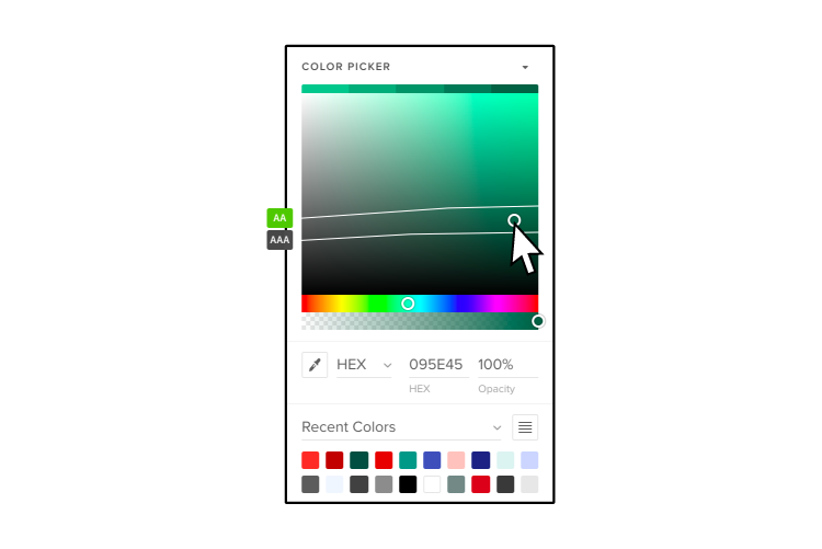
Design your applications using React components imported from Git, Storybook or through an npm package. Drag and drop them in a design environment and copy them into dev workflow. Discover UXPin Merge.

Design UI with code-backed components.

Use the same components in design as in development. Keep UI consistency at scale.

Asana

asana react example min

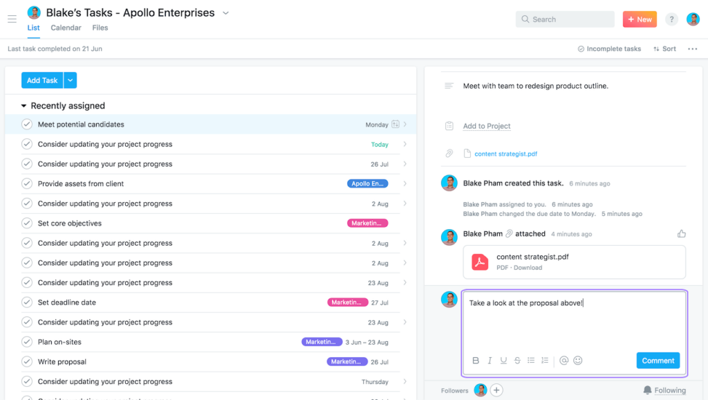
Asana is a project management platform helping teams organize work and collaborate effectively. The platform offers robust features such as task management, workflow visualization, team collaboration, and integrations with other tools, making it a go-to choice for teams of all sizes. Its clean and intuitive interface design reduces friction and increases productivity.

React UX highlights

  1. Simplicity and clarity: Asana’s interface is clean, with a simple layout makes it easy for users to navigate and find the information they need. It presents tasks and projects clearly, reducing cognitive load for users. The use of React enhances simplicity and clarity by enabling the creation of reusable UI components. This ensures a consistent look and feel throughout the app, reducing complexity and maintaining simplicity.
  2. Visual workflows: Asana provides visual project timelines and Kanban boards, making it easy for users to see the progress of tasks and projects at a glance. React contributes to these visual workflows through its efficient rendering capabilities, enabling smooth and fast updates of the visual elements for an uninterrupted user experience.
  3. Real-time updates: Asana offers real-time updates and notifications, ensuring users are always aware of task changes, comments, or updates. React’s efficient data handling and state management capabilities make these real-time updates possible, keeping the user interface in sync with the underlying data without unnecessary page refreshes.
  4. Intuitive interactions: From creating tasks to setting due dates, the interactions on Asana are intuitive and straightforward, contributing to a smooth user experience. React enhances these interactions by offering a robust event-handling system, enabling interactive UIs that respond to user inputs seamlessly.

Facebook

fb react web app min

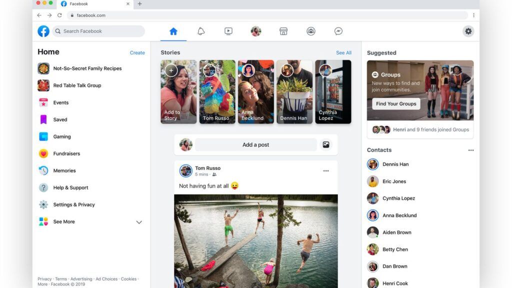
Facebook is one of the world’s largest social networking platforms, boasting around 3 billion active users. It provides an online space where users can connect with friends, share content, join groups, and engage in many other social activities.

React UX highlights

  1. Personalized user feed: Facebook’s personalized user feed delivers content tailored to each user’s preferences and interactions, creating a unique and engaging experience. With React, Facebook can efficiently update and render these personalized feeds, ensuring a smooth, up-to-date experience that engages users.
  2. Interactivity and responsiveness: Facebook is highly interactive–from liking and sharing posts to real-time messaging and video calling. React’s efficient event-handling system enhances these interactions, providing a responsive and seamless user experience.
  3. Real-time notifications: Users on Facebook receive real-time notifications about friend requests, messages, comments, and more. React’s state management capabilities allow for these real-time updates, ensuring the interface stays current without requiring page refreshes.
  4. Consistent design across platforms: Facebook maintains a uniform design and experience across its website and mobile apps, ensuring users can switch between platforms seamlessly. React (and React Native for native apps–iOS, Android, etc.) enables this consistency, allowing developers to create reusable components across different platforms.

Airbnb

react web app airbnb min

Airbnb is an online marketplace that connects people seeking accommodations with those offering them, allowing users to book unique homes and experiences worldwide. The platform provides a vast selection of listings, intuitive search, filter options, and seamless booking procedures, making it a popular choice for travelers.

React UX highlights

  1. Intuitive search and filters: Airbnb’s platform makes it easy for users to specify accommodation preferences with its intuitive search and robust filtering options. React’s component-based architecture allows for creating complex, customizable search and filter components, ensuring a smooth and user-friendly experience.
  2. Interactive map view: Alongside the list view of properties, Airbnb offers an interactive map view, allowing users to explore properties in their chosen location visually. React enhances this feature by efficiently rendering and updating map components based on user interactions.
  3. Detailed listings: Airbnb provides comprehensive information about each listing, including photos, amenities, host details, and reviews. React’s capabilities for handling complex data structures and state management allow for the efficient rendering of these complex components, ensuring a smooth user experience.
  4. Smooth booking process: Airbnb’s straightforward and user-friendly booking process provides real-time availability and pricing information, including currency conversions. React’s state management and real-time updating capabilities streamline this checkout user flow, providing users with accurate, real-time data as they navigate the booking steps.

Netflix

netflix react web app min

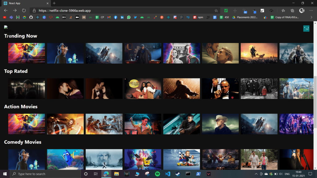
As a global streaming service, Netflix offers a vast library of films and television series, including in-house productions. Thanks to its personalized content recommendations, user-friendly interface, and seamless streaming experience, Netflix dominates the streaming industry, serving over 200 million subscribers worldwide.

React UX highlights

  1. Personalized content recommendations: Netflix uses sophisticated algorithms to curate and recommend content based on user behavior and preferences. React boosts this process, efficiently rendering and updating personalized content feeds to ensure a smooth, bespoke user experience that sustains subscriber engagement.
  2. User-friendly interface: The design of Netflix’s interface leans heavily towards ease of use, with intuitive navigation and a clean, visually appealing layout. The component-based architecture of React enhances this design, allowing the development of reusable UI components that maintain a consistent look and feel throughout the application.
  3. Seamless streaming experience: Netflix delivers high-quality streaming seamlessly across a wide range of devices. React’s efficient rendering and state management capabilities are crucial in this seamless experience, reducing latency and promoting smooth, uninterrupted viewing.
  4. Interactive features: Netflix offers interactive previews, ratings, and user profiles. With its robust event-handling system and component lifecycle methods, React powers these interactive features. It ensures real-time feedback and updates, contributing to a more engaging user experience.

Slack

slack react web app min

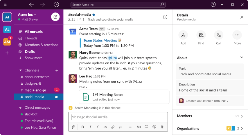
Slack is a widely-used communication platform that fosters collaboration among small and large teams. It successfully integrates messaging, file sharing, and video/voice calls in a single platform, thus facilitating seamless communication and efficient workflows.

React UX highlights

  1. Organized Conversations: Slack organizes conversations into channels, ensuring discussions remain on-topic and easy to follow. React’s component-based architecture aids in managing these distinct areas of the interface, ensuring quick updates and a smooth user experience.
  2. Integrations: Slack offers many integrations, including tools like Google Drive, GitHub, and Trello. This level of integration simplifies workflows by providing a unified platform for various tasks. React’s flexibility plays a significant role by enabling seamless interaction with different APIs and services.
  3. Real-time Interaction: Slack’s real-time messaging system keeps teams connected, fostering collaboration. React’s efficient state management ensures users see updates instantly without page refreshes, enhancing the interaction experience and productivity.
  4. Customizable Notifications: Slack allows users to customize notifications, ensuring they stay focused without missing important updates. The flexibility of React supports this customization, allowing the app to efficiently manage changes in user settings and provide a tailored experience.
  5. Search Functionality: Slack’s powerful search functionality lets users quickly locate past conversations or files. React enhances this feature by facilitating fast rendering of search results, ensuring a smooth, uninterrupted user experience.

Why Web Apps Use ReactJS?

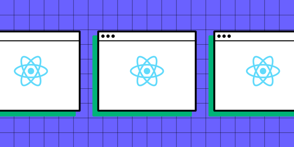
The React library promotes code reuse and modularity through its component-based architecture, enabling developers to construct complex user interfaces from small, isolated pieces of code.

Under the hood, Node.js, a powerful JavaScript runtime, often powers the server-side operations of these React applications, creating a seamless full-stack development experience.

React’s virtual DOM (ReactDOM) optimizes rendering and improves app performance, efficiently handling high-load applications. With JavaScript at its core, React allows seamless integration with other JS libraries and frameworks, providing a flexible app development environment.

React’s support for server-side rendering (converting pages to HTML, CSS, and Javascript in the browser) also aids in SEO, ensuring that web apps are discoverable and performant—a critical feature many libraries and frameworks (Angular, Vue, etc.) cannot replicate effectively.

How React impacts web app UX

React’s fast rendering creates a smooth, lag-free user experience critical for user engagement and satisfaction. A perfect example of React’s performance in action is Facebook, one of the most complex web applications in the world.

The ability to effortlessly reuse components throughout an application helps maintain design consistency and coherence for uniform user interfaces and interactions.

5 Criteria for a Great React UX

1. User-centric design

User-centered design focuses on the needs and preferences of the target audience. React’s component-based architecture and flexibility allow developers to create highly customizable user interfaces that cater to specific user expectations and deliver a tailored experience.

2. Performance and speed

A critical aspect of great UX is ensuring that web apps deliver the highest speed and performance. React’s virtual DOM and efficient rendering mechanisms help achieve this by minimizing updates to the actual DOM, leading to a smoother user experience with minimal latency, even in complex applications.

3. Consistency and predictability

Consistency and predictability in a web app’s design and interactions are essential for enhancing user satisfaction. React’s component-based structure promotes the reuse of UI elements across the application, ensuring a consistent look and feel and providing predictable user interactions.

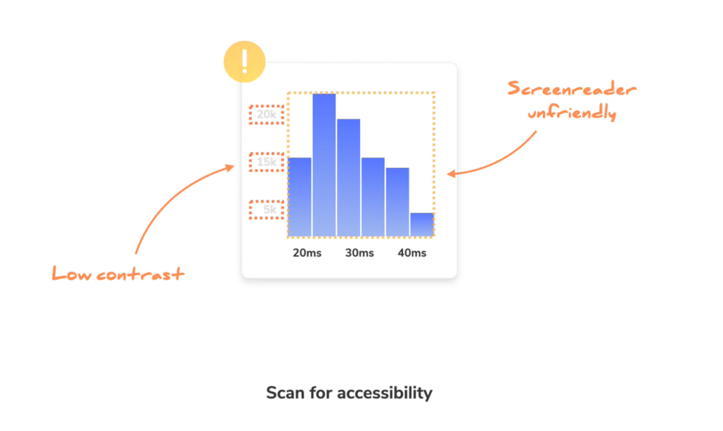
4. Accessibility and inclusiveness

Designers must make web apps accessible to all users, regardless of their abilities, devices, or assistive technologies. React’s ecosystem offers a range of libraries and tools to implement accessibility best practices, ensuring an inclusive user experience.

5. Feedback and responsiveness

Providing timely feedback and responsiveness in web apps is crucial for maintaining user engagement. React’s state management capabilities and component lifecycle methods enable developers to handle user interactions efficiently, providing real-time feedback and updates. This instant feedback creates a more interactive and engaging user experience, fostering user satisfaction and loyalty.

How TeamPassword Using React for Prototyping

Password manager TeamPassword uses a custom React MUI design system to develop its products. The startup doesn’t have a design team, meaning engineers must do all the prototyping and testing before releasing new features.

“Customers entrust us with sensitive information in their login records. Inconsistencies or an outdated design can cause some customers to question whether we are technologically up-to-date enough to keep that information secure. Front-end development builds trust and confidence in the backend performance.” Tony Caccavo, Director of Operations at TeamPassword.

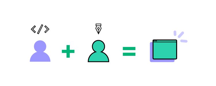
The engineering team imports their React design system into UXPin using Merge, allowing them to leverage UXPin’s drag-and-drop design environment to build prototypes and make changes significantly quicker than writing code.

TeamPassword gets all the benefits of code with the simplicity of UXPin’s design interface allowing the company to ship UX-optimized releases fast. UXPin renders JSX, meaning React developers can copy/paste production-ready prop changes to develop the final product.

Prototype your React web applications with fully functional components to enhance testing with actionable feedback from test participants and stakeholders. Visit our Merge page for more details.

How Do You Incorporate Feedback into Your Designs?

how do you incorporate feedback into your designs min

Constructive feedback provides UX designers with different perspectives, helping to highlight areas that may require improvement or revision. This process is essential as designers are often too close to their projects, blinding them from possible flaws or enhancements.

Feedback helps align product design with user needs and business goals, improving the design’s usability, user experience, and business value. Incorporating feedback can foster more collaborative, user-centric, and outcome-focused designs.

Does your design tool elicit good feedback? Deliver products that exceed user needs and stakeholder expectations. Discover how UXPin can enhance your prototyping capability to elicit more meaningful, actionable feedback. Sign up for a free trial.

Build advanced prototypes

Design better products with States, Variables, Auto Layout and more.

Try UXPin

Understanding Feedback

search observe user centered

It’s important to understand what type of feedback you receive, who it’s from, and its relevance. This understanding will help differentiate valuable feedback vs. negative feedback and what information you use to drive decision-making.

Constructive vs. destructive feedback

Constructive criticism aims to foster improvement and is generally given with positive intent to drive design decisions. For example, a colleague might say, “The call-to-action button doesn’t stand out. Maybe making it more prominent would lead to higher user engagement.” 

Conversely, destructive feedback is negative, unhelpful, and does not provide any direction for improvement. An example would be, “I don’t like the design. It’s dull.”

User vs. stakeholder or client feedback

User feedback refers to insights provided by a product’s end-users, often gathered through user testing or surveys. For example, a user might suggest, “I prefer websites and apps with dark mode because I suffer from screen fatigue.”

Stakeholder feedback typically comes from people involved with a design project. For example, a stakeholder from the branding team might say, “This color scheme doesn’t align with our brand identity.”

Peer vs. expert feedback

Peer feedback refers to input from fellow designers or colleagues, typically during design critiques or standups. An example might be, “I think we need to adjust the typography to improve readability.” 

Expert feedback comes from seasoned professionals or individuals with significant experience or expertise in a specific domain. An expert might provide insights such as, “The current design might have accessibility issues for visually impaired users. This project requires a color contrast of Level AA–contrast ratio of at least 3:1 for text not smaller than 24px or 4.5:1 for text smaller than 24px.”

This example demonstrates that peers might spot a problem but not know how to fix it. Designers must contact domain experts to gather more data and implement a suitable solution.

Techniques for Eliciting Great Design Feedback

team collaboration talk communication ideas messsages

Asking the right stakeholder questions

It’s crucial to ask the right questions when eliciting feedback from stakeholders. Instead of general queries like “What do you think of this design?” guide your reviewers with more specific questions about your design goals. 

For example, asking, “Do you think we have prioritized the primary and secondary navigation appropriately?” or “Does the color scheme evoke the emotions we’re aiming for in our target audience?” These pointed questions will encourage more targeted, actionable responses that you can incorporate into your designs.

Using open-ended questions

Open-ended questions can be a powerful tool for eliciting user and stakeholder feedback. Unlike closed questions that limit responses to yes or no, open-ended questions encourage users to share their thoughts, feelings, and ideas in detail.

For example, rather than asking, “Do you like feature X?” you could ask, “How does this feature X help you?” By allowing users to express their thoughts freely, you gain deeper insights into their experiences and needs, which can guide you in refining your design.

Setting clear expectations

Feedback is more valuable when designers set clear goals and expectations. Clarify what kind of feedback you’re seeking and when you need it. For example, if you’re in the initial design stage, you may say, “I’m looking for feedback on the overall layout and color palette by the close of business tomorrow.” This way, reviewers understand the feedback’s scope and urgency, enabling them to provide more thoughtful, timely responses.

Design Feedback Framework

Here is a basic design feedback framework designers can apply to users and stakeholders.

designops picking tools care

Step 1: Set your feedback goal

Before you even start collecting feedback, it’s essential to identify the purpose and goal. What aspect of your design are you focusing on? Is it usability, aesthetic, or functionality? Or are you interested in how well your design aligns with your target audience’s expectations? 

By establishing clear feedback goals, you can set the direction for your feedback session, ask the right questions and ensure responses are meaningful and actionable.

Step 2: Identify who you need feedback from

Identifying the right stakeholders for your feedback session is crucial. For example, if it’s a question about usability, you have to recruit participants from a specific user group, while a technical question will require input from an engineering stakeholder. In some instances, you may need diverse feedback to ensure your solution meets many needs.

Identifying who you need to speak to and what questions to ask is essential for gathering feedback to propel your project forward while meeting user and business goals.

Step 3: Collect feedback

Once you’ve defined your goals and identified your audience, it’s time to collect feedback. You might do this through one-on-one interviews, group workshops, or digital tools for remote feedback collection. For asynchronous or on-the-go surveys, tools like Google Forms, Typeform, or survey links embedded in The QR Code Generator (TQRCG) offer practical ways to gather input. QR codes can be added to onboarding documents, internal Slack messages, design mockups, or even printed handouts during client presentations to allow quick access to feedback form. Remember to create a comfortable space (virtual or in-person) for stakeholders and users to express their thoughts. Be sure to ask open-ended questions to encourage in-depth responses.

Step 4: Organize responses

You’ll often have lots of data and UX assets at the end of a feedback session. For example, one 30-minute interview will produce several transcript pages, a video, notes, and a report. You must organize and store these so it’s easy for team members to fetch and analyze the data.

To make sense of it all, you need to organize and categorize the feedback–for example, usability, aesthetics, functionality, technical, etc. This step will make it easier for you to analyze and prioritize the feedback.

UX researchers often use tools like Condens, Dovetail, and Productboard as asset repositories to organize and distribute data.

Step 5: Evaluate

Once you’ve organized the feedback, it’s time to analyze the data objectively. Focus on understanding the underlying concerns or ideas behind what users and stakeholders have shared. Look for common themes or recurring issues, as these can highlight areas to prioritize.

Step 6: Prioritize

After evaluating the feedback, you may have several changes, but they’re not equally important. It’s essential to prioritize these changes based on their impact on the overall user experience and the project’s goalsaccording to the goals you set in Step 1. You can add the non-essential items to the product’s backlog.

Step 7: Implement

Now that you’ve identified and prioritized the necessary changes, it’s time to implement them. For example, stakeholders have asked designers to improve conversions with a more prominent CTA. The design team must build prototypes based on the feedback to begin testing.

Step 8: Iterate and improve

The process doesn’t end with implementing the changes. The next step is to prototype and test these changes with users and stakeholders to see if they’ve improved the design.

Collect feedback on these new iterations, evaluate them, and make further changes if necessary. Design is an iterative process, and each round of feedback takes you one step closer to a design that meets user needs and business goals.

Incorporate feedback with UXPin

The quality of your prototype significantly impacts the quality of feedback you get from users and stakeholders. Digital products are highly interactive, but the prototypes from traditional design tools are not! 

This lack of interactivity limits prototyping scope, the questions designers can ask, and the feedback quality. For example, most design tools don’t have functioning input fields. Design teams must use multiple frames or plugins to achieve basic functionality–which still doesn’t provide a realistic user experience.

A stakeholder might comment, “This button doesn’t do anything,” or “Why can’t I enter my name in this input field?” Unfortunately, these are the frustrating limitations of image-based design tools.

Better Design Decisions with Interactive Prototypes

UXPin is a complete end-to-end design tool with features to create wireframes, mockups, and high-fidelity prototypes faster and with enhanced functionality. 

UXPin is interactive by default. When designers add an input field to the canvas, it’s fully functional and ready to receive data–no plugins or additional frames required.

Designers can use UXPin’s Variables to capture user inputs and create dynamic prototypes to impress stakeholders while providing usability participants with a realistic user experience.

Variables are just one of UXPin’s many advanced prototyping features:

  • Conditional Interactions: take interactions to the next level with if-then and if-else rules to determine outcomes based on user actions.
  • Expressions: design Javascript-like functionality to validate passwords or update a shopping cart.
  • States: create multiple variants of a component that respond to specific user interactions, including dropdown menus, accordions, image carousels, and more.
  • IFTTT: connect other apps or products to create realistic prototyping experiences, like adding an event to a user’s calendar or sending an email verification.

Ready to see how UXPin can enhance your digital product design process? Sign up for a free trial.

A Designer’s Guide to Content Inventory

Content Inventory

A content inventory is a comprehensive and structured collection of all the content assets within a digital product or website. It’s a detailed catalog that captures information about each piece of content, including its location, format, metadata, and key attributes.

Managing a content inventory is essential for user experience as it provides a centralized and organized view of the content landscape, allowing designers to understand the content’s breadth, depth, and relationships.

With a content inventory, UX designers can clearly understand the content’s scope and structure, enabling them to plan and create user-centered experiences effectively. 

By managing the content inventory, designers can ensure that content is properly structured, labeled, and accessible, improving navigation, findability, and overall user satisfaction. The content inventory is a foundational tool for content strategy, governance, and optimization efforts, ultimately contributing to a seamless and engaging user experience.

Create a single source of truth and streamline design operations with UXPin Merge. Visit our Merge page for more details and how to request access.

Reach a new level of prototyping

Design with interactive components coming from your team’s design system.

What is a Content Audit?

A content audit systematically and thoroughly evaluates the content inventory within a digital product or website. It involves reviewing and analyzing the content to assess its quality, relevance, accuracy, and effectiveness in meeting user needs and business goals–like the company’s content marketing strategy.

UX designers use content audits to identify content gaps, redundancies, inconsistencies, and areas for improvement, enabling them to make informed decisions about content strategy, organization, and optimization.

Who is Responsible for a Content Audit?

team collaboration talk communication

Typically, a content audit is a collaborative effort involving multiple stakeholders. The primary responsibility for a content audit often lies with the UX design team, specifically the content designers or strategists. These individuals possess the expertise and knowledge to effectively assess and evaluate the content.

Do you need a content designer?

A dedicated content designer plays a crucial role in content management and strategy. They take ownership of the content audit process, working closely with the UX design team, content creators, and stakeholders. 

A content designer’s responsibilities include:

  • Collecting and analyzing content.
  • Identifying gaps and redundancies.
  • Organizing the content inventory.
  • Documenting findings.

They collaborate with stakeholders to implement content improvements based on the audit’s recommendations, ensuring the content aligns with user needs and business goals

The content designer also contributes to content strategy development, guiding the creation and maintenance of high-quality, user-centered content across digital platforms. Their expertise helps establish consistent brand messaging, tone, and style while ensuring content meets accessibility, SEO, and usability standards.

How to Conduct a Content Audit

design system components

Collect existing content

Start by identifying the content sources and compiling a comprehensive inventory list. This process involves gathering all the content assets from various sources, such as web pages, documents, images, videos, and downloadable files.

Create a structured inventory including URL or location, content type, metadata, and other relevant information to ensure a thorough content representation.

The NN Group recommends using a spreadsheet (Google Sheets or Excel) for managing content inventories and audits. Spreadsheets have all the required features, and the design team can invite collaborators from across the organization without investing in additional tools and subscriptions.

Analyze content

Review the content inventory for relevance and accuracy. Assess the quality and consistency, considering factors such as readability, tone, language, and alignment with brand guidelines. 

Evaluate the effectiveness of the content in meeting user needs and business goals, ensuring it provides value, supports key messages, and aligns with the overall user experience strategy.

Organize it into categories

Categorize the content based on topics or themes to create a logical organization. Establish a content hierarchy or structure that reflects the relationships between different content pieces.

This organization helps users navigate the content more effectively and enhances their overall experience. Consider user personas, user journeys, and information architecture principles when organizing the content.

Assess content gaps and redundancies

Identify any missing or outdated content that must be created or updated. Eliminate redundant or overlapping content to streamline the user experience and ensure clarity and consistency. By identifying gaps and redundancies, you can optimize the content ecosystem and ensure that users can easily find the information they need without confusion or frustration.

Document findings and recommendations

Create a comprehensive content inventory report that documents the findings from the audit. Include an analysis of the content, highlighting strengths, weaknesses, and areas for improvement. 

Based on the audit’s findings, outline actionable recommendations for content enhancement, restructuring, or removal. Provide clear guidelines for content creators and stakeholders to implement the recommended changes, fostering a user-centric approach to content management and improving the overall user experience.

When Should You Conduct a Content Audit?

timer

There are several instances where UX teams might want to consider conducting content audits:

  • Website redesign or migration: Conduct a content audit before a website redesign or migration to evaluate the existing content’s relevance, accuracy, and quality. This audit helps inform decisions on what content to keep, revise, or remove during the redesign process.
  • Content strategy development: Perform a content audit when developing a content strategy to gain insights into the current content landscape, identify gaps and redundancies, and inform future content planning and creation.
  • User experience optimization: Conduct a content audit to improve the user experience by ensuring the content is organized, structured, and easily accessible. This optimization helps identify improvements, such as updating outdated content or adapting content for different devices.
  • SEO and keyword analysis: You can also leverage an AI blog post title generator to come up with headline variations that align with your keyword strategy and attract more clicks. Use a content audit to assess the performance of existing content in search engine rankings, identify keyword opportunities, and optimize content for improved visibility and search engine optimization.
  • Compliance and legal requirements: Regular content audits ensure compliance with legal and regulatory standards, such as data privacy, accessibility, and copyright. The UX team can identify potential risks or address non-compliant content.

Best Practices and Tips for Successful Content Inventory

image 1

Involve stakeholders and subject matter experts

Collaborate with individuals from various teams, including content creators, designers, developers, and subject matter experts, to gather insights and ensure comprehensive coverage of the content landscape. 

Engaging stakeholders throughout the process promotes a shared understanding of content goals and facilitates a more accurate and thorough inventory.

Maintain version control and documentation

Establish a clear system for tracking changes, updates, and revisions to the content inventory, ensuring everyone works from the most up-to-date version.

Document important details, such as content sources, metadata, and relevant notes or observations, to provide a comprehensive record for future reference and maintain consistency and accuracy.

Consider scalability and future content updates

Anticipate future growth and changes in content, ensuring the inventory framework and structure can accommodate new content and adjustments. A flexible inventory design allows for easy additions, modifications, and scalability as the content landscape evolves. 

This proactive approach ensures that the content inventory remains valuable and effective long-term, even as the team adds new content or the strategy evolves.

Tools and Resources for Content Inventory Management and Audits

Content inventory spreadsheet templates

Content inventory templates provide a structured framework for capturing essential information about each piece of content, including metadata, URLs, page titles, and descriptions. 

Tools like Google Sheets, Microsoft Excel, Notion, or Airtable offer customizable templates specifically designed for content inventory purposes. These templates streamline the inventory process, allowing you to efficiently input and analyze content data.

The NN Group provides a list of standard inventory attributes you can use as a foundation for your spreadsheet:

  • Name or title of the piece of content (not the page title, the actual name or title); if it doesn’t have one, give it a clear name or summarize what it is
  • URL or link to where it lives
  • Author, owner, or source (who wrote or created it, who owns it, is it user-generated, fed in from somewhere else, etc.)
  • Subject matter or topic it relates to
  • Format (article, video, image, web part or component, webpage type, PDF)
  • Creation or last-modified date
  • Metadata (page title, meta description, alt text, etc.)
  • Where raw files reside, internally

Content analysis and mapping tools

Tools like Smartocto and Siteimprove enable you to analyze and visualize content hierarchies, relationships, and performance metrics.

These tools provide data-driven insights to uncover content gaps, redundancies, and opportunities for optimization. Utilizing these tools lets you make informed decisions about content strategy, information architecture, and user experience.

Here are a few content inventory tools for analysis and mapping:

Collaboration and project management software

Collaboration and project management software facilitates effective teamwork and streamlined content inventory workflows. 

Tools like Trello, Asana, Notion, or Jira help teams collaborate, assign tasks, set deadlines, and track audit progress.

Content Prototyping With UXPin Merge

UXPin Merge enables content designers to build interactive prototypes that replicate the final product experience accurately. With UXPin Patterns, designers can create multiple instances of interactive components or interfaces and quickly swap these during usability testing or stakeholder feedback sessions to get instant feedback on different types of content.

UXPin Merge’s drag-and-drop workflow empowers non-designers to build and test prototypes at a higher fidelity and with greater interactivity than traditional design tools.

Take your content strategy to the next level with interactive prototyping from UXPin Merge. Visit our Merge page for more details and how to request access.

3 Types of Accessibility Testing Tools that You 100% Need

accessibility testing tools min

Accessibility testing evaluates digital products or services to ensure they can be accessed and used by individuals with disabilities. It involves assessing various websites, applications, or content aspects to identify and address barriers that hinder users with disabilities.

UX teams aim to identify and rectify issues related to visual, auditory, motor, and cognitive impairments, making their digital products more inclusive and usable.

Accessibility testing is crucial because it helps ensure equal access and usability for all individuals, regardless of their abilities. It plays a vital role in creating inclusive digital experiences that comply with accessibility standards and guidelines, such as the Web Content Accessibility Guidelines (WCAG 2.0) and Section 508.

Test your designs without leaving the canvas with UXPin’s built-in accessibility features. Sign up for a free trial to explore the world’s most advanced UX design tool.

Build advanced prototypes

Design better products with States, Variables, Auto Layout and more.

Try UXPin

Understanding Accessibility Guidelines

The most widely recognized and adopted guidelines are the Web Content Accessibility Guidelines (WCAG) developed by the World Wide Web Consortium (W3C). It covers various aspects of accessibility, including visual design, multimedia, navigation, forms, and assistive technologies.

WCAG uses four principles: Perceivable, Operable, Understandable, and Robust (POUR), to categorize accessibility, accompanied by specific success criteria. These criteria outline the requirements that digital products must meet to be considered accessible. 

WCAG has three conformance levels:

  • A (basic)
  • AA (intermediate)
  • AAA (advanced)

Achieving a higher conformance level indicates a higher level of accessibility.

This article focuses on accessibility tools. You can learn more about accessibility and testing here:

Types of Accessibility Testing Tools

eye accessibility wcag

Accessibility testing tools fall into three primary categories:

  • Automated testing tools
  • Manual testing tools
  • Hybrid testing tools

What are automated testing tools?

Automated Testing Tools are software applications designed to scan and evaluate digital products for accessibility issues automatically. These tools use algorithms and predefined rules to analyze web pages or applications, identifying potential violations of accessibility standards and guidelines.

They can detect common issues like missing alternative text for images, improper heading structure, and color contrast accessibility problems.

While Automated Testing Tools are valuable for identifying specific types of accessibility issues, it’s important to note that they have limitations and cannot fully replace manual testing and expert judgment.

What are manual testing tools?

Manual Testing Tools are tools that require human intervention and evaluation to assess the accessibility of digital products. Unlike automated testing tools, which rely on algorithms and predefined rules, manual testing tools involve direct interaction with the product, thorough inspections, and expert judgment.

Teams use manual testing tools to conduct in-depth evaluations of various accessibility aspects, such as keyboard navigation, screen reader compatibility, and cognitive accessibility. These tools often include checklists, guidelines, and testing methodologies to guide testers through the evaluation process.

What are hybrid testing tools?

Hybrid Testing Tools are a combination of both automated and manual testing approaches in accessibility testing. These tools leverage the benefits of automation to streamline the testing process while incorporating human evaluation for a more comprehensive assessment.

Teams use hybrid testing tools to take advantage of the efficiency and speed of automated testing, which can quickly scan and identify common accessibility issues. These tools often integrate with automated accessibility testing engines or APIs to analyze code (HTML, CSS, Javascript), markup (ARIA, alt text, etc.), and design elements.

Hybrid testing tools also provide room for manual inspection, allowing testers to conduct deeper evaluations, assess user interactions, and identify complex accessibility barriers that may require human judgment.

Automated Accessibility Testing Tools

axe by Deque

example of accessibility testing tools

Developed by Deque Systems, axe offers a comprehensive set of features to identify and address accessibility issues, helping to ensure that digital products are usable by individuals with disabilities. The automated accessibility testing tool evaluates the accessibility of web pages and applications.

Pros:

  • axe provides extensive automated accessibility testing capabilities, scanning web pages and applications for various accessibility issues.
  • You can integrate axe into various development workflows and environments, including popular web browsers and frameworks.
  • axe generates detailed reports highlighting accessibility violations and provides guidance on how to fix them.
  • You can customize axe’s rulesets to fit your specific accessibility requirements and preferences, allowing for more targeted and tailored testing.
  • axe has an active and supportive community, offering resources, documentation, and ongoing updates to stay aligned with evolving accessibility standards.

Cons:

  • axe’s automated analysis may not fully understand the context and intent of specific design elements or interactions, leading to potential limitations in identifying nuanced accessibility barriers.
  • axe’s accuracy and effectiveness relies on the quality and accuracy of the underlying code and markup. axe may not capture issues related to poorly structured code or incomplete implementation.

WAVE

best accessbility testing tools

WAVE (Web Accessibility Evaluation Tool) is a widely used automated accessibility testing tool developed by WebAIM. It helps evaluate web content for accessibility issues and provides visual feedback for identifying potential problems.

Pros:

  • User-friendly interface and intuitive visualizations make it easy to understand accessibility issues.
  • Provides detailed reports with clear explanations of accessibility errors and warnings.
  • Offers a browser extension for quick on-page accessibility testing.
  • Supports testing of both live websites and local development environments.
  • Available as a free browser extension and an online tool.

Cons:

  • Limited to automated testing and may not detect all accessibility issues.
  • Requires manual interpretation of results for accurate assessment.
  • The tool may not fully capture some features, such as dynamic content or complex web applications.

Pa11y

Pa11y is an open-source automated accessibility audit tool that helps identify accessibility issues in web pages. It allows developers and testers to automate accessibility testing and integrate it into their development workflow.

Pros:

  • Supports multiple testing standards, including WCAG and Section 508, providing comprehensive accessibility evaluation.
  • Offers a command-line interface for easy integration with build processes and continuous integration tools.
  • Provides detailed reports with specific accessibility errors and warnings.
  • Allows customization of testing rules and thresholds to match project requirements.
  • Available as a free and open-source tool, allowing customization and community contribution.

Cons:

  • Requires technical knowledge to set up and configure.
  • Pa11y relies solely on automated testing, which may not capture all accessibility issues.
  • Requires manual interpretation of results for accurate assessment.
  • Limited support for dynamic content and complex web applications.

Manual Testing Tools

UXPin

uxpin accessibility wcag color picker

UXPin provides designers with two built-in accessibility tools to test UIs on the fly, including a contrast checker and color blindness simulator.

Pros:

  • Enables designers to test colors without leaving the design tool.
  • Automatically identifies text colors with insufficient contrast.
  • Displays results for all types of color blindness and allows designers to preview interfaces as a user with each visual impairment would see it.
  • Doesn’t require plugins or external tools when testing designs in UXPin.

Cons:

  • Limited to testing color only.
  • Only works with UXPin designs (but you can import Figma and Sketch files).

NVDA

NVDA (NonVisual Desktop Access) is a free accessibility tool and open-source screen reader designed for Windows. It enables users with visual impairments to navigate and interact with digital content by converting on-screen information into synthesized speech or Braille output.

Pros:

  • A free and open-source screen reader for Windows, making it accessible for users with visual impairments.
  • Supports various web browsers (Chrome, Firefox, Internet Explorer, and Edge), applications, and document formats, allowing comprehensive testing across different platforms.
  • NVDA is actively maintained and regularly updated, ensuring compatibility with the latest technologies and accessibility standards.
  • It offers customizable settings and options, allowing testers to simulate different user experiences and preferences.

Cons:

  • NVDA is limited to the Windows operating system, so it may not be suitable for testing on other platforms like macOS or Linux (you can use VoiceOver in conjunction with NVDA to cover all platforms)
  • There may be slight differences in interpretation and rendering compared to other assistive technologies, so it’s important to conduct additional testing with multiple tools.
  • NVDA requires some level of familiarity and training to use effectively, particularly for accurately interpreting complex web content and interactions.
  • Support resources are limited, and users may need to rely on community forums or documentation for assistance.

Hybrid Testing Tools

Storybook Testing

accessibility testing tool in storybook

Storybook is a web-based open-source tool primarily used for developing UI components in isolation. The free tool offers a built-in accessibility toolkit that helps developers identify and address accessibility issues within their components.

Pros:

  • Storybook’s accessibility tool seamlessly integrates into the component development workflow, allowing developers to catch accessibility issues early in development.
  • By testing components in isolation, developers can focus specifically on their accessibility and ensure they meet the required standards.
  • The tool provides visual feedback on accessibility violations, making it easier for developers to identify and understand the issues.
  • Integrates with UXPin Merge to provide product teams with design and development accessibility testing capability.

Cons:

  • Storybook’s accessibility tool focuses primarily on the accessibility of UI components and may not comprehensively evaluate the entire website or application.
  • The platform requires developers to manually check and address accessibility issues, which may require some accessibility expertise.
  • While Storybook offers customization options, it may require further configuration to align the tool with specific accessibility requirements.

Google Lighthouse

Google Lighthouse is an open-source web accessibility testing tool. It includes an accessibility auditing feature that evaluates a website’s adherence to accessibility standards.

Pros:

  • Google Lighthouse thoroughly evaluates accessibility issues, covering a wide range of accessibility best practices and guidelines.
  • Lighthouse’s accessibility tool is part of a suite of performance audits, allowing users to assess multiple aspects of their website simultaneously.
  • The tool generates detailed reports highlighting specific accessibility issues and suggestions for improvements.
  • Chrome extension allows you to test user interfaces on the fly.

Cons:

  • Using Lighthouse effectively may require technical knowledge and familiarity with web development tools.
  • Lighthouse focuses specifically on web accessibility and may not be suitable for evaluating accessibility in native mobile apps or other digital products.
  • While Lighthouse automates some aspects of accessibility testing, manual testing is still necessary to evaluate specific interactive or dynamic components.

Accessibility Insights

Accessibility Insights is an open-source accessibility testing tool developed by Microsoft. It provides automated and manual testing features to help identify and fix accessibility issues in digital products.

Pros:

  • Accessibility Insights offers automated tests to quickly identify common accessibility issues and manual testing capabilities for evaluating more complex interactions.
  • The tool integrates seamlessly with popular web browsers and developer tools, making it convenient for developers and testers to incorporate accessibility testing into their workflows.
  • Provides detailed guidance on how to fix identified issues, including code examples and best practices.

Cons:

  • While the tool offers extensive features, there may be a learning curve for users new to accessibility testing.
  • Accessibility Insights primarily focuses on web accessibility and may not be as suitable for evaluating native mobile apps or other non-web digital products.
  • Some features have compatibility limitations with specific browsers or development environments.

Streamline your accessibility testing with UXPin. Sign up for a free trial to explore UXPin’s advanced design and prototyping features.

8 Design System Best Practices that Top Enterprise Companies Follow

Design System Best Practices for Enterprises

Together with Whitespace, we hosted a webinar for hundreds of tech professionals titled: How to Overcome Challenges of Scaling a Design System? DesignOps and Product Design Leadership expert Dave Malouf moderated the event with speakers from two enterprise multinationals:

This webinar provided interesting insights into how two enterprise giants approach design systems, including maintenance, scaling, and governance.

Achieve design system maturity and a single source of truth with UXPin Merge. Visit our Merge page for more details and how to request access.

Reach a new level of prototyping

Design with interactive components coming from your team’s design system.

Benefits of a Design System

Before we get into the webinar, we wanted to highlight the high-level benefits of a design system:

  • Improved consistency and coherence: Design systems establish a unified visual design language and functionality, ensuring a cohesive user experience across products and platforms.
  • Enhanced collaboration and communication: By serving as a single source of truth, design systems facilitate better teamwork among designers, developers, and stakeholders, streamlining handoffs and reducing miscommunications.
  • Faster design and development process: Reusable components and guidelines within a design system enable teams to accelerate their workflows, reducing the time spent on designing and coding individual elements.
  • Scalability and maintainability: Design systems are built for adaptability, allowing product teams to easily update, expand, and maintain their products while preserving consistency and usability.
  • Better user experience and product quality: By providing a structured approach to design, design systems help deliver a refined, high-quality user experience that meets user needs and expectations.

Do you recognize any challenges in your organization related to the benefits above? The next step is to build a business case. Here’s how teams at Sage and Weir Group secure funding and resources for their design systems.

Acquiring and Maintaining Funding and Resources for Design Systems

designops efficiency person

Building a case for large federated design teams at Weir Group

Ryan Kane, who works for the Weir Group–a large corporation with numerous federated design teamsargues that the efficiency savings realized from design systems can make a compelling case for funding. 

The company can save significant resources by avoiding the redundancy of rebuilding and redesigning components across different projects. 

Ryan explains this saving through the lens of coded and design components and considers the broader scope of design language systems that cater to teams relying on low-code or no-code solutions

This broad approach ensures that all teams benefit from time-saving, consistency, trust, and a coherent product experience regardless of their development approach.

A fascinating part of the Weir Group’s strategy includes creating lighter versions of their React and React Native components to suit configuration needs. It also extends the design system’s benefits to teams not directly engaged in development but that use bought and configured solutions.

An additional layer of complexity in larger organizations is the various tech stacks, which may include systems like Salesforce and SAP, further reinforcing the need for an adaptable design system.

A creative approach from Dave Malouf

Dave Malouf described how his team at Northwestern Mutual used accessibility as a foundational argument for acquiring design system funding. Dave’s team partnered with legal to demonstrate the organization could build accessibility into the design system and avoid regulatory challenges–which could lead to potential fines and lawsuits in some jurisdictions.

Dave’s example shows how teams must assess the product and industry landscape holistically to build a case for a design system and other UX initiatives.

Learning from experience at Sage

Julian Vaniere’s experience at Sage differs slightly. His team started their design system proactively, based on knowledge from a manager who had previously created a design system at Intuit. They didn’t need to justify each step but instead focused on adoption and eventual constraints

Vaniere’s team focuses on patterns more than components, which they see as making a significant difference. Sage’s global and diverse products drive this focus, including HR software, ERPs, accounting software, and more. Sage is working towards a seamless experience across these products and needs rather than perfect consistency.

The key to securing and maintaining funding and resources for a design system depends on an organization’s unique circumstances. 

Demonstrating cost and efficiency savings, scalability, and the ability to deliver a seamless user experience across diverse products and regions can make a compelling case. It’s crucial to think beyond patterns and consider larger design language for a more inclusive and comprehensive design system.

Making the Development Process More Efficient

scaling prototyping

Julian Vaniere provides insight into how Sage structures its design system efforts and highlights the importance of focusing on accessibility. His team comprises various roles, with five UX/UI designers and an Accessibility Designer.

Julian drives the accessibility initiative in his organization, which adds another dimension to their design system. He indicates that having an Accessibility Designer on the team is crucial as it ensures that products are accessible to all users. This accessibility is essential to creating a seamless user experience, regardless of geographical location or user needs.

Developers want to build rather than make design decisions

According to Julian, developers at Sage are most interested in building features; they typically prefer not to spend time fixing accessibility or making design decisions. This tendency among developers can justify the cost of a design system team who can efficiently handle these aspects. This separation of responsibility allows developers to focus on what they do best – building features.

Vaniere’s team implemented the concept of “accessibility champions” within each team. These individuals can leverage their knowledge and expertise to guide the rest of the organization, clarifying precisely what everyone must do for accessibility.

How design systems enable devs to focus on development

A design system can facilitate the dev team’s desire to focus on building features rather than design decisions or accessibility by providing guidelines and components. This unified design language streamlines the development process and ensures consistency across different projects and products.

With roles like Sage’s Accessibility Champions, the knowledge and expertise about design considerations, including accessibility, can be efficiently distributed among design teams, creating a more focused and efficient development process while reinforcing the cost-effectiveness of a dedicated design team.

Maintaining Great Work When Things Get Tight

image 12

The Weir Group has a federated structure consisting of individual businesses with a corporate function on top. Each business uses the same design language but has autonomy regarding strategies and budgets.

The corporate level manages the design language, but Ryan emphasizes that no one truly “owns” the design language–it’s a living, breathing entity for which the entire community is responsible. 

The challenge many design organizations face

The rationale for the so-called ownership at the corporate level is to have a dedicated resource that isn’t juggling too many responsibilities. In many companies, design teams often bear the dual burden of delivering design on products and projects while also maintaining and growing the design language. Inevitably, when resources become tight, maintaining the design language is deprioritized.

Join our next webinar: Strategies for Building a Resilient DesignOps Practice.

Distributed, shared responsibility

To compensate for this deprioritization, Ryan’s team segregates the design work and the maintenance of the design system. The federated businesses handle the hands-on design work, while the centralized design system team manages the maintenance and growth of the design system.

This delegation of responsibilities ensures the organization’s design teams focus on products and design projects while the corporate team manages design system maturity and maintenance.

Design systems are never complete

The Weir Group runs a “contribution model” for its governance. They acknowledge the design system is an evolving entity and should never be considered complete. 

The design teams in the federated businesses are empowered to design and develop new components based on emerging use cases that the library doesn’t cater to. Teams then contribute these components back to the central library via UXPin Merge, similar to GitHub releases.

This approach has multiple benefits:

  • Eliminates duplication of effort by allowing teams to contribute to one central library. 
  • Fosters efficiency, with empowered teams across the business contributing to a shared resource, guided by a corporate function overseeing it all.
  • Ensures the maintenance and growth of the design system even when resources are limited.

Build, Scale, Mature, and Distribute Your Design System With UXPin Merge

The Weir Group uses UXPin Merge as a single source of truth for its federated design teams. Ryan Kane’s team utilizes UXPin Merge’s Version Control to sync and distribute changes to the entire organization. A complex task for traditional DesignOps teams is fully automated with UXPin Merge.

“With UXPin Merge, we’ve removed duplication and created efficiency where we’ve got empowered teams contributing to one central library–the design system’s repository–with a corporate function managing and maintaining it.” Ryan Kane, Head of UX Design at The Weir Group.

Are you still using multiple design tools for designing, prototyping, and testing your design projects? With DesignOps working tirelessly to sync and update design system changes?

Create a single source of truth and automate redundant, time-consuming tasks with UXPin Merge. Visit our Merge page for more details and request access.

Free Webinar: “Strategies for Building a Resilient DesignOps Practice”

1200x600 blogpost webinar 1

Join our upcoming webinar with DesignOps Assembly’s members. We invited Meredith Black, Salomé Mortazavi, and Adam Fry-Pierce to discuss strategies for building a resilient DesignOps practice.

Build a Reliable Design Operations

DesignOps strengthens your design team and processes for producing the best work possible. In difficult times, it’s extremely important to show the impact of the work you’re doing, back up your operations with data that make sense for the business, and tackle the real needs of the design team.

UXPin partnered up with DesignOps Assembly and invited top experts to discuss how to set up design operations to success when the resources are spare, designers have mixed feelings, and there’s an aura of uncertainty around us. Join us to listen to their discussion.

Save your free spot for the “Strategies for Building a Resilient DesignOps Practice” webinar.

You’ll learn about:

  • Pinpointing the real needs of design teams. 
  • Rightsizing the DesignOps practices.
  • Establishing critical cross-functional partnerships.
  • Measuring and impacting: How to tell a story about ROI of DesignOps.
  • Influencing metrics in our sphere of control.

About DesignOps Experts

We invited three excellent DesignOps practitioners who have immense experience in leadership.

  • Salomé Mortazavi – leads the DesignOps team at SiriusXM. Before DesignOps, she consulted Fortune 500 companies on how to transform their development practices through Lean, Agile and user centered methodologies and led design teams.
  • Adam Fry-Pierce – Chief-Of-Staff for UX Leadership at Google. Previously the Head of DesignOps at DocuSign and the founding director of the Design Leadership Forum, he’s been a long-time community builder. Now, he’s involved in DesignOps Assembly.
  • Meredith Black – Founder of DesignOps Assembly. She also consults companies worldwide on running DesignOps. She started and grew the DesignOps team at Pinterest, being instrumental for the team success and their international recognition.

Sounds exciting? Join our experts for free on June 28th at 9:00 AM PDT. You’ll get a unique opportunity of asking your questions and learning about improving your own operations. The webinar will be full of knowledge that will come in handy no matter if you’re expert or a fledgling designer.

Save your spot for the webinar here.

8 Tips for Shaping Product Aesthetics with UI Mood Boards

Creating Moodboards for Perfecting Product Aesthetics min

Mood boards are a compilation of illustrations, newspaper cutouts, images or pieces of text put together on a physical or digital board. The purpose of a mood board is to make everyone agree on the creative direction of a project. You can use it for any creative endeavour, and it’s immensely useful in product design. Let’s see do’s and dont’s of UI moodboards.

Keep everyone on the same page, collaborate easily, and make sure you’re meeting your design goals. Try UXPin for free and find out how it streamlines prototyping, user testing, and design handoff. Sign up for a 14-day free trial.

Build advanced prototypes

Design better products with States, Variables, Auto Layout and more.

Try UXPin

What are mood boards?

A mood board is a visual tool that designers use to capture ideas and communicate them to each other. They can ‘pin’ various visual scraps, illustrations, or fonts to see if they work with one another and help build a unique style for the product. Since they support conceptual work, designers usually create them before proceeding with later stages of UI design, such as mockups

As a result, all stakeholders can get a rough idea of how the product might look and feel. 

Mood boards can either be physical or digital, depending on what tools designers prefers to use. However, most people today use the latter as they’re more accessible, easy to work on collaboratively, and more affordable in the long run. We discuss this in further detail next.

Physical vs digital mood boards

So, what do designers take into account while choosing between the two? It mostly comes down to their preferences and project goals. From a technical standpoint, how do these two mood board types differ? 

Physical mood boards involve the use of tangible materials. Such assets include pages from magazines, various types of paper, fabric swatches, and other ‘tangible’ elements.

Some designers may prefer the tactile and immersive experience of physical mood boards. They can be particularly useful when collaborating in person, as well as when you need to feel the texture of what you’re designing.

If the entire design team is based in-house, it’s easy to use physical boards in on-site brainstorming sessions and to apply real-time adjustments. The downside is that creating physical mood boards is more time-consuming. It can also be more costly, since they require printed materials.

Digital mood boards, on the other hand, involve compiling several elements into a digital collage. One of the more distinct types are UI mood boards, which let designers work on digital product interfaces.

Among others, these online boards can feature color palettes, typography samples, and screenshots from inspiring websites or apps. They offer several benefits over physical ones. Two of them stand out the most – convenience and flexibility. 

image

To sum up, if you’re working on a UI, digital mood boards will likely be the best option. They make it easy to share your concepts not only with fellow design team members, but also developers and other project stakeholders.

When choosing between the two, consider all factors. These may include the size of the product development team, project requirements, budget, and whether you cooperate with others entirely on-site or remotely.

How to Integrate Mood Boards in Your Design Process

To make the most of your mood board, you have to effectively integrate it into your design process. Here is how you can use it for a couple of purposes.

For exploratory purposes, when you’re working on a new feature 

When creating a product, mood boards can serve as a starting point for gathering inspiration and exploring different design directions. Irrespective whether you’re a solo designer or part of a team.

By curating a collection of diverse visuals, color palettes, typography samples, videos, and other design elements, designers can ignite their creativity and explore various possibilities before deciding on a specific aesthetic. Better yet, mood boards can help you spot any potential issues, well before you work on your wireframes. 

For example, say that you’re thinking of using a highly-decorative, serif font. After adding it onto your website mood board, you realize that it wouldn’t be consistent with the remaining elements of the design. Or, that serif type could be challenging to read on smaller screens.

To figure out product branding

You can use brand mood boards to ensure that your design ideas are on-brand. For instance, if you are creating a mobile app for a fashion company, a mood board could include photos from the catwalk, vibrant color palettes, and sleek typography. You could experiment with layout from traditional fashion magazines to see if they would work for your project.

image 1

Or, if you are working on a website for a meditation platform, you might want to create a UI mood board consisting of serene nature images, soft color palettes, and minimalistic font.

As you can see, having those elements on the mood board can set the tone for the entire design. It ensures that it’s appealing to the target audience and evokes the right emotions. In fact, studies show that 94% of consumers are likely to recommend a brand with which they are emotionally engaged.

Boosting understanding and collaboration across the product design team

Though indirectly, mood boards serve as an effective communication tool. Particularly, if there are multiple stakeholders involved in the product ideation stage, including your clients.

Sharing the mood board ahead of any brainstorming sessions lets everyone take note of how the current design direction makes them feel. If anyone on your team believes that part of your board doesn’t fit the style, they can share their opinion, and come up with an alternative solution.

Such feedback can influence the direction of the entire project.

Maximizing UI Mood Board’s Potential – Do’s & Don’ts

As mentioned earlier, mood boards can be a great tool in the design process, but you need to know how to use them to get the best results. Here are some do’s and don’ts that you can follow to make the most out of your mood boards. 

Clearly define your goals

Before adding any elements to your mood board, set clear goals and objectives for your design project.

  • Why are you designing the website or app?
  • Who is your target audience and why would they use a product like yours?
  • What message do you want to convey?

You should also consider any project requirements or limitations you’re aware of. Also worth noting? Having clear objectives will make it easier to choose the best UI mood board template for your project, if you don’t want to start from scratch. 

Diversify your sources of inspiration

Whether you’re creating a digital or physical product, you don’t have to reinvent the wheel. Seek inspiration from various sources, even those that don’t seem to be connected to an industry like yours.

Peruse various websites, magazines, art, and nature. Opening yourself up to more diverse sources means exceeding assumptions and boosting your creativity.

Continuously reference your mood board

The main goal of your app or website mood board is to inspire and remind your team of the core narrative, or their vision, that they must consider when making certain design choices.

Encourage everyone on the team to refer back to the mood board when in doubt, as a guiding reference.

Don’t get attached to your initial concepts

Despite being a source of inspiration and direction, mood boards are not meant to be static. You should look at your mood board as a living document

image 2

It should evolve alongside your design and new information on your target audience.

Don’t overcrowd the mood board

Even though mood boards are meant to inspire and guide design teams, it is crucial to keep them simple and well-organized. So, you should resist the temptation to include every interesting piece of design you come across.

Overcrowding the brand mood board can lead to visual clutter and confusion as to which elements take precedence over others. You should only include the most impactful and relevant design elements that align with your goals and convey your desired message.

UI mood boards – the perfect tool for design ideation

As we’ve demonstrated in this piece, UI mood boards enable designers to create digital products that are not only aesthetic, but also trigger the right emotional response. They’re a true source of inspiration for designers, particularly in the first stages of the  design process. 

Not to mention they create a common understanding between design and software teams, clients, and other project stakeholders, early on in the product development process.

Increase transparency and understanding between designers and other people on the team. Use one of the most collaborative prototyping tools out there. Sign up for a free UXPin trial.

Prototype Product Design – 9 Tips To Get You Started

Prototype Product Design min

Developing prototypes can lead you nowhere in product development process unless you are using the right tools and following best practices. These tips are perfect for ensuring that you prototype the right solution that has user experience in mind.

Build interactive prototypes and speed up product design with UXPin Merge, powerful technology that helps designers build a stronger, more collaborative process by importing coded components to design. Discover UXPin Merge.

Reach a new level of prototyping

Design with interactive components coming from your team’s design system.

Figure out Features to Test in the Prototype

designops picking tools options

Knowing your product’s primary features is critical to your prototype’s success. This is best followed up by checking off some elementary steps before diving into the design process:

Define your product’s intended features from the outset. This lets you ensure that your prototype’s design has a clear direction from the get-go. 

Plan out How You’re Going to Validate the Prototype

testing compare data

Start with a testing target of three to five tasks per session. And focus on the overall concept and core functionality in the first rounds. You can then move on to those smaller features or specific tasks that are still important but less critical.

Focusing on the right things first allows you to answer the questions that matter most. These questions will assist in defining the goals of testing and give you a view of where your focus needs to be. 

  • What? Pick the elements and goals you’re testing in a session. 
  • How? Clearly define and quantify the relevant pass or fail testing benchmarks. 
  • Why? Establish your hypotheses and assumptions around the prototype’s usability, feasibility, and scale. 
  • Who? Assign specific testing phase roles and responsibilities.
  • When? Confirm your deadlines and timeline targets to ensure you’re on track. 

Many people end up prototyping the entire product when they should have focused on the key features that provide the most value. Non-critical sections can always be taken care of later. 

Consider Rapid Prototyping if You’re Short on Time

idea design brainstorm 1

Rapid prototyping can turn a 5-day design sprint into just one. This prototyping tactic is effective for teams under time pressure. It means that while the first prototype iteration may be a little basic, teams can:

  • Produce a basic product prototype in a day instead of a week.
  • Save time and move into the next phases quickly.
  • Ideate together in the same space and at high speed.
  • Start testing almost immediately.

Product development and design team members working together on one whiteboard are more productive. And when collaborating in a single design tool instead of hopping between tools, basic prototyping and testing can happen in record time.

Decide on the Product Prototype Fidelity

design and development collaboration process product

When establishing how closely a prototype will resemble the final product (high vs. low fidelity), it is important to remember at what stage of the product development you’re in. Product prototype fidelity thus depends on the type of prototype you’re designing. 

  • Low-fidelity prototypes are intended for design teams to brainstorm possible solutions at low cost and effort without committing to any idea. They can be done on paper, digitally, or on a whiteboard.
  • High-fidelity prototypes are what is typically shown to stakeholders, startup’s investors or users who are testing the product. Hi-fi prototypes can be in form of a static mockup which resembles a final product or a functional prototype that can be clicked through.
  • Component-based prototypes boast a high level of fidelity, because they not only look polished but are fully functional and interactive. Those prototypes are assembled with interactive components that come from coded design libraries.

A good prototyping tool allows you to design prototype versions ranging from low to high fidelity. The ability to present prototypes across differing fidelity levels means more feedback and different perspectives during testing.  

Test your Prototypes with REAL Users 

testing observing user behavior

Testing prototypes exposes problems early. But effective testing also depends on whom you use to assess your prototype. Design team and product development members provide critical insights through testing. But they cannot deliver the feedback and input that matters most – what the user will think

Using real end-product users to test your prototype will allow you to establish what it needs most.

  • Decide if you’re testing low- or high-fidelity prototypes early since this will help you to target the right testing objectives.  
  • Establish the personas and likely user scenarios to understand where and how you should be running your testing. 
  • Face-to-face moderated tests or usability testing are ideal for validating your assumptions. In-person testing gives you a more accurate result. Alternatively, you can turn to user testing platforms to gain access to a broad market. 

The nature of the project you’re dealing with determines how much fidelity you’re aiming for. Low-fidelity testing works when starting from scratch (like product idea or developing new startups). However, if your design system is already up and running – and you’re building a prototype of a new feature for an existing product – you can quickly assemble ready-to-test prototype with UI components.

Fill in Your Prototypes with Real Content

mobile screens pencils prototyping

The more realistic your prototype is, the better. Testing your feature or product idea with the actual content that’s intended for the end-product provides better feedback, fosters understanding, and good communication. 

Much of the content likely to make it onto the finished product won’t be ready just yet. Instead, consider using content that at least resembles your final product’s copy and imagery.

  • Avoid using placeholder text, which can confuse people and leave your prototype feeling vague and generic. If you see the words “Lorem ipsum…” anywhere, swap it out for something else. 
  • Use the right imagery and visual elements, especially if testers are unfamiliar with you. If you can’t get hold of the necessary logos, images, and icons, do what you can to include similar elements that bear a resemblance instead. 
  • Deploy related copy if you cannot find someone to generate written testing content in time. Look at associated products or use template content within a similar product category. 

A design and prototyping tool that uses realistic content is necessary for comprehensive testing. Give test users a less-generic taste of the product’s user interface elements. Provide a hint of its character, and make your testing easier and more effective. 

Iterate and Test 

testing user behavior pick choose

Prototyping means going through the motions over and over. Each time you iterate, you’ll learn something new, spotting and improving issues. The more you test, the more confident you will be that you’re going in the right direction. 

  • Test your prototype for the first time with an open mind. Anticipate it will fall short of expectations, and don’t be overly critical of yourself.
  • Gather information and analyze feedback in minute detail. The closer you look at the test results, the sooner you reach your goals. 
  • Make changes fast and avoid getting bogged down on arbitrary revisions. 
  • And test again. And again… and again if need be. Keep testing until you’re certain that the product meets the needs of your users.

Collaborate with Developers

process teams

The modern prototype product design process often sees designer and developer efforts overlapping. This can often lead to friction and problems. Cooperation is the biggest factor here. Finding common ground with product developers is vital to your prototyping success. 

  • Establish timeline expectations, especially where design decisions and testing results may impact already-existing app. By giving developers an idea of when they can expect answers, teams can plan accordingly. 
  • Communicate effectively from the outset by establishing your communication channels, roles, and contact points.
  • Operate from a single source of truth between designers and devs, no matter what. When this changes, ensure everyone is aware and in agreement before proceeding. Check how to establish a single source of truth.

Good collaboration always makes for good product design. Cooperation and effective communication are key to good prototyping process. Thankfully, there are design tools that allow teams to use code-based UI elements in their product design and development process. These tools make for smooth collaboration and open the door to interactive prototyping.

This leads us to the last point.

Select the Right Prototyping Tool

image 12

Many designers make the mistake of employing multiple tools in their prototyping process. This can cause frustration and complicate things when transitioning from static design to interactive, coded ones.

With UXPin’s features, resources, and capabilities, designers and developers alike can enjoy the benefits of an all-in-one designing, prototyping, and testing resource. A tool that makes prototype product design easy. Here are just some of UXPin’s features:

  • Life-like prototypes which closely resemble the finished product.  
  • Advanced interactions, variables, or states allow you to present all microinteractions
  • A fully interactive prototyping that not only resembles a look of the product, but also mimics its behavior that’s aligned with existing design system

UXPin’s superior ability to gather, curate, and present detailed feedback and analysis is game-changing. It means that testing your prototype is more effective and representative of target user needs. 

Getting Prototype Product Design Right

Like any good product design process, digital product design demands effective prototype testing. Prototypes that boast interactivity are far better at succeeding than those that simply look good. 

Understand your product features and improve your prototyping skills. Define your focus areas and establish your prototyping scope with product developers from the outset. Test using the right subjects and show optimal fidelity along with the right balance of realistic prototype content. Re-test and iterate until you’re happy with your product prototype and find the tools that work for you, your team, and developers.

Designers rely on these interactive prototypes for testing before passing them on to developers. One tool that helps you create interactive prototypes from the start is UXPin. When powered with Merge technology, it also helps you connect design and development processes in a way you didn’t expect.Learn more about it. Discover UXPin Merge

Web Design Basics that Will Kick-Start Your Career

Web Design Basics min

Web design basics help you get a grasp of what web design is and how it affects user experience. Let’s learn all of that in today’s article.

Start your web design journey and impress clients and employers with interactive prototypes from UXPin. Sign up for a free trial and discover how UXPin’s advanced features can enhance your design projects.

Build advanced prototypes

Design better products with States, Variables, Auto Layout and more.

Try UXPin

What is Web Design?

Web design is a multidisciplinary craft that crafts visually appealing, intuitive, and functional digital environments. It goes beyond aesthetics. Designers must create interfaces users can easily navigate, leading to satisfying and efficient interactions.

Web design aims to enhance user experience through the thoughtful arrangement of elements–colors, typography, images, and more–to drive engagement and fulfill the website’s purpose, be it a news publication, eCommerce store, or online community.

Website Design vs. Web Development

There are two distinct disciplines within the web development process. People often use web development as the all-encompassing end-to-end process of building a website, but there are two separate phases within the web development process:

  • The web design phase includes research, user interviews, ideation, prototyping, and testing.
  • The web development phase must develop the solution into a functioning website or web application based on the design team’s designs, prototypes, and documentation.

The design process creates a plan and roadmap for developers, including the look and feel of the site, navigation structure, information architecture, and interaction design. Without a solid design, developers lack direction, resulting in a poor final product, bad user experience, rework, and designer/developer friction.

To use a restaurant analogy, the design team creates a recipe and sources the ingredients based on what users and stakeholders need. And the engineering team prepares and serves the final dish.

User Interface vs. User Experience Design

There are two roles within web design, each with a slightly different focus:

  • User interface design (UI design): Focuses on creating the visual design elements users interact with when using a digital product or website–i.e., buttons, color, icons, typography, images, forms, and other elements and components.
  • User experience design (UX design): Encompasses the broader user experience and how people feel when interacting with a product–including user interfaces. UX designers also focus more on navigation and user flows to optimize the product’s experience and make it more enjoyable and user-friendly.

In large organizations, you may have other design roles, including:

Further reading: UX Team Structure – How to Plan Your Career in Product Design

Web Design Basics

Here is a broad overview of the basic web design elements.

  • Layout: The arrangement and structure of elements on a webpage. Layout influences how users interact with a site, guiding their eye from one point to another. An effective layout ensures a smooth user journey, promoting a positive user experience.
  • Typography: The typefaces and styles used on a site convey a brand’s personality and facilitate readability. Good typography uses fonts, sizes, and arrangements that complement the overall design, enhance readability, and maintain visual harmony.
  • Colors: Colors evoke emotions and can drive user behavior. An effective color scheme is consistent with a brand’s identity and the target audience’s preferences. Contrasting colors can highlight essential elements like call-to-action (CTAs) buttons.
  • Images and Graphics: Visual content like photos, illustrations, icons, and other assets can elevate a website’s appeal and reinforce the brand message. Supporting graphics must be high-quality, relevant, and optimized for fast loading.
  • Navigation: Navigation is the roadmap of a website. Clear, intuitive navigation makes it easy for users to move around a site, improving user satisfaction and engagement. A user-friendly navigation system includes a logical page hierarchy and clickable buttons.
  • Content: Content design incorporates text, images, maps, videos, etc., to provide information, tell a brand’s story, and drive user action. Content must be relevant, valuable, and engaging to users, as well-structured content can boost SEO rankings (search engine optimization) and user engagement.

Principles of Web Design

  • Balance: Balance in web design refers to the distribution of visual elements across the layout. A balanced design helps maintain stability and harmony. Designers can achieve balance by using appropriate proportions in size, colors, and textures.
  • Contrast: Contrast uses shapes, sizes, and colors to make elements stand out. It aids in highlighting key points and guiding users’ attention to essential areas, such as call-to-action buttons or key messages.
  • Emphasis: Emphasis is the technique of making a particular element or feature stand out more than others. Designers can achieve emphasis by using color, size, or animation. Emphasizing specific elements helps guide users’ attention to the most essential parts of the site.
  • Consistency: Consistency in design helps create a coherent and predictable user experience. Using consistent fonts, colors, and styles across a website ensures a smoother user journey and strengthens brand recognition.
  • Unity: Unity refers to how well all the parts of the design work together. It’s about ensuring that all elements on the page appear harmoniously and create a cohesive user experience, reinforcing the overall design theme and purpose.

Responsive Web Design

Responsive web design provides an optimal viewing experience across a range of devices and viewports. Whether a visitor accesses a site on a desktop computer, tablet, or mobile phone, the user interface must look and function consistently and seamlessly.

Importance of responsive web design

Responsive web design is critical to provide consistent user experiences across the multitude of devices people use worldwide. Websites that aren’t responsive can appear cramped, unreadable, or skewed on mobile devices, leading to a frustrating user experience and a high likelihood of user abandonment.

Impact on user experience

Responsive design significantly enhances user experience by ensuring that no matter the screen size or orientation, users can easily read and navigate your site with minimal resizing, panning, and scrolling.

A responsive design isn’t just about fitting the screen; it’s about applying a user-centered mindset to create a cross-platform environment that accommodates users’ preferences and circumstances. Responsive web design is no longer optional; it’s vital to creating an inclusive, user-friendly website.

Understanding Web Accessibility

Web accessibility considers how a web design impacts users with disabilities. It’s a critical aspect of inclusive design, and in some countries, web accessibility is a legal requirement.

Web Content Accessibility Guidelines (WCAG) are a set of recommendations that designers should follow to make their web content more accessible. These guidelines cover visual, auditory, cognitive, and physical accessibility to ensure that all users, regardless of their abilities or disabilities, can interact with and benefit from the web.

3 Steps to Getting Started in Web Design

Get learning resources

Platforms like Coursera, Udemy, and Khan Academy offer extensive online courses, some of which are taught by leading experts in UX design. For example, Coursera offers a UX design course taught by former and current Google employees. There are also many free tutorials and courses available on YouTube.

Books such as “Don’t Make Me Think” by Steve Krug and “The Elements of User Experience” by Jesse James Garrett provide valuable insights into user-centric design.

Get our book recommendations: Best books about Product Design.

Build a portfolio

Most UX design and web design courses teach you how to create a portfolio. A portfolio showcases your work and understanding of design principles, including design thinking, user experience, research, wireframing, prototyping, etc. Your portfolio must evolve; regularly updating it with your latest work is vital to showing your growth and versatility as a designer.

Seek networking and mentorship

Networking and mentorship are critical for a career in web design, especially if you plan to climb the ladder to a Design Leader or launch a startup. These relationships help you grow as a designer and professional, exposing you to more opportunities and earning potential.

Web Designer Skills

Hard skills

  1. Understanding of Design Principles: Proficiency in design principles, like balance, contrast, and typography, is fundamental to creating aesthetically pleasing and practical web designs.
  2. Proficiency in Design Software: Mastery of various design tools is essential for web designers. These tools help to create and edit visuals, develop prototypes, and design user interfaces.
  3. HTML/CSS Knowledge: Though not always required, understanding HTML and CSS is advantageous for web designers. It lets you know how devs will implement your designs, facilitating better collaboration with engineering teams.
  4. Responsive Design: Understanding how to design for various devices and screen sizes is critical. Familiarity with media queries and fluid grids is vital in creating responsive designs.
  5. User Experience (UX) and User Interface (UI) Design: UX design focuses on creating a smooth and enjoyable user journey, while UI design concentrates on the look and feel of the website. Both are crucial for creating user-friendly designs.
  6. SEO Knowledge: While often associated with content creation, SEO is also important in web design. Knowing SEO best practices can help a designer create a more effective and easily discoverable site.

Soft Skills

  1. Communication: You must often articulate your ideas to clients and stakeholders, understand their requirements, and collaborate efficiently with other team members.
  2. Problem-Solving: Web design has many complex challenges, from usability issues to client/stakeholder demands. Being able to identify problems and find creative solutions is an essential skill.
  3. Versatility: Web design trends and technologies are constantly evolving. Adapting and learning new skills is crucial in this ever-changing field.
  4. Time Management: Web designers often juggle multiple projects simultaneously. Good time management skills help to meet deadlines and manage workloads effectively.
  5. Empathy: Empathy is fundamental to understanding user needs and creating designs that offer a great user experience.
  6. Attention to Detail: Even minor details can impact the overall user experience in web design. An eye for detail can help a designer create a polished and efficient design.
  7. Receptiveness to Feedback: Design is subjective, and critiques are part of the job. Being open to feedback and criticism–and using it constructively–can help you grow as a designer.

Interactive Prototyping With UXPin

One of the biggest challenges designers encounter with traditional image-based design tools is the lack of fidelity and functionality, making it nearly impossible to create a prototype that looks and feels like the final product.

UXPin’s biggest differentiator is that instead of producing vector graphics when a designer draws or places an object on the canvas–like other popular design tools–it renders HTML, CSS, and Javascript behind the scenes.

This code-based design approach enables designers to achieve prototyping fidelity and functionality indistinguishable from the final product. Higher-quality prototypes improve testing, giving designers meaningful, actionable feedback to iterate and improve.

Enhance your design skills with the world’s most advanced user experience design tool. Sign up for a free trial to build your first interactive prototype with UXPin.

Examples of Interaction Design — Patterns and Best Practices

Examples of interaction design min

Interaction design is the discipline of creating intuitive interfaces that promote seamless interaction between users and products. It’s not just about UI design and visual appeal; it’s about functional, efficient, and enjoyable usage.

Consider the swipe gesture on Tinder or the pull-to-refresh on Twitter or Instagram. These are the results of careful interaction design that facilitate user engagement. A well-designed interaction doesn’t merely look good—it feels intuitive, creating a more enjoyable and satisfying user experience.

Effective interaction design is key to user satisfaction, engagement, and product success. Interaction design elevates usability, information architecture, and user needs to make products more intuitive and user-friendly. It can even introduce elements of delight, contributing to a memorable user experience. 

Conversely, poor interaction design leads to confusion and user frustration, no matter how attractive the product might appear.

Build fully interactive prototypes with a single source of truth shared across design and development. Supercharge your design process and speed up design handoff. Discover UXPin Merge.

Reach a new level of prototyping

Design with interactive components coming from your team’s design system.

Elements of Interaction Design

These five elements of interaction design come from Don Norman’s 1988 book, The Design of Everyday Things, where he introduced concepts like affordance and visibility.

  • Visibility involves making critical components and navigation options clearly visible to users. Visibility promotes intuitive use by allowing users to perceive possible functions without needing instructions or a guide. This visibility enhances user experience as it reduces confusion and promotes user self-sufficiency.
  • Feedback is about informing users about the results of their actions or decisions. Feedback could be a simple color change, a vibration, or a message indicating success or failure. This feedback helps users understand whether their interactions have been successful, making the interface more transparent and reliable.
  • Constraints are limitations that prevent users from performing specific actions, reducing the likelihood of errors. Constraints could disable certain functions until users complete a required action or guide user input through specific formats. Constraints help streamline the user experience by reducing errors and ensuring users only make appropriate interactions.
  • Consistency promotes similar patterns and designs throughout the user interface. This user interface design consistency could involve maintaining the same color scheme, typography, or button design across all screens. Consistency helps users quickly learn and understand the interface, making navigation smoother and more comfortable.
  • Affordance refers to design attributes that suggest how someone must use an element. For instance, a 3D effect on a button suggests it’s clickable, or a hand icon on mouse hover implies an interactive component. Affordances enhance usability by providing cues about how users interact with different elements, making interfaces more intuitive.

Further reading on interaction design:

Types of Interactions

Interactions typically fall into two primary categories: desktop and mobile. Here are the interactions available to designers in each category:

Desktop interactions

  • Click: Users use a mouse or trackpad to interact by clicking elements like buttons or links. Essential for navigation and performing actions.
  • Hover: Users move the cursor over a component, triggering a reaction. Common for revealing additional information, tooltips, or options.
  • Drag and Drop: Users click, hold, and move an item to a new location. Often used in file explorers and graphic design tools.
  • Keyboard Shortcuts: Combinations of keys execute commands without navigating menus. Enhances efficiency and speed.
  • Scrolling: Users roll the mouse wheel or swipe on a trackpad to navigate vertically or horizontally. Primarily used for browsing content.
  • Right-click (Contextual Menus): Offers additional options relevant to the selected object or area.

Mobile interactions

Mobile interactions are typically called gestures because users interact with a device using hand and finger motions.

  • Tap: The primary interaction method on mobile, equivalent to a click on a desktop device.
  • Double-tap: Two quick taps are often used for specific actions, like zooming in on maps or liking posts in social media apps.
  • Swipe: Users touch the screen and move their fingers in a certain direction. Widely used for navigation, like scrolling or moving between screens.
  • Press, hold, drag: Users can reorder items in a list or move content around the interface.
  • Pinch (Zoom in/out): Users touch the screen with two fingers and move them closer or apart. Common for zooming in or out.
  • Long Press (Press and Hold): Holding down a tap for an extended period reveals additional options or functions.
  • Pull Down (Refresh): Users drag content downwards to update or refresh the content. Common in social media or news apps.

Examples of Interaction Design

iOS swipe back

iOS devices offer a convenient swipe-back feature where users can swipe from the right edge of the screen to return to a previous interface. This swipe feature means users don’t need to return to the top of the screen to hit the back button, creating a more efficient user experience.

Pull to refresh

Many apps use a pull-to-refresh feature for mobile devices. This interaction enables users to load more content with minimal effort.

Pinching to zoom

Pinching is a quick way to zoom in and out of content on mobile devices. This interaction is available on Google Maps, but users can also pinch to zoom in on images, including social media apps like Facebook, Pinterest, Instagram, etc.

Communication through states

Component states are crucial for interaction design because they inform users about completing tasks, successes, and errors. For example, a simple checkbox example from MUI’s design system demonstrates how states help users complete a task successfully. The user must only select two options. The component changes color and displays an error message if the user selects more or less than two choices.

Cross-platform consistency

One of the challenges with interaction design is creating a consistent and cohesive user experience across multiple devices, operating systems, and platforms. LinkedIn, and other social media apps, offer ‘reactions’ to posts—an evolution of the simple like button.

LinkedIn shows how designers have used familiar user interactions to create an intuitive and cohesive user experience between their web and mobile applications. On LinkedIn’s web app, users hover to reveal reactions, while on the mobile app, they press and hold to achieve the same result.

LinkedIn’s desktop reaction interaction:

LinkedIn’s mobile app reaction interaction:

Voice interactions

With the rise of voice user interfaces (VUI), interaction design extends beyond the physical to verbal interactivity and commands. For example, users can initiate VUI’s like Amazon’s Alexa or Apple’s Siri by saying “Alexa,…” or “Hey Siri,…”

A voice command like “Hey Siri, what’s the weather like today?” is similar to a user opening the weather app on their device. Instead of viewing the weather, Siri describes the conditions to the user.

These voice commands initiate actions, making interaction hands-free and efficient, particularly useful when the user’s hands or eyes are occupied.

Auto-complete interactions for efficiency

Auto-complete uses machine learning to help users create content or write faster. The most famous example is Gmail, which allows you to compose emails quickly by providing suggestions. 

Users can complete common phrases like “I trust you are well” or “I’ve attached proof of payment” simply by typing the first few letters and hitting tab or desktop or tapping the suggestion on mobile.

This auto-complete functionality is an excellent example of human-computer interaction (HCI) and how machine learning can predict our behavior to provide efficient, intuitive, and user-friendly interactions.

Interactive Digital Product Design With UXPin Merge

Unlike image-based design tools, which create visual representations of user interfaces, UXPin renders HTML, CSS, and Javascript, giving designers more fidelity and functionality to create fully interactive prototypes.

UXPin Merge takes this code-based design approach one step further with a code-to-design workflow where designers import UI components from a repository into UXPin. Designers can use these repository components like any other image-based UI element, only the outcome changes—a far superior prototype that looks and feels like the final product.

Interactive Merge components

Merge components are interactive by default. Whatever animations, states, and other interactivity developers program and save to the repository are available to designers in UXPin.

To demonstrate this interactivity, we’ve dragged four random Merge components from the built-in MUI design library and previewed them. The input field, checkbox, star rating, and select menu are interactive with states and default content defined by the repository. None of these interactions were created in UXPin, meaning you can build interactive prototypes in minutes.

To replicate this functionality in an image-based tool, designers must spend time setting up the components. They may have to use multiple frames, plugins, and other tools to mimic a UXPin prototype. Even then, they can’t achieve comparable results.

With UXPin Merge, designers accomplish this high level of interactivity simply by dragging and dropping Merge elements from the library onto the canvas and make adjustments via the properties panel.

With this code-like fidelity and functionality, designers can prototype and test complex interaction design ideas during the design process—something they can’t do with image-based design tools.

Take your interaction design prototyping to the next level with a code-to-design solution from UXPin. Visit our Merge page for more details and how to request access.

Bad Product Design – 3 Examples of Poorly Designed Products

Bad product design min

Bad product design is expensive. Visitors will leave your site if it loads for too long or if it’s too difficult to navigate. App users may stop using it if they’re unhappy with the experience once they’re presented with an alternative. Both scenarios will result in revenue loss. Simply, in the words of Ralph Speth, CEO of Jaguar, if you think that good design is expensive, poor product design will cost a fortune!

In today’s article, we’re going to share a few examples of bad product design. Hopefully, this will help you avoid some of the most common mistakes that designers make.

Design prototypes with UI elements that have interactivity built into them. Explore UXPin Merge, a powerful technology for bringing React, npm, or Storybook components to UXPin for faster prototyping and easier design handoff. Discover UXPin Merge.

Reach a new level of prototyping

Design with interactive components coming from your team’s design system.

What is Bad Product Design? 

Bad product design causes user confusion and, generally speaking, complicates their lives. The best way to think of it is to contradict it with the values of good product design.

For example, instead of making it fast and easy to complete a purchase, a user finds themselves entangled in various forms they need to fill in, or can’t see a “buy” button anywhere.

There’s a clear monetary loss to events of bad product design. Not only does it distract users from their main goal by showing unnecessary information, but it might also block them from reaching it entirely. 

What Causes Poor Product Design?

Here are some of the most common mistakes leading to poor product design, along with examples of badly designed products on the market.

Choosing form over functionality

Have you ever heard the saying – “the best design is no design?”. It’s a controversial one for a reason. Namely, while it’s absolutely correct when it comes to flawless, almost “invisible” user experience, it doesn’t apply to all products.

Let’s take Apple’s infamous stairs project as a prime design fail example.

In this industrial design example, we can clearly see how you can block users from completing their journeys from point A to point B (in this case, quite literally).

real world example apple bad design
Source: Patently Apple

In the late 2000s and early-2010s, the electronics company became fascinated with glass store architecture. They saw it as an ideal extension to their minimal device design and wanted to patent and launch see-through stores all across the globe.

While, admittedly, they do look “light” and are cohesive with Apple branding, it failed to foresee some common user scenarios. A translucent store could fail at least in three ways:

  • Discriminating against those who are wearing apparel without a pant section – skirts, dresses, or ethnic garments, among others. Since staircases were also designed in glass, it put some Apple Store customers, particularly those from a conservative background, in an uncomfortable position. Think of it as a physical counterpart of a ‘blocker’ in an app, i.e., something that disrupts a person from continuing on their journey. Say that a potential customer wants to buy a new phone, but finds out that it’s on the first floor. They might abandon the idea of going through with the purchase if there’s no way of getting to the item without feeling discomfort. One might argue that the problem could be easily tackled by using opaque glass. Still, this wouldn’t suffice with the next issue.
  • It can be hard to use by the vision-impaired. How so? Two words – lack of color contrast. In the words of Don Norman, the Co-Founder of the NN Group and UX design pioneer, “with age, vision deteriorates. The lens of our eyes harden, making focusing more difficult”. The older the population, the more likely they are to have floaters block the light from passing through the retina. This means that a person entering a translucent store might find it difficult to see object boundaries. This leads to the last argument below:
  • Risk of injury. People can mistakenly walk into a glass door or trip on a stair. Not to mention, there’s also the risk of birds flying into invisible walls at full speed.

To sum up, form should never fail user’s needs or, worse yet, make them feel incapacitated.

Takeaways for the design team:

  • Before prototyping, run thorough user research
  • Always design with functionality in mind
  • Maintain a balance between visual appeal and function – remember that UX and UI go hand in hand.

Aggressive popups

Few things annoy users as much as pop-ups, which show immediately after entering a website. They haven’t even had the chance to look at what the brand has to offer, and they’re already asked to sign up for a newsletter or download an ebook. This is hugely discouraging and disruptive. 

People come to your website to get answers to their questions – their time as well as attention span is limited. Flooding them with requests to complete a specific action ruins their experience, and can simply be considered bad product design. High chances are they’ll leave (especially, if the pop-up is hard to exit) and search for alternatives. 

We’re not saying that you should give up on pop-ups altogether. Just make sure they appear at the right time – and not necessarily during the first visit. Consider waiting until the user absorbs some of the content. Once the user sees value in what you offer, they might consider signing up for a demo or a newsletter. 

Takeaways for the design team:

  • Make sure that pop-ups don’t appear as soon as a visitor enters your website, give them time to look around;
  • Turn to hello bars rather than pop-ups as they’re less obtrusive way of getting user’s attention with web design;
  • Ensure that your pop-up is task related, otherwise, it will be considered annoying. 

Complex navigation 

Another example of poor product design? Amazon Web Services – a comprehensive cloud-computing platform that has over a million users, and really complex navigation. The fact that it offers a wide variety of features shouldn’t stop the brand from creating a good user experience, right? 

However, as soon as you click on the products tab, you’re overwhelmed with options – there is so much choice it’s very difficult to find what you’re looking for. And if you’re browsing on a mobile device, then it becomes even harder as you have to scroll endlessly

aws bad product design example ux
Source: AWS

Such complex navigation might cause frustration as users are unable to find the information they need. While overall, the design itself is pleasing to the eye, the information could be displayed better. There’re so many products to choose from that the visitor might simply feel lost. And instead of searching for a suitable product, they’ll exit in panic. 

Takeaways for the design team:

  • Pay attention to the Information Architecture, especially if there is a lot of content that you’d like to display;
  • Use card sorting to test your navigation before committing to it;
  • Don’t neglect discoverability, it’s an important UX principle.

Inability to manage expectations 

Whenever you introduce a new feature, you’re hoping that it will meet users’ expectations. Unfortunately, this isn’t always the case (which makes prototyping even more important), and WhatsApp is a great example of such a scenario. If you’ve ever used their messaging app, then you’ve probably noticed that WhatsApp informs you when a message gets deleted. 

This creates a lot of confusion. Most users expect not to see the message after deleting it, instead of getting a notification that the message was deleted. This creates awkwardness and sometimes leads to follow-up questions like – “what did you write” or “why did you delete your message”. 

This is definitely not what human beings want or expect – unless they love drama. 

bad product design whatsup ux
Source: techweez

Takeaways for the design team:

  • User requirements come first, account for them 
  • Put yourself in your users’ shoes while designing features
  • Make sure that the design team applies user stories in feature planning.

Stigmatizing certain user groups

Let’s once again go back to the elderly user perspective, but this time not in terms of accessibility, but how products make them feel. The older the population, the more prominent the aesthetics problem becomes in digital and physical products for seniors.

Before the industrial revolution, when many items were custom-made, products like canes were often treated as a work of art. On top of serving their core purpose, i.e., keeping the user upright and stable, they often came meticulously designed, with intricate carvings. Fast forward to today, devices – both electronic and analog – tend to be ugly

According to Norman, they nearly ‘scream’ as a signal of frailty. It’s hardly an emotion anyone, regardless of age, wants to give off to their surroundings. That’s one of the reasons why some people decide not to use walking devices in the first place.

The same can be said of phones designed for users with vision impairment – traditional buttons on phones don’t have to be the only option. If the phone interface and apps offer font or any other user interface element size adjustments, elderly customers might continue using products for the ‘general’ population.

It’s important to bring this forward when you and the design team work on ideation and prototyping your solution. Since the global population of people over 60 years will double between 2020 and 2050 (reaching 2.1 billion), this will likely be the most prominent example of bad product design in the near future.

Takeaways for the design team:

  • Dive deep into the world of inclusive design
  • Build user personas to better understand different user groups and adjust their experiences
  • Focus on the end-user when designing and continuously collect feedback. Tracking your user base’s average age will help you decide when it’s time to do a product re-vamp and include more accessibility features.

Collaborative Prototyping for Preventing Bad Product Design 

You can avoid the bad product design examples above by following a well-thought-out product design process. Namely, before putting the first version of your solution out on the market, you need to run extensive user research, ideate, and test out your concepts in the form of prototypes. 

Here’s where using the right prototyping tool will be extremely helpful. Using a solution like UXPin lets you, among others:

  • Test out your product’s early concepts with potential users, design team, and stakeholders. You can work together to come up with better solutions. 
  • Collect feedback on your product design – you don’t have to create the designs from scratch. UXPin lets you pull them in from your design system. You can use UI coded components from Git repo, npm, or Storybook. Discover UXPin Merge.
  • Collaborate with developers and save time by improving design handoff and communication with developers.

Zero Tolerance for Bad Product Design

Poor design comes in various forms. Commonly, it circles around:

  • Ignoring user needs or being unaware of them altogether. This can be avoided by taking on a humble approach to design. A bit of Socratesian “I know that I know nothing” could go miles here. Product design must start with research – ultimately, designers aren’t made to cater to the needs of stakeholders, but the end-user. The design must also go through user testing, as designers can’t predict how users will respond to their user interface design without checking its usability.
  • Poor collaboration. When product development team members don’t know how to communicate project requirements or their ideas, problems are bound to happen.
  • Lack of iteration in the design process. No one gets it right the first time around. So, it’s important to continuously collect feedback, prototype, and implement changes.

Considering the number of options that people get these days, there is simply no room for poor product design. Users will switch to a solution, which not only satisfies their needs but is also pleasant to use. And given the advanced prototyping tools at your disposal, you can easily prevent bad product design with UXPin and its Merge technology. Discover UXPin Merge.

6 Mobile Navigation Examples and 8 Types You Should be Aware of

Mobile Navigation Examples min

Mobile navigation is crucial for digital product design as it directly impacts user satisfaction and engagement. Many users access the web on mobile devices, so designers must prioritize mobile navigation to ensure seamless interaction and a positive user experience.

Mobile navigation should be easily accessible and intuitive. Mobile users must quickly locate and understand how to navigate through your app or website. Using familiar UI design patterns such as hamburger menus or tab bars, designers can capitalize on established mental models to make navigation feel effortless.

Due to limited screen real estate, mobile navigation should be small and prioritized but with a touch target sufficient for thumbs and fingers while allowing enough surrounding whitespace to avoid accidental taps. Designers must also consider reach and placement so users can access mobile navigation effortlessly and intuitively.

This article explores various types, examples, and ten best practices to elevate your mobile navigation design game. With a keen focus on accessibility, intuitive patterns, and optimized touchpoints, learn how to captivate and keep users engaged with your app or website through thoughtful mobile navigation patterns.

Design responsive experiences your customers will love with UXPin, an all-round prototyping solution for conceptualization, interactive prototyping, and design handoff. Sign up for a free trial.

Build advanced prototypes

Design better products with States, Variables, Auto Layout and more.

Try UXPin

Types of Mobile Navigation Menus

Here are some common types of mobile navigation used for responsive web design and native applications.

Tab menu (or tab bar):

A tab menu sits at the top or bottom of a screen, with icons and labels representing different app sections. Users can quickly switch between sections by tapping on the corresponding icon.

material design tab menu example min

Bottom navigation

Like a tab menu, the bottom navigation pattern places the primary options at the bottom of the screen, making it easily accessible for users with one-handed operation.

bottom navigation example min

Top navigation (App bar)

App bars are standard across websites and cross-platform applications, typically featuring a back button/hamburger menu, page title, and other action buttons.

app bar nav example min

Hamburger menu (or side drawer)

The three-horizontal line hamburger menu is the standard UI pattern for mobile navigation, like hidden drawers and modals. Users tap the hamburger icon to reveal the menu’s items.

menu drawer example min

Navigation rail

A navigation rail is a compact sidebar menu for tablets, but you also see this navigational pattern in Gmail’s desktop application. Navigation rails offer great space-saving benefits while keeping menu items visible and easy to access.

navigation rail example min

Floating action button (FAB)

A FAB is a button floating above the main content, usually in the bottom right of the screen, so users can easily reach it with their thumb. Designers use FABs for a primary action within the user interface–for example, Gmail uses a FAB for composing a new email in its mobile app.

fab menu examples min

Bottom sheets

Bottom sheets display supplementary content and actions on mobile screens. These sheets can be scrollable, allowing designers to offer many additional options and links only when the user needs them (progressive disclosure), keeping UIs uncluttered.

bottom sheets example min

Gesture-based navigation

Gesture-based navigation allows users to navigate a user interface through various touch gestures, like swiping or pinching–for example, iOS app developers can use swipe gestures for forward and back navigation. This gesture-based navigation makes navigating UIs easy and intuitive and reduces the need for a back button to clutter screen space.

ios swipe navigation min

Mobile Navigation Examples

Spotify’s top and bottom navigation bars

Spotify’s mobile application provides users with top and bottom navigation links. The bottom navigation features three items, Home, Search, and Your Library. These are the three most important features for users wanting to play music, podcasts, or audiobooks.

spotify example min

Spotify’s header uses an app bar with a settings icon to open the primary navigation drawer, which includes links to many features and settings. The time icon takes users to a “Recently played” screen, and the bell icon opens the latest releases according to the artists and podcasts a user follows.

Google Calendar on Android

Google Calendar on Android uses several mobile navigational UI elements:

  • App bar: The top app bar features a hamburger menu, search, calendar icon (takes the user to today’s date), and user’s image to open profile settings.
  • FAB: The FAB enables users to create a new event.
  • Bottom navigation: Android’s bottom navigation features three standard Android navigational actions, view all open apps, exit app, and back.
google calendar example min

Combining these mobile navigation items makes it easy for users to complete most Google Calendar tasks without accessing the navigational drawer. 

Google Maps on iOS

Google Maps route planning has several navigational elements with many actions on a small screen. The top app bar offers a large search field with a microphone icon for voice commands–an essential accessibility feature. The user’s image opens a modal with account-related links.

There are two FABs in Google Maps. One takes users to their current location, and the other opens the map’s directions feature. Below the FABs is a bottom sheet that opens an interface showing users location sites and attractions.

Google Maps’ bottom navigation provides users with five primary menu items:

  • Explore
  • Go
  • Saved
  • Contribute
  • Updates
google maps example min

Google Maps is a good example of using multiple navigational menus for complex features and actions on one screen.

UXPin’s responsive web navigation 

If you navigate to UXPin’s homepage on a mobile device, you’ll see this screen featuring a prominent CTA with UXPin’s logo and a hamburger menu icon in the header navigation.

uxpin example min

Opening the hamburger displays UXPin’s primary menu items in a neat navigational drawer. The down arrows next to some items indicate that there are additional submenus to explore.

uxpin example 2 min

Creative Snakebar navigation from Dribbble

Jarek Maćków from Poland-based HeroDOT Digital House posted this open-source bottom navigation on the company’s Dribbble account

The Flutter prototype features an onboarding sequence with swipe navigation followed by a “Snakebar navigation” example. The active indicator crawls across the nav bar like a snake when the user clicks a menu item.

This navigation pattern from HeroDOT provides a fun, intuitive, and immersive user experience to engage users during onboarding.

eCommerce cart bottom sheet

This eCommerce bottom sheet cart design from Rishabh Varshney on Dribbble illustrates how designers can use mobile navigation patterns to balance user needs with business goals. The user enjoys a fast, intuitive checkout process while the website increases conversions with creative navigation, prompting the user to complete their purchase.

ecommerce product nav sheet example min

Tips & Best Practices for Effective Mobile Navigation

Here are ten best practices to improve your mobile navigation design:

  1. Keep it simple: Minimize the number of navigation options and ensure the menu labels are concise and easy to understand.
  2. Prioritize important features: Place the most frequently used or essential features at the forefront of the navigation.
  3. Make navigation accessible: Ensure the navigation elements are easily reachable, especially for one-handed use. Test your navigation with assistive technologies to provide everyone with an intuitive user experience.
  4. Utilize standard navigation patterns: Stick to familiar navigation patterns familiar to users, like tab menus and hamburger menus. Use obvious names to prevent confusion.
  5. Optimize for touch: Design navigation elements with sufficient touch targets and spacing to avoid accidental taps.
  6. Use clear visual cues: Highlight the currently active navigation item and provide visual/haptic feedback when users tap a menu item.
  7. Adapt to screen size and orientation: Design navigation that adapts to various screen sizes, orientations, and devices.
  8. Offer gesture-based navigation: Integrate gestures like swipes and pinches to make navigation more intuitive and efficient.
  9. Provide context-sensitive navigation: Provide menu options based on the user’s current task or context.
  10. Test and iterate: Continuously test the navigation with users and gather feedback to optimize the design.

Mobile Navigation Prototyping With UXPin

UXPin is the only design tool that offers complete interactive prototyping with code-like fidelity and functionality. This high-level interactivity means designers can build complex components that look and feel like the final product, providing accurate results and meaningful feedback during the design process.

Here’s how UXPin can revolutionize your design workflows to produce sophisticated final-product like prototypes:

  • States: allow designers to create multiple states for a single UI element and design complex interactive components like dropdown menus, tab menus, navigational drawers, and more.
  • Variables: capture data from user inputs and create personalized, dynamic user experiences–like their name and profile image in the app bar.
  • Expressions: Javascript-like functions to create complex components and advanced functionality–no code required!
  • Conditional Interactions: create if-then and if-else conditions based on user interactions to create dynamic prototypes with multiple outcomes to accurately replicate the final product experience.

Create advanced prototypes that accurately replicate the final product experience to improve testing and solve more usability issues. Sign up for a free trial to design your first interactive prototype with UXPin. 

A Guide to Cross-Functional Collaboration for Designers

cross functional collaboration min

UX designers must collaborate effectively with various teams, departments, and stakeholders to align design with business goals, streamline processes, and create better products that meet user needs and expectations.

When UX designers become effective communicators and collaborators, they enhance their networking skills and contribute to creating exceptional user experiences–emphasizing the importance of UX within an organization.

Streamline and enhance cross-functional collaboration during the design phase of product development process. Create advanced prototypes with built-in interactivity, share them with your team, and execute design handoff without switching between tools. Visit our Merge page to learn more about this technology.

Reach a new level of prototyping

Design with interactive components coming from your team’s design system.

Importance of Cross-Functional Collaboration for UX Designers

As product development becomes increasingly complex, UX designers must work closely with various teams within an organization to ensure a seamless, user-centric experience. Effective collaboration helps align the design with business goals, streamline processes, and create successful products that meet user needs and expectations.

Goals and benefits of effective collaboration within an organization:

  • Accelerated product development: Collaborative teams can work more efficiently, reducing time to market and improving responsiveness to user demands.
  • Enhanced innovation: Diverse perspectives from cross-functional collaboration foster creativity and lead to innovative solutions.
  • Improved decision-making: Informed decisions can be made with input from multiple stakeholders, leading to better outcomes, fewer design problems, and preventing rework.
  • Greater adaptability: Collaborative teams can more effectively respond to changes in user needs or market conditions, ensuring the product remains relevant and competitive.
  • Higher employee engagement: Collaboration fosters a sense of ownership, camaraderie, and job satisfaction, resulting in increased productivity and reduced turnover.

How Organizational Structures Impact Cross-Functional Collaboration

image

Here are four typical UX team structures and how they impact cross-functional collaboration for designers:

  • Centralized design team structure: Limited exposure to other teams may lead to silos, making it difficult for designers to understand each project or department’s unique requirements and constraints.
  • Embedded design team structure: Designers may become too focused on their specific project or department, potentially losing sight of the organization’s larger design goals and consistency.
  • Decentralized design team structure: With design teams dispersed throughout the organization, coordinating efforts and maintaining design consistency can be challenging, leading to potential misalignments and inconsistencies.
  • Contractual design team structure: Contract designers may not have the same level of access to resources, knowledge, or communication channels within the organization, making it challenging to collaborate with internal teams and stakeholders effectively.

Who Do Designers Collaborate With?

direction process path way

To achieve optimal results and foster innovation, UX designers must collaborate with various organizational stakeholders. Understanding each role’s contribution to the product development process is essential for effective collaboration.

Key collaborators for UX designers include:

  • Product Managers: Aligning design goals with product strategy, prioritization, and overall business objectives.
  • Developers: Working closely to ensure design implementation is accurate and efficient while considering technical constraints and possibilities.
  • Marketing Teams: Collaborating on user research, personas, and user journeys to enrich user data and create targeted, impactful marketing campaigns.
  • Sales Teams: Gather valuable feedback and insights on customer needs, preferences, and pain points to inform design decisions.
  • Customer Support Teams: Utilizing their direct contact with users to address issues and gather feedback that helps improve the product experience.
  • Quality Assurance Teams: Ensuring the design meets usability, accessibility, and performance standards before the product launch.
  • Executive Stakeholders: Communicating design goals, progress, and results to gain buy-in and support from organizational decision-makers.

The DesignOps Impact on Cross-Functional Collaboration

designops efficiency person

DesignOps (Design Operations) is a strategic approach to streamlining organizational design processes and workflows. It optimizes resources, tools, and communication among design teams, stakeholders, and other departments. By implementing DesignOps, organizations can foster a collaborative environment that supports creativity, innovation, and efficiency, ensuring that design teams can deliver high-quality, user-centric products.

How DesignOps fosters communication and teamwork

DesignOps plays a crucial role in promoting communication and teamwork by establishing clear channels for collaboration, setting expectations, and defining roles and responsibilities.

DesignOps aims to standardize processes, provide tools for effective collaboration, and align design goals with business objectives, bridging the gap between designers, developers, and stakeholders. This alignment enables cross-functional teams to work together seamlessly, leading to better decision-making, improved product quality, and increased innovation.

Implementing DesignOps to improve collaboration

To implement DesignOps effectively, organizations must first assess their current design processes, identify inefficiencies, and establish clear goals for collaboration.

Next, develop a plan that outlines the necessary tools, processes, and communication channels to support effective collaboration. This plan may include regular cross-functional meetings, design reviews, or workshops to foster teamwork and alignment.

Organizations should monitor the success of DesignOps implementation by tracking key performance indicators (KPIs), such as project timelines, product quality, and employee satisfaction. By continuously refining and adjusting the DesignOps approach, organizations can create a collaborative culture that drives product success.

The Role of Design Systems in Cross-Functional Collaboration

task documentation data

How design systems streamline collaboration

Design systems streamline cross-functional collaboration by providing a centralized, comprehensive, consistent set of guidelines, components, and patterns. A shared design language enables designers, developers, and other team members to work cohesively and efficiently, eliminating miscommunication and reducing the need for repetitive tasks.

Design systems promote a consistent user experience across products and platforms and foster a unified brand identity. By leveraging a design system, teams can focus on brainstorming, innovation, and problem-solving, resulting in better outcomes and user experiences.

Establishing and maintaining a design system within an organization

It’s essential to involve cross-functional teams when building a design system. This collaborative approach ensures that the design system meets the needs of all stakeholders and aligns with business objectives. 

Start by documenting existing design components, patterns, and guidelines, then refine them through an iterative process, seeking input from designers, developers, and other team members. 

Once you implement a design system, it’s crucial to keep it up-to-date and relevant by continually evaluating its effectiveness, incorporating feedback, and adapting to the organization’s evolving needs. By prioritizing maintenance and regular updates, the design system will remain a valuable asset that supports cross-functional collaboration and drives product success.

Collaboration at Different Stages of the Design Process

prototyping design drawing pencil tool

Research and discovery phase

During the research and discovery phase, UX designers must collaborate closely with stakeholders and subject matter experts to gather critical information about the project.

This collaboration provides valuable insights into user needs, business requirements, and industry trends. Additionally, engaging with users and other teams helps designers identify pain points, opportunities for improvement, and potential solutions. By fostering open communication and actively seeking diverse perspectives, designers can build a solid foundation for informed decision-making throughout the design process.

Design and prototyping phase

Effective collaboration between UX designers, developers, and other design teams is crucial for creating a cohesive and functional product in the design and prototyping phase.

By working together, teams can ensure that design concepts align with business goals and marketing strategies while addressing technical constraints and feasibility. Open communication channels, regular design reviews, and shared tools facilitate smooth collaboration, enabling teams to iterate on design ideas, address potential issues, and refine the overall user experience.

User testing and validation phase

The user testing and validation phase is critical for ensuring the final product meets user needs and expectations. Collaborating with users, testers, and product managers during this stage helps UX designers gather essential feedback and identify areas for improvement. 

By actively engaging with these stakeholders, designers can incorporate feedback into their prototypes, prioritize revisions, and make data-driven design decisions. This collaborative approach ultimately results in a more user-centric and successful product that aligns with user and business goals.

Design Handoffs and Smooth Collaboration

search observe user centered

Importance of effective design handoffs

Effective design handoffs are crucial for ensuring a seamless transition from the design phase to the development phase. A well-executed handoff minimizes miscommunication, reduces project delays, and prevents unnecessary rework. By fostering a clear understanding of design specifications, UX designers and developers can work together more efficiently, resulting in a higher-quality product that meets user needs and aligns with business objectives.

Best practices for successful handoffs

To ensure successful design handoffs, designers and developers should adopt best practices that facilitate communication and collaboration. Utilizing tools and technology, such as design collaboration platforms and version control systems, can streamline the handoff process and reduce the likelihood of errors.

Additionally, clear documentation and guidelines for design specifications, including color palettes, typography, and responsive layouts, help developers understand and implement the intended design accurately. By following these best practices, teams can significantly improve the overall efficiency and effectiveness of the handoff process.

Building a strong designer-developer relationship

Cultivating a solid designer-developer relationship is essential for successful collaboration throughout the product development process. By fostering open communication, mutual respect, and empathy, designers, and developers can better understand each other’s perspectives, constraints, and goals.

Regular meetings, shared decision-making, and collaborative problem-solving help build trust and rapport between team members, leading to a more cohesive and successful product. By investing in these relationships, organizations can create an environment that encourages cross-functional collaboration and ultimately drives better user and business outcomes.

Tips for Effective Cross-functional Collaboration

process direction 1
  • Build trust and rapport with team members: Participate in team-building activities and make an effort to understand each team member’s role, strengths, and challenges to foster a supportive environment.
  • Encourage open communication and feedback: Establish regular meetings or touchpoints with team members to share updates, discuss challenges, and provide constructive feedback, fostering a culture of transparency and continuous improvement.
  • Leverage collaboration tools and software: Utilize project management, communication, and design collaboration tools (e.g., Trello, Slack, UXPin Comments) to streamline workflows, improve communication, and ensure everyone can access relevant UX resources.
  • Continuously improve collaboration skills: Attend workshops, webinars, or conferences focused on collaboration, communication, and teamwork to enhance your ability to work effectively with diverse teams and adapt to different working styles.
  • Advocate for UX and users: Share user research findings, insights, and success stories with your team and stakeholders to raise awareness about the importance of user-centered design and demonstrate the value of UX in achieving business goals.

UXPin Merge – The Ultimate Collaboration Facilitator

UXPin Merge enhances designer/developer collaboration by bridging the gap between design and front-end development with a single source of truth for your product’s design system.

By bridging this gap, UXPin Merge facilitates better communication and collaboration because everyone “speaks the same language” and works within the same limitations and constraints defined by the design system and the product’s code.

Streamline your product development process and enhance team collaboration with a single source of truth from UXPin Merge. Visit our Merge page for more details and how to request access.