Fluent UI – A Free Interactive UI Library in UXPin

Fluent UI blogpost

Try a full set of interactive, ready-made components created by Microsoft and used by hundreds of enterprise companies. Build prototypes with the drag-and-drop elements that developers can easily copy. Learn more about Fluent UI.

Build advanced prototypes

Design better products with States, Variables, Auto Layout and more.

Try UXPin

What is Fluent UI?

Fluent UI is an open-source React component library developed by Microsoft. It helps teams build accessible, scalable, and usable applications that work across devices (mobile, tablet, desktop) and operating systems (iOs, Android, Windows).

It’s one of the most popular design systems, preferred by companies that build enterprise solutions. It’s well-documented, customizable, and used by Microsoft to build Windows products. That’s why it includes pivot tables, charts, and other complex UI components.

Use Fluent UI in UXPin

We’ve just added a built-in Fluent UI library. It contains 70+ components that you can use in prototyping. They are fully interactive. Once you use them, you can set up their properties and they will behave the same way as they do in the product.

  • Design faster – build prototypes by dragging and dropping fully functional UI components; assemble your prototypes, test them with users, do multiple iterations in the same timeframe as you would just design a prototype.
  • Build interactive interfaces without coding – Fluent UI components are fully interactive, so you don’t need to ask developers to help you build advanced prototypes with a high level of interactivity. You can do it on your own without limits to how the prototype could behave.
  • Streamline design handoff – share prototypes with developers – they can just copy the ready code in a few clicks. Put an end to a lengthy design handoff process and make sure what you design can be easily translated into code.

How to Use Fluent UI on Trial?

  1. Sign up for a trial – Fluent UI is available for 14 days.
  2. Open a new prototype from the UXPin Dashboard.
  3. Go to Design System Libraries in the Toolbar on the left. 
  4. Drag and drop interactive components from the library and preview how they behave.
  5. View and copy the code in the Spec Mode. Fluent UI is available until your trial ends.

Try Interactive Prototyping with Fluent UI

Create prototypes that are interactive from the start. Use Fluent UI components in UXPin.

Content Design System – Do You Need It?

Content Design System

Designers have long recognized the benefits of using a design system in their work, streamlining their processes and saving time by not having to start from scratch every time. However, not everyone is aware that the same concept can be applied to content design, helping content and UX writing teams avoid the tedious task of reinventing the wheel. 

In this article, we’ll explore the concept of a Content Design System (CDS) and help you determine if your project could benefit from one. We’ll also guide you on how to effectively garner stakeholder and team buy-in for such a system. If you’re new to the world of content design, be sure to check out our article “What is Content Design?” for a comprehensive explanation of the concept.

Fewer design tweaks and less back-and-forth communication between content, design, and developer teams? Solve these issues with the right technology. Learn more about it.

Reach a new level of prototyping

Design with interactive components coming from your team’s design system.

4 Questions to Help You Decide If You Need a Content Design System

Do you have limited access to UX writers?

If you do, then you’re not alone. In fact, according to a study by UX Writing Hub, almost 90% of UX writers work in a 1:10 ratio to designers. Some teams have an even higher imbalance, standing at 1:20!

What this means is that – more often than not – product designers have to make content decisions on their own. What’s more, some companies can’t afford a ux writer altogether, and the responsibility of creating microcopy falls on those without the necessary skills or gets delegated to copywriters who are experienced in writing for sales and not UX.

Even if your team has UX writers on board, it can be difficult to maintain consistency and scale without a content design system in place. This can lead to a domino effect. Namely, the writing team may not have the time to create copy early in the design process, which means that designers will not be able to prove their concept due to lack of real-life context. Think prototypes filled with “Lorem Ipsum” or other placeholder text.

A content design system, paired with a prototyping tool like UXPin, can help overcome these challenges. It lets you draw some of the CDS or include content box templates.

Do you want to ensure consistency in your communication with users? 

Inconsistent language or terms can create confusion for the user, leading to frustration and potentially even to abandoning your product altogether. A content design system can help ensure that your team is communicating with users in a clear, consistent manner.

For example, the use of words like “delete,” “discard,” and “remove” can vary in meaning, but they all have similar connotations. If your team is not using these terms consistently, it can result in confusion. The same goes for terms like “export,” “download,” and “share.”

It’s important to be cohesive with the terms you use and document them in your content style guide. Map out all terminology, write down tone guidelines or then audit your product ongoingly to identify any inconsistencies. By making a habit of documenting these decisions, you can bring clarity to your product design and improve communication with your users.

Do you want to ship your designs faster? 

When it comes to designing a product, speed and efficiency are key factors. A CDS can greatly enhance the speed and efficiency of the design process. By having key content decisions built into the design system, teams can avoid wasting time debating or testing certain decisions, such as how to capitalize items in a dropdown or whether to use contractions.

Having a clear set of content guidelines allows teams to move forward with their designs without having to constantly pause and reassess. This means teams will be able to finalize their designs faster, and focus on other areas of the product that require their attention.

Do you want to ensure good usability? 

Having consistent UI patterns helps create an experience that feels intuitive and welcoming to users, leading to better engagement and satisfaction. A CDS that incorporates standards for accessibility, inclusivity, legal clearance, and translation-friendliness can help ensure that the content and user experience are consistent across all aspects of the product ecosystem.

By following these standards, teams can be confident that they are providing a positive experience for all users. This is an essential step in creating digital products that are not only aesthetically pleasing but also stress the importance of functionality and readability. By focusing on good usability, you can build a loyal user base and foster a positive brand image. This, in turn, will set you apart from your competitors.

If you answered YES to all of the above questions, then you clearly need a content design system. Let’s now take a look at how to get started. 

How to Start a Content Design System

Getting started with a CDS can seem daunting, but the key to success is to understand the needs of those who will be using it. For starters, it’s important to consider the size and scope of your company, as well as the products you work on.

If your organization is small and only works on a few products, then a simple and streamlined solution like Bulb’s content design system could be a good source of inspiration.

Keep in mind that building a comprehensive and effective system requires a significant amount of work. It will need to be updated and adapted as your company’s design maturity evolves. Some companies have designated design or content operations teams that are responsible for building and maintaining their CDS.

To create your own system, your UX writers or content strategists should first document your company’s existing best practices and design guidelines, even if they are currently informal. This process will help to formalize these guidelines and make them part of your content design system. 

The content strategy they build from the ground up must document how the brand tone of voice (ToV) is applied to UX writing.

It’s common for the ToV guidelines to be created by brand or marketing teams with a focus on marketing copy, rather than on elements such as button labels or error messages. By considering these important factors, you’ll be well on your way to creating a CDS that meets the needs of your team and supports your overall design goals.

If you’re wondering where you can keep your content design system, then there are two ways you can go about it. For instance, you can make it available publicly, i.e., make it ‘live’ beyond your product design toolset. A good example is how Google structured its Material Design library, which can be accessed online through the browser. 

Source: Material.io

How to Get Internal Buy-in for Content Design System

Here are four ways to help build support for your CDS:

Provide a clear value proposition

When proposing a CDS, it is important to clearly communicate the benefits it will bring to the organization. To do this, take a product management approach and define a clear value proposition that outlines the problems you are trying to solve, and the solutions provided by the CDS.

You can present this information in a simple three-column table to make it easy to understand. Jot down some of the problems your team is facing in one column, ways that a CDS could potentially solve them in another, and, finally, the value generated by the solution in the third one.

Seek allies

Identifying allies who have similar goals and outcomes within the organization can be a valuable way to build support for your CDS. Look for individuals who can become champions of the system, and engage with team members from multiple disciplines as well as users in the decision-making process. This means reaching out to designers, developers, writers, and product team members who will use the system in the discussions. By working together, you can ensure that everyone is invested in the success of the CDS.

Set clear expectations and avoid overpromising

It is important to be realistic about what a CDS can and cannot achieve. Set clear expectations about its limitations and capabilities and be transparent about the assumptions and calculation methods behind your ROI estimations. 

Avoid overpromising and ensure that you have the capacity to deliver what you promise. If a content design system truly is a good fit for your team, conservative estimates should still get them excited if you present them correctly. Then, when the system is in place, the team might be pleasantly surprised by how well it performs.

Demonstrate how a CDS can streamline the product development process

In order to further convey the importance of a CDS, it can be helpful to prepare a short presentation that compares the results of projects carried out with and without a CDS in place. You can show how a CDS can streamline the product development process and help save time for your content and design teams. Or how a CDS with content patterns can quickly provide relevant copy as opposed to a screen full of “Lorem Ipsum.”

For example, say you’re designing a landing page and need to fill out the headings and call-to-action box. Instead of filling them all with “Lorem Ipsum”, you could easily dive into your CDS and use existing templates, like “Sign up for free” for your CTA button. 

You can run a presentation and display how a design could look like if it were filled with “Lorem Ipsum” from top to bottom, and then, on the next slide, show the same layout with relevant copy.

This type of demonstration will contrast both versions, prove the importance of context in the design process, and help get buy-in for your CDS.

Create a Content Design System

Having a content design system is essential for ensuring the overall success of a digital product as it significantly improves its usability. The content in an app or website is context-specific, which calls for a good content strategy that has to be supported by a content design system for effective execution. Remember that visual style guide, component library, and UI writing must be approached holistically. 

Investing time and effort into creating a comprehensive content design system will pay off in the long run with a more intuitive, accessible, and user-friendly product. If you’re searching for a tool that will help you build prototypes with your design library components, then check out UXPin Merge

What is Progressive Disclosure? Show & Hide the Right Information

progressive disclosure

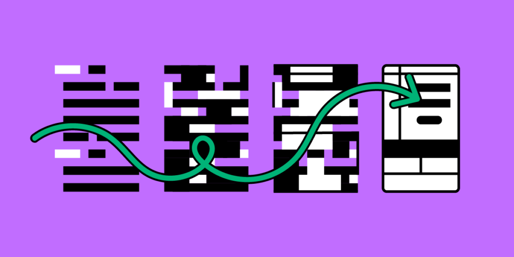
Progressive disclosure is one of the ways of reducing UI complexity and it may come in handy whenever designers want to make products less overwhelming for the end-user.

This article explores progressive disclosure, when to use it, helpful UI components, real-world examples, and a step-by-step process for implementing this design technique.

Design user experiences your customers love with the world’s most advanced design tool. Sign up for a free trial to create your first interactive prototype with UXPin. 

Build advanced prototypes

Design better products with States, Variables, Auto Layout and more.

Try UXPin

What is Progressive Disclosure?

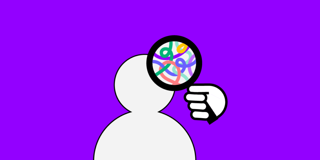
Progressive disclosure is a technique UX designers use to reduce cognitive load by gradually revealing more complex information or features as the user progresses through a user interface of a digital product.

Jakob Nielsen, co-founder of the famous Nielsen Norman Group, introduced progressive disclosure in 1995 as an interaction design pattern to reduce user errors for complex applications.

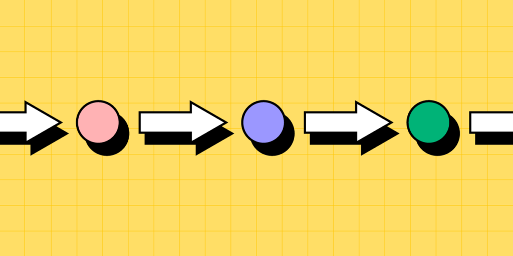
Designers achieve this by breaking complex tasks into smaller, more manageable steps and presenting these to users one at a time. This step-by-step approach allows users to complete large tasks without being overwhelmed by too much information and instructions at once.

The most common example of progressive disclosure is a multi-step form, typically used for eCommerce checkouts. An example may look like the following:

  • Step one: name and delivery address
  • Step two: shipping options
  • Step three: order confirmation and payment details
  • Step four: success/thank you page

What are the three categories of progressive disclosure?

There are three categories for progressive disclosure:

  1. Step-by-step: breaking complex tasks into manageable steps
  2. Conditional: hiding certain elements and features until the user requests them
  3. Contextual: offering additional information and options to provide context based on the user’s current situation

What is progressive enabling?

Progressive enabling is a similar design technique that gives users incremental access to features and functionality as they become more familiar with a product. This technique is especially effective for complex products, allowing users to fully comprehend each feature before moving to the next.

The levels in video games are an excellent example of progressive enabling. Players start with basic features and difficulty, which grow in complexity with each level.

When to Implement Progressive Disclosure

process

Here are four instances where designers might consider progressive disclosure.

Complex tasks

Breaking complex tasks into manageable chunks makes it easier for users to understand and complete. If you save each step, users don’t have to complete everything at once and can return later.

Contextual help

Designers often use contextual help through tooltips, popups, hotspots, and other UI elements to direct users through tasks. For example, a designer can highlight the form field a user must complete next so they know where to focus.

Onboarding

Progressive disclosure is highly effective for onboarding, where designers provide in-app tutorials and walkthroughs to explain steps in a specific process, including using contextual help.

Content design

Content, especially in product documentation, can be overwhelming to read and digest. Content designers can use progressive disclosure to present users with the most important information first, with the option to explore more content for those who need it.

UI Patterns for Progressive Disclosure

Here are some examples of how designers use UI design patterns for progressive disclosure.

Accordions

Accordions give users control over when and if they need content. These design patterns are particularly helpful when designers have to present a lot of content, like FAQs.

Tabs

Tabs allow designers to organize content into categories so users can choose when they need it. These tabs also reduce scrolling, which is particularly helpful on mobile apps.

Dropdown menus

Dropdown menus help keep UIs uncluttered by hiding long lists. Hiding this content allows users to focus on the current task without being distracted by irrelevant content. For example, imagine trying to complete a form with all the countries, states/provinces, and cities visible. It would be a nightmare to navigate.

Scrolling

Presenting users with the most important content high on the page above the fold can help them find answers or complete tasks without scrolling. Designers can provide supplementary content and features when users scroll. Sales landing pages often use this type of progressive disclosure to make a decision immediately or scroll for more information.

Explore: 4 types of scrolling patterns.

Dialog boxes & popups

Dialog boxes, popups, and tooltips provide users with additional information when they hover or click on a UI element. This progressive disclosure technique lets users find answers without leaving the task while keeping interfaces uncluttered.

Examples of Progressive Disclosure

GOV.UK bank holiday page

The most famous progressive disclosure case study for content design is the UK government’s GOV.UK bank holiday page redesign. The initial web design was busy and overwhelming.

Through user research, the team learned that most people wanted to know the date of the next bank holiday. The redesign presents users with the upcoming bank holiday at the top of the screen using a clear visual hierarchy, with the following days in smaller text below.

gov uk example min

Google’s primary search is simple: one input field with a few options, including an image search and two buttons. Most users will only use this basic search feature.

google basic example min

Google’s Advanced Search is more complex, with multiple fields and options for users to get more granular, including settings for language, region, exact phrase, last updated, etc.

google advanced search min

Dropbox’s File-Sharing Options

When you share a file in Dropbox, the file-sharing options are initially hidden, with only the email field and “Share file” button visible.

dropbox example min

Users must click “Settings” to access more advanced settings like “File settings” and “Link for viewing” options.

dropbox advanced example min

eCommerce product pages

Designers use progressive disclosure on product pages, so they don’t overwhelm customers. A standard technique is to use accordions or tabs to hide details so shoppers can choose if and when they want to see them.

For example, only the quantity stepper and “Add to Cart” button are visible on this product page from Shopify Themes. The product’s description, shipping and returns, and reviews are hidden behind accordions.

ecommerce example min

Progressive Disclosure Design Process

Identify user needs

As we saw in the GOV.UK example above, understanding what content and information your users need is vital for progressive disclosure. Designers can use fundamental UX research techniques like user interviews and usability testing to determine these needs.

Prioritize information

Next, designers use card sorting and affinity mapping to prioritize information and features to help users accomplish their goals efficiently. For example, designers may hide the lowest priority items or use the hierarchy to create an efficient multi-step process.

Determine the correct level of detail

Once they have prioritized the information, designers must determine the level of detail for each one. What information must designers present immediately, and what must follow?

For example, with GOV.UK, the most important information what the next bank holiday. The level of detail users required was the date and name of the holiday–for example, December 25, Christmas Day. The other holidays followed sequentially with the same level of detail.

Design for simplicity

Keeping user interfaces simple and easy to use is crucial. Designers must only provide the content and features required to complete a single task or decision–which is why the first three steps above are essential for progressive disclosure.

John Maeda’s 10 Laws provide an excellent framework for achieving design simplicity:

  1. Reduce: remove what isn’t needed
  2. Organize: makes complex systems easier
  3. Time: saving time feels like simplicity
  4. Learn: knowledge makes things simple
  5. Differences: balancing simplicity and complexity
  6. Context: “What lies in the periphery of simplicity is not peripheral”
  7. Emotion: more emotion is better than less
  8. Trust: simplicity = trust
  9. Failure: some things aren’t meant to be simple
  10. The one: subtract the obvious and add the meaningful

Prototype and test

The last step is to prototype and test your solution. Designers must also consider usability and ensure the design doesn’t introduce problems. For example, hiding features so users can’t find them.

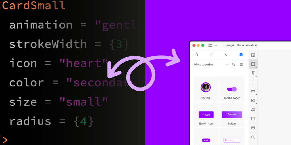
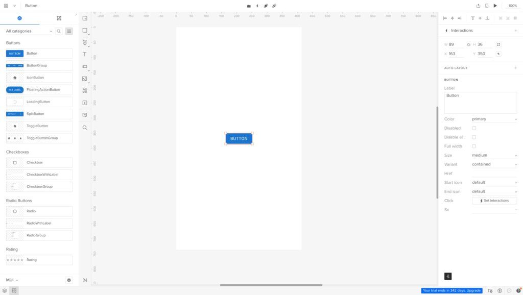
Create Better Prototypes With UXPin

UXPin’s advanced features allow designers to create immersive prototypes indistinguishable from the final product. With fully functional forms and code-like interactivity, design teams can test ideas to find a solution that best solves user needs while providing maximum business value.

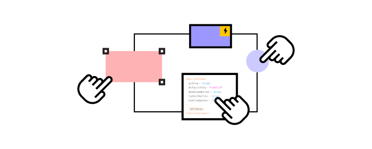
These four UXPin features enable designers to build advanced prototypes: 

  • States: create multiple states for a single component and build complex UI patterns like dropdown menus, steppers, carousels, and accordionsessential for progressive disclosure user testing.
  • Interactions: use Triggers, Actions, and Animations to design immersive prototype experiences. With Conditional Interactions, designers can create dynamic interactivity according to user actions.
  • Variables: collect data from user inputs and use it elsewhere in the application. Designers can use these variables to personalize the prototype experience to feel like the final product.
  • Expressions: design form validation, computational components, dynamic error messages, and more. When combined with States, Interactions, and Variables, Expressions enable designers to create Javascript-like functionality.

Build prototypes that allow your team to get meaningful, actionable results from testing. Sign up for a free trial to create your first UXPin prototype today.

How to Turn Code into Design?

How to turn code into design min

The standard product design workflow is that designers create prototypes in a vector-based tool and convert them to code. Your design starts as an image and then needs to be translated into code to make it functional.

Is there an alternative to that approach? One that would allow you to start with code? Code-to-design process is one of the alternatives. It helps you create code-based prototypes using dev’s UI components that stay functional even when used in a design tool. This article will show you how to turn code into design using this alternative approach to design-to-code workflow.

Get started with code to design today using our solution. For more details, visit our Merge page.

Reach a new level of prototyping

Design with interactive components coming from your team’s design system.

What You Need to Turn Code into Design

If you want to build a code-based prototype, you need a component library and a design tool that supports it.

Component library

You can use a private design system if you have one or an open-source component library like MUI, Bootstrap, Fluent UI, etc.

Here are some things to consider when choosing a component library:

  • High ratings on GitHub and the npm registry indicate the library’s quality and versatility. For example, MUI and Bootstrap have exceptionally high ratings.
  • What are you trying to build? Each component library offers elements and features for specific use cases. For example, MUI is excellent for cross-platform applications, while Bootstrap is better for websites and web apps.
  • Documentation and support are vital for learning the component library and solving issues. Most popular component libraries have active communities where devs ask questions and share solutions.
  • Themeable component libraries allow you to customize certain aspects via design tokens, like colors, spacing, typography, sizing, etc.

Here are a few open-source libraries we recommend for product development:

  • MUI: great for cross-platform applications, including enterprise products. MUI offers a vast component library and third-party templates.
  • React-Bootstrap: best for responsive websites and web applications. One of the oldest frameworks with a massive community and regular updates.
  • Semantic UI React: excellent Bootstrap alternative with a more modern, stylistic aesthetic.
  • Ant Design: a massive design system with components for cross-platform and native applications. 

Design tool

design and development collaboration process product communication

The next step of turning code into a design is getting a design tool. You may get a vector-based tool and upload your components into it. Yet, those components will be reduced to images. They will look like code components but they will lose all the functionality.

Traditional image-based design tools lack features to test even the most basic functionality. For example, a form field in Figma or Sketch is essentially an image. You can’t interact with form fields or enter data.

When using code-based prototyping tools, the components stay interactive. They look like components from the library and behave like ones too. You can use our code-based prototyping for this kind of workflow: UXPin Merge.

Merge components work like building blocks, allowing you to drag and drop to create user interfaces.

You can adjust each component’s properties via the Properties Panel according to any props assigned in the repository. For example, this MUI Button has several properties that correspond to the libraries documentation available in the Properties Panel, including:

  • Label
  • Color
  • Disabled (true or false)
  • Full width (true or false)
  • Size
  • Variant
  • href (link)
  • Leading/start icon
  • Trailing/end icon
  • Interactions
mui button props min

UXPin has canvas templates for multiple screen sizes, including wearables, allowing you to effortlessly create cross-platform apps and responsive websites. Connect your screens and add interactivity using UXPin’s Interactions to create immersive prototyping experiences.

Once you finish prototyping, you can hand over the prototype to development.

UXPin’s Spec Mode provides details about each mockup, including measurements, properties, and JSX presets for each Merge component. You can view each screen individually and its corresponding responsive layout. The Simulate mode enables you to use the prototype as intended, including microinteractions, animations, and page transitions.

Spec Mode also displays your project’s style guide so devs can copy the correct HEX codes, typography, and assets. Even if you’re working as a solo designer/engineer, having everything in one place streamlines your workflow and serves as a repository for future reference.

Examples of Companies Using Code to Design

TeamPassword

TeamPassword is a startup with five employees, including two developers and no designers. The password manager startup uses a custom MUI React library for its products, which they import to UXPin for prototyping.

TeamPassword is an excellent example of how Merge makes UX design and testing accessible to non-designers. The startup’s two devs complete all the prototyping and testing in UXPin, before developing the final product.

Since switching to this workflow, TeamPassword’s UI consistency and speed to market have improved significantly, making them more competitive in a market dominated by billion-dollar organizations.

PayPal

If TeamPassword is a good startup model, PayPal is a fantastic example of Merge working at the enterprise level. PayPal uses Merge for its 60+ internal products.

Like TeamPassword, non-designers from PayPal’s product teams complete most design projects, leaving the UX team to focus on high-level user experience initiatives.

After switching to Merge, PayPal delivers design projects 8X faster than experienced UX designers could previously with traditional image-based design tools.

Quick Note on Importing Components

When using UXPin Merge, you have three options for importing components.

  • Git Integration
  • Storybook Integration
  • npm Integration

It’s important to note that the Git and Storybook integrations require technical expertise to set up the boilerplate and repository. You’ll also need to maintain the repo and add new components as you scale. Once you connect the repository, Merge will automatically sync updates to the Design System Libraries in UXPin.

The npm Integration is a better option for non-technical users as it uses a dashboard instead. 

Git Integration

The Git Integration is the best option for importing React libraries because you benefit from all Merge’s features, including Version Control, Patterns, and JSX presets–which aren’t available with Storybook.

Storybook Integration

There are two reasons why you might choose the Storybook Integration over Git:

  1. You want to develop and manage your components using Storybook.
  2. You want to use a framework other than React.

Firstly, Storybook is an excellent platform for developing and managing components in isolation. It also offers documentation, testing, and governance features vital for scalability and collaboration with cross-functional teams.

If you’re developing a product using Vue, Ember, HTML, Web Components, or Angular, you can only import these libraries via the Storybook Integration.

npm Integration

The npm Integration is the best option for designers with little or no technical skills. If you don’t want to mess with boilerplates and repositories, then using npm and UXPin’s Merge Component Manager (MCM) is recommended.

You can import most component libraries available on the npm registry via MCM. Unlike Git and Storybook, with npm, you select which components and associated props to import. Unfortunately, you can’t customize the props, so you’re constrained to the library’s standard theme properties.

The npm Integration is also helpful for importing components your current design system doesn’t have. For example, if you need a bottom navigation component for a mobile application but don’t have one. Instead of designing from scratch, you can import MUI’s Bottom Navigation for prototyping.

Whether you’re a one-person startup or a multinational organization, UXPin Merge bridges the gap between design and development by allowing teams to use the same components in their workflow. Interested to hear more? Visit our Merge page.

Why Developers Use Frameworks?

Why do developers use frameworks

Modern product and web development rely on frameworks, libraries, and dependencies to achieve desired results and outcomes. Understanding these frameworks’ capabilities and limitations can help designers collaborate better with engineers throughout the design process and, most importantly, during design handoffs.

Bridge the gap between design and development with UXPin Merge. Design fully interactive prototypes using UI coded components without writing a single line of code. Visit our Merge page.

Reach a new level of prototyping

Design with interactive components coming from your team’s design system.

What is a Front-End Framework in Programming?

Front-end frameworks are pre-written code with tools, templates, functionality, and components that help developers build websites and applications fast. These frameworks provide a foundation for developers to be more product-focused rather than writing from scratch.

Front-End Library vs. Front-End Framework

People often use front-end frameworks and front-end libraries interchangeably, but there are distinct differences.

Front-end libraries include pre-written code for common tasks, like manipulating the DOM, making HTTP requests, and animating elements. Libraries require less setup and configuration and have fewer constraints than frameworks, giving software engineers more freedom and control. Popular front-end libraries include Reactjs, jQuery, Django (for Python), and Redux.

Front-end frameworks are pre-written code that provides structure for building websites and applications. These frameworks usually include libraries, tools, and other features to develop, scale, and maintain applications. Popular front-end open-source frameworks include React Native, AngularJS, Vue (check out the difference between the three of them,) and last but not least, Bootstrap.

Wait, isn’t React a Framework, not a library?

React is a Javascript library floating between being a library and a framework. Many developers debate whether React is one or the other.

While React technically isn’t a framework, it does provide the foundation to create reusable UI components–which is why so many developers use React for design systems. Engineers can combine React with other libraries to create a custom front-end solution.

For the purposes of this article, we’re referring to React as a framework for product development.

Programming language vs. framework

Another important distinction is the difference between a programming language and a framework. Programming languages are the actual code behind frameworks. Javascript, PHP, Typescript, HTML, and Python are all programming languages.

For example, Javascript is a programming language. React, Angular, and Vue are all Javascript frameworks.

Types of Programming Frameworks

For digital product development, there are two primary framework categories:

  • Server-side/back-end frameworks
  • Client-side/front-end frameworks

You also get full-stack frameworks with everything programmers need to build a complete application, including front-end, back-end, and database management. The most famous full-stack framework example is Ruby on Rails.

Some common examples of other programming frameworks include:

  • Web application frameworks
  • Mobile application frameworks
  • Game development frameworks
  • AI frameworks
  • Data science frameworks

Since this article focuses on digital product development, we will explore client-side or front-end frameworks, as these directly impact the design process and designer/engineer collaboration.

Advantages & Disadvantages of Using a Programming Framework?

Programming frameworks offer many benefits, notably streamlining workflows, improving code quality, and faster cross-platform application development. But there are some disadvantages and limitations, which we outline below.

Advantages

Efficiency

Developers can leverage a framework’s features to build applications faster than programming from scratch. This efficiency is also beneficial for developing minimum viable products and prototypes

Consistency

Many frameworks use standardized structures, and code conventions engineers must follow. This standardization allows organizations to maximize cohesion and consistency across products and teams.

Reliability

The most popular frameworks are well-maintained, with regular updates and fixes. They’re also compatible across multiple browsers and devices, so engineers can confidently build and ship products without worrying about bugs or compatibility issues.

Scalability

Frameworks provide the tools and features to scale faster than writing from scratch. Engineers can also add libraries, tools, and packages to extend functionality as the product evolves.

Community

Most frameworks have large communities where engineers can ask questions and discover new ideas. For example, React, Vue, Angular, and Bootstrap all have massive active global communities with users sharing ideas in multiple languages and across many markets and industries. It’s hard to find a problem that someone hasn’t already solved.

Disadvantages

Restrictive

While the structure and guidelines frameworks allow for faster development and scalability, they can limit creativity and flexibility. Developers must follow the framework’s architecture or conventions, which may stifle innovation.

Performance

Frameworks add an extra layer of code which can slow performance and increase memory if developers don’t optimize code properly. There are fixes for these performance issues, but it comes with additional costs.

Dependencies

Many frameworks, including React, Vue, and Angular, rely on third-party libraries and tools. Additionally, developers will use various dependencies and devDependencies to build projects. These dependencies increase maintenance and security risks.

Maintenance

Aside from dependencies, frameworks require constant maintenance and updates to stay up-to-date and secure–over and above maintaining the product.

Learning curve

Each framework has different syntax, conventions, and codebase, which can take a long time to learn and master. This learning curve can be particularly challenging for beginners.

Most popular frameworks have excellent documentation and many tutorials, but this education requires significant time and resources. These learning curves are why most developers specialize in a specific programming language or framework rather than being a jack of all trades.

Using Front-End Frameworks for Prototyping

Many developers use front-end frameworks like React, Angular, and Vue for prototyping. These frameworks provide front-end developers with tools and functionality to create prototypes with basic functionality.

For example, if you want to create a prototype with MUI’s React UI library, you install the MUI package and import components into your project file. You can then add a button, complete with styling and interactivity, using one line of code:

<Button variant=”contained”>Contained</Button>.

mui react button min

While prototyping with front-end frameworks is significantly quicker than programming from scratch, it’s nowhere near as efficient as using a design tool. Dragging and dropping components is much faster than writing code.

Startup TeamPassword struggled with this challenge before fullstack developer Matthew Chigira joined the team. TeamPassword still had a 2-person engineering team and no UX designers. They were using outdated development methods resulting in slow time to market and UI inconsistencies.

Matthew suggested switching to React and creating a custom version of the MUI design system to solve these issues. TeamPassword also added UXPin Merge to their tool stack to facilitate faster prototyping and testing.

Read the full story: TeamPassword Case Study.

Prototyping With React using UXPin Merge

UXPin’s Merge technology syncs a UI library from a repository to UXPin’s design editor, giving design teams fully interactive components for prototyping.

These Merge components render the same in UXPin as they do in the repository, allowing designers to build prototypes indistinguishable from the final product.

TeamPassword’s engineering team achieves comparable results in UXPin using Merge than they do writing code, making it the perfect tool for prototyping and iterating quickly–critical for a small startup competing with billion-dollar competitors.

Once TeamPassword completes prototyping and testing, they have production-ready code to develop the final product. They install their custom MUI library, import the components into the project, and copy the layouts from UXPin. UXPin even renders JSX to copy/paste for each component’s props.

How does Merge work?

UXPin renders HTML, CSS, and Javascript, unlike other design tools that generate vector graphics. This code-based approach means that a React button on UXPin’s design canvas is exactly the same as a React button in a developer’s IDE. Any props associated with the button will appear in UXPin’s Properties Panel, so designers can make changes using a mouse instead of editing code.

uxpin properties panel react props min

Once you sync Merge with UXPin, the component library (green arrow) appears under Design System Libraries (purple arrow). Designers drag and drop UI elements onto the canvas to build user interfaces.

design libraries example min

Connecting UXPin Merge

UXPin offers three ways to connect a design system using Merge:

Ultimate consistency

Consistency is one of Merge’s biggest benefits. With every design and engineering team using one UI library, design drift, and inconsistencies are almost non-existent. While designers can adjust the component’s props, they can’t change its structure or interactivity.

This single source of truth means designers and engineers can focus on solving user problems and product challenges rather than designing or programming from scratch or fixing errors and inconsistencies.

Better testing

Testing is significantly better with Merge than with image-based design tools. UXPin’s component-driven prototyping methodology enables design teams to prototype and test with code-like fidelity and functionality. 

Designers can also connect external tools and services using UXPin’s API, extending the scope beyond what’s possible using other design tools–like sending a confirmation email from a prototype or syncing a user’s calendar.

Merge prototypes allow design teams to get accurate, meaningful feedback from testing. Participants can interact with prototypes like they would the final product, allowing designers to solve more problems and identify more opportunities during the design process.

Stakeholders also provide better feedback because the prototype experience closely resembles the final product.

“The C-suite people and the directors are able to give us stronger feedback about the ultimate direction because they experience the features and goals of these prototypes rather than just commenting about how, how these boxes don’t look like a text field, for example.” – Erica Rider, UX Lead EPX at PayPal.

Smoother design handoffs

Design handoffs in Merge are seamless and frictionless. With design and engineering teams using the same components and constraints, the transition from design to development is much smoother than traditional design-to-code workflows.

“The markup required to render the prototype can be taken directly from Merge and handed over to the engineer, who can place it in their software development tool of choice. The engineer no longer needs to start from scratch and already knows what components and settings to use. It will help us avoid the ‘design drift’ we so often see. Things like spacing and typography should all be aligned, as it is all driven from one place.” –  Nick Elliott, Design System Product Owner and Regional Head of Product Design at Iress.

Designing products using components from the same framework your engineers use makes the most sense, yet few design tools offer this code-based workflow. Only UXPin Merge bridges this gap successfully.

Designers and engineers still work within their familiar tools and environments, while Merge provides the translation to facilitate this code-based workflow.

Whether you’re an early-stage startup like TeamPassword or a multinational tech giant like PayPal, UXPin Merge will streamline your product development process with a single source of truth across the organization. For more details, visit our Merge page.

Should User Experience Designers Be Aware of Psychology?

Should user experience designer be aware of human psychology

Products are built by people for people. To do it right, UX designers must have a genuine interest in human psychology – to understand the emotions and motivations behind users’ actions. Only then you are able to create products, which perfectly resonate with the target audience. Without this knowledge, it’s like shooting in the dark – high chances are, you’ll miss your target. 

In this piece, we’re going to focus on the question – should user experience designers be aware of human psychology? We’ll discuss the psychology principles you should be aware of and how you can apply them to your design process.

Implement all UX psychology principles that we’re about to outline right away. Create advanced prototypes using UXPin, an end-to-end prototyping tool that supports product design and development teams on their journey to build the best apps, websites, and other digital products for their users. Try UXPin for free.

Build advanced prototypes

Design better products with States, Variables, Auto Layout and more.

Try UXPin

Psychology and user experience are inseparable. You cannot design products that will appeal to your target audience without diving into human psychology – at least on a basic level. Otherwise, how will you know how to influence their decisions and resolve their problems?

If you’re a designer, then high chances are you’ve heard the term “design psychology”. It’s a combination of the following:

  • Neuroscience
  • Cognitive psychology
  • Social psychology
  • And human-computer interaction.

By wrapping your head around these branches of psychology dedicated to human thinking, you’ll be able to view the design process through a more human lens.

In other words, you’ll be capable of implementing mechanisms that will drive specific responses and actions from your users into your products.

4 UX Psychology Factors Designers Need to Know

user bad good review satisfaction opinion

At UXPin, we’ve noticed that plenty of sources online reduce the role of psychology in design to ‘studying behavior’. However, it’s far beyond that. It’s a complex process, which circles around analyzing the user’s emotions, attention, cognition, and perception levels. Of these four criteria, the last two should be studied particularly well by designers.

In this section, we’re going to discuss all four UX psychology factors and how you can make them play out in your digital product’s favor.

Cognition

Have you ever stepped into a store to buy yogurt, only to stare blankly at the fridge, overwhelmed with the choice? This is a prime example of Miller’s law. In a nutshell, people struggle to compare multiple options against one another due to cognitive limitations.

The average person can simultaneously process anywhere between five to nine options. Anything above this threshold either makes us pause our actions or withdraw from them altogether. The same is likely to happen to your users if you clutter too much information on your website or app.

To tackle this UX psychology challenge, it’s best to distribute information over multiple, progressive screens. For example, if you operate an online store, show no more than nine products per page. If it isn’t possible, then try to group them into categories to ease navigation.

The same rules apply when designing entire user journeys. If you’re creating, say, an in-app onboarding sequence, break it down into smaller chunks, and show a progress bar at the top.

Here’s a great example from WordPress:

cognition ux psychology
Source: Useronboard

Perception

Perception kicks in as soon as a person comes across your brand name or logo for the first time, and stays with them in all interactions with your website and services. It’s a mixture of opinions and emotions that your product triggers in them, and is subject to change over time.

So, what contributes to how users perceive digital products? The Interaction Design Foundation points to several Gestalt principles. While discussing all of them in depth would be beyond the scope of this piece, designers should particularly consider the following: 

  • Proximity – users tend to think that elements placed close to one another in an interface are part of a group, i.e., there’s a relation among them.
  • Similarity – people believe that similar elements are related to one another, even if they’re dispersed on a screen miscellaneously. What we see as ‘similar’ can be based on shape, color, or size.
  • Closure – the human brain tends to imagine lines and links between shapes if it helps us see a pattern. Look at the famous Champions League logo below. Even though the stars aren’t linked on the outer edges, we clearly see a star-shaped football.
Source: Wikipedia

To learn more about the role of perception in design, grab our free eBook on Web UI design for the Human eye.

Attention

There is a statistic circling the internet that the average human’s attention span is just 8.25 seconds, which would put us behind goldfish (9 seconds). This number has rung alarm bells among psychology scholars. While the goldfish analogy has luckily been debunked, it’s true that our attention has worsened when compared to the pre-personal tech era.

There are two things that can disrupt your user’s journey. Firstly, they can get distracted by their own thoughts or physical surroundings. Secondly, they can be deliberately interrupted by other apps competing for their time – for example, via push notifications.

Here’s how to tackle this while designing your website or product:

  • Refrain from any strong stimuli that could interfere with the user’s goals. For example, if they visited your product page, showing them random pop-up surveys or colorful banners could keep them from converting (i.e., draw their attention away from the “Buy now” button). 
  • Inform your users about where they are in the process. Imagine they were setting up your tool, but were interrupted by a phone call. Will they know where they’ve left off once they return to your app or site? A good idea is to create breadcrumbs or even a progress bar, so they can see how many steps are left in the process.
  • Finally, try to make your product stand out. People are attracted to and interested in new experiences. That being said, don’t break any UX design conventions. Simple actions like moving between categories or finalizing a purchase need to be easy to complete.

Emotion

The age-old rule says that you become who you surround yourself with. But it’s also strongly about what we surround ourselves with. If we dedicate, say, 80% of our leisure time to watching sad movies, it will be easy for us to pick up the gloomy mood. This is a subconscious reaction, which can luckily also be used to evoke positive feelings.

How does this relate to digital product design? Don Norman, UX design guru and co-founder of the NN Group, says that aesthetics play a key role. One of his research papers circles around the claim that “attractive things work better”.

What Norman has noticed throughout decades of UX design work is that people tend to forgive usability glitches if they like the design. They will also feel that aesthetically pleasing interfaces are more functional. So, when it comes to emotion in UX, it’s not only about your company’s message. It’s also about how you present it through visual and functional design.

Is a Psychology Degree Necessary for UX Designer?

designops efficiency arrow

Both psychology and UX revolve around people. So while a user experience designer should be aware of human psychology, they don’t necessarily need to be a psychologist.

Most psychology principles are easy to understand but can have a tremendous impact on your design process if applied correctly. Let’s take a look at what UX design and psychology have in common: 

Research – humans are complicated creatures, and figuring out their motivations and needs can be hard, especially when they can’t verbalize them. Having basic psychological knowledge will help you apply specific techniques to gather information and derive insights from them.

Empathy – a lot of us think that empathy is something we’re born with. However, the truth is that it can be trained, and psychologists spend years trying to become more empathetic. Being able to step into your users’ shoes, which is what empathy is about, will become handy in UX design. 

Emotional design – successful products and services are built around users’ emotional journeys. When you run user interviews and usability testing, you’ll be able to apply your basic psychological knowledge to figure out how people feel while using your product. 

Check out: UX Design Degrees and Courses that Are Worth it

Psychology in Design – How Can it Help You? 

direction process path way

Applying psychology to your designs will help you make better design decisions.

Here is how:

Decision making – giving users more options to choose from isn’t always the right thing to do as it can lead to a paradox of choice. The more choice they have, the harder it is to make a decision. Offering your users guidance, and simplifying their entire journey will improve their experience. 

Motivation – UX designers have to understand their target audience’s pain points and needs. In short, they have to know what motivates them to use a product. Without this knowledge, they won’t be able to retain a user for long. 

Influence – as humans we’re often indecisive; we don’t know what action to take until we actually take it. This is a very important piece of information, as it shows that people need guidance. Psychologists are aware of mechanisms that can be applied to “push” individuals towards a certain action. The same principles can be used while designing products. However, there is a thin line between manipulation and influence. Trust and credibility are the basis for building a lasting relationship with customers. 

Interactions – the more complex the product the harder it is to interact with it. And this is worth taking into consideration as people have different levels of tech savviness. If you want people to use your product or service then you have to adapt it to your users, not the other way around. 

Use Psychology Principles in UX Design 

An understanding of psychology principles is a must-have in any UX designer’s skill set. Humans are complex beings, and our reactions aren’t always the most ‘rational’ ones on the table. Knowing how people create visual connections and what triggers their positive and negative emotions will help you do more than just build more enjoyable experiences. It will also support your business goals and have users return for more. 

The best part is that, since we’re all humans, you can test your concepts well before you put out a design. By using UXPin, you can create interactive prototypes, from start to finish. Have an idea for a functionality or an assumption you’d like to build and test out? Get started with UXPin.

Design Project Management 101 – Methods, Tools, and Necessary Skills

Design project management 1
]

To deliver successful outcomes, design project management incorporates several key UX functions, including creative direction, UX design, DesignOps, and design leadership.

This article explores the design project management discipline, a manager’s skills, relevant tools, and the five stages from initiation to final delivery.

Achieve better results during the design process with high-quality, interactive prototypes using UXPin Merge. Learn what makes this technology stand out among other design tools. Visit our Merge page.

Reach a new level of prototyping

Design with interactive components coming from your team’s design system.

What is Design Project Management?

Design project management oversees the design process for digital product development projects, including resource allocation, task delegation, goal setting, stakeholder reporting, and other project-related functions.

Design project management functions similarly to traditional project management, but managers must understand design thinking, UX research, and user experience principles to implement effective plans and strategies.

5 Design Project Manager Skills

designops picking tools options

Here are five essential skills every design project manager must have.

UX Design

UX Design is one of the skills unique to design project managers vs. regular project managers. This knowledge helps define a realistic roadmap and project timelines, allocate resources effectively, and assign tasks to the right team members. These UX design skills also help design project managers communicate with stakeholders.

UX design skills can be acquired on a job or formally via UX design degrees.

Technical understanding

While design project managers don’t have to learn code, it’s important to have a foundational understanding of the product’s framework and technical limitations. Technical skills help when collaborating with engineering teams and stakeholders and articulating the impact of missed deadlines to designers.

Communication

Design project managers must be excellent communicators, capable of communicating and collaborating with team members at every level of the organization. They must facilitate design and cross-functional meetings, often bridging the gap between designer/engineer communications–further reiterating the importance of foundational UX and technical proficiency.

Collaboration can be facilitated with the right tools. Read about: Top Design Collaboration Tools.

Leadership

Leadership is a significant part of any project management role. Design project managers must often motivate and mentor project team members to complete challenging work to tight deadlines. They also play an essential role in conflict resolution within the project and, therefore, must be someone the team respects as an unbiased mediator.

Resource management

Design project managers are responsible for a project’s due dates, deliverables, budget, and team members. They must understand how to manage these resources and implement corrective actions with contingencies when things don’t go according to plan.

Design Project Management Frameworks and Methodologies

team collaboration talk communication ideas messsages

Design project management frameworks don’t differ too much from regular project management. Here are five common frameworks used for design projects.

Agile

Agile is an iterative project management methodology with shorter planning cycles, flexible to changes (market, product, tech, etc.), work-in-progress (WIP), and vaguely outlined project goals. This flexibility makes Agile popular for digital product development, where new technology and trends can influence the direction of a project.

Scrum

Scrum is an Agile framework that divides a complex project into digestible short-term goals or sprints. These sprints vary between 2-4 weeks, where teams iterate over a single problem to find the best solution.

Kanban

Kanban is a transparent framework that uses a kanban board with columns or sections to visualize a project and its tasks. Kanbans typically have three columns:

  1. To-do
  2. Doing (work in progress/WIP)
  3. Done

Team members move tasks through these sections as they start and end each one. In some instances, the project manager may add additional columns–for example, “in review,” “QA,” “backlog,” etc.

Lean UX

Lean UX is a collaborative outcomes-based framework focused on conducting many experiments during the design process to solve a specific problem. Designers must deliver a solution that offers maximum value without “nice to have” features.

Waterfall

Waterfall is a sequential methodology with five static phases:

  1. Requirements
  2. Design
  3. Implement
  4. Control
  5. Closure

The aim is to complete each phase before moving to the next. Waterfall is a rigid project management method with no room for error or iteration. PMs typically use waterfall when a project’s budget, requirements, and scope are clearly defined, reducing the need for flexibility.

Design Project Management Software

settings

Design teams use project management software and various design tools to complete projects.

Project management tools

Project management software is vital to define tasks, manage workflows, and track progress in a centralized repository. Common project management apps used by creative teams include:

  • Trello
  • Asana
  • Notion
  • Wrike
  • Monday.com

Whiteboarding & brainstorming

Designers use whiteboarding tools throughout the design process to collaborate and share ideas. Some popular examples include:

  • Miro
  • Mural
  • Google Jamboard

User research and testing

Research and testing are vital for any design project. Designers use various tools to recruit, schedule, test/analyze, and pay participants. Some examples include:

  • Ethnio
  • User Interviews
  • Userback
  • Hotjar

Team communication

Communication is critical to keep team members connect with one another and the rest of the organization–especially in remote work environments. Some examples include:

  • Slack
  • Google Chat & Spaces
  • Microsoft Teams

Design & Prototyping Tools

Design tools allow designers to create user flows, wireframes, mockups, and prototypes. Common design tools include:

The Five Stages of Project Management

designops efficiency arrow

There are five stages of project management which design projects also follow:

  1. Initiation
  2. Planning
  3. Execution
  4. Monitoring
  5. Closure

Project Initiation

Design leads and stakeholders review two documents to determine whether they will initiate a design project:

  • Business case: outlines the benefits of a project, initiative, or strategy and why the company or department needs it.
  • Feasibility study: defines the problem and whether the design project will solve it.

If the organization decides to proceed, they create a project initiation document (PID) which includes:

  • The project’s scope and goals
  • Constraints
  • Budget
  • Risk assessment
  • Key stakeholders
  • Controls and reporting
  • Deadlines and delivery
  • Design Brief

Project Planning

Following the PID and design brief, the design project manager and various stakeholders define the project’s roadmap, including scope, goals, tasks, schedule, and resources.

A typical design project plan will include:

  • Available resources, including time, budget, and labor
  • Roles and responsibilities
  • Project milestones and objectives
  • KPIs
  • Reporting intervals
  • Risks and contingencies
  • Project tools and communication methods
  • Project deliverables, file formats, and delivery method (Dropbox, Google Drive, etc.)

Project Execution

A “kickoff” usually starts a project where the entire team and stakeholders gather to discuss the problem the project must solve and relevant deliverables. The design team begins working according to the project framework and assigned responsibilities.

Project Monitoring

Monitoring is the project manager’s primary responsibility and runs parallel to execution. The PM monitors KPIs, budgets, and tasks, ensuring the project stays on track while paying close attention to potential scope creep. PMs also meet with stakeholders for regular reporting and updates.

Project Closure

Project closure occurs when the design team is ready for the design handoff. In some cases, stakeholders might dissolve the project due to unforeseen circumstances.

Some examples of design project closure tasks include:

  • Design handoff to engineers
  • Completing quality assurance or UX audit
  • Archiving UX deliverables for future reference
  • Canceling any supplier contracts–i.e., software subscriptions, contractors, etc.
  • Presenting the final budget and report to stakeholders
  • Releasing team members

Improve Design Project Delivery with UXPin

code developer design 1

Prototyping and testing are integral to every design project. Designers must iterate fast to deliver within timeframes while ensuring they solve the project’s core problem according to the design brief and users’ needs. Unfortunately, traditional image-based design tools lack the fidelity and functionality designers need to achieve this successfully.

UXPin Merge is a code-based design tool bridging the gap between designers and engineers. Designers can build fully functioning prototypes using interactive components pulled from a design system’s repository.

This component-driven prototyping methodology allows designers to iterate faster while scaling the design process. PayPal proved this concept on an enterprise level when the internal UX team switched to UXPin Merge in 2019. Now, PayPal’s product teams complete 90% of design projects 8X faster than experienced UX designers could previously with traditional design methods.

“UXPin Merge enables us to perform this “snap-together” type design. We provide product teams with components they can drag and drop to build user interfaces. Product teams create layouts with fixed margins and components, so everything looks and works as it should. Designers didn’t have to police anything or step in to design products.” Erica Rider, UX Lead EPX at PayPal.

Better quality prototypes improve testing

With Merge’s fully functioning components, designers can build prototypes indistinguishable from the final product. These high-quality prototypes allow designers to get actionable results from user testing and meaningful feedback from stakeholders.

Smoother design handoffs

The transition from design to development is seamless with UXPin Merge because designers and engineers use the same component library from the same repository.

Front-end engineers install the design system’s package and copy prototype layouts from UXPin. UXPin Merge renders JSX for each component which devs can view in Spec Mode.

“With this new UXPin approach, we’re seeing a more collaborative, integrative design process. Rather than separating design, prototyping, and development, UXPin allows us to create an integrated flow where we engage engineering and product teams throughout the process. As a result, the product’s final quality has improved dramatically.” Erica Rider, UX Lead EPX at PayPal.

Enhance your design project management with the world’s most advanced design tool. Visit our Merge page to find out how to get started with revolutionary technology.

Mobile App vs. Web App – What to Design?

Mobile App vs. Web App

Deciding between launching a mobile app vs. web app isn’t always an easy decision. There are many factors to keep in mind before making the call – from user experience and technical constraints to cost-effectiveness and scalability.

We’ll explore web design vs mobile app design. All so that you can make an informed decision about which approach is best for your project. Follow along our tips and sign up for a free trial at UXPin. It’s an end-to-end prototyping tool that allows you to build advanced prototypes that look and behave like a mobile or web app you’re about to develop. Try UXPin for free.

Build advanced prototypes

Design better products with States, Variables, Auto Layout and more.

Try UXPin

What Is a Mobile App?

Mobile applications are tools designed specifically for portable, mobile devices. They come in various forms. From small, single-function applications to more complex, multi-functional mobile platforms, each should provide users with a quality experience.

Apps vary significantly in their purpose and scope, allowing people to engage in activities ranging from gaming and leisure to business and professional pursuits. 

When it comes to developing an app, product development teams often need to consider the screen size and operating system of the device they are creating the app for. As mobile technology advances rapidly, many apps are now built with cross-platform compatibility in mind so users across various devices and platforms can enjoy them.

The types of mobile apps available today include:

  • Native – native mobile apps are usually developed for one platform or operating system (iOs or Android apps),
  • Hybrid – hybrid apps leverage reusable code to provide a native-like user experience for less effort and money,
  • PWAs – it’s short for Progressive Web Apps, PWAs are mobile web apps built with HTML, CSS, JavaScript, and other frameworks. they should function on desktop and mobile, standards-compliant browsers.

Pros of mobile apps

  • They work efficiently (they’re created natively for mobile devices)
  • They can work offline, without the Internet connection
  • They offer better analytics, i.e., more accurate data collection and conversion tracking.

Cons of mobile apps

  • They’re expensive to design, more so to maintain
  • You need to build a separate app for iOS and Android 
  • You’re in charge of maintaining privacy and security.

What Is a Web App?

A web app is an application that users can access through the web on any device with an internet connection. It runs in a browser, reducing users’ need to install and keep track of a separate application on their PC, which increases its accessibility.  

What’s great about using web apps is that you can create more interactive user experiences in comparison to traditional websites. All thanks to powerful front-end frameworks such as AngularJS or ReactJS. They allow app developers to quickly build dynamic single-page applications, which provide smooth transitions between different views and respond quickly when user input is received.

Web apps are a popular solution since they offer incredible performance and scalability without compromising security. 

Pros of web apps

  • They work on any platform – a web application is hosted on a server and delivered over the internet through a browser interface.
  • Since it’s stored on a remote server and supplied online via a browser interface, users don’t need to install updates.
  • Easy to maintain by web development team

Cons

  • They require internet access to be used
  • They might be slow to load – if a server is overloaded, the contents of your app won’t appear quickly, which can severely affect the user experience. Or, worse yet, cause the user to leave the app before it loads.
  • Not as easily discovered by target audience – web apps are not promoted in app stores because they are not listed there. Product Hunt, Capterra, and app review sites can be a decent way to promote your web apps, but their discoverability is nowhere near as robust as in Apple and Android app stores.

Discussing the Differences Between a Mobile App and a Web App

direction process path way

Let’s now take a quick look at how mobile apps and web apps differ.

  • While web apps can be accessed via virtually any browser, mobile apps must be downloaded from the app store.
  • Differences in screen size requirements. Mobile apps can’t be accessed on desktop, and are created solely for smaller screens. This, in turn, implies lesser pixels. Meanwhile, web apps can be accessed on both mobile and desktop.
  • Mobile apps can be used without internet access, while web apps can’t. 
  • Since web apps need access to internet connection and rely on web browsers, they tend to be slower than mobile apps. 
  • Most people use computers while sitting. App users may be commuting to work or even jogging while using their phones. As a designer, you must account for these different scenarios to ensure high usability and accessibility standards.
  • Mobile apps have more advanced security than web apps. Therefore, mobile app development should cater to this by creating two-factor authentication or other means that improve safety. 

Effective Ways to Help You Choose Between a Mobile App and a Web App

lo fi pencil

Here are the top considerations while deciding between a mobile app vs. web app.

Determine user context and purpose

The web offers an abundance of resources and information to users, who typically access it from a comfortable seated position. Mobile devices offer a unique opportunity for users to search for and quickly obtain information on the go.

When designing for mobile UX, navigation should be simple and easy to follow, with well-structured code written concisely, and visually prioritized. The goal is to ensure maximum accessibility of the desired information in the least amount of time.

User experience designers must pay close attention to design elements such as:

  • natural gestures, which are most intuitive for users on small screens
  • simplicity in menu selection options
  • clear visual pathways
  • consistent user interface elements like fonts and colors
  • easily clickable and accessible buttons and links
  • and other interactive elements that make user navigation easier.

This must also be paired with relevant accessibility standards, to ensure that all users can use the app to its full advantage and functionality. 

Verdict: Web apps are great for longer user sessions and don’t compete with mobile apps. A mobile app may be suitable if your product can be used regularly in shorter periods, such as habit or meal tracking app, mobile eCommerce app or social media app.

Assess your product or service’s required screen size

Many B2B tools are now web-based, allowing users to access them from their phones, tablets, or other mobile devices. This is advantageous for several reasons:

  • It enables the user to access information quickly and conveniently regardless of their device.
  • It allows them to view content more clearly and in more detail on a larger screen.
  • If any PDF downloads or exports need to be done regularly, it’s much easier and more efficient for the user to do this on a desktop computer than on a mobile device. This is because PDFs can take up considerable amounts of data space on mobile devices, and saving them frequently could result in the device becoming bogged down. Not to mention, it’s not exactly the most convenient screen size to peruse these files.
  • Users may prefer their files to stay on one machine rather than having them spread across multiple devices. For businesses to get the most out of their B2B platform, providing web-based access is essential since it gives customers both convenience and flexibility when interacting with the company.
  • By allowing users to access the app on a larger screen rather than solely on mobile – where content may not always be visible clearly – companies can ensure that their clients always have a good user experience.

Verdict: Web apps are suitable for complex (often work-related) apps, where there are plenty of charts and analytical data. These types of apps usually require a lot of jumping back and forth between screens.

List device-specific features

If you sell beauty products, for example, it is much more beneficial to develop a tailored beauty app for mobile devices since that’s where people tend to spend most of their day.

This platform provides you with a larger audience and allows you to take advantage of multiple features not available on computers, particularly the higher-resolution phone cameras. When it comes to these kinds of products, image quality is essential for market success. 

Although designing a web-based application that is accessible via mobile view can enable the use of the device camera, some other features are only accessible through mobile hardware and functionalities. Think of things like your phone’s built-in gyroscope or GPS, which would have been essential if you were to create a runner’s app, for one.

Also, when designing the UX/UI design for a mobile app, make sure to always include device-specific elements like larger interactive buttons and simple navigation. Furthermore, make sure to work hand in hand with your software development team to ensure all third-party apps integrations work flawlessly. The types of integrations depend on your product – these can be those with social media, online payment methods, and push notifications.

Verdict: Mobile apps come with the added value of device-specific hardware and features like GPS and high-resolution cameras.

Check your competitors’ choices

Businesses should analyze the competitive landscape prior to launching a new product or app to make an informed decision as to what to develop.

If it turns out that many of the top players in the market are web-based solutions, it’s probably the best way to go. They’ve created a solution for a platform users find convenient to use, and the UX they’ve created allows them to complete their goals (after all, otherwise these apps would not have had this level of market success).

Let’s not forget that users appreciate familiarity in products from the same category – it will make it that much easier for them to start using your app, if they were to switch to you from a competitor. Thoroughly researching competitors can help identify opportunities and potential risks before investing in a project. 

Verdict: If your app’s goal isn’t to revolutionize your category, it’s worth going with the platform others are finding success with. That’s where your target audience can be reached.

Mobile or Desktop App? Design it in UXPin

responsive screens prototyping

It’s our hope that after reading this piece, you can now pick a winner in your mobile app vs web app dilemma. Use the considerations above to understand how user context, screen size, and your competitor landscape can contribute to your app’s success.

With UXPin, you can create advanced prototypes and quickly share them with stakeholders or developers – regardless whether you’ve decided to go with a web app or mobile app. Ready to take it for a spin? Try our tool on a free trial.

And with our free trial, nothing is stopping you from trying it out for yourself today. So what are you waiting for? Try UXPin and streamline product design and development process. Start your trial.

What is Contrast in Web Design? [+7 Tips How to Use it]

Contrast in Web design 1

When it comes to web design, the concept of contrast is often discussed in terms of aesthetics and visual appeal. However, the truth is that contrast plays a much more important role in the overall usability and accessibility of a website. We’ll explore the basics of contrast in web design and show you how to use it to improve the user experience for all visitors, regardless of their abilities. 

Test website design tips right away. Design a website using contrast advice from this article in UXPin, a tool for building advanced prototypes that simplify design-development workflow. Try UXPin for free.

What is Contrast in Web Design?

Contrast in web design refers to the relationship between two or more design elements, such as text and background that stand out in relation to one another. It is about emphasizing the differences between these elements rather than their similarities.

The degree of contrast is inversely proportional to the level of similarity. The less similar two items are, the greater the contrast between them. High-contrast elements are very different from each other, while low-contrast elements are more similar.

Contrast plays a crucial role in making the design elements on a website stand out and be more easily noticed by the viewer, making the design more aesthetically pleasing and user-friendly.

Types of Contrast in Web Design

There are several types of contrast that can be used in web design to enhance the visual appeal and user experience of a website.

  • Color contrast is the difference in light between the font (or anything in the foreground) and its background. This type of contrast is essential for ensuring that text is easily legible and that other design elements stand out.
  • Size contrast relates to the multitude of different sizes in a graphic interface. By leveraging it, you can emphasize certain elements, as well as generate a visual depth and create a sense of hierarchy.
  • Space contrast, also known as negative space, is the emptiness around an element, whether created by white space or any other type of visual spacing. This type of contrast highlights the contrast between the element’s background and the design details surrounding it.
  • Foreground and background contrast refers to the visual relationship between an element in the foreground of an image and the background behind it. In web design, this type of contrast is unique in that the background can change dynamically as the site visitor interacts with it.
  • Shape contrast is achieved by making things notable by their difference in physical shape compared to other things on the page. This type of contrast can be used to create interest and to guide the viewer’s eye.
  • Elements contrast refers to the different types of media that can be used in web design, such as photographs, illustrations, or hand-drawn sketches. The choice of media can have a significant impact on the overall look and feel of a website. It should be chosen based on the website’s goals and the type of content being presented.

Why is Contrast Important in Web Design?

Contrast affects more than just aesthetics. It has strategic and usability purposes.

  • Supports visual hierarchy. Emphasizing the difference between two design elements supports intuitive design. It also helps users hone in on the important actions and elements.
  • Ensures accessibility. Heavily contrasting colors or elements can be very helpful in making your design more accessible. The goal is to make sure no one – particularly those with visual disabilities – is blocked from using a website.
  • Compliance with local & international web regulations. There is an international standard, which outlines these rules for contrast accessibility in web design – the Web Content Accessibility Guidelines (WCAG). There are also governmental ones, like compliance with the USA’s Title III of the Americans with Disabilities Act. Lack of ADA-compliance has resulted in thousands of federal lawsuits against non-accessible websites. So, it’s imperative to adhere to best practices for accessibility.

Contrast in Web Design – 7 tips 

Contrast in web design is a crucial element in creating visually appealing and user-friendly websites. However, it’s not always easy to know how to effectively use contrast in your designs. Here are a few tips you can follow. 

Check your text contrast ratio 

This is an important step in assessing the overall contrast in your web design. One of the best ways to do this is to use a contrast ratio calculator.

The golden rule is to keep the 4.5:1 ratio for text and text-based images. However, there is an exception for logotypes and large text, such as headings. In these cases, using contrasting typefaces for headlines versus body copy can help create hierarchy and improve readability. This helps readers skim or search through your page for the information they need.

One tool for this is the UXPin built-in contrast checker, which you can try out for free.

Source: McSaatchi

Create large spacing to bring attention to detail

Creating large spacing, also known as negative spacing, is a powerful design technique that can be used to bring attention to specific elements on a website. This is achieved by strategically placing large amounts of empty space around a particular element, which serves to highlight the contrast between the element and its background.

By creating a sense of emptiness around a design element, you create visual tension and the element will stand out more. The viewer’s attention is naturally drawn to the element that stands out in the emptiness. Negative spacing is also effective in creating a sense of hierarchy within the design, which can make it easier for the viewer to navigate and understand the content.

This technique can be achieved by using white space, or by using other types of visual spacing such as margins, padding, or line spacing. It is also highly useful when creating call-to-action buttons, separating different sections of your web page, and creating visual interest.

Look at these two examples from Apple’s announcement of the iPhone 14. Notice how both images have a copious amount of space around them, bringing the visitor’s attention to underline the key message, i.e., the phone has a great camera and superb battery life.

Source: Apple

Use sufficient color contrast 

When text contrasts poorly with its background, it makes reading more difficult, especially for people with impaired vision, or even strained/tired eyes. The same goes for icons and situations where highlighting is used to draw attention (such as the hover effects on links).

Source: HBR

This example shows two color combinations: one that has a low contrast ratio and one that has a high contrast ratio.

Here, in the case of text, make sure that the contrast ratio between text color and background color is at least 4.5:1. There are color-contrast tools that can help you test color pairs for contrast and adjust the values as necessary.

Such a contrast checker is built into UXPin, so you can easily check the values as you work on your prototypes. It also features a color blindness simulator – so, you can make sure that the color contrast you put the effort into building out is genuinely seen by all user groups.

With that in mind, it’s advisable to avoid very high contrast. Be aware that for some people, especially people with dyslexia, a very high contrast color scheme can make reading more difficult. It’s a good idea to choose an off-white background color rather than a white background to aid on-screen reading.

Use a background with vivid imagery 

If you are creating a page for a travel agency, for example, you can always choose to put a background that represents some of the travel destinations where you offer tours to.

Always keep in mind how the different background types will affect such other important factors as loading speed and site performance. Awesome video backgrounds might have a huge impact on the overall design, but if they take too long to load, they may defeat the sole purpose of engaging the user.

With UXPin, you can fill your prototypes with real data. Make your prototypes look and feel more real. Fill them with auto-generated names, cities, and even images. It just takes two clicks using UXPin’s built-in data. That’s right, no more lorem ipsum or searching for images on stock sites. 

Let the size variation be noticeable

When all elements in a design are the same size, it can be difficult for the user to understand which ones are most important and where to focus their attention. Size contrast can be used to create emphasis on particular elements. 

By making certain elements larger or smaller than others, you can draw the viewer’s attention to specific parts of the design. This technique is especially useful for headings, calls-to-action, and other important information that you want to stand out. Additionally, it can be useful to make sure that the font size of the text is easy to read and accessible, to follow the general design principles.

Scale is also a powerful tool for creating a dynamic and interesting layout. By using different sizes in elements, you can create a sense of depth and movement, which can add drama to a design and make it more engaging for the viewer.

It is worth noting that when using size contrast, it is important to keep the overall design in mind and make sure that the size variations used are proportional to the other elements on the page. Size variations that are too extreme can be distracting, and it could cause issues in the overall readability and accessibility of the website.

Source: Medium

Use textures and patterns 

Textures and patterns can help you create high-contrast designs when their characteristics are significantly different from each other. For instance, pairing a rough textured background with smooth foreground text would add contrast to the design.

Textures give designs character. Rough, grainy textures will give your designs vintage qualities whereas a subtle noise texture will help create a natural variation similar to one you’d find on printed newspaper. Similarly, photographic textures give realistic-looking results and are another popular way of adding contrast to your designs.

Source: secretstache

As it takes trial and error to get the textures and patterns right for your web design project, it’s worth using a prototyping tool that will enable you to save and repurpose the ones that work. UXPin lets you incorporate them into your design system and repurpose the components in your future work – and this means a faster product design process. 

Experiment with shapes: organic vs. geometric, edges vs. corners

Most shapes can be categorized as either geometric (rectangles, triangles, circles, etc.) or organic (fluid, nature-inspired). 

Here, a label design incorporates organic, almost abstract shapes that complement and enhance the straight, clean lines of the typographic choices.

Source: Canva

One more way you can subtly use shape in your design is on the edges and corners of your design elements, whether typography, boxes, or buttons. If you use a more rounded shape, you’ll get a softer, more friendly appearance. Sharper shapes, on the other hand, create a more ordered and crispy style. You can contrast these qualities against each other, as in the example below.

Source: Canva

Using Contrast in Web Design

Using contrast in web design is a powerful tool for creating visually appealing and user-friendly websites. The types of contrast include color, size, space, shape, and elements. By using them effectively, designers can create designs that are both aesthetically pleasing and easy to navigate.

One important aspect of contrast in web design is ensuring that text and text-based images have a ratio of 4.5:1. The only exceptions are logotypes and large text-like headings.

Creating large spacing is another technique that can be used to bring attention to specific elements. And the use of size contrast can also help create hierarchical relationships between elements, making it easier for users to understand their importance. 

To ensure proper web design contrast, use a prototyping tool like UXPin – not only will you be able to create visually appealing prototypes; you’ll also have access to a built-in contrast checker and real-life interface texts. Create a web design using UXPin. Start a free trial.

6 Storybook Tutorials for Product Development Teams

Storybook Tutorial 1

There are so many Storybook tutorials that it’s difficult to know which is best for your needs. We’ve summarized the five best Storybook tutorials to help get you started with this component-driven development technology.

Take UI components directly from Storybook, Git or through npm and drag n’ drop the coded components to create your layout faster. Discover UXPin Merge.

Design UI with code-backed components.

Use the same components in design as in development. Keep UI consistency at scale.

What is Storybook?

logo storybook

Storybook is a Javascript-based, open-source collaborative development environment for front-end engineers to build UI components in isolation. The platform works with several front-end frameworks, including React, React Native, Angular, Vue, Ember, and HTML, to name a few.

The intuitive user interface makes collaboration more accessible for UX designers, product teams, and stakeholders to interact with UI elements, share feedback, and approve for release.

One of Storybook’s primary use cases is developing and maintaining design systems. Cross-functional teams use the platform to build components, create documentation, run multiple tests (visual, interaction, accessibility, code, etc.), and publish directly to GitHub for distribution.

How does Storybook work?

Front-end devs create components as they would with any project but include a “story” (in the form of a .stories.js file) for each one to appear in the Storybook UI. Within the stories file, devs create controls using arguments, or args for short (the equivalent of React props). These controls appear in the Storybook UI so teams can change a component’s properties, states, interactions, etc.

Read more: What are Storybook args?

The benefit of this file structure and workflow means Storybook runs outside yet parallel to your primary application. So, there’s no need to add any Storybook code to your component library’s files.

Why would you use Storybook?

Sharing, testing, and collaborating on UI components is challenging if you don’t have technical skills. You must set up a local environment and connect your IDE to a shared repository. This workflow is simply too complicated for UX designers, product teams, and non-technical stakeholders.

With Storybook, devs can host their component library on a server for everyone to access as they would any website. Everyone has a user account, allowing them to collaborate and share feedback without writing code or installing extra software.

Read more about Storybook’s benefits: How Storybook helps developers with design systems?

6 Storybook Tutorials

code developer design 1

Storybook’s Official Tutorial

One of the reasons devs and product teams love Storybook is its comprehensive documentation and community. The Storybook team has created an excellent 10-part tutorial on how to get started setting up the environment and making your first story.

The official Storybook tutorial will give you a foundational understanding of the platform and its features but maybe a little technical and concise for inexperienced front-end engineers.

That said, there are two reasons why you should start with this Storybook tutorial before looking at alternatives:

  1. Like any technology, Storybook is constantly releasing updates. The official documentation is updated regularly to reflect these changes. Some Storybook tutorials are outdated, particularly if they use addons that have been updated or no longer exist.
  2. Most Storybook tutorials focus on one framework, usually React. Storybook’s docs cover six front-end frameworks: React, React Native, Vue, Angular, Ember, and Svelte. Additionally, these tutorials are available in 11 languages, so it’s an excellent resource for multinational teams.

Atomic Design and Storybook

Brad Frost created the Atomic Design principles many organizations use to develop their UI libraries. Atomic Design and Storybook describes how to apply these principles when building components and stories. There’s also an interesting one-hour discussion between Brad Frost and Michael Chan about the history of component libraries.

The Atomic Design and Storybook tutorial is a fantastic resource for anyone who wants a systematic, scalable approach to building UI libraries in Storybook. Brad breaks down an Instagram post to demonstrate how atomic principles apply to a real-world user interface.

React Storybook Tutorial

Codevolution’s step-by-step Storybook tutorial will take you from novice to expert within a few hours. If you like video code-along style tutorials, then Codevolution’s course is an excellent option.

The tutorial covers every facet of Storybook, including:

  • Setting up a Storybook environment
  • Writing stories and story hierarchy
  • How to use Args
  • Storybook addons
  • Accessibility and testing
  • Environment variables

Judging by the comments, by the end of this 20-video tutorial series, you’ll have enough knowledge to build a Storybook from scratch or start collaborating on an existing project.

Codevolution offers many free React courses on the same YouTube channel, including Node.js, npm, and Typescript, which you’ll need for setting up your Storybook local environment.

React Storybook Crash Course

Web Dev Simplified is one of the most popular developer channels on YouTube, with over a million subscribers. Kyle aims to explain technical concepts, tools, frameworks, etc., with simple examples and tutorials.

Kyle’s React Storybook Crash Course is one of the best tutorials to understand the fundamentals of creating and managing stories. He doesn’t take you through the setup process but focuses on the code and file structure.

The 17-minute tutorial covers the following:

  • Creating a basic story
  • Adding interactivity to Storybook stories
  • Creating multiple stories for a single React component
  • Advanced tips

Storybook in Vue 3

Storybook supports several front-end frameworks, including Vue. The quick tutorial will show you how to set up a Storybook project using Vue 3 and create two stories for a button and card.

LogRocket also explains several Storybook features and how you might apply them to your project, including:

  • The template section
  • Named exports
  • Addons
  • Testing
  • FAQs

Prototyping with Storybook components

So far, we’ve focused on Storybook for development. While designers and product teams can collaborate in Storybook, the platform doesn’t provide the features for prototyping and testing like they would using a design tool.

UXPin Merge integrates directly with Storybook, so that designers can use the component library for prototyping. These fully interactive components look and feel in UXPin, like in Storybook or the final product, allowing designers to build fully functioning prototypes.

Learn How to Import Your Components into Storybook and Use Them in UXPin in this step-by-step tutorial. Sync once, and Merge will automatically update the component library in UXPin and notify design teams of the change.

Sync Storybook to Design with UXPin Merge

Integrate Storybook with UXPin Merge and create a product development workflow that supports a cross-functional collaborative environment where everyone uses the same UI library, eliminating inconsistencies and drift while reducing time-to-market. Discover what UXPin Merge is about.

Game UX — Blending Game Design and User Experience

game UX

The video game industry is a fun and exciting place for UX designers passionate about art, creativity, design innovation, and, of course, gaming. Game UX designers work on diverse projects, creating UIs and interactions to enhance the gaming experience.

This article is for UX designers looking for an introduction to game UX and the various user experience roles. We’ve included insights from several game industry experts about the many UX design disciplines and responsibilities.

Get better results from design projects and deliver better outcomes with interactive prototypes from UXPin. Sign up for a free trial to explore UXPin’s advanced design and prototyping capabilities.

Build advanced prototypes

Design better products with States, Variables, Auto Layout and more.

Try UXPin

What is Game UX Design?

Game UX design is the process of designing enjoyable video game experiences. Rather than designing the gameplay, UX designers ensure UIs, controls, menu items, navigation, etc., are intuitive, free of usability issues, and easy to access.

UX designers also consider the game’s features and how they teach new gamers through onboarding, providing contextual information, and guides. The better someone understands how to play, the more likely they will spend time with the product and share it with friends.

Game design vs. Game UI/UX

It’s important to differentiate between a game designer and a game UX designer:

  • Game designers design the actual game. They use 2D and 3D design tools to create the interactive gaming experience, including visual design elements, interactions, VFX, etc.
  • Game UX designers design the interface overlays, menus, onboarding, and settings. They also present the necessary feedback and data about what’s happening in the game.

Differences and similarities between game UX and other digital products

Founder of the famous NN Group, Jakob Nielsen, discussed the similarities and differences between game UX and other digital products in a five-minute YouTube video.

Jakob notes that the most significant difference is that UX designers don’t try to make actions and tasks easier. He joked that if UX teams approached games the same way they did other digital products, there would be a “Kill All Enemies” button, and the game would be over.

Instead, UX designers must ensure the controls are intuitive and easy to use.

UX principles still apply the same way for games as they do with other products, namely:

  • The game must be easy to learn
  • It must be efficient to use
  • Memorable so that you can return to the game after some absence
  • UIs must facilitate low error rates
  • The game and UIs must produce satisfaction–more so than other digital products

These principles apply more to the operations, menus, controls, product feedback, and settings than to the game itself. Games must be challenging; otherwise, people lose interest.

Jakob emphasizes the importance of learnability. If someone can’t figure out how everything works, it causes frustration resulting in abandonment.

One of the biggest challenges for UX designers is facilitating memorability. Games are complex. If a player doesn’t have the means to remind them of their place in the game, what they have achieved, where everything is, how to complete tasks, etc., it layers an extra level of complexity which may be too overwhelming to want to return.

The challenge of play testing (user testing)

User testing (called play testing in gaming) offers a unique challenge for UX/UI designers creating game experiences. Where digital products typically test user flows with several screens lasting a few minutes (even seconds), gameplay can take 40 to 80 hours plus.

For these long games, play testing can take several days in a lab environment rather than a one-hour session for most other digital products.

What’s the Purpose of UX Design in Video Game Development

In a 2021 YouTube video, Intro to UI/UX in Games, Designers at Creative Assembly Alex Tokmakchiev (Lead UI/UX Game Designer), and Anna Wikstrom (UX Game Designer), outline the purpose of UX/UI design in game development.

Communicate to the player

One of the essential functions of UI design in games is communication–for example, a player’s damage, fuel/ammo status, enemy/ally location, etc. This information is a UI overlay that sits on top of the game, giving players real-time data and feedback.

Outside of the game are the menus, and settings players navigate. UX designers must understand the users’ needs at different stages of the game to prioritize menu content accordingly.

Allowing players to interact

There are two ways players and game interact:

  • Players can interact with the game via the user interface
  • The game can interact with the player via the user interface

Style and aesthetics

As if things weren’t complex enough, UX/UI designers must “look stylish as heck,” as Alex and Anna put it. The UI must mirror the game’s character and enhance the gaming experience.

Onboarding

Onboarding is another vital UX responsibility in game design. UX designers must introduce players to the game’s purpose, features, and controls.

Onboarding is a balancing act–too much information can overwhelm players, while too little will bore them. UX designers typically use progressive disclosure, introducing players to functionality, actions, and mechanics in manageable stages. This incremental increasing complexity develops the player’s skill and confidence.

Feedback in Game UX Design

error mistake wrong fail prototyping

In a Medium article, Game UX Designer Alex Harbuzinski talks about the importance of feedback in game design and how it impacts gameplay and player experience.

Players get feedback from games through various mediums:

  • Visual
  • Audio
  • Haptic

Feedback enhances the experience by making players feel like they’re in the game. For example, in an explosion, there are massive visual FX, the screen shakes, and the player’s controller vibrates violently.

This feeling also occurs more subtly. For example, if someone walks into an object, the controller may vibrate softly, and the screen moves slightly as the NPC bounces off.

Creating feeling is crucial because it produces an immersive, unique gaming experience. UX designers also use feedback to emphasize emotional experiences by adding UI elements to enhance what’s happening within the game.

The Viewing Experience

user laptop computer

Gamers don’t only play; they watch others playing–for example, Twitch or Esports. UX designers are responsible for designing this user experience too.

Alex Wheeler, a User Experience Designer from Riot Games, lists four key elements designers must communicate on a broadcast UI:

  • How long has the match been going;
  • How each team is performing;
  • Individual player performance;
  • Upcoming key moments;

Additionally, designers must provide data like performance statistics. Including this information is challenging with limited screen real estate and diverse user needs and expectations.

Keeping viewers engaged

Game watching is big business. The design team’s job is to attract viewers to their stream and keep them engaged. At Riot Games, designers gamify the game-watching experience with incentives, rewards, and “Watch Missions.”

These UIs display the league’s schedule, VODs, standings, rewards, and upsells to increase business value. 

“While there’s a lot to consider, we try to focus on decisions that make the watching experience informative, intuitive, and accessible to fans. As fans ourselves, we know how tilting a subpar viewing experience can be.”Alex Wheeler, UX Designer at Riot Games.

Game UX Design Process

design and development collaboration process product

UX designers looking to get into game UX will be pleased to know that the design process is similar but with slight variations.

Like other digital products, UX designers use sketches and low-fidelity prototypes to iterate on ideas and generate solutions. 

“Your flow diagrams, user journeys, card sorting, story-boarding, and prototyping muscles that you’ve built over many years of practice and study will all still serve you extremely well in games.” Alex Wheeler, UX Designer at Riot Games.

Prototyping and testing are more frequent and intense with game UX. At Riot Games, Alex’s team reviews analytics or runs play tests daily to improve the user experience and make UIs more intuitive.

Game UX Design Roles

Cheryl Platz, Director of UX for Player Platform at Riot Games, provides detailed insights about the various UX roles at the gaming giant.

There are five different types of opportunities for UX designers:

  • Production games: UX designers own the user experience for a game in production, working closely with game designers.
  • R&D games: designers work on unreleased projects designing games from scratch.
  • Player platform: game-adjacent user experiences like product websites, mobile app UIs, authentication, etc.–more traditional digital product UX.
  • Developer & internal tools: the digital products and tools required to build and deliver games.
  • Esports, events, & entertainment: focuses on marketing-style content and optimizing the game viewing experience.

Core UX designer jobs and roles at Riot Games

Cheryl also offers excellent insight into the UX roles, required experience, and career paths at Riot Games:

  • Junior UX Designer: 1-2 years experience (possibly through an internship)–owns and works on small features.
  • Mid-Level UX Designer: 2-4+ years experience–drives design with moderate supervision.
  • Senior or Lead UX Designer: 5+ years experience–works on complex design projects across multiple platforms. Applies product ownership skills, responsible for delivering outcomes based on KPIs.
  • Principal UX Designer: 8+ years experience–Designs solutions for multiple audiences, systems, or products. Leads projects, owns a project vision, and mentors other designers.
  • UX Architect: 11+ years experience–develops new ideas, collaborates across departments (including to the leadership level), and transforms products.

Additionally, there are three DesignOps roles, which Riot Games refer to as UX Management:

  • UX Manager: 5+ years experience–manages mid-level design teams of 3-5 people. Focuses on audience needs for a specific area while managing organizational strategy, UX artifacts, communication, and collaboration.
  • Senior UX Manager: 8+ years experience–manages junior to senior teams of between 3-6 people. Advocates for a broad range of player groups, regions, and cultures. Works on high-level strategy and gathers expertise from cross-disciplinary experts.
  • UX Director: 11+ years–manages careers for designers of all levels, including creating spaces and programs for individual growth. Works on strategic business goals and OKRs. Communicates with leadership and advocates for UX across the organization.

While this structure is specific to Riot Games, designers can expect similar roles and opportunities at other gaming companies.

Better Product Design With UXPin

Designing any digital product, including game UIs, requires interactive prototypes to test ideas and hypotheses. Traditional design tools lack the fidelity and functionality to get meaningful, actionable results from user testing.

UXPin is an end-to-end design tool that enables designers to create fully interactive prototypes. Usability participants and stakeholders can interact with these advanced prototypes like they would the final product, allowing design teams to identify more usability issues and business opportunities during the design process.

Enhance your prototyping scope and deliver better user experiences with the world’s most advanced design tool. Sign up for a free trial to explore UXPin’s features and build your first hi-fi prototype without writing a single line of code today.

Free Report on Design Systems and DesignOps in the Enterprise

800x400 Whitespace ebook 1

Between December 2021 and January 2022, UXPin and Whitespace interviewed Design Systems Managers from nearly twenty enterprise-level organizations. We compiled this research in a free ten thousand-word report titled Design Systems and DesignOps in the Enterprise.

Download the report for free. Head onto Design Systems and DesignOps in the Enterprise.

This outline provides an introduction to the report and what you can expect to learn from our research. We learned that in an ideal world, organizations want a common set of tools, documentation, and governance–but currently fail to achieve these results effectively.

The Purpose of This Report

user search user centered

Our team at UXPin wanted to understand how organizations use design systems and what role DesignOps plays in facilitating and streamlining this usage.

Through this report, we wanted to understand organizational challenges with design systems and identify tools and solutions to solve these issues. 

Research sources

UXPin partnered with Whitespace to interview 19 enterprise organizations from seven countries, including the United States, Switzerland, Germany, France, the United Kingdom, Indonesia, and Australia.

These companies serve several industries, including technology, health care, transportation, retail, and government.

Topics covered

We covered six key topics when interviewing each organization:

  1. Design system journey to date
  2. Design system maturity
  3. Governance and processes
  4. Designer/developer cooperation and challenges
  5. Roadmap and milestones
  6. Comparisons to the existing market research

Quick view

Here’s where most companies stand regarding design systems:

  • A single source of truth is the primary goal, but silos and poor documentation stifle progress toward this ideal outcome.
  • Design system governance lacks support, and team members waste resources trying to demonstrate ROI for their work.
  • Design system adoption is a challenge for many organizations.
  • Design system maturity varies widely across organizations and industries, often hinging on support from leadership and stakeholders.

Download the report for free at Design Systems and DesignOps in the Enterprise.

A Brief Overview of Each Chapter

designops picking tools options

Design Team

The Design Team Chapter discusses the organizational structure, cross-functional collaboration, and its influence on design system adoption.

Even in cases with leadership support, design system adoption is slow and challenging due to silos and poor communication channels. The report outlines several solutions, including:

  • Transparent communication between teams
  • Establishing a single source of truth
  • Setting measurable goals with KPIs to track progress
  • Assigning accountability across teams toward a common goal

Design Process

The Design Process Chapter looks at working standards, the handoff process, and team aspirations. We learned that designers like to create new things, while developers prefer to reuse as much as possible.

Many design system workflows and components are outdated. Updating component libraries, adding elements, and making changes overall are some of the companies’ biggest areas of concern.

Another challenge is the design handoff. Most organizations voiced concerns about their current design process but didn’t have a clear path to making it more effective. Even with a solid design system, the transition from design to development is challenging. Teams adopt tools to simplify this handoff process, often introducing fragmented communication and inefficiencies.

Tooling

We explore how the tools used during design and development impact a design system’s adoption and success. 

Many organizations recognize they need intuitive tools that provide a single source of truth–but switching tools is a heavy lift requiring time and resources to change people’s mindsets.

Design System Documentation

One of the most daunting tasks of managing a design system is keeping every part of it up to date. Documentation is a valuable resource helping designers and developers model their efforts to deliver consistent user interfaces.

file folder

Organizations have learned that successfully designing and delivering products is nearly impossible without adequate documentation. But, the bandwidth required to maintain design system documentation is challenging, particularly for small teams with fewer resources.

The right tools can help facilitate design system maturity while providing structure for documentation. Learn more about the tools from the report: Design Systems and DesignOps in the Enterprise.

Design System Adoption

Design system adoption requires continuous evangelism and outreach to ensure that stakeholders understand its value and how it can improve efficiency.

Effective adoption requires top-down support combined with change management from HR and DesignOps teams. An adoption strategy must be measurable so organizations can monitor progress and identify successful initiatives.

A Vision of the Ideal Model

We put together a vision for the ideal design system model using insights from our research. While the ideal design system framework differed between organizations, one distinct commonality was “to create more effective workflows for better product development.”

Organizations implement design systems to achieve several goals:

  • Create design and development work at scale with greater efficiency and the ability to replicate elements and components
  • Reduce strain on design resources
  • Create a unified design language
  • Create visual consistency across products, channels, and departments
  • Serve as an onboarding tool with clear standards, processes, and documentation

How to Use This Report

designops efficiency arrow

This research demonstrates that organizations share similar struggles with product development and design systems. Through sharing our findings, we hope companies can model solutions based on how others have solved (or plan to solve) similar challenges. We also hope it will feed the discourse around design system maturity and the future of product design.

Download the report for free. Head onto Design Systems and DesignOps in the Enterprise.

A Complete Website Checklist for Quality Web Design

website check list

From creating high-quality visuals to making sure all the web pages are intuitive and responsive, website design requires a combination of technical know-how and artistic vision.

To ensure your website is successful in both areas, you’ll need to do your due diligence and follow a website checklist. In this article, we’ll describe the qualities of a good website and how to work with a team of web developers. We’ll also outline tasks to follow if you want to make your website functional in addition to being aesthetically pleasing.

If you’re creating a web design, use UXPin. It’s an end-to-end prototyping tool with which you can create an interactive prototype of a website, share it with others, and use it for user testing. It’s the only prototyping tool that allows you to test true experience of a website. Sign up for a UXPin trial.

Build advanced prototypes

Design better products with States, Variables, Auto Layout and more.

Try UXPin

What are the Top Qualities of a Good Website?

A website should be more than just functional; it also needs to look aesthetically pleasing and consistent in portraying your brand. In short:

  • It should answer your target audience’s questions,
  • The content should be organized and accessible to all users, including those with disabilities,
  • It should be optimized for mobile devices,
  • It should guarantee the highest security standards (have an SSL certificate and more).

These are just a few of the qualities of a good website that must be taken into account during the web design process. If you are looking for a full list of website design elements, this web development checklist can be very useful for webmasters and web designers.

A pre-launch website checklist for creating effective web designs 

Interview stakeholders

team collaboration talk communication ideas messsages

Stakeholder interviews have a major impact on the final product. They help gather valuable insights that would otherwise be difficult to obtain. Here are a few things you need to do to prepare for a stakeholder interview:

  • Pinpoint your research objectives: What outcomes are you seeking? It’s best to devise a script or list of questions that will assist in uncovering vital information.
  • Identify the stakeholders: Depending on the project you are working on, the people who have a say in it may be from different parts of the company, like management, engineering, marketing, or sales. A stakeholder is anyone whose job will be affected by the product.
  • Define the setup: For any stakeholder interview, be sure to have all the essential tools on hand. Understanding the website’s objectives, functionalities, and timeline help you structure the interview.

Stakeholder interviews are a great way to learn about what people want. They help you understand how users behave, what limits them, and what problems they have.

Research competitors

To compare your website to others, you need to first identify who your competitors are. You can find this information in three different sources:

  1. Well-known direct competitors in your industry. This complete detailed guide on competitive analysis for UX should help you out.
  2. Identify your most relevant keywords and conduct a Google search. Search the results and see which websites are appearing.
  3. Take the time to research related companies on Capterra and G2. Arm yourself with knowledge of what potential customers look for to craft the perfect content and structure when planning your website. This information can give you insights into both the features and services that will make it stand out.

An ideal way to kick off an analysis of the competition’s design is by evaluating their website performance. When rating each website, assess its performance using a scale from 1 to 5 (with 5 being the highest score).

  • What is the site performance?
  • Is the layout easy to navigate?
  • Is the font easy to read?
  • Are the images properly sized and have alt text?
  • Is the website responsive?
  • How would you rate your new site’s usability?

Use this scale to make sure each page is graded the same way. This will help ensure that your assessments are accurate. Be sure to take notes as you go along. The goal is to look at each page and see what it has, how it works in different areas, and what’s missing. The most important part is seeing how you can do better than the other pages.

Do user research 

user search user centered

User research is very important in the process of making a website. In short, it helps you design something that your target audience will like, understand what consumers want, and, ultimately, help your business grow. 

Once you’ve gained a rough understanding, do additional research to check if your initial assumptions align with the people you want to reach. They will give you important information about what design to use. You can learn more by doing things like diary studies, interviews, and focus groups. This way you will know if your design meets your users’ needs.

Creating website personas is another helpful way to identify the brand’s tone. By building personas, you can gain a better understanding of the website user. Personas are fictional characters created to represent website users. They help you understand how users behave, how they think, and what website features will engage them. 

Check if there are any functional constraints

Construction of an app or website requires three essential components: desirability, viability, and feasibility. All must be carefully considered to ensure a successful new site launch.

This point centers on the feasibility of this initiative. For example, if you are planning to design and develop a website with Webflow, you must understand the full capabilities of the platform. By discovering what can be accomplished with it, you’ll have greater control over your digital project and create an incredible end result.

Tap into a current design system or craft your own for maximum impact

design system abstract

A Design System is a shared vocabulary for product teams that allows them to communicate more effectively and efficiently.

By having this common language, designers can create consistent experiences across different platforms with clarity and cohesion. It makes the design process go faster and helps teams communicate better so they can make products. This article goes into more depth on Design Systems.

Plan information architecture (IA)

code developer design 1

Interaction design, which includes information architecture (IA), takes into account content, context, and users for a more efficient user experience. To create a user-friendly experience, it’s essential to consider users’ needs, business objectives, search engine’s requirements, and the site pages involved.

To start your information architecture plan, you will need a few things from the IA starter pack.

  • Craft your content to meet the needs of your audience in an organized manner
  • Use headings to create content structure
  • Start making a map in your head and planning how people will move around your website.

Ultimately, you want people to convert or take the desired action. By developing website content that caters to your website visitors, you can create an enhanced user experience and increase website conversions. You’ll need to structure website content and create labels that are meaningful, consistent, and user-friendly. 

Build a prototype of a new website

mobile screens pencils prototyping

When deciding which prototyping tool to use, it is essential to consider how product teams work, exchange information, and gather feedback.

Here’s where a tool like UXPin will be immensely useful. It allows designers to use coded UI components to create fully interactive prototypes that feel like the end product while removing silos and miscommunication during the design-developer handoff stage. 

Test with users

testing user behavior pick choose

User testing involves observing real users interacting with homepage, contact page or any other site pages and seeing how they complete certain tasks, such as filling a contact form. It’s best to start running the tests when your design drafts are complete, but also for initial wireframes.

When you are designing something, establish when it’s time to move from sketching to low-fidelity mockups to high-fidelity prototypes. 

UXPin lets you create interactive prototypes filled with real data, and easily share them with all your stakeholders. This makes design testing and feedback gathering more effective.

Iterate

testing observing user behavior

Use a tool that will help you be more productive when you are working on multiple design iterations. The best way is to use one tool for both making a model of your idea and collecting people’s opinions about it.

For example, PayPal’s Senior Manager for UX, Erica Rider, says it used to take her half a day to roll out a new iteration. Ever since she’s turned to UXPin, she can do so in as little as 30 minutes.

Hand your project over to the development team

design and development collaboration process product communication 1

Now is the time to equip your developer with all of the digital assets they need to begin working. Some tips to make the handoff process easier for you include:

Create templates: To make the handoff process simpler, create a template for each task and all deliverables associated with it. This template will change to match your needs and how you work. That way, when you need to hand something off at a moment’s notice, these templates will be ready.

Prevent clutter: Make sure your designs are easy to understand. This will make it less frustrating for people who are looking at them for the first time. Make sure everything is organized and labeled clearly. This way, you can easily find what you are looking for and won’t have to waste time searching. In addition, you should give developers access to all documents before they start working.

Review your work: Before you hand your work in, review every aspect of the deliverables. Double-check that all of your links are functional and accessible. To ensure that each section is presented clearly, double-check for errors in spelling and grammar as well as the appropriate use of visuals.

Run design handoff meetings: Gather both the design and development teams for a meeting. Demonstrate how each deliverable will be included in the handoff. Be prepared to answer any inquiries that may come up and convey as much insight as possible during this meeting.

Takes notes and explain: When you are done with designing, it’s a good idea to write down why you made each decision. This will help you remember your thought process later on. These annotations explain how the product is supposed to work and what it is supposed to do.

UXPin allows you to work with your team anywhere. No more endless file swapping. You can share your work and collaborate with your team on one prototype. No plug-ins, and no third-party handoff apps are necessary. You can use it to create contextual documentation. 

Leave perfectly detailed descriptions of elements on your designs, down to the smallest detail, for anyone involved – especially developers. Describe when and how certain elements should be used. You can even include accessibility guidance.

What to do post-launch?

timer

Website launch checklist doesn’t end with the first launch. You need to constantly monitor your site using website analytics tools, such as Google Analytics or Google Search Console. Websites are prone to have problems with pagespeed, indexing, or broken links. It’s necessary to monitor your site’s health and SEO.

Plus, the best websites stay on top of their conversion rates. We have a separate article about improving site conversion, but to be brief, you need to test your call-to-actions and implement other best practices that set up your site for success.

Follow this website checklist during web design

Creating website checklists and collecting feedback on a new site design are important steps. Use it to ensure that your website meets all of the qualities of good website design. Iterate your designs with a tool like UXPin to save time and be more productive.

Finally, hand your project over to the development team by creating templates, holding design handoff meetings, annotating and explaining your web design decisions, avoiding clutter, and ensuring that you review your own work.

By following these steps, website design will become a much smoother process for all involved. With the right tools and processes in place, website design can be completed quickly, efficiently, and easily.

Create the prototype of a website right away. Use the steps we outlined in this article and create your website design in UXPin. Sign up for a free trial.

Code to Design vs. Design to Code – Which is Better?

Code to Design vs Design to Code

Just completed the final iteration of your prototype? Great! Let’s send the design to the development team, so they can translate it to code. Here the question pops up: is design to code really the best direction you can hope for? Actually, there’s a second model of working: pushing code to design and working with coded UI components.

In this article, we will discuss design-to-code model and why design teams cannot eliminate inconsistencies and lack of collaboration without changing their tools. Luckily, with UXPin Merge, designers still enjoy an intuitive design tool’s user interface; all that changes is what’s behind the components that they use for prototyping.

Ready to experience code-to-design technology? Request access to UXPin Merge and obtain a single source of truth between design and development. Read more about UXPin Merge.

Reach a new level of prototyping

Design with interactive components coming from your team’s design system.

Design to Code 

Design to code describes a typical product development process. Designers use design and prototyping tools to design user interfaces and hand these off to developers to code.

Over the years, the design-to-code process has evolved, but there is still a big gap between design and development. Designers still create static vector user interfaces, which engineers must translate into code.

mobile screens pencils prototyping

Due to the lack of fidelity and functionality, design teams must include documentation, annotations, and explanation about what designs and prototypes are supposed to do.

Many designers use GIFs and videos to demonstrate animations and transitions because their tools lack interactivity, which requires significant time and resources. It also fragments design files and documentation, confusing developers and stakeholders.

Read more about it in our article about image-based vs. code-based tools.

Benefits of design to code

The design-to-code process is comfortable for designers and engineers because it allows each party to work with familiar tools, workflows and using familiar vocabulary that’s comprehesive to them.

Design tools are built for ease of use and speed. Experienced designers can create a screen mockup really fast using an image-based design tool.

Limitations of design to code

Unfortunately, the limitations outweigh the benefits–which is why so many companies seek ways to improve and update their design processes.

Misalignment between design and development

Fidelity and functionality are massive limitations with current design-to-code workflows. Image-based prototypes don’t look or function like the end product. Even with documentation, annotations, and handover meetings explaining prototypes, designers still complain that engineers haven’t met their expectations. Conversely, engineers struggle to articulate technical limitations to designers, creating friction.

Design system challenges

Even with high-quality design systems, design to code creates challenges for handoffs, scalability, and maturity. The design system team must manage two design systems:

  • UI kit for designers
  • Component library for developers

Additionally, they must maintain documentation for both systems.

design system abstract

Describing this workflow as a single source of truth is a fallacy. As the German-based software development agency dotSource points out in this article

“Most design system releases require updating in at least three places:

  1. The design system’s codebase (component library)
  2. The design team’s UI kit (design tool)
  3. The design system’s documentation

Instead of a “single source of truth” that gives “three single sources of truth” for every UI component–this seems counterintuitive and increases errors. If the design system’s update process and technologies don’t align, the team ends up with redundant work because a single change requires three updates.”

Duplicated work

When engineers get the final version of design, they need to translate it to code. Thus, their work takes much longer than it could if the team didn’t need to push design to code.

Code to Design

Code-to-design is a workflow pioneered by UXPin using Merge technology.

collaboration team prototyping

Designers still use a design tool with the same familiar UI and features, but the designs render production-ready code instead of vector graphics.

Many design tools try replicating this system with plugins and extensions, but the code is rarely usable for engineers. Merge is different because it syncs components from a design system’s repository to UXPin–engineers can use the code because they wrote it.

Designers use the same component library during the design process as engineers use for development.

Benefits of code to design

Single source of truth

Code to design solves many product development problems, but the most significant benefit is a true single source of truth–everyone uses the same component library from the same repository. Any changes to the repo automatically sync to UXPin, notifying design teams of the update.

Merge’s Version Control allows design teams to change to earlier releases and only update an existing project when they choose.

design and development collaboration process product communication 1

If devs are using UXPin’s Storybook Integration, they update documentation simultaneously with every release. This single source of truth solves many DesignOps challenges, allowing team members to focus on high-level tasks.

Another significant benefit of a code-to-design workflow is smoother design handoffs. Engineers import the component library’s package, add the components, and copy JSX code from UXPin to complete frontend development.

Component-driven prototyping

Merge components appear in UXPin with the same properties and interactivity as the repository. Each component’s Props (Args in Storybook) appear in UXPin’s Properties Panel, allowing designers to make changes according to the design system–i.e., colors, states, sizes, etc.

These ready-made UI elements facilitate rapid component-driven prototyping, where designers simply drag and drop components and patterns to build fully functioning prototypes.

Ultimate consistency with zero design drift

These ready-made components eliminate inconsistencies because everyone uses the same UI library with the same limitations and constraints.

Designers can only change elements via the properties available in UXPin’s Properties Panel. There are no overrides, thus eliminating the possibility for changes, resulting in no drift.

Better governance

These limitations improve governance and design system integrity. The design system team has absolute control over the repo; therefore, everyone must follow the correct procedures to promote new patterns and components.

Scalability and maturity

Merge facilitates the highest design system maturity stage with every team member using the same component library–no designing or developing from scratch to release products. Using this technology, organizations can achieve this level of maturity significantly quicker than following a design-to-code workflow.

screens prototyping

With everyone using a single codebase, it’s easier to scale a design system following technological and market changes. Whenever the design system team adds new components, patterns, or templates to the repository, they’re immediately available for the entire product development team.

Enhanced testing

Better prototypes mean better testing. Designers can solve more issues and find better opportunities during the design process with prototypes that accurately represent the final product experience.

Usability participants and stakeholders can interact with these prototypes like they would the final product, resulting in meaningful feedback and actionable data-driven insights.

Limitations

Code to design requires a component library

Code to design can only work with a component library. You can use an open-source UI library if your organization doesn’t have a design system. For example, PayPal’s internal product development team uses a customized Microsoft Fluent UI design system.

Designers can also use Merge’s npm integration to import components from open-source libraries available on the npm registry. This method requires no technical skills. Instead, designers use the Merge Component Manager to import and manage UI elements.

Designers rely on engineers

Code-to-design requires designers and engineers to work closer together. Most organizations have a dedicated design system team, so this won’t be too different from standard governance procedures.

Less flexibility

A code-based design system is less flexible than a UI kit that designers can quickly assemble. Designers have limited or no possibility of changing or manipulating components once uploaded into the design tool. This inflexibility is necessary for design system governance and integrity, but some might argue that it restricts innovation and creativity.

design system components

UXPin functions like any other design tool, so designers can develop new ideas and patterns to present to team members. With UXPin Patterns, designers can combine existing design system elements or import open-source libraries to create new components, patterns, and templates.

With this in mind, code-to-design creates more opportunities for creativity and innovation because designers can leverage the best parts of open-source libraries to develop new patterns.

Companies Using Code to Design

Our diverse client base proves that code to design works for multinational enterprises, agencies delivering white-label software, and startups. Here are three great examples of code-to-design in practice.

PayPal

PayPal’s internal UX team revolutionized its product development process by switching to a code-to-design model. Since the switch in 2019, PayPal’s product teams deliver releases 8X faster with no design drift or inconsistencies. PayPal’s new product development process has improved cross-functional collaboration, with everyone taking responsibility for user experience.

Merge also improved PayPal’s prototyping and testing, with better feedback from test participants and stakeholders. 

“One of the significant impacts of UXPin Merge is our ability to create higher-fidelity prototypes. There’s a lot more confidence from everyone (including designers, C-suite, directors, and developers) about what the final product will look like, the user experience, and interactivity–giving us higher quality feedback from stakeholders.”Erica Rider, UX Lead EPX at PayPal.

TeamPassword

TeamPassword is a 5-person startup (as of Feb 2023) operating in the highly competitive password management market. The startup doesn’t have a UX team, requiring engineers to prototype and test new releases.

Before switching to Merge, TeamPassword’s engineers would develop each prototype–a time-consuming process for a company with limited resources. In 2022, TeamPassword changed to Merge and synced a custom MUI design system.

Since changing to a code-to-design workflow, TeamPassword’s speed-to-market has drastically improved, and the product has no usability issues or inconsistencies, making the company more competitive.

Ready to overhaul your design-to-code workflow with a revolutionary code-to-design solution? Visit our Merge page.

App Engagement – 7 Ways UX Design Can Increase it

app engagement 1 1

Mobile app competition is fierce, with millions of digital products vying for people’s limited attention. Increasing app engagement is a high priority for many product development teams, constantly looking for innovative ways to retain and entertain.

UX designers play an essential role in keeping app users engaged using various design and psychology techniques. Prototyping and testing are vital for helping designers fix usability issues or business opportunities that could lead to higher engagement.

Test your design ideas with the world’s most advanced design tool. Create immersive prototypes that look and function like the final product. Sign up for a free trial to explore UXPin’s features today.

Build advanced prototypes

Design better products with States, Variables, Auto Layout and more.

Try UXPin

Why is App Engagement Important?

App engagement is a crucial business value metric because it influences many other factors, including revenue, brand loyalty, retention, and, most importantly, a company’s valuation.

Here are four reasons why app engagement is essential:

  • Revenue: whether your app uses an ad or paid model, higher engagement typically results in higher earnings.
  • Retention: higher engagement is a good indication that users rely on your product in their daily lives, leading to increased retention and customer lifetime value (CLV).
  • Brand affinity: higher engagement leads to increased brand affinity, which impacts key business metrics like Net Promoter Score (NPS) and Customer Satisfaction Score (CSAT). Improving these scores indicates that customers will share product experiences leading to free exposure.
  • Data and research: increasing engagement enriches data analytics, allowing product teams to understand user behavior better and optimize for growth.

What is a Good Engagement Rate For an App?

Determining a good app engagement rate will depend on many factors, including the product, industry, niche, market, and users. Researchers use UX benchmarking to calculate the correct app engagement industry standard and measure this against the product’s performance.

The formula for calculating app engagement rate is simple:

  • monthly active users / total users X 100

You can use the same equation for daily engagement by replacing monthly active users (MAU) with daily active users (DAU).

What is the UX Team’s Role in Increasing App Engagement?

UX designers play a critical role in app engagement and user retention. Intuitive UIs and well-designed features that enable users to complete tasks and solve problems efficiently create an enjoyable experience and increase engagement.

During prototyping and testing, designers can identify roadblocks and streamline user flows to make products more intuitive and easier to use.

App Engagement Metrics for UX Designers

designops efficiency arrow

Here are some key performance indicators (KPIs) UX designers can use to measure performance:

  • Retention rate: the percentage of users who continue to use an application
  • Churn rate: the number of users who have stopped using an application
  • Average session length: the average time users spend using an app during a single session 
  • Daily active users (DAU): the number of users who open an app on a single calendar day
  • Monthly active users (MAU): the number of users who open an app over 30 days
  • Stickiness: a radio or percentage indicating how often users return to an app
  • User engagement rate: how many active users complete a specific action in an app
  • Push notification open rate: the percentage of app users who open notifications–expressed overall and per notification type
  • App reviews: the percentage of users who leave a review in app stores or on platforms like Trustpilot

Design teams must measure these app engagement metrics before and after design projects to demonstrate how design decisions create business value and deliver a return on investment.

How Can UX Designers Help Increase App Engagement?

user search user centered

Progressive disclosure

Progressive disclosure is a design technique that only shows users the most critical features or options to complete a single task or action. For example, many eCommerce stores often hide a product description and other information behind accordions to minimize cognitive overload, allowing users to choose when and if they need to see it.

Progressive disclosure increases app engagement by:

  • Making products easier to learn and navigate
  • Places less important features on secondary screens so users complete tasks quicker
  • Reducing errors, creating a more enjoyable user experience

Streamline the app onboarding process

It’s no good looking at app engagement if users struggle with the onboarding process. Designers must aim to eliminate roadblocks so new users can start using the product and experiencing its benefits as soon as possible.

Here are some ways designers can streamline app onboarding:

  • Allow users to sign up using popular social media accounts like Facebook, Google, LinkedIn, etc.
  • Use simple product walkthroughs explaining features when users log in for the first time to reduce checking the documentation.
  • Ensure form fields have practical helper text and error messages that enable users to solve issues quickly.

Incorporate gamification

Gamification is a tried and tested method for increasing customer engagement. Many products use badges and points, but there are subtle ways to reward users for engagement.

Grammarly sends users a “Weekly Writing Update” newsletter showing their productivity, mastery, and vocabulary in relation to other users.

gamification in grammarly for increasing app engagement

The great thing about Grammarly’s Weekly Writing Update is that it’s uncomplicated and uses product analytics–making it cheap and easy to implement. The update only exists in email for premium users, so it doesn’t add unnecessary data to Grammarly’s UI.

Create personalized user experiences

App personalization makes users feel like designers created the product specifically for them. Personalization goes beyond adding someone’s name to a user interface. If you’ve ever visited YouTube using a browser’s incognito mode, you’ll get a wide range of recommendations–most of which you have zero interest in ever watching.

YouTube and other social media platforms use personalization to recommend content based on your browsing history–which is why no two homepages will ever look the same. Presenting users content and features that interest them increases engagement because everything they need is right in front of them.

Here are three tips for creating personalized app experiences:

  • Show users recently visited features or content on the home screen to continue incomplete tasks or return a project they were working on.
  • Use browsing history to anticipate what someone might want to do–i.e., a budgeting app might encourage users to add expenses for the day when they open the app in the evening.
  • Allow users to customize user interface layouts and widgets to prioritize and organize content–for example, a user might want to regularly reorganize their project management dashboard to align with new projects and tasks.

Using microinteractions to create immersive user experiences

Designers use microinteractions and animations to engage and entertain users. For example, double-tapping an Instagram post and seeing a red heart appear–so addictive!

Some examples where microinteractions increase app engagement include:

  • Progress bars display progress, encouraging users to complete tasks.
  • Helpful push notifications that remind users of incomplete tasks, in-app messages, or items requiring their attention.
  • Infinite scroll or swipe animations that keep users engaged while exploring content.
  • Short celebration animations reward users for completing tasks, encouraging them to continue using the app or move on to the next task.

Using scarcity and FOMO to engage users

When the social audio app Clubhouse launched in 2019, it was an invite-only application. Each user had a limited number of invites they could send, creating scarcity and FOMO for those who wished to join.

This scarcity also kept users engaged because they wanted to be “there” for the most popular conversations so they could talk about the experience firsthand to friends or followers on other social platforms.

Many dating apps limit the number of likes a user can complete on their free plan. This scarcity works twofold:

  1. One, it keeps users who wish to stay on the free plan more engaged because they’re more careful about conserving their swipes, increasing their session length and opportunities to present ads.
  2. Two, limiting like actions means users are more likely to sign up for a paid plan–ever seen your dream match on the very next profile after your free likes run out? This isn’t a coincidence.

Improving app performance

There’s nothing more frustrating than waiting for an application to load. Users quickly lose interest, stop using the product and find a competitor with better app performance.

While engineers typically have the most control over optimizing app performance, there are four ways UX designers can help:

  • Optimize asset files by reducing file sizes and dimensions
  • Minimize content per screen to reduce load times
  • Create loading interactions to momentarily distract users for big system tasks
  • Keep animations short and only use them to help users

Increasing App Engagement With UXPin

UXPin is an end-to-end design tool enabling designers to build prototypes with final product like fidelity and functionality. 

These fully interactive prototypes give design teams meaningful, actionable insights to improve and iterate on ideas, solve more problems, and identify valuable business opportunities–like app engagement. Designers can test prototypes in the browser or optimize mobile app engagement via the UXPin Mirror app (iOS & Android). 

Build prototypes to test and improve app engagement with these four UXPin features:

  • States: create multiple states for a single component and build complex UI patterns like dropdown menus, steppers, carousels, accordions, and more.
  • Interactions: use Triggers, Actions, and Animations to design immersive prototype experiences. Designers can also use Conditional Interactions to create dynamic interactivity that responds to user actions.
  • Variables: collect data from user inputs and use it elsewhere in the application. Designers can use these variables to personalize user interfaces and give real-world app experiences.
  • Expressions: design form validation, computational components, dynamic error messages, and more. When combined with States, Interactions, and Variables, Expressions enable designers to create functionality comparable to code.

Improve app retention and engage more users by solving more issues and identifying more opportunities during the design process with UXPin. Sign up for a free trial to explore UXPin’s advanced prototyping features.