The Basic Principles of User Interface Design

BlogHeader 14UIPrinciples 1200x600

A good user interface is critical to a good user experience. If the interface doesn’t allow people to easily use the website or app, they won’t use the product or they’ll overwhelm tech support with costs, ballooning costs.

UI has real, tangible business impacts. Paying attention to it isn’t window dressing, it’s crucial to a business’s success. 

Many of these principles boil down to “make life easy for the user”. 

These 14 principles of user interface design will improve your users’ usability, so make them enjoy your product while using it. Apply this principles in practice. Use UXPin for advanced prototyping that makes you create beautiful and fully interactive prototypes in minutes. Try UXPin for free.

Build advanced prototypes

Design better products with States, Variables, Auto Layout and more.

Try UXPin

What are UI Design Principles?

UI Design Principles are foundational guidelines aimed at creating user interfaces that provide a positive, intuitive, and effective user experience. These principles guide designers in making decisions that improve usability, accessibility, and overall satisfaction in digital interfaces.

You should apply UI design principles at every stage of the design process to create intuitive, user-centered interfaces that meet user needs. Here’s how and when to apply these principles:

1. During Early Planning and Conceptualization

  • Clarity and Accessibility: From the beginning, consider the clarity of the information architecture and how accessible your design will be for all users. This helps establish a strong foundation for an interface that is easy to navigate and understand.
  • Consistency: Establish design guidelines early on (like style guides or design systems) to maintain consistency across colors, typography, and interactions. This will ensure visual and functional coherence throughout the design process.

2. Wireframing and Prototyping

  • Hierarchy and Feedback: During wireframing, focus on visual hierarchy to make sure the most important elements are prominent. Include feedback mechanisms, such as placeholders for error messages or loading indicators, to provide users with a responsive experience.
  • Flexibility and Efficiency: For prototypes, consider ways to streamline interactions. This could mean including keyboard shortcuts, visible cues, or easy navigation options for users at different experience levels. Testing different iterations with these principles helps refine and improve the layout.

3. User Testing and Iteration

  • Applying Accessibility Principles: Accessibility testing ensures that the UI is usable for everyone, including those with disabilities. This is crucial for refining areas like color contrast, navigation paths, and text legibility.
  • Feedback: Gather user feedback on the interface’s responsiveness. Users should feel confident that the system reacts to their inputs in expected ways, reducing confusion and improving satisfaction.

4. Final Design and Development Handoff

  • Consistency and Clarity: Before handing off to development, verify that every element adheres to design principles. Ensure consistent spacing, typography, color, and interactions. Clear documentation also helps developers maintain these principles during coding.
  • Usability and Flexibility: Ensure that interactions are user-friendly and adaptable to various devices, screen sizes, or input methods. This includes providing alternative paths for novice and experienced users, enhancing overall usability.

5. Post-Launch Evaluation and Iteration

  • Even after launch, it’s important to revisit UI design principles. Use data and feedback to understand how users interact with the interface in real scenarios and make adjustments to improve clarity, accessibility, and usability over time.

Why UI Design Principles Matter?

UI design principles are essential because they provide a structured approach to creating interfaces that are usable, accessible, and enjoyable for users. When these principles are applied, they guide the user seamlessly through a digital experience, helping them achieve their goals without frustration.

  1. Improved Usability: Design principles like clarity, consistency, and feedback help users understand how to navigate an interface intuitively. When users can recognize icons, understand labels, and feel confident in their actions, they’re more likely to complete tasks efficiently. For instance, feedback mechanisms, like button states and error messages, let users know their actions are being processed, reducing uncertainty and enhancing satisfaction.
  2. Enhanced Accessibility: Accessibility principles ensure that digital products are usable by people of all abilities, providing features such as text alternatives for images, high-contrast text, and keyboard navigation. Without these considerations, people with disabilities may face barriers that prevent them from fully accessing or interacting with the product.
  3. Consistency and Reliability: Consistency in visual style and interactions, such as using the same color scheme and button behaviors across pages, builds user trust. Users learn patterns and expectations, making navigation and action-taking more natural. If consistency is lacking, users may become confused, leading to mistakes and frustration.
  4. Supports Faster Learning and Engagement: Good UI design helps users learn an interface quickly, especially if it incorporates recognizable patterns. For example, using a clear visual hierarchy and logical groupings of information supports user engagement and retention. Without these principles, users may experience a steep learning curve and are likely to disengage if the interface feels confusing or overwhelming.

Principle #1: Place Users at the Center

As always, the first UI design principle is to focus on people (or, the “user” as we all say). A good user interface is easy and natural to use, avoids confusing the user, and does what the user needs

14 01

You need to understand who your users are as well as understand what they want to do. Are they experts? The best way to do this is to talk to them.

Creating and structuring interviews is beyond the scope of this post, but interview your audience, learn who they are, and develop UI designs for them. Learning about human-centered design will help you achieve the right mindset for best interfaces and focus on people first, design second.

Principle #2: Strive for Clarity

The purpose of the user interface is to allow the user to interact with the website or application (or, more generally in broader design, any product). Avoid anything that confuses people or doesn’t help them interact. 

Principle #3: Minimize Actions and Steps Per Screen

Streamline tasks and actions so they can be done in as few steps as possible. Each screen should have one primary focus. For example, the purpose of this blog is for you to read and, hopefully, enjoy it and learn from it. It’s not to share it on Twitter or email a colleague (though please do if you find it valuable enough to share). 

14 02

Keep the primary action front and center and move secondary actions to deeper on a page or give them lighter visual weight and the right typography.  

Principle #4: Aim for Simplicity

Classics exist for a reason; they’re timeless and never go out of style, though they do benefit from modern touches. Think of the little black cocktail dress or the tuxedo; each are fashion style staples. They’re simple, elegant, and add a touch of class to the wearer.  

A user interface should be simple and elegant. Read more about simplicity here: Design Simplicity.

Principle #5: Be Consistent 

Consistency creates familiarity, and familiar interfaces are naturally more usable. How frustrating would it be to get behind the wheel of a car and the brake is on the right and the accelerator on the left? Or filling in a Web form with the “Submit” button in red and the “Delete” button in green. 

14 03

Consistent design reduces friction for the user. A consistent design is predictable. Predictable design means it’s easy to understand how to use functions without instruction. Not only should UI design be consistent internally, but externally as well.

General conventions across websites and apps that work identically or nearly so make your site easy to navigate and use. Apple’s Human Interface Guidelines provide a fantastic example of consistency across apps. The guidelines detail how functions should work across apps and on all Apple devices so that a user of any Apple product can pick up any other and easily use it. 

This also means don’t invent or reinvent common patterns. Many patterns already exist for design problems (patterns also reduce cognitive load, principle 9 below, because users already know how they work). Putting the search bar at the bottom of the page wouldn’t be revolutionary to design, it would just be confusing. 

A design system is a great way to ensure consistency in UI design. 

Principle #6: Make Your User Interface Design Invisible

Don’t draw attention to your user interface. A great UI allows people to use the product without friction, not spend time figuring out how to interact with the interface. 

Principle #7: Provide Useful Feedback

Feedback can be visual, audio (the ding of a new message alert), or sense of touch (useful in gaming or the “buzz” alert for a new email or phone call when your phone is set to “silent”). Every action should have feedback to indicate that the action was successful or not. 

Feedback helps to answer questions in four areas: 

  1. Location: You are here.
  2. Status: What’s going on? Is it still going on?
  3. Future status: What’s next?
  4. Outcomes & Results: Hey, what happened?
14 04

Hovering over a navigation item that then changes color indicates an item is clickable. Buttons should look like buttons. Feedback lets the user know if they’re doing the right thing (or the wrong thing).  

Principle #8: Reduce Cognitive Load

Many of these UI design principles serve to reduce cognitive load for users. Basically, don’t make users think (also a useful UX design principle as well). There are a few common ways to reduce cognitive load and make using your website or app easier:

  • Chunk actions and information – Most people can handle seven-plus-or-minus two chunks of information when processing it. For instance, breaking up telephone numbers in the usual 3-3-4 way rather than a 10 digit sequence results in fewer errors. 
  • Apply 3-click rule – it shouldn’t take more than three clicks to find any information.
  • Minimize recall in favor of recognition – common images and icons in context help users identify functionality, think of the trash can and the bell icons (commonly used for notifications) and other commonly used icons that trigger pre-existing memory. This also means don’t take a commonly used icon that most people understand and then use it to represent something else, you’ll just confuse people. 

Principle #9: Make It Accessible

UI designs need to take into account accessibility issues. Online, this often means ensuring the visibly impaired can access and use the product. Don’t forget about color blindness as well.

Roughly 1 in 12 males (that’s about 8%) and 1 in 200 females (about .5%) are color blind to some degree. Use color to accentuate and emphasize, but don’t rely entirely on color to communicate information. 

Principle #10: Include User Feedback in the UI

Don’t design in a vacuum. Test and validate design choices by gathering user feedback. Watch users attempt to use your design (without coaching them). Are they confused? Can they achieve the desired outcome easily?

Do this in both the design process and continually evaluate after launch (heat maps are one way to track how effective a UI is; another one is A/B testing). 

Principle #11: Flexibility

Create a UI that will work and look great across multiple platforms. Of course, it may have to be tweaked depending on the form factor of a device and its operating system (Android and iOS, for example), but it should be flexible enough to work on anything. 

Principle #12: Visual Structure

Keep a consistent visual structure to create familiarity and relieve user anxiety by making them feel at home. A few elements to focus on include a visual hierarchy with the most important things made obvious, color scheme, consistent navigation, re-use elements, and create a visual order using grids.

14 05

Principle #12: Dialogs Should Result in Closure

Actions should have a beginning, middle, and end (with feedback at each step). For example, when making an online purchase we move from browsing and product selection to the checkout and then finally confirmed that the purchase is completed. 

Principle #13: Provide a Clear Next Step

Include a clear next step a user can take after an interaction. That could be as simple as a “back to top” click at the end of a long blog post or a pointer to more information. Help the user achieve their goals with the next step. 

One final thought to remember when designing a user interface, you will never successfully appeal to everyone. You can do your best to appeal to most. You can also do your best to personalize based on personas and well-defined users.

Even so, you’ll never appease everyone. However, keeping all fourteen of these UI design principles in mind as you decide what to include and exclude in your user interface design will help you keep the user front and center in your decision-making.

Creating a user interface is simple in UXPin. Work inside of a browser, get real-time feedback and collaborate with your entire team all online. You’ll create, test, and iterate your UI designs faster than ever with UXPin. Discover the power of UXPin for UI design. Try UXPin for free.

How To Run A Successful Design Thinking Workshop

BlogHeader DesignThinkingWorkshop 1200x600

Running a design thinking workshop is one of the best ways to spark creativity and nurture a user-centric mindset within your design team. As a designer, you will encounter situations where you need to run design thinking workshops either with your team, your stakeholders, or other departments in your organization.

UXPin is an end-to-end design tool that will support you throughout the full human-centered design process, from creating basic user flows, through prototyping, and up to design handoff. Create a strong, transparent, and quality design process with UXPin. Enjoy a free trial.

Build advanced prototypes

Design better products with States, Variables, Auto Layout and more.

Try UXPin

What is a Design Thinking Workshop? 

A design thinking workshop is a creative problem-solving session that is based on the principles of design thinking. These workshops are activity-based and they involve real-time collaboration. For that, they are often done in person but they can also be done remotely.

The activities of a design thinking workshop are organized according to the three phases of the design thinking process: empathy, ideation, and prototyping.

  • Empathy: Developing a deep understanding of the problem that end-users face and empathizing with them.
  • Ideation: Coming up with many ideas on how the user problem can be solved. 
  • Prototyping: Creating a prototype of potential solutions and then testing it with real users.
design thinking workshop triangle

A workshop can last for a few hours long, a whole day, or even a week.

7 Goals of a Design Thinking Workshop

Design thinking workshops help design teams to create feasible and user-focused solutions to complex problems in design. This helps the team to design better products faster, reduce costs, and increase profits.

Design Thinking Workshops typically have several key goals:

  1. Problem Understanding: The primary goal of a Design Thinking Workshop is to deeply understand the problem or challenge at hand. This involves empathizing with the users or stakeholders, defining the problem from their perspective, and gaining insights into their needs, desires, and pain points.
  2. Creative Ideation: Another key goal is to generate a wide range of creative ideas and solutions to address the identified problem. Through brainstorming sessions and other ideation techniques, participants are encouraged to think outside the box and explore unconventional approaches.
  3. Collaboration and Team Building: Design Thinking Workshops often involve interdisciplinary teams working together collaboratively. A goal is to foster teamwork, encourage diverse perspectives, and leverage the collective intelligence of the group to generate innovative solutions.
  4. Prototyping and Iteration: Participants in a Design Thinking Workshop create prototypes or mock-ups of their ideas to quickly test and iterate upon them. The goal is to rapidly learn from feedback, refine ideas, and improve upon them iteratively.
  5. User-Centric Solutions: Design Thinking emphasizes a human-centered approach to problem-solving. Therefore, a key goal of the workshop is to develop solutions that are deeply rooted in the needs and experiences of the end-users.
  6. Actionable Insights: By the end of the workshop, participants should have gained actionable insights into the problem space and potential solutions. These insights can inform future decision-making and guide further development efforts.
  7. Empowerment and Ownership: Design Thinking Workshops aim to empower participants to take ownership of the problem-solving process and feel confident in their ability to innovate. This can lead to a culture of creativity and innovation within an organization.

Who should run a Design Thinking Workshop? 

who is responsible for design thinking workshop

A design thinking workshop should be run by a facilitator, that is a person who understands the design thinking process and guides the participants throughout the workshop. The facilitator should have presentation skills and the ability to keep the group engaged. It would also be great if facilitator had a hands-on experience with running workshops.

If you need tips on facilitation, see our other article: How to be a facilitator.

How many people should be in a design thinking workshop?

The ideal number of participants for a Design Thinking Workshop can vary depending on factors such as the complexity of the problem, the scope of the workshop, and the resources available. However, a common range is typically between 6 to 12 participants.

Here are some considerations to help determine the appropriate number of participants:

  1. Diversity of Perspectives: It’s essential to have a diverse group of participants representing different backgrounds, expertise, and perspectives. This diversity fosters creativity and ensures that various viewpoints are considered during the workshop.
  2. Effective Collaboration: A smaller group size facilitates more effective collaboration and communication among participants. Larger groups may become unwieldy and make it challenging for everyone to actively contribute and engage in the process.
  3. Resource Constraints: Consider the resources available, such as facilitators, materials, and space. Ensure that the workshop can be adequately managed and supported with the available resources.
  4. Time Constraints: The duration of the workshop can influence the number of participants. With a larger group, it may take more time to ensure everyone’s voice is heard and to reach consensus on ideas and solutions.
  5. Scalability: If the workshop is part of a larger innovation initiative or project, consider whether the outcomes need to be scalable across different teams or departments. A manageable group size makes it easier to replicate the workshop format if needed.

Ultimately, the goal is to strike a balance between having enough participants to generate diverse ideas and perspectives while maintaining a manageable group size for effective collaboration and decision-making. Flexibility is key, and adjustments may be necessary based on the specific context and objectives of the workshop.

How to run a Design Thinking Workshop

The design thinking process is made up of activities that are done before the workshop and during the workshop. Here is a step-by-step plan of a design thinking workshop.

Step 1: Plan your workshop

Before you can run a design thinking workshop, there are some things that need to be in place first, they include:

  • Workshop objectives: This is a clear definition of the goals that the workshop should achieve. Is it to generate new ideas or to improve on an existing design product? This is also a good time to define the challenge or question that the workshop will answer. It might be “how can we improve the user experience of our website users?”
  • Workshop location: Choose a suitable location for your design thinking workshop. If the workshop is happening physically, choose a location that has enough space for your design team. If the workshop is happening online, decide on the meeting and presentation tools that you are going to use. 
  • Workshop agenda: This is a plan of how and when the different activities are going to happen. Do not make the workshop too long and be sure to include a lot of activities in your design thinking workshop agenda. 
  • Workshop toolkit: Ensure that all the necessary design thinking workshop materials such as paper, marker pens, post-it notes, whiteboards, and props are in place. 

After making all the necessary preparations as outlined above, the next steps will be the execution of your workshop agenda.

Step 2: Introduce participants to the idea

Welcome all the participants to the workshop and brief them on what they should expect during the workshop. Share the following information:

  • The main objective of the workshop and the problem that it is going to solve.
  • A schedule of the workshop activities. 

Step 3: Kick off the meeting using an icebreaker

Use fun icebreaker activities to help your team warm up before the workshop begins. This will make it easy for them to collaborate and share their ideas with team members.

Step 4: Begin design thinking session

Make a brief presentation on what design thinking is, the phases of design thinking, and its benefits. This presentation is useful even for designers who are already familiar with the design thinking philosophy because it brings everyone up to speed and ensures that you are all on the same page. 

Step 5: Empathize with the user

This is the first step in the design thinking process where you encourage the workshop participants to put themselves in the shoes of the user. This will help them to start generating ideas on what the user needs from the product. 

What can help you empathize with the end-user? You can use activities such as role-playing and creating an empathy map to help the participants really understand the needs, wants, feelings, and language of the user. After these activities, give the participants a chance to share their findings and ask questions, if any.

The output of this step could be creating user personas. Read more about it here: Personas in UX.

Step 6: Get more specific on the problem 

After the empathy exercise, participants are better placed to really narrow down on the problem that the user faces. Ask your team to create a problem statement that will guide the rest of the design thinking workshop.

Step 7: Come up with ideas and possible solutions

The next design thinking step is ideation where your team suggests possible solutions to the problem that they identified in step 6. Use techniques such as brainstorming to come up with a list of potential solutions. 

Give the participants a chance to discuss their solutions and then come up with one refined solution. 

Step 8: Create a user journey map

After settling on one solution, get your team to map out the steps that users will take so that they can solve the problem. These steps can be downloading an application, setting up an account, adding their bank details, and then sending money.  Give them enough space and sticky notes to create a step by step representation of the user journey. 

Step 9: Create prototype and test it

This is the final step in the design thinking process where participants will create low fidelity prototypes of their solution. Ask the users to create screens for each step of the user journey and then ask them to add functionality to their screens in the form of buttons. 

Once again, give your team some time to compare their prototypes and then ask them to vote for the best prototype. 

Step 10: Describe the next steps and close the workshop

Close the workshop by explaining to your team the next steps such as turning their prototypes into wireframes, high fidelity prototypes, and actual user testing.

This is also a good time to ask your design team what they learned from the design thinking workshop. Don’t forget to ask for feedback so that you can improve your design thinking workshop facilitation skills. 

How Do You Structure a Design Workshop?

A design workshop typically has three main parts: an Introduction, a Main Activity, and a Summary.

  1. Introduction: This is where the facilitator welcomes participants, sets the context for the workshop, and reviews the agenda. It often includes an icebreaker to make everyone comfortable and a clear definition of the workshop goals.
  2. Main Activity: This core part focuses on interactive exercises. Participants brainstorm ideas, discuss solutions, sketch, or create prototypes based on the workshop’s objectives. It’s often structured with smaller activities, like group discussions or hands-on exercises, and may include feedback sessions to refine ideas.
  3. Summary and Wrap-Up: In the final section, the facilitator recaps the key takeaways, insights, and any decisions made. Action items are assigned, and next steps are clarified to ensure the workshop’s output is ready for implementation or further development.

This structure provides a clear flow, guiding participants from orientation through active collaboration and closing with a sense of direction.

Solve design challenges with the best design tools

Design thinking workshops help your design team to come up with innovative and user-centered solutions to design problems. Use UXPin to design, wireframe, and prototype the innovative ideas that you come up with during your design thinking workshop. Sign up for a free trial of UXPin and turn your ideas into wonderful designs.

Website Structure 101 with Examples

BlogHeader WEbsiteStructure 1200x600

According to a study on health sites, 94% of first impressions are design-related. If you don’t have a defined website structure, you may lose users to the websites with well-thought-out UI.

The look and feel of a website significantly impact a user’s perception of credibility and trustworthiness. A website structure helps users to navigate sites and find the information that they are looking for. This article will explain why site structure is important for designers and how designers can create effective site structures.

Key takeaways:

  • A website structure is the way a website’s content and pages are organized and interconnected.
  • It involves the hierarchical arrangement of web pages and their relationships to one another.
  • Website structure helps visitors and search engines navigate and understand the website’s content.
  • There are four types of website architectures: hierarchical, sequential, matrix, database.

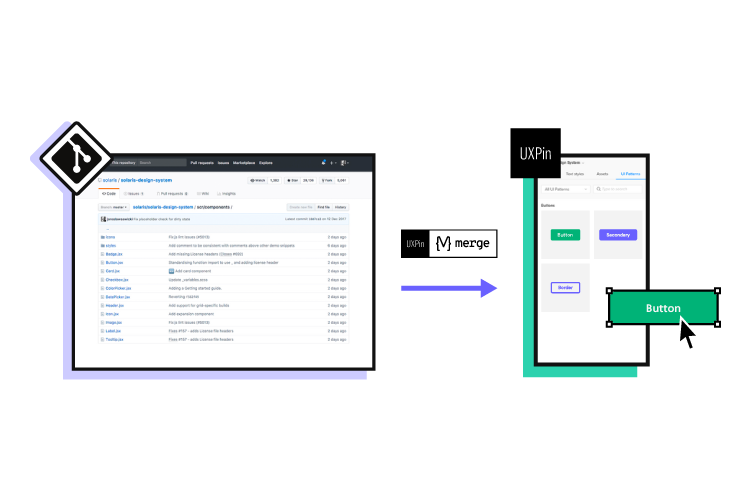
Designing a new site? Use UXPin and build website architecture and turn it into a workable prototype. It’s an end-to-end solution that simplifies UI and UX design process up to design handoff, so your developers can extract ready HTML and CSS code to kick start website development. Try UXPin right now.

Build advanced prototypes

Design better products with States, Variables, Auto Layout and more.

Try UXPin

What is website structure?

Website structure is the organization and layout of the various elements and pages within a website. It is how the different pages of the site are linked with each other through internal links and their hierarchy. It is about how the information on a site is organized and presented, so that the users know how to move through the site whilst the web crawlers can read the context well.

Good website structure facilitates easy navigation for both users and crawlers. Apart from influencing user experience, it also affects the SEO ranking of a website in search engines.

Why is website structure important for designers? 

The role of a UX designer is to create a website that has a great UX that takes care of accessibility and is easy to use. A great website structure improves the usability or user-friendliness of your website by making it easy for users to find what they are looking for.

4 Types of Website Structure

There are different types of web structure that you may use in UX design. They are hierarchical, sequential, matrix, and database model. What are they about?

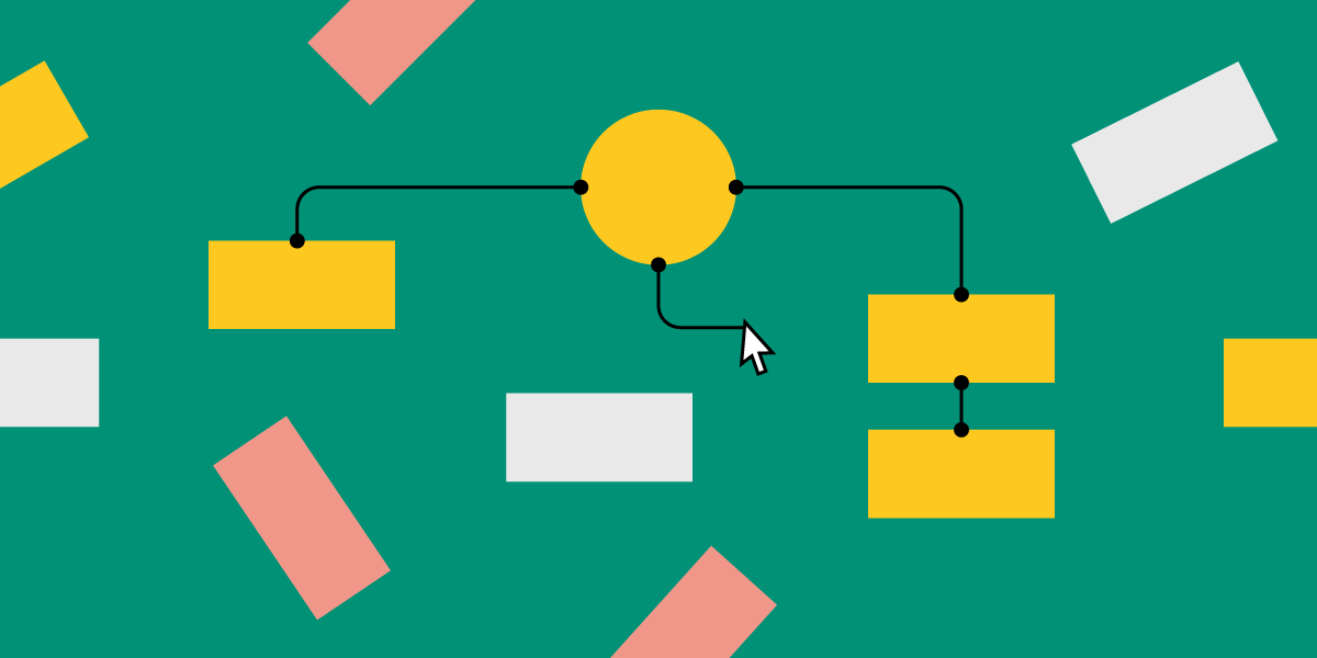
Hierarchical website structure

hierarchical website structure example

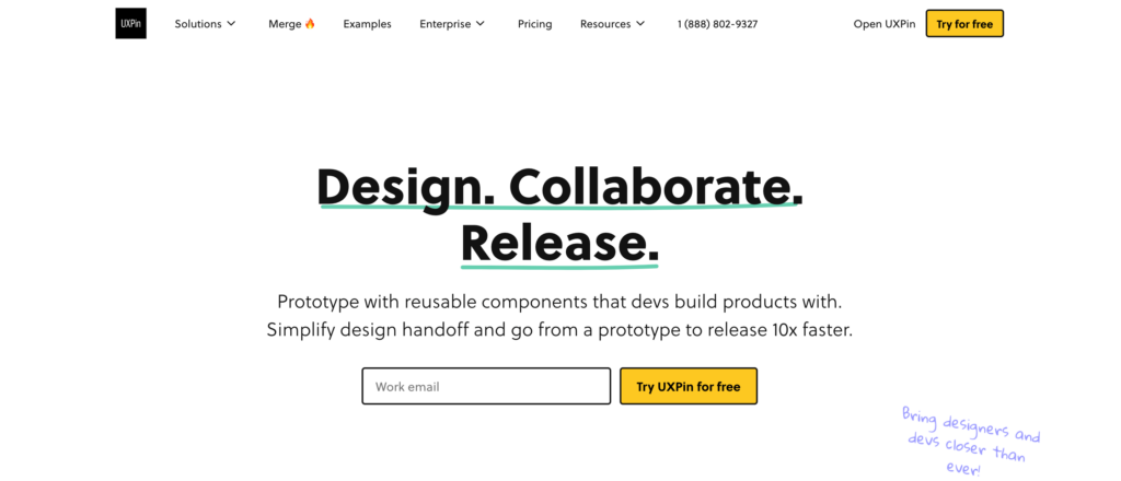
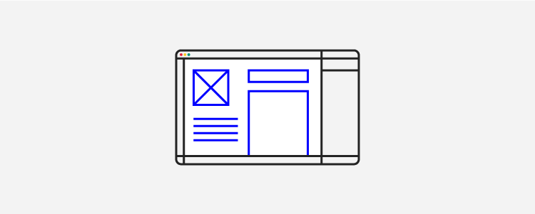
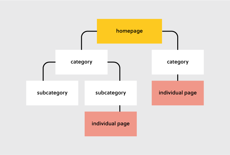
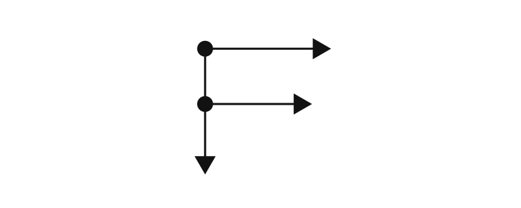
Hierarchical structure is the most common website structure is a hierarchical structure that is based on one parent page (main page) and child pages (categories and sub-categories) that flow from the main page. Think of UXPin’s page (image above).

An example of this structure is UXPin’s website. You can see a screenshot of a homepage that takes you to different child pages in its navigation bar and website footer. The user can click through pages, but they can quickly go back to homepage if needed. The website is designed to guide users through a series of steps to create an account and explore the platform’s features.

Sequential website structure

sequential web page structure

A sequential website structure is a design approach that guides users through a series of steps or a specific sequence of content to achieve a desired outcome or experience. This structure is particularly effective when you want to tell a story, present a process, or lead users through a journey with a logical progression.

An exemplary illustration of a sequential structure can be found in Growth Design‘s UX case study pages, as featured in their newsletter. In this context, the UX case study pages are meticulously organized to present information in a step-by-step manner, allowing users to follow the evolution of a project or design process. Each step in the sequence builds upon the previous one, providing a cohesive narrative and facilitating a deeper understanding of the showcased work.

Key features of a sequential website structure, as demonstrated by Growth Design’s UX case study pages, may include:

  • Clear Progression – each step or section logically follows the preceding one, creating a smooth and clear progression.
  • Engaging Storytelling – the structure facilitates storytelling, enabling the presentation of a narrative that captivates users and maintains their interest.
  • Visual Hierarchy – visual elements such as images, diagrams, and multimedia are strategically used to enhance the hierarchy and emphasize key points in the sequence.
  • Focused User Journey – users are guided along a predefined path, reducing cognitive overload and helping them absorb information in a structured manner.
  • Call-to-Action Integration – integration of relevant calls-to-action at appropriate points in the sequence to encourage user interaction or prompt specific actions.

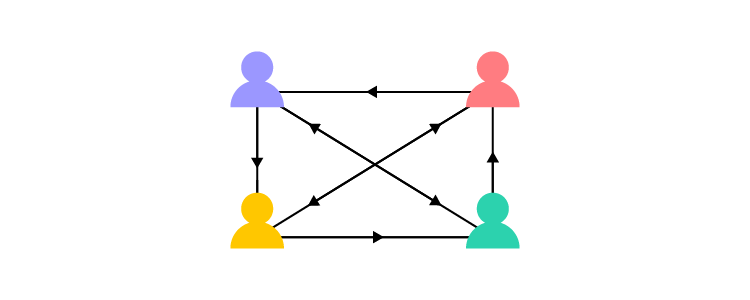
Matrix web structure

content website structure

A matrix structure in organizational terms refers to a management approach where employees report to both functional managers and project managers simultaneously. This dual reporting system allows for more flexibility and a balance between functional expertise and project-oriented goals.

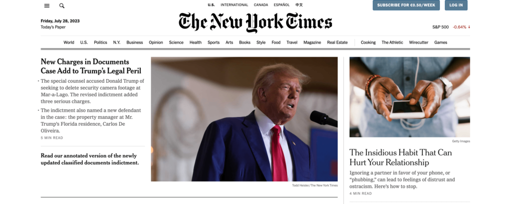
n the context of a website structure, particularly common for online newspapers like the New York Times, the matrix structure can be used as a metaphor to describe a complex and multi-dimensional site architecture.

In a matrix-like website structure for online newspapers:

  1. Content Categories – the structure can be represented by various content categories, such as News, Opinion, Business, Technology, and more. Each category acts as a functional area with its own set of expertise and content creators.
  2. Dynamic Homepage – the homepage serves as a dynamic dashboard, showcasing a mix of the latest news across various categories. It may feature a blend of top stories, trending topics, and multimedia content, breaking away from a strictly hierarchical presentation.
  3. Search Functionality – the website integrates robust search functionality. Users can enter keywords, topics, or author names, and the search results dynamically pull content from different categories and sections, reflecting the matrix-like interconnectedness.
  4. Multidimensional Navigation – users navigate through the website based on their interests, and the navigation isn’t strictly hierarchical. Instead, it’s multidimensional, allowing users to explore various dimensions simultaneously. They can choose to follow a specific category or delve into cross-cutting topics seamlessly.
  5. User Personalization – the matrix structure allows for user personalization, where readers can customize their news feeds based on preferences. This customization could involve selecting favorite categories, following specific authors, or receiving tailored recommendations.

While the hierarchical model provides a clear and structured path, the matrix structure in online newspapers introduces a more dynamic and interconnected approach. It accommodates the diverse interests of readers, encourages exploration across multiple dimensions, and mirrors the complexity of the news landscape in a digital era.

Database website structure

pinterest guidedsearch

Database model, also called dynamic website structure, is the model prevalent for sites that have a lot user-generated content. It is characterized by its reliance on a database to store, manage, and retrieve content dynamically, providing flexibility, scalability, and real-time interactivity.

Unlike static websites with fixed content, the database model offers flexibility in managing and displaying content. Content can be easily added, edited, or removed through interactions with the database, allowing the website to evolve based on user contributions.

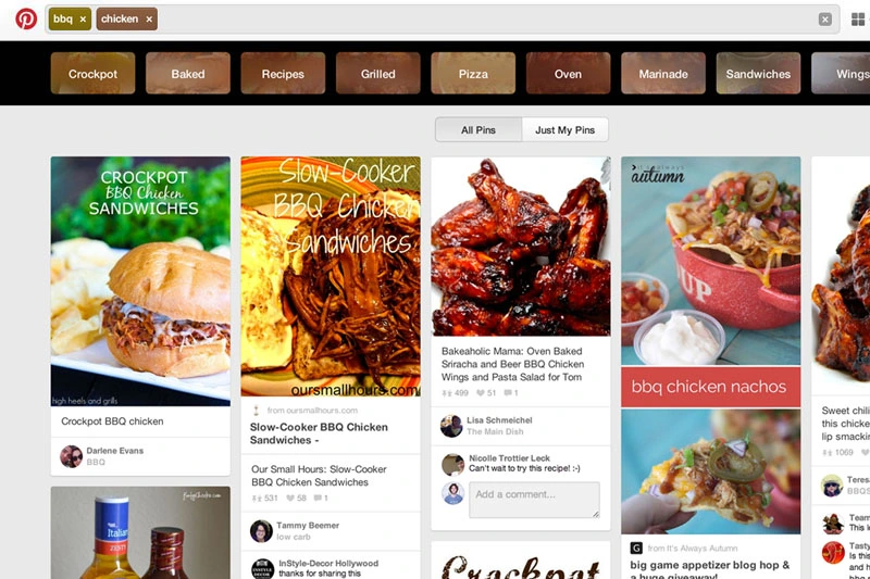
Think of sites like Pinterest. This site relies on user-generated content, such as posts, likes, comments, pins, and other contributions. The database serves as a central repository for storing and retrieving this dynamic user-generated data.

Users can interact with the site in real-time, submit content, and engage with dynamic features. Personalization features, such as customized user profiles and tailored content recommendations, are often implemented based on database-driven insights.

Given the nature of user-generated content, websites using the database model incorporate robust content moderation tools to ensure quality and adherence to community guidelines. Security measures are also implemented to protect against potential threats associated with dynamic content contributions.

How to Choose the Best Website Structure?

To create a website structure, you need to map out how you will organize the content on your site (homepage, categories, individual page, blog posts). This is why website structuring should be the first step in any web design project.

The underlying principle in great website structure is Information Architecture (IA). IA ensures that content is organized, structured, and labeled effectively and consistently.

Consider the following factors to design an information architecture of your site:

  1. User journey: Since websites are created to serve users, it is important to consider how they might experience or interact with your site and their expectations of how your website should work. You can determine the journey of your users through interviewing them or doing a card sorting exercise
  2. Content: The structure of your website will also be largely determined by the type and volume of content on your site. The structure of an e-commerce site will be different from the structure of an academic site. Read more about UX content: Content Strategy for UX.
  3. Context: The context of a website is determined by its business goals, the cultural context that it exists in, and the resources available. It is important to consider this fact as you structure your website.

Key Elements of Website Structure

Let’s focus on hierarchical structure of a website. This is a structure which most content websites, such as company website, eCommerce store, common blogs, etc. are based on.

Website Structure

Let’s look at each of these elements and how you can optimize them during your design process.

Homepage web structure

Your homepage is the top page in your website hierarchy and the central place where users navigate your website from. Ensure that all the important pages on your website are linked from this page. The relationship between your homepage and the main category pages is represented by your website’s menu or main navigation.

Here’s how to design a useful navigation/menu for your website.

Navigation or menu web structure

Your site visitors will use the navigation to understand how information is structured on a website and to find what they are looking for. Ensure that all your main category pages are represented on your menu or main navigation. Additionally, use the following rules when creating your navigation:

  • Use short phrases or even one word for each element.
  • Use simple language that your users can understand. 
  • Don’t clutter your navigation with sitelinks.

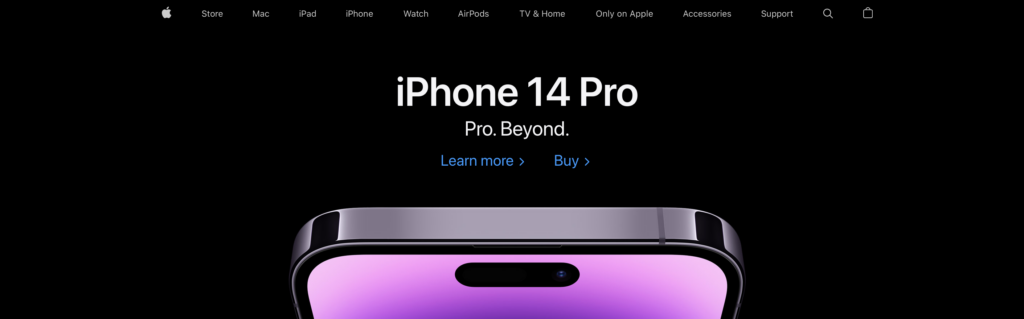
Apple’s main navigation follows these rules to create a simple but super-useful menu.

example of good website structure from Apple

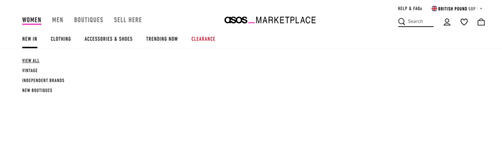
If your site has some subcategories that are useful for users such as their account information. You can create a secondary vertical menu like Asos has.

Other useful categories such as utility pages (privacy policies, disclaimers and legal information) can be placed on the footer of the website. 

Categories and subcategories web structure best practices

Use categories to group website pages that have similar content which makes it easy for users to access the content. Blog posts can be grouped into categories such as ‘marketing’ and then be further subdivided into subcategories such as ‘landing pages’ and ‘email marketing.’

If you are designing an e-commerce website, you can group your products into categories such as ‘men’ and ‘women.’ If your categories are too many you can further subdivide them into subcategories. Continuing with our example of an e-commerce store example, the women category can have subcategories such as ‘clothes’, ‘shoes’, and ‘handbags’. 

A great example of this is the Asos Marketplace website where their clothing category has a subcategory that shows the types of clothing available in the marketplace such as swimwear, sweatshirts, tracksuits, and hoodies. 

asos web structure example

Web structure tips for individual pages

It is important to structure your individual website pages or blog posts in a way that makes it easy for users to find what they are looking for, find similar content and understand where they are on your website. Breadcrumb trails, tags, and contextual sitelinks are used to structure information architecture on individual pages.

Take care of the headers that you put on individual pages. Make sure that they follow the right order, for example, the title of the blog post is H1 and that they all have metadata. Metadata are important part of UX, too. You don’t want to confuse users what your site is about.

Use breadcrumb trails

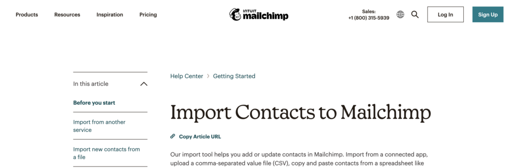
You can add navigation on your pages or posts in the form of a breadcrumb trail. A breadcrumb trail is made up of clickable sitelinks that show users exactly where they are on your site plus your site structure. Breadcrumb trails like the one used by Mailchimp improve usability and user experience. 

web structure of mailchimp

Add tags and categories

Tags are another useful way of grouping similar content on a specific page. Tagging enhances content discoverability and user navigation. This enables users to explore related content more effectively, thereby increasing engagement.

The difference between tags and categories is that categories have a hierarchy and can be further subdivided into subcategories but tags have no hierarchy. They simply group similar content. 

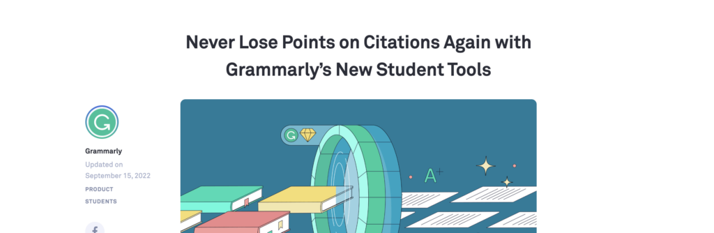
For example, Grammarly’s blog uses categories and tags, such as ‘how to,’ ‘product’ and ‘inspiration’ to group blog content.

web structure grammarly example

The usefulness of these tags is displayed when a user clicks on one of the posts tagged ‘how to’ and they are shown other posts that are also tagged ‘how to’ at the end of the blog post. This is a great example of how website structure makes it easy for users to find information

Tags can also be used in e-commerce websites to group products according to brand and direct users to similar products. 

Here are 3 best practices for creating tags:

  • Don’t create too many tags or a new tag for every post.
  • Place tags in a place where site visitors can easily see them such as your sidebar or at the end of your blog posts/product pages.
  • Make sure that the tags are clickable and users can view similar content if they need to.

These are links on webpages or blog posts that point to other relevant content on other webpages. Contextual links are useful in showing users related content. In the context of a blog post, contextual links can be used to point users to other blog posts that have similar content. Grammarly does this in their blog post as shown below. 

grammarly web structure best practices

Contextual links can also be used in e-commerce pages to link to pages that have related items, what other people have bought, or which products are often bought together. 

Identifying Site Structure Issues

An effective website structure is crucial for ensuring a seamless user experience and achieving business goals. However, structural issues can often go unnoticed until they start negatively impacting usability, SEO, or content management. By identifying these issues early, designers can maintain project quality and avoid costly revisions later in the development process. Here are some common site structure problems to look out for and how to address them:

Confusing Navigation & Hierarchy

When users struggle to find key information, it’s often a sign of poor navigation and content hierarchy. Overly complex menus, inconsistent labeling, or too many layers in the navigation can frustrate visitors and lead to higher bounce rates. To identify these issues:

  • Perform a navigation audit: Test each menu item and link to ensure they lead to relevant pages.
  • Analyze user behavior data: Tools like heatmaps and session recordings can reveal which paths users follow and where they drop off.
  • Conduct usability testing: Ask real users to complete tasks and observe where they struggle.

Solution: Simplify the navigation, keep category names consistent, and minimize menu layers. Use breadcrumbs or secondary menus to improve the discoverability of deeper content.

Orphaned Pages or Broken Links

Orphaned pages are those not linked from any other page on the site, making them difficult for users (and search engines) to discover. Broken links, on the other hand, can frustrate visitors and hurt your SEO efforts.

  • Run a site crawl: Use tools like Screaming Frog or Ahrefs to identify orphaned pages and broken links.
  • Check internal linking: Ensure each page has at least one internal link pointing to it, preferably from a related high-traffic page.

Solution: Fix broken links and add internal links to orphaned pages from relevant sections of your site. Regularly update your site’s internal linking structure as new content is added.

Overlapping or Redundant Content

When multiple pages target the same keyword or topic, it can create competition between your own pages—often referred to as keyword cannibalization. This can dilute the value of each page and confuse users about which page to visit.

  • Conduct a content audit: Review all pages and group them by topic. Look for instances where multiple pages serve a similar purpose.
  • Use analytics data: Determine which pages perform best for their intended keywords and consider consolidating weaker pages.

Solution: Merge similar pages into a single, comprehensive resource. Use redirects to ensure that any traffic to the original pages is redirected to the new, optimized page.

Lack of Responsive Design

With more users accessing websites on mobile devices, a lack of responsiveness can significantly impact usability and engagement. Pages that don’t adjust to different screen sizes lead to poor navigation and readability issues.

  • Test on multiple devices: Use tools like Chrome DevTools or BrowserStack to test your site across various screen sizes and devices.
  • Check component behavior: Verify that interactive elements like buttons, menus, and forms are usable on mobile.

Solution: Ensure your site’s CSS is built with responsiveness in mind. Use frameworks like Bootstrap or apply CSS media queries to optimize layouts and component sizes for different devices.

Unclear Information Architecture

A poorly structured information architecture can make it difficult for users to understand the relationship between different content sections. This issue often arises when new pages or sections are added without considering the overall structure.

  • Create a sitemap: Outline your website’s structure and evaluate if each page fits logically within the hierarchy.
  • Card sorting exercises: Use card sorting with real users to see how they naturally group content and structure your IA accordingly.

Solution: Adjust your IA so that related content is grouped together under clear, distinct categories. Make sure there’s a logical flow from top-level categories down to specific pages.

By proactively identifying and addressing these common site structure issues, designers can ensure that their projects maintain a high standard of quality, enhance user experience, and support the website’s long-term goals. Regular audits and usability testing can help keep your site’s structure in check as it evolves over time.

Easily Incorporate Website Structure In Your Designs 

Web structure is how information is organized and interconnected on a website. An effective site structure improves usability and user experience which makes web structuring an important step in the web design process. The UXPin design tool makes it easy for you to design, prototype and structure a website, as you collaborate with other team members and designers. Try UXPin now.

What is React and why use it for your app?

What is React and why use it for your app

Designing an app is complicated at the best of times, so anything that will make it simpler is always welcome. That’s where React comes in. What is React? It is a library of JavaScript code and components designed to make the creation of user interfaces easier. As an open-source framework, it has been used to create some of the biggest apps on the market today, including Paypal, Netflix, and more.

This framework is popular for a number of reasons, but perhaps the biggest one is that it offers declarative views. You can create an interactive app that will be neatly updated instantly when new information comes in. As soon as the data reaches your app, it will update. You can see this in comments on Facebook, where you can see new ones come up without the need to refresh your screen.

Build beautiful and interactive React app layouts 8.6x faster. Use our drag-and-drop UI builder to create consistent designs for your React apps with code-backed components. Try UXPin Merge for free now.

Design UI with code-backed components.

Use the same components in design as in development. Keep UI consistency at scale.

What is React?

React is a popular JavaScript library for building user interfaces. React is just one of many JavaScript libraries. Others are Angular, Vue, and Svelte which you can compare in our previous article: React vs Angular vs Vue.

React encourages developers to break down UIs into reusable components. Components are self-contained units of UI that can be composed together to build complex interfaces. This modular approach promotes reusability, maintainability, and scalability.

It introduced the concept of a virtual DOM, which is a lightweight representation of the actual DOM. When the state of a React component changes, React compares the virtual DOM with the previous state and updates only the parts of the DOM that have changed. This approach improves performance by minimizing DOM manipulation and re-renders

Originally developed by Facebook, React is now run by both Facebook and Instagram developers. They are joined by a number of outside developers, as well. The end result is a very versatile, useful framework that more and more app developers are interested in using.

Is React frontend or backend?

React is considered frontend. It’s commonly used to create interactive and dynamic UI components for web applications. However, React can also be used on the backend with technologies like Next.js, which allows for server-side rendering of React applications, blurring the line between frontend and backend to some extent. Overall, though, React is predominantly associated with frontend development.

React vs Vanilla JS

Vanilla JavaScript refers to the core JavaScript language without any additional libraries or frameworks. It allows you to directly manipulate the Document Object Model (DOM) and handle events without relying on any external dependencies.

You have full control over how you structure and organize your code. While it provides flexibility and control, building complex web applications entirely with vanilla JavaScript can be time-consuming and tedious, especially for tasks like managing state and updating the UI.

React, on the other hand, is a JavaScript library for building UIs. It provides a more structured and efficient way to build dynamic user interfaces, especially for larger and more complex applications.

Is React a framework?

React is often mistakenly referred to as a framework, but it’s more accurately classified as a JavaScript library for building user interfaces.

Frameworks, like Angular or Vue.js, typically provide a more comprehensive structure for building applications, including routing, state management, and other features.

React, on the other hand, focuses primarily on the view layer of the application, allowing developers to create reusable UI components and manage state efficiently.

While React can be extended with additional libraries and tools to provide more framework-like functionality, its core philosophy remains centered around building UI components.

How does React work?

Here’s a step-by-step guide on how React works. First, you define React components. Components are the building blocks of a React application. They can be either class-based or functional components. Once you’ve defined your components, you can render them to the DOM using ReactDOM.render(). This function takes two arguments: the component you want to render and the DOM element where you want to render it.

When you render a component, React creates a virtual DOM representation of the component and its children. The virtual DOM is a lightweight copy of the actual DOM. When the state or props of a component change, React re-renders the component and its children. It creates a new virtual DOM representation and compares it with the previous one to determine what has changed.

React performs a process called reconciliation to update the actual DOM efficiently. It calculates the differences (or “diffs”) between the new virtual DOM and the previous one and applies these differences to the actual DOM.

React handles user interactions using synthetic events. Event handlers are functions that are called when a specific event occurs, such as a button click or form submission. React provides a consistent API for handling events across different browsers.

React components can have state, which represents data that can change over time. You can use the useState hook (for functional components) or the setState method (for class components) to manage state within a component.

React components have lifecycle methods that allow you to hook into various stages of a component’s lifecycle, such as when it is created, rendered, updated, or destroyed. You can use lifecycle methods to perform initialization, cleanup, and other tasks.

What is JSX in React?

JSX is a syntax extension for JavaScript that allows developers to write HTML-like code within JavaScript. JSX makes it easier to define UI components in React by combining HTML-like markup with JavaScript logic. JSX code is transformed into standard JavaScript by the React compiler.

Why JavaScript is best?

While we know React is written in JavaScript, why should that matter so much? It matters because JavaScript is one of the most used programming languages in the world. In fact, 9.7 million developers use it for their programming needs, making it the best choice for a wide-spread building platform.

1 7

With this programming language mixed with HTML, it’s possible to get React to do just about anything you need it to. The learning curve is fairly low for anyone already familiar with JavaScript, too. The ability to jump into React and start programming apps immediately means you get started faster than ever.

Individual components can be edited alone

Most programming works so that if you change one thing, the whole program needs to be adapted. This can cause a lot of issues if you are trying to change one area of the app and end up with a big mess to sort out. However, with React, you don’t get that. It’s a downward flow programming method, so anything that is changed will not affect what is upstream from it.

2 8

The components can also be changed and edited without affecting the rest of the components. This speeds things up drastically. You no longer have to adjust all the codes in order to suit one change. When it comes to fixing glitches and doing regular maintenance on the app, the entire process is faster, since the components are separate.

JavaScript libraries are available from multiple sources

Since React is open-source, there are a lot of developers working on making it better. You’ll find JavaScript libraries available with code you can use for a wide variety of functions. These libraries are full of pre-written codes for a variety of functions and you can simply grab them for use.

There’s no reason to code the most basic functions when you can use an existing code. It speeds up the entire process and makes it less frustrating.

Everyone needs similar codes at some point, so don’t reinvent the wheel, just make a point of working smarter, not harder. Using code that manages basic ideas is just a better way to do it.

The virtual DOM helps load info fast

Normally, your app or website updates the DOM or document object model, using HTML. This was the only way to do things for a long time and while it is functional, the method takes longer and longer when you have more people using the site. The more users on the site, the more complicated it is to refresh the page. Previously, this was the only way to update things like comments and any other data that needs to be refreshed instantly.

The virtual DOM just copies the actual DOM and then lets you instantly update using ReactJS. Instead of reloading the whole page, it only loads the info that is changing. This means the entire page or app will run much faster. As a small feature, it may not make a huge difference to one or two people. However, if large amounts of people are using the same page, then the difference is incredible.

React has drastically sped up the entire process of not only creating an app or site but also the everyday function of said app. Not only can developers speed through the creation of a prototype app, but they are also able to get a full app up and running in half the time. This is thanks to the ability to reuse code. Once the app or site is in public use, the user interface creates a better user experience, as well, due to the virtual DOM.

How much Javascript is required for React?

React relies heavily on JavaScript. To effectively use React, you need to have a solid understanding of JavaScript fundamentals. Some of the JavaScript concepts you’ll commonly encounter and use when working with React include:

  1. Variables and Data Types: Understanding how to declare variables (let, const, var) and the various data types (string, number, boolean, etc.) is essential.
  2. Functions: Knowing how to define and call functions, as well as understanding concepts like arrow functions and function expressions.
  3. Objects and Arrays: Objects and arrays are fundamental data structures in JavaScript. You’ll frequently work with them when managing state and props in React components.
  4. ES6 Features: React heavily utilizes ES6 features like arrow functions, classes, destructuring, spread/rest operators, and template literals. Familiarity with these features will make your React code cleaner and more concise.
  5. Scope and Closures: Understanding how scope and closures work in JavaScript is crucial for managing state and handling asynchronous operations in React.
  6. Asynchronous JavaScript: Since React applications often interact with APIs or handle asynchronous operations like fetching data, knowing how to work with Promises, async/await, and handling errors is important.
  7. DOM Manipulation: While React abstracts away much of the direct DOM manipulation, having a basic understanding of the Document Object Model (DOM) and how to manipulate it with JavaScript can be helpful for certain tasks.
  8. Event Handling: React applications respond to user interactions via event handling. Knowing how to attach event listeners and handle events in JavaScript is necessary.
  9. Conditional Rendering and Loops: React allows for conditional rendering and looping through data to dynamically generate UI elements. Understanding JavaScript’s conditional statements (if, else) and loops (for, while, forEach, etc.) is essential for this.
  10. Module System: React applications are typically built using a modular approach. Understanding JavaScript modules (e.g., import and export statements) is important for organizing and managing your codebase.

While React provides its own syntax and features for building components and managing state (JSX, hooks, context, etc.), a solid understanding of JavaScript is crucial for effectively using React to build dynamic and interactive user interfaces.

What are Javascript concepts for React?

JavaScript concepts that are particularly relevant and commonly used in React development include:

  1. Variables and Data Types: Understanding how to declare variables (let, const, var) and the various data types (string, number, boolean, object, array) is fundamental for working with React components and managing state.
  2. Functions and Arrow Functions: Knowing how to define and call functions is essential in React for defining component behavior. Arrow functions are commonly used to define event handlers and callback functions within components.
  3. Objects and Arrays: Objects and arrays are frequently used in React for storing and manipulating data. Understanding how to work with objects and arrays is crucial for managing component state and props.
  4. ES6 Features: React heavily utilizes ES6 features like arrow functions, classes, destructuring, spread/rest operators, and template literals. Familiarity with these features will make your React code cleaner and more concise.
  5. Scope and Closures: Understanding how scope and closures work in JavaScript is important for managing state and handling asynchronous operations in React components.
  6. Asynchronous JavaScript: Since React applications often interact with APIs or handle asynchronous operations like fetching data, knowing how to work with Promises, async/await, and handling errors is important.
  7. Event Handling: React applications respond to user interactions via event handling. Knowing how to attach event listeners and handle events in JavaScript is necessary.
  8. Conditional Rendering and Loops: React allows for conditional rendering and looping through data to dynamically generate UI elements. Understanding JavaScript’s conditional statements (if, else) and loops (for, while, forEach, etc.) is essential for this.
  9. Module System: React applications are typically built using a modular approach. Understanding JavaScript modules (e.g., import and export statements) is important for organizing and managing your codebase.
  10. DOM Manipulation: While React abstracts away much of the direct DOM manipulation, having a basic understanding of the Document Object Model (DOM) and how to manipulate it with JavaScript can be helpful for certain tasks.
  11. Callbacks and Higher-Order Functions: React frequently uses callbacks and higher-order functions to pass data between components and handle asynchronous operations. Understanding how to work with callbacks and higher-order functions is important for building React applications.

These JavaScript concepts provide the foundation for working effectively with React and building dynamic and interactive user interfaces. Familiarizing yourself with these concepts will help you become proficient in React development.

How long does it take to learn React?

For a ballpark figure, achieving basic proficiency could take anywhere from one to three months of dedicated learning, assuming some familiarity with web development fundamentals. Gaining deeper expertise could take another few months.

If you have a solid foundation in HTML, CSS, and particularly JavaScript, you can pick up the basics of React more quickly. JavaScript is especially crucial because React is a JavaScript library. The more you practice by building projects, the better you will understand and be able to use React’s capabilities. Practical application is key to solidifying your knowledge.

If you need to create a React front-end for an app, prototyping tools like UXPin Merge may come of aid. More on that in the section below.

Can you design with React components?

Yes, you can design with React components, but you need the right tools. One of them is UXPin Merge, a UI builder technology for creating UIs with React components. Those components come from popular open-source libraries, such as MUI, Ant design, and more.

UXPin Merge is the only design technology that allows you to build prototypes of your React app with code-backed React components. Other design tools, such as Figma (see how Figma uses React), use only visual representation of React components. UXPin uses both visual and code layers. If you’re ready to get this technology a go, try UXPin for free today.

Basic Design Elements and the Principles of Design

Basic Design Elements and the Principles of Design

Good design isn’t about many years of practice and thousands of hours spent in graphic editor tools. The beauty of this craft is that it’s accessible to all, given that they have a surface level understanding of its principles and the basic design elements.

Luckily, hundreds of years of work with paintings and graphics have provided us with a series of vital rules that guide designers to this day. 

In today’s article, we’ll take a closer look at these rules, along with the building blocks of design that will help you create great products with little effort or experience.

Create advanced prototypes that can be quickly translated into code. Try UXPin, an end-to-end prototyping tool for interactive design that helps you test not only the looks, but interactions too. Try it for free.

Build advanced prototypes

Design better products with States, Variables, Auto Layout and more.

Try UXPin

What is Design? 

An essential first step on the journey towards good design is understanding what it is at its core. We often mistakenly believe that it has a decorative function — it’s meant to make things pretty and appealing. However, its spirit is much more pragmatic. 

Design isn’t art per se. Some designers go as far as to insist that there’s pretty much no overlap between the two. While there’s a lot to debate in this viewpoint, one thing is for sure — the purpose of design is to solve problems. Furthermore, it can often be done to the detriment of beauty. 

A design’s end goal is to find an innovative solution; this solution’s prettification is a secondary matter. 

Therefore, it’s safe to say that design is the arrangement of visual elements that aims to solve a real-world problem. As designs become more complex, they evoke feelings that form experiences. Fundamentally, it helps us shape the world we live in and impact the way we perceive reality.

Basic Design Elements

Before we dive into the central principles of design, let’s explore its basic elements. 

Lines

Lines are the most seamless and most powerful elements of design. They have a vast spectrum of functions and purposes. We use them to separate and organize space, outline and contour objects, emphasize certain elements, draw attention, and so forth. 

01 3

It’s interesting how such a simple element can yield such a strong effect on our attention and have such a complex meaning in the modern visual grammar. 

More importantly, we can curve and combine them to create rich meaning through different shapes and patterns due to how fundamentally simple lines are. 

Lines can be thin and thick, horizontal, vertical, and diagonal, curved and zigzagged, dashed, and dotted — all of them can be used to convey meaning and shape experiences. 

Source: https://www.pexels.com/photo/abstract-architect-architectural-design-art-323645/ 

Shapes

Everything is made of shapes which, in turn, are made of lines. We can deconstruct the world we live in into a series of basic geometric and natural forms. 

Human cognition is odd. In our daily lives, we tend to forget that shapes surround us. Too often we fail to notice how they influence us too. Their effect on our psyche is partly due to our evolutionary upbringing — some shapes instill comfort, others make us cautious. 

Rounder shapes like circles and ovals are generally associated with safety and children — throughout evolution, few round things could harm us. 

02 3

On the other hand, pointier shapes make us think of danger. Throughout the early days of human evolution, they’ve forced us to direct our attention towards them. 

A few million years forward, we’ve started using various shapes in typography and art. Human perception has fine-tuned the meaning of every kind of shape in part. Here’s a rough overview of a few of them. 

  • Squares and rectangles — they make us think of stability and safety. They’re balanced and mathematically sound;
  • Triangles — often associated with power and energy. They often make us think of action, tension, and even aggression;
  • Circles and ovals — typically associated with harmony, life, and permanence;
  • Spirals — associated with nature, birth, evolution, and growth;

Color

Colors are equally mysterious. At their core, they’re nothing but electromagnetic radiation at different frequencies, yet they still have a very powerful effect on the human mind. 

At the same time, it’s important to underline that there’s a lot of subjectivity to color perception. Our opinion on a certain color can be affected by various cultural, religious, geographical, and professional factors, along with plain personal preference.  

03 2

Fortunately, we can outline how certain color groups affect the majority of people. 

  • Warm colors (red, yellow, orange) typically instill a series of emotions ranging from calm and warmth to aggression and anger;
  • Cool colors (blue, green, purple) can instill a range of feelings ranging from calm to sadness; 

Plus, every color in part has its connotation and can evoke a complex spectrum of emotions. The most commonly used colors in modern design are:

  • Blue — it’s extremely popular in web design and digital interfaces in general. It’s the predominant color on the web’s most trafficked websites. It’s twice as popular as yellow and red;
  • Red — while not as popular as blue, red has a very clear function — push us towards action. This is precisely why it’s among the most used colors in calls to action on the internet;
  • Yellow — can be perceived as cheerful and pessimistic, depending on the tone and hue;
  • Green — mostly associated with nature and fertility. However, it can also be associated with money and greed;

Typography

04 2

Fonts are multifaceted. They communicate meaning through words and a mood through its characteristics. 

When it comes to spoken language, we typically use a variety of factors to convey how we feel — rhythm, pitch, tone, gestures, and so forth. Typography also has a diverse set of characteristics that modulate the feelings that a text can evoke  — size, weight, kerning, position, and so forth. 

Due to how long we’ve been exposed to different typefaces, we’ve formed individual impressions about fonts. Some convey seriousness; others feel silly and unpresumptuous. 

We use typographic differences to establish a visual hierarchy and outline the differences between kinds of information in design.  

Source: https://www.typewolf.com/site-of-the-day/medium-2020 

Larger, heavier fonts are often used for headlines. They set the tone for the text that will follow below. They aim to entice the reader by offering them a short glimpse of what they’re about to read. 

Given that it’s common to keep headlines short, the fonts used for them will sometimes have more ornaments. Body text is meant to be slightly simpler to ensure legibility. 

The rightness and wrongness of a type

There’s a myriad of things that you should consider when choosing the right font for your design. 

Fundamentally, your choice should be guided by the message, the medium, and the audience you’re writing for. 

Start with minimal diversity and gradually introduce the smallest amount of typographic contrasts necessary to guide a person through the classes of the information displayed. 

Excessive complexity and lack of expressivity can make your design bland, unappealing, and illegible. 

Bear in mind that your goal is to create unity through design. You’re on a mission to find the golden mean — the path between consistency and emphasis. 

The Central Principles of Design

Now that we’ve gone through the basic design elements, we need to look at the principles that shape their relationship in a medium. 

These principles differ based on their purpose and function. Things like contrast, repetition, and rhythm will help certain elements and components draw a person’s attention to them. Balance and variety are essential when it comes to creating designs that appeal to our senses.

More importantly, it’s essential to point out that all of these principles are tightly related to one another. Your goal as a designer is to achieve their harmonious coexistence. 

It’s important to underline that you shouldn’t necessarily include all the principles in a design. However, using at least a few will guide you towards a more coherent and cohesive end-product.

Unity

Unity is a quality that a designer achieves once the product is finished. It’s important to point out that there are two kinds of unity — conceptual and visual. 

The former is extremely important during wireframing. Conceptual unity is all about combining information for the user’s comfort and ensuring that they have to perform as little interactions while going from point A to point B. 

The latter has to do with how things look. The idea behind it is to ensure the harmonious use of elements, colors, shapes, sizes, and so forth. Equally important design elements should have the same size or color and vice versa. A unified design allows to establish consistency and a clear visual hierarchy.

Contrast and similarity

Designers use these two principles to guide a person’s attention. Similarity is a powerful tool that allows us to create relationships between elements. Let’s take a quick look at a famous example of the similarity principle visualized by the Nielsen Norman Group.

According to the Gestalt principles in design, we tend to group things together based on their appearance. That is why people typically perceive the above image as four columns rather than three rows. We unify the sequences of triangles and circles in their own groups. 

As a designer, you can use this principle to signify relationships between objects based on their shared features. 

We generally use contrast to make things stand out. Our brains are hardwired to observe things that are out of place. These visual or structural outliers pique our interest and draw our attention. 

Given that designs are created by people, we can immediately conclude that an existing contrast is there for a reason. 

There are lots of basic ways you can create contrast. Here are a few of them: 

  • Texture — rough and smooth;
  • Shapes — organic and geometric, rounded and sharp edges;
  • Colors — difference in warmth, hue, and intensity;
  • Scale and size — large and small objects; 

Balance

Balance triggers a certain kind of satisfaction in us. It just “feels right.” It creates a sense of stability and composure. However, balance isn’t just one thing. There are a few kinds of balance that designers make use of — symmetrical, asymmetrical, mosaic, and radial. Each of them has a variety of subtypes. 

05 1

A lack of balance can cause multiple issues — it can misguide the user, causing them to feel disoriented or trigger a sense of visual discomfort. Therefore, a visually unbalanced composition will inevitably create unnecessary friction between the user and the medium. 

As a result, a poorly balanced design will cause a scattered interaction with the product, causing some of the information to go unnoticed. 

Hierarchy and emphasis

The main idea behind hierarchy is to ensure that a person follows a right order while processing the information in a design. Its purpose is to make sure that the elements presented in a medium are structured rationally, allowing the person to reach their final goal. 

Hierarchy can be established by using a variety of visual parameters. Here are a few of them:

  • Size — larger things are typically easier to notice. Therefore, they are considered more important;
  • Color — things that have a brighter color stand out compared to the paler ones;
  • Contrast — contrasting colors are more captivating;
  • Alignment — misaligned elements are more eye-catching than the ones that are in order;
  • Repetition — similar element features may indicate that they are related;
  • Proximity — things that are placed close to one another typically seem related;
  • White space — the more isolated elements are, the more attention they draw;
  • Texture — complex textures typically draw more attention than the simpler ones;

A series of objects that lack prioritization will have too many accents. As a result, this can cause a rippled perception of the design. This chaotic quality feels irritating and frustrating. On the other hand, a lack of clearly emphasized elements may cause a design to seem dull and unappealing. 

Rhythm and flow

Compositional flow determines how the eye is led through a design: where it looks first, where it looks next, where the eye pauses, and how long it stays.

Interaction layouts

To ensure that your design has a coherent flow, it’s essential to look into a couple of traditional layouts.

06 1
  • The Gutenberg diagram — This layout is used applicable to cultures that read left to right. According to this pattern, reading gravity moves our attention from the top-left corner of a plain towards the lower-right corner. As a result, the other two corners get considerably less attention — they’re called fallow areas. 
08
  • The F-pattern — widely used in design for digital interfaces. Here, the eye movement starts at the top and moves from left to right. Then it moves onto the next line of text and continues its rightward movement. However, because modern users tend to skim over text, the lower lines vary in length, creating an F-shaped pattern. 
07
  • The Z-pattern — The logic behind this layout is that our eyes move in a Z-shaped pattern when exploring a visual medium. We sweep from left to right on the upper side of the plain, then make a diagonal transition to the bottom-left side, and finish by moving to the lower-right side.

However, these principles apply mostly to text-heavy designs. Once you start adding various graphical elements, the relevance of these patterns will gradually wither away. 

Compositional flow

In order to guide our users in a scenario that isn’t covered by the layouts above, we need to make use of a variety of directional cues to guide our users. Here are a few of them:

  • Repetition of elements
  • Rhythm
  • Implied action
  • Diagonal lines
  • Gestural lines
  • Directional lines
  • Perspective
  • Subject matter of elements
  • Gradation

These objects can be used to imply direction and guide a user’s movement. 

Rhythm and repetition

Without repetition, there is no rhythm. Our brains are hardwired to seek patterns and similarities in our surroundings. In design, we can also use alteration and gradation to trigger pattern-like thinking. 

There are three general kinds of rhythm:

  • Regular — occurs when the size of the elements or the size of the space between them is predictable.
  • Flowing — this rhythm is similar to the regular one yet does not imply an even size or distance between elements. Instead, it has to do with patterns we consider organic, similar to the patterns you’d see on a tiger.
  • Progressive — occurs when an action’s progress is represented through continuous change in shape, color, etc. 

White space

White space isn’t necessarily white; it can be of any color, texture, and so forth. Simply put, it’s the area that surrounds one or more elements of your design. 

It’s a vital component for enhancing your text’s legibility and reducing cognitive fatigue and friction between the beholder and your design. 

White space has become especially relevant in the last 15 years, as designers started moving away from extremely crammed and disorienting interfaces. 

Please take a look at Arngren, an old version of a Norwegian classified site that immediately throws us back into the ’90s (not in a good way). It’s a perfect example of a near-total lack of white space. Take a second to think about how it makes you feel:

Now, compare it to Apple’s 2020 homepage:

Why use white space?

The effective use of white space has a wide array of benefits. First off, it directs a person’s attention towards a specific object. It’s another way of establishing a visual hierarchy. It allows us to guide a person through a design and direct their attention to its most essential elements. 

Secondly, it increases the chances that a person will interact with it. At the end of the day, that’s why we design things — we want people to use them to solve important problems. 

Thirdly, a lack of white space can take its toll on the eyes and brain. Let’s go back to Arngren and Apple for a second — imagine you’re looking for something on the first site; a microwave oven, for instance. Try to be mindful of how complicated this task appears. Furthermore, pay attention to how tiring this experience is to the eye. 

Last but not least, white space ensures legibility. By not cramming your text in a tiny area, you’ll make it significantly more accessible for people to read it. 

Here’s an example of text that has very little white space:

And an example of text that has plenty of it:

Variety

Variety is a vital part of design that aims to arouse visual interest. Designers typically use it to counteract excessive unity — when things are too monotonous and bland. An uninteresting design will often fail to communicate which elements are more important and deserve a person’s attention.

There are many ways we can use variety to liven things up:

  • Lines — varying weight, angle, or length
  • Shapes — changing up the kind of shape (i.e., amorphous or geometric) as well as the size, color, orientation, texture, etc.
  • Colors — using diversity in the hue, value, or saturation
  • Values — varying the lightness or darkness
  • Textures — is it rough or is it smooth?

Use Principles of Design in Prototyping

On the surface, design is in continuous change — it never stays the same. However, its principles and elements are timeless. 

More importantly, it’s a good idea to think of them as parts of a large system. Improving on variety might harm balance. Making a design too unified, might cause it to seem dull and unappealing.  

One thing is for sure — by continuously taking them into account, you’ll be able to create well-thought-out designs, whether you’re a beginner or a pro.

Create prototypes that are as interactive as the end-product. No code required. Use UXPin and dive into the world of advanced prototyping. Try for free.

What Actually Constitutes Design Language?

What Actually Constitutes Design Language

Visual communication is exceptionally complicated. It’s diverse, boundless, and relentless. A design language establishes principles and constraints that induce the clarity, consistency, and cohesion necessary for designers to communicate with end users.

Developing this design language is a time-consuming undertaking requiring feedback and collaboration from multiple departments and stakeholders.

The final result will allow an organization to create convergent and coherent experiences, significantly decrease spending, and set a high design standard that’s easy to follow.

Bake your design language into your component library with a single source of truth from UXPin Merge. Visit our Merge page for more details and how to request access to this revolutionary technology.

Reach a new level of prototyping

Design with interactive components coming from your team’s design system.

What is design language?

Design language is the collection of visual and interactive elements designers use to communicate with users. It ensures that designers create cohesive and consistent user experiences across platforms, products, user interfaces, and features.

The design language typically relates to the company’s brand values and identity–allowing people to recognize a brand through its designs and content.

There are two perspectives of design language: internal and external.

  • Internal: ensures that every team follows the same rules and methodologies using a set of reference points and coordinates, making the design process efficient and free of confusion.
  • External: facilitates familiar, intuitive user experiences for customers across multiple platforms and products.

By blending these two perspectives, companies create more efficient design processes, craft a memorable brand identity, and enhance usability.

What goes into a design language?

A design language covers many facets of a product, such as

  • Colors
  • Fonts
  • Icons
  • Sounds
  • Spacing and layouts
  • Copy
  • Graphic design and illustrations
  • Data visualizations
  • States

What’s the difference between design language and design system?

A design language typically exists within a design system or style guide, providing product teams with guidelines, usage, and instructions. In a 2017 article, UXPin founder Marcin Treder made the argument that design systems are a language:

“A design system is a dynamic dictionary that describes the ever-changing current state of the language, prescribes the proper usage of it, and invites all the users of the language to extend it.” Marcin Treder.

If you aim to build a design system, defining your visual language first will help guide the development of your UI components and pattern library.

Why is having a design language important?

A design language is a set of rules and principles that guide an organization’s visual identity, ensuring designs have a sense of continuity.

design system abstract

A well-defined design language offers many benefits, including:

  • Ensuring design teams deliver consistent and coherent results, no matter who works on the project
  • Streamlines onboarding and handovers by providing new team members with instructions and guidelines
  • Creates brand consistency which helps develop a strong brand identity and trust
  • Makes digital products more intuitive by providing users with a familiar and consistent user experience
  • Provides a foundation for scalability because product teams make fewer design decisions, increasing efficiency and productivity

Design Language Examples

There are two organizations many designers use as models for developing their design language and building a design system:

  • IBM
  • Airbnb
color sample library

IBM Design Language

Part of IBM’s design philosophy is to create instantly recognizable designs. Users must be able to identify an IBM product by its design characteristics rather than the logo itself.

A distinguishable visual identity is vital for building brand recall and user fidelity. One of the ways IBM achieves that is by engineering its grid systems like the 2x Grid.

Precise use of the grid, along with consistent shapes, angles, and radii, help define a particular aesthetic that’s critical in expressing the “IBMness” of our illustrations and reveals a well-considered and systematic approach” – IBM.

Airbnb’s Visual Language

Airbnb’s Visual Language aims to achieve similar results but with the flexibility to scale. The company’s design language prioritizes speed and growth while preserving Airbnb’s strong brand identity.

“Here’s the simple truth: you can’t innovate on products without first innovating the way you build them.” – Alex Schleifer, VP of Design at Airbnb.

Airbnb’s language makes communication between designers and stakeholders much easier and standardizes practices across platforms and devices.

How to Create a Design Language

Developing a design language is arduous and time-consuming but well worth the effort. The earlier you start, the less work you’ll have, and the sooner your teams will start reaping the rewards.

designops efficiency arrow

Start with UI audit

It’s often best to complete a UI audit before developing your design language. An audit will allow you to identify issues, inconsistencies, or design decisions that don’t align with your principles or values.

Create a vocabulary

A vocabulary should contain and clearly define a product’s visual elements. The aim is to include a systematized pattern library and UI components accompanied by a style guide.

Your style guide must provide directions for each element’s purpose and how they promote consistency and clarity–for example:

“This [design element] from the [library] allows us to express [purpose].”

Keeping these directions (principles) succinct, easy to understand, and implement is crucial. For example, Shopify Polaris, used by thousands of designers worldwide, articulates its design principles in fewer than 100 words:

  • Fresh visual style: A clean, simple style makes things feel approachable and efficient.
  • Faster performance: Elegant code and lightweight assets means pages load more quickly.
  • Future-friendliness: Built for flexibility, design tokens and new infrastructure let us iterate easily across experiences.
  • Purposeful brand presence: Being intentional about when the Shopify brand comes forward, and when it takes a backseat, directs the focus to where it matters most.
  • Familiarity across experiences: Defined patterns and guidelines help us design a wide variety of experiences that still always feel like Shopify.”

Polaris uses this simplified approach across its documentation.

This simplification enables organizations to establish the meaningful constraints mentioned above while allowing designers to streamline decision-making. For example, here’s how Atlassian explains the logic behind their color palettes:

“Our primary palette is comprised of neutrals, white, and blue to bring boldness to our brand and is used in logical ways throughout product and marketing to guide the eye and highlight the important bits. We pepper warmer, secondary palette colors throughout to soften the experience and to impart confidence and optimism.” – Atlassian Design System.

Defining your design principles

The principles behind a product’s design philosophy are a litmus test for evaluating a design’s quality and purpose. It allows an organization to assess whether prototypes adhere to its general guidelines.

Some key points to consider include:

  • Consistency
  • Clarity
  • Simplicity
  • Usability
  • Accessibility

For example, Airbnb’s design principles prioritize accessibility and functionality. They aim to create “unified, universal, iconic, and conversational” designs.

IBM’s principles aim to create “carefully considered, uniquely unified, expertly executed, and positively progressive” designs.

Set the rules

Principles define what your organization’s values are, while the rules guide teams on how to achieve them. These rules are essential for creating consistent workflows and outcomes to deliver great user experiences.

The rigidity of your rules will vary–some will be strict, while others will promote creativity and flexibility to innovate. You might not recognize these differences from the beginning, so it is crucial to encourage feedback from team members.

Facilitate growth

Your design language and system are ever-evolving organisms adapting to product, market, and technological changes. The design system team must adjust to these changes while encouraging users to contribute.

“A unified design language shouldn’t be just a set of static rules and individual atoms; it should be an evolving ecosystem.” – Karri Saarinen, Principal Designer at Airbnb.

Here are three ways to remain flexible and update your design language:

  • Follow market trends and adjust to ensure your design language stays relevant to users.
  • Keep personas up-to-date so that your design language aligns with the people your products serve.
  • Monitor your competitive landscape to explore strategic design opportunities and create a distinct visual identity.

Who’s Responsible for Creating a Design Language?

While designers are responsible for developing an organization’s design language, it’s a collaborative effort requiring input from multiple departments and stakeholders. This collaboration increases adoption and ownership across the organization.

Here are some key departments and specialists you’ll want to include when developing a design language:

  • UX/UI Designers: responsible for the visual components of the language.
  • Accessibility specialists: ensure that the language abides by accessibility standards.
  • UX writers or Content strategists: responsible for the tone of voice guidelines and brand spokesperson parameters.
  • Researchers: provide valuable insight into the needs of the end-users.
  • Front-end developers: instrumental in writing efficient programming syntax and assisting with documentation.
  • Stakeholders: ensure that the language aligns with the organization’s goals and identity.

Unify Design Language With UXPin Merge

UXPin Merge is a technology for syncing a product’s UI library with UXPin’s design editor. By bridging the gap, Merge enables designers to use the same components during the UX design process as engineers use to develop the final product.

This single source of truth eliminates design drift and enhances designer/developer collaboration with built-in properties, principles, and constraints.

Instead of designing from scratch, designers use these components like building blocks and create prototypes for user testing. Because engineers already have the same UI library, design handoffs are smoother, almost non-existent, thus reducing time-to-market with minimal errors and debt.

Unify your product development process with a single source of truth from UXPin Merge. Visit our Merge page for more details and how to request access.

What Should You Expect From a UX Developer?

BlogHeader WhatExpectUXDev 1200x600

UX developers can play critical roles in product development. Oddly enough, some people in the industry don’t know what UX developers do. Many others confuse them with front-end developers and UI designers. The following article will give you a deeper understanding of what UX developers do and how they can help you build great products.

Key takeaways:

  • UX developers help to build user-friendly interfaces for digital products.
  • It’s a cross-functional role that focuses on making features with users in mind.
  • UX developers’ skills combine prototyping, thinking about user needs, considering technical requirements, etc.

Try the simplest way of building code-based UIs. Import UI components from Git repo, Storybook, or through NPM to UXPin and assemble production-ready designs on the fly. Discover UXPin Merge.

Design UI with code-backed components.

Use the same components in design as in development. Keep UI consistency at scale.

What is a UX Developer?

UX developers often fill a variety of roles in prototyping and product development. They have excellent communication and critical thinking skills that lead to better, faster product development. They also have the ability to think from multiple perspectives, so they can get inside the head of your target market to anticipate needs.

You can think of UX developers as coaches that help your team members reach their goals by anticipating problems and predicting how the other team will respond.

Essential UX Developer Skills

Many people get confused about the skills that UX developers need to do their jobs successfully. Some don’t understand the difference between a UI and UX developer. Others don’t know how to differentiate between the skills of a front-end developer vs. a UX developer.

Some of the most essential skills required from UX developers include:

  • Wireframing that creates a blueprint of the product.
  • Prototyping that tests whether products will work correctly before releasing them.
  • Information architecture that helps them create intuitive navigation and other features.
  • Research to understand consumer needs and how to discover ways that a product can solve problems.
  • Visual communication that includes an understanding of layout, color, icons, typography, and other aspects of design theory.

UX Developers vs. UI Developers

UX developers and UI developers often work together to reach a common goal. They do, however, play different roles in product development.

UX developers focus on features that will affect the user’s experience. The UX developer has to get inside the user’s head to understand consumer needs and preferences. They think about questions like:

  • Would an auto-complete form benefit users here?
  • Should modal pop-ups interrupt the user’s experience to make a task easier?
  • Will this landing page convert visitors?
  • Do this product’s users prefer horizontal or vertical layouts?
  • Will this feature decrease the amount of time clients need to fulfill a task?

UI developers may ask themselves some of the same questions, but they usually think about their work from a design perspective. More importantly, they try to do things like:

  • Selecting the colors that guide users through the product.
  • Choosing icons that intuitively express an action.
  • Keeping designs clean and simple so users don’t feel overwhelmed.

The difference can seem subtle at times, and there is some crossover. When you built a team, though, you will see the differences between UX developers vs. UI developers.

Front-End Developers vs. UX Developers

A common misconception is that UX developers have similar skills as front-end developers. Many UX developers find it helpful to learn some front-end developing skills, but they can do their jobs without spending too much time with technical details.

At the most basic level, UX developers help think of features and designs that make products appealing to consumers. The UX developer does not necessarily need to know how to make these features function, though. 

That job falls on front-end developers who need skills like using:

  • HTML and CSS
  • JavaScript
  • JQuery
  • Content management systems (CMS)
  • E-commerce platforms
  • RESTful APIs

In other words, front-end developers have much more technical roles than UX developers. While UX developers try to imagine how a product will fill consumer needs, front-end developers find ways to make those features function. 

How a UX Developer Fits Into Your Team

More often than not, several team members fulfill multiple roles. Few members, however, do more than your UX developer. A UX developer has some knowledge about designing and coding. That makes the person an excellent communicator between your artistic and technical teams. You need someone to translate. A UX developer gets the job done.

UX developers also do a lot of research with potential users. The research can involve surveys and interviews. It can also involve thinking from the perspective of a potential user. Ideally, the UX developer identities problems and recommends improvements before your team spends too much time developing a product.

Your UX developer can also provide a fresh perspective on your team’s work. People often get emotionally attached to ideas when they work on them for weeks. The UX developer can step in and question whether an approach truly works as intended, especially when confronted by a new user.

A UX developer may upset some of your employees. The person isn’t there to massage egos. The UX developer’s work helps ensure that users will have an excellent experience that will make the product successful. 

When Should You Hire a User Experience Developer?

There isn’t a perfect time to hire a user experience developer. Some companies get UX developers involved at the beginning of a project. Others give their technical and design teams some time to work before they bring in a UX developer to review the progress. 

Either approach can work well, depending on the project. Just remember why you hired the UX developer. If you want to identify a product’s user, you probably want to get the UX developer involved as soon as possible.

If you want a UX developer to organize a website, it could make more sense to bring the person in half-way through the project. That way, the person can get a lay of the land and start organizing pages.

You have two basic choices:

  • Get the UX developer involved early to avoid mistakes.
  • Get the UX developer involved after the project has started to find mistakes and recommended corrections.

Benefits of Using UXPin With a UX Developer

Your team members will need to share a lot of information with the UX developer. UXPin, a collaborative prototyping tool, makes working with your team very simple. With UXPin, you get real-time collaboration that works similarly to Google Docs. When someone makes a change to the prototype, everyone sees it happen.

Plus, it lets you design with real coded components. Use integrations with Storybook and Git, or bring a component library through an npm and build interactive designs that are ready for development. Discover UXPin Merge.

Lean UX: Expert Tips to Maximize Efficiency in UX

Lean UX

Everything is about lean these days. The lean startup, lean manufacturing, lean software development, lean UX, and the list goes on! The goal with all of these lean processes is to trim the fat. Remove the systems and processes that slow or disrupt productivity.

Key takeaways:

  • Lean UX is a collaborative approach to UX design that incorporates principles from Lean and Agile methodologies.
  • It is an off-shoot of a book in early 2000s about Lean software development.
  • It has 15 principles such as prioritizing learning, placing importance on outcomes, continuous discovery, and more.

Choosing the right design tool can help streamline UX workflows and processes. UXPin is a collaborative design tool built to increase speed, consistency, and efficiency. Sign up for a 14-day free trial.

Build advanced prototypes

Design better products with States, Variables, Auto Layout and more.

Try UXPin

What is Lean UX?

Lean UX is an outcome-based design process that promotes collaboration and encourages lots of testing and experiments on minimum viable products (MVP).

Lean UX prioritizes outcomes over deliverables. Instead of asking “what are we designing,” lean UX asks, “why are we designing?” By replacing what with why designers must find reasons and supporting data to do design—rather than building something because someone thinks it’s a good idea!

In this way, lean UX design is more of a thought process than a workflow concept. Designers must formulate and validate a hypothesis before they commit to building it. This thinking process is why testing and experiments on MVP concepts are a significant part of a lean UX workflow.

The History of Lean UX

Lean UX is an off-shoot of the 2003 book Lean Software Development and the Agile methodology. Janice Fraser, an internationally recognized design and business expert, coined the term lean UX in the late 2000s stating, “Lean UX is UX practice adapted for Lean Startups…”

Janice used her knowledge and experience of innovation and scaling several Silicon Valley startups to apply lean concepts to UX design.

Agile UX vs. Lean UX

Agile UX and lean UX are similar concepts; however, Agile UX is effective for teams using Agile, while the lean UX process is suitable for any startup or organization.

The Lean UX Process

It’s important to note that the lean UX process still involves all of the traditional UX design thinking phases, just in a different protocol.

The five stages of the design thinking process include:

  1. Empathize: Discover what your users need
  2. Define: Determine the problem you want to solve
  3. Ideate: Develop possible solutions to users’ problems
  4. Prototype: Create prototypes
  5. Test: Test your prototypes with users & stakeholders

While lean UX breaks the process into three stages:

  1. Think: Outcomes, assumptions, user research, ideate, mental models, sketches, storyboards
  2. Make: Wireframes, prototypes (minimum viable products), value propositions, hypotheses
  3. Check: Analyze data & analytics, usability testing, stakeholder and user feedback

As you can see, both processes include the same elements; only the methodology differs.

Lean UX Principles

In an informative article, Ben Ralph outlines 15 core lean UX principles:

  1. Cross-functional teams—build teams with members from several departments working on the same project.
  2. Small, dedicated, co-located—keep teams small (5-9), focused on a single problem, and in the same workspace (or the same timezone for remote teams).
  3. Progress = outcomes, not output—achieving business goals are outcomes, features and services are output.
  4. Problem-focused teams—teams must focus on solving problems, not designing new features.
  5. Removing waste—remove work and processes that don’t get you to your business goals. Does your team attend meetings or generate reports without explicit reasoning?
  6. Small batch size—teams must focus on completing one task or objective at a time.
  7. Continuous discovery—engage with customers, end-users, and stakeholders regularly.
  8. Get out of the building (GOOB)—don’t debate assumptions internally. Test ideas with real users.
  9. Shared understanding—collaborate and share ideas so that the entire team learns and grows together.
  10. Anti-pattern rockstars, gurus, and ninjas—every team member is valued the same. 
  11. Externalizing your work—create an environment where people are free to share ideas. There are no right or wrong ideas!
  12. Making over analysis—don’t waste time debating whether something will work. Try it and learn from the experience.
  13. Learning over growth—make the right thing first, then scale.
  14. Permission to fail—experiment and take risks! As Mark Zuckerberg famously said, “move fast and break things.” Prioritize speed to market over perfection.
  15. Getting out of the deliverables business—keep UX documentation to a minimum. Prioritize the outcome.

There are two common themes across all of these 15 lean UX principles:

  1. Take action—turn ideas into minimum viable products and prototypes. Test, and test again!
  2. Teamwork—share, communicate, collaborate.

Benefits of Lean UX

Traditional UX design processes involve time-wasting roadblocks like oversight meetings, unnecessary documentation and deliverables, department/team silos, and poor communication.

Lean UX optimizes the UX workflow by encouraging inter-departmental collaboration and avoiding protocols that don’t add business value. 

Lean UX’s outcomes-based means that UX designers focus intensely on solving user problems and testing ideas rather than meeting to discuss the color of the CTA button.

Building cross-functional teams with representatives from multiple departments means that designers can draw from diverse ideas, experiences, and perspectives. With this wealth of knowledge, teams can build better MVPs and test more ideas faster. 

We can summarize Lean UX benefits in five bullet points:

  • Eliminates waste
  • Fosters collaboration
  • Fast
  • Efficient
  • User-centered

The Lean UX Methodology

There are three main principles central to the lean UX methodology:

  • Assumptions
  • Hypotheses
  • Minimum viable products (MVP)

Assumptions

Assumptions are just ideas. But the beauty of an assumption is that you’re allowed to be wrong—which complements the lean UX philosophy of experimenting and taking risks.

To make an assumption, you must have the research knowledge and a problem statement you acquire during the think phase. With this knowledge, you can make assumptions about:

  • Business outcomes—what is a successful outcome?
  • Users—be specific about the people you’re helping (user personas).
  • User outcomes—what is a user pain point, and how can your product solve it?
  • Product features—product improvements required to solve the problem.

Armed with a set of assumptions, you can begin making hypotheses for solving your problems.

Hypothesis

A UX hypothesis is a testable assumption with three variables:

  1. What you’re going to do
  2. To solve a problem for (users)
  3. To achieve a desired outcome

You can write a hypothesis statement as follows:

We believe [doing this] for [these users] will achieve [this outcome].

A theory must be tested, not debated. Team members must avoid getting into debates over opinions on how a hypothesis will turn out. Let the test results determine what to do next!

Minimum Viable Product (MVP)

Instead of designing an entire product, teams create the bare minimum (MVP) to test their hypothesis. 

If your hypothesis works, you have a small functional product to expand on. If the hypothesis is incorrect, you can ditch the idea and move on with minimal time wasted.

Designers can build an MVP using wireframes, mockups, and prototypes to test anything and everything. Teams may even create a paper MVP during early testing to flush out many ideas quickly before committing to a slower digital design process.

The MVP must be able to test the hypothesis. For example, if you want to test a button interaction, a paper prototype will not give you a meaningful result. It would be better to use a high-fidelity prototype with color and content to test the interaction in the context of the digital product.

Conversely, you don’t need to spend hours or days building a fully functioning high-fidelity product prototype to test a signup form. A simple wireframe will get the job done faster.

Minimum Viable Products in UXPin

With UXPin’s built-in design libraries, designers can drag-and-drop components to build minimal viable products quickly. You can also add advanced interactions, so prototypes look and feel like the final product.

Need more fidelity for better accuracy during testing?

Take your MVPs to the next level with UXPin Merge—a technology that bridges the gap between design and development. Sync UXPin’s design editor to your company’s design system via a repository (Git and Storybook integrations available) so designers can build prototypes using fully functioning code components.

A fantastic case study of how Merge optimizes the lean UX process was PayPal’s experiment when they first adopted the technology. A designer made two one-page prototypes (or MVPs)—the first with a traditional design tool and the second using UXPin Merge. Using the traditional design tool, the designer created an MVP in a little over an hour. With UXPin Merge: eight minutes. And, the Merge prototype had higher fidelity and functionality.

Read more about UXPin Merge and how it solves DesignOps challenges with sophisticated code-based design technology.

Once you designers complete building a minimum viable product, it’s time for testing!

testing compare data 1

Testing

Finally, teams get to test their hypothesis and MVP. Testing prototypes don’t only help validate ideas, but researchers can also gather valuable insights from observing user behavior and how they interact with a prototype.

Usability testing can also expose usability issues and business opportunities, which designers can add to the next iteration.

With test results, lean design teams can return to the think stage with new insights to start the process again.

Summary

The Lean UX process reorganizes a traditional design process to optimize workflows and enhance collaboration. Your teams don’t have to learn new skills, but rather the organization needs a mindset shift to a new methodology of designing products.

As we’ve highlighted throughout this article, UXPin can help foster lean UX tenets and workflows. Using comments, teams can communicate, assign tasks and mark them as resolved once completed.

With built-in design libraries, designers can skip low-fidelity prototyping and go straight to high-fidelity minimum viable products that deliver meaningful, actionable feedback from usability participants and stakeholders.

Best of all, UXPin also minimizes deliverables with built-in documentation so designers can annotate and create instructions on user interfaces for developers during design handoffs.

Ready to try UXPin to optimize your lean UX process? Experience the power of the world’s most advanced code-based design tool. Sign up for a 14-day free trial.

Web Accessibility Guide – Everything Designers Should Consider and Implement

Web Accessibility Guide for 2023

Billions of people visit websites every day, some are able-bodied and others are not. How does a designer ensure that everyone can access and use their website? The answer is web accessibility.

Build accessible prototypes with UXPin, a design tool that has a built-in contrast checker and more. Explore all the features during a free trial. Sign up for a free UXPin’s trial.

Build advanced prototypes

Design better products with States, Variables, Auto Layout and more.

Try UXPin

Why is Web Accessibility Important?

Web accessibility is designing websites that can be used by people who have disabilities like low vision, color blindness, blindness, cognitive disabilities, deafness or hearing impairment, and mobility impairments. 

Web Accessibility with UXPin

Web accessibility is important because it makes websites responsive to the needs of all users.  At the moment, there are more than 1 billion people who have disabilities in the world while in the United States, 61 million people live with disabilities. When you design websites with accessibility in mind, you make your creations available to people who have disabilities. 

Accessible web design is not just a ‘nice to have’ it is required by law in countries such as the US, Israel, Canada, the United Kingdom among others. In fact, 2,000 website accessibility lawsuits were filed in the United States in 2019 alone. 

Research has shown that there is a strong business case for accessible website design because it improves SEO rankings, increases customer satisfaction, improves usability, and increases the reach of a website.  

POUR – The 4 Web Accessibility Standards

According to the Web Content Accessibility Guidelines (WCAG) put forward by the Website Accessibility Initiative (WAI) of the World Wide Web Consortium (W3C), web content must be POUR. 

This means it has to fulfill the following principles: 

  • Perceivable Information
  • Operable UI and Navigation 
  • Understandable Information and UI
  • Robust Content and Reliable Interpretation 

Perceivable Information Principles

All the Information and UI components must be presented in a way that all users can understand in different ways. There should be no invisible or difficult to understand information or UI elements

Here are the guidelines that your design must follow to fulfill this principle:

  • Alternative text for all content that is not text such as pictures and graphics. This ensures that non-text content can be transformed into other forms like speech, braille, or larger fonts.
  • Give alternatives such as subtitles and closed captions for all time-based media such as videos and animations
  • Create adaptable content that can be presented in a variety of ways such as a simple layout without interfering with its structure. 
  • Make it simple for users to see and hear your content by differentiating between your foreground and background. 

Operable UI and Navigation Principles  

This principle requires that your website’s UI components and navigation can be operated easily without a mouse and it should not require interactions that a user cannot do. 

Here’s how to make your web design operable:

  • Make all functionalities keyboard accessible. 
  • Give your users ample time to interact with your content. 
  • Avoid designing content (flashing elements) that can cause seizures.
  • Give users ways to find out where they are, navigate your site, and find the content that they are looking for. 

Understandable Information and UI Principles

You should ensure that users can understand how your site’s user interface works and the information presented on your site. 

Here’s how to accomplish that:

  • Ensure that the text on your site is easy to read and understand
  • Create and present web pages that work in predictable ways. 
  • Make it easy for users to avoid and correct input mistakes on your website. 

Robust Content and Reliable Interpretation Principles 

Robust content is content that can be interpreted accurately by assistive technologies such as screen readers. Your content should continue being accessible to and compatible with these assistive devices even as their technologies evolve. 

For each of the WCGA principles, there is a success rating of either A (minimum rating), AA (good), and AAA (gold standard). 

What Makes Websites Accessible? Use Cases and Examples

Here are some changes that you can make to your web designs to make them accessible. 

Color Contrast 

When designing your website ensure that there is enough contrast between the background color and the foreground text. The principles of color contrast also apply to buttons, the text that’s on images, and other UI elements. 

Color contrast has a significant impact on how easy it is for users to read the content on your website. Low contrast makes it difficult for people with low vision to read. According to the WCAG, the minimum acceptable contrast ratio is 3:1 while the gold standard is 7:1. 

UXPin has a color contrast checker that helps you ensure that your designs are up to WCAG standards. The tool also lets you view your design the way people with the eight different types of color blindness would. 

Color contrast - web accessibility

An example of the difference that color contrast makes from W3C.

Alternative text

For each image and graphic, provide descriptive alternative text that passes on the same meaning as seeing the text. Screen readers read this alternative text for visually impaired people so avoid using numeric descriptors or those that do not convey any meaning.

Additionally, for time-based media such as video or audio recordings, provide closed captions and transcripts that have visible links. This also applies to icons, buttons, tables, and graphs. 

You can present alternative text using the <alt> tag or use captions to provide context. 

Easy to read content

Users interact with websites primarily through text content. This makes it important to use simple language that is free of jargon and uncommon words, WCAG requires that websites use language that is at a “lower secondary level” to make it as accessible as possible. 

You can use tools such as the Hemmingway App to determine the readability level of your website copy. 

Use header tags appropriately 

Header tags make it easy for users to skim through web content and they give screen readers signals about the importance, relationship, and hierarchy of different pieces of information.

Start with the <h1> and use the tags consistently and in the correct order. 

Header tags - web accessibility

How to use header tags correctly from W3C.

Design clear focus states 

Focus states make it easy for people navigating your website using the tab key to know where they are when using your site. They are used by screen readers, people with limited mobility, and power users. 

Ensure that your menu items, forms, links, and buttons have clear, high contrast focus indicators that help them stand out. 

Focus states - web accessibility

An example of clear focus states from W3C

Design helpful error states

Provide helpful and contextual information to users when they make errors. Also, explain to them how they can fix the errors and give them a chance to reverse their submissions. 

Present instructions clearly and instances where user action is required should be displayed prominently. 

An example of easily identifiable error states from W3C

Label all form fields  

Make sure that you have descriptive labels next to every form field. Additionally, avoid using placeholder text as the form label because it is often low contrast making it hard to read. Placeholder text also creates confusion because users can’t tell what to do after the text disappears. 

Form labels are also useful for people using screen readers to understand your form, screen readers only read the information that is tagged as <label> and skip over placeholder text. 

A form with clear labels from W3C

Don’t use flashing UI animations

UI animations that flash more than 3 times per second can trigger seizures or physical reactions for some people. So it’s best to avoid them. 

Avoid using only color to pass a message

Color is a good way to pass on a message but it should not be the only way as some people are color blind. Instead, use color plus other elements such as asterisks. For graphs and other charts, use labels plus color. 

Color and message - Web Accessibility

Using color plus other elements to pass on a message from W3C

Use easy to read fonts 

Use a font size and style that is easy to read. The readability of a font is often determined by its style rather than its type. As a rule, cursive or decorative fonts are hard to read. Use large text, with short line lengths, tall line heights, and more space between letters for improved readability. 

New Accessibility Considerations for 2020 and Beyond

WCAG 2.2 to Be Released in 2020 

The World Wide Web Consortium (W3C) released the first draft of WCAG 2.2 on the 27th of February 2020. This update aims to further improve web accessibility for disabled persons, especially on mobile devices. 

Here’s what you need to know about WCAG 2.2:

  • It is backward compliant with WCAG 2.0 and 2.1 meaning that if your website meets the criteria of 2.2 it also meets the criteria of the previous versions.
  • It includes new criteria for focus visible states such as the size of focus area and color contrast. 

Growing Importance of VUI and Voice Interface Design 

With more people using voice-controlled devices like Alexa, Siri, and Amazon Echo for their search needs, there is a growing need for voice interface design. 

Here’s how designers can make their voice interface designs more accessible:

  • Tell users what they can do.
  • Let users know the functionality that they are using.
  • Don’t give too many options.
  • Give visual feedback whenever possible

Don’t Over-Promise on “Full” or “100%” ADA Compliance 

The Americans with Disability Act (1990) was signed into law to prevent discrimination against people with disabilities. However, this law does not explicitly mention web accessibility and is therefore open to different interpretations. This means that as a designer you should not over-promise on full ADA compliance because it is not clear how ADA applies to web accessibility. 

Prototyping, Designing and Developing With Accessibility in Mind

To fully comply with accessibility web design, you need the best tools to help you with prototyping, design, and development. UXPin offers an all in one platform where you can check your designs for WCAG compliance and handoff your designs smoothly. Try UXPin for free.

Agile vs. Scrum vs. Kanban – Comparing Top 3 Project Management Methodologies

Blog Header Agile Scrum Kanban

Choosing the ideal project management methodology enables users to optimize results by identifying and handling the critical components of their projects. This ensures that teams are able to manage deadlines and budgets by leveraging specific processes. 

For example, agile methodologies (as the term suggests), focus on dynamic communication and constant feedback among cross-functional teams and end-users. 

A project management method provides your team with a consistent reference point toward success, however, there is no one-size-fits-all choice. As such, it is vital that project management teams identify the advantages of a method before making a decision.

When using any of those methods, you need a fast and reliable prototyping tool to bring your ideas to life. UXPin is such a tool. It will cover every part of design process, so it makes collaboration easy. Experience product design with UXPin. Sign up for a free trial.

Build advanced prototypes

Design better products with States, Variables, Auto Layout and more.

Try UXPin

Comparing Agile vs. Scrum vs. Kanban at a Glance

Agile Methodology

01 Agile

The Agile methodology focuses on an incremental and iterative approach that caters to the changing landscape of a project. Generally, agile methods apply to any process that is tied to the concepts contained in the Agile Manifesto drafted in 2001.

Scrum Methodology

02 Scrum

Scrum is one of the most widely applied implementations of the agile methodology. The methodology utilizes a consistent and specific set of roles, meetings, and responsibilities that are maintained throughout the project. Scrum was created in 1993 by software developer Jeff Sutherland and remains a popular methodology.

Kanban Methodology

03 Kanban

Kanban approaches are visual implementations of the agile methodology. It provides users with a comprehensive breakdown of project details at a glance, which minimizes cycle time while optimizing the overall workflow.  

Here is a breakdown of the main features of each methodology:

Agile 

  • Agile features a 12-point manifesto that guides teams toward more agile communication practices. 
  • Encourage continuous improvement through dynamic communication between teams and end-user customers.
  • Supports projects with vaguely outlined end goals, i.e. work-in-progress shaped by feedback.
  • Focuses on the adaptation to change. Shorter planning cycles pave the way for convenient editing and optimization of backlogs.

Scrum

  • Scrum is a subset of the Agile method.
  • Ideal for projects that focus on transparency and user visibility. 
  • It collectively handles coding and related processes in small quantities, which improves accountability. 
  • Reduces the risks of misunderstandings through improved teamwork while facilitating changes. 
  • Functions through uniform iterations known as sprints that last between 1-2 weeks, which enables project teams to ship software with uninterrupted consistency.

Kanban

  • Kanban is a highly visual framework that presents project details in a concise manner.
  • It sorts workflow management through online Kanban boards that are easily customized.  
  • Kanban Boards apply multiple swimlanes categorized by key details such as project status and roles.
  • Boards are color-coded for easy referencing at a glance, i.e. grouping all completed tasks in purple and work-in-progress in green.

Choosing The Right Methodology

What is the Project’s Goal? 

The project’s goal will determine the ideal approach by narrowing down on the processes prioritized by a team or organization. As such, it is important for users to identify the type of project and its involved processes before settling on a project management methodology. 

This means examining the critical criteria that drive a project, some of which include: its budget, complexity(based on the timeline and number of people involved), scalability (the targeted outreach, long-term business plans), role specializations, availability of resources, industry practices, and timeline. 

Upon assessing the criteria, project managers will be able to seek a methodology that enhances the structure of their project. This involves comparing the pros and cons of each methodology and determining the choice that will deliver maximum impact while eliminating those that carry the most risks. 

Who Needs to Be Involved in the Project? 

Customer Involvement 

It is essential to establish the customer’s role in project management. Project managers should seek to provide seamless communication channels between customers and the development team. This may include the facilitation of interactions such as real-time updates between customer user responses and backend data management.

Kanban and Scrum differ in a way that the feedback will be presented to the rest of the team. While in Kanban, they will end up on the backlog board, in Scrum, they will be carefully considered.

Team and Stakeholders

Project managers should determine the size of each team and the best method of communication among various roles. The selected methodology should support teams in achieving individual deliverables while maintaining efficient collaboration.

Project managers should also work closely with major stakeholders who are responsible for high-level planning such as budget approval. A best-fit methodology should optimize connections among every tier within project management.

Scrum is praised for its efficiency. A sprint lasts two weeks, while Kanban doesn’t have such rules.

Role Specialization 

The roles involved in a project will determine the type and frequency of communication in project management. Additionally, it is essential to identify various role specializations to ensure that each stakeholder is provided relevant support and privileges. 

When comparing Scrum vs Kanban vs Agile, only Scrum has clearly specialized roles that you need to adhere to. In Kanban, every team member is the owner of the board. Choose this method if role assignment is something that will improve project flow for your team.

What Is Your Timeline? 

Timelines will help project managers determine realistic targets. Timeline planning should include budget considerations, the estimated response rates of the various roles involved, and leeway for technical error and other potential setbacks. 

What is Your Budget? 

Project managers should establish the budget for the project by considering its processes, roles, and timeline. Complex projects may require a combination of various project management methodologies. 

Budget tracking should be available to stakeholders in a transparent and consistent manner. A project’s budget is a major factor in assessing the preferred methodology since it serves as the baseline in estimating the variance of a project. 

How Complex is Your Project? 

A project involving multiple roles and procedures might require a combination of methodologies for the most successful results. Complexity is assessed based on requirements such as the roles involved, time and cost.

How Scalable is Your Project? 

Determine the long-term targets of the project, which include the scope and timelines for expansion. Project managers should check if their programs are equipped to scale-up according to set goals. Scalability might include additional processes and roles among other variables. Project managers must decide how these changes are implemented in the quickest, most effective, and affordable manner.

Use the Best Possible Tools 

Project management can be simplified with excellent results by applying the most suitable methodology. The selection of an effective project management software is equally critical to the success of projects.

UXPin is a leading project management solution that supports every  methodology. The platform utilizes a massive range of dynamic features, which include:

  • Neat and structured dashboards for highly visual Kanban-style projects, where the permissions and statuses of members are clearly displayed for easy reference. Additionally, each uploaded design is encrypted and backed up for added security. 
  • Built-in notifications, task assignments, and approval requests ensure that projects are carefully handled under the Scrum framework for maximum accountability. 
  • Optimizes user accessibility of agile methods through a dynamic and cohesive system that connects people in a project with simple push and pull changes. Users may easily share project specifications with developers through password-protected links. 

Additionally, UXPin enhances project management with a vast range of design and prototyping elements which include unlimited prototypes and reviewers, stakeholder approval, conditional logic and contextual documentation. 

UXPin is your one-stop design tool for your project needs, suitable for all methodologies. We are here to help you bring your greatest ideas to life. From prototyping, collaboration to design handoff. Sign up for a UXPin’s trial.

Powerful Microinteractions to Improve Your Prototypes

Powerful microinteractions to improve your prototypes

Well-designed microinteractions enhance the user experience by providing reinforcement and feedback. Without microinteractions, user interfaces would be dull and lifeless.

Like it or not, digital products play on human psychology. When you see the flashing “typing…” in chat or social media apps, you want to stick around to see what the person’s going to say.

These microinteractions keep users engaged, so they’re more likely to continue using the product, make a purchase, or share a positive brand experience.

Microinteractions can also distract or impede the user from completing user flows, resulting in a negative experience.

Finding the right balance comes down to UX teams testing high-fidelity prototypes with end-users through usability studies and feedback from stakeholders.

If you want to speed up the process of adding interactions, use UXPin Merge to have UX designers create high-fidelity prototypes using fully interactive components from a Git repository or Storybook. By using code-based prototypes, UX teams can test the exact microinteractions used in the final product. Get started with a free trial to experience advanced prototyping with UXPin today!

Build advanced prototypes

Design better products with States, Variables, Auto Layout and more.

Try UXPin

What Are Microinteractions?

Microinteractions provide feedback based on triggers from the system (system-initiated triggers) or end-user (user-initiated triggers). This feedback helps users know when a task is completed or alerts them when action is required.

Microinteractions work in trigger-feedback pairs. First the trigger, then the feedback in acknowledgment:

  • Trigger: user action or system state change
  • Feedback: visual, audio, haptic changes to the user interface

An excellent example of a microinteraction we mindlessly use every day is swiping away preview notifications. If you receive a notification while using your mobile, you often swipe it, and the notification popup slides off the screen.

In the above example, we can define the microinteraction trigger-feedback as:

  • Trigger: user swipes the notification popup
  • Feedback: notification slides off the screen

The notification appearing in a popup is also a microinteraction.

  • Trigger: system receives a notification
  • Feedback: notification popup animation

The notification popup is a fantastic example of a microinteraction serving more than one purpose:

  • Helpful: notifies the user of a new message
  • Marketing: encourages the user to use the product that sent the notification

The Four Stages of Microinteractions

To the user, microinteractions happen as trigger-feedback. But as product design teams and engineers know, there’s more happening behind the scenes.

There are four stages or parts of a microinteraction:

  • Trigger: user action or system state change
  • Conditions: system rules that define what microinteraction is triggered
  • Feedback: visual, audio, haptic changes to the user interface
  • Loops & Modes: those are the meta-rules of the microinteraction and determine what happens once the microinteraction is complete—state or UI changes (modes) and how long it will last (loops)

UXPin provides UX designers with various user-initiated triggers, including click/tap, mouse actions, and gestures. You can also set “if-then” conditions for the prototype’s next actions (including microinteractions)—similar to running a Javascript function.

Try it for yourself. Sign up for a free UXPin trial to play with the world’s most advanced prototyping tool.

Why Are Microinteractions Important?

Microinteractions allow a brand to communicate with the user—providing clarity, validation, brand engagement, and more.

Provide Clarity & System Feedback

For example, when you pull down on your Instagram feed (or most apps), a loading animation appears at the top to indicate that the system is working to refresh the feed.

Without that microinteraction, the user wouldn’t know if the system had A, complied with their action, or B, completed the task.

Take Action

Microinteractions also help guide users to take action. The most common of which is a call to action, such as the “add to cart” microinteraction that we see in eCommerce.

When a shopper adds a product to their cart, the cart icon jiggles or changes color in the header. In some cases, the cart might slide in from the side of the screen—prompting the user to checkout.

Branding

Microinteractions also enhance the brand experience. Those small moments provide the user with positive reinforcement or they are a fun animation.

A great use case for this is DuckDuckGo’s app experience. If you’ve ever used DuckDuckGo’s app, when you click Clear All Tabs And Data, a flame appears to indicate that the browser has erased your browsing history.

This microinteraction affirms DuckDuckGo’s commitment to providing users with browsing privacy and blocking tracking cookies.

More Examples of the Importance of Microinteractions

  • Improve navigation and user flows
  • Provide prompts and direction—especially during the onboarding stage
  • Indicate or prevent user errors—a red highlight around a required incomplete form field
  • Encourage engagement and sharing

Types of Microinteractions

The possibilities are endless when it comes to microinteractions. UX designers often have fun showcasing their creativity while designing microinteractions.

These are some of the most common examples of microinteractions and how they enhance the user experience.

Mouse Hover Effects

Mouse hover effects are some of the most common microinteractions for desktop users. These microinteractions can provide clarity through tooltips or change the cursor to indicate a clickable element.

Hover microinteractions can also initiate or stop image carousels or preview a video, so the user can “browse” across the screen before deciding where they want to click.

Click/Tap Effects

Most interactions occur when a user clicks or taps an element on the screen. There are endless microinteractions and possibilities for click/tap interactions, but most of the time, they provide a way to navigate through a product or website.

Click/tap actions might trigger a microinteraction on the element, like a button press effect, triggering a page slide transition to show the user they’ve navigated to another screen—typical microinteractions for an eCommerce checkout flow.

Tap/Click and Hold Effects

Tap and hold microinteractions are fantastic alternatives to dropdown menus, especially for mobile devices with limited screen space. Users can tap and hold an element to get more options—usually activating a popup with some sort of microinteraction.

A perfect example is Facebook’s like button. On desktop, you can hover over the like button for more post reactions. You don’t have a mouse cursor on mobile, so you must tap and hold the thumbs up button to get the same functionality.

Haptic Feedback

Apart from visual feedback that we discussed, mobile apps and gaming controllers feature haptic feedback—vibrations that correspond to a user or system action.

Games often use haptic feedback for action sequences, like when you’re getting shot or punched. These vibrations create an immersive experience where the user hears, sees, and feels what’s happening on screen.

If you use thumbprint biometrics on your smartphone, you’ll feel a slight vibration under your thumb if the authentication fails. This haptic microinteraction lets you know that you must reposition your thumb and try again.

Data Input & Progress Microinteractions

Microinteractions are highly effective for data input and progress. Often when you create a new password, a progress bar will appear starting from “weak” and progressing to “strong” or “very strong” as you go.

The Signup or Confirm button might also remain shaded dark/unclickable and illuminate once you have created a strong enough password to proceed.

Progress bars at the top of a flow can tell users how far they still have to go to the confirmation page. The bar might animate or change a different shade as they progress to encourage completion.

Swipe/Slide Microinteractions

UX designers often use slide microinteractions, such as scroll bar, to indicate movement or navigation. These microinteractions are most effective on mobile but also work well on desktop screens for image carousels, sales funnels, and checkout flows.

On mobile devices, swiping can replace tapping for smoother, faster navigation. Slide microinteractions work well with swipes because they correspond to the action.

An excellent example of slide microinteractions is the swipe left or right on dating apps. As the user swipes, the potential match slides off-screen. If it’s a match, the app rewards the user with “It’s a Match” microinteraction and a button or link to start chatting.

System Feedback

Microinteractions play a crucial role in communicating system feedback to the user. Spinning loading icons are the most common system microinteractions. These microinteractions let the user know to wait while the app or website is loading.

Without the spinning icon, the user might think the app has crashed, or they might keep clicking or tapping, resulting in multiple server requests.

Message notifications are also great examples of system feedback. The app receives a new message (from another user) and alerts you to open the app.

Effective Microinteractions Enhance UX

We’ve demonstrated the importance of microinteractions and how to use them to enhance the user experience. Like anything, less is more. Don’t overuse microinteractions or create long, unnecessary animations that slow user progress or derail users’ attention.

UX designers must use feedback from usability studies to determine where users might need microinteractions to help with navigation or if they’re missing vital instructions—like creating a strong password.

Creating Microinteractions for Your UXPin Prototypes

UXPin provides UX designers with Triggers, Conditions, and Interactions to create immersive user experiences for their high-fidelity prototypes.

You can also create variables to personalize microinteractions. For example, capturing a user’s name from a signup form to personalize a welcome animation when the user signs in successfully.

You can also activate page transitions, show/hide elements, toggle, set state, create an API request, and much more. UXPin provides the tools and flexibility for UX teams to exercise their creativity by building fully functioning high-fidelity prototypes.

Get started designing your next prototype with UXPin. We offer a 14-day free trial to let you experience the power of prototyping with the world’s most advanced code-based design tool.

10 Examples of Design Decisions and How to Make them

design decisions

Design decisions define the direction and outcome of design projects. Designers use research and data to validate assumptions and eliminate biases during the decision-making process.

Making decisions is one part of this process. Design teams must also articulate their thought process to get stakeholders, engineers, and product owners on the same page.

Articulate your design decisions using UXPin Merge to create high-quality interactive prototypes that accurately replicate the final-product experience. Visit our Merge page for more details.

Reach a new level of prototyping

Design with interactive components coming from your team’s design system.

What are 10 Examples of Common Design Decisions?

The types of decisions a designer makes during the design process will vary depending on an organization’s size and the product’s maturity.

For example, designers make fewer design decisions for products with a design system. The design system’s style guide, design language, and other guidelines reduce decision-making so designers can focus on solving user needs.

These are ten examples of common types of design decisions:

  1. Color palette selection
  2. Typography selection
  3. Design layout
  4. Visual hierarchy
  5. Media selection (images, video, maps, etc.)
  6. Interaction design
  7. Microinteractions, animations, and motion
  8. Accessibility considerations
  9. Content design
  10. Iconography and graphics

In isolation, these decisions are somewhat straightforward. Designers can choose a trendy color palette and typeface to make a UI look cool, but how do these elements impact accessibility? What is the impact on performance, and how will interfaces change across multiple platforms?

When you zoom out, design decision-making is a complex process involving multiple factors and considerations.

4 Ways Designers Make Decisions

color sample library

There are four ways UX designers make decisions:

  • Experience
  • Intuition
  • Imitation
  • Reference

Experience

Experience decision-making comes from a UX designer’s knowledge and past work. Over time, designers make these decisions unconsciously, like creating layouts, alignment, and spacing.

This experience provides designers with a boilerplate to begin work, but it won’t solve every problem and quickly becomes outdated–meaning, experience alone is unreliable, which leads us to intuition.

Intuition

Intuition can inspire designs and decision-making, particularly early in the design process, which relies on out-of-the-box thinking and making many decisions fast.

Intuition and experience are also great for collaborative design exercises–bringing diverse ideas and perspectives together to find the best solution.

Imitation

Much of design is imitation. For example, designers rely on universally recognized design patterns to solve fundamental usability issues. You’ll find variations of these UI patterns across multiple products and industries.

Sometimes imitation is necessary to remain competitive. Meta launched Reels to compete with TikTok, and Twitter launched Spaces in answer to Clubhouse.

Reference

Reference is similar to imitation, but instead of copying, designers use one another’s work to form new ideas and outcomes–similar to how musicians remix old songs.

Design teams also reference competitors, industry standards, accessibility guidelines, and other external sources to formulate decisions about solving specific user problems.

How to Make Good Design Decisions

user bad good review satisfaction opinion

Start with research

UX designers cannot make decisions in a vacuum. They rely on UX research to identify problems and formulate ideas that solve user needs. Some research methods that guide the decision-making process include:

Of these three categories, user research is the most critical for decision-making. Designers must pinpoint a specific problem, understand why it’s happening, and design a solution for that user persona.

UX designers reference user research such as personas, customer journeys, empathy maps, and problem statements throughout the design process to keep users at the forefront of decision-making.

Using data and analytics

Data and analytics help designers make informed decisions backed by evidence, eliminating assumptions and biases. Some examples include:

  • Product analytics: web and app analytics from tools like Google Analytics help designers identify bottlenecks, dropoffs, and opportunities. Designers also use these metrics to define a baseline before a redesign and measure the project’s success after delivery.
  • A/B testing: helps designers choose the best decision between two options. A/B testing works best when designers want to test subtle differences, like color choice, headlines, and CTAs.
  • Heatmaps: inform design teams how users interact with user interfaces and content. For example, do most users use the primary CTA or look for another option in the navigation menu?

Incorporating business needs

Designers must balance user needs with an organization’s business goals when making decisions. Meeting with stakeholders is key to prioritizing and incorporating these business needs.

Achieving successful business outcomes and delivering a positive return on investment is critical for designers as this determines future buy-in and resource allocation.

Test early, test often

User testing is vital for a designer’s decision-making process. The results from every test drive the next decision through wireframing, mockups, high-fidelity prototyping, and final delivery.

During the early stages of the design process, designers use sketches and paper prototypes to iterate on many ideas fast. During this phase, UX designers and collaborators use experience and intuition to drive decision-making based on the problems they’ve identified during user research.

testing user behavior prototype interaction

By the time designers begin digital wireframes and mockups, they have a foundational user flow and information architecture. They test wireframe prototypes to finalize the steps in the user flow and navigational elements.

The final step is high-fidelity testing using interactive prototypes. UX designers test these prototypes with end-users and stakeholders to gather insights and make educated decisions about the final result.

Document design decisions

Documenting design decisions is critical, and many teams fail to do this properly. They often record what works and leave out what doesn’t. Documenting every design decision–good and bad–allows designers to see what’s working and what other team members have already tried.

Knowing where others have failed prevents designers from duplicating design decisions that don’t work. Conversely, documenting the process behind design decisions implemented by previous designers will help future teams understand why the solution exists the way it does.

Product Designer Edward Chechique offers practical advice in this Medium article about the importance of documenting design decisions.

Articulating design decisions

team collaboration talk communication ideas messsages

Articulating your design decisions is just as important as making them. It’s a challenge many designers battle with. As UX designer Mirela Ignat puts it in a 2019 Medium article about design decisions, “I believe an essential thing that makes us better designers is the ability to explain the “why” behind the solutions we propose. And if you’re lacking this ability, there is a high chance of ending up on the losing side of the argument, forced to make some changes you will not agree with.” 

Mirela argues that designers must become better communicators, using analogies and storytelling to relate with stakeholders, product managers, and developers. These people often don’t understand user experience or design thinking, so they don’t have the framework to understand the “why” behind design decisions.

Using user stories

UX artifacts that describe users’ stories are excellent for getting stakeholders to understand problems and empathize. User personas help humanize users, while journey maps and storyboards illustrate their challenges.

Using these user research tools to tell user stories helps non-designers understand how designers get to their decision while providing the foundation for stakeholders to offer meaningful input and feedback.

Showing through prototypes

Often the best way to articulate design decisions is by showing stakeholders using prototypes. When stakeholders experience how your design solves a problem, they’re more likely to trust your decision-making.

For example, you might create two prototypes. One using their proposal and a second based on user insights and data. They’ll understand why your design works better when they experience the prototypes from a user’s perspective.

Making Better Design Decisions With UXPin Merge

uxpin merge react sync library git

The problem with traditional image-based design tools is that they make poor prototypes. Designers are limited by what they can create and test–making it challenging to articulate design decisions and get buy-in.

UXPin Merge is a code-to-design technology that bridges the gap between design and development. Organizations can bring a design library hosted in a repository to UXPin’s design editor, giving designers interactive components to build fully functioning prototypes that look and feel like the final product.

Streamline decision-making

Merge components include properties and interactivity defined by the design system, so designers can spend more time building user interfaces to solve user problems rather than making component-level decisions.

This Merge workflow has reduced time-to-market for many organizations, including FinTech giant PayPal. 

“Now that we’re using UXPin with Merge, my design philosophy and productivity have gone way up! I’m confident that I can implement a prototype in 30 minutes or less. Whereas with the tools I was using previously, it would take me half a day.” Erica Rider UX Lead EPX at PayPal.

Better understanding from stakeholders

Erica and her team also benefit from better stakeholder feedback: “The C-suite people and the directors are able to give us stronger feedback about the ultimate direction because they experience the features and goals of these prototypes rather than just commenting about how these boxes don’t look like a text field, for example.”

With meaningful feedback and accurate insights from usability testing, designers can solve more problems while making better decisions during the design process using UXPin Merge.

Build better product experiences for your customers with the world’s most advanced design tool. Visit our Merge page.

How to Create a Wireframe? Step-by-Step Guide + Examples

BlogHeader StepByStepWireframe 1200x600

Wireframing is a crucial part of the design process, where designers typically complete most of the work, including information architecture, layout, structure, identifying key navigational elements, and screen transitions.

The more work designers complete during wireframing, the less they do during the mockup and high-fidelity prototyping phases, thus streamlining the design process.

UXPin features built-in UI design elements, including forms, shapes, icons, and dummy content, for designers to create wireframes from scratch in minutes. Sign up for a free trial to design your first interactive wireframe with UXPin.

Build advanced prototypes

Design better products with States, Variables, Auto Layout and more.

Try UXPin

What is Wireframing in UX Design?

A wireframe is the structure of a digital product or website. Wireframes are composed of shapes (circles, squares, rectangles, triangles, etc.) to represent UI elements and lines for text–except for critical copy like call-to-actions (CTAs), headers, pricing, or instructions.

Wireframe 06 1

Wireframes must answer four critical UI design questions:

Wireframing is the process of iterating over many design ideas using wireframe UIs. These rudimentary designs make it easy for designers to identify and fix fundamental user experience issues before they commit to mockups and high-fidelity prototyping–which require significantly more time and resources to change.

What is the difference between a wireframe and a mockup?

Wireframes generally contain no color, fonts, graphics, or other visual design elements and are therefore referred to as low-fidelity designs. Mockups are high-fidelity designs that provide an accurate graphical representation (or screenshot) of a final user interface.

Why do Designers Create a Wireframe?

Wireframing is integral to the design process because it forces designers to zoom in on what users need without being distracted by picking the right colors, typography, images, and other content.

The wireframing phase can significantly reduce product’s time-to-market and avoid costly design mistakes. Designers can use it to test their design idea and communicate it to stakeholders without committing to colors, fonts, or copy, thus making fewer design decisions at the start of the project.

Information architecture and navigation

Wireframing is also crucial for a digital product’s navigation and information architecture. Designers can solidify these decisions before creating high-fidelity mockups.

Imagine designing a high-fidelity, 10-step user flow only to discover you can do it with six. That’s four steps of wasted resources, which could mean missing a deadline or going over budget.

Sharing ideas

Designers use wireframes to share ideas and gather feedback from team members and stakeholders. They explore various layouts and move elements around to determine the best outcome for user experience and business goals. For example, designers might collaborate with the marketing team to find space above the fold for a specific CTA.

How to Create a Wireframe

What do you need to create a wireframe?

You’ll need several key UX artifacts when designing a wireframe, including:

  • User persona: defines the user group you’re designing for
  • User journey map: a high-level visualization of how your persona interacts with a digital product
  • Sitemap or information architecture (for existing products): a visual representation of a product’s screens and how they connect
  • Business goals: the elements or features required by the organization (banners, forms, CTAs, etc.)
Wireframe 02

Only start sketching once you have synthesized your research and defined user needs and business goals.

These documents will guide the design process and tell you what features, elements, assets, and content you’ll need in your designs. More importantly, it’ll tell you what you don’t need.

Define your user flow

A user flow is a high-level flow diagram (flow chart) with shapes and lines. Each shape represents a screen or decision, while the lines show the user’s progress and direction through a sequence–like completing a signup process for a mobile app.

Wireframe 03

Teams often use a whiteboard and sticky notes (digital or physical) to visualize a user flow and define each step. They move the sticky notes around, trying different possibilities while considering different scenarios–for example, there may be more than one entry point to a user flow.

This process aims to have a clearly defined map of how users will navigate your user flow, the screens needed, and the decisions users must make at each step.

Do paper sketches

Once you have a user flow, you can create wireframes. Designers typically start wireframing with a pen and paper. This method offers three benefits:

  • It’s faster and cheaper than using a design tool
  • Sketching is more collaborative
  • Allows designers to focus on the problem without distractions
Wireframe 01

While there are some best practices for sketching wireframes, the aim is to test as many design ideas as possible. Sketching is probably the most creative part of the design process, where designers are encouraged to think out of the box–there’s even a UX ideation method called “worst possible idea.”

Crazy 8s is a popular paper wireframing method for exploring many ideas to achieve the same outcome–for example, eight ways to design a signup screen. Designers have eight minutes to sketch eight variations of a single screen and choose the best option to iterate.

By the end of the sketching process, you should have a layout with placeholders for content and features for each screen. If you’re designing a cross-platform product or responsive website, you’ll need a version for each screen size–i.e., mobile, tablet, desktop.

Try to complete as much as possible during the sketching process. The more you do during sketching, the faster the rest of the design process will go.

Create digital wireframes

Copy your paper wireframes to a design tool and recreate it in a digital design tool for product prototyping like UXPin.

Wireframe 04

Designers look at spacing, sizing, and alignment to ensure wireframes are consistent and visually appealing. They may add copy like CTAs and headlines to provide more clarity and context.

Low-fidelity prototyping & testing

Low-fidelity prototyping allows designers to test user flows, ensure they have the correct navigational elements and solve foundational usability issues.

They present these prototypes to stakeholders for feedback and may do a few iterations until they’re satisfied the designs adequately solve user needs and meet business goals.

Wireframe 05 1

Once designers complete this wireframing process, they move on to UI mockups and high-fidelity prototyping.

UXPin – The Most Advanced Prototyping Tool

UXPin provides designers with everything they need to start prototyping immediately. Unlike other design tools which require plugins and extensions, UXPin comes with out-of-the-box features to build wireframes and mockups.

User Flows

User Flows is one of UXPin’s built-in design libraries allowing designers to design flow diagrams and map information architecture. The User Flows library includes all the elements required to create flow diagrams, including actions, decisions, arrows, gestures, message icons, etc.

Team members can collaborate on user flows, trying different variations while commentating and annotating using UXPin Commentsperfect for remote design teams.

Built-in Elements

UXPin’s Elements library includes shapes, forms, icons, and text to create wireframes fast. Unlike image-based design tools, UXPin’s form elements are fully functional, allowing designers to create interactive wireframes with minimal effort.

UXPin’s interactive form elements include:

  • Text input
  • Button
  • Select
  • Checkbox
  • Radio button

UXPin also provides a Content and Data feature to populate elements with accurate dummy data like names, addresses, dates, eCommerce products, and more–no more lorem ipsum

Simplified wireframing tool

UXPin provides designers with multiple canvas sizes for desktop, tablet, mobile, and wearables. Instead of drawing wireframe elements from scratch, designers select them from the Quick Tools menu to create layouts.

Designers can create a wireframe design system in UXPin, including components and wireframe templates, and share it with team members, saving valuable time and resources for future projects.

Interactive low-fidelity wireframe prototyping

Designers generally leave interactivity to the high-fidelity prototyping phase, but with UXPin’s interactive components, they can complete more advanced experiments during wireframing–for example, capturing a user’s name and email using UXPin’s text inputs or testing a checkbox for a consent form.

Leveraging built-in design libraries

With UXPin’s built-in design libraries (iOS, Material Design, Bootstrap, and Foundation), designers can go from wireframes to high-fidelity mockups and prototypes effortlessly.

These built-in libraries enable designers to test and iterate on ideas, including interactions, before committing to the time-consuming task of converting wireframes.

High-fidelity prototyping

UXPin is powered by code, enabling designers to add interactivity and functionality that other design tools can’t. These powerful features extend the prototyping scope so designers can solve more problems and identify more business opportunities during the design process.

  • States: Create multiple state variants, each with different properties and interactions for a single component.
  • Variables: Capture user input data and use it to create personalized, dynamic user experiences.
  • Expressions: Javascript-like functions to create complex components and advanced functionality–no code required!
  • Conditional Interactions: Set if-then and if-else conditions based on user interactions to create dynamic prototypes with multiple outcomes to replicate the final product experience accurately.

Enhance your wireframing and prototyping capabilities with the world’s most advanced product design tool. Sign up for a free trial to explore UXPin’s features and start designing better user experiences for your customers.

UX Team Structure — How to Plan Your Career in Product Design?

ux team structure

User experience design projects often require multiple UX professionals, each with a different function and responsibilities. Understanding a UX team structure and each individual’s responsibility helps organizations hire the right people, and UX designers develop the necessary skillset for their desired career path.

This article explores the different UX roles, skillsets, and team structures organizations and startups use for product development. We also look at how UX teams work together throughout the design process to deliver products successfully.

UXPin is a collaborative design tool with features for every UX role and task. From simple wireframes to complex high-fidelity prototypes, UXPin’s code-based design tool empowers UX teams to deliver exceptional user experiences to their customers. Sign up for a free trial to explore all of UXPin’s advanced features.

Understanding UX Roles and Their Skillsets

Modern product development teams include many UX specialists, each responsible for different elements of the design process. Here are nine UX roles and their skillsets:

  • UX designer
  • UI designer
  • UX researcher
  • UX architect
  • UX writer
  • Content strategist
  • UX engineer
  • DesignOps practitioner
  • Product designer

UX Designer

Most UX experts start as UX designers. UX designers are responsible for the end-to-end UX process in small companies, including research, UI design, prototyping, testing, documentation, and handoff.

In large organizations and enterprise product development, the UX designer role is more focused on user experience, usability, and accessibility.

UX designers spend a lot of time understanding behavior, pain points, emotions, and other human factors to deliver products that meet user needs.

UI Designer

UI designers focus on a product’s visual design and interaction design. It’s their job to ensure a product looks aesthetically pleasing while remaining functional and cohesive–essentially balancing form and function.

UI designers work with visual elements like buttons, color, icons, typography, images, forms, components, UI patterns, etc., to design user interfaces. They must rely on UX research to create interfaces that meet users’ needs.

UI designers often collaborate with front-end developers or UX engineers to understand technical constraints and provide adequate documentation for development.

UX Researcher

search observe user centered

UX researchers are responsible for collecting and analyzing user, competitor, and market research. They use qualitative and quantitative research methods to create a holistic understanding of these three segments.

UI designers also conduct face-to-face interviews and usability testing on prototypes with end-users. They may also do field research to understand a specific industry and its target demographics.

UI designers must compile this data into various UX artifacts, including user personas, customer journey maps, empathy maps, etc., for the rest of the team to understand users and guide design decisions. They’re also responsible for managing and updating research, so UX teams always have the latest insights to make decisions.

UX Architect

UX architects are responsible for a digital product’s structure, information architecture, and navigation. They must understand every user flow to prioritize links, screens, and navigation accordingly.

UX architects spend a lot of time analyzing heat maps, analytics, screen recordings, eye tracking, and other data related to navigation to design a product’s architecture that meets business goals and user needs.

A UX architect’s primary deliverables are wireframes that UI designers and content strategists use as the foundation for their work.

UX Writer

UX writers focus on language and phrasing for user interfaces. This crucial role ensures that UIs, form labels, components, navigation, CTAs, and other user-facing touchpoints, have consistent and coherent language.

UX writers also ensure system messages (error, success, informational, etc.) and emails have clear, actionable language for users.

UX writing extends to product documentation, policies, disclaimers, and other long-form content. UX writers don’t always create this content, but they will collaborate with legal, technical writers, etc., to ensure language is uniform and consistent across all touchpoints.

Content Strategist

It’s a content strategist’s job to ensure a product’s content (text, images, video, etc.) meets user needs and business goals. They’re also responsible for managing and updating content so that it’s always relevant.

Like any UX professional, content strategists rely on user research. They must understand users and their needs to ensure a product’s content is relevant to the target demographic.

Content strategists are not confined to UX. They work closely with several departments, including marketing, customer support, business, and product teams, to source, edit, and publish content.

UX Engineer

UX engineers are front-end developers who understand user experience design and design thinking principles. This hybrid role works in both the UX design process and front-end development.

UX engineers collaborate with design teams throughout the design process, providing technical advice and assistance. They also help designers develop high-fidelity code prototypes using HTML, CSS, and Javascript to test complex functionality.

UX engineers work with UI designers to convert designs into functioning code. They also act as a bridge between designers and engineers to ensure the final product meets design specifications.

DesignOps Practitioner

DesignOps practitioners work on the operational side of UX design. It’s their job to optimize UX workflows by removing inefficiencies and bottlenecks. They also help motivate teams and reinforce company culture to keep everyone working as a cohesive unit. 

There are three primary DesignOps roles:

  • DesignOps Leader: A high-level position focused on creating the operational vision and roadmap
  • Design Program Manager (DPM): Responsible for executing the DesignOps Leader’s strategy and roadmap
  • Design Producer: Works directly with team members at the project level to manage daily administrative and operational tasks

Get our free eBook: DesignOps 101: Guide to Design Operations.

Product Designer

Product designers have a similar function to UX/UI designers, but they work with existing products rather than designing from scratch. It’s their job to manage the product’s user experience for the remainder of its life cycle.

Product designers focus on designing new product experiences and typically use an existing design system or component library to build user interfaces.

While product designers remain focused on user experience, they’re also responsible for increasing business value and ROI on new product releases.

What is the Best UX Team Structure?

designops increasing collaboration group

There are three primary UX design team structures:

  • Centralized design team structure
  • Embedded/decentralized design team structure
  • Flexible design team structure 

Centralized Design Team Structure

In the centralized design team structure, the UX team works from a single location under a UX leader and UX managers. This UX team structure works best for medium-sized organizations where it’s relatively easy for designers to share knowledge and give each other feedback.

Embedded/Decentralized Design Team Structure

The embedded or decentralized design team is a cross-functional structure best for small businesses, agencies, and startups. This cross-functional team model includes UX experts, developers, marketers, a product manager/owner, and a project leader.

Flexible design team structure

The flexible design team structure is a hybrid centralized/decentralized model. The UX team report to a design leader for high-level UX strategy and a team leader for day-to-day tasks. The flexible design team structure works best for enterprise organizations or companies with high design maturity.

How UX Teams Collaborate using UXPin

UXPin’s end-to-end design tool allows UX teams to collaborate with each other, stakeholders, and other departments throughout the design process.

Early Stage

During the early stages of the design process, UX researchers can build quick prototypes using UXPin’s built-in design libraries or the product’s design system to demonstrate user pain points to the rest of the team.

Ideation & Low-Fidelity Prototyping

lo fi pencil

Once the UX team has defined users’ problems, they can ideate and build prototypes to test ideas. The UX architect will create the prototype’s screens and build wireframes to link them.

The UX researchers and UX designers can use UXPin’s Preview and Share feature to conduct tests on user flows and navigation to ensure they meet user needs. They can leave comments and insights via UXPin’s Comments feature and assign them to relevant team members–like UX writers and UI designers.

Mockups and High-Fidelity Prototyping

UI designers can use assigned comments and other documentation to build high-fidelity mockups complete with color, typography, and other visual elements. They can use UXPin’s Content and Data feature to fill components with dummy data while they focus on designing the user interface.

UI Designers can use UXPin’s code-based features like Interactions, States, Variables, Expressions, Animations, and more to accurately represent the final product experience.

UX writers will ensure the UI’s language aligns with product guidelines and meets users’ needs. At the same time, content strategists can replace dummy data with real content to give users an accurate user experience during testing.

User Testing

Using Preview and Share, UX researchers can test prototype iterations and share insights with the rest of the UX team to make tweaks and adjustments. They can pinpoint usability issues and assign these to relevant team members via UXPin’s Comments.

The team can also present high-fidelity prototypes to stakeholders via the Preview and Share link. Stakeholders can review the designs and assign comments to relevant team members.

Design Handoff

UX engineers can work with the UX team to prepare for the final design handoff. They’ll convert UI elements to code or grab snippets from the design system for front-end development.

DesignOps assists the UX team with operational issues and onboarding new team members during this entire design process. They’re checking UXPin’s comments to add these to the backlog and ensuring team members complete each task.

Try UXPin and Prototype 10x Faster

Ready to discover how code-based design can enhance your UX team’s productivity and deliver better user experiences to your customers? Sign up for a free trial to explore UXPin’s advanced features today!

Who is a UX Engineer Specifically?

ux engineer 1

UX engineers play a crucial role in modern software development teams. These tech generalists have the skills and language to enhance collaboration between design and development.

Key takeaways:

  • A UX engineer is hybrid role that connects design with development skills. They know how to code but they also know a lot about designing user-friendly interfaces.
  • UX engineers often work on cross-functional teams, providing clarity and support between designers and engineers.
  • There are a few paths of becoming a UX engineer, depending on the expertise they want to have.

Build interactive and user-friendly interfaces in seconds. Bring coded components to our design editor and assemble layouts that are production-ready from the start. Discover UXPin Merge.

Design UI with code-backed components.

Use the same components in design as in development. Keep UI consistency at scale.

What is a UX Engineer?

code design developer

A UX engineer (user experience engineer), also called a UI engineer or UI or UX engineer, is a hybrid UX designer-developer position. They’re generally front-end developers who understand design thinking and design principles.

UX engineers work with design teams, engineering teams, or somewhere between, acting as a bridge between design and development. They usually specialize in front-end development building and optimizing UI elements like layouts, buttons, links, and other interactive components.

UX engineers often work with design systems–transforming static design elements into interactive code components.

UX Engineer’s Skills & Responsibilities

In UX Engineers: What We Are, UX engineer Briley Sandlin uses a graphic to represent a UX engineer’s responsibilities.

UX Designer:

  • UX research
  • Asset creation and management
  • Wireframing

UX Engineer/UX Designer overlap:

  • Ideation
  • Design testing
  • Redesigning

UX Engineer:

  • Prototyping
  • UI component development
  • UI maintenance
  • Styling architecture

UX Engineer/Front-End Engineer Overlap:

  • Implementation
  • Technical feasibility
  • Backlog management

Front-End Engineer:

  • Performance
  • Query architecture
  • Search engine optimization

UX engineers must be highly competent at front-end programming with knowledge and understanding of design processes and principles. Here is a walkthrough of how a UI/UX engineer’s skills and responsibilities fit in the software development process.

Does UX Engineer Need Code?

Yes, UX engineers must know how to code. At a bare minimum, they must be highly competent with primary front-end programming languages like HTML, CSS, and Javascript.

Front-end Development – HTML, CSS, Javascript

A UX engineer’s primary role is front-end development. Like any front-end development, they must be highly competent and experienced with HTML, CSS, and Javascript. 

Depending on the product, some companies might require experience with a specific front-end framework like React, Angular, Vue, etc.

Package Managers

Depending on the programming language, UI/UX engineers must know how to work with package managers like NPM or Yarn used with Node.js projects.

Version Control (Git)

Front-end development is ever-changing and evolving. UX engineers use version control systems like Git to manage changes and updates. Version control also allows UX engineers to work on a project simultaneously with other programmers.

Design Thinking

Understanding the design thinking process is crucial for UX engineers to collaborate with designers. They must have empathy for end-users and understand user experience design principles.

User Interface Design & Interaction Design

UI design and interaction design are crucial skills for a UX engineer. They work with designers to brainstorm ideas and turn prototypes into functioning code. While UX engineers don’t design user interfaces, they convert design files into code and must understand UI design principles.

Human Computer Interaction (HCI)

Human computer interaction (HCI) is similar to interaction design but focuses on code rather than design principles. The UX engineer’s job is to build an intuitive front-end experience based on the designer’s prototypes.

Design Systems

UX engineers often work on design systems with a cross-functional team of designers, researchers, and other engineers. The UXE is responsible for building new components from design files

Debugging & Testing

Debugging and testing are a crucial part of a UX engineer’s job because they’re responsible for catching and fixing front-end bugs before release. UX engineers build code prototypes which they present to designers and engineers.

Designers ensure the prototype matches the design while the UXE’s fellow developers review the code for best practices, naming conventions, etc.

By building these code prototypes, UXEs streamline the design handoff process while creating the foundation for engineers to develop the final product. 

Navigation and Information Architecture

UX engineers must understand navigation and information architecture because they’re responsible for connecting screens, modals, and pages.

Responsive Design

Responsive design is crucial for front-end development. UX engineers must use CSS media queries to set breakpoints for multiple screen sizes and devices, including mobile, tablet, and desktop.

Wireframes & Mockups

While UX engineers don’t necessarily build wireframes and mockups, they must turn these designs into code.

Aside from the essential skills we list above, UX engineers must also understand the following basic design principles to collaborate with design teams:

What Does a UX Engineer Do?

A UX engineer’s (UXE) responsibilities vary depending on the organization and product, but they usually work across design and engineering processes. We can define the UXE process in four stages:

  1. Ideation
  2. Design
  3. Build
  4. Test

Ideation

process brainstorm ideas

UXEs partner with user researchers and designers to define usability goals, brainstorm solutions and advise on the technical feasibility of early designs. 

Brainstorming and sketching ideas are crucial during the ideation phase. UXEs provide technical insights about how an idea might work and if it’s within the product’s technical constraints.

Having a UXE during the ideation phase can save organizations valuable time because they can steer designers and researchers away from solutions beyond engineering capabilities.

Design

prototyping design drawing pencil tool

UXEs take an active role in the design process–from wireframing and low-fidelity prototyping to mockups and high-fidelity prototyping. If the UX engineer is working with a design system, they collaborate with designers to design a library of components in tools like UXPin.

A UX engineer is responsible for assisting designers in preparing design files, documentation, and prototypes for the design handoff. They ensure that developers understand the language and instructions and facilitate communication between designers and engineers.

Build

settings

A UXE is responsible for converting static designs into code. Their role extends to layouts and UI elements, leaving other front-end development like data integration, APIs, performance, and analytics to the engineering team.

UX engineers work with the engineering team throughout the development phase to execute designs as intended.

Test

testing observing user behavior 2

UX engineers work closely with designers to test ideas and develop solutions during the design process. UXEs also work with engineers to identify and fix bugs in code.

How to Become a UX Engineer

If you want to get a job as a UX engineer at a major tech company, they usually require a degree in Computer Science, human computer interaction (HCI), or UX design.

You have a few paths to becoming a UX engineer:

  • UX designer: Must learn programming languages like HTML, CSS, and Javascript, plus other front-end skills like Git, Chrome Developer Tools, NPM/package managers, and working with the command line.
  • Front-end developer: The most common route to becoming a UX engineer is transitioning from front-end development. Front-end devs already have most skills a UXE requires but must learn UX design processes and principles.
  • Product designer: The path from product designer to UX engineer is also straightforward. Product designers apply design thinking to their work, and most have basic programming skills to build prototypes.

UX engineers also work with a diverse toolkit. They must be competent with design tools, DevOps, and developer toolkits because they wear both designer and developer hats. Check out UX engineer’s tools.

Many UX engineer positions work with design systems, so design system knowledge and experience are crucial if you want to land a high-paying UX engineer role.

UX Engineer Salary

According to Glassdoor, the average salary for a UX engineer in the United States in 2022 is $116,625.

Optimizing UX Engineering Workflows With UXPin Merge

UXPin Merge allows UX engineers to collaborate with designers and developers through one tool. Sync components from a repository to UXPin’s design editor, so designers and engineers work with the same UI elements.

Instead of creating UIs in code, teams can drag and drop UI components to assemble layouts. Build designs that are production-ready 10x faster. Request access to UXPin Merge.