5 Art Portfolio Examples that Will Leave you Awestruck

Art Portfolio Examples

An art portfolio is a curated collection of an artist’s best work. It promotes the artist’s work and attracts potential employers, clients, galleries, or educational institutions. Most professional artists present their portfolio in form of an artist website and today we’re going to go through a couple of artist portfolios to help you build one.

Website builders feel stifling? Create a custom web design with UXPin, a prototyping tool that doesn’t limit your imagination. Add UI elements that you need, test your prototype with users, and easily build cross-platform, user-friendly digital products you feel proud of. To design even faster, use our Tailwind UI library and copy and paste fully coded web design sections that can be customized. Try UXPin Merge for free.

Design UI with code-backed components.

Use the same components in design as in development. Keep UI consistency at scale.

What is an art portfolio?

An art portfolio is a collection of an artist’s work that showcases their skills and style. It serves as a professional curation, often used for presenting their work to potential clients, applying for jobs or academic programs, and presenting at exhibitions or galleries.

An art portfolio can be physical or digital, but in the modern context, online art portfolios are more prevalent. Most artists have their own websites that they use to post their work, stay in touch with the art world or even run an online store where people can buy their work.

5 Art Portfolio Website Examples

Julia Plath

art portfolio website 1

Julia Plath’s online art portfolio website effectively showcases her work with a minimalist design that emphasizes the artwork. The site excels in visual presentation and simplicity, making it easy for users to focus on the illustrations, admire the artist’s technical skills, and find contact information.

The website is visually appealing, using a minimalist and clean design. It focuses on the artwork with a white background that highlights the images without distraction. When it comes to typography, simple, sans-serif fonts are used, consistent with the minimalist approach. The text is legible and complements the visual elements without overshadowing the artwork.

A predominantly black-and-white color scheme ensures the artwork stands out. Colors used are minimal and primarily come from the art pieces themselves, drawing attention to them.

art portfolio website 2

The website has intuitive navigation. The menu is clear and accessible at the top of the page, leading to sections like Home, Portfolio, About, and Contact.

While the design is visually appealing, the site could improve on accessibility aspects. For instance, adding more descriptive alt text for images and ensuring text contrast is high enough for readability.

The website has limited interactivity, focusing mainly on viewing the artwork. There is a subtle hover effect on images, enhancing the user interaction without overwhelming the design.

Bonnie White

artist art portfolio online 2

Bonnie White’s portfolio site showcases a distinct approache to digital portfolio design and brings to mind traditional fine art websites. It’s well-made in terms of SEO, featuring a blog that adds dynamic content to the site, engaging visitors with updates and insights into the visual artist’s process and activities.

Her design portfolio embraces a warm, vibrant aesthetic with a soft color palette that complements her folk art, creating an inviting and personal atmosphere. Artwork is well-organized and displayed with ample spacing. Each piece is accompanied by titles and descriptions, offering context to viewers. The portfolio is accessible directly from the main menu, making it easy to browse.

artist art portfolio online 1

Fonts are clean and readable, with a mix of serif and sans-serif. The titles use a decorative serif font that adds a personal touch, while body text is in a simple sans-serif, balancing readability with style.

The use of earthy and pastel colors aligns well with the folk art theme. The colors are not overwhelming and help create a cohesive look that reflects the artist’s personality.

The site is fairly accessible with reasonable text contrast and alt text for images. However, some improvements could be made, such as ensuring all text is large enough for readability and enhancing keyboard navigation.

Camille Walala

graphic design art portfolio 1

The art portfolio of Camille Walala has a dynamic and vibrant design that mirrors the artist distinctive graphic design-like style. It uses bold colors and geometric shapes throughout, effectively capturing the essence of her work.

The homepage features full-screen images of her most striking projects, giving a dramatic presentation that immerses the visitor in her world of art. This approach effectively showcases the scale and impact of her installations.

The top navigation menu is straightforward, with clear labels like Work, About, and Contact. This simplicity ensures that users can quickly find what they’re looking for without distraction.

The website design incorporates a vivid color palette, primarily consisting of bright blues, reds, yellows, and blacks. These colors are consistent with Walala’s artistic style and create a cohesive visual experience.

The typography is playful yet clean, featuring bold fonts for headings and simple, sans-serif fonts for body text. This balance maintains readability while adding to the site’s energetic feel.

graphic design art portfolio 2

High-quality images of Walala’s work are prominently displayed. The website effectively uses full-screen images and slideshows to showcase her projects in various settings, making her portfolio visually impactful.

While the site is well-optimized for performance and user experience, there are areas for potential improvement, particularly in accessibility and SEO, which could further enhance its effectiveness and reach.

Timothy Goodman

online art portfolio 1

Timothy Goodman is another visual artists whose online art portfolio is a great example of good web design and a great presentation of visual arts. Based in New York City, Goodman is known for his distinctive graphic style and has created numerous public art installations, illustrations, and typographic works throughout New York and beyond.

Timothy Goodman’s own portfolio successfully captures the essence of his artistic style through its bold, vibrant, and playful design. The intuitive navigation, responsive layout, and engaging visual elements create a positive user experience. The site effectively showcases his diverse body of work while providing clear paths for exploration and interaction.

online art portfolio 2

Hovering over project thumbnails in the Work section triggers visual feedback, such as color changes, zoom effects, or brief overlays with project titles. This interaction invites users to explore and signals that the images are clickable.

Navigation buttons and links change color or style upon hovering, providing a clear indication of their interactivity.

Each project thumbnail is clickable, leading to a dedicated page with detailed images, descriptions, and context for the project. This interaction makes it easy for users to delve deeper into specific works that interest them. Clicking on project links dynamically loads the new content without refreshing the entire page, ensuring a seamless user experience.

Lily Clementine Orset

art portfolio example web

Lily Clementine Orset uses a unique and unconventional approach to present her art. The web design of this online art portfolio reflects an experimental and DIY aesthetic, aligning with her artistic vision and providing a different experience compared to traditional portfolio websites.

The interface allows users to click and drag elements, enhancing the interactive and hands-on feel of the site.

The use of textured backgrounds and layered images gives the site a tactile, handmade quality that complements the DIY ethos of her work.

The website employs a mix of hand-drawn and digital fonts, contributing to its quirky and artistic vibe. The variety in font styles adds to the visual interest but might affect readability in some areas. Font sizes vary across the site, which adds to the eclectic feel but can create challenges in maintaining a clear visual hierarchy and readability.

art portfolio example web 2

The site is designed primarily for desktop use, with the interactive elements best experienced on larger screens. On mobile devices, the navigation and interactions may be less effective or more cumbersome. Elements might not scale well on different screen sizes, potentially affecting the browsing experience on tablets and smaller screens. Having said that, the interactive design invites exploration and encourages users to spend more time on the site, though it may also create some usability challenges.

10 UX and UI tips based on those art portfolios

Effective UX and UI design is crucial for art portfolio websites to showcase the artist’s work, engage visitors, and create a memorable browsing experience. Here are some tips to follow when creating your art portfolio website:

  1. Align with Art Style: Ensure the website’s design reflects the artist’s style. Use colors, fonts, and layouts that complement the artwork.
  2. Showcase Artwork Effectively: Use high-resolution images that capture the details and colors of the artwork. Include full-screen images, close-ups, and various views to give a comprehensive presentation.
  3. Use Neutral Backgrounds: Opt for neutral backgrounds to make artwork stand out. A simple color scheme (e.g., white, black, or gray) ensures the focus remains on the art.
  4. Apply Readable Fonts: Use clean and readable fonts. Ensure font sizes and colors provide good readability against the background.
  5. Clear Menu Structure: Provide a simple and intuitive navigation menu with clear labels such as Home, Gallery, About, Blog, and Contact. Make sure the menu is accessible from all pages.
  6. Breadcrumbs: Use breadcrumbs or a similar mechanism to help users understand their location within the site and easily navigate back to previous pages.
  7. Responsive Design: Ensure the website is fully responsive. Design layouts that adjust smoothly across different devices and screen sizes, including desktops, tablets, and smartphones.
  8. Interactive Elements: Incorporate subtle hover effects and clickable images to enhance interactivity. Ensure that interactions are intuitive and provide visual feedback, such as highlighting clickable elements or changing colors on hover.
  9. Categorize Work: Organize artwork into categories or series. This helps visitors find specific types of work quickly and provides a structured browsing experience.
  10. Optimize Performance: Optimize images and code to reduce loading times. Fast performance is crucial for keeping visitors engaged and reducing bounce rates.

Design your own website today

We’ve seen five totally different art portfolios today and what would you say about creating your own with UXPin? Drag and drop interactive UI elements that have code behind them, arrange the perfect layout of your website and then, copy the code to build your own site. Try UXPin Merge for free.

Laravel and Tailwind CSS — A Quick Integration Guide

Laravel Tailwind

If you’re developing a web application that requires both robust backend functionalities and a flexible, stylish frontend, Laravel and Tailwind CSS make a perfect combination.

There are several other popular CSS frameworks and libraries you can use with Laravel. Tailwind CSS stands out from other CSS frameworks due to several distinctive features that cater to modern web development practices, such as utility-first approach, high customizability, and more.

Let’s see how to make Laravel and Tailwind CSS work together.

Generate code-backed Tailwind UI components with UXPin Merge. Its Merge AI plan allows you to generate complex Tailwind components with a prompt. Do you need a table, navigational menu or user profile card? Our AI component generator have your back! Use this feature and our built-in library to design UI that you can copy the code off. Try UXPin Merge for free.

Design UI with code-backed components.

Use the same components in design as in development. Keep UI consistency at scale.

Why Tailwind CSS works great with new Laravel projects

Tailwind CSS stands out from other CSS frameworks due to several distinctive features that cater to modern web development practices. Here are some reasons why Tailwind CSS might be a better choice than other frameworks depending on your specific project requirements:

  1. Utility-First Approach: Tailwind CSS is built around the concept of utility-first, meaning it provides low-level utility classes that you apply directly in your HTML. This approach encourages you to think about styling in terms of constraints and systems rather than traditional semantic CSS, which can lead to more consistent and maintainable codebases.
  2. High Customizability: Unlike frameworks like Bootstrap or Foundation, which come with predefined component styles, Tailwind allows developers to create custom designs without fighting against the default styles that need to be overridden. You can design unique UIs that don’t look like they come from the same template.
  3. Responsive Design Made Simple: Tailwind makes it extremely easy to build responsive designs with its mobile-first philosophy. You can control every style of your application on different screen sizes using simple modifiers appended to your utility classes, such as md:, lg:, and so on.
  4. No JavaScript Dependency: Tailwind doesn’t include any JavaScript by default, which makes it purely focused on styling. This can be a significant advantage if you want to control exactly what JavaScript runs on your site or if you prefer to use other libraries for interactivity.
  5. PurgeCSS Integration: Tailwind integrates seamlessly with tools like PurgeCSS, which strips out unused CSS when building for production. This means that despite having thousands of utility classes, the final CSS bundle that goes to the client can be extremely small and fast-loading.
  6. Rapid Prototyping: The utility-first approach lets you quickly see changes and iterate on design directly in the markup. This can speed up the process of experimenting with different designs and layouts without the overhead of going back and forth between CSS files and HTML.
  7. Developer Experience: Tailwind provides a consistent and easy-to-remember set of utility classes that can reduce the cognitive load when styling elements. This can lead to faster development times and less context switching between HTML and CSS.
  8. Growing Community and Ecosystem: Tailwind CSS has a rapidly growing community and an increasing number of plugins and integrations that extend its functionality, such as Tailwind UI for complete design patterns and components.

While Tailwind CSS offers numerous benefits, it’s important to consider that it does have a learning curve, especially for those accustomed to traditional CSS or more semantic frameworks. The choice between Tailwind and other frameworks should depend on your project needs, team familiarity, and specific preferences in web development workflows.

What are typical Laravel and Tailwind CSS use cases?

Tailwind CSS can be a fantastic choice for a wide range of Laravel projects due to its flexibility, customizability, and utility-first approach. Here are some types of Laravel projects where Tailwind CSS particularly shines:

Single Page Applications (SPAs)

For projects where Laravel serves as a backend API and the frontend may be handled by Vue.js, React, or another JavaScript framework, Tailwind CSS provides a quick and efficient way to style responsive layouts and components. Its utility-first approach allows developers to rapidly prototype and iterate on the UI design.

Dashboards and Admin Panels

Tailwind’s utility classes make it easy to create custom and responsive dashboards or admin panels. The framework’s responsiveness and component-driven structure are ideal for building complex UIs that require a high level of customization.

E-commerce Platforms

Tailwind can help create visually appealing and highly customized interfaces for e-commerce platforms built with Laravel. It supports diverse product displays, complex form inputs, and varied layouts that are common in e-commerce sites.

Blogs and Content Management Systems

Tailwind can be used to style blogs and CMS platforms, providing the flexibility to customize themes and layouts easily. Its utility classes help in quickly adjusting typography, spacing, and other elements crucial for content-driven sites.

Educational Websites

For websites that feature online learning or courses, Tailwind CSS can help design clear, readable, and engaging interfaces. It’s particularly useful for creating layout grids, text utilities, and responsive designs that enhance the user experience on educational platforms.

SaaS Products

Startups and businesses building SaaS products with Laravel as the backend can benefit from Tailwind’s scalable and maintainable styling approach. Tailwind facilitates the creation of a cohesive look and feel across the entire application, which is vital for brand consistency.

Marketing Websites

When using Laravel to build a marketing or portfolio website, Tailwind CSS’s design flexibility enables developers to implement creative, modern designs that stand out, without heavy reliance on custom CSS.

Social Networks

For social networking platforms with complex user interfaces, Tailwind CSS helps manage various UI components such as modals, dropdowns, timelines, and feed layouts effectively and responsively.

How to integrate Tailwind CSS with Laravel

You could go traditional route of setting up a Laravel project and instaling Tailwind CSS. Yet, we have a tool that will help you streamline front-end development — UXPin Merge. This is a UI builder for creating interfaces with Tailwind UI components. Thus, the first step of integrating Tailwind with Laravel is to do UI exploration in UXPin.

Step 1: Create UI design in UXPin

Go to UXPin and start a new project. Open a Tailwind UI library (an official Tailwind CSS library of reusable components) that’s available on Merge AI plan (or on free trial.) Choose components that your project requires and set up their properties. Can’t see a relevant component? Use AI Component Creator to generate a component you need.

Let’s say we’re building a marketing website. What’s cool about UXPin Merge is that you can copy the code from Tailwind UI library and paste it to UXPin’s editor, using an extra component in Tailwind UI library called Custom Component.

Here’s how:

  1. Go to Tailwind UI > Hero Section
  2. Copy the code by clicking the Copy icon in the top right corner.
  3. Open UXPin’s prototype.
  4. Copy the code in the Custom Component.
  5. Pick another section and repeat the steps above.

This is the fastest way of building a code-based UI. If you need a custom section that you can’t find in the Tailwind UI resources, use AI Component Creator to generate one based on your prompt. We cover how to use it in this article: ChatGPT in UI Design.

Then, you can use Global Theming for Tailwind UI library in UXPin to make your design consistent.

Step 2: Set up a Laravel project

The next step is to set up a new Laravel project or open your existing one.

  1. Install prerequisites such as PHP, Composer (dependency manager), and Node.js with npm.
  2. Install Laravel using Composer if you’re starting a new project.
  3. Open your Laravel project in Visual Studio Code or StackBlitz.
  4. Install recommended VS Code extensions for Laravel development, such as PHP Intelephense and the Laravel Extension Pack.
  5. Configure your environment by adjusting settings in the .env file.

Step 3: Install Tailwind CSS

Install Tailwind CSS via npm, setting up your tailwind.config.js, and configuring your CSS files to include Tailwind’s directives. You’ll also need to adjust your Webpack configuration through Laravel Mix to ensure that Tailwind’s build process is integrated into your asset compilation pipeline.

What you want to do is incorporate the UI design that you’ve created in UXPin into your project. You can copy the code off the component and incorporate it into the thing you’re building. You just need to use a code editor like Visual Studio Code or StackBlitz.

Just open the Preview mode in UXPin and switch to an Inspect tab. Click on the component and you will see that you get the code behind it. Copy it and paste it to your Laravel project.

We covered this step in this webinar:

Step 4: Serve your application

“Serving your application” refers to the process of running your web application on a local development server so that it can be accessed through a web browser. This is a crucial step during development because it allows you to view and interact with your application as it would appear and function on a live web server, albeit in a local and controlled environment.

When you serve a Laravel application, you typically use Laravel’s built-in development server, which can be started with the Artisan command-line tool.

Use Tailwind CSS with Laravel

For developers working on web applications that demand both strong backend capabilities and a stylish, adaptable frontend, Laravel paired with Tailwind CSS is an excellent choice. Unlike other CSS frameworks, Tailwind CSS offers unique advantages for modern web development, including a utility-first approach and extensive customizability. This article also explores how to integrate Laravel with Tailwind CSS effectively.

Quickly build code-backed UIs with UXPin Merge – a powerful UI builder that integrates the power of design and code, so you can create UI designs of your app with pre-built components, AI generation and quick code copy features. Try UXPin Merge for free.

Node JS vs React JS – A Quick Comparison of Two JavaScript Frameworks

Nodejs vs Reactjs

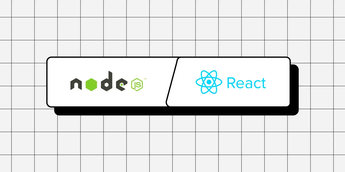
Node.js and React.js are two popular technologies in web development, but they serve different purposes within the development stack. Node.js is a runtime environment used for backend services, while React is a front-end library focused on building user interfaces of web applications (frontend development).

Node.js and React.js are often used together in full-stack JavaScript applications to handle both server and client-side tasks effectively. Let’s examine them up close and decide if this pairing is fit for your project.

No designers to help you create a UI of your app? No problem! Design it on your own with a developer-friendly UI builder. Build user-friendly, responsive interfaces that are scalable. Try UXPin Merge.

Design UI with code-backed components.

Use the same components in design as in development. Keep UI consistency at scale.

What is Node JS?

Node.js is an open-source, cross-platform runtime environment for executing JavaScript code outside of a browser. Historically, JavaScript was primarily used for client-side scripting, where scripts written in JavaScript would run on the client’s browser and make web pages interactive.

However, Node.js allows developers to use JavaScript for server-side scripting—running scripts server-side to produce dynamic web page content before the page is sent to the user’s web browser. Thus, Node.js represents a “JavaScript everywhere” paradigm, unifying web application development around a single programming language, rather than different languages for server side and client side scripts.

Node.js operates on the V8 JavaScript engine—the same runtime used by Google Chrome—which compiles JavaScript directly into native machine code. This execution model provides high performance and low latency, making Node.js particularly well-suited for data-intensive real-time applications that run across distributed devices.

Moreover, Node.js uses an event-driven, non-blocking I/O model, which makes it lightweight and efficient, ideal for environments with high data throughput but low computational power requirements, such as web servers.

The ecosystem around Node.js is vast, with a thriving and active community. It uses npm (Node Package Manager), the largest ecosystem of open source libraries that can be easily installed and added to any project, thus enhancing functionality and reducing development time.

Who uses Node JS

Over the years, Node.js has become a foundational element for many web technologies, fostering innovative platforms and tools such as the MEAN (MongoDB, Express.js, AngularJS, and Node.js) stack, which simplifies the development of full-stack applications entirely in JavaScript. This extensive use and support have cemented Node.js as a pivotal technology in modern web development.

Several high-profile companies have adopted Node.js for various parts of their applications due to its efficiency and scalability.

  1. Netflix — The streaming platform uses Node.js to handle its server-side operations for its streaming service, which demands low latency and high concurrency. This shift has significantly reduced startup time and improved the overall performance of their application.
  2. PayPal — It has transitioned from Java to Node.js for its web applications, which resulted in faster response times and quicker development cycles. The company reported that using Node.js allowed them to handle double the requests per second at a fraction of the response time compared to their previous Java application.
  3. LinkedIn — Other notable examples include LinkedIn, which utilizes Node.js for its mobile app backend, vastly improving the app’s performance and load times.
  4. Uber — It employs Node.js in its massive matching system, valuing the platform’s ability to handle a huge volume of network requests efficiently and effectively.

These companies’ use of Node.js not only highlights its capabilities in handling web-scale applications but also illustrates the growing trend of JavaScript usage across the full stack of technology development, confirming Node.js’s role as a key component in modern web architectures.

Pros and cons of Node JS

Advantages of Node JS

Node.js offers numerous advantages that make it a preferred platform for developers working on various types of projects, especially web-based applications. Here are some of the key advantages:

  1. Speed and Efficiency: Node.js leverages the V8 JavaScript Engine from Google, which compiles JavaScript directly into native machine code. This allows for faster execution of applications. Its event-driven architecture and non-blocking I/O operations further enhance its speed and efficiency, making it suitable for handling data-intensive real-time applications.
  2. Scalability: One of the core strengths of Node.js is its scalability. The event loop, as opposed to traditional threading, allows Node.js to perform non-blocking I/O operations. This means Node.js can handle numerous connections simultaneously, making it ideal for high-load applications like live chat apps, online gaming, and collaboration tools.
  3. Unified Programming Language: Node.js uses JavaScript, which is traditionally a client-side programming language. This allows developers to use a single language for both server-side and client-side scripts. This unification helps streamline the development process, as the same team can manage the entire code base, reducing context switching and redundancy.
  4. Robust Technology Stack: Node.js is a key component of various stacks, such as the MEAN stack (MongoDB, Express.js, AngularJS, and Node.js), which allows developers to build powerful and dynamic web applications using end-to-end JavaScript. This integration simplifies the development process and accelerates the delivery of applications.
  5. Strong Community Support: With a vast and active community, Node.js developers have access to countless modules and tools available through npm (Node Package Manager). This extensive ecosystem ensures that developers can find libraries and tools for nearly any functionality they need to implement, significantly speeding up the development process.
  6. Cross-Platform Development: Node.js supports cross-platform development and can be deployed on various operating systems including Windows, macOS, and Linux. This makes it easier for developers to write code that runs seamlessly across different platforms.
  7. Ideal for Microservices Architecture: Node.js fits well with microservices architecture due to its lightweight and modular nature. Companies looking to break down their applications into smaller, interconnected services find Node.js a suitable choice due to its ability to handle asynchronous calls and its efficiency with I/O operations.
  8. Corporate Backing: Node.js has robust corporate support from major tech giants like Microsoft, Google, and IBM, which helps in ensuring continuous development and reliability. This backing also reassures businesses adopting Node.js of its capabilities and long-term viability.

These advantages make Node.js a compelling option for both startups and large enterprises looking to develop efficient, scalable, and innovative web applications.

Weak spots of Node JS

While Node.js offers numerous advantages and is a popular choice for many development scenarios, there are some drawbacks that should be considered when deciding whether it’s the right tool for your project. Here are some of the cons of using Node.js:

  1. Performance Limitations with CPU-Intensive Tasks: Node.js is not suitable for heavy computational tasks. Its single-threaded nature can become a bottleneck when handling CPU-intensive operations. Such tasks can block the event loop, leading to delays in processing other concurrent activities. This makes Node.js less ideal for applications that require complex calculations, image processing, or large data transformations on the server-side.
  2. Callback Hell: Node.js heavily relies on asynchronous code which can lead to what is known as “callback hell” or “pyramid of doom,” where there are multiple nested callbacks. This can make the code hard to read and maintain. Although this issue can be mitigated with modern features such as Promises and async/await, it remains a challenge for beginners or in legacy codebases.
  3. API Stability: In the past, Node.js has faced issues with API stability, where frequent changes have led to backwards-incompatible updates. Although this has improved significantly with the establishment of a stable LTS (Long Term Support) version, rapid changes can still pose a challenge for maintaining and upgrading applications.
  4. Understanding Asynchronous Programming: Asynchronous programming is a core concept in Node.js, and it requires a different mindset compared to traditional linear programming approaches. Developers new to asynchronous programming may find it difficult to understand and implement effectively, which can lead to errors and inefficient code.
  5. NPM Ecosystem Quality: While npm provides a vast number of packages, the quality of these packages can vary significantly. Some packages may be poorly maintained, lack proper documentation, or have security vulnerabilities. The open nature of the npm repository requires developers to be meticulous in choosing reliable and secure packages.
  6. Heavy Reliance on Outside Libraries: Due to JavaScript’s historically limited functionality on the server-side, Node.js applications often rely heavily on middleware and external libraries to handle basic functionalities like routing, security, and interacting with databases. This can sometimes increase complexity and the risk of dependency issues.
  7. Divergence from Conventional Server-Side Programming: Developers familiar with more traditional, multi-threaded server environments (such as Java EE or .NET) might find Node.js’s single-threaded, event-driven architecture challenging. This can require a significant shift in design paradigm and adjustment in development practices.
  8. Developer Expertise and Resources: While JavaScript is widely known among developers, Node.js’s particular style of server-side development may require additional learning or expertise. Companies might face challenges finding developers who are proficient in the nuances of full-stack JavaScript development.

What is React JS

React.js, unlike Node.js, is a client-side JavaScript library developed by Facebook, designed for building user interfaces, particularly for single-page applications where a dynamic interaction model is necessary.

It is used primarily for handling the view layer of web applications, enabling developers to describe their interfaces in terms of a state that changes over time.

React uses a declarative paradigm that makes it easier to reason about your application and aims to be both efficient and flexible. It designs simple views for each state in your application, and when your data changes, React efficiently updates and renders just the right components.

Comparing Node JS vs React JS

Execution Environment

  • Node.js: Runs scripts on the server-side, enabling JavaScript to execute outside the browser. It is used mainly for back-end services like APIs, server logic, database operations, and handling asynchronous operations across a network.
  • React.js: Operates on the client-side, within the user’s browser, to enhance the interface interaction. It can also be rendered server-side using Node.js to improve performance and SEO.

Architecture

  • Node.js: Utilizes an event-driven, non-blocking I/O model that makes it lightweight and efficient, suitable for data-intensive environments that require real-time operations across distributed devices.
  • React.js: Employs a virtual DOM (Document Object Model) that optimizes interactions and updates by re-rendering only parts of the page that have changed, rather than reloading entire views.

Use Case

  • Node.js: Ideal for developing server-side applications where scalability and high concurrency are necessary, such as web servers and RESTful APIs that interact with client applications.
  • React.js: Best suited for developing highly interactive user interfaces and web applications where state management and responsive, real-time updates are crucial.

Development Model

  • Node.js: Encourages modular, asynchronous programming and is heavily reliant on its vast ecosystem, including npm for managing packages.
  • React.js: Promotes component-based architecture, allowing developers to build reusable UI components that manage their state, then compose them to make complex user interfaces.

Integrating Node JS and React JS

While Node.js and React.js can function independently, they are often used together in full-stack JavaScript applications. Node.js can serve as the back-end, handling API requests, interacting with databases, and serving files and React applications, while React runs in the browser, presenting the user interface and making asynchronous calls to the server.

This synergy allows developers to use JavaScript consistently across both client side and server side, streamlining the web development process and reducing the complexity of using different languages for different environments.

In summary, React.js is focused on building user interfaces and improving the interaction experience on the client-side, complementing Node.js’s capabilities on the server-side. Together, they offer a comprehensive approach to developing modern web applications.

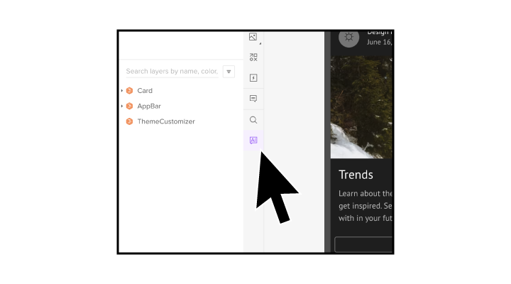
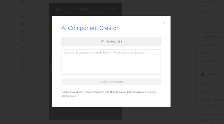
Build a React app UI with UXPin Merge

UXPin Merge allows you to use real, production-ready React components to build responsive and highly interactive interfaces. What you design is precisely what gets built, the tool ensures full consistency between UI design and the final product and faster deployments of high-quality products. Try UXPin Merge for free.

Tailwind vs Material UI – Full Comparison

Tailwind CSS vs MUI

Most front-end developers are aware that a front-end framework can make or break your project. In this article, we’ll compare two of the most popular styling and UI component libraries – Tailwind CSS and Material UI. Both offer unique strengths and cater to different developer needs, but how do you decide which one is right for you? Let’s dive into a side-by-side comparison that will help you make an informed decision.

Do you want to quickly test which is better for you – Tailwind vs Material UI? UXPin Merge’s trial comes with imported Tailwind UI and MUI libraries that you can prototype with. Start your trial, pick one of the libraries in UXPin’s editor, build your design, and copy the ready code to see which one fits you better.

UXPin Merge is a prototyping tool that renders components as code, not pixels, so you can quickly move from design to development with no hurdles. Try UXPin Merge for free.

Design UI with code-backed components.

Use the same components in design as in development. Keep UI consistency at scale.

Tailwind CSS

Tailwind CSS has taken the web development world by storm with its utility-first approach. Rather than providing predefined components, Tailwind offers a set of low-level utility classes that let you build custom designs without leaving your HTML. This methodology promotes rapid development and exceptional flexibility, allowing developers to create highly bespoke interfaces.

  • Customization at its Core: Tailwind allows you to style your components directly within your HTML, offering unparalleled control and customization.
  • Speedy Development: By using utility classes, you can prototype and build faster, eliminating the need to write custom CSS from scratch.
  • Responsive Design Made Easy: Tailwind’s responsive utility classes enable you to design for multiple screen sizes effortlessly.
  • Community and Ecosystem: With a growing community and a rich ecosystem of plugins, Tailwind ensures you have the tools and support you need.

Who uses Tailwind?

Tailwind CSS is used by a diverse range of companies and developers across various industries. Some notable organizations and platforms that use Tailwind CSS include:

  1. GitHub: GitHub uses Tailwind CSS for several of its interfaces, leveraging its utility-first approach for rapid and flexible development.
  2. Laravel: The Laravel framework has integrated Tailwind CSS into its ecosystem, making it a popular choice among developers within the Laravel community.
  3. Dev.to: The popular developer community and blogging platform Dev.to utilizes Tailwind CSS for its frontend design, benefiting from its customizable utility classes.
  4. Statamic: Statamic, a CMS for static site generation, uses Tailwind CSS to provide a sleek and efficient user interface.
  5. Algolia: Algolia, a powerful search-as-a-service platform, incorporates Tailwind CSS in its documentation and various web interfaces.
  6. Vercel: Vercel, a platform for frontend frameworks and static sites, uses Tailwind CSS for its documentation and marketing pages.
  7. Superhuman: The email client Superhuman uses Tailwind CSS for its sleek and fast user interface, highlighting its efficiency and customizability.

These examples illustrate the versatility and popularity of Tailwind CSS across various sectors, from large tech companies to individual developers and small startups.

Material UI

Material UI (called MUI by front-end devs) is a React component library that implements Google’s Material Design philosophy. It provides a comprehensive set of pre-styled components that follow best practices in user experience design, making it a go-to choice for developers seeking consistency and modern aesthetics.

  • Ready-to-Use Components: Material UI comes with a vast array of pre-built components that adhere to Material Design guidelines, ensuring a cohesive look and feel across your application.
  • Theming and Customization: While the components are pre-styled, Material UI offers robust theming capabilities, allowing you to tweak and customize the look to match your brand.
  • Accessibility and Performance: Built with accessibility in mind, Material UI components are optimized for performance, providing a seamless user experience.
  • React library: Material UI leverages the power of React’s component-based architecture, making it a natural fit for React projects.

Who uses MUI?

MUI is widely used by various companies and organizations, ranging from startups to large enterprises, due to its comprehensive set of pre-styled components and adherence to Material Design guidelines.

Here are some notable examples of organizations and platforms that use Material UI:

  1. Netflix: The streaming giant utilizes Material UI for certain internal tools and applications, benefiting from its component-driven architecture and consistent design.
  2. Spotify: The popular music streaming service leverages Material UI for some of its web applications, ensuring a cohesive and modern user experience.
  3. Nasa: NASA uses Material UI in some of their data visualization and internal tools, taking advantage of its robust and accessible components.
  4. Amazon: Parts of Amazon’s internal dashboards and tools are built using Material UI, providing a streamlined and efficient development process.
  5. Shutterstock: The stock photography company incorporates Material UI in their web applications, ensuring a clean and professional look across their platform.
  6. Blue Origin: Jeff Bezos’s aerospace manufacturer and sub-orbital spaceflight services company uses Material UI for some of their internal tools and applications.
  7. Hootsuite: The social media management platform uses Material UI to provide a consistent and user-friendly interface for its customers.

The framework’s versatility and adherence to Material Design principles make it a popular choice for companies looking to build modern, responsive, and accessible web applications.

How to Choose Between Tailwind CSS and Material UI

Choosing between Tailwind CSS and Material UI ultimately boils down to your project requirements and personal preference.

If you thrive on granular control and customization, Tailwind’s utility-first approach will be your best friend. On the other hand, if you prefer a structured, component-driven framework with a focus on consistency and rapid development, Material UI might be the way to go.

Design Approach and Philosophy

  • Tailwind CSS:
    • Utility-First: Tailwind CSS is a utility-first CSS framework, providing low-level utility classes that enable developers to build custom designs directly in their HTML. This approach promotes rapid prototyping and high flexibility.
    • Customization: Tailwind offers extensive customization options, allowing developers to configure their styles and create a unique design system.
  • Material UI:
    • Component-First: Material UI is a React component library based on Google’s Material Design guidelines. It provides pre-built, styled components that ensure a consistent and cohesive user experience.
    • Design Consistency: Material UI focuses on maintaining consistency across applications by adhering to Material Design principles.

Development Speed and Workflow

  • Tailwind CSS:
    • Rapid Prototyping: The utility-first approach allows for quick styling changes directly in the markup, making it easier to iterate on designs.
    • Learning Curve: Developers might need to adjust to using utility classes instead of traditional CSS methods.
  • Material UI:
    • Out-of-the-Box Components: Material UI provides ready-to-use components, which can speed up the development process by reducing the need to build and style components from scratch.
    • React Integration: Seamlessly integrates with React, leveraging React’s component-based architecture for building complex UIs.

Customization and Flexibility

  • Tailwind CSS:
    • Highly Customizable: Tailwind’s configuration file allows developers to define their styles, color schemes, and spacing scales, offering extensive customization.
    • Component Libraries: While Tailwind is primarily utility-based, developers can create or use component libraries that fit within the Tailwind ecosystem.
  • Material UI:
    • Theming and Styling: Material UI offers theming capabilities, allowing developers to customize the appearance of components to match their brand’s design language.
    • Limited by Design Guidelines: Customization is possible, but components are designed to follow Material Design guidelines, which might limit flexibility for highly unique designs.

Community and Ecosystem

  • Tailwind CSS:
    • Growing Ecosystem: Tailwind CSS has a rapidly growing ecosystem with plugins, themes, and tools that enhance its functionality.
    • Community Support: A vibrant community and extensive documentation provide support and resources for developers.
  • Material UI:
    • Mature Library: Material UI is a well-established library with a strong community, extensive documentation, and numerous examples and tutorials.
    • Comprehensive Component Set: Provides a wide range of components, from basic UI elements to more complex features like data tables and charts.

Performance Considerations

  • Tailwind CSS:
    • Smaller CSS Bundle: By using PurgeCSS, Tailwind can significantly reduce the size of the final CSS bundle by removing unused styles, leading to better performance.
    • Custom Builds: Tailwind’s configuration allows for creating custom builds tailored to the specific needs of a project.
  • Material UI:
    • Optimized Components: Material UI components are optimized for performance, but the library’s size can be a consideration for highly performance-sensitive applications.
    • Tree Shaking: Supports tree shaking to remove unused components and reduce bundle size.

Use Cases

  • Tailwind CSS:
    • Custom Designs: Ideal for projects that require highly custom, bespoke designs and where developers want full control over the styling.
    • Rapid Prototyping: Useful for quickly prototyping and iterating on UI designs.
  • Material UI:
    • Consistent UI: Perfect for applications that benefit from a consistent, polished look and adhere to Material Design principles.
    • React Projects: Best suited for React-based projects where ready-to-use, styled components can significantly speed up development.

Can you use Tailwind and MUI together?

Yes, you can use Material UI (MUI) with Tailwind CSS in a project. Integrating these two can allow you to leverage the utility-first approach of Tailwind CSS for rapid styling while also using MUI’s pre-built, highly customizable React components.

While specific examples of companies or high-profile projects that publicly acknowledge using both Tailwind CSS and Material UI together might not be as readily available, the combination is certainly popular among individual developers and smaller projects. It gives developers flexibility, rapid development capabilities, and ability to maintain a consistent and polished UI.

Better option: Tailwind CSS with Tailwind UI

Tailwind UI is a premium component library created by the makers of Tailwind CSS. It provides a collection of professionally designed, fully responsive UI components built using Tailwind CSS. These components help developers quickly build beautiful and consistent user interfaces without having to start from scratch.

How Tailwind UI Fits into Tailwind CSS

  1. Complementary Tool: Tailwind UI is a natural extension of Tailwind CSS. While Tailwind CSS provides the utility-first framework for creating custom designs, Tailwind UI offers a collection of pre-built components that can be directly used in projects.
  2. Efficiency and Speed: Tailwind UI enhances the efficiency of Tailwind CSS by allowing developers to quickly assemble UIs from a library of components. This is especially useful for prototyping and MVP development.
  3. Consistent Design Language: Using Tailwind UI ensures a consistent design language across the application since all components follow the same design principles and are built using Tailwind CSS.
  4. Educational Resource: Tailwind UI also serves as an educational resource, demonstrating how to use Tailwind CSS effectively. Developers can learn best practices and advanced techniques by examining how Tailwind UI components are constructed.
  5. Integration: Integrating Tailwind UI components into a Tailwind CSS project is straightforward. Developers can copy the HTML structure and corresponding utility classes from Tailwind UI and paste them into their Tailwind CSS-based project. From there, they can further customize the components as needed.

Using Tailwind UI in UXPin

UXPin Merge has a built-in Tailwind UI library. You can take the CSS components and build fully functional prototypes with them.

Nest components together to create complex elements or use “Custom Component” tile to paste in pre-built sections that are posted at Tailwind UI website.

Can’t find a section you like? Use AI Component Creator to generate one based on your prompt. See a full tutorial of using component creator here.

Using MUI in UXPin

If you want to build a React app, use the MUI library in UXPin. We integrated UI components that allow you to build fully functional and responsive React interfaces.

You can style them anyway you like and even bring more components if you like to. Follow this tutorial to see how to build your prototype: Dashboard Example.

What Do We Recommend – Tailwind vs Material UI?

Both Tailwind CSS and Material UI are powerful tools in a developer’s arsenal. Your choice will depend on your need for customization versus convenience, and how closely you want your project to adhere to Material Design standards. Whatever you choose, both frameworks promise to enhance your development workflow and help you build beautiful, responsive web applications.

UXPin Merge is a powerful tool that transforms the way design and development teams collaborate, offering a unified platform where designs are directly linked to the production code. This innovation not only speeds up the workflow but also ensures a high level of accuracy and consistency, making it an indispensable tool for modern design teams aiming to create high-quality digital products efficiently. Try UXPin Merge for free.

Material UI vs Bootstrap – What to Use?

MUI vs Bootstrap

When it comes to building responsive, aesthetically pleasing web applications, two frameworks often come into the spotlight: Material UI and Bootstrap. Both are powerful tools in a developer’s arsenal, each with unique strengths and philosophies. Let’s dive into a comparative analysis of these two front-end giants to help you decide which one aligns best with your project needs.

Build your React app’s interface with code-backed MUI or React-Bootstrap components. Drag and drop coded components on the canvas and design an interface that’s interactive and production-ready by default. Save your time on translating design to code. Try UXPin Merge.

Design UI with code-backed components.

Use the same components in design as in development. Keep UI consistency at scale.

Material UI

Material UI (known as MUI) is a React component library that implements Google’s Material Design rules. It is renowned for its clean, modern aesthetics and comprehensive component set, making it a favorite among developers who value design consistency and user experience.

Key Features of MUI

  • Design Philosophy: Material UI adheres strictly to Material Design principles, offering a cohesive and visually appealing design language that promotes user familiarity and intuitiveness.
  • Component Library: MUI boasts a rich library of pre-built, customizable components designed to work seamlessly out of the box, reducing the need for extensive custom styling.
  • Customization: MUI provides robust theming capabilities, allowing developers to tweak and personalize the appearance to align with their brand’s identity.
  • React Integration: As a React-specific library, MUI leverages the power of React’s component-based architecture, making it ideal for developers working within the React ecosystem.
  • Accessibility: Material UI components are built with accessibility in mind, ensuring that web applications are usable by everyone, including those with disabilities.

Ideal Projects for Material UI

  1. React-Based Applications: Material UI is specifically designed for React, providing seamless integration and development experience.
  2. Projects Requiring Consistent Design Language: Ensures a consistent and cohesive user interface across different parts of the application.
  3. Applications with Complex UI Components: Offers a comprehensive set of pre-built components such as tables, forms, buttons, modals, and navigation elements.
  4. Projects Prioritizing Accessibility: Follows best practices to ensure usability by people with disabilities.
  5. Applications Needing Custom Theming: Provides robust theming capabilities for easily modifying and extending default themes.
  6. Projects with Agile Development Processes: Suitable for agile development, where requirements may change frequently, and iterative improvements are common.

Bootstrap

Bootstrap is one of the most popular CSS frameworks, widely adopted for its simplicity and flexibility. It provides a solid foundation for building responsive web designs and is known for its extensive grid system and pre-designed components.

Key Features of Bootstrap

  • Design Philosophy: Focuses on utility and ease of use, providing a straightforward, grid-based approach that simplifies responsive web design.
  • Component Library: Offers a comprehensive set of components ranging from navigation bars and forms to modals and carousels.
  • Customization: Highly customizable with CSS overrides or built-in SASS variables to tailor the design.
  • Flexibility: Utility classes make it easy to apply consistent styling and responsive behaviors across different elements.
  • Community and Documentation: Extensive documentation and a large community provide abundant resources for troubleshooting, learning, and enhancing development processes.

Ideal Projects for Bootstrap

  1. Responsive Web Design: Bootstrap’s grid system and responsive utilities make it easy to create layouts that adapt to different screen sizes and devices.
  2. MVP or PoC Projects: Enables developers to quickly build and iterate on designs with a wide range of pre-designed components and utility classes.
  3. Admin UI Panels: Ideal for building feature-rich admin interfaces with its comprehensive set of components.
  4. Landing Pages: Popular choice for creating attractive and responsive landing pages with easy-to-use components and extensive customization options.
  5. Educational and Non-Profit Websites: Allows educational institutions and non-profits to create functional and appealing websites without extensive development resources.
  6. Documentation and Resource Sites: Components such as alerts, badges, and panels make it easy to create well-structured and readable documentation sites.

Comparative Analysis: Material UI vs Bootstrap

Responsive Design

Bootstrap:

  • Renowned for its 12-column grid system, which is highly flexible and easy to use.
  • Offers numerous utility classes to control visibility and layout on different devices.

Material UI:

  • Supports responsive design through its Grid component, based on CSS Flexbox, for dynamic and flexible layouts.
  • Provides customizable breakpoints for different screen sizes.

Verdict: Both frameworks excel in responsive design, but Bootstrap’s grid system is often considered more straightforward for beginners due to its extensive documentation.

Performance

Bootstrap:

  • Can be heavier due to extensive use of CSS and JavaScript, but optimization (like using PurgeCSS) can significantly improve performance.
  • Load times can be affected by unused components if not optimized properly.

Material UI:

  • Designed with performance in mind, leveraging React’s efficient rendering.
  • Supports tree shaking to remove unused code, improving load times and performance.

Verdict: Material UI tends to have an edge in performance due to its React-based architecture and tree shaking capabilities, although Bootstrap can perform well with proper optimization.

Rapid Development

Bootstrap:

  • Comes with a vast library of pre-designed components, speeding up the development process.
  • Simple to integrate with any web project, ideal for quick prototyping and development.

Material UI:

  • Provides a rich set of pre-built components following Material Design guidelines for rapid development of modern interfaces.
  • Seamlessly integrates with React, leveraging React’s powerful features for faster development.

Verdict: Both frameworks support rapid development, but Material UI’s React integration can make it faster for React-based projects, while Bootstrap’s simplicity and wide usage make it great for quick setups.

Flexibility

Bootstrap:

  • Highly customizable with SASS variables, allowing extensive tweaking of styles and components.
  • Offers numerous utility classes for flexible styling and layout adjustments.

Material UI:

  • Offers robust theming capabilities for creating custom themes across the application.
  • Provides flexibility in customizing components through props, themes, and custom styling.

Verdict: Material UI offers more advanced theming and customization options, especially beneficial for React projects, while Bootstrap provides straightforward customization through utility classes and SASS variables.

Ease of Use

Bootstrap:

  • Known for its gentle learning curve and extensive documentation, making it accessible for beginners and experienced developers alike.
  • Wide adoption means numerous resources, tutorials, and community support are available.

Material UI:

  • Requires knowledge of React, which can be a barrier for developers not familiar with React.
  • Offers detailed documentation and a strong community, but the initial learning curve can be steeper for those new to React or Material Design.

Verdict: Bootstrap is generally easier to pick up for beginners due to its simplicity and extensive documentation, while Material UI might have a steeper learning curve but offers greater rewards for those familiar with React.

Conclusion: Which One to Choose?

Bootstrap is an excellent choice for projects that need quick, responsive design solutions with a low learning curve. It’s particularly useful for rapid prototyping and projects that need to be framework-agnostic.

Material UI, on the other hand, shines in React-based projects where a consistent design language and performance optimization are crucial. Its advanced theming and component customization capabilities make it ideal for projects requiring a modern, cohesive UI.

Choosing between Material UI and Bootstrap depends on your project’s specific needs, your familiarity with React, and your preference for customization versus simplicity. Both frameworks offer robust solutions for building responsive, high-quality web applications.

Build your app with code-backed MUI or React-Bootstrap components using UXPin Merge. Drag and drop these coded components directly onto the canvas to design an interface that’s interactive and production-ready from the start. No more time wasted translating design into code—UXPin Merge ensures your designs are ready for development right away. Try UXPin Merge for free.

Website Best Practices – Basic Tips for Better Web

design planning min

Crafting websites that are visually appealing and user-friendly is essential for business’ success.This guide will cover essential web design best practices, focusing on accessibility, grid design, consistency, and design systems. Whether you’re a seasoned professional or just starting in the field, these tips will help you leverage UXPin to create outstanding website prototypes.

With UXPin, a powerful prototyping tool, you can efficiently implement these best practices from the earliest stages of design, ensuring that your final product is both effective and inclusive. Try UXPin for free.

Build advanced prototypes

Design better products with States, Variables, Auto Layout and more.

Try UXPin

Accessibility Tips

Accessibility in web design ensures that your website is usable by everyone, including people with disabilities. This is not just a moral and legal obligation but also a practical one—an accessible website reaches a broader audience and can improve SEO rankings. Familiarize yourself with the Web Content Accessibility Guidelines (WCAG) to understand the standards you should aim for.

Incorporating Accessibility into Prototypes

Using UXPin, you can integrate accessibility features directly into your prototypes. Here’s how:

  • Text Readability: Ensure that text on your website meets WCAG guidelines for contrast ratios. UXPin allows you to experiment with different font sizes, colors, and typographic choices to find the perfect balance.
  • Keyboard Navigation: Test your prototype for keyboard accessibility by simulating how users navigate through your site without a mouse. Ensure that all interactive elements are easily accessible.
  • ARIA Roles and Labels: Add ARIA (Accessible Rich Internet Applications) roles and labels in UXPin to make sure assistive technologies can interpret your site’s elements correctly.

Testing for Accessibility Early

Testing for accessibility should not be an afterthought. Use UXPin’s built-in features to simulate screen readers and test your design with different assistive technologies. Conduct usability testing with diverse user groups to gather feedback and make necessary adjustments early in the design process.

Grid Design Tips

Grids are the backbone of any well-structured website, providing a framework that guides the placement of elements in a consistent and aesthetically pleasing way. Understanding the types of grids—fixed, fluid, and responsive—will help you decide which is best for your project.

Implementing Grids in UXPin

Setting up a grid system in UXPin is straightforward:

  • Responsive Grids: Create and save grid layouts to adjust your design to different screen sizes.
  • Visual Harmony: Maintain visual balance by aligning text, images, and other elements to your grid, ensuring a clean and organized layout.

Best Practices for Grid Usage

Consistency is key when applying grids. Ensure that your grid system is uniformly applied across all pages. This not only helps in maintaining a cohesive design but also makes the site more intuitive for users.

Consistency Tips

Consistency in design builds trust and reduces cognitive load for users. When elements behave predictably, users can navigate your site with ease, leading to a better overall experience.

Ensuring Visual and Functional Consistency

UXPin’s components and design libraries are invaluable for maintaining consistency:

  • Color Schemes and Typography: Develop a consistent color scheme and typographic hierarchy that is applied across all pages.
  • Code-Backed Components: Try React or other code-backed UI components like buttons, forms, and navigation bars to ensure a uniform look and feel.

Maintaining Consistency Across Teams

Collaboration is easier when everyone is on the same page. UXPin allows teams to share libraries and components, ensuring that everyone follows the same design guidelines. Version control features in UXPin help keep track of changes and ensure consistency throughout the design process.

Content Design Tips

Content design is the practice of planning, creating, and organizing content to ensure it effectively communicates with users and supports their needs. It involves crafting clear, concise, and accessible text, visuals, and multimedia elements that guide users toward completing specific tasks or finding necessary information.

Incorporating Content Design in UXPin’s Prototypes

UXPin allows you to seamlessly integrate content design into your prototypes, ensuring that your content is user-focused from the early stages of development. Here’s how to incorporate content design in UXPin:

  • Content Structure: Use UXPin to prototype various content layouts, experimenting with different text structures, such as short paragraphs, bullet points, and subheadings. This helps you find the most readable and user-friendly format.
  • Visual Hierarchy: Implement visual hierarchy by adjusting font sizes, weights, and colors to emphasize important content. UXPin’s design tools let you create prototypes that prioritize content based on user needs.
  • Interactive Elements: Incorporate interactive content elements like buttons, forms, and links directly into your prototypes. UXPin allows you to test how these elements interact with content, ensuring a cohesive user experience.
  • Content Accessibility: Use UXPin to prototype accessible content by ensuring proper color contrast, adding alt text for images, and designing layouts that work well with screen readers. This ensures that your content is accessible to all users.

Best Practices for Content Design

To create effective content that resonates with users, follow these best practices:

  • Clarity and Conciseness: Keep content clear and to the point. Avoid jargon and complex language. Users should be able to understand the message quickly and easily.
  • User-Centered Content: Always design content with the user in mind. Consider what information users need at each stage of their journey and how they prefer to consume it.
  • Consistency: Maintain a consistent tone, style, and format across all content. This not only builds trust but also ensures that users can easily navigate and understand your site.
  • Engaging Visuals: Complement text with relevant visuals that enhance understanding. Use images, infographics, and videos that are directly related to the content to maintain user engagement.
  • Responsive Design: Ensure content is optimized for all devices, especially mobile. Test your content on various screen sizes in UXPin to ensure it is readable and visually appealing across platforms.
  • Continuous Testing and Iteration: Regularly test your content with real users and iterate based on feedback. UXPin’s prototyping features make it easy to update content and test different versions to find what works best.

By integrating these practices into your design process, you can create content that is not only informative but also engaging and accessible, providing a superior user experience across all platforms.

Performance Tips

Taking care of website’s performance is one of the most important website best practices these days. A slow-loading website can lead to high bounce rates and poor user experience, which ultimately affects your site’s success. As a designer using UXPin, you can take several steps to ensure your website prototypes are optimized for speed from the ground up.

Optimizing Image Sizes and Formats

Images are often the largest files on a webpage, making them a primary target for optimization:

  • Choose the Right Format: Use the appropriate image format based on the content. For instance, use JPEGs for photographs, PNGs for images with transparency, and SVGs for icons and logos. WebP is also an excellent option for smaller file sizes with good quality.
  • Compress Images: Before uploading images to UXPin, use tools like TinyPNG or ImageOptim to reduce file sizes without sacrificing quality.
  • Responsive Images: Use UXPin to design responsive images that adjust based on the user’s screen size. Implementing srcset attributes ensures that the browser loads the correct image size for each device, reducing unnecessary data load.

Reducing File Sizes with Efficient Use of Assets

Every asset on a page—whether it’s CSS, JavaScript, or images—contributes to the load time:

  • Minimize and Combine Files: Use tools that combine and minify CSS and JavaScript files to reduce the number of HTTP requests and overall file sizes.
  • Reuse Components: Design reusable components in UXPin to avoid creating multiple versions of the same element, which can bloat file sizes. A single well-designed component can be reused across different pages, keeping your design lean.
  • Lazy Loading: Implement lazy loading for images and videos, where media is only loaded when it comes into view. This technique helps reduce initial load time and saves bandwidth for users who may not scroll through the entire page.

Optimizing Typography and Fonts

Fonts can significantly impact website performance if not handled properly:

  • Choose System Fonts: Whenever possible, use system fonts that don’t require additional downloads. This ensures faster rendering and better performance.
  • Limit Web Fonts: If you’re using custom web fonts, limit the number of font families and weights to reduce the amount of data that needs to be downloaded. Use font-display: swap; to improve perceived performance by showing fallback fonts until the custom fonts are fully loaded.
  • Font File Compression: Ensure that font files are compressed (e.g., using WOFF2 format) to reduce their size.

Design System Tips

Another website best practices is designing a website based on a design system. A design system is a collection of reusable components and guidelines that standardize your design process. It helps scale your design efforts across different projects, ensuring consistency and efficiency.

Building a Design System in UXPin

UXPin is an excellent tool for creating and managing design systems:

  • Component Libraries: Create and maintain a library of reusable components that can be easily updated and shared across projects.
  • Integration with Git or Storybook: UXPin’s integration with Git or Storybook allows for seamless updates and management of your design system.

Scaling and Evolving Your Design System

As your design needs evolve, so should your design system. Regularly review and update your design system to incorporate new trends, technologies, and feedback from users. This ensures that your design system remains relevant and effective.

Implement Website Best Practices Now

By following these best practices for accessibility, grid design, consistency, performance, and design systems, you can create websites that are not only visually appealing but also user-friendly and inclusive. UXPin provides all the tools you need to implement these practices efficiently, from the earliest stages of prototyping to the final product.

Remember, the key to a successful website is not just in how it looks but in how it works for all users. Start applying these best practices in your next UXPin project and take your web design to the next level. Try UXPin for free.

User Flows – How to Create Perfect User Flows for Smooth UX

User flow

User flows are integral to the UX design process. These valuable UX artifacts help product teams visualize flows and processes from users’ perspectives to reduce errors and enhance the user experience.

This article takes a deep dive into user flows, their importance, the principles that guide them, the visual representations, and the various types of flows.

Create user flows and design advanced prototypes with UXPin, an all-in-one design tool that covers every part of your design process, from ideation to design handoff. Build your first prototype today. Sign up for a free trial.

Build advanced prototypes

Design better products with States, Variables, Auto Layout and more.

Try UXPin

What is User Flow in UX?

A user flow is a graphic visualization representing the sequence of steps, decisions, and actions users perform while navigating a digital product, app, or website.

Product teams typically focus on one task or goal at a time, such as an onboarding sequence or eCommerce checkout. Designers build prototypes of these user flows to test the user experience with usability participants and stakeholders, iterating on feedback until they have a product ready for development.

Importance of User Flows in UX Design

User flows help product teams visualize the paths users take through an application or website to complete a specific task or achieve a goal. This visualization enables teams to identify friction points and opportunities within user flows and design solutions to fix them. 

Additionally, designers can look at optimizing flows to create more efficient and satisfying user experiences.

testing observing user behavior

Benefits of a well-designed UX flows

A well-designed user flow offers many important benefits for users and the organization:

  • Improves usability: optimized user flows feel intuitive, simplifying decision-making while reducing cognitive load, resulting in a user-friendly experience where users don’t get lost or frustrated. 
  • Better retention: when a digital product meets user needs, allowing them to complete tasks and achieve goals, they’re more likely to keep using it and share their positive experience.
  • Higher conversions: streamlining user flows removes roadblocks and obstacles for tasks that generate revenue for the business, like signups, purchases, subscriptions, etc.
  • Reduce costs: optimized user flows remove redundant screens and features, resulting in many cost-savings, including design, development, maintenance, server requests, API usage, etc.
  • Improved accessibility: design teams can visualize and optimize user flows to meet accessibility requirements, making user interfaces more inclusive while increasing the product’s user base.
  • Data-driven design decisions: analyzing user flows provides valuable insights into user behavior and preferences, allowing designers to make informed decisions based on actual data rather than assumptions. Data-driven design decisions deliver products and experiences that meet user needs, making them more intuitive, enjoyable, and user-friendly.

UX Principles of Effective User Flows

team collaboration talk communication

Successful user flows incorporate UX principles that guide design concepts and decision-making. Here are some fundamental UX principles to consider when designing user flows:

Clarity and simplicity

Your user flows must be easy to understand and navigate. Avoid complex designs or features that people must learn before using them. Navigation and interaction elements must be consistent, predictable, and straightforward. When you force people to overthink a process or interaction, they’ll abandon it for an easier option, even at a higher cost.

Consistency

Maintain a consistent design language, layout, patterns, and interaction design throughout your product and user flows. Design consistency increases familiarity resulting in a more intuitive, user-friendly experience.

Flexibility

Design flows that cater to different needs, preferences, and abilities by offering multiple ways to complete tasks–for example, providing alternate paths, shortcuts, or input methods.

Feedback and communication

UI feedback guides users and manages expectations as they navigate user flows–for example, progress indicators, visual cues, status information, messages (success, error, etc.), and alerts. This communication informs users of the system status, whether their action was successful, and what to do next.

Anticipate user needs

Designers can utilize user research to predict and address user needs to prevent obstacles and roadblocks. Adding helpful tips and error prevention features enables users to solve problems faster for more efficient and streamlined flows.

Minimize steps

Designers can streamline user flows by eliminating unnecessary steps, actions, and decision points. Minimizing these points of friction increases efficiency while reducing errors and drop-offs.

Focus on user goals

Would you rather use a product that helps you achieve your objectives efficiently or one inundating you with business value proposals and other irrelevant content? Design user flows that prioritize the user’s goals and desired outcomes with features that enhance efficiency and success.

Accessibility and inclusivity

Ensure that users with diverse abilities, preferences, and devices can use your products, navigate flows, and complete tasks. Designers must consider how factors like font size, color contrasts, keyboard navigation, language, and screen-reader compatibility impact user experiences. Read more about accessibility here: Web Design Accessibility Checklist.

Types of User Flow Visualizations

Before we explore the user flow types, it’s important to explain the visualizations design teams use to map these journeys. 

Flowcharts

User flowcharts (user flow diagrams) are a diagramming technique used across many industries to represent the information flow, decision points, and user actions. These visualizations use symbols, arrows, and other shapes to depict elements, processes, decisions, and data input/output.

Wireflows

Wireflows combine wireframes and flowcharts to provide a detailed view of a user’s journey through an interface. These visualizations describe each screen’s layout as well as how users and information flow between them. 

Wireflows help visualize user interactions with specific elements and understand the context of these interactions. Designers and engineers can use these wireflows to visualize information architecture and navigation in greater detail.

Screen-flows

Screen-flows are annotated screenshots or mockups illustrating a user’s path through a product. These high-fidelity versions of wire-flows allow designers and stakeholders to visualize user flows in greater detail with screens that accurately represent the final product.

Storyboarding

Designers use storyboarding similarly to the film industry, using a series of illustrations, images, or screens to show a user’s journey. Storyboarding is helpful as it allows design teams to zoom out from the user flow and visualize a user’s environment and circumstances.

For example, if you’re designing an app for food delivery drivers, you’ll need to visualize the user flow from multiple perspectives:

  • Walking
  • Cycling
  • Scooter/motorbike
  • Car
  • Van

Storyboard combined with user flows helps design teams empathize with users better to deliver more relevant solutions.

Types of User Flows

Here are seven common user flow categories. Design teams can use the techniques and mediums above to visualize these user flows.

Task flows

Task flows represent the steps users must follow to complete a specific task. These flows focus on sequential user actions and decision points, often visualized using a flowchart. Task flows are particularly helpful for identifying pain points and optimizing user journeys.

Onboarding flows

Onboarding flows allow product teams to visualize and design the product’s initial setup and introduction. These flows incorporate account creation, tutorials, feature highlights, and personalization options to familiarize users and get them started quickly.

Conversion flows

Conversion flows are crucial for generating revenue and growth. These flows represent the steps toward a desired action or outcome–for example, newsletter signups, purchases, plan upgrades, etc. Designers typically aim to minimize friction and distractions for these flows to maximize conversion rates, upsells, and other revenue-generating activities.

Navigation flows

Navigation flows outline the structure and architecture of a digital product. These visualizations help design teams understand how users move between screens, sections, and features. They can use these insights to prioritize features and content so users can find things faster and complete tasks more efficiently.

Account management flows

Users often need to update account information like addresses, passwords, billing details, app preferences, subscriptions, etc. Account management flows allow designers to simplify these administrative experiences so users can return to more important tasks.

Error flows

Error flows allow design teams to simulate issues and design solutions to fix them. They can use these insights to improve the user flow and eliminate errors from occurring or create appropriate feedback for users to correct problems.

Offboarding flows

Offboarding flows guide users through discontinuing a product or service, like canceling a subscription or deleting their account. These flows must be as efficient as onboarding to minimize frustration, increasing the chances of winning back customers.

How to Create a User Flow in 8 Steps

Here is a step-by-step framework for creating user flows.

Define the goal and entry points

Identify the task or goal you want to analyzethis could be one of the above user flows or something specific to your product. This goal will help determine the scope and focus of your user flow and which visualization is most appropriate.

If you are designing a website user experience, another good practice before creating your flows is to determine and map out where your users are coming from. Based on Morgan Brown’s advice in Stop Designing Pages and Start Designing Flows, we’d recommend you consider the following sources for your web or mobile prototype:

  • Direct traffic
  • Organic search
  • Paid advertising
  • Social media
  • Referral sites
  • Email

Identify personas

Your product may have many user personas. Determine which of these is most relevant to the user flow. You may assess the user flow for multiple personas to ensure it meets everyone’s needs and expectations.

Screen Shot 2015-02-18 at 7.25.18 PM

For templates and helpful tips on creating personas, check out the chapter “Analyzing Users Before Diving Into Design” in the free ebook The Guide to UX Design Process & Documentation.

List user actions and decision points

Break down the user journey into a list of individual actions and decision points. Consider each step a user must take to achieve goals and their choices. For example, a signup screen might have several options, including email signup and multiple social logins. Each option will have a different path to completing the signup process.

Map the flow

Start by sketching your flows on paper or in a digital tool to iterate on many ideas fast. This should be a collaborative effort where team members share ideas and suggestions.

Once you have a basic outline, you can create your user flow in a design tool. UXPin offers five built-in design libraries, one of which is aptly named User Flows. UXPin’s User Flows library includes everything teams need to create and share user journeys, including:

  • Flow lines for every conceivable direction
  • Action blocks
  • Icon blocks
  • Labels
  • Devices (mobile, tablet, desktop)
  • Gestures

Here are a couple techniques for outlining your flow.

Writing-first Approach to Outlining a Flow

You can use the writing-first approach, which Jessica Downey writes about in her article Jumpstarting Your App Conception Without Sketching UI. This outlining method helps flesh out ideas and build a “common understanding” of each page of your app or site.

Let’s create one for, say, a banking app. The scenario: someone wants to turn on auto deposit. Note in the outline below, content in [brackets] represents action buttons/links.

Step 1: Would you like to set up auto deposit?

[Set auto-deposit]

Step 2: Select Deposit Frequency

[Once per month][Twice per month]

[Every other week][Every week]

Step 3: Deposit Once per Month

[Select calendar day]

Step 4: Set Amount

Display amount field

[Set auto-deposit]

Shorthand Approach to Outlining a Flow

You can also try  a shorthand approach used by Ryan Singer at Basecamp. Ryan’s approach treats flows as ongoing conversations.

For our banking app example above, we can create a shorthand for Steps 2 and 3 that looks something like this:

image01

To see how Singer demonstrates shorthand for Basecamp and how he can illustrates complex flows with this outlining process, check out A Shorthand for Designing UI Flows.

Add screens

If you’re designing a wireflow or screen-flow, you can add relevant wireframes, mockups, and screenshots depending on the level of fidelity you need for your user flow.

Include system feedback

Add system feedback and responses such as error messages, success notifications, or loading indicators. This detail will help designers and engineers create the appropriate UI components and content to guide users.

Review and iterate

Analyze the user flow for potential improvements, pain points, or friction. Share the visualizations with team members and stakeholders for feedback and iterate until you have a flow ready for prototyping.

Prototype and test

Create a prototype of your user flow in a design tool. UXPin’s built-in design libraries (iOS, Material Design, Bootstrap, and Foundation) provide designers with UI components and patterns for web and native applications. Drag and drop UI elements from the Design Libraries panel to create high-fidelity mockups you can test in the browser or use UXPin Mirror for mobile app testing.

Create fully interactive prototypes using advanced UXPin features to achieve results that accurately replicate the final product:

  • States: allow designers to create multiple states for a single UI element and design complex interactive components like accordions, carousels, steppers, and more.
  • Variables: capture data from user inputs and create personalized, dynamic user experiences–like a welcome message using data from the name field in a signup form.
  • Expressions: Javascript-like functions to create complex components and advanced functionality–no code required!
  • Conditional Interactions: create if-then and if-else conditions based on user interactions to create dynamic prototypes with multiple outcomes to accurately replicate the final product experience.

Enhance your user flows with high-quality prototyping and testing from UXPin. Start designing the user experiences your customers deserve with the world’s most advanced design tool. Sign up for a free trial.

The Difference Between Design Systems, Pattern Libraries, Style Guides & Component Libraries

design system vs component library

You’ll often see the terms design system, pattern library, component library, and style guide used interchangeably. While these concepts are connected, they refer to different parts of a whole.

There’s also confusion about a design system vs. a component library. Design systems have component libraries, but a component library is also a stand-alone ecosystem, like MUI, React-Bootstrap, and others.

Confusing? Don’t worry; this article will help define all of these terms and put everything into perspective. We also explore the benefits of design systems and component libraries and how designers and developers use these differently.

Integrate your design system directly into the design tool. Use UXPin Merge to design with dev-ready components and eliminate the discrepancies of design to code translation. This not only speeds up the handoff process but also ensures that your final product is visually consistent, user-friendly, and true to your brand. Discover UXPin Merge.

Reach a new level of prototyping

Design with interactive components coming from your team’s design system.

What is a Design System?

A design system is a complete set of design standards (style guide) and documentation accompanying a UI tool kit, including UI patterns, UX design principles, and components. When we look at a design system in this context, it incorporates everything designers and developers need to build and scale digital products.

Some other things you’ll find within a design system include:

  • Brand guidelines
  • Accessibility guidelines
  • UI Design guidelines
  • Governance
  • Best practices
  • Design system roadmap and releases
  • Code snippets
  • CSS variables & design tokens
  • UI kit (an image-based version of design system components)
  • Downloadable assets

Pattern Library vs. Component Library–What’s The Difference?

Another big cause for confusion is “the difference between a pattern library vs. a component library.” Most designers use these terms interchangeably. To some extent, that’s not incorrect, but it’s also not completely accurate.

The difference between components and patterns is best explained using Brad Frost’s Atomic Design methodology:

  • Atoms: The foundational design elements that you cannot break down further. For example, buttons, icons, forms, etc.
  • Molecules: Created by combining atoms to create larger UI components or patterns, like pagination, breadcrumbs, etc.
  • Organisms: Complex UI patterns comprising of atoms and molecules. These patterns shape a user interface with cards, navigation bars, logos, search fields, etc.
  • Templates: Complete layouts and wireframes which include atoms, molecules, and organisms. A template starts to resemble parts of a webpage or mobile application.
  • Page: A page brings everything together on one screen.
design system atomic library components 1

Using Atomic Design, we can define patterns and components as follows:

  • Component library (Atoms): A component is a reusable block of code that can stand alone or form part of multiple UI patterns–for example, a button. A component library is a collection of UI components within a design system.
  • Pattern library (Molecules & Organisms): A pattern is a group of components that designers use to solve usability issues–for example, a navbar with a logo, links, search form, and CTA button. A pattern library is a collection of UI patterns within a design system.

What is a Style Guide?

And lastly, we have a style guide. A style guide is a piece of documentation that provides context and instructions for a design system’s patterns and components–for example, color HEX codes, typography scales, usage, dos and don’ts, etc.

Design System vs. Component Library

When people talk about component libraries like MUI, React-Bootstrap, and others, things get even more confusing. Aren’t these design systems? 

Although these component libraries have extensive documentation and guidelines, they’re not design systems. Designers and engineers can use these open-source component libraries however they choose.

They can edit the library’s components without limitations (so that they’re indistinguishable from the original), build new patterns, combine with other libraries or create custom components.

A design system is different. Designers and engineers must use the components as building blocks. They must follow the system’s guidelines, style guide, principles, and other documentation to design consistent-looking user interfaces–like following the instructions to build a Lego set.

If team members want to change a component or introduce a new pattern, they must follow the design system’s governance procedures. In some cases, the design system team will have the final say about how to build that new component.

Design Systems in Practical Sense

Design systems might seem restrictive, but there’s a good reason for these processes and protocols. Let’s take Atlassian as an example. Atlassian has a suite of business tools with a global userbase.

The company’s biggest selling point is that organizations can use and sync Atlassian’s product suite for a cohesive, consistent experience across the company, from customer support to sales, design, and development.

It’s challenging to achieve that level of consistency when you have a global team of designers, product teams, and engineers. So, Atlassian’s design system stipulates how teams must design its products for a seamless user experience.

In another example, Shopify allows third-party applications, themes, and other integrations. These add-ons come from freelancers and agencies worldwide–which is even more challenging to maintain cohesion and consistency than Atlassian!

Shopify developed its design system Polaris to ensure a consistent user experience, which both internal and third-party developers use to build Shopify products. The design system includes a UI kit for designers and React component library for engineers. 

Polaris Design System

In this case, Polaris is the complete design system of principles, written content, visual properties, and UI components. The style guide is simply the static documentation on the Polaris website which describes how to use the design system. The pattern library is part of the “Components” in the Polaris design system.

The differences are subtle but unmistakably important when it comes to improving product development. A style guide on its own becomes quickly outdated since documentation requires maintenance. A pattern library lacks the instructions and principles for coherent implementation.

The design system ties everything together.

Creating a Design System

Now that you know what these terms mean and how they work together, let’s quickly review how to build a design system. Here’s a quick overview of the steps involved from our 50-page e-book Creating a Design System: The 100-Point Process Checklist.

design system 2

1. Create the UI inventory: First list and describe all of the design patterns currently used in your interface and note the inconsistencies therein. 

2. Get support of the organization: Present your findings and explain the utility of a common design language to everyone. As explained in our Evangelizing Design Systems templates, estimate the number of design and engineering hours wasted on redundant work and how product coherence can improve NPS scores.

3. Establish design principles: Codify your practices. You’re now starting to work on the style guide for the design system.

4. Build the color palette: When building the UI inventory, we found 116 different shades of grey that needed consolidation. Create the palette and its naming convention.

5. Build the typographic scale: You can optimize the scale to serve existing styles, or you might try to build a harmonious scale using the golden ratio or major second. When building the scale, don’t forget that you’re not only setting the size of the font, but also weight, line-height and other properties.

6. Implement icons library and other styles: Decide which icons from the UI inventory will become part of the design system, then standardize the implementation.

7. Start building your first patternsThis is the task that will never end. Patterns should always either reflect the truth about the product, or reflect the aspirational state of the product in the near future.

Learn More About Design Systems

We’ve defined and organize the terms design system, style guide, and pattern library into a hierarchical structure. We’ve also quickly described how to build your own design system.

For a step-by-step walkthrough of how to build a design system, download the 50-page ebook Creating a Design System: The 100-Point Process Checklist. All the advice is based on UXPin CEO Marcin Treder’s experience building the internal design system.

Once you build the system, there’s still things to do to ensure its success. We prepared a checklist of things that you should do after releasing a design system at your organization.

On Using a Component Library

design system library components 1

Component libraries provide design and engineering teams with a comprehensive collection of UI elements and components for digital product design. 

The most significant benefit is that teams don’t have to start from scratch–they can begin prototyping and testing immediately using a thoroughly tested component library.

MUI (based on Google’s Material Design UI), one of the world’s most comprehensive and widely used component libraries, even provides customization through theming, so you can separate your UIs from competitors–even if they’re using the same component library.

While component libraries are customizable, they also provide a single source of truth between design and development–something particularly challenging, especially in the early stages of a product’s lifecycle.

Using the same components as engineers gives designers some constraints to minimize drift. At design handoff, engineers simply copy the component library’s components and make changes according to the designer’s mockups and prototypes.

Another significant benefit of a component library is that it gives solo engineers and startups professionally styled UI elements to build products and prototypes, making it easier to enter the market and compete.

How Can Designers and Engineers Use Design Systems?

Designers and engineers follow the same design principles but the guidelines and documentation differ. 

For example, with Polaris, designers and engineers must follow Foundations and Experiences to understand the principles, brand requirements, and approach to designing Shopify products. This knowledge is essential to know before you can start designing and coding.

uxpin design system components states icons 2

Polaris also includes a Resources section with a UI kit, Polaris tools (icons set), Polaris GitHub page, links to Shopify’s blogs, additional developer documentation, and forums/communities.

Polaris’ Content and Design is designer-specific documentation for designing Shopify products. The Design section includes a style guide with Polaris’ design language, colors, typography, illustrations, sounds, icons, states, spacing, and data visualization.

Developers must familiarize themselves with Polaris’ design documentation (especially if it’s a solo developer) to understand the reasons behind design decisions and build layouts accordingly, but they have separate documentation under Components.

The Components section includes interactive example components with a code snippet and a link to open it in CodeSandbox. Devs can explore each component and use the snippet as starter code to develop a Shopify product.

Using Component Libraries and Design Systems with UXPin Merge

UXPin Merge allows you to sync any design system or component library hosted in a repository to UXPin’s editor. Instead of using a UI kit, designers build mockups and prototypes using fully functioning code components.

The design system team can set constraints and provide flexibility via the component’s props with our Git integration (for React) or Args with Merge’s Storybook integration (Vue, Ember, Angular, and more). Any updates the DS team makes to the repository automatically sync to the design editor, and UXPin notifies teams of the changes–creating a single source of truth across the organization!

uxpin merge component responsive 1

Designers can make adjustments to components via UXPin’s properties panel or switch to JSX to edit code directly–perfect for you designer/developers who want the best of both worlds. At design handoff, engineers copy each component’s JSX properties to develop the final product.

UXPin also generates an automatic design system with interactive components generated from your code. You can also include a style guide and other documentation, keeping your entire design language in one place. Instead of downloading and importing assets and components, design teams grab what they need from the Design Libraries Panel to build layouts. Discover UXPin Merge.

Design Consistency Guide UI and UX Best Practices

Design Consistency Guide

One of the key design principles, no matter if your designing a mobile app or a desktop one, is to keep your UI consistent. But what does it mean? How do you achieve consistent user interface? Which design decisions you need to make to achieve that? It’s time to explore that.

Good UX design doesn’t come from following UX design best practices. You need to test your product to tell if it offers great UX and fulfills user needs. That’s where prototyping tools come in. With a tool like UXPin, design teams can prototype their product, and then optimize their design through series of iterations and usability testing with real users.

Maintaining consistency between design and development can be challenging, especially in complex projects. UXPin Merge bridges this gap by allowing designers and developers to work with the exact same components. With Merge, your design team can create complex interfaces using the same elements your developers use in production, ensuring that what you design is exactly what gets built. Discover UXPin Merge.

Reach a new level of prototyping

Design with interactive components coming from your team’s design system.

What Exactly is Design Consistency?

Design consistency is what ties UI elements together with distinguishable and predictable actions, which is key for great product experience and an important thing to consider for UX designers. A way to simplify things is to think of it as a commitment that you make to your users (“whenever you see the light grey button in the pop-up on a homepage, you can assume that it will cancel and the pop-up will close”) so that they can easily interact with your product.

As they become more acquainted and become regular users, they begin to trust the product more and more, which is a reflection of the consistent design. To provide users with a consistent UI, here are UI and UX best practices I’ve found useful for product design.

4 Types of Design Consistency

There are four types of design consistency that comprise visual, functional, internal, and external consistency.

  1. Visual Consistency
  2. Functional Consistency
    • Interactions: Ensuring that similar actions (like clicking buttons or navigating menus) yield similar outcomes.
    • Controls and Components: Using the same design for similar controls and UI components (e.g., buttons, forms) across different sections.
  3. Internal Consistency
    • Within a Product: Ensuring all parts of a single product or system look and behave consistently, even across platforms.
  4. External Consistency
    • Across Products: Aligning design elements and interactions with other products in the same ecosystem or brand family.

What are the Benefits of Design Consistency?

Design consistency enhances usability by making elements predictable, and it also shortens the learning curve, improves aesthetics, reduces user errors, and strengthens brand recognition by using uniform visual and functional elements.

  • Improved Usability – users can predict how elements behave, leading to a smoother and more intuitive experience.
  • Faster Learning Curve – users familiar with one part of the system can easily navigate others, reducing the need for extensive learning.
  • Enhanced Aesthetics – a cohesive look enhances the visual appeal and professionalism of the design.
  • Reduced Errors – predictable interactions minimize user errors and enhance reliability.
  • Brand Recognition – consistent use of visual and functional elements strengthens brand identity.

How to Achieve Design Consistency

  1. Design Systems and Style Guides – develop and adhere to comprehensive design systems or style guides that outline standards for visual and functional elements.
  2. Component Libraries – use component libraries to maintain consistent design elements and interactions.
  3. User Testing – Conduct regular user testing to ensure consistency meets user expectations and needs.
  4. Documentation and Training – provide documentation and onboarding for new designers and developers to maintain consistency.

9 UI and UX Best Practices for Consistent Design

Start with research

Nothing is more important for a consistent experience than quality research.

This should not be underestimated or hurried. Time and budget are always a necessary consideration in product design. Without either of these, a product would never ship. Although they are important to the process, we can’t lose sight of who actually uses the product, what their customer journey looks like, whether they are desktop or mobile users.

Keep your users top of mind and don’t overlook UX research in the beginning stages of product design planning.

Define user goals

Get into the mindset of a new user. What do they want to accomplish? How will the application help them? List our goals and refer back to these throughout the UI or UX design process.

For example, let’s assume we’re building a travel app. This travel application allows users to select a vacation timeframe and find deals on flights and hotels within their budget. But it’s not just the standard travel site. It connects to your Facebook account, works its magic, and plans the top five vacations based on the content that you’ve shared. The user selects the vacation plan that they like best and all the details are taken care of.

Here are some of the user goals:

  • View vacation options within a specified timeframe
  • Compare different vacation options
  • Select a vacation based on users interests
  • Keep within vacation budget

Now that we know the breakdown of goals, we can design to meet user expectations.

Familiarize yourself with common UI patterns

Don’t reinvent the wheel when it comes to established UI patterns. Recurring patterns solve common UX and UI design problems.

Of course, UX designers shouldn’t just “copy” the entire layout of another similar web or mobile app. They need to filter and modify the patterns based on specific user goals.

Common UI Patterns  - UXPin for UX Designers

 A typical pattern in eCommerce is a product grid. With this pattern users can easily browse and see product information.

It’s safe to say that patterns have been evolving and users become aware of standard locations for elements. Most users would agree that when they want to search for something, they look for the search bar in the upper center or right since this is a common placement.

Establish design patterns for product UI and UX design consistency

One of the keys to a successful — and consistent — UI is the user performing tasks with the minimum number of actions is. If a task that takes four steps can easily be completed in two, the UI should always be modified for the shorter task flow. UI patterns can help with this… after all, this efficiency is why they became patterns in the first place.

Design hierarchy

Along with design patterns, having an established visual hierarchy of UI design elements does wonders for UI consistency. Whether users are aware of it or not, they instinctively pay attention to the order and priority of the elements they interact with.

When it comes to visuals and the human eye, some elements take precedence over others (bigger sizes, bright colors, etc.), depending on how “noticeable” they are. Think about your screen visuals in terms of what people will see first, second, third, and so on.

This allows UX designers to ensure users find primary functions faster than others, but they can also present secondary and tertiary functions with the appropriate amount of attention.

design Hierarchy - UXPin for UX Designers

UI elements

There is a multitude of design elements that go into an application’s UI, and each makes up the building blocks that form UI patterns. Keep an organized inventory and check that elements are used properly to maintain a consistent experience.

Branding elements

Stay consistent with the overall brand. Typography, logo, correct image styles, brand color schemes, etc. should be reflected in the application, just like the rest of the brand’s properties.

Is the correct logo used? Are branding colors consistent? Does the typeface match the others? Brand consistency helps new projects feel like part of the brand’s family, rather than a black sheep. Style guides usually provide all the information you’ll need.

This consistency should extend beyond UI into brand touchpoints – such as presentation templates, onboarding kits, and even contact-sharing formats. Tools like a Uniqode: digital business card, custom email signatures, or branded social headers help reinforce identity in client-facing moments. Whether shared during a product demo, usability test, or design conference, these assets contribute to a unified brand experience.

Branding Elements - UXPin for UX Designers

Making sure colors and typography are on brand gives each of the company’s products a consistent look and feel.

Typography

Elements with the most visual impact like typography should always be “on brand.”

This visual element is especially important, not just for hierarchy, but for the entire UX as well. Changing the sizes, fonts, and arrangement of the text can improve scanability, legibility, readability, and even navigation.

UI components

During user research, become familiar with UI patterns and their components. Knowing how each component behaves, within the pattern and outside it, lets UX designers properly prioritize all elements on the screen without anything slipping through the cracks.

“Components” can refer to any number of elements that make up a pattern, such as:

Let’s say you’re considering adding pagination to long lists so the user doesn’t have to scroll far with long lists.

As you examine the wireframes, you notice that one list has pagination with 20 or more items, while in another part of the application, a list only has pagination with 40 or more items. Which is correct? This example illustrates how making definitive decisions about guidelines is the backbone of UI and UX design consistency.

Templates

If you’re having difficulty standardizing your site or app, try using templates.

Most applications allow them, and because the layout and elements look the same, they streamline UI features across the products. Plus, you can reuse the same UI templates over and over, even years down the line.

Using Templates - UXPin for UX Designers

Pattern library and design system

It may not be user-facing, but it is one of the keys to consistency. Today, many teams have a pattern library or design system as a point of reference to keep everyone on the same page.  Pattern libraries and design systems are the rulebooks that anyone on the team can reference at any time. For team-wide consistency, they are essential.

A pattern library may not be as robust as a design system since it’s limited to design patterns specifically. A design system has more information all around, including helpful documentation about all the UI patterns and various components. A pattern library can also be a subsection of a design system.

Make actions consistent

Everyone loves when an application is user-friendly. It saves time, avoids headaches, and helps users accomplish their goals by eliminating confusion — all requirements for creating satisfied customers.

Consistent actions remove the need for user discovery and therefore make their task flow run more smoothly. If a user knows how to use the functionality in one section, they know how to use it in all sections (as long as it’s consistent).

Users inherently transfer past knowledge to new contexts as they explore new parts of the application. Consistent actions become second nature and eventually, the user can use the application without even thinking. Furthermore, users bring these expectations into new features or aspects of the product that they haven’t explored yet, minimizing the learning curve.

Consistent actions - design consistency - UXPin for UX Designers

 “View” placement is not consistent. On most of the cards, it’s toward the top, but on the collection card, it’s at the bottom. This inconsistency might cause the user to pause for a moment to search for the “View” option, not to mention it undermines their own natural habit-forming processes.  

So what, specifically, should you consider when designing your interface? Ask yourself these questions during the entire process:

  • Do all parts of the application behave the same way?
  • How do interactions work? Are they predictable and consistent?
  • How much discovery is needed for a user to understand this interaction?
Sorting - design consistency - UXPin for UX Designers

The example on the left has inconsistent sorting; not all columns have the option to sort. Users may want to sort data in other columns. The example on the right has consistent sorting on all columns.

Review your content

It’s not just about the visual elements, but also the text throughout the application.

Consistent copy — especially consistent terminology — in each place in the application is another key. Using two different words for the same function makes them seem like different functions, causing a momentary pause in the workflow while the user sorts out the discrepancy.

Consistent copy avoids this confusion.

Content structure

Content plays a crucial role in UI elements, whether something as simple as navigation listings or as complex as product documentation. It’s not just the words themselves, but how to copy text is presented visually, such as body copy, list items, table content, etc.

In particular, pay attention to how content is handled in these areas:

  • Navigation
  • Dropdowns
  • Form fields
  • Validation messages
  • Tooltips
  • Charts
  • Image captions
  • Error messages
  • Loading screens
  • Confirmation pages
  • Product support documentation

Brand consistency in content

You know that feeling when a certain part of an application feels “off.” A lot of times the reason is an inconsistency in the content’s language, for example, if one button says “Logout” and another says “Sign out.”

Even less noticeable inconsistencies can create that “off” feeling.

For the Oxford comma fans out there, something as “minor” as comma usage is picked up subconsciously. After enough of these subconscious flags, the user’s conscious brain starts to notice.

Other writing guidelines such as title case and voice/tone also influence the user’s experience. While title typography is more empirical, voice and tone are a little harder to pin down.  The trouble escalates if most content uses a casual style that clashes with a more formal “brand language.”

Appropriate user defaults

By considering user goals upfront, you can set realistic defaults to reduce the burden on the user.

If the defaults are set to the most popular preferences, the user may not have to make any adjustments at all. Take the date picker on an airline or car rental site. Often the starting default date is sometime in the near future, the most likely choice according to past statistics.

Pay close attention to forms, too; they’re a great opportunity for defaults to reduce the amount of user effort.

Datepicker template UXPin - UXPin for UX Designers

Consistent communication

Search results, form submit messages, error windows — every interaction with your user is communication. For an app to be successful, it must speak to the user and keep them informed on what’s happening. And, as with everything else, the way you communicate should be consistent.

Changes in state and helpful information

Users appreciate feedback: a toggle that changes color to indicate “on” or “off,” for example, or a sound effect to verify a completed action.

Give visual feedback - design consistency - UXPin for UX Designers

Your user should never waste time wondering whether an action took place or not. Form field submissions are notorious for this, but it happens in other areas as well. In situations where it may not be clear, a quick success (or error) message is all you need.

Messages in forms design consistency - UXPin for UX Designers

Play it safe. Even when it’s apparent that the action was successful, a lot of users still prefer a quick confirmation.

Reduce user frustration

The most common cause of user frustration happens when it’s not clear what to do next. Some tasks are not so self-explanatory, but UI and UX designers are often too close to it to notice. Luckily, some instructional text — even just a line or two — can solve the problem.

Instruction in an online form - UXPin for UX Designers

For the same reason, error messages are useful too. While users may not like seeing them, they still need to know what happened and how it can be corrected.

visual cues - design consistency - UXPin for UX Designers

Which Design Tools Help in Maintaining Consistency?

There are several tools on the market that help designers and developers keep consistency. We will discuss three of them. If you want to learn about more tools, you can see our article with Design System Management Tools.

UXPin Merge

UXPin with Merge technology allows design teams to build interfaces with production-ready UI components that can be further used to build the end-product. It ensures that the user interface that you design stays consistent and functional with the end-product that gets developed.

https://www.youtube.com/watch?v=b_cFR5aGLG8

This means that design and development teams can be on the same page throughout the full product development process, from early-stage prototyping to creating fully interactive prototypes, eliminating discrepancies and reducing rework by maintaining a single source of truth.

Merge also allows designers to create fully functional prototypes using actual, interactive UI components, leading to more accurate user testing and a seamless handoff to development. Overall, it speeds up the design process by enabling real-time updates and feedback using the latest components, making it easier to maintain consistency and quickly adapt to changes.

Read about dotSource case of using UXPin Merge in their process.

Figma

Figma is a collaborative design tool that allows teams to create, share, and maintain consistent UI design and style guides in real-time. Designers use it to design interfaces of websites, apps, and other digital products that are consistent and easily shareable with other designers.

Read how Porsche uses Figma and UXPin together to create consistent interfaces at scale: Code or Design – Which is a Better Source of Truth?

https://www.youtube.com/watch?v=XW9Vk4CH0XQ

Storybook

Storybook is a tool for developers that use it to create and maintain UI components, enabling designers and developers to ensure consistency and proper integration of design elements. UXPin integrates with Storybook, so designers and developers can share coded components as a single source of truth.

https://www.youtube.com/watch?v=WXgUfZLCPfE

The integration works by allowing designers and developers to use real UI components from Storybook directly within UXPin. Here’s how:

  1. Component Sync: UXPin imports Storybook’s components, enabling designers to drag and drop them into UXPin prototypes.
  2. Live Preview: Design changes in UXPin reflect in real-time, using the actual code components from Storybook.
  3. Shared Libraries: Both tools use the same source of truth, ensuring that design and development stay aligned and consistent with the latest UI components.

Read more about the integration: Storybook and UXPin integration.

Level up Design Consistency with UXPin

Consistency in UI is a huge undertaking, and it’s easy for some parts to slip through the cracks. The end goal is, of course, a perfectly consistent and in-sync interface, but that’s not always possible right out of the gate.

For startups, you can try an MVP (minimum viable product). Even if the product starts out with some inconsistencies, your team can iron them out one by one over time once you start receiving feedback.

If you’re making updates to an existing product, it can be more difficult to remain consistent. This is where the right prototyping software comes in handy. UXPin allows you to build interactive prototypes fast and keep them in line with your design system. Discover UXPin Merge.

Tailwind CSS vs Bootstrap – A Comprehensive Comparison

happy path

When it comes to choosing a CSS framework for your web development project, two popular options often stand out: Tailwind CSS and Bootstrap. Both have unique strengths and cater to different developer needs. Here’s a detailed comparison to help you decide which one is the best fit for your project.

Build UI with React components that come from Tailwind UI or React-Bootstrap libraries. Push your UI as code with one click and keep consistency between design and code. Try UXPin Merge fro free.

Design UI with code-backed components.

Use the same components in design as in development. Keep UI consistency at scale.

Tailwind CSS

Tailwind CSS is a utility-first CSS framework that allows developers to design custom interfaces directly within their HTML. Instead of providing pre-designed components, Tailwind offers low-level utility classes that enable granular control over the design.

Key Features

  • Utility-First: Provides utility classes like flex, pt-4, text-center, and mt-2 that can be composed to build any design, directly in your markup.
  • Customization: Highly customizable through a configuration file, allowing you to tailor the framework to your project’s specific needs.
  • Responsive Design: Offers responsive utilities to manage how your application looks on different devices easily.
  • Performance: Uses PurgeCSS to remove unused CSS, keeping your file sizes small and improving load times.

Companies Using Tailwind CSS

  • GitHub: Utilizes Tailwind for certain interface elements, particularly in its documentation and internal tools.
  • Laravel: The PHP framework’s ecosystem integrates Tailwind in several official and community projects.
  • Dev.to: The developer community platform uses Tailwind for its clean and responsive UI.

Bootstrap

Bootstrap is a comprehensive CSS framework developed by Twitter. It provides a collection of pre-styled components and a powerful grid system, making it easier to create responsive, mobile-first web applications quickly.

Key Features

  • Pre-Designed Components: Comes with a wide range of components like navbars, buttons, forms, modals, and more.
  • Utility Classes: Includes utility classes for spacing, alignment, and other styling needs.
  • Customization: Can be customized via SASS variables to modify its default styles.

Companies Using Bootstrap

  • Twitter: Bootstrap was initially developed by Twitter for internal use and continues to be used in various projects.
  • LinkedIn: Uses Bootstrap for certain UI elements and internal tools.
  • Spotify: Utilizes Bootstrap for parts of its marketing website.
  • NASA: Uses Bootstrap for several public-facing websites and internal projects.
  • Coursera: The online education platform incorporates Bootstrap in its design for consistency and responsiveness.

Tailwind vs Bootstrap Comparison

Performance

Performance in web development refers to how efficiently a website or web application loads and runs, which directly impacts the user experience. When comparing Tailwind CSS and Bootstrap, several performance-related factors need to be considered: CSS file size, loading speed, rendering efficiency, and the ability to optimize and manage unused styles.

Tailwind CSS

  • Smaller CSS Bundle: With PurgeCSS, unused styles are removed, resulting in a smaller CSS bundle.
  • Customizable: Highly customizable, allowing for the inclusion of only the styles needed.

Bootstrap

  • Comprehensive but Heavy: Includes a wide range of components and utilities, which can lead to larger file sizes if not optimized.
  • Custom Builds: Allows for custom builds using SASS to exclude unused components.

Verdict: Tailwind generally results in smaller, more optimized CSS bundles out of the box, while Bootstrap requires careful management to avoid bloat.

Rapid Development

Rapid development refers to the ability to quickly build and iterate on web applications, enabling faster time-to-market and more efficient project workflows. In comparing Tailwind CSS and Bootstrap, several factors contribute to rapid development, including pre-designed components, ease of use, integration capabilities, and customization options.

Tailwind CSS

  • Utility-First Approach: Enables rapid prototyping by composing utility classes directly in the markup.
  • Learning Curve: May have a steeper learning curve initially but allows for fast, flexible design once mastered.

Bootstrap

  • Pre-Designed Components: Offers a vast library of ready-to-use components, speeding up the development process.
  • Ease of Use: Easy to get started with, making it ideal for quick prototyping and development.

Verdict: Bootstrap is excellent for rapid development due to its pre-designed components, while Tailwind allows for more flexible and detailed custom designs.

Flexibility

Flexibility in web development frameworks refers to the ability to adapt, customize, and extend the framework to meet specific project needs. When comparing Tailwind CSS and Bootstrap, flexibility encompasses how easily developers can modify styles, create unique designs, and integrate the framework with other tools or technologies.

Tailwind CSS

  • Highly Customizable: Tailwind’s utility classes provide unparalleled flexibility, allowing for intricate and unique designs.
  • Configurable: The configuration file allows extensive customization to fit project-specific needs.

Bootstrap

  • Structured Components: Offers flexibility through SASS variables and custom builds, but components are more structured and opinionated.
  • Utility Classes: Includes utility classes for quick adjustments, but not as extensive as Tailwind.

Verdict: Tailwind offers more flexibility for creating unique designs, while Bootstrap provides a balance of flexibility and structure.

Ease of Use

Ease of use refers to how quickly and efficiently a developer can learn, implement, and work with a CSS framework. It encompasses factors like the learning curve, documentation, community support, and the intuitiveness of the framework’s design and structure.

Tailwind CSS

  • Utility Classes: Requires familiarity with utility classes and the utility-first approach.
  • Documentation: Comprehensive documentation, but the approach might be different for those used to traditional CSS frameworks.

Bootstrap

  • Component-Based: Easy to use with well-documented components and examples.
  • Wide Adoption: Extensive community support and resources available.

Verdict: Bootstrap is generally easier for beginners due to its component-based approach and extensive documentation, while Tailwind’s utility-first approach offers a unique but rewarding learning curve.

Conclusion: When to Use Tailwind CSS or Bootstrap

Use Tailwind CSS if:

  • You need a highly customizable and flexible design system.
  • You prefer a utility-first approach for granular control over styles.
  • You want to ensure minimal CSS file size with tools like PurgeCSS.
  • Your project requires unique and intricate designs that go beyond standard components.

Use Bootstrap if:

  • You need a quick, out-of-the-box solution for responsive design.
  • You prefer a component-based framework with pre-designed elements.
  • You are working on projects with a tight deadline and need to speed up the development process.
  • Your team values consistency and prefers a well-documented, widely-adopted framework.

Both Tailwind CSS and Bootstrap have their strengths and are suited for different types of projects. By understanding your project’s specific needs and the advantages each framework offers, you can make an informed decision that best supports your development goals.

Speed up your product development process, starting with design. Drag and drop Tailwind UI or React Bootstrap components and create a stunning layout that can be quickly exported as code. Try UXPin Merge for free.

UX Honeycomb – 7-Factor Design Framework for Great User Experience

the ux honeycomb

Peter Morville’s User Experience Honeycomb has been around since 2004 and is still a highly relevant design framework for modern product development projects. The framework forces design teams to evaluate a product through seven facets of user experience to identify areas for improvement.

This article provides an overview of the UX Honeycomb and the circumstances where it’s most effective. We highly recommend checking out our design frameworks article for more UX models that solve problems and improve project delivery.

Revolutionize your workflows with the world’s most advanced UX design and prototyping tool. Sign up for a free trial to discover all of UXPin’s code-based design features.

Build advanced prototypes

Design better products with States, Variables, Auto Layout and more.

Try UXPin

What is the User Experience Honeycomb? 

The UX Honeycomb is a design framework developed by Peter Morville in 2004. The framework uses seven facets of UX to guide design teams in delivering a good customer experience. The UX Honeycomb is also a fantastic educational tool for educating junior designers about user-centered design and how to design products customers will love.

Who is Peter Morville, the author of UX Honeycomb?

Peter Morville is an information architect and user experience designer from Scottsville, Virginia, USA. His bestselling books include Information Architecture for the World Wide Web, Intertwingled, Search Patterns, and Ambient Findability.

Peter has spoken on information architecture and user experience at conferences and workshops worldwide and consulted for many Fortune500 companies through his company Semantic Studios.

Peter Morville has won several awards, including from the University of Michigan, AIIP, Society for Technical Communication, and the National Cancer Institute, to name a few.

You can follow Peter’s blog Intertwingled where he shares his valuable knowledge and insights.

7 Facets of UX Honeycomb

Peter’s UX Honeycomb identifies seven facets of user experience designers must fulfill to deliver a product that successfully meets user needs. Let’s explore those seven facets in greater detail.

Useful

The useful component asks, “Is this product or feature valuable to users?” “Is there a want or need?” “Does your product solve a problem for users?”

user laptop computer

If a product or feature isn’t useful, it has no purpose, and there’s no reason to build it in the first place. Whether something is useful comes from thorough user research and understanding end-users.

Usable

Usability is a significant part of user experience design. A product might be useful, but if it frustrates users, then it isn’t usable.

Designers must create intuitive user interfaces and information architecture to minimize any learning curve while making it easy to complete tasks or use features.

Prototyping and testing are crucial in identifying pain points and improving the user experience. Designers must also conduct UX audits to ensure new releases meet a project’s requirements while fulfilling user needs.

Desirable

Aesthetics and desirability make digital products enjoyable to use. Designers must consider layouts, visual design, interaction design, and other UI design elements that engage and excite users.

During usability testing and interviews, designers must carefully consider users’ feelings and emotions to determine a product’s desirability. The goal is to delight users with products and features that solve problems effortlessly.

Findable

Findable is about making content and features easy to find. Information architecture, search, and navigation are vital for making a product “findable.” Designers must prioritize navigation according to user needs and business goals. 

For example, when designing a mobile app, designers must decide which menu items live on the tab bar vs. behind a navigational drawer.

Findable also includes alerts and error messages. Designers must guide users to solve problems as quickly as possible–like helpful, actionable error messages for form fields.

Accessible

Designing accessible products is essential for modern product development. Designers and engineers must ensure everyone can navigate a site effectively and digest its content, regardless of physical or mental ability.

accessibility

Accessibility extends beyond these physical and mental limitations to situational and environmental constraints. For example, a voice user interface (VUI) helps blind users use an application, but it’s also essential for someone driving a vehicle.

Designers must consider who will use their products and what situational and environmental challenges they might encounter. It’s also imperative to think about people with disabilities and how to design comparable experiences for assistive technologies.

Credible

Trust and credibility are essential for acquiring and retaining customers. Users expect a consistent product they can rely on to live up to expectations and doesn’t deceive. 

For example, how easy is it for someone to downgrade or cancel a paid service? Making these tasks easy creates trust, increasing the likelihood of someone returning as a paying customer. A difficult experience frustrates people, damaging the product and brand’s credibility.

Designers must also ensure CTAs and instructions do what they say. Using ambiguous language or tricking users into completing a task is a quick strategy for losing customers!

Valuable

Users must want or need to use your product. A valuable product solves problems and delivers a return on investment. The return doesn’t have to be monetary; it could be time-saving, help achieve something the user can’t do otherwise, a mindless distraction while waiting in a queue, or even bring joy.

heart love like good

For example, food delivery apps became extremely valuable to people in many countries during lockdowns. These products kept many restaurants open while providing customers with meals.

Understanding users and delivering services that satisfy their wants and needs makes a product valuable.

How to Use the UX Honeycomb

The UX Honeycomb is an excellent framework for evaluation. It’s most effective for existing products rather than designing from scratch. Here are some scenarios where design teams might use the UX Honeycomb framework:

  • Erasing design debt: Some design debt is easy to fix, but other usability issues require a systematic approach to identify the core issue(s). The UX Honeycomb lets designers look at problems from multiple angles to pinpoint the root cause.
  • UX checklist: The UX Honeycomb provides designers with a foundational user experience checklist during UX audits and other design evaluations.
  • Educational tool: Designers can use the UX Honeycomb as a framework for educating junior designers, clients, stakeholders, and cross-functional teams about user experience and how usability issues impact users.
  • Redesigns: Designers can use the UX Honeycomb to identify user experience flaws in an existing product before a redesign. 

What is an Example of Using UX Honeycomb?

Let’s see how user experience designers can use UX Honeycomb to build a banking app for mobile designers.

1. Useful

  • Objective: Ensure the app meets users’ needs effectively.
  • Implementation: Conduct user research to identify the most needed features such as balance checking, money transfer, bill payments, and account alerts.
  • Outcome: Features prioritized based on user needs ensure the app is relevant and valuable.

2. Usable

  • Objective: Make the app easy and efficient to use.
  • Implementation: Design intuitive navigation, simple workflows, and clear instructions. Conduct usability testing to identify and fix issues.
  • Outcome: Users can complete tasks quickly and with minimal effort, reducing frustration and improving satisfaction.

3. Desirable

  • Objective: Create an aesthetically pleasing and emotionally engaging experience.
  • Implementation: Use appealing visuals, engaging animations, and a consistent design language that reflects the brand’s identity.
  • Outcome: The app not only functions well but also delights users, encouraging continued use and brand loyalty.

4. Findable

  • Objective: Ensure users can easily find the information and features they need.
  • Implementation: Implement a logical information architecture and effective search functionality. Use clear labels and a well-organized menu.
  • Outcome: Users can quickly locate features like transaction history, settings, or customer support, enhancing the overall user experience.

5. Accessible

  • Objective: Make the app usable by as many people as possible, including those with disabilities.
  • Implementation: Follow accessibility guidelines such as WCAG. Implement features like screen reader support, high-contrast modes, and adjustable text sizes.
  • Outcome: The app is inclusive, allowing users with diverse abilities to interact with it effectively.

6. Credible

  • Objective: Build trust and reliability in the app’s functionality and security.
  • Implementation: Display clear privacy policies, use secure authentication methods, and provide transparent customer support options.
  • Outcome: Users feel confident that their personal and financial information is safe, which is crucial for a banking app.

7. Valuable

  • Objective: Ensure the app delivers value to both the business and the users.
  • Implementation: Align app features with business goals such as increasing user engagement and reducing operational costs. Continuously gather user feedback and analytics to improve the app.
  • Outcome: The app helps users manage their finances effectively while achieving business objectives like customer retention and satisfaction.

Practical Steps

  1. User Research: Conduct surveys, interviews, and focus groups to understand user needs and preferences.
  2. Usability Testing: Perform tests with real users to identify usability issues and gather feedback.
  3. Design and Prototyping: Create wireframes and prototypes, focusing on usability and aesthetics.
  4. Accessibility Testing: Use tools and guidelines to ensure the app is accessible to all users.
  5. Iterative Improvements: Continuously gather user feedback and update the app to enhance its usefulness, usability, and desirability.

By applying the UX Honeycomb framework throughout the design process, the resulting mobile banking app can provide a comprehensive, user-centered experience that addresses all aspects of user satisfaction and engagement.

Build interactive and fully functional prototypes with UXPin. Sign up for a free trial and start building better user experiences for your customers with UXPin.

ChatGPT in UI Design – How UXPin Can Generate UI Components

chatgpt in ui design


ChatGPT is a language model developed by OpenAI. It is part of the generative AI tools which utilize deep learning techniques to understand and generate text.

The model works like a chatbot for asking questions or giving prompts, and it generates contextually relevant responses. Designed to handle a variety of natural language understanding and generation tasks, this OpenAI tool is versatile for different applications, including generating UI components from open-source libraries based on prompts.

Try UXPin’s AI Component Creator and generate custom UI components with ChatGPT. Quickly save the components as patterns for future reuse. Explore this and other features that make design 8.6x faster than with other tools. Try UXPin Merge for free.

Design UI with code-backed components.

Use the same components in design as in development. Keep UI consistency at scale.

What is ChatGPT?

ChatGPT is a language model developed by OpenAI. It is designed to understand and generate text based on the input it receives. The model has been trained on a diverse range of Internet text, and it can perform various natural language processing tasks. This includes answering questions, engaging in conversations, summarizing text, translating languages, and more.

ChatGPT was created to provide a powerful, versatile, and user-friendly language model that’s capable of addressing various natural language processing challenges. Its broad applicability, combined with the scale of data it was trained on, makes it a significant advancement in the field of conversational AI and language understanding.

It’s one of the most powerful language models, but not the only one. There are also Google’s Bert, T5, Baidu’s ERNIE, Facebook’s Blender Bot or a model named XLNet. ChatGPT 3.5 was the one of the largest language models ever created at the time of its release, with a staggering 175 billion parameters. The training data gave it the power to generate more contextually relevant, coherent and versatile responses compared to smaller models.

Many users implemented ChatGPT into their workflow, built AI tools using its API key, and contributed to its success. An API provided by OpenAI allows developers to integrate the model into their applications, products or services. That’s what we did when we built our AI Component Creator.

How does ChatGPT work?

ChatGPT works by generating a human-like text in response to a prompt it receives from a user. It can generate all types of responses – from a block of text to real conversations and even visuals. Users come into interactions with ChatGPT by typing in what is known as “prompt” into ChatGPT UI.

Prompts are input queries or statements provided to the model to generate responses. The prompt is the command or question that the user gives to the model to elicit the desired output. How users phrase the prompt has an influence on the quality and relevance of what they get in return.

chatgpt ui

Here are examples of prompts for language models like ChatGPT:

  • Conversation: “Tell me about your favorite programming language and why you like it.”
  • Instruction: “Provide tips for improving website performance and speed.”
  • Creative writing: “Write a short story about an unexpected adventure in a futuristic city.”
  • Problem-solving: “I’m having trouble debugging my code. Can you help me identify the issue in this JavaScript function?”
  • Education: “Explain the concept of machine learning in simple terms.”
  • Opinion: “What’s your opinion on the latest advancements in AI?”
  • Scenario for role-playing: “Imagine you are a travel assistant. Plan a weekend getaway itinerary for someone who loves outdoor activities.”
  • Comparison: “Compare and contrast the pros and cons of using Python and JavaScript for web development.”
  • Task: “Write a Python function to find the factorial of a given number.”
  • Explanation: “Explain the functioning of blockchain technology and its applications.”

You can see that those prompts start with an action verb. They provide a cue of what the user wants from ChatGPT, be it an explanation, plan, comparison, answer or mistake spotting. ChatGPT comes up with the best answers to those. You can ask one prompt per conversation or continue a discussion until you are satisfied.

Learn how to write a good prompts for UI design here: Prompt Engineering for UX/UI Designers.

When using prompts, it’s helpful to be specific about the challenges you’re facing or the aspects you want to improve. Providing context and asking for practical advice will get you more tailored and actionable responses from ChatGPT.

The benefits of using ChatGPT in UI design

ChatGPT can increase your productivity, help you refine your skills, and provide answers to your questions. Of course, it’s just a language model, so take its recommendations with a grain of salt and if you’re not sure if the answer is correct, fine-tune it, and try again.

The benefits of using ChatGPT in UI design are as follows:

  • No training required — unlike traditional machine learning models that require extensive training on specific datasets, ChatGPT comes pre-trained about various topics, including UI design. This eliminates the need for users to train the model themselves.
  • Instant design assistance — ChatGPT provides rapid responses to a query, offering instant guidance, eliminating the need of looking for the answer on the Internet or asking peers.
  • Efficient problem-solving — with ChatGPT’s quick and informative responses, designers can maintain a high level of productivity. This model’s efficiency enhances the overall productivity of the design process.

While UX designers use ChatGPT to help them with preliminary user research, building personas, perfecting user flows, UI designers ask ChatGPT to come up with layout, color schemes or typography combinations. When it comes to AI Component Creator, it helps you generate simple or complex UI components, so you can build MVPs or advanced apps faster. Let’s see what you can expect.

How to generate UI components with ChatGPT

Using ChatGPT to generate UI components involves providing clear and detailed prompts to receive the component that you need.

With UXPin Merge, you don’t need to go to OpenAI’s website to get help with UI design. The tool is built in UXPin’s editor. It’s available in the “Quick Tools” bar and it can be quickly launched whenever you need it. And what it does is it generates you UI components based on your prompt that appear directly on your design.

chatgpt ai design creating component in uxpin

The UI component that’s generated with the ChatGPT integration is the Tailwind UI component. It’s one of a few built-in open-source component libraries available in UXPin Merge. Tailwind is a great resource for building content-first web designs, such as landing pages, documentation hubs, task management apps, employee portals, and more.

You can use the component that has been generated as any other UXPin Merge component in your project. You can resize it, change its position, and more.

How to use ChatGPT integration in UXPin

Do you have a UXPin Merge account? Now, it’s the right time to log in. And if you don’t have an account yet, try UXPin for free, so you can follow along with our tutorial.

The integration requires you to have an OpenAI API. Don’t have it? Write to our support and they will be happy to assist you. Read our help documentation, so you know how to contact our support.

#1: Write the prompt for components

You are in the midst of creating your user interface design and you can’t find a component to go with your design? Let’s generate it. Navigate to the ChatGPT plugin that’s in Quick Tools bar and click the icon labeled “AI” (look at the first screenshot above.)

Now, you will see a modal popping out that looks like this:

Merge AI by ChatGPT integration

Here you can type in your prompt. What will it be? Going back to the section about “How does ChatGPT work?” we’ve seen examples of prompts. They had an action verb (write, provide, identify), some context for the chatbot to grasp what you want, and specific details, such as “responsive,” “gradient,” “customizable,” and more.

Additionally, make sure you specify any requirements and limitations that you have. The requirements may be about the color scheme, such as a specific HEX code for a background color, or accessibility limitations.

Tailwind UI is a great component resource AND component inspiration. So, head to their website to discover what kind of components you can generate. Some suggestions:

  • Pricing table — “Generate a pricing table with 3 columns. Column 1: freelancer priced at $19, Column 2: startup and be priced at $39. Column 3: company and be priced $59. Company column should be highlighted and labeled as most popular.”
  • Testimonial card — “Create a testimonial card with 5-star rating. The testimonial should be in quotes. Its copy should be “The best tool I’ve ever used” and 5 out of 5 stars should be active. Use #FFD700 for stars and #636363 for text. Add a label long-time customer.”
  • CTA section — “Create a CTA section that’s split with an image. An image is on the column on the left and it has a person in front of a whiteboard. The other column is a CTA “Let’s work together” and it has a button “Contact us” that is orange.”

Look at the Tailwind UI site to learn what is possible.

#2: Generate UI components

The component prompt that we will use for the purpose of this tutorial is this:

Please create a contact form with a header “Leave your message”, an email field, a checkbox with text “I accept privacy policy” and a field where a user can type their message. Use color #0000FF for background.

We generated the following component (screenshot below).

It has a blue background, interactive input fields for email address and user input, submit button, and clickable checkbox. The result is pretty nice. There are some things that could be improved, so if you feel like it, write another, more specific prompt.

Check the component place in Pages & Layers Panel. Make sure it is a standalone component and not a part of any other Layer.

#3: Save your components for reuse

Now that you have a component you like, save it to your library in case you want to use it elsewhere or keep it as part of your design documentation. The component is backed with code, and you can export it to your dev’s environment with one click.

Read more about it in our documentation about AI Component Creator.

Resources for writing better prompts

Here are some resources that will help you write better prompts:

Design with ease with UXPin Merge

Ai Component Creator is a new addition to UXPin and it’s great for getting you a component that is backed with code and fully consistent with the Tailwind UI library. Think of it as an AI-design assistant that generates a UI element based on an instruction.

Get custom nav bars, persona cards, gallery of images, or sidebars that can be easily reused throughout your design. And if you can’t imagine what you can create with Tailwind UI components, go through their website for some inspiration.

UXPin Merge makes it extremely easy for non-designers to build interactive and beautiful UI without having design skills. It works in a drag-and-drop like fashion, so you can take a component from a library and build an interface with it. Aside from Tailwind UI, it has other open-source libraries, such as MUIv5, React Bootstrap, Ant Design which are based in React.

Give it a try. Pick one of the available templates and customize it or start a completely new design. Then, copy the code off your design and bring it straight to a development tool. Try UXPin Merge for free.

Color Schemes for Apps – How to Choose One [+ 5 Examples]

color schemes for apps

Color scheme is a combination of colors that are used in projects or products in order to communicate or evoke emotions. An artist, designer or anyone responsible for visual communication of a project or a product picks colors that go well together and help achieve desired outcome.

An app’s color scheme makes user experiences familiar and memorable, setting your brand apart from competitors. Color also helps maintain UI and brand consistency, fostering trust with users.

A color palette impacts readability of an app’s text and navigation. For example, poor color contrast makes text legibility difficult for most users but nearly impossible for visually impaired users. Designers must assess how fonts and other design elements appear on the user interface’s background color to balance brand requirements and aesthetics with usability and accessibility.

Create a prototype of your app that will use your brand colors and test it with users. UXPin is an end-to-end prototyping tool for making UI design not only look good but also behave like a real app. Try it for free. Sign up for a free trial.

Build advanced prototypes

Design better products with States, Variables, Auto Layout and more.

Try UXPin

How to Use Color Psychology for Mobile App Design

Color psychology explores how hues influence human behavior, feelings, and decision-making. This color theory is a fascinating intersection of art, science, and culture.

Color psychology examines how color impacts our daily lives–from purchasing decisions to moods. It also plays a significant role in marketing and branding, “In an appropriately titled study called Impact of Color in Marketing, researchers found that up to 90% of snap judgments made about products can be based on color alone (depending on the product).” Gregory Ciotti, The Psychology of Color in Marketing and Branding.

For designers, this field offers invaluable insights. By grasping the emotional and psychological effects of colors, designers can craft more effective and resonant designs. They can curate experiences that align with a brand’s identity, drive user engagement, and elicit desired user responses. Incorporating color psychology isn’t just about aesthetics. It’s a strategic move to enhance user experience and satisfaction.

How do colors evoke emotions and feelings?

Colors carry an inherent emotional weight, eliciting strong feelings and responses and shaping a user’s perception and experience within an app. Here are some examples of colors and their effects on humans:

  • Blue: Often associated with trust, calmness, and reliability.
  • Red: Evokes feelings of passion, urgency, or even danger.
  • Green: Symbolizes growth, harmony, and health.
  • Yellow: Represents optimism, warmth, and energy.
  • Black: Can signify elegance, power, or mystery.
  • White: Denotes purity, simplicity, and clarity.

What are the cultural implications of color choices?

Color perceptions aren’t universal; they vary significantly across different cultures. For example, people perceive the color white differently across Eastern and Western cultures:

  • In Western cultures, it represents purity, innocence, and weddings.
  • In Eastern cultures, white is traditionally linked to mourning and death.

These vast differences underline the importance of cultural consideration in UX design. For global applications, understanding color implications in varied cultural contexts is essential to creating a universally resonant user experience.

When to use color gradients

A color gradient refers to transitioning from one color to another. It can add depth, dimension, and visual interest to app designs. Here are key considerations when integrating gradients:

  • Highlighting a focal point: Gradients can direct users’ attention to specific sections or elements, such as call-to-action buttons or banners.
  • Background enhancement: Instead of a flat color, a subtle gradient can add richness and depth, providing a more immersive experience.
  • Creating depth and dimension: Gradients combined with shadows can make UI elements appear more tactile and three-dimensional.
  • Eliciting emotions: Just as individual colors evoke emotions, gradients can blend these feelings, creating a broader emotional palette.

How to Choose a Color Scheme for Your App

Designers must consider usability, brand perception, and user engagement when determining the right color palette, including:

  • The app’s purpose and the mood it aims to set.
  • The existing brand identity and ensuring visual consistency.
  • Insights from user research to match user preferences and expectations.

Decide on an app’s purpose and mood

Each app serves a unique purpose and aims to evoke specific feelings and emotions. A meditation app might lean towards calming blues or earthy greens, while energetic oranges or motivating reds would benefit a fitness app.

It’s vital to align the color palette with the intended mood. Before selecting colors, define the emotions and reactions you want your app to elicit. These emotions will guide color and design decisions, ensuring the chosen hues reinforce the app’s core objectives.

Incorporate brand identity and visual consistency

Your app should be an extension of your brand, and consistency is key to brand recognition. Begin by assessing your existing brand colors. Can they be directly integrated, or do they require adjustments to fit the app environment?

It’s important to note that colors render differently across various browsers, devices, and platforms, so it’s crucial to test color schemes thoroughly. Designers must ensure that hues maintain a strong brand identity while optimizing for digital displays, usability, and accessibility.

Conduct user research to determine your color scheme

Designers must include user research to understand the target audience’s preferences, cultural associations, and potential colorblindness concerns. UXPin offers built-in accessibility features for color testing, including a Color Blindness Simulator and Contrast Checker so designers can evaluate designs on the fly.

Start by conducting surveys or focus groups, asking users about their color preferences in similar apps. A/B testing with different color schemes can also offer data-driven insights.

How Top Tech Brands use Color for Their Digital Products

Each of these brands has chosen colors that align with their brand identities and the emotions and values they aim to evoke in their users. The color choices aren’t just visually appealing; they resonate with the brand’s core mission and vision.

Google

  • Primary Color: Blue
  • Secondary Colors: Red, Yellow, and Green
  • Google’s colorful palette represents the brand’s playful and innovative nature. The four colors are prominently used across many of its products and logos, signifying diversity and inclusivity.
google color scheme

Facebook

  • Primary Color: Facebook Blue
  • Secondary Color: Light Gray
  • Facebook’s dominant blue color scheme exudes a sense of trust, reliability, and connectivity. It’s calm yet authoritative.
facebook app color scheme

Apple

  • Primary Color: Black for logos and white for products.
  • Secondary Color: Silver/Gray tones for product designs.
  • Apple’s palette is minimalistic and sleek, reflecting its focus on innovation and user-centricity. The simplicity of the colors aligns with their ethos of sophisticated and intuitive design.
apple color

Headspace

  • Primary Color: Orange
  • Secondary Colors: Soft Yellow, Pale Blue, Light Green, and Light Lavender.
  • Headspace’s calming and varied color palette mirrors its mission: to improve health and happiness through mindfulness and meditation. The primary orange denotes enthusiasm and encouragement, while the secondary colors radiate tranquility and balance.
headspace color in app

Robinhood

  • Primary Color: Robinhood Green
  • Secondary Colors: Dark Green, Dark Gray, and Light Gray
  • Robinhood’s dominant green, especially the minty shade, symbolizes wealth, growth, and prosperity. The name itself, derived from the Middle Ages hero who took from the rich to give to the poor, is represented by the green shade synonymous with money. At the same time, the grays provide a solid, stable backdrop, reflecting the stability one desires in finance.
dashboad statistics trading robinhood palette 55497 colorswall

Duolingo

  • Primary Color: Duolingo Green
  • Secondary Colors: Light Green, Dark Green, Lighter Gray, and Dark Gray
  • The lively and vibrant shade of green is a nod to growth, learning, and progress–precisely what Duolingo aims to achieve in language learning. The shades of green represent the different stages and paces of learning, and the grays offer a neutral balance to the overall energetic palette.
duolingo color scheme

How UXPin Helps Streamline Digital Product Color Testing

UXPin’s advanced prototyping features allow designers to go beyond static mockups when testing app UIs to determine how interaction design, animations, and functionality will influence color choices. 

With built-in accessibility features like the Color Blindness Simulator and Contrast Checker, UXPin ensures designers can quickly evaluate and refine their color choices during the design process to create digital experiences that are both visually captivating and universally inclusive.

Create high-quality, visually appealing mockups and interactive prototypes using the world’s most advanced user experience design tool. Test your app’s color scheme in a prototype built with UXPin. Sign up for a free trial.

Frequently Asked Questions (FAQs) About Color Schemes for Apps

1. Why is choosing the right color scheme important for app design?

A well-chosen color scheme enhances user experience, improves readability, and reinforces brand identity. Colors influence user perception, emotions, and interaction with your app.

2. How do I choose the best color palette for my mobile app?

Start by understanding your brand identity and target audience. Use color psychology, contrast principles, and accessibility guidelines. Consider tools like color wheel generators and UI design platforms to create a balanced palette.

3. What are the best color schemes for improving app usability?

High-contrast color schemes improve readability, while minimalistic palettes create a clean and modern look. Accessible designs should follow WCAG guidelines to ensure text is easily legible against background colors.

4. How does color psychology impact user behavior in apps?

Different colors evoke different emotions—blue promotes trust, red stimulates urgency, and green symbolizes growth. Understanding these associations helps in creating an engaging and effective user experience.

5. What are some trending color schemes for apps in 2024?

Popular trends include dark mode themes, pastel gradients, neomorphism-inspired palettes, and high-contrast accessibility-friendly colors. Many designers are also incorporating AI-generated palettes for unique and dynamic aesthetics.

6. How do I ensure my app’s color scheme is accessible to all users?

Follow accessibility standards such as WCAG 2.1, ensuring sufficient contrast between text and background. Use tools like color contrast checkers to validate readability, and consider features like color-blind modes for inclusivity.

7. Should I use dark mode in my app’s color scheme?

Yes, if it aligns with your user preferences and brand identity. Dark mode reduces eye strain, saves battery on OLED screens, and enhances visual appeal, especially in low-light environments.

8. What tools can help me create the perfect color palette for my app?

Popular tools include Adobe Color, Coolors, Color Hunt, and Figma’s color palette generator. These help designers experiment with different shades, gradients, and harmonious color combinations.

9. How do I test my app’s color scheme for usability?

Conduct A/B testing with different color variations, gather user feedback, and use heatmaps to analyze user interaction. Additionally, usability testing with real users can reveal how colors impact navigation and engagement.

10. Can I change my app’s color scheme after launch?

Yes, but it should be done carefully to avoid disrupting user experience. Gradual changes, user testing, and clear communication can help users adapt to the new color scheme without frustration.

How to Choose the Best UX Tool

How to choose the best UX tool 1

Are you searching for the best UX tool? If so, then you might have noticed that the tools out there vary greatly in terms of the features they offer. Because of that, it can be hard to assess if the user experience software you’re considering genuinely has all you need. Or, even, if you’ll need to get multiple design tools just to create a prototype from start to finish.

Luckily, all hope is not lost, as there is a way to find the perfect design software for your upcoming project. We’ll show you what key features you should be looking for and why they are necessary for the design process that makes product development fast and easy.

Looking for a tool that will support your development and design collaboration? Try UXPin for free.

Build advanced prototypes

Design better products with States, Variables, Auto Layout and more.

Try UXPin

How should your UX tool help you in the design process?

There are seven key features that you should check off your list while searching for the right UX design platform. You’ll want to look for design software that: 

It has real-time collaboration

Real-time collaboration will allow you to work together with your team on the same project whether team members are in the same room or not. This increases productivity and enables those who are working remotely to interact with other team members in real time. UXPin, for example, features advanced collaboration abilities that allow you to get feedback on projects, leave comments, and even share prototypes.

You can also save your project and flip through previously saved versions on command. For an enhanced collaboration environment, you can also integrate Slack and Jira. You can also see any edits made by team members, which helps keep everyone on the same page. 

It has convenient design handoffs

As you know, once the prototype process is complete, the next step is to hand the prototype off to developers so that they can create the finished product. Unfortunately, this process isn’t as simple as it seems. Most high-end tools like Adobe XD allow the user to share design documents with other team members. While this is a simple process, the problem is that your designs are typically going to be rendered in vectors. On the other hand, UXPin will render your designs in code.

Since the design documents will be rendered in code instead of vectors, developers will have a clear understanding of each component in your design. On top of that, when creating the final product, developers can refer to your coded designs, which results in a faster and more convenient development process. When it comes down to it, coded designs help ensure that there is no misunderstanding or complications while the team works on bringing the product to life.

It’s equipped with interactive prototyping

Interactive prototyping is becoming more and more popular because it allows you to explore different design ideas by creating an interactive environment that lets you put your idea to the test. It is also great when you want to explain a design or pitch an idea, as others will be able to better understand the value that your design offers. UXPin is equipped with interactive prototyping features, and with it, you can:

  • Give engineers or stakeholders an interactive experience of your design so that they can fully understand and experience what your product will look like.
  • Test your products with real-life users to gather more accurate feedback and data on how users will go about using your design.
  • Design prototypes that function like the finished product by using features such as states, variables, advanced interactions, and more.
  • Add details to make your prototypes look closer to the finished product by using the “auto-generate” feature that will add names, images, and more to your design.
  • Create interactive components such as button hovers and conditional navigation flows so as to best show off your design. 

With UXPin, your prototypes don’t have to be static and non-clickable designs. Instead, you can create dynamic prototypes that accurately reflect the look, user experience, and functionality of the finished product. 

It helps stakeholders understand your design 

As you know, when it comes to designing a product, it is critical to make sure that stakeholders and other interested parties are on the same page. That is why it is important to keep them involved throughout the design process, from brainstorming new ideas to testing out your design.

So, you’ll want to make sure you have a UX tool that:

  • Allows stakeholders to experience and test out prototypes and design components via an interactive experience. This will help them understand your design and how it will play out when it is finished.
  • Gives stakeholders the ability to leave feedback on your designs throughout the design process. Tools like UXPin allow others to add comments and questions on designs. You can then easily reply to their feedback all without ever having to be in the same room as them.

It helps designers communicate with developers

Designers are not only responsible for creating the design, but also for showing developers how to create the finished product. And so, communication is critical—especially in this day and age where remote work is becoming more of the norm. Because of that, having the right communication tools have become an essential part of the design process.

So, using tools such as UXPin, you can ensure that there is better communication and understanding between you and the developers. With UXPin’s Merge technology, you can also use the Git repository and Storybook integrations which let designers use the same technology as developers so as to produce consistency between the two teams. Plus, there is no need for designers to compromise on their own design process. UXPin’s Merge technology ensures that there is no extra work that the designer needs to perform to achieve that level of consistency between the teams.

Lastly, because Merge is a tool that both developers and designers use, both will be able to work on projects together without complications.

It’s a tool that doesn’t require you to buy plugins

If you’re like me, then you may find it annoying whenever you buy a product only to find that many of its features are locked behind a paywall. Unfortunately, that can be the case with many design tools on the market. 

A lot of design software out there is lacking needed features. So, it is not uncommon for designers to find themselves having to purchase plugins to complete their product. 

Thankfully, you don’t have to buy any plugins when using UXPin as all the necessary features are built-in and come at no additional costs. In other words, UXPin comes with everything you need to carry out your design from start to finish.

It’s available on both Mac and Windows, and is cloud-based

Design tools like Figma are only web-based. Because of that, designers can run into compatibility issues when using different devices as well as various limitations. So, it is important to find design software that is compatible and available on multiple systems including Mac, Windows, and cloud-based systems.

UXPin works across systems and can be used through desktop apps as well as on the web. On top of that, you can even import your Figma design to UXPin so that you have access to more features and increase usability across systems. 

You’ll also be able to download UXPin to your computer or simply use the web-based version. By using the downloaded software, you will have the additional ability to work on projects when offline. 

What’s more, UXPin also has a mobile app view. This allows you to create and test prototypes for mobile devices, which greatly helps assess the user experience of an app.

Try UX Design with UXPin 

All in all, UXPin is really a one-stop solution for all designers. It comes with all the features you could need such as being able to scale a design on command or engage in interactive prototyping. 

UXPin also comes with some of the best collaboration features, which will allow you to cooperate seamlessly with your team—regardless of whether you’re all working remotely or not. Plus, it is available across devices and systems which will ensure that there are no compatibility issues among team members.

So, whether you’re building out a simple design or a complex system, UXPin has all the features you need to complete a project from start to finish. Try UXPin for free here.

Healthcare App Design in 9 Steps

healthcare app design

Healthcare apps are transforming the patient-care paradigm, offering multifaceted benefits for patients and medical professionals. These apps provide real-time health monitoring, instant communication channels, and many functionalities tailored to individual needs. From secure symptom checkers to instant appointment bookings, these apps elevate the healthcare experience, combining technology with wellness.

Build UI design with a single source of truth that can be shared between designers and developers. Close communication gap and move quicker while preserving top-notch quality. Discover UXPin Merge.

Reach a new level of prototyping

Design with interactive components coming from your team’s design system.

What is a Healthcare App?

A healthcare app is a digital tool designed to address health-related needs, from wearables to mobile and web apps. This mobile app technology is especially significant for on-the-go healthcare solutions. From booking doctor’s appointments to monitoring vital signs, or integrating with urgent care EMR systems, these apps streamline health management processes for patients and healthcare professionals.

Medical applications are crucial in bridging the gap between patients and health services. They provide real-time health monitoring, data-driven insights, and efficient communication channels to improve patient outcomes and enhance healthcare efficiency.

Types of healthcare apps

There are at least 8 types of healthcare apps. All those apps have common goals such as improve health outcomes, streamline healthcare delivery, and granting users secure remote access to services.

  1. Telemedicine Apps
  2. Mental Health and Wellness Apps
  3. Medication Management Apps
  4. Chronic Disease Management Apps
  5. Women’s Health Tracking Apps
  6. Emergency and First Aid Apps
  7. Medical Reference Apps
  8. Hospital and Practice Management Apps

Examples of healthcare apps

  1. Glucose Buddy: Helps diabetics log and track blood glucose levels, medication, and diet.
  2. Teladoc: Connects users with board-certified doctors through video or phone calls for non-emergency medical issues.
  3. Doctor on Demand: Offers virtual consultations with physicians, psychiatrists, and psychologists.
  4. PlushCare: Connects users with top doctors via video or phone for a variety of medical issues, including primary care, urgent care, and ongoing chronic disease management. Also offers mental health services.
  5. DrChrono: a comprehensive healthcare platform designed to streamline practice management for medical professionals

What are the Benefits of a Healthcare App?

Healthcare apps have revolutionized the way patients and medical professionals interact, bringing forth a range of benefits that cater to modern-day healthcare demands:

Benefits for patients:

  • Immediate Access: No more waiting in queues; patients can book or reschedule appointments in seconds.
  • Health Tracking: Seamlessly track vitals, medication schedules, etc.
  • Personalized Insights: Get tailored health advice based on real-time data.
  • Secure Communication: Safely discuss health concerns with healthcare professionals.
  • Digital Records: Access medical histories, prescriptions, and test results anytime, anywhere.

Benefits for providers:

  • Efficient Scheduling: Automate appointments, reducing administrative tasks.
  • Real-time Monitoring: Oversee patient health metrics as they come in.
  • Data-driven Decisions: Use gathered data for more accurate diagnoses and treatments.
  • Improved Outreach: Connect with patients, send reminders, or share health information easily.
  • Cost-effective: Reduce overhead costs through automated processes and streamlined workflows.

What are Some Features That a Healthcare App Should Have?

prototyping design drawing pencil tool

Designing a healthcare mobile app is a delicate process, considering the importance of the data it manages. Beyond medical interventions, these apps also promote overall wellness by providing resources for preventive care. 

Appointment and procedure bookings

  • Instant Bookings: Allow patients to schedule, reschedule, or cancel appointments within moments.
  • Smart Calendars: Integrate doctor schedules so patients view real-time availability.
  • Notification Alerts: Send reminders for upcoming appointments or procedures to reduce no-shows.
  • History Tracking: Record past appointments and procedures for easy reference.

Remote consultations

  • Video Consultations: Enable face-to-face consultations without physical constraints.
  • Secure Messaging: Offer encrypted chat options for patients to discuss health matters privately.
  • File Sharing: Facilitate the secure exchange of medical records, lab results, or images.
  • Billing Integration: Process payments for online consultations.

Medication Tracking and Reminders

  • Digital Prescription Lists: List down medications prescribed with their timings and dosages.
  • Timely Alerts: Notify patients when it’s time to take their medications.
  • Refill Reminders: Alert patients when they need to refill a prescription.
  • Dosage Information: Provide details about each drug, its side effects, and interactions.

Symptom checkers:

  • Interactive Questionnaires: Guide patients through questions to evaluate their symptoms.
  • Immediate Triage: Based on symptoms, suggest if a user should seek immediate care, consult remotely, or book an in-person visit.
  • Integration with Professionals: Facilitate a quick consultation booking if a symptom indicates urgency.
  • Educative Content: Provide relevant information about the identified symptoms, potential causes, and preliminary care steps.

What are the Challenges of Designing a Healthcare App?

lo fi pencil

Healthcare apps offer design teams more challenges for patient and provider-facing interfaces than the average digital product. Designers must navigate the regulatory constraints and complex system integrations. Here are some key challenges to consider and plan for.

Regulatory and Compliance Considerations

Healthcare app design offers many challenges and complexities in processing and storing user data–the most sensitive and protected information globally. Here are some things designers must consider to stay compliant.

HIPAA and Data Privacy:

  • Strategy: Prioritize user data safety from day one. Design the app structure so sensitive patient information remains encrypted in transit and at rest.
  • Consideration: Understand HIPAA’s guidelines and make the app infrastructure compliant, ensuring that third-party integrations adhere to these standards.

FDA and Medical App Classifications:

  • Strategy: Clarify the app’s medical classification, as it sets the foundation for regulatory compliance.
  • Consideration: Is the app intended for diagnosis or treatment? Does it influence medication? Answers dictate FDA requirements and oversight.

Global Considerations:

  • Strategy: Adopt a globally-aware design stance. Familiarize yourself with varying healthcare rules in targeted regions.
  • Consideration: Countries differ in healthcare regulations. An app successful in the U.S. might require modifications for the EU due to the GDPR.

Integrating with existing systems

Healthcare product developers must deal with complex integrations and systems, each with rigid security and restrictions. Here are some of the systems designers must consider and research.

Electronic Health Records (EHR):

  • Strategy: Seamless data flow is vital. Ensure the app can effortlessly pull and push data from and to an EHR.
  • Consideration: Beyond integration, think about data accuracy and real-time updates. Mobile app users shouldn’t experience information lag.

Pharmacy systems:

  • Strategy: Create an intuitive bridge between the app and pharmacy databases, ensuring quick medication data access.
  • Consideration: Can users easily order or refill prescriptions? The smoother this process, the more value the app offers.

Insurance and billing platforms:

  • Strategy: Financial elements in healthcare can be intricate. Simplify the design to allow straightforward navigation of insurance claims and billing details.
  • Consideration: Offer summarized views, detailed breakdowns, and instant support options for financial queries.

Ensuring security and trust

Healthcare apps must have security features and protocols comparable, sometimes stricter, than banking or finance apps. Designers must incorporate features that secure app access while reassuring users their information is safe. Here are some considerations for designing robust healthcare applications.

End-to-end encryption:

  • Strategy: Design the app with a security-first mindset. Use robust encryption methods to safeguard patient data.
  • Consideration: Every piece of patient information, no matter how trivial, needs protection. Never compromise on encryption.

Multi-factor authentication (MFA):

  • Strategy: Incorporate MFA to provide an additional security shield, deterring unauthorized access.
  • Consideration: While MFA enhances security, ensure the process remains user-friendly and not overly complex.

Transparent data practices:

  • Strategy: Be upfront about how the app uses, stores, and shares data. Design a clear, concise privacy policy and make it easily accessible.
  • Consideration: Trust is hard to gain and easy to lose. Be open about data practices; users will be more inclined to trust the app.

Accessibility and inclusivity

Accessibility and inclusivity are paramount for healthcare app development because their purpose is to serve everyone. Understanding user needs and limitations is crucial to ensure user interfaces accommodate all user groups.

Implement WCAG (Web Content Accessibility Guidelines) Standards:

  • Strategy: Aim to comply with WCAG 2.1 AA standards as a minimum benchmark.
  • Consideration: Utilize accessibility tools like axe or WAVE to evaluate the app’s accessibility levels. Rectify identified shortcomings.

Voice command integration:

  • Strategy: Enhance usability by incorporating voice command functionalities, beneficial for visually impaired users and those with motor disabilities.
  • Consideration: Integrate with voice recognition platforms like Google’s Speech-to-Text or Apple’s Speech framework.

Captioning and transcripts:

  • Strategy: Provide captions and transcripts if your app uses audio or video.
  • Consideration: Collaborate with transcription services like Rev or use automated tools like Otter.ai. Ensure accuracy and clarity.

Provide Keyboard Navigation:

  • Strategy: Ensure the app is navigable via keyboards for users with motor disabilities.
  • Consideration: During development, enforce tab order and keyboard focus rules.

Language and localization:

  • Strategy: Consider non-native speakers. Offer multiple language support and ensure clarity in translations.
  • Action: Collaborate with localization services. Avoid direct translations–context is crucial.

How to Improve Healthcare Product Design With UXPin Merge

Jared Spool is quoted saying, “Designing for healthcare is designing for the most critical moments in people’s lives. The stakes are high, and the impact of good design can be profound.” Let’s see how to design a healthcare app.

Step 1: UX Research and gathering requirements

Start by understanding the healthcare domain and your target audience. Conduct surveys, interviews, and field studies with end-users and healthcare providers to gather insights. Engage with experts from the healthcare industry for deeper insights. This research will guide the design process, ensuring the app meets user needs and regulatory requirements.

Step 2: Sketching and paper prototyping

Map user journeys, sketch UIs, and create paper prototypes of user flows to develop ideas and insights to guide the digital design process.

Step 3: Digital wireframing in UXPin

Use UXPin’s built-in User Flows library to design the app’s information architecture. Draft a wireframe version of the app’s interface. Map user flows and layouts using UXPin’s Forms and Shapes to identify structure and navigation.

Step 4: Choose a design system that meets your needs

Import React or other JavaScript framework components directly into UXPin using Merge. You can also use one of UXPin’s built-in Merge libraries to begin prototyping immediately, including Fluent UI, Ant Design, MUI, and Material UI.

Using code components during the design process helps maintain UI consistency while streamlining designer/development collaboration.

Step 5: Create high-fidelity mockups

This phase emphasizes refining the app UI to make it intuitive and visually appealing. Transition from wireframes to high-fidelity interactive Merge components

Merge creates a drag-and-drop environment with styling (fonts, colors, sizing, etc.) and interactivity (states, APIs, etc.) programmed into UI elementsfar better than any UI kit in Figma or other image-based UI design tools. These Merge components mirror those in the final product and ensure your designs align with what’s feasible in development.

Step 6: Interactive prototyping

Implement screen transitions, navigation, animations, and interactivity using UXPin’s Interactions. Set component-level states, styling, and interactivity via UXPin’s Properties Panel. Merge pulls these properties from the component’s props defined in the design system’s repository, so designers and engineers work within the same constraints.

Step 7: Gather stakeholder feedback

Share interactive prototypes with stakeholders to gather feedback. Stakeholders can view and interact with prototypes and annotate feedback using UXPin’s Comments. They can assign comments to specific team members who mark them resolved after appropriate action.

“Our stakeholders can provide feedback pretty quickly using UXPin. We can send them a link to play with the prototype in their own time, and UXPin allows them to comment directly on the prototypes. UXPin’s comments functionality is great because we can follow along and mark comments as resolved once we address them.” Erica Rider, Product, UX, and DesignOps thought leader.

Step 8: User testing:

Using Merge’s interactive components for testing means users and stakeholders can interact with prototypes like they would the final product. These realistic user experiences give design teams valuable, actionable insights to iterate and improve, allowing them to solve more usability issues during the design process.

Share the interactive designs with a varied group of testers. Capture their feedback to pinpoint areas of improvement, ensuring the healthcare app’s user experience is intuitive and caters to the needs identified during your initial research.

With UXPin’s Mirror app, you can test prototypes on iOS and Android devices to ensure designs meet platform-specific needs and requirements.

Step 9: Design handoff to developers

Document your component usage, design guidelines, and best practices for developers and future projects. Using React components in the design process means devs require less documentation and explanation. UXPin produces production-ready JSX so engineers can copy/paste to start development. This streamlined process paves the way for smoother app development.

UXPin is a full-stack UI/UX design tool with everything design teams need to execute complex projects like healthcare apps. Merge technology enables designers to prototype with code components and get meaningful insights to iterate and improve while enhancing collaboration with engineering teams.

Bridge the gap between design and development to simplify complex interactive digital products with UXPin and Merge technology. Visit our Merge page for more details and how to request access.