Login Page Design – Guide for SaaS Websites

login page design

Login page design refers to the user interface and experience of the entry page where users input their credentials to access a platform or app. An effective login page is far more than a basic entry form—it’s often the first interaction a user has with the product, setting the tone for the entire experience. A well-designed login page can streamline user access, enhance security, and boost user retention.

For SaaS websites where branding and security are paramount, UXPin supports brand consistency by integrating design systems and styles that make the login page both polished and trustworthy. Designers can also easily share interactive prototypes with stakeholders and developers, who can view specs and documentation directly from the prototype, ensuring an efficient and accurate handoff. UXPin empowers you to create a professional, accessible, and secure login experience that reflects your brand and sets the right impression for users from their first interaction. Try UXPin for free.

Build advanced prototypes

Design better products with States, Variables, Auto Layout and more.

Try UXPin

What is a Login Page?

A login page is a web page or screen where users enter their credentials—typically a username or email and password—to access a secure area of a website, app, or platform. It serves as a gateway to restricted content, personal accounts, or subscription-based services, ensuring that only authorized users can enter. So, it’s like a security measure that authenticates users, provides controlled access, and helps protect user data.

Beyond fields for username and password, login pages often feature additional options, like “Forgot Password” links, two-factor authentication (2FA), or single sign-on (SSO) options (e.g., logging in with Google or GitHub).

This small but vital part of user experience design influences users’ trust and perception of the product from their very first interaction. That’s why it’s important to follow best practices when designing it.

How to Design it in UXPin?

Designing a login page in UXPin allows you to create an interactive, high-fidelity experience that’s close to the final product. Here’s a step-by-step guide:

Step 1: Start with a New Project or Page

Create a new project in UXPin or add a new page to an existing project if you’re integrating the login page into a larger prototype.

Step 2: Set Up the Login Form Layout

Add Text Fields

Use UXPin’s input fields to create the username/email and password fields. Customize these with placeholders like “Enter your email” or “Password” to guide the user.

Add Labels and Instructions

Label each input field to ensure accessibility and clarity. If needed, include hints or instructions, such as secure password requirements or validation info.

Step 3: Design the Action Buttons

Add a Login Button

Create a button labeled “Login” using UXPin’s button element. Adjust its size, color, and style to match your brand and make it visually prominent.

Add Secondary Actions

Include other essential actions like “Forgot Password?” and “Sign Up.” These can be text links or secondary buttons, positioned below the login button for easy navigation.

Step 4: Customize the Visual Design

Apply Brand Colors and Fonts

Customize the login page with your brand’s color scheme and typography, ensuring consistency with the rest of the app or website.

Add Background and Logo

Incorporate the brand logo at the top of the page to reinforce the brand identity. For background options, consider a minimalist look or subtle imagery to keep the design clean and focused.

Step 5: Add Conditional Logic for Error States

Set Up Error Messages

UXPin allows you to add conditional logic to elements, so you can simulate error messages. For example, if a user leaves the password field blank or enters the wrong credentials, display an error message below the field.

Highlight Errors Visually

Add color indicators (like red outlines or icons) around fields with incorrect input to guide users on how to correct them.

Step 6: Add Interactive Elements

Checkboxes for “Remember Me”

If you want to include a “Remember Me” checkbox, add a checkbox element and place it under the login fields. This can be styled and customized to match the overall look.

Password Visibility Toggle

Use UXPin’s interaction options to add a password visibility toggle (like an eye icon) to the password field. Set up interactions to show or hide the password when the user clicks the icon.

Step 7: Add Security Features

Simulate Two-Factor Authentication (2FA)

If your login page includes 2FA, add a new screen or modal that prompts the user to enter a verification code. Set up navigation and interactions to display the 2FA screen after clicking “Login.”

Set Up Success or Error Pages

Design a success message or transition to the main app interface upon successful login. For incorrect login attempts, route users to an error page or display an error state directly on the login page.

Step 8: Test Interactions and Usability

Use UXPin’s preview mode to test interactions and confirm that all links, buttons, and conditional logic work as expected. Check for smooth navigation and verify that error states appear as intended.

Step 9: Conduct Usability Testing

Conduct usability testing directly within UXPin by sharing the prototype with users. Collect feedback on user flows, error handling, and general ease of use to identify any improvements before finalizing the design.

Step 10: Share with Stakeholders or Developers

When your login page is complete, share the UXPin prototype link with stakeholders or developers for feedback or handoff. UXPin’s developer mode allows teams to view CSS, measurements, and style guides, streamlining the transition from design to development.

Top Tips for Login Page Design for SaaS Websites

Here are essential tips for crafting an effective, user-friendly login page that enhances UX and UI for SaaS websites. Let’s cover key areas like accessibility, branding, developer handoff, security, and microcopy to ensure your login page sets the right tone and functions seamlessly.

  1. Minimize Complexity: Keep the login page straightforward and avoid distractions. Focus users’ attention on logging in without overcrowding it with unnecessary links or information.
  2. Visual Hierarchy: Direct users’ attention to input fields and the login button. Place secondary options like “Forgot Password?” and “Sign Up” in less prominent, but accessible, areas.
  3. Keyboard Navigation: Ensure that users can tab through all interactive elements (input fields, buttons, checkboxes) logically. Test this flow for ease of navigation by keyboard.
  4. Labels and Alt Text: Include accessible labels for fields (username, password) and alt text for icons (like the password toggle). This helps screen readers convey information to visually impaired users.
  5. Color Contrast: Ensure sufficient contrast between text and backgrounds, especially on buttons and error messages, to improve readability for visually impaired users.
  6. Integrate Brand Identity: Use brand colors, fonts, and logo placement to reinforce brand identity. Avoid over-styling—keep it clean and professional.
  7. Subtle Animations: Thoughtful animations (e.g., button hover effects) create a polished look. Keep animations quick to avoid distracting from the main action.
  8. Friendly Language: Label fields clearly, use placeholders (e.g., “Enter your email”), and add welcome messages like “Welcome back!” for a friendly touch.
  9. Helpful Error Messages: Avoid vague messages like “Invalid credentials.” Instead, specify (e.g., “Incorrect password. Please try again.”) and use real-time validation if possible.
  10. Password Recovery: Make the “Forgot Password?” option easy to find and use, minimizing friction for users who need to reset their credentials.
  11. Two-Factor Authentication (2FA): Offer 2FA as an option for enhanced security, along with simple setup instructions if available.
  12. Password Visibility Toggle: Add an eye icon to toggle password visibility, especially helpful for mobile users.
  13. SSL and Encryption: Make sure login forms are secure by using HTTPS and encrypting data, crucial for protecting sensitive user information.
  14. Define States and Interactions: Document button and field states (default, hover, active, disabled). Developers need this for accurate functionality.
  15. Style Guides: Provide exact specifications for colors, fonts, padding, and spacing. UXPin’s developer mode can help by generating specs from the prototype.
  16. Interactive Prototyping: Create a clickable prototype in UXPin to show how the page behaves with user inputs, error handling, and API calls, ensuring a clear handoff.
  17. Responsive Design: Ensure the design adapts well to both desktop and mobile layouts. Elements should adjust properly on smaller screens to maintain usability.
  18. Touch-Friendly Elements: For mobile logins, make sure buttons and input fields are large enough for easy tapping to reduce user frustration.
  19. Preempt Common Errors: Guide users to avoid mistakes with placeholder hints (e.g., “example@domain.com”).
  20. Clear, Actionable Error States: Use red outlines and clear messages for fields with issues (e.g., “This field is required” for blank fields) to help users correct input easily.
  21. Single Sign-On (SSO): For B2B SaaS, consider SSO options (e.g., Google, Microsoft) to streamline login, especially useful for enterprise users.
  22. Convenience for Frequent Users: Allow frequent users to save login credentials securely (e.g., a “Remember Me” option) for easier daily access.
  23. Usability Testing: Test the login page with real users to uncover usability issues. Use insights to adjust elements like field placement, button size, or error messaging.
  24. Gather Analytics: Track metrics like failed login attempts and password reset frequency. High drop-off points may indicate design areas needing improvement.

Summary

A well-designed login page is essential for SaaS websites, providing users with a secure, efficient entry point that sets the tone for the overall experience. Effective login design combines simplicity and accessibility, guiding users through the login process without distractions. Accessibility features like clear labels, keyboard navigation, and color contrast ensure usability for all users, while brand consistency and concise microcopy reinforce trust and make the experience welcoming.

Security elements like two-factor authentication, password visibility toggles, and SSL encryption protect user data and build confidence. Testing and iterating based on real user feedback allows for continuous improvements, creating a login page that’s secure, accessible, and user-friendly.

UXPin is the ultimate tool for designing high-quality, interactive login pages that streamline user experience and improve handoff to development. With UXPin, designers can create data-connected, real-code prototypes that mirror the final product, complete with dynamic elements like password toggles, real-time error handling, and conditional logic for seamless user interactions. Try UXPin for free.

Corporate Website Design – Examples and Best Practices

Corporate website examples

Corporate Website Design focuses on creating an online presence that effectively communicates a company’s brand, values, products, and services to its audience, usually in a professional, user-friendly way. A well-designed corporate website builds credibility, supports marketing efforts, and provides users with the information they need to engage with the business. 

UXPin Merge revolutionizes corporate website design by bridging design and development, using real code components for seamless, high-fidelity prototypes. With Merge, teams create consistent, responsive designs that match the final product, enabling faster collaboration, efficient scaling, and realistic user testing—all in one platform. Discover UXPin Merge.

Reach a new level of prototyping

Design with interactive components coming from your team’s design system.

What is a Corporate Website?

A corporate website is the official online presence of a company, designed to provide essential information about the business, its products or services, values, and brand identity to its audience.

It serves as a central hub for various stakeholders, including customers, clients, investors, and potential employees, by offering an easily accessible, comprehensive overview of the company. Unlike e-commerce websites focused mainly on transactions, corporate websites emphasize credibility, branding, and communication.

The primary purpose of a corporate website is to communicate the brand’s story and build credibility. It serves as a virtual business card that provides users with a first impression of the company, often guiding their decision-making process. Additionally, corporate websites support marketing efforts, drive brand recognition, and serve as a digital touchpoint for customer support, partnerships, and talent acquisition.

Corporate Website Examples

UBS

corporate web design process

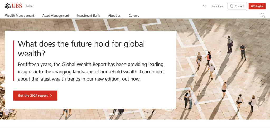
UBS’s website is a solid example of corporate web design that combines usability, professional aesthetics, and brand consistency to create a credible online presence.

  1. Professional and Clean Design: UBS uses a polished, minimalist design that reflects its brand as a leading financial institution. The layout is structured, with ample white space and a clear hierarchy, making it easy to navigate and reinforcing trust.
  2. Structured Information Architecture: The website is organized into sections for different stakeholders, including Investors, Clients, and Careers, which allows each audience to quickly find relevant information. This thoughtful structure supports easy access to information and enhances user experience.
  3. Interactive and Engaging Elements: UBS incorporates interactive elements such as drop-down menus, video content, and call-to-action buttons, which guide users through key services and offerings without cluttering the experience.
  4. Consistent Branding: The design aligns closely with UBS’s brand identity, using its signature colors, fonts, and logos across the site, reinforcing a cohesive look that users will recognize.
  5. Responsive and Accessible Design: The site is optimized for mobile and desktop, ensuring accessibility across devices, which is critical for global users.

Johnson&Johnson

corporate website example jandj

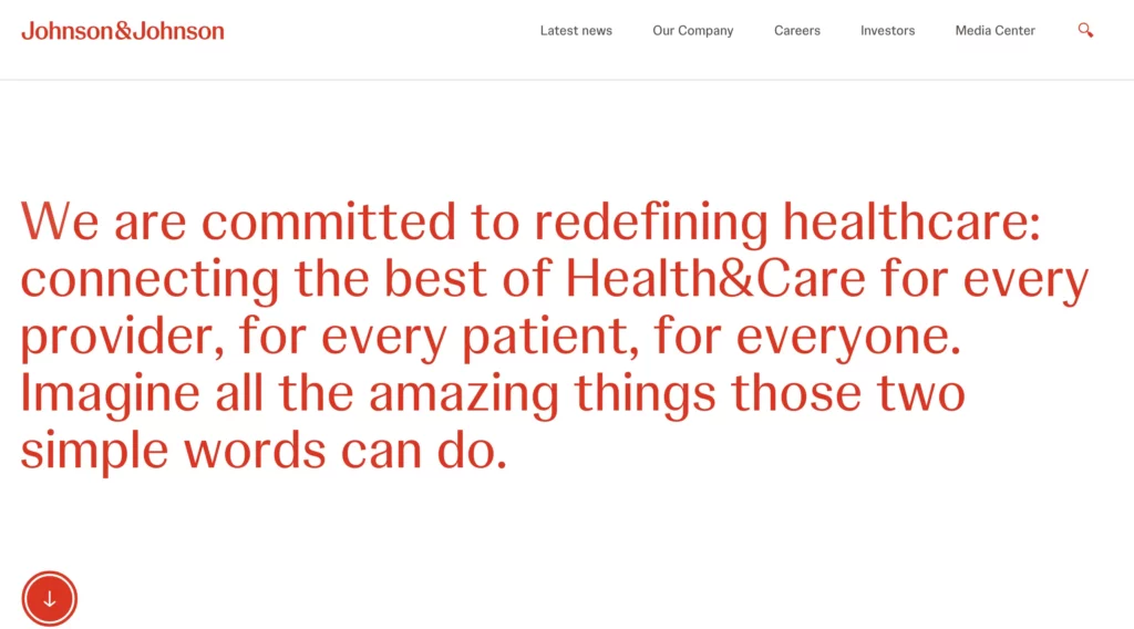
These elements make Johnson & Johnson’s website a model of corporate web design, demonstrating how an organized, transparent, and brand-aligned site can effectively communicate a company’s values and engage various audiences globally.

  1. Clear Mission and Values: The website effectively communicates Johnson & Johnson’s commitment to health and humanity, which is reflected across sections dedicated to innovation, social impact, and ethical practices. Their “Our Credo” mission statement emphasizes prioritizing user needs, creating an instant sense of trust and purpose.
  2. Comprehensive Information Architecture: Johnson & Johnson’s website is structured to serve multiple audiences, with dedicated sections for Investors, Careers, Innovation, Health & Wellness, and Global Health Equity. This organization ensures that each audience finds relevant information easily, making the website user-friendly and informative.
  3. Engaging Visual Design and Consistent Branding: The site uses high-quality visuals and a clean, professional layout that matches the company’s healthcare focus. With a muted color palette, ample white space, and thoughtful typography, the design feels both accessible and aligned with the brand’s serious, healthcare-centered mission.
  4. Responsiveness and Accessibility: Optimized for both desktop and mobile, the website ensures a consistent and accessible experience across devices. This is crucial for a global audience, making the website functional and visually appealing on any screen size.
  5. Commitment to Social Responsibility: Johnson & Johnson includes a section for Environmental, Social, and Governance (ESG) Policies, highlighting their commitments to social impact, diversity, and sustainability. This not only serves as a corporate responsibility showcase but also appeals to stakeholders interested in ethical business practices.

Learn about prototyping at Johnson&Johnson.

Meta

meta website example

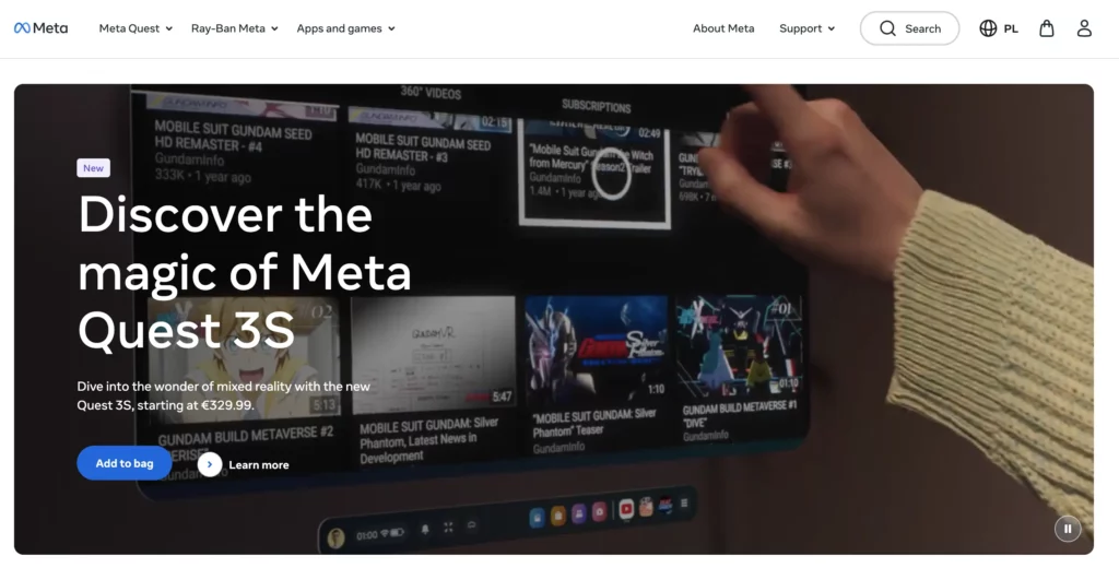
Meta’s website is a strong example of how large corporations can use digital design to effectively communicate with varied audiences, support their brand identity, and keep users engaged with rich, interactive content. 

  1. Clear Communication of Vision and Mission: Meta’s website emphasizes its mission to connect people, explore virtual and augmented reality, and develop the metaverse. It includes sections like “Who We Are” and “Our Actions,” which highlight Meta’s values, sustainability efforts, and innovations in social technology, providing transparency and building trust with users.
  2. User-Centric Navigation: With dedicated sections for various stakeholders—like “Investors,” “Developers,” “Media,” and “Careers”—the site makes it easy for different audiences to access the information relevant to them. This thoughtful structure supports easy navigation and a user-friendly experience.
  3. Modern and Consistent Design: The site’s sleek, minimalist design uses Meta’s branding elements, such as its color palette and typography, to maintain a cohesive look. It employs clean lines and interactive visuals to enhance the site’s usability, making it feel both accessible and professional.
  4. Interactivity and Engagement: Interactive elements like videos, image galleries, and animations add depth, allowing users to explore Meta’s projects, products, and social impact in a dynamic, engaging way.
  5. Accessibility and Global Reach: Meta’s website is designed to be responsive, ensuring optimal viewing on any device. Additionally, it aligns with Meta’s goal of inclusivity, offering global resources in various sections, which supports a diverse audience and makes the brand accessible worldwide.

The Volkswagen Group

corporate website example by volksvagen

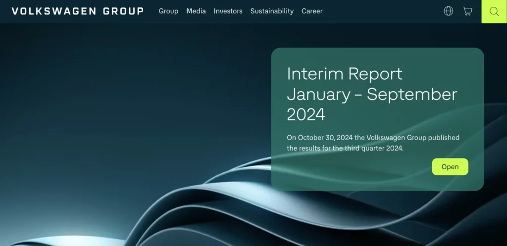
These design choices position Volkswagen’s corporate website as a robust tool for brand engagement, information dissemination, and customer interaction, making it a model of effective corporate web design for large, internationally-focused businesses.

  1. Clear, User-Centric Structure: Volkswagen’s website is organized to cater to diverse audiences, including investors, media, and sustainability advocates. Key sections like Sustainability, Investors, and Corporate Governance provide easy access to relevant resources, making the user experience straightforward and engaging.
  2. Visual and Brand Consistency: The website employs a clean, professional design that aligns with Volkswagen’s brand identity. It balances text with high-quality images and videos of its vehicle concepts and sustainability projects, visually reinforcing its commitment to innovative and eco-friendly automotive solutions.
  3. Focus on Innovation and Sustainability: Volkswagen highlights its forward-thinking initiatives with dedicated sections on electric mobility, battery technology, and autonomous driving, as part of its “NEW AUTO – Mobility for Generations to Come” strategy. This transparent presentation of its transformation goals appeals to both environmentally conscious users and tech-focused stakeholders.
  4. Interactive, Multimedia Content: The site incorporates engaging content, including video presentations and infographics, which allow users to explore Volkswagen’s product innovations and global impact in an immersive way. This multimedia approach enhances user engagement and conveys complex information more effectively.
  5. Accessible and Global-Friendly: Designed with a global audience in mind, the site is multilingual and mobile-responsive, ensuring that users from different regions can access and interact with the content seamlessly, regardless of their device or language.

Corporate Website Design Best Practices

Create a Clean, Professional Layout

Use a minimalist design with clear structure and ample white space to emphasize professionalism and readability. Avoid clutter by organizing content into easily digestible sections.

Example: Look at Volkswagen Group’s website—its structured layout makes it easy to find information, giving the site a polished, credible feel.

Ensure User-Centric Navigation

Design an intuitive navigation bar with clearly labeled sections that cater to various stakeholders like Investors, Careers, Products, and Sustainability. Use a sticky header for easy access and a mega-menu if your site has many categories.

Example: Johnson & Johnson’s navigation is structured by audience type, making information easily accessible to investors, media, job seekers, and healthcare professionals.

Responsive and Mobile-Friendly Design

Use responsive design techniques to ensure your website looks and functions well on all devices. Test on multiple screen sizes and orientations to ensure a seamless experience.

Example: Meta’s corporate site is optimized for both desktop and mobile, maintaining a consistent and accessible experience across devices.

Maintain Strong Visual and Brand Consistency

Use your brand’s color palette, typography, and logo consistently across all pages. This builds trust and reinforces brand identity.

Example: UBS and Volkswagen effectively reinforce brand identity by using signature colors and logos, giving their sites a cohesive, professional look.

Emphasize Key Information with Visual Hierarchy

Use size, color contrast, and spacing to highlight important elements like CTAs, headings, and key messages. Design with a clear visual hierarchy so users naturally follow the intended flow.

Example: Meta’s website uses ample white space and strategically placed CTAs to guide users toward important sections without overwhelming them.

Prioritize Accessibility

Incorporate accessibility features like alt text for images, high-contrast colors for readability, and keyboard navigation support. Use accessible, descriptive labels on forms and buttons.

Example: Many corporate sites, including Volkswagen’s, prioritize accessibility to accommodate a global audience, ensuring that all users have an equitable experience.

Highlight the Brand’s Mission and Values

Dedicate sections to the company’s mission, values, and ethical commitments. This might include pages on social responsibility, sustainability, or community engagement.

Example: Johnson & Johnson’s “Our Credo” section reflects the brand’s values and commitment to health and humanity, connecting emotionally with users and building trust.

Include Interactive and Engaging Elements

Use interactive features like hover effects, animations, and videos to make the site more engaging, but keep them subtle to avoid overwhelming users.

Example: Meta’s corporate website uses interactive media effectively to enhance user engagement without compromising the site’s clean, professional appearance.

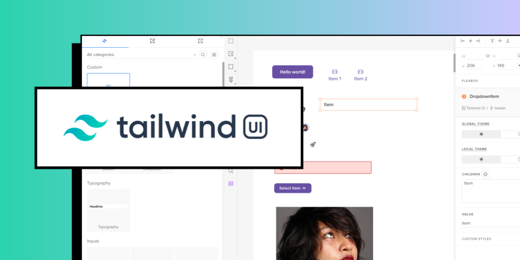
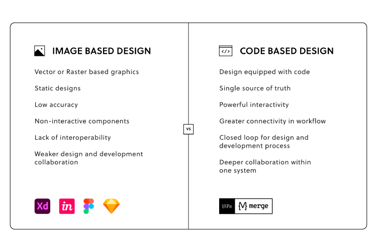
Use Real Code Components for Prototyping

Utilize tools like UXPin Merge to create high-fidelity prototypes with code-based components. This ensures the design closely resembles the final product, making testing and iteration more effective.

Example: Prototypes that behave like the final product allow for accurate usability testing, helping to refine user experience early in the process.

Implement SEO Best Practices

Optimize the site for search engines by using keywords, meta descriptions, and alt tags for images. Structure the site with a logical hierarchy to improve both usability and SEO.

Example: Well-structured corporate sites like Johnson & Johnson’s or UBS’s rank higher and attract organic traffic due to their well-optimized, keyword-rich content.

Feature Social Proof and Trust Elements

Incorporate elements like customer testimonials, case studies, client logos, and compliance badges. This builds credibility and trust with users, showing your brand’s reputation and reliability.

Example: Johnson & Johnson includes awards, partnerships, and impact statements, which reinforce their credibility and dedication to their field.

How Can UXPin Merge Help with Corporate Website Design?

UXPin Merge can be a game-changer for designing corporate websites because it bridges the gap between design and development, providing a faster, more collaborative, and consistent approach.

Here’s how Merge can support a corporate website design process.

Real Code Components for High-Fidelity Prototypes

With UXPin Merge, designers can use actual code components in their prototypes. This means that every button, navigation bar, or form you design in UXPin is a real component from the codebase, not a static mockup. This high fidelity allows designers to create prototypes that look and behave like the final product, making it easier to demonstrate interactions, gather stakeholder feedback, and test user flows effectively.

Design Consistency with Reusable Components

Merge allows teams to design with reusable components, ensuring that every element on the corporate website—from headers to footers, buttons to modals—stays consistent. Since these components come from a shared design system, all brand styling and interaction rules are pre-applied, maintaining consistency across the website and minimizing discrepancies between design and development.

Efficient Collaboration Between Design and Development

Merge’s code-based components align directly with what developers will use in production, meaning the transition from design to development is seamless. Designers can hand off fully interactive prototypes built with real code, eliminating the need for developers to “recreate” the design from scratch. This reduces back-and-forth adjustments, saving time and ensuring that what was prototyped is what ends up in production.

Responsive, Adaptable Design Systems

Corporate websites need to look great across devices, and Merge’s components can adapt to different screen sizes just like they would in the final product. Since components can be responsive, designers can easily test layouts and adjust designs within UXPin to ensure the site looks polished on mobile, tablet, and desktop, all within the same platform.

Scalability for Large Projects

For corporate websites that require complex navigation, extensive product pages, or interactive elements, Merge helps scale the design with reusable, component-based systems. By using Merge, designers can quickly build new pages or sections without starting from scratch—just drag and drop existing components into the prototype and customize as needed.

Streamlined Feedback and Iteration

Merge prototypes are interactive and code-based, meaning that stakeholders and users can experience the prototype with all intended interactions intact. This makes feedback more specific and actionable, as users can interact with the site as if it’s live. Designers can then make adjustments directly in UXPin, iterate based on real interactions, and keep the prototype up-to-date without repetitive rework.

Realistic User Testing

Because UXPin Merge prototypes are built with real components, they provide a near-final experience for user testing. This allows teams to conduct usability tests with realistic interactions, helping to uncover any usability issues and validate designs before development. User feedback is more relevant since participants interact with the prototype as they would with the final site, making it easy to identify issues early and adjust accordingly.

Using UXPin Merge in corporate website design empowers design and development teams to work faster, produce consistent and scalable designs, and reduce the risk of discrepancies between design and production. This streamlined, code-based approach helps ensure the corporate website aligns with brand standards, functions seamlessly, and delivers a high-quality user experience. Discover UXPin Merge.

What is Desirability, Viability, and Feasibility? [+ Design Review Template]

The concepts of desirability, feasibility, and viability are foundational to the design process, especially in the context of human-centered design and innovation. They help ensure that designs are not only user-centered but also practical and sustainable.

Does your design tool provide you with features to take a product from concept to design handoff? UXPin is an advanced end-to-end design tool that makes it easy to create prototypes with live React, Storybook or npm components. Check why this approach to prototyping can help you. Discover UXPin Merge.

Reach a new level of prototyping

Design with interactive components coming from your team’s design system.

What are Desirability, Viability, and Feasibility in Design?

Desirability, viability, and feasibility is a design thinking methodology to test ideas, concepts, and hypotheses to determine if you have a unique value proposition (aka unique selling point) and whether it’s worth pursuing.

Without checking all three boxes, you increase the risks, costs, and potential for failure. You could say desirability, viability, and feasibility are a risk analysis methodology for ideas – a toolkit to find that innovation sweet spot.

By applying this methodology, you can pinpoint the weak points in your design concepts, do further research or scrap the idea and move on.

Where Does this Methodology Originate?

IDEO, a global design company, conceptualized the desirability, viability, and feasibility design thinking methodology in the early 2000s as a way to test ideas.

IDEO recognized that the best ideas succeed when they fulfill this trifecta. Conversely, “great ideas” often fail when they miss one or more of these three criteria.

Let’s look through these three lenses to understand how this trifecta fits together.

Desirability

The first box designers must check is desirability. If your product idea has no market value and people don’t want or need it, it won’t sell. 

Researching desirability will also tell you whether your product is a want or a need. For example:

  • You need to get to work which you can do by walking, taking public transport, driving, carpooling, etc.
  • You want a car to get to work because it offers convenience, and maybe more luxury than public transport.

A need is something your customers cannot live without, while a want is often a more desirable option to fulfilling that need. Both check the box for desirability, but a product that fulfills someone’s need is far more valuable than something someone wants or is “nice to have.”

heart love like good

To find a desirable product, you must research your customers and identify pain points (wants and needs) that you can fulfill. 

  • Does your product solve someone’s problem?
  • Do your competitors offer a solution? 
  • Do you have a better idea? 
  • What makes your idea unique, and why would someone choose yours over the competition?
  • How will your product make end-users feel?
  • Is your product so desirable that people will tell their friends?
  • Will your product be something that once people try it, they won’t want to live without it?

When researching desirability, the intention is to stress-test your idea to find the gaps that need fixing. The more gaps you fill, the stronger your product and the better it will stand up against rigorous stakeholder questioning and customer satisfaction.

Example of desirability

Here’s an example of desirability in design:

Imagine you’re designing a fitness app aimed at helping people track their workouts and achieve fitness goals. To focus on desirability, you’d start by understanding users’ motivations, needs, and emotional triggers. Through user research and interviews, you might discover that your target users (let’s say busy professionals) want more than just tracking workouts—they want an app that encourages them to stay motivated and makes fitness feel rewarding.

Desirability in Action:

To address this, you design a feature that gamifies the fitness experience, such as:

  • Earning badges for milestones (e.g., completing a 30-day workout streak).
  • A personalized progress tracker that visually shows how close they are to their fitness goals.
  • Social sharing options where users can share achievements with friends or workout communities for added motivation.
  • Push notifications that are encouraging, like “You’re halfway to your weekly goal, keep it up!” rather than guilt-inducing or annoying.

These features make the app desirable because they align with users’ deeper needs—such as staying motivated, feeling accomplished, and sharing success with others. They’re not just functional, but also emotionally engaging, making users more likely to use the app regularly and enjoy the experience.

By focusing on desirability, you’re ensuring that the app does more than just meet basic needs; it makes the experience delightful and motivating, ultimately increasing user retention and satisfaction.

Viability

Viability tells you whether or not your product makes business sense. Even if you have the most desirable product in the world, if it’s too expensive or isn’t profitable, then it’s not a good business model.

A truly viable product idea makes business sense in the short-term and into the future. The quicker and longer it can deliver a positive return on investment, the higher the viability of your design idea.

user bad good review satisfaction opinion

A fantastic example of viability is how Coca-Cola designed a beverage formula in 1886 that’s still one of the most consumed drinks in the world today! That initial investment created massive wealth for its inventors and still delivers incredible returns for shareholders more than 135 years later.

Viability is also about societal and environmental impact—the ethical aspect of your design. Will your digital product provide a positive gain for society? In 2021, Facebook whistleblower Frances Haugen released documents showing that the social media giant’s internal research showed that Instagram creates anxiety, depression, and suicidal thoughts among teenage girls.

Instagram might deliver high financial returns in the short term, but is this harm to teenagers sustainable long-term? And what will governments do to regulate Facebook and Instagram?

Facebook is a massive company with the resources to overcome societal controversy, fines, and lawsuits. But, a smaller company or startup will mostly like fold when confronted with similar pressures. 

So, when we look at viability, it must provide value for the business, customers, and society. Some questions you might want to consider include:

  • What has to be true for this design to work?
  • What will it cost to turn your design into a functioning product?
  • Do you have the capital investment to build the new product or feature?
  • What is the pricing model? And, can the business make a profit?
  • How long will it take to see a positive return on investment?
  • Is the product sustainable?
  • How does the product impact society?

Like desirability, viability requires you to research, analyze, and stress-test ideas to ensure they’re viable and sustainable.

Example of viability

Let’s take the same fitness app example and focus on viability—how the design supports the business and remains financially sustainable.

Viability in Action

You’ve already created a desirable app with features that engage users, but now you need to ensure that the app generates revenue and aligns with long-term business goals. To address viability, you decide to implement a freemium model with monetization strategies that balance user satisfaction with business needs.

Here’s how you might approach it:

  1. Free Basic Tier: The app provides essential workout tracking features for free, attracting a wide user base. This tier gives users just enough to get value from the app and start using it regularly.
  2. Premium Subscription: To drive revenue, you introduce a premium subscription that unlocks additional features. These might include:
    • Advanced fitness analytics and personalized workout plans.
    • Exclusive content like video tutorials from expert trainers.
    • Early access to new features or challenges.
    • An ad-free experience.
  3. In-App Purchases: Another viable revenue stream could be selling customized workout plans or nutrition guides as one-time purchases. This allows users to buy specific content without committing to a subscription, catering to different user preferences.
  4. Brand Partnerships and Sponsored Content: To further support business viability, you establish partnerships with fitness brands. These brands could sponsor certain challenges within the app, or provide users with exclusive discounts on fitness gear or supplements. This brings in additional revenue without compromising the user experience.
  5. Cost-Efficient Scaling: On the backend, you work with your team to ensure that the app’s infrastructure is scalable, meaning it can grow with the user base without incurring massive costs. You may use cloud services with cost-efficient pricing models or optimize the app to use fewer resources.

Why This Supports Viability:

  • The premium tier generates recurring revenue, which is crucial for long-term sustainability.
  • In-app purchases provide a flexible option for users, tapping into a secondary revenue stream.
  • Sponsored content and partnerships offer additional income, while also aligning with the fitness interests of users (so it feels less intrusive).
  • The freemium model ensures a large user base, which helps with growth and retention, making the app attractive to potential investors or partners.

By considering these factors, you’re ensuring that the app can not only survive but thrive in the market, making it viable from a business perspective while still delivering value to users.

Feasibility

Feasibility looks at your current resources to determine if you’re capable of developing the product in the foreseeable future. Designers must consider how the product will impact the business.

settings

Some feasibility factors include:

  • Technical constraints
  • Financial constraints
  • Product’s impact on branding, marketing, customer support, and other areas of the business
  • Estimated time-to-market
  • Operational capabilities

Ideally, you want to design a new product or feature within the company’s current capabilities using available resources. When you have to build infrastructure to support a new product, you increase the risks and costs.

Here are some feasibility questions you might want to consider when designing a new product or feature:

  • Does the current design system have the components to develop the new product?
  • How long will it take to design and develop the product?
  • Do you have enough product designers, UX designers, and engineers to build and scale the new product?
  • Can our technical constraints support the new design?
  • Will the organization need to hire new talent?
  • If you have to extend the organization’s capabilities, how can this benefit future products?
  • What impact will the product have on the brand?
  • Will the product’s release impact other areas of the organization, like marketing, sales, and customer support? And do these departments have the capacity for more work?

Example of feasibility

Continuing with the fitness app example, let’s explore feasibility—ensuring that the app can actually be built and maintained with the available resources, technology, and team capacity.

Feasibility in Action

You’ve designed a desirable and potentially viable app with a freemium model, premium features, and possible in-app purchases. However, before moving forward, you need to ensure it’s technically feasible to implement these features with the resources you have.

  1. Assess the Development Team’s Skills: You review your team’s capabilities. Your developers are skilled in building mobile apps, but the gamification features (like badges and achievements) you’ve designed require more sophisticated backend systems for tracking user progress in real-time. To make it feasible, you might decide to:
    • Start with basic badges that are awarded based on simple rules (e.g., completing 10 workouts) and phase in more advanced features over time.
    • Use an existing third-party service that provides gamification tools, rather than building it from scratch, saving time and resources.
  2. Use Readily Available Technology: Instead of developing a custom AI-based workout recommendation engine (which would be desirable but complex), you decide to use a machine learning API from a trusted provider (like AWS or Google Cloud). This allows you to implement basic personalized recommendations with much less development effort, making the feature feasible within your current tech stack.
  3. Optimize for Platform Limitations: Your team needs to ensure the app works smoothly on both iOS and Android. Since developing two separate apps would be resource-intensive, you opt for a cross-platform framework like React Native. This makes it feasible to launch on both platforms using a single codebase, saving time and reducing maintenance costs.
  4. Infrastructure and Scaling: The premium subscription model will involve tracking individual user accounts, payments, and access to premium content. To ensure this is feasible at launch, you might integrate with a trusted subscription management service (like Stripe or Paddle) instead of building a custom payment system from scratch. Additionally, you consider using cloud services (e.g., AWS or Google Cloud) for scalable storage and server needs, allowing you to handle user growth without needing to manage your own servers.
  5. MVP (Minimum Viable Product) Approach: You realize that building all the features—badges, custom workout plans, social sharing, etc.—at once is not feasible within your current timeline and budget. So, you plan to release an MVP version of the app that includes the core workout tracking and a few simple badges. Other features, like advanced analytics or social sharing, will be introduced in later versions once the app gains traction and resources allow for further development.

Why This Supports Feasibility

  • By leveraging third-party tools and APIs, you reduce the development time and complexity, making the project more manageable.
  • Using React Native allows you to build for both iOS and Android with a single development team, saving significant time and cost.
  • Subscription management services like Stripe make payments and user account management straightforward without the need to build complex systems in-house.
  • Focusing on an MVP approach ensures you can release the app in stages, allowing the team to validate the core idea and refine the product without being overwhelmed by too many features at once.

By considering the team’s skills, available technology, and development time, this approach ensures that the fitness app can be built within the given constraints, making it feasible.

Using Desirability, Viability, and Feasibility in a Design Review

Organizations conduct a design review during the early stages of a product design to evaluate the design against specific criteria. The goal is to identify any problems with the design or prototype before developing it–which carries the costs of infrastructure, marketing, sales, customer support, and more.

Essentially, the organization wants to know the product design’s desirability, viability, and feasibility.

A UX Design Review Template

Applying the desirability, viability, and feasibility design thinking methodology will give you the insights and data to present a comprehensive and objective design review to stakeholders. 

mobile screens

Below is a structure or template you can use to present your design review so that it’s easy for stakeholders to read and digest.

The problem: State the problem succinctly. The design and business teams will build a shared understanding from this foundation.

The system (current state): Show how the current system works (if it’s an existing product) to help put the problem in context. Later, you can show how the system could work with your proposed experience.

The Jobs To Be Done (JBTD): A shared understanding of what motivates your customers is crucial for a design review. As Tony Ulwick defines JBTD: “a lens through which you can observe markets, customers, user needs, competitors, and customer segments differently, and by doing so, make innovation far more predictable and profitable.” This lens helps stakeholders understand how customers decide whether to “hire” or “fire” your solution.

The business objective: State the business value and ROI for solving this customer problem.

The metrics that matter: You can’t improve what you don’t measure. These metrics should enable you to quantify the business and customer value you’ll create through your new product design.

The proposed experience: Summarize the proposal in a sentence. Make it clear and understandable. The people in the room need to understand how this proposal relates to the problem you’ve previously articulated.

The implications of your proposal: How will your proposal impact other parts of the business? Maybe you don’t know. Understanding this early in the product design process is critical to achieving balance in desirability, viability, and feasibility.

Basic experience design: Present your wireframes, mockups, prototypes, or minimum viable product (MVP) so that stakeholders can visualize how a customer might find the product desirable.

testing observing user behavior

Insights informing the design: What led you to choose this design? What were the insights, hypotheses, etc.? Show your depth of thought in a few bullet points.

Hypotheses about the new design

  • What are your hypotheses about the new design? 
  • How did you arrive at this hypothesis? 
  • How can you align these hypotheses to the metrics you believe matter?

These should be clear and testable. By conducting tests with clear pass/fail metrics, these hypotheses should also give you a strong foundation for measuring the incremental progress you’re making.

The team’s collaborative focus: Why are you all in the room? What input do you need from stakeholders? This section of the design review template helps set a clear context and focus for the stakeholders responsible for the product’s success.

With UXPin Merge, you can use built-in component libraries to quickly assemble high-fidelity prototypes and MVPs and present these to stakeholders during the design review. This will definitely speed up your time to market, and make you release quality products faster. Discover UXPin Merge.


Frequently Asked Questions (FAQs) About Design Review Templates

1. What is a design review template, and why is it important?

A design review template provides a structured framework for evaluating a design’s desirability, viability, and feasibility. It ensures that teams make informed decisions, align with business goals, and deliver user-centric products efficiently.

2. What are the key components of a design review?

A comprehensive design review assesses three critical aspects:

  • Desirability – Does the design meet user needs and expectations?
  • Viability – Is the solution sustainable from a business perspective?
  • Feasibility – Can the design be implemented effectively with available resources?

3. How does balancing desirability, viability, and feasibility improve product design?

By addressing all three factors, teams ensure that designs are user-friendly, commercially viable, and technically achievable. This balance helps avoid design failures due to poor market fit, unsustainable business models, or technical limitations.

4. When should teams conduct a design review?

Design reviews should be conducted at multiple stages of the product development process—during initial ideation, before development, and after testing—to refine designs and ensure alignment with user and business objectives.

5. How can a structured design review template improve collaboration?

A template standardizes the review process, making it easier for cross-functional teams (designers, developers, product managers, and stakeholders) to collaborate, provide feedback, and make data-driven decisions.

6. What tools can help streamline the design review process?

Popular tools for conducting design reviews include UXPin, Figma, Miro, Notion, and Google Docs. These platforms enable teams to document, annotate, and collaborate on design decisions effectively.

7. How do I make design reviews more effective?

To improve design reviews:

  • Set clear objectives for each review session.
  • Involve key stakeholders early in the process.
  • Use a structured template to document insights and decisions.
  • Prioritize feedback based on business impact and technical feasibility.

8. What are common pitfalls to avoid in design reviews?

Common mistakes include lack of clear criteria, subjective feedback without data, overlooking technical constraints, and not involving key stakeholders early enough. A well-defined review template helps mitigate these issues.

9. How can teams measure the success of a design review?

Success can be measured by improved design decisions, reduced rework, faster approval processes, and alignment between user needs, business goals, and technical feasibility. Tracking design iteration cycles and stakeholder satisfaction also helps assess effectiveness.

10. Can a design review template be customized for different projects?

Yes! A flexible design review template should be adapted based on project scope, team workflow, and industry-specific requirements. Tailoring the template ensures it remains relevant and actionable for different design challenges.

UI Localization Guide for Multi-Region Designs

ui localization

UI localization is the process of adapting a user interface to fit the cultural, linguistic, and regional preferences of different user groups. This adaptation involves translating text, adjusting layouts, adapting date and time formats, converting currencies, and modifying graphics or symbols to ensure that the design feels natural to users in specific locales.

UI localization is crucial for global products as it provides a seamless and accessible experience for diverse audiences. It allows users to interact with a product in a way that feels familiar and intuitive, which can increase engagement, satisfaction, and overall usability.

With UXPin, designers can easily build flexible layouts, handle right-to-left and left-to-right language adjustments, and adapt components like currency, date, and time formats to match local expectations. UXPin’s powerful tools make it simple to create globally accessible designs from the start, saving time and ensuring a natural, intuitive experience for users everywhere. Ready to design for the world? Try UXPin for free.

Build advanced prototypes

Design better products with States, Variables, Auto Layout and more.

Try UXPin

What is UI Localization?

UI Localization is the process of adapting a user interface (UI) to meet the linguistic, cultural, and functional expectations of users in different regions or languages. It’s a critical part of creating globally accessible products, ensuring that users feel comfortable and engaged when interacting with an interface, regardless of their location or cultural background.

Localization goes beyond simple translation, addressing everything from language and layout adjustments to cultural relevance and legal compliance, making the product feel “native” to each audience.

What Does UI Localization Involve?

Here are the key components of UI localization:

  1. Language Translation: Translating the UI text into the target language is the most direct form of localization. However, it’s not just about translation; it also involves cultural adaptation to ensure the meaning is contextually appropriate. For example, idioms, phrases, or product names may need to be modified.
  2. Layout Adjustments: Different languages vary in text length and direction. For instance, English is generally concise, while languages like German or Russian tend to have longer words, potentially requiring additional space. Right-to-left (RTL) languages like Arabic and Hebrew require UI adjustments to accommodate the reversed layout direction.
  3. Date, Time, and Number Formatting: Different regions have distinct date, time, and numerical formats. For example, while the U.S. commonly uses the “MM/DD/YYYY” date format, many European countries prefer “DD/MM/YYYY.” Localizing these elements enhances clarity and usability.
  4. Currency and Units of Measure: Users expect prices in their local currency and measurements in familiar units (e.g., kilometers vs. miles). Properly localizing these details improves accuracy and trust in the interface.
  5. Culturally Relevant Imagery and Symbols: Imagery, color schemes, and icons often carry cultural meanings, so localization ensures these elements are relevant and appealing in each target region. For example, the color white is associated with purity in some cultures but can signify mourning in others. Similarly, certain gestures, like a thumbs-up, might have positive connotations in one culture but be offensive in another.
  6. Consistency with Brand and User Experience: Localization must also maintain a cohesive brand identity across different regions. Localization balances brand consistency with cultural customization, ensuring that while the product feels native in each region, it still aligns with the global brand values and user experience.

Where Does UI Localization Fit in the Design Process?

UI localization should be integrated early in the design process rather than treated as a final adjustment.

Localization considerations can impact design decisions from layout flexibility to text expansion handling, and anticipating these needs during the wireframing or prototyping stage saves time and resources later. Working alongside localization experts, designers can create adaptable layouts and reusable components that accommodate various languages and cultural needs.

Imagine you’re designing a checkout page for an international e-commerce store. Your goal? Make sure every user, whether in Paris or Tokyo, feels right at home.

  1. Language and Text: In English, your checkout button might say “Buy Now,” but in French, it needs to say “Acheter maintenant,” which is longer. To accommodate this, you design flexible buttons that expand to fit different text lengths.
  2. RTL Layouts: For Arabic-speaking users, the entire layout shifts to a right-to-left format. The shopping cart icon moves to the right, and text alignment reverses, creating a familiar experience for these users.
  3. Currency and Payment Options: U.S. users see USD, but Europeans see euros and region-specific payment methods like iDEAL. You ensure these currency symbols and payment options are easy to spot.
  4. Date and Number Formatting: For credit card expiration dates, you adjust the format based on the locale. U.S. users expect MM/YY, while other countries might prefer DD/MM/YY.
  5. Compliance and Privacy Notices: For European customers, you add a GDPR-compliant consent checkbox, while California users see a CCPA notice.

Each step creates a seamless experience, making every user feel like the interface was designed just for them—no matter where they are.

How to Handle UI Localization in UXPin?

Handling localization in UXPin involves designing with flexibility in mind so that your prototypes can adapt to different languages, formats, and user expectations across regions.

Here’s a step-by-step approach to effectively localize your designs in UXPin.

Use Flexible Layouts for Text Expansion

Different languages vary in text length, which can impact UI spacing and layout. When designing in UXPin, use flexible, responsive layouts that allow elements like buttons, text fields, and menus to expand or shrink without breaking the design. For instance, keeping adequate padding around text blocks ensures that longer translated text doesn’t overflow.

Design for Right-to-Left (RTL) and Left-to-Right (LTR) Languages

If you’re designing for regions that use RTL languages (like Arabic or Hebrew), UXPin allows you to easily adjust alignment, position, and spacing. You can create two versions of the same screen (one for LTR and one for RTL), or use mirrored layouts. Consistent use of flexible layouts can make this adjustment easier and help maintain alignment.

Prepare for Different Date, Time, and Number Formats

For international users, date, time, and number formats vary (e.g., “MM/DD/YYYY” vs. “DD/MM/YYYY” for dates). In UXPin, create prototype variations that reflect these differences based on your target regions. You can also add notes for developers to specify how these formats should change depending on user location.

Create Component Variants for Currency and Units

UXPin allows you to set up component variants, which is useful for adapting elements like prices or units of measurement. For instance, you can create a “Price” component with different currency symbols or formats (e.g., $, €, ¥) so that developers know to adjust the display depending on the locale.

Use Icons and Symbols Carefully

Localization goes beyond text, so consider how icons and symbols are interpreted in different cultures. UXPin’s library includes various icons that can be swapped out depending on region-specific preferences. Always test for cultural appropriateness, especially for icons or symbols that might not translate universally.

Document Localization Notes

In UXPin, you can annotate designs to provide localization instructions. Adding notes about translation, text length constraints, and any RTL adjustments gives developers clear guidelines, ensuring that the final product aligns with your localized design intent.

Test Prototypes for Regional Usability

Once your localized versions are set up, test each prototype to make sure they’re usable for users in different regions. UXPin allows you to create interactive prototypes that reflect the localized experience, which you can then share with users or stakeholders for testing and feedback.

Summary

UI localization is essential for creating a truly user-centered design that resonates with a global audience. By incorporating localization into the design process from the beginning, designers ensure that users worldwide have an intuitive, culturally relevant, and seamless experience with the product, regardless of where they are or what language they speak.

In UXPin, you can create adaptable, region-friendly prototypes that meet the needs of a global audience, allowing for a seamless transition to development with localization built in from the start. Try UXPin for free.

UI Inspiration – Where to Get it From?

Product Page

Collecting UI inspiration is a key part of the creative design process. It helps them stay current with design trends, find innovative solutions to common design challenges, and explore different aesthetics that could improve the user experience. Popular sources for UI inspiration include platforms like Dribbble, Behance, Awwwards, and Pinterest, where designers share and discover creative examples of interface design.

UXPin is the go-to platform for designers seeking UI inspiration that’s both creative and practical. With pre-built design systems and interactive, real-code components, UXPin lets you explore and prototype with production-ready elements. Test animations, user flows, and conditional logic to bring ideas to life, all within one seamless tool. Spark your creativity—try UXPin for free today.

Build advanced prototypes

Design better products with States, Variables, Auto Layout and more.

Try UXPin

What is UI Inspiration?

UI inspiration refers to sources, ideas, and examples that designers use to spark creativity and inform the look and feel of user interfaces. It’s a way for designers to explore new layouts, color schemes, interactions, typography, and design patterns that can enhance usability and visual appeal. UI inspiration can come from websites, apps, design galleries, or even non-digital sources like art, nature, and architecture.

Why You Should Seek Inspiration as UI Designer

UI design is a blend of science and art: while one part of the process relies on principles like usability, structure, and function, the other part thrives on creativity, emotion, and visual storytelling.

Seeking UI inspiration is essential because it nurtures the artistic side of design, helping designers cultivate a unique, creative flair that resonates with users. By exploring various color palettes, typography choices, layout patterns, and interaction styles, designers can experiment with new visual directions that make their work stand out.

Inspiration serves as a catalyst for creativity, allowing designers to see how others have balanced function with aesthetics. This not only brings fresh ideas but also expands the designer’s toolkit, offering diverse ways to infuse emotion, energy, and personality into their designs.

Studying UI inspiration from different sources helps designers break out of rigid design patterns and develop a more refined, artistic eye. This approach leads to UI designs that are not only scientifically sound in terms of usability and accessibility but also compelling and memorable. In the end, seeking inspiration enriches a designer’s creative palette, allowing them to merge function with artistry, creating experiences that engage users on multiple levels.

How UXPin Helps Get UI Inspiration

UXPin helps designers gather UI inspiration by providing a platform that combines prototyping, real-code components, and a vast library of interactive elements to experiment with and draw ideas from. Here’s how UXPin supports UI inspiration:

  1. Pre-built Design Systems and Component Libraries: UXPin offers access to libraries like Material Design and Bootstrap, enabling designers to explore established UI patterns and see how various components work together. This helps designers get inspired by standardized elements and speeds up the design process.
  2. Merge with Real Code Components: With UXPin’s Merge technology, designers can pull in real, code-based components from existing design systems, enabling them to see how actual, functioning UI elements work within a prototype. By experimenting with these components, designers can find inspiration for how different UI patterns function in a realistic context.
  3. Interactive Prototyping: UXPin’s interactive prototyping capabilities allow designers to test out UI ideas in real-time, including micro-interactions and complex animations. This hands-on experimentation with functionality and interactions provides a new layer of inspiration that goes beyond static visuals.
  4. Collaboration with Design Systems: UXPin allows designers to create and reuse shared design systems. By centralizing UI components, designers can explore and get inspired by elements used across projects, ensuring consistency while also sparking new ideas for reusable patterns.
  5. Inspiration from Accessible and Inclusive Design: With built-in accessibility features, UXPin helps designers get inspired to create a UI that’s visually appealing while also being usable by all audiences. Accessibility tools encourage design choices that are both functional and visually inspiring, balancing creativity with inclusivity.

Where to Get UI Inspiration From?

These brands and platforms serve as invaluable resources for UI designers, offering a blend of structured design thinking, fresh creative ideas, and exposure to current trends across different industries.

Other Designers’ Work and Design Thinking

Platforms like Dribbble, Behance, and Awwwards feature designs shared by other professionals. Here, designers showcase their work and often describe the design thinking and process behind it, giving insights into creative approaches and trends.

  • Dribbble: A popular social platform for designers to share small snippets or “shots” of their work, such as UI elements, branding, and illustrations. It’s known for highly visual inspiration and creative experimentation.
  • Behance: A portfolio platform by Adobe where designers, photographers, and creatives share full projects and case studies. It’s ideal for seeing detailed design workflows and cohesive project presentations.
  • Awwwards: A website awards platform that recognizes outstanding web design from around the world. It’s a go-to resource for cutting-edge trends and examples of innovative design.

Networking Meetings for Designers

Design meetups, networking events, and online communities connect designers to share feedback, insights, and solutions to design challenges.

  • Meetup: A global platform where designers can join local or virtual groups for networking, workshops, and collaborative sessions. It’s widely used for design meetups around UI/UX.
  • ADPList (Amazing Design People List): A free mentorship platform where designers connect for one-on-one or group sessions, sharing feedback and insights on design projects and career development.

Conferences

Design conferences offer sessions and workshops led by experts, covering the latest tools, techniques, and trends in UI/UX design.

  • UXDX: A conference focused on the entire product lifecycle, from UX and design to development, with sessions on UI trends, design systems, and user experience strategies.
  • Smashing Conference: A hands-on conference by Smashing Magazine that dives deep into UX/UI design, front-end development, and accessibility.
  • Adobe MAX: Adobe’s annual creative conference, featuring sessions on everything from design tools and UI trends to interactive design, branding, and illustration.

Looking for Inspiration Outside of Design

Observing the world beyond screens, such as nature, art, and architecture, reveals patterns, colors, and textures that inspire unique, non-digital elements for UI design.

  • Architecture: Architectural design, with its emphasis on structure, space, and form, can inspire layouts and spatial relationships in UI.
  • Fine Art and Museums: Museums and galleries, featuring classic and contemporary works, provide ideas for color schemes, contrast, and texture that enhance visual appeal.

Reading Fiction

Fictional narratives in books, poetry, and films inspire creativity and emotional depth, which can lead to more engaging, story-driven UI designs.

  • Books: Novels and short stories can spark ideas for storytelling in user journeys, helping designers create emotionally engaging experiences.
  • Films: Film visuals, narrative pacing, and cinematography offer inspiration for crafting user flows and immersive digital experiences.

Inspiration Websites and Galleries

Websites like Pinterest, Muzli, and SiteInspire offer curated design galleries showcasing UI and UX inspiration from across the web.

  • Pinterest: A visual search engine where designers save and share inspiration boards, covering everything from color palettes to UI patterns.
  • Muzli: A Chrome extension and website that curates the latest design trends and inspiring work, including UI, UX, branding, and illustration.
  • SiteInspire: A showcase of well-designed websites, categorized by style, type, and industry, helping designers explore UI ideas for specific website themes or industries.

Unlock UI Inspiration with UXPin

UXPin is more than a prototyping tool—it’s a platform that fuels creativity and brings UI inspiration to life. With access to pre-built design systems like Material Design and Bootstrap, UXPin provides an inspiring foundation of components and patterns ready to use and customize. Designers can explore real, interactive code components with UXPin’s Merge technology, allowing them to prototype with production-ready elements that mimic the final product’s look and feel. This feature enables designers to experiment, innovate, and refine, breaking away from static design and diving into fully interactive ideas.

UXPin also brings together design and development in one place, creating a seamless flow where designers can try out ideas in real time without limits. Advanced prototyping features allow you to test animations, interactions, and conditional logic, providing endless inspiration for user flows and experiences. For designers looking to keep up with the latest in UI, UXPin’s design system integrations, accessible UI patterns, and collaborative tools offer a dynamic space to explore and implement cutting-edge ideas, making it a go-to platform for both creativity and functionality. Try UXPin for free today.

Retool Alternatives for 2025

Retool alternatives

Retool lets teams build internal tools quickly without extensive coding. It speeds up development and reduces resource costs for companies needing fast, functional internal tools. What if you want another tool that has a drag-and-drop interface, and enough flexibility to create dashboards, CRMs, and admin panels efficiently? Here are top alternatives to Retool that you should consider. Let’s explore them.

UXPin Merge is perfect for creating polished, customer-facing applications with minimal design handoff issues. By bridging design and code, the tool enhances collaboration, speeds up development, and maintains design consistency across all project stages. Try UXPin Merge for free.

Reach a new level of prototyping

Design with interactive components coming from your team’s design system.

UXPin Merge

UXPin Merge allows designers to create high-fidelity, code-based prototypes that feel like the final product, enhancing collaboration with developers and ensuring faster, more accurate releases.

With access to pre-built and custom components, designers can mimic real user interactions, providing an authentic user experience. Once approved, the design’s auto-generated specs and production-ready code streamline the development process, saving time by reducing the need for translating designs into code.

Retool is tailored to data-driven workflows rather than full product design. UXPin Merge’s focus on production-quality prototypes makes it the superior choice for companies needing robust, design-to-development alignment for customer-facing applications.

Appsmith

Appsmith is a powerful alternative to Retool for building internal tools, particularly for developers seeking an open-source, highly customizable solution. With Appsmith, users can drag and drop components, connect to various data sources, and apply custom JavaScript, offering flexibility similar to Retool but with more control and adaptability.

Appsmith’s open-source nature allows teams to fully customize and self-host their applications, making it ideal for organizations that need control over deployments and advanced custom features.

Budibase

Budibase enables teams to rapidly create custom internal tools with interactive components and flexible data integrations. By leveraging pre-built templates and UI elements, teams can build high-fidelity prototypes that closely resemble final applications, improving collaboration and accelerating the release cycle.

Budibase connects the finished tool to databases, APIs, and other data sources, reducing the development time by simplifying data handling and minimizing the need for repetitive code—making it an efficient solution for fast, production-ready deployments.

Budibase stands out over Retool for teams looking for an open-source, self-hosted platform with more control over customization and deployment. Unlike Retool, which is more focused on data-driven internal tools, Budibase allows users to build internal apps with more flexibility, including custom workflows, form creation, and even user-facing portals.

Additionally, Budibase’s open-source foundation makes it adaptable and cost-effective, giving organizations greater control over security, scalability, and extended custom features without vendor lock-in.

Bubble

Bubble empowers non-developers to build interactive, high-fidelity web applications without coding. By using its drag-and-drop editor and extensive library of components, teams can create prototypes and functional applications that mimic the final product experience. Bubble’s seamless data management and workflow automation allow for realistic interactions, speeding up the development process from idea to launch. 

Bubble applications are production-ready, offering a smooth path to deployment without needing translation from design to code, making it an ideal tool for quickly launching customer-facing applications.

UI Bakery

UI Bakery is a no-code/low-code platform that enables users to create custom internal tools and business applications using a visual interface. With a drag-and-drop editor, pre-built UI components, and integration capabilities for databases and APIs, teams can quickly prototype and build interactive applications that feel like the final product. 

UI Bakery simplifies deployment, supporting efficient handoffs and enabling production-ready applications with minimal coding, making it ideal for businesses that need rapid internal tool development without extensive engineering resources.

DronaHQ

DronaHQ empowers teams to build custom internal tools and applications with a no-code/low-code approach. With its drag-and-drop interface and a library of ready-to-use components, teams can create functional, high-fidelity prototypes that replicate the final user experience.

DronaHQ integrates seamlessly with databases and APIs, allowing teams to connect data sources directly and manage workflows efficiently. This streamlines the transition from design to production, making it ideal for rapidly deploying business tools that are user-ready without extensive back-end development.

Plasmic

Plasmic allows teams to create custom, high-quality front ends visually, combining the ease of no-code with full-code flexibility.

With a rich library of components, seamless integrations, and responsive design capabilities, Plasmic enables the rapid creation of pixel-perfect prototypes and applications that can connect directly to APIs and data sources. This approach streamlines collaboration and allows developers to add custom logic, making it ideal for quickly deploying production-ready web experiences or user-facing applications with full design control.

Which Retool alternative is best for collaboration?

For collaboration, UXPin Merge stands out as the best option. It allows designers and developers to work with the same production-ready code components, ensuring design consistency and reducing handoff friction. This makes it highly effective for teams that need to stay aligned on complex projects and design systems.

Plasmic also ranks highly for collaborative design, allowing designers and developers to work together on flexible front ends while accommodating custom code.

Retool and DronaHQ support collaboration for internal tools but primarily focus on data integration rather than design-development collaboration.

Which Retool Alternative is Best for UI Exploration?

For UI exploration, Plasmic and UXPin Merge are excellent Retool alternatives. Plasmic offers a flexible visual editor that’s ideal for exploring various UI layouts and designs with pixel-perfect control, making it especially useful for front-end designers seeking creative freedom.

UXPin Merge, while not no-code, allows designers to experiment with real production components, so it’s powerful for high-fidelity UI exploration within the constraints of a design system. Both tools enable iterative design, bridging creativity with functionality for more polished UI exploration.

Which is Best for Building Apps Quickly?

For building apps quickly, Bubble, and DronaHQ are among the best options.

  • Bubble is great for non-technical users creating full web applications, including customer-facing ones, without writing code.
  • DronaHQ offers a no-code/low-code environment with drag-and-drop components, making it a solid choice for rapid internal tool and business app development.

Each has strengths for specific app types, but all prioritize fast deployment.

Which Retool Competitor is Best for Rapid Prototyping?

For rapid prototyping, UXPin Merge, Plasmic, and Bubble are top choices:

Each tool supports fast iteration, enabling teams to test ideas and gather feedback quickly.

Why Should You Give UXPin Merge a Chance?

Considering tools like Retool, Appsmith, Budibase, or Bubble makes sense if you’re exploring options for building internal tools, dashboards, or simple apps quickly, especially when low-code or no-code functionality is needed.

While these tools can help teams create data-driven internal applications without extensive coding, UXPin uniquely empowers teams focused on high-fidelity, customer-facing product design. UXPin provides a streamlined design-to-development process using production-ready components, ensuring that prototypes match final product quality—ideal for polished, consistent user experiences. Discover UXPin Merge.

Carousel UI – What is a Carousel in Web Design?

carousel ui

Designers use carousels to showcase multiple pieces of content in a compact, engaging way without overwhelming users. Carousels allow them to highlight key content—such as promotions, product images, or featured stories—while saving screen space. Read about carousels in UI design, when not to use them, and how to create them in UXPin.

UXPin makes it easy to create carousels that highlight products, promotions, or content in a sleek, space-saving format. Whether you’re using UXPin’s intuitive design tools, AI Component Creator, or powerful Merge capabilities, you can build fully customizable, responsive carousels that look and feel production-ready. Try UXPin for free.

Build advanced prototypes

Design better products with States, Variables, Auto Layout and more.

Try UXPin

What is Carousel UI?

A carousel is an interactive component used to display multiple pieces of content within a single section, allowing users to navigate through images, text, or other media one at a time. Typically, carousels are horizontally scrolling panels that users can control by clicking navigation arrows or swiping (on mobile devices).

Key Features of a Carousel in UI

  1. Multiple Slides: A carousel can contain several slides, each showcasing a different image, product, or message.
  2. Navigation Controls: Carousels include left and right arrows or other controls that allow users to move back and forth between slides.
  3. Auto-Rotation (Optional): Some carousels automatically advance to the next slide after a short delay, though this can sometimes be optional or user-controlled.
  4. Pagination Indicators: Dots or other indicators often show the number of slides available, helping users understand their position within the carousel.

When to Use a Carousel?

Carousels are commonly seen on homepages, galleries, product showcases, and promotional sections to save screen space and visually highlight important content.

Instead of stacking multiple images or promotions vertically, carousels allow users to view content in a controlled, engaging way without overwhelming the screen. They’re especially useful for:

  • Showcasing Products: In e-commerce, carousels display multiple product images or related products.
  • Highlighting Features or Promotions: Carousels often spotlight key promotions or updates on homepages.
  • Creating Visual Flow: Carousels guide users through content sequentially, which can help with storytelling or leading users to the next action step.

While carousels can add visual appeal and functionality, they need to be designed thoughtfully to ensure they enhance the user experience rather than distracting from it.

What to Use Instead of a Carousel?

While carousels look appealing, they often create usability issues and may not be the best choice for achieving your design goals.

Here’s why and what to use instead:

Why Avoid Carousels?

  1. Low User Engagement: Studies show that most users don’t interact with carousels as much as designers expect. Often, they view only the first slide and ignore the rest. This means important information on later slides may go unseen.
  2. Distractions and Cognitive Load: Auto-rotating carousels, in particular, can be distracting. They shift content automatically, which can interrupt users and make it harder to focus on the information.
  3. Slower Decision-Making: Carousels hide content until the user actively clicks or waits for the next slide. This can make it harder for users to quickly scan available options and make a choice, slowing down decision-making.
  4. Accessibility Issues: Carousels can be challenging for users with disabilities, especially those who rely on screen readers or keyboard navigation. Poorly implemented carousels might make navigation frustrating or impossible for these users.

What to Pick Instead?

  1. Grid or Card Layout – With a grid, users can quickly scan through options without needing to click or wait for slides to change. This format is great for showcasing multiple products, articles, or visual content.
  2. Tabs – They are ideal for categorizing content when you have a few distinct options. They provide an instant way for users to switch between sections without extra animations or waiting times.
  3. Lists– Lists allow users to control the pace of browsing, which feels more natural and keeps information accessible. It’s especially useful for mobile designs where scrolling is second nature.
  4. Accordions – Accordions are perfect for structuring content-heavy pages, like FAQs or product specs, without overwhelming the user. Unlike carousels, they allow users to navigate to specific sections without waiting.
  5. Content Block with Supporting Links – This is an ideal solution when you want to spotlight one piece of content but still make additional options available without hiding them behind a carousel. It’s often used for news articles or promotional sections.

How to Create Carousel UI in UXPin

Creating a carousel UI in UXPin is a great way to display multiple items or images in a single interactive component. Here’s a step-by-step guide to building a basic carousel:

Method 1: Using UXPin

This setup creates a basic, interactive carousel in UXPin, allowing you to showcase multiple slides in an engaging way. With UXPin’s advanced prototyping features, you can further customize each slide with animations, clickable elements, and interactions.

Step 1: Set Up Your Carousel Container

  1. Create a Container: Start by creating a rectangle (or any shape you prefer) to act as the container for your carousel. This container will hold your images or content slides.
  2. Set Size: Adjust the container size to fit the area where you want the carousel to appear.

Step 2: Add Carousel Content

  1. Add Images or Content Blocks: Inside the container, place images or content blocks (text, icons, buttons) you want to showcase in the carousel. Position them side-by-side in a horizontal line.
  2. Group Content: If each slide has multiple elements (e.g., image and text), group them so each slide remains cohesive.

Step 3: Create States for Each Slide

  1. Add States: With the container selected, go to the Properties Panel and select Add State. This feature allows you to create multiple versions of the container, where each state represents a different slide.
  2. Duplicate and Adjust: For each new state, adjust the content so that only one slide is fully visible within the container. For example, in State 1, only the first image is centered and visible, while in State 2, the second image is centered, and so on.

Step 4: Add Navigation Controls

  1. Create Navigation Buttons: Add left and right arrows (or other navigation icons) outside the container to allow users to navigate between slides.
  2. Set Up Interactions:
    • Select the right arrow, then go to Interactions in the properties panel.
    • Choose On Click as the trigger, and select Set State as the action.
    • Link the right arrow to advance the container to the next state (i.e., State 2 → State 3).
    • Repeat this process for the left arrow to go back to previous states.

Step 5: Add Auto-Transition (Optional)

  1. Auto-Transition: To make the carousel auto-slide, add a Timer interaction on the container itself.
  2. Set Time: Define the time delay (e.g., 3 seconds) and link it to trigger the next state automatically. You can also set it to loop back to the first state when the last slide has displayed.

Step 6: Preview and Test

  1. Preview: Click Preview to test your carousel and ensure each interaction works smoothly.
  2. Adjust as Needed: If the timing or transitions feel too fast or slow, adjust the time in your interactions for the desired effect.

Method 2: Using AI Component Creator

The AI Component Creator in UXPin lets you generate basic components with functionality quickly using ChatGPT. The AI Component Creator is a quick way to prototype, but for more complex or tailored functionality, consider using UXPin Merge. Here’s how to create a carousel:

  1. Open AI Component Creator:
    • In UXPin, open the AI Component Creator and enter a prompt that describes your carousel. For example, “Create a responsive image carousel with left and right navigation arrows that cycles through images automatically.”
  2. Define Carousel Specifications:
    • When prompted, specify details like the number of slides, timing for auto-transition, and whether you want looping or manual navigation only.
  3. Customize Generated Component:
    • The AI Component Creator will generate a carousel component with the specified features.
    • Customize the component’s styles, size, and transition speed as needed by adjusting the component’s properties in the Properties Panel.
  4. Preview and Test:
    • Once generated, preview the carousel in UXPin’s Preview Mode. Test the navigation buttons and ensure the auto-transition and looping work as expected.

Method 2: Using UXPin Merge

Using UXPin Merge allows you to work with real code, making it the perfect choice for enterprise teams who need pixel-perfect, production-ready components. It also offers the flexibility to adapt the carousel as your design needs evolve, ensuring consistency between design and development.

With UXPin Merge, you can import ready-made React components (or create new ones) and customize them to behave as a carousel. Here’s how to do it:

Step 1: Prepare or Import a Carousel Component

  • Option 1: If you already have a React carousel component, import it into UXPin using Merge. The component should include all necessary props for images, auto-transition, looping, and navigation.
  • Option 2: Use a popular React component library like Material-UI or Swiper.js, which includes pre-built carousels. Customize the component in your code editor (e.g., Visual Studio Code) as needed.

Step 2: Configure Props for Customization

  • Once imported, configure the carousel’s props in UXPin Merge to control options like:
    • Image Array: Add a prop to let you easily swap out the carousel images.
    • Auto-Transition: Enable a prop for timing (e.g., 3-second delay).
    • Looping: Set a boolean prop to turn looping on or off.
    • Navigation Controls: Customize left and right arrows or pagination dots.

Step 3: Add Carousel to Your UXPin Project

  • In UXPin, drag the imported carousel component from the Merge Library to your canvas.
  • Adjust the component size, styling, and layout within UXPin as needed. Since it’s a coded component, the design will match your production-ready UI exactly.

Step 4: Preview and Test in Real Time

  • Go to Preview Mode in UXPin to test the carousel’s behavior.
  • Verify that the navigation arrows, looping, and timing function as intended. Make any final tweaks in your React code if needed for more precise control.

Best Practices for Creating Carousel

By following these best practices, you can create a carousel that not only looks appealing but also delivers a smooth, engaging, and accessible experience for all users:

  1. Use auto-rotation sparingly – While auto-rotation can attract attention, it can also be frustrating if slides change too quickly. Apply a delay of at least 3-5 seconds per slide. Provide users the option to pause or manually navigate if desired.
  2. Include strong Calls-to-Action – CTAs guide users to take the next step, whether it’s exploring more content or making a purchase. A clear CTA on each slide ensures the carousel is purposeful and engaging.
  3. Optimize for responsiveness – Mobile users often have less patience for interactive elements that are difficult to use. Responsive design ensures the carousel is usable on both desktop and mobile devices.
  4. Test the carousel’s usability – Run usability tests to see how users interact with the carousel and gather feedback on navigation and content. It’s an essential step for validating design effectiveness.
  5. Use clear navigation controls – Include visible left and right arrows for manual navigation, and consider adding pagination dots or a progress indicator.
  6. Make the carousel accessible – Ensure slides are keyboard-navigable and compatible with screen readers. Add descriptive alt text for images and consider using HTML <button> elements for navigation.

Create Carousel and Other Interactive Elements in UXPin

A carousel is a dynamic UI component used to showcase multiple pieces of content—like images or text—in a limited space. With UXPin, creating an interactive carousel is easier than ever, whether you’re highlighting products, features, or stories. UXPin offers flexibility for building and testing carousels through its standard editor, AI Component Creator, or UXPin Merge, allowing designers to experiment with advanced prototypes that feel like real products. Try UXPin for free.

What is a Sitemap in UX?

sitemap examples

A sitemap in UX is more than just a visual representation of a website’s structure; it’s a foundational tool that helps designers and developers at enterprise-level organizations plan and optimize the user journey from the ground up.

Sitemaps play a critical role in ensuring that complex sites or applications are intuitive, efficient, and aligned with both user and business goals. Enterprise sites often have vast amounts of content, detailed workflows, and layered access levels, making a clear, well-structured sitemap essential to creating a seamless experience for diverse user groups.

UXPin’s interactive capabilities let you create dynamic sitemaps that go beyond static visuals. Simulate real navigation paths and interactions, allowing stakeholders to experience the user flow firsthand, making it easier to identify areas for improvement. Try UXPin for free.

Build advanced prototypes

Design better products with States, Variables, Auto Layout and more.

Try UXPin

What is a Sitemap in UX?

A sitemap in UX is a visual representation of a website’s structure, outlining how different pages connect and relate to each other. It acts as a blueprint for the content hierarchy, showing how users will navigate through the site to reach various sections. UX sitemaps help designers plan the user flow and organize content in a logical, user-friendly way.

Think of it as the “architect’s blueprint” for a website or app: just as a blueprint maps out each room and pathway in a building, a sitemap shows how different sections and pages connect, guiding users to key information with ease.

A sitemap is often represented as a flowchart or tree diagram, giving stakeholders a big-picture view of the website’s structure, hierarchy, and main navigation paths.

UX Sitemaps vs Information Architecture

While sitemaps and information architecture both play critical roles in organizing content for a website or app, they each serve distinct purposes in the design process.

UX Sitemap

A sitemap visually maps out the website’s page structure, showing an overview of all primary pages and how they interlink. Sitemaps are primarily focused on the layout and structure:

  • What pages exist on the site (home, about, products, services, etc.)
  • How these pages are connected to one another
  • The hierarchical levels of content (main sections, sub-sections, etc.)

This makes the sitemap a tool for planning the navigation structure and content flow, helping ensure that all essential sections are accounted for and logically organized.

Information Architecture delves deeper into organizing, categorizing, and labeling content in a way that aligns with how users think and interact with information, often based on user research and behavioral insights.

While a sitemap shows what pages exist, Information Architecture, IA for short, defines how content is grouped, labeled, and arranged to support intuitive navigation. It involves:

  • Understanding user needs and mental models: IA is shaped by research into how users expect to find information, ensuring that the structure aligns with their natural thought processes.
  • Contextual relationships and categorization: IA considers the context and relationships between content items, grouping them in a way that makes sense to users and reflects their goals and expectations.
  • Labeling and taxonomy: Clear, consistent labeling ensures that users can easily recognize where they are and where to find what they need.

For example, in an e-commerce site, the sitemap might simply outline main categories like “Men’s Clothing” or “Women’s Shoes” and subpages under each. IA would go further to define whether “Women’s Shoes” should be organized by type (sneakers, heels, boots) or occasion (casual, work, formal), based on user research showing how shoppers think about and search for products.

How They Work Together

In short, while sitemaps give a high-level structure, information architecture provides the details that make that structure usable and logical. In complex, enterprise-level websites or applications, IA ensures that content is accessible and intuitive for diverse audiences, with a navigation structure that aligns with how users expect to find information.

Together, sitemaps and IA lay the groundwork for a seamless user experience, balancing the organization of content with the needs and mental models of real users.

What Should be Included in a Sitemap?

A comprehensive sitemap is essential for organizing large, complex websites or applications. It provides a clear structure that helps users navigate efficiently, ensuring they find the information they need quickly and without frustration.

Here’s a breakdown of what should be included in an effective sitemap:

1. Main Pages

  • These are the top-level sections of the website, such as the homepage, main product or service categories, user dashboards, and primary landing pages.
  • Main pages act as starting points for users, providing a broad overview and often linking to more specific areas. For instance, a homepage might direct users to products, services, support, and contact information, making it essential for creating a coherent first impression.
  • In enterprise contexts, main pages often reflect core business goals, such as leading with solutions for B2B audiences or providing quick access to employee resources in an internal portal.

2. Subpages and Nested Content

  • These pages allow users to drill down into more specific information within each main section. For instance, a “Product” main page may include subpages for each product, detailed features, pricing information, FAQs, or customer testimonials.
  • Nested content may also include role- or department-specific resources in intranet sites, where different levels of detail are required to support the unique needs of various employee groups.
  • By including these subpages in the sitemap, you ensure the organization is clear, allowing users to understand the depth of content available and where to find it.

3. User Flows

  • User flows are predefined paths that users might take to achieve specific goals. Including these flows in the sitemap highlights how users will move through the site, from start to finish, for key tasks.
  • For example, in a customer-facing e-commerce site, a user flow might outline the steps from the homepage to the checkout page. For an enterprise HR platform, a flow might show how an employee navigates from the dashboard to the benefits page.
  • Mapping out these flows in the sitemap helps designers and developers ensure that users encounter a logical progression, making it easier for them to complete their objectives without unnecessary steps or confusion.

4. Hierarchy and Relationships

  • The sitemap should clearly represent the hierarchical relationships between main pages, subpages, and nested content, effectively grouping related pages together.
  • This hierarchy provides an intuitive structure where users can quickly grasp how different sections connect. For instance, within a “Products” category, users should immediately see links to specific product pages, and within each product page, links to supporting resources like guides or FAQs.
  • Visualizing these relationships also helps to avoid redundant pages or overlapping content, creating a streamlined, efficient structure that guides users seamlessly.

5. Permissions and Access Levels

  • In enterprise environments, access to specific content is often role-based. For instance, certain sections may only be visible to managers or specific departments, such as HR or finance.
  • The sitemap should indicate which content is accessible to different user groups or permission levels to prevent accidental access to sensitive information and to help users know exactly where they can navigate within their permissions.
  • Including access levels in the sitemap is essential for ensuring that users only see content relevant to their roles, creating a more efficient experience and maintaining security in enterprise settings.

By incorporating these elements into the sitemap, your team can create a well-organized, logical site structure that addresses the unique needs of your users. A strong sitemap not only enhances usability but also ensures that the site structure aligns with business goals, providing a clear path for each type of user—whether they’re customers, employees, or stakeholders.

Why is site mapping important in navigation design?

Site mapping is crucial for defining user paths and ensuring users can easily find information. By mapping the structure, designers ensure that the most important pages are accessible and logically connected.

This process helps identify any redundancies or gaps in the content flow, leading to a more cohesive navigation experience. A well-thought-out sitemap improves usability, supports user goals, and reduces the chances of users feeling lost within the site.

What are the two types of sitemaps?

Designers should be aware of two main types of sitemaps, each serving distinct purposes:

  1. HTML Sitemaps: linked pages that help locate sections.
  2. XML Sitemaps: back-end sitemaps created for visibility in search results.

HTML Sitemaps

These are on-site, user-visible pages that list links to primary sections of the site. They’re a fallback tool for users who may struggle to navigate through traditional menus and are also helpful for accessibility.

XML Sitemaps

XML sitemaps are for search engines rather than users. Submitted to search engines like Google, they ensure all pages, particularly newer or lesser-linked ones, are found and indexed. For large enterprise sites, XML sitemaps are crucial for improving SEO and keeping the site visible in search results.

How to Create an Effective Sitemap?

Creating an effective sitemap helps you structure a website in a way that’s easy for users to navigate. Here’s a beginner-friendly guide, complete with tools and tips:

1. Define Objectives

  • What to Do: Start by understanding the main purpose of the site. Ask yourself, “What are the site’s goals?” For example, is it to sell products, share information, or provide tools for employees? Also, identify the target audience (e.g., customers, employees, or partners) and the primary tasks they’ll need to perform.
  • Why It Matters: This step sets the foundation for your sitemap by helping you focus on content that directly supports user needs and business goals.
  • Tools: You can use a simple document, spreadsheet, or a tool like Notion to list objectives and brainstorm tasks.

2. Gather Content

  • What to Do: Make a list of all existing content, like pages, articles, or tools, and decide what to keep, update, or remove. Identify gaps in content that you may need to add to fulfill user needs.
  • Why It Matters: Knowing what content is available and what’s needed helps you plan a comprehensive sitemap.
  • Tools: Airtable or a spreadsheet is useful for organizing content and adding notes about each item’s status.

3. Organize Hierarchically

  • What to Do: Group similar content together under main categories. Think about creating sections like “Products,” “About Us,” “Services,” etc., with subcategories beneath them. For example, under “Products,” you might add subcategories like “New Arrivals” or “Top Sellers.”
  • Why It Matters: A clear hierarchy makes it easy for users to understand the layout and find what they’re looking for.
  • Tools: Use a visual tool like Miro, Lucidchart, or UXPin to create a flowchart showing the site’s structure with main categories and subcategories.

4. Map User Flows

  • What to Do: Sketch out pathways users would take to complete specific tasks. For example, if a customer wants to buy a product, they’d start at the homepage, go to “Products,” select a product category, and proceed to checkout.
  • Why It Matters: Mapping user flows ensures the sitemap supports easy access to important sections, aligning with the actual ways users will navigate.
  • Tools: Whimsical or UXPin are great for mapping out user flows visually, making it easy to share and gather feedback.

5. Test and Revise

  • What to Do: Share the sitemap with team members or a small group of real users and gather feedback on whether the structure makes sense. Are they able to find content easily? Does the flow feel natural?
  • Why It Matters: Testing validates your design, allowing you to make adjustments based on real feedback before the site goes live.
  • Tools: Use UXPin for creating interactive sitemaps or Maze for gathering feedback on navigation flow.

What are Sitemap Best Practices?

Creating an effective sitemap requires thoughtful planning and a user-centered approach to ensure easy navigation, scalability, and optimal search engine visibility.

  1. Keep Critical Pages Accessible – Ensure important pages are reachable within 2-3 clicks to streamline navigation and improve user experience.
  2. Use Descriptive, Clear Labels – Label sections clearly, avoiding jargon, so users can easily understand and navigate the site.
  3. Organize for Scalability – Structure the sitemap to allow easy additions as the site grows, ensuring a flexible, future-proof design.
  4. Highlight SEO-Relevant Pages – Emphasize high-value content in the sitemap to improve search engine indexing and visibility.
  5. Regularly Update the Sitemap – Keep the sitemap current to reflect changes in content and structure, maintaining efficient navigation.
  6. Limit Depth and Minimize Navigation Effort – Keep essential pages within 2-3 clicks to reduce navigation complexity and avoid user frustration.
  7. Align with SEO Objectives – Structure the sitemap around SEO priorities to boost search visibility and align with user intent.

Unlock the power of seamless sitemap and information architecture design with a free UXPin trial! UXPin provides designers and developers with intuitive, powerful tools to create structured, interactive sitemaps that mirror the real user experience. Try UXPin for free.

Get our Latest eBook – Interaction Design Patterns

ebook blogheader

We’re excited to introduce our latest eBook, a comprehensive guide for designers and developers looking to master interaction design patterns in UXPin. This free resource will help you design and reuse essential interaction patterns, with clear guidance on the best practices, tools, and techniques that make these patterns effective.

Here’s a closer look at why interaction design is crucial to user experience, why patterns matter, and what to expect from each chapter of the eBook.

Download the free eBook here →

Why Interaction Design is Important

Interaction design is at the core of user-centered design. It’s what allows users to navigate, interact, and achieve their goals within an interface, and it determines whether that experience is smooth and intuitive or frustrating and cumbersome. Great interaction design guides users subtly and effectively, using visual cues and feedback to create a dialogue between the user and the interface.

When executed well, interaction design can:

  1. Enhance Usability: Clear, interactive elements help users know where to go, what to do, and how to complete tasks without confusion.
  2. Increase Engagement: Well-designed interactions are engaging and satisfying, encouraging users to spend more time with a product and return to it.
  3. Reduce Errors: Thoughtful interactions can prevent mistakes by guiding users or offering timely feedback that prompts corrections.
  4. Build Trust: Consistent interactions create a sense of reliability. Users trust interfaces that behave predictably and provide clear feedback.

Our eBook provides a toolkit of interaction patterns that are effective, reusable, and adaptable to different contexts, helping designers build user experiences that feel effortless and intuitive.

Understanding Interaction Design Patterns: Why They Matter

Design patterns are tried-and-tested solutions for common design problems. They simplify the design process by offering established solutions that are known to work, allowing designers to focus on higher-level design decisions rather than reinventing the wheel

In interaction design, patterns are essential for creating familiarity and consistency. When users encounter familiar elements—like input forms, navigation bars, or alerts—they know what to expect, and the interface becomes easier to use.

What do you get by using patterns?

  1. Increases Efficiency: Patterns provide a foundation, allowing designers to move more quickly by reusing proven layouts and interactions.
  2. Enhances Consistency: By applying standardized patterns, designers ensure a cohesive experience across screens and components, which is critical for user confidence and ease of navigation.
  3. Improves Usability Testing: Because patterns are established solutions, they’re easier to test and optimize, as users are already accustomed to them.

Our eBook dives into the specifics of these patterns, covering the context of use, tools to build them, and scalability tips to help you design polished, user-friendly prototypes.

Download the free eBook here →

What’s Inside: Key Benefits and Insights

prototyping elements components building

With this eBook, you’ll gain key insights into:

  • When and Where to Use Each Pattern: Contextual guidance on each pattern’s best use, helping you select the right interaction style based on user needs.
  • Tools and Techniques: UXPin provides powerful tools to build each pattern accurately, with tips for enhancing realism in your prototypes.
  • Scalability: As your design evolves, learn how to adapt patterns to scale for different contexts, from small screens to complex interfaces.
  • Best Practices: Each chapter includes dos and don’ts on feedback, visual clarity, and interactive flow to ensure a refined, effective user experience.
  • Creating Realistic Prototypes: Build prototypes that look and feel like the end product, using tools and techniques that make your designs production-ready.

Download the free eBook here →

What’s Inside the Chapters?

search files 1

Here’s what each chapter covers:

  • Chapter 1: User Input Patterns
    This chapter explores patterns for capturing user data, such as form fields, rating systems, comments, and buttons. You’ll learn how to design these elements to feel seamless and engaging, guiding users through data entry and interaction smoothly.
  • Chapter 2: Data Display Patterns
    Visualizing information is essential for user understanding. This chapter covers data tables, pie charts, graphs, and lists, equipping you with methods to display data clearly and interactively.
  • Chapter 3: Progress Tracking Patterns
    Keep users informed of their progress with structured components like wizards, helpboxes, and progress indicators. These patterns are essential for guiding users through multi-step processes without confusion.
  • Chapter 4: Navigation Patterns
    Navigation elements are crucial for creating a logical, user-friendly layout. This chapter focuses on icons, breadcrumbs, app bars, and footers, providing tips to make navigation intuitive and accessible.
  • Chapter 5: Account Management Patterns
    Protect and manage user access effectively with patterns for permissions, hiding sensitive information, and granting role-based access. These elements enhance user security and privacy without sacrificing usability.
  • Chapter 6: Alerts Patterns
    Error messages, popups, modals, and snackbars are used to communicate critical information without disrupting the user experience. This chapter covers best practices for alerting users at the right moments, keeping them engaged and informed.

Ready to Build Hyper-Interactive Prototypes?

With this eBook, you’ll have everything you need to design and implement interaction patterns that are realistic, scalable, and ready for production. Master the dos and don’ts of UI and UX design, optimize feedback, and build highly polished prototypes that feel like the real product—all in UXPin.

Get your free eBook now and take the first step towards designing more engaging, interactive, and user-friendly interfaces.

Download the free eBook here →

Tailwind Design System – How to Start

Tailwind Design Sstem

To build a Tailwind Design System in UXPin, begin by leveraging the built-in Tailwind UI library, customizing foundational components for brand alignment. Use UXPin’s AI Component Creator for unique elements, set global and local themes for consistent styling, and add icons with Heroicons and patterns with Hero Patterns.

Document each component to maintain accessibility and scale. For handoff, UXPin exports HTML with Tailwind classes, ensuring a streamlined design-to-development process. This approach creates a flexible, consistent, and production-ready design system. Try UXPin and build your design system today.

Reach a new level of prototyping

Design with interactive components coming from your team’s design system.

What is Tailwind Design System?

Tailwind design system leverages Tailwind CSS’s utility-first approach to create a cohesive and scalable collection of design elements, such as colors, typography, spacing, and components.

By organizing and styling components with Tailwind’s utility classes, a Tailwind design system promotes consistency, flexibility, and rapid development across projects. It simplifies the implementation of UI elements directly in code, ensuring that designers and developers work seamlessly together while maintaining a unified look throughout the product.

Why use Tailwind for a Design System?

Using Tailwind for a design system offers several advantages:

  1. Consistency Across UI: Tailwind’s utility classes enable a consistent styling approach, ensuring every component and element follows the same design rules.
  2. Scalability and Flexibility: Tailwind’s modular structure allows you to build reusable, adaptable components that scale well across projects.
  3. Rapid Development: Utility classes make it easy to create and maintain design elements directly in code, reducing custom CSS and streamlining collaboration between design and development teams.
  4. Customization: Tailwind’s configuration options allow for tailored themes and responsive design, supporting brand-specific needs within the design system.

Tailwind CSS can be a powerful choice for companies looking to create fast, scalable, and cohesive design systems across their digital products. OpenAI uses Tailwind CSS for its marketing site, leveraging its quick styling capabilities and utility classes for building a cohesive, clean interface.

GitHub Next and Shopify also integrate Tailwind into their marketing and SaaS platforms, benefiting from Tailwind’s modularity, which aids in maintaining a consistent brand aesthetic across a variety of complex pages.

Building a Tailwind Design System in UXPin

Creating a design system with Tailwind CSS in UXPin leverages the power of code-backed components and UXPin’s Tailwind UI integration. This guide outlines the process step-by-step, helping you build a robust, responsive design system.

Start with the Tailwind UI Library in UXPin

UXPin offers a built-in Tailwind UI library integrated via Merge. Begin by exploring the 18 pre-built components available, including essential UI patterns and layouts. These built-in components are fully customizable, providing a solid foundation for your system.

Create Custom Tailwind Components with UXPin’s AI Component Creator

For unique elements, UXPin’s AI Component Creator streamlines the process. Describe the component you need in simple language (e.g., “responsive card with hover effects”), and the AI will generate it using Tailwind classes. Once generated, save it to your component library to expand your design system.

Customize Components and Patterns

Tailwind’s utility-based styling allows for flexible customizations. Tailor colors, sizes, and typography directly within UXPin to align with your brand’s visual guidelines. Use these foundational components as the building blocks for more complex elements in your design system.

Set Up Global and Local Themes

Tailwind UI in UXPin supports global and local theme management, allowing you to establish a consistent color palette, typography, and spacing across your design system. For consistent branding, use global themes. For tailored component variations, apply local themes to specific pages or elements.

Add Iconography and Patterns with Heroicons and Hero Patterns

Enhance your design with Tailwind’s Heroicons, high-quality SVG icons perfect for interactive elements. Hero Patterns provide seamless SVG background options, adding polish to your UI without heavy custom CSS work. These elements can be added directly within UXPin, making them available across your design system.

Documentation and Testing for Consistency

Ensure your components align with Tailwind principles and meet accessibility standards. Document each component, its purpose, and usage, using UXPin’s Design System Library. This makes it easy to share and scale the system with your team.

Developer Handoff with Spec Mode and HTML Export

One of the biggest advantages of Tailwind in UXPin is the streamlined design-to-development process. Once your design is complete, UXPin allows you to export HTML with Tailwind classes or share the design in Spec Mode for detailed, production-ready handoff. This minimizes manual coding and ensures your design matches the final product.

Use Tailwind Design System in UXPin

Using UXPin and Tailwind together empowers your team to create a flexible, scalable design system. From building foundational components to handing off production-ready HTML, this approach brings consistency, speed, and clarity to the design-to-development workflow. Discover UXPin Merge.

Figma Tailwind vs UXPin Tailwind – Best Tailwind Kits

Tailwind Figma vs Tailwind UXPin

Tailwind CSS has transformed web design by simplifying styling with utility-first classes. Designers are increasingly looking for ways to integrate Tailwind directly into their design tools to streamline workflows. Here, we’ll explore the different ways Figma and UXPin handle Tailwind CSS and how each tool fits into design and development processes.

Bring your Tailwind components to life with UXPin Merge. Sync code-backed components straight from your repo, adding real interactivity, responsive layouts, and dynamic states—all in true Tailwind style. Hand off developer-ready HTML with Tailwind classes intact, minimizing rework and keeping fidelity high from prototype to deployment. Request access to UXPin Merge.

Reach a new level of prototyping

Design with interactive components coming from your team’s design system.

Tailwind CSS in Figma

Figma’s integration with Tailwind CSS primarily relies on community-made UI kits like TailGrids and Tailwind UI Components for Figma. These kits provide a variety of pre-styled, Tailwind-inspired components, which designers can use to quickly prototype and design consistent UIs.

What are the Advantages of Using Tailwind in Figma?

  • Fast Prototyping: Designers can drag-and-drop pre-designed Tailwind-styled elements, enabling a swift visual representation of a Tailwind-based design system.
  • Customization: While the components are pre-styled, Figma’s design flexibility allows for modification within the platform, enabling customizations to fit specific design requirements.
  • Consistency in Visuals: Since these kits use Tailwind’s design principles, they provide a high level of visual consistency for UI projects that will eventually be styled with Tailwind.

What are the Limitations?

  • Static Design: Figma’s Tailwind components are static, lacking interactivity and states. This makes it challenging to represent responsive behaviors or component interactions accurately.
  • Developer Handoff: Unlike UXPin, Figma doesn’t export HTML with Tailwind classes, requiring developers to manually interpret and translate designs into code.

How to use Tailwind in Figma

Here’s a step-by-step walkthrough for using Tailwind in Figma:

  1. Install Tailwind UI Kit: Start by importing a Tailwind CSS UI kit, like TailGrids or Tailwind UI, from the Figma Community. This gives you access to pre-designed components that follow Tailwind’s styling principles.
  2. Customize Components: Use Figma’s tools to adjust colors, sizes, and layouts within the components, matching your project’s specific needs while maintaining Tailwind’s utility-based approach.
  3. Arrange and Prototype: Build screens by arranging these Tailwind-styled components. Use Figma’s prototyping features to link screens, though interactions will remain static without dynamic states.
  4. Handoff to Development: When ready, provide annotated designs or style guides to developers. Since Figma lacks HTML export, developers will need to manually translate the designs into Tailwind classes for production.

Tailwind CSS in UXPin

UXPin integrates Tailwind CSS using UXPin Merge, allowing direct integration of code components. This setup means that the Tailwind components you use in UXPin can match production-ready code exactly, bridging the gap between design and development.

Advantages of Using Tailwind in UXPin:

  • Live, Code-Backed Components: With UXPin Merge, designers work directly with production-ready components that use Tailwind classes, ensuring that prototypes match the final build.
  • Interactive Prototyping: UXPin supports interactive components with states, responsive design features, and conditional logic, allowing designers to test and demonstrate real-world functionality within the prototype.
  • Developer Handoff with Code: UXPin exports HTML with Tailwind classes intact, allowing for a smoother transition from design to development and reducing the potential for misinterpretation of designs.
  • AI Component Creator. This AI tool allows designers to generate components with Tailwind styles directly, bypassing manual coding. By typing prompts, UXPin quickly generates Tailwind UI elements.

Disadvantages of UXPin Tailwind Setup:

  • Community size: It isn’t as large or robust as Figma’s. This limits the available resources, plugins, and peer support, making it harder to find ready-made solutions or community-built Tailwind components, unlike Figma’s vast ecosystem.
  • Learning curve: Figma has many tutorials while UXPin offers just a couple of videos on using Tailwind UI to build a full-fledged app.

How to use UXPin and Tailwind

To use UXPin with Tailwind CSS, follow these steps:

  1. Built-in Tailwind UI Kit: UXPin provides a pre-built Tailwind UI kit, making it easy to start with Tailwind-styled components directly in your design environment.
  2. Customization and Prototyping: Customize and arrange these components to build interactive prototypes. UXPin supports full interactivity, allowing you to add component states and responsive behavior, which is especially valuable for Tailwind-based designs.
  3. AI Component Creator: Use UXPin’s AI Component Creator to generate new Tailwind components quickly. This feature allows you to prompt the AI to create unique components that follow Tailwind’s styling principles.
  4. Code Export for Development Handoff: When your design is complete, UXPin can export HTML code with Tailwind classes intact, allowing developers to seamlessly implement the design into production without extensive manual coding.

This streamlined process helps ensure your Tailwind-based designs in UXPin are consistent, interactive, and ready for development handoff. For more details, check UXPin’s documentation.

Choosing the Right Tool for Tailwind CSS

Figma uses static Tailwind UI kits, allowing designers to create Tailwind-style visuals quickly but lacking interactivity or component states. UXPin, on the other hand, provides live, code-backed Tailwind components through UXPin Merge, supporting full interactivity, component states, and responsiveness.

While Figma’s Tailwind designs visually match the end product, UXPin achieves exact fidelity with production code, exporting HTML with Tailwind classes for seamless developer handoff. Figma designs require more manual coding interpretation, whereas UXPin directly connects design to development.

When Should You Use Figma’s Tailwind Kits?

Figma is ideal if you’re focused on quick, visual prototyping without the need for code-backed components. It’s best suited for teams who need a visual representation of Tailwind styling but will handle coding separately. Figma’s simple drag-and-drop UI can also work well for less complex projects or for creating marketing visuals.

When Should You Use UXPin Tailwind UI Kit?

UXPin is the better choice if your project requires interactive prototypes that closely match production code. It’s especially useful for design systems, high-fidelity prototyping, and projects where design and development need to align perfectly. UXPin’s code-backed components make it a powerful tool for complex applications or teams aiming for seamless design-to-development workflows.

Conclusion

Both Figma and UXPin have unique strengths when working with Tailwind CSS. Figma excels in rapid visual prototyping, while UXPin offers a more dynamic, production-aligned approach. Your choice will depend on your project’s complexity, fidelity requirements, and whether your design process demands a high level of interactivity and alignment with final code.

Using UXPin Merge with Tailwind CSS transforms the design process, especially for teams that want production-ready, interactive prototypes. With Merge, you can sync Tailwind-styled components directly from your codebase into UXPin, ensuring that your designs are accurate representations of the final product. Request access to UXPin Merge.

Design System Adoption – 3-Step Strategy

Adopting Design System with Delivery Hero

“The success of a design system hinges on its adoption. Until you have users using your product, it’s not successful.” – Amber Jabeen. A while back, UXPin hosted Amber Jabeen, DesignOps Director at Delivery Hero MENA (talabat), for a webinar titled: Enterprise Design System – How to Build and Scale. This article covers the second half of Amber’s talk, which focuses on Delivery Hero’s design system adoption strategy.

Achieve greater design system adoption, consistency, and cohesion with UXPin Merge. Sync your design system’s component library to UXPin’s design editor to create a single source of truth across the organization. Request access and experience Merge technology today.

Reach a new level of prototyping

Design with interactive components coming from your team’s design system.

What is Design System Adoption?

Design System Adoption is the process by which a design system is accepted, implemented, and actively used by an organization’s design, product, and development teams. A design system is a comprehensive collection of reusable components, guidelines, and standards that ensures consistency and efficiency in product design and development.

Adoption involves making sure that these components, patterns, and guidelines are integrated into daily workflows and are embraced by everyone involved in the product lifecycle.

Delivery Hero’s Design System Adoption

After trying many initiatives, Amber and her team developed a three-component design system adoption strategy for Delivery Hero:

  • Gamify
  • Socialize
  • Celebrate

A “Consistently Delightful” Vision

Amber’s team recognized that they had to treat their design system like any other product to increase adoption. The first step was defining a vision–a Northstar to guide their strategies.

Using input from stakeholders and team members, the team came up with: “Deliver a consistently delightful user experience across all platforms.” 

The design system team emphasized consistently delightful to highlight the vision’s motto and principles.

Consistently (motto):

“Always…without exceptions. Don’t make me think.” The idea is that design consistency creates a more intuitive user experience where users don’t need to learn the UI or its features.

Delightful (principles):

  • talabat cares: Product experiences must show we care about our users–both design system users and the product’s end-users
  • Made for me: A personalized experience
  • Fast: As a delivery company, they want to deliver fast
  • Simple: Intuitive user interfaces
  • Fun: An enjoyable user experience

With a clear vision, Delivery Hero’s design system team developed its three-component adoption strategy.

Step #1 Gamify DS Adoption

One of the team’s successful strategies was gamification. They realized to adopt the new design system; many team members would have to abandon their existing templates and start from scratch. So, Delivery Hero’s gamification strategy made switching to the design system fun and competitive.

Adoption Tiers

The design system team designed gamified adoption tiers aligned with the system’s vision. The aim was to get team members to start small and scale their usage. Once they completed a “level,” the DS team encouraged users to pursue the next target–as you would in a video game.

  • Bronze: Foundations (design tokens)
  • Silver: Consistent and cohesive (components)
  • Gold: Delightful experience (voice & tone, microinteractions, haptics, transitions)
  • Platinum: Premium experience (motion, dark theme, voice UI)

The team created a poster of the design system’s tiers and associated UI patterns and posted them around workspaces to remind people of the “game” and its “levels.”

Design System Dashboard

It was important for team members to visualize their progress to know what they had to do to progress. The DS team created a Discovery Squad dashboard to visualize the user’s adoption and progress towards the next tier.

Step #2: Socialize to Boost Adoption

designops increasing collaboration talk

The second component of the design system’s strategy was “socializing the design system with community-driven initiatives to keep people invested and interested.”

You’ll notice a consistent theme of fun and inclusion with Delivery Hero’s socialize initiatives, which aligns with the design system’s vision.

Design system naming competition

Amber’s team invited everyone to take part in naming Delivery Hero’s design system. They sent out a company-wide mailer asking team members to submit names.

They narrowed the options down to two and voted for the “Marshmallow Design System.” Delivery Hero employees feel a sense of ownership for Marshmallow because they were part of the naming process.

The strategy was a success for the design system team because they immediately had team members invested and engaged.

Marshmallow’s avatar, hashtag, and emoji

To solidify Marshmallow’s identity and raise further awareness, the DS team created an avatar, hashtag, and emoji, which they use across internal communications.

Open design system showcase event

The team hosted events to engage with users and asked questions to encourage live feedback and discussions:

  • How are we [design system team] doing?
  • How do you find working with the design system?

The aim was to gather new insights and ideas from users to improve the design system. When people feel they’re being heard and see their contributions added to the design system, they take ownership and become advocates, ultimately leading to further adoption.

They even served marshmallows to team members to keep events lighthearted and fun.

Feedback surveys

The DS team used surveys to engage further and gather feedback about different parts of the design system.

Design system guild

The Marshmallow Design System Guild included team members across Delivery Hero’s brands to discuss challenges and share ideas. The aim is to learn from each other and grow the Marshmallow community.

Newsletter

A Marshmallow email newsletter helped the design system team share updates and information with users while keeping stakeholders informed and part of the conversation.

Step #3: Celebrate the Adoption

In her talk, Amber says celebrating process is the most important adoption strategy component. The Marshmallow team acknowledges and celebrates every small win as a symbol of progress towards 100% adoption.

“We celebrated our small wins, which led us to really big wins.” – Amber Jabeen.

The team was “very good at celebrating,” as Amber puts it. When they reached an important milestone, like completing 70% of Marshmallow’s design language, they celebrated. They gave acknowledgments for various achievements across company channels. They used photos and videos to share celebratory moments across the organization.

Amber notes in her presentation:

  • We celebrated adoption tiers for each of our squads in monthly newsletters, All Hands, Slack channels, etc.
  • Celebrating adoption tiers motivated teams to keep making progress towards bigger goals and encouraged contribution.
  • The next step is to start rewarding contributions to the design system. For example, making it part of the organization’s performance reviews would encourage adoption and contributions.

“You can build a design system, but you can’t scale it without a healthy dose of organic contributions. A great way to do that is by rewarding people who contribute to the system.” – Amber Jabeen.

Showing Impact

designops efficiency person

Marshmallow’s team measured growth and used graphs to present the results to team members and stakeholders. Some of the DS team’s key wins include:

  • Marshmallow reduced design debt by approx. 20% month over month. The DS team was able to measure this impact from their initial experiments. Read about getting buy-in for Delivery Hero’s design system here.
  • By designing 80% of the product’s component library, the DS team left room for creativity and new components. Marshmallow’s component library reduced front-end effort by approx. 40% in new features.
  • Component adoption = consistent and coherent experience. Developers reach out to the Marshmallow team when they notice a component not in the library, asking for advice, which drives conversations around scaling the design system.

Marshmallow’s Successful Strategies

  • It takes a tribe to build and run a design system. Build cross-functional partnerships. Even with a dedicated design system team, you can only achieve success with help and advocacy from stakeholders, leaders, and team members.
  • A sustainable adoption strategy is community-driven. When you want to scale a design system, find ways to include the organization by designing strategies that rally everyone around its growth and success. Always be available. Reach out to team members. Deliver five-star service to your design system users.
  • Give recognition and celebrate small wins. As we outline in “Component Three,” celebrating small wins leads to bigger wins and wider adoption. People like to be recognized, so celebrate and encourage progress.
  • Quantify success and communicate 360. Base success on your value proposition and what you set out to achieve. Use metrics to showcase progress towards achieving your design system’s goals. Communicate this progress 360 degrees to everyone in the organization, including stakeholders, partners, sponsors, team members, etc.
  • Rinse and repeat! Amber says it’s crucial to find what works and repeat this strategy to scale adoption across the organization.

Watch Amber Jabeen’s talk, “Enterprise Design System – How to Build and Scale,” for the complete story about Delivery Hero’s journey to creating the Marshmallow Design System.

Scaling a Design System With UXPin Merge

As we’ve learned from Delivery Hero’s story, scaling a design system and achieving organization-wide adoption is a challenge.

uxpin merge comparison 1

The DS team must encourage designers to use a UI kit and engineers to use a component library. No matter how good your design system is, designers and engineers still speak different languages.

With UXPin Merge, designers and engineers use the exact same component library. Merge syncs components from a repository to UXPin’s editor, giving design teams the same interactive code components to build prototypes as engineers use for the final product. 

The design system team can program each component’s props (or Args for our Storybook integration), including interactions, so designers only have to focus on building products. An easier workflow and less work mean greater enjoyment and wider adoption.

Find out how to scale your design system while enhancing cross-functional collaboration with the world’s most advanced code-based design tool. Request access to Merge.

What is a CRUD App?

What is crud

A CRUD app is an application that performs the basic operations of Create, Read, Update, and Delete on data. That’s why it’s abbreviated into CRUD. The four operations represent the fundamental actions that can be performed on most database management systems and are essential for managing data within an application.

CRUD operations are most commonly used in cases where there is a need to manage and manipulate data. Its use spans across various industries, such as task management tools, booking and reservations systems, CMS platforms, and more.

Build an interactive prototype of admin panels, internal tools or any other user interface without a designer. Drag and drop pre-built components on the canvas and create beautiful interfaces that are ready for development. Discover UXPin Merge.

Design UI with code-backed components.

Use the same components in design as in development. Keep UI consistency at scale.

What is a CRUD app?

A CRUD application is a foundational software app designed to perform fundamental operations on data that form the basis of data management in various platforms, providing end users with the ability to interact, organize, and maintain data efficiently.

The acronym CRUD stands for Create, Read, Update and Delete — four actions that represents the core operations performed on data. In the acronym, “Create” involves adding new data, “Read” focuses on retrieving and displaying existing data, “Update” allows for modifying existing data, and “Delete” provides the capability to remove unwanted or obsolete data.

From content management systems to e-commerce websites, CRUD apps empower end users to interact, organize, and maintain data efficiently, forming the backbone of dynamic and responsive user experiences.

In essence, a CRUD app is the engine driving data interactions, enabling users to systematically and intuitively create, retrieve, update, and delete information. Understanding these fundamental operations is key to grasping the essence of data management in the digital realm.

What are 4 CRUD operations?

Here’s a breakdown of each CRUD operation:

  1. Create Operation: Adding new data or records to the system. In a CRUD app, this could be, for example, creating a new user account, adding a new product to an inventory, or creating a new post in a blogging platform.
  2. Read Operation: Reading or retrieving data from the database is the second operation. This includes fetching and displaying information. In a CRUD app, reading may involve displaying a list of all user accounts, showing details of a specific product or presenting a feed of posts.
  3. Update Operation: Modifying existing data in the system to keep it current. This could include editing user information, changing the details of a product, or updating the content of a post.
  4. Delete Operation: Removing unwanted or obsolete data from the system. This could be deleting a user account, removing a product from inventory, or deleting a post.

Breaking CRUD operations into distinct categories enhances front-end and back-end development practices by promoting clarity, modularity, reusability, and maintainability. It aligns with best practices in software engineering and contributes to the overall efficiency and robustness of a software application.

Each operation has a clear and specific purpose, making it easier for fullstack developers and stakeholders to comprehend the system’s functionality. They all can be implemented independently, allowing for easier maintenance, updates, and scalability.

What’s more, developers can create standardized functions or components for each CRUD operation, making it possible to reuse these elements across different parts of the application or in future projects.

Breaking CRUD into discrete operations also makes sense from the end user’s perspective. It allows for granular control over user permissions. Different roles or users can be granted or restricted access to specific CRUD functionalities based on their responsibilities and requirements.

Plus, CRUD operations help users easily grasp the distinct actions they can perform—create, read, update, or delete. It contributes to creating more user-friendly applications with clear and intuitive interfaces.

Breaking Down the CRUD Functions in Design

Based on the article by Tanya Anokhina, here are CRUD functions explanations for designers:

  1. Create: This involves designing ways for users to add new content. Think of “+” buttons or “New” prompts that lead users into a smooth content-creation experience. Entry points should be easy to spot and accessible, and actions like autosave can prevent accidental data loss.
  2. Read: Design readable displays of user-generated content, like lists or grids, with helpful previews or thumbnails. Users should be able to easily navigate, sort, or filter content to quickly find what they need.
  3. Update: Updating or editing content should feel natural. Inline editing, undo functions, and clear “Save” and “Cancel” options protect users from making accidental changes. Consider modal dialogs for focused editing, especially for content that’s crucial or complex.
  4. Delete: Since user-generated content is often valuable, design deletion workflows that help users avoid mistakes. Use “Recently Deleted” sections, confirmation prompts, or undo options to allow recovery of deleted data.

What are examples of CRUD apps?

Here are some common examples of CRUD applications that most of us heard about.

WordPress

wordpress crud app
  • Type of application: Content Management System
  • CRUD Operations:
    • Create: Authors can create new blog posts, pages, and media content.
    • Read: Users can read published content on the website.
    • Update: Authors can edit and update existing posts and pages.
    • Delete: Unwanted or outdated content can be deleted.

Salesforce

salesforce crud application
  • Type of application: CRM System
  • CRUD Operations:
    • Create: Sales representatives can create new customer records.
    • Read: Users can view customer profiles and interactions.
    • Update: Sales teams can update customer details based on new information.
    • Delete: Remove records for customers who are no longer relevant.

Shopify

shopify crud app
  • Type of application: eCommerce platform
  • CRUD Operations:
    • Create: Merchants can add new products to the inventory.
    • Read: Shoppers can view product listings.
    • Update: Merchants can update product details, prices, and availability.
    • Delete: Remove products that are discontinued or out of stock.

Facebook

facebook crud application
  • Type of application: Social Media Platform
  • CRUD Operations:
    • Create: Users can create new posts, upload photos, and add comments.
    • Read: Users can view posts, photos, and comments from their friends.
    • Update: Users can edit or update their own posts and profile information.
    • Delete: Remove posts, comments, or even the entire account.

Trello

trello crud application
  • Type of application: Task Management Application
  • CRUD Operations:
    • Create: Users can create new tasks, boards, and cards.
    • Read: Team members can view tasks, boards, and project progress.
    • Update: Users can edit and update task details, due dates, and assignments.
    • Delete: Tasks that are completed or no longer relevant can be archived or deleted.

What are the equivalents to CRUD operations?

In the world of web development, equivalents to CRUD exist with slight variations in function names and operations. For instance, SQL, a widely-used language for interacting with databases, refers to these functions as Insert, Select, Update, and Delete.

In NoSQL databases (MongoDB, Cassandra, and CouchDB), however, the expressions corresponding to CRUD operations are based on the specific database and its query language. For example, in MongoDB, you have insertOne, find, updateOne, and deleteOne.

Cassandra uses CQL (Cassandra Query Language) with INSERT INTO, SELECT, UPDATE, and DELETE FROM. CouchDB employs HTTP methods like POST, GET, PUT, and DELETE.

While the specific names and syntax may vary across different databases and programming languages, the basic CRUD actions performed—creating, reading, updating, and deleting data—are essentially equivalent or analogous.

What are the steps of building CRUD apps?

Here is an overview of developing a crud app. The process involves prototyping phase – a very important step. Why is that? Prototyping ensures that the app will be a user-centric, reliable, and scalable solution that stands the test of time.

Gather requirements

Before you will build a Crud app, sit down with your team and decide what your app needs to do, outlining the specific information you intend to handle through each CRUD operation. This initial step lays the foundation for a robust and efficient application that seamlessly manages data interactions.

The easiest way of gathering requirements is design thinking workshop, a structured meeting during which you discuss what needs to be built and how, imagining user journeys and user requirements, as well as technical constraints and business objectives. In design thinking, user, business, and technical requirements are translated into desirability, feasibility, and viability.

Learn about design thinking workshops here.

Design a Prototype of a Crud App

An aesthetically pleasing and user-friendly interface is the face of any successful CRUD app. Leverage UXPin Merge to build prototypes that function like an end-product. Craft screens that cater to each CRUD operation—creation, reading, updating, and deleting data.

Why would you start with a design? The design-centric approach ensures that you can test the design before committing resources to building it. It allows you to check if what you want to design is intuitive to the end-users. What’s more, it helps you make sure you’re creating an app that you actually need. Lastly, it ensures that your design is feasible as UXPin Merge is a design tool for designing with real React components that will be building blocks of your app.

Set Up Database

Are you happy with your design? Great! The next step is installing and configuring a database based on your data model. Let’s say you picked MongoDB. It’s high time to install and configure it

Build API endpoints and Connect them with UI

Develop dedicated routes and controllers to facilitate smooth communication between the user interface and the database. Embed proper validation and error-handling mechanisms, ensuring the reliability and security of your app as it processes data through each CRUD functions.

Then, build a front-end based on your design and connect the interface with API endpoints.

Test your Crud app

Validate each CRUD operation extensively to ensure they function as anticipated. This testing phase also encompasses ensuring data integrity and addressing potential edge cases. Rigorous testing guarantees that your app is not only user-friendly but also robust, resilient, and capable of handling various scenarios.

Deploy the app

The final step in the journey of crafting a CRUD app is its deployment. Make your app accessible to the public by deploying it to a server or a cloud platform. This ensures that users worldwide can benefit from the functionality you’ve meticulously designed. Deployment is the culmination of your efforts, transforming the app from a local development environment into a valuable asset in the digital realm.

How tools like AI Component Creator streamline CRUD UI creation?

Tools like UXPin’s AI Component Creator can streamline CRUD app design by automating repetitive UI elements, such as buttons, forms, and modals, for creating, updating, and deleting data. This automation enhances prototyping speed, allowing designers to focus on user experience rather than manual component setup.

Additionally, the AI ensures that all CRUD components adhere to design system standards, maintaining visual consistency across the app. For designers, this means faster, more cohesive CRUD interfaces that are ready for real-world testing and deployment.

Build an interface of a CRUD app with UXPin Merge

Time to build your own CRUD app. Start by planning its interface. Use UXPin Merge to quickly assemble an interactive, fully functional prototype of a Crud app that you can test and show to other team members. Try a design tool that’s made with developers in mind. Discover UXPin Merge.

Prototype vs Final Product — A Deep-Dive

prototype vs final product min

A prototype is a draft or blueprint to explore and refine ideas, while the final product is the completed, fully functional version ready for release. Prototypes and final products serve distinct roles, helping teams move from ideas to a completed, user-ready solution. ~Let’s explore similarities and differences between prototypes vs final products.

By leveraging real code components, responsive design, accessibility features, and seamless handoff capabilities, UXPin enables teams to create prototypes that are nearly indistinguishable from the final product. This reduces the need for costly iterations, minimizes miscommunication, and results in a more efficient and reliable product development process. Try UXPin for free.

Build advanced prototypes

Design better products with States, Variables, Auto Layout and more.

Try UXPin

What is a Prototype vs Final Product?

A prototype is an early model or simulation of a product used to test ideas, designs, and interactions before full development. It often includes basic interactions, layouts, and sometimes simulated data to give a realistic feel, but it’s not fully functional or ready for end-users.

The final product, on the other hand, is the completed version, fully developed and ready for users. It includes all interactions, live data, final visuals, and complete functionality. It’s polished, tested, and built to handle real-world use cases.

In short, a prototype is a draft or blueprint to explore and refine ideas, while the final product is the completed, fully functional version ready for release.

What is their Place in the Design Process?

Prototype in the Design Process

  • Purpose: Prototypes are essential for testing and validating ideas before full development. They allow designers, stakeholders, and users to see and interact with a product concept, providing feedback early.
  • Stage: Prototyping usually comes after initial research, brainstorming, and wireframing. It’s used to explore layouts, interactions, and functionality in a realistic way without the full cost or time commitment of building a final product.
  • Benefits: Prototyping helps identify issues, refine usability, and ensure that the design meets user needs. It’s a key step in preventing costly changes later.

Final Product in the Design Process

  • Purpose: The final product is the outcome of all previous design stages. It’s a polished, functional version of the initial concept that has gone through testing, iterations, and feedback.
  • Stage: The final product is produced at the end of the design and development process, after prototyping, usability testing, and stakeholder approval.
  • Benefits: A finalized product is ready for users and meets all design, functionality, and performance criteria established during the design process. It represents the end goal, where ideas are fully realized and ready for release.

What is the Goal of a Prototype vs Final Product?

The goal of a prototype is to serve as a testing ground for ideas, design concepts, and user interactions before committing to full development. Prototyping allows teams to experiment, gather feedback, and make adjustments to ensure the design aligns with user needs and project goals.

By creating prototypes, designers can validate functionality, interaction flows, and usability in a low-risk environment. This testing phase is critical, as it helps identify potential issues early on, minimizing the chances of costly changes later in the development process. Prototypes focus on essential elements of the user experience rather than technical specifics, enabling teams to iterate quickly and refine ideas.

In contrast, the goal of the final product is to be a fully functional, polished solution, ready for users. The final product includes all technical depth and backend functionality needed for real-world use, such as data handling, performance optimization, and security.

Unlike prototypes, which simulate functionality, the final product delivers a complete experience, optimized for consistent, reliable use by end-users. Every aspect has been carefully tested, validated, and refined to meet the project’s standards and requirements, ensuring that it’s ready for release.

By focusing on interactivity and usability, prototypes don’t need the same level of technical detail as the final product, allowing for flexibility in exploring ideas. The final product, however, must meet rigorous quality standards to support real-world scenarios, bridging the gap from concept to completed, user-ready solution.

Are All Prototypes Exactly like the Final Product?

No, not all prototypes are exactly like the final product. Prototypes vary in fidelity and purpose, and they often focus on simulating certain aspects of the final product rather than replicating it entirely. while high-fidelity prototypes or UXPin prototypes can closely resemble the final product, prototypes in general are simplified versions meant to test and validate ideas before committing to full-scale development.

Here’s how prototypes differ from one another:

  1. Fidelity Levels: Prototypes can range from low-fidelity sketches or wireframes that outline structure and flow to high-fidelity prototypes with detailed interactions and visuals that closely resemble the final product. Low-fidelity prototypes are used for early exploration, while high-fidelity prototypes may be created to validate more specific interactions.
  2. Functionality and Interactions: Many prototypes include limited functionality. They may mimic certain user flows or interactions but lack complete backend connections or real data. This allows designers to focus on key aspects without building everything from scratch.
  3. Design Completeness: Prototypes may not always have the polished look or precise details of the final product. For example, placeholder text or images might be used instead of final content, or the design may be simplified to prioritize testing functionality over aesthetics.
  4. Technical Accuracy: Unlike the final product, prototypes aren’t fully developed, so they often don’t include optimized code, data handling, or security features that would be necessary for release.

9 Similarities Between UXPin Prototypes and the Final Product

Real Code Components for Authenticity

  • Similarity: UXPin prototypes use code-backed components through Merge, meaning the elements designers use in prototypes are the exact components developers will implement in production.
  • Benefit: This approach ensures that all interactions, styles, and functionalities in the prototype are identical to those in the final product, eliminating guesswork during development.

Dynamic, Conditional Interactions

  • Similarity: UXPin allows designers to build complex, conditional interactions directly into prototypes, mimicking the final user experience. This includes features like conditional navigation, form validation, and dynamic content states.
  • Benefit: By simulating the real logic behind interactions, UXPin prototypes offer a more accurate representation of the user experience, aligning closely with how the final product will behave.

Consistent Design Systems and Libraries

  • Similarity: UXPin’s integration with design systems means that components, styles, and themes are consistent from the prototype stage to production. This centralized library of components ensures that updates made in the prototype automatically reflect in the production design.
  • Benefit: This results in prototypes that are visually and functionally in sync with the final product, making it easy for teams to scale projects without introducing inconsistencies.

Built-in Accessibility Standards

  • Similarity: UXPin incorporates accessibility standards within the prototyping process, allowing designers to check for compliance as they create. Accessibility features in prototypes are carried over to the final product.
  • Benefit: Teams can ensure the final product meets accessibility guidelines from the start, saving time and costs associated with post-production fixes.

Production-Ready Code

  • Similarity: UXPin’s prototypes can export clean, production-ready code, particularly when using Merge. This makes the handoff from design to development seamless, as developers receive components that are essentially ready to integrate into the final product.
  • Benefit: By reducing the need for rework, teams can move from prototyping to production faster, ensuring that what was approved in the prototype phase is accurately translated into the final product.

Responsive and Adaptive Design

  • Similarity: UXPin supports responsive design directly within the prototype, allowing teams to test how the product will adapt across devices and screen sizes.
  • Benefit: This makes UXPin prototypes functionally close to the final product, as designers can validate responsiveness early and avoid surprises during development.

Interactive Data Integration

  • Similarity: UXPin allows teams to integrate real or sample data within prototypes, helping to simulate dynamic content and user-driven changes in real time.
  • Benefit: By seeing how data interacts with the UI, teams can confidently align the prototype with the data-driven features of the final product.

Usability Testing Integration

  • Similarity: UXPin prototypes are functional enough to support usability testing, allowing real users to interact with the design and providing feedback that’s directly applicable to the final product.
  • Benefit: This feedback loop ensures that user-centered design decisions made during prototyping are maintained in the final product, minimizing discrepancies post-launch.

Full Design-to-Development Workflow in One Platform

  • Similarity: UXPin offers a single platform for the entire design-to-development workflow, from initial wireframes to high-fidelity prototypes and handoff.
  • Benefit: By using one platform, UXPin keeps everything aligned, ensuring that each stage reflects the final product as closely as possible.

How UXPin Speeds up Prototyping to Final Product Transition?

Using UXPin speeds up the translation from prototype to final product by creating a seamless, integrated workflow that connects design and development. Here’s how it accelerates the process:

  1. Real Code Components with Merge: UXPin allows designers to use real code components in their prototypes. With Merge, designers and developers work with the same coded elements, meaning the prototype is already built with production-ready code. This eliminates the need to recreate components from scratch, speeding up the transition from prototype to final product.
  2. Dynamic Interactions and Logic: UXPin supports complex interactions and conditional logic directly in prototypes, allowing designers to test and refine real product functionality. This lets teams validate interactive elements early, so developers don’t need to interpret design intentions or manually code interactions, reducing back-and-forth between design and development.
  3. Consistent Design Systems: UXPin integrates with design systems to ensure that design elements, styles, and components used in prototypes are the same ones used in the final product. By centralizing libraries and maintaining consistency, UXPin minimizes design-to-code translation errors and ensures that prototypes align with production standards.
  4. Built-in Documentation and Accessibility Checks: UXPin includes documentation and accessibility features within the prototyping process, meaning design guidelines and accessibility standards are already embedded when handing off to developers. This minimizes additional work post-prototyping and ensures the final product meets accessibility requirements from the start.
  5. Seamless Handoff with Production-Ready Code: Unlike traditional tools where prototypes are static, UXPin’s prototypes can export clean, usable code that developers can implement directly. This significantly cuts down on development time, as the code is ready to use rather than needing to be recreated from scratch.

By combining design and development elements in one platform, UXPin bridges the gap between prototype and final product, reducing rework, minimizing translation errors, and accelerating the overall development timeline. Try UXPin for free.

Product Designer vs Product Manager – Key Differences

product designer vs product manager

Successful products aren’t just built—they’re designed and managed with precision and collaboration. Two of the most crucial roles in this process are the product designer and the product manager. While both professionals work toward a common goal of delivering a product that meets user needs and drives business value, their roles, skill sets, and day-to-day responsibilities differ significantly.

Understanding these differences is essential for anyone involved in product development, from designers and developers to stakeholders. For designers looking to move into management or professionals who work closely with design teams, grasping the nuances of each role can enhance collaboration and ultimately contribute to more impactful product outcomes.

To bridge this collaboration gap, many teams turn to UXPin Merge, a technology that enables designers and developers to work seamlessly by using the same code components across the design and development process. With UXPin Merge, product designers and managers can create and test consistent, interactive designs that reflect the final product, simplifying communication and reducing handoff errors. By fostering a shared visual language, UXPin Merge empowers teams to work more efficiently and deliver user-centered products faster. Request access to UXPin Merge.

Reach a new level of prototyping

Design with interactive components coming from your team’s design system.

What is a Product Designer?

A product designer plays a pivotal role in creating the look, feel, and functionality of digital products. They focus on crafting user-centered designs that are both visually engaging and functional, ensuring that every element of the product serves a purpose aligned with user needs and business objectives. Unlike specialized roles like UI or UX designers, a product designer typically wears multiple hats, blending skills across research, visual design, and prototyping to deliver cohesive, end-to-end product experiences.

Key Responsibilities of a Product Designer

The responsibilities of a product designer cover a broad spectrum of tasks, often extending beyond pure design to include strategic input and collaboration with cross-functional teams. Typical responsibilities include:

  • User Research: Conducting interviews, surveys, and usability testing to understand user needs and pain points.
  • Ideation and Prototyping: Developing early design concepts, wireframes, and interactive prototypes to test functionality and gather feedback.
  • UI Design: Creating visually engaging interfaces that follow brand guidelines while focusing on usability and accessibility.
  • Interaction Design: Defining how users will interact with various elements in the interface, ensuring smooth transitions, animations, and intuitive flows.
  • Collaboration: Working closely with product managers, developers, and stakeholders to align design with product goals and technical constraints.

Ultimately, a product designer’s goal is to create a product that not only looks great but is intuitive and easy to use. This requires balancing user needs, business goals, and technical feasibility to deliver a product that adds value to both the user and the organization.

Key Skills of a Product Designer

To fulfill these responsibilities, product designers need a wide range of skills that enable them to design, test, and refine their work efficiently. Some of the most critical skills include:

  • UX/UI Design: Proficiency in user experience and user interface design, including principles of layout, color theory, typography, and accessibility.
  • Prototyping: Ability to create interactive prototypes that demonstrate how users will navigate through the product.
  • User Research: Skills in conducting and analyzing user research to inform design decisions.
  • Communication: Strong communication skills to effectively present design concepts and collaborate with cross-functional teams.
  • Problem-Solving: A strategic approach to solving design challenges that may arise from technical or business constraints.

Tools Commonly Used by Product Designers

Product designers rely on a variety of design and collaboration tools to bring their ideas to life. Here are a few commonly used tools:

  • UXPin: Known for its end-to-end design capabilities, UXPin enables designers to create interactive prototypes, collaborate with stakeholders, and seamlessly hand off designs to developers. UXPin’s design system features are particularly valuable, as they allow designers to maintain consistency and scalability by using reusable components.
  • Figma: A cloud-based design tool widely used for its real-time collaboration features, making it easy for teams to work together on the same design files.
  • Sketch: A vector-based design tool known for its simplicity and ease of use, particularly for UI and UX design tasks.

What is a Product Manager?

A product manager (PM) plays a central role in guiding the product’s direction, ensuring it meets both user needs and business objectives. Often referred to as the “CEO of the product,” the product manager takes on a strategic role, overseeing everything from product vision and development to launch and continuous improvement. While product designers focus on the how of the user experience, the product manager focuses on the what and why, aligning the team around a shared vision and clear objectives.

Key Responsibilities of a Product Manager

Product managers are responsible for bridging the gap between business strategy and execution, which involves coordinating with design, development, marketing, and sales teams. Key responsibilities include:

  • Product Strategy and Vision: Defining the product’s purpose, setting long-term goals, and shaping a vision that aligns with company objectives and user needs.
  • Prioritization and Roadmapping: Developing and maintaining the product roadmap, prioritizing features, and determining the sequence of work to maximize impact and value.
  • Stakeholder Communication: Acting as the primary point of contact for cross-functional teams, gathering input, sharing updates, and managing expectations across departments.
  • User and Market Research: Conducting research to understand user needs, market trends, and competitive landscapes, ensuring the product’s value and relevance.
  • Metrics and Success Tracking: Defining and tracking key performance indicators (KPIs) to evaluate product success and inform future decisions.

The ultimate goal of a product manager is to create a product that aligns with the company’s goals while delivering real value to users. To do this effectively, a PM balances strategic priorities, development constraints, and user feedback.

Key Skills of a Product Manager

The diverse responsibilities of a product manager require a blend of strategic thinking, communication, and analytical skills. Essential skills for this role include:

  • Product Strategy: The ability to shape a product’s direction based on company goals, user insights, and market analysis.
  • Prioritization and Decision-Making: A strategic approach to making choices about what goes into the product, often requiring tough calls on feature inclusion, timelines, and budget.
  • User Empathy: A deep understanding of the target audience and their pain points, helping to make user-centered product decisions.
  • Communication and Stakeholder Management: Strong interpersonal skills to align cross-functional teams, manage expectations, and advocate for the product.
  • Analytical Skills: Ability to interpret data, measure success, and apply insights to inform product changes or future direction.

Tools Commonly Used by Product Managers

Product managers rely on various tools to help them plan, prioritize, and communicate effectively with their teams. Some of the most popular tools include:

  • Jira: A project management tool favored for its ability to track progress, manage sprints, and organize tasks, helping PMs coordinate with development teams.
  • Trello: A visual task management tool useful for maintaining high-level overviews of project status and prioritization.
  • Asana: A collaborative tool that enables product managers to assign tasks, track project milestones, and align team members around a shared plan.

Key Differences Between Product Designer and Product Manager

Product designers and product managers play distinct yet complementary roles in product development. While product designers focus on the usability and aesthetics of the product, product managers concentrate on the overall strategy, roadmap, and alignment with business goals. Understanding their differences in skill sets, tasks, goals, and success metrics can help create a more effective collaboration between the two roles.

  • Skill Set: Product designers focus heavily on design skills, such as UX/UI design and prototyping, to ensure the product is both visually pleasing and intuitive. Product managers, on the other hand, rely on skills in product strategy, prioritization, and communication to align the product with both business goals and user needs.
  • Primary Focus: Product designers concentrate on the user experience, crafting interfaces and interactions that are easy to navigate and align with brand standards. Product managers focus on the larger product vision, ensuring the product meets company objectives and is developed within time and resource constraints.
  • Day-to-Day Tasks: The day-to-day activities of a product designer typically involve wireframing, prototyping, and iterating based on user feedback, while product managers spend much of their time on strategic planning, coordinating with stakeholders, and prioritizing the development roadmap.
  • Project Goals: For product designers, the primary goal is to create an effective, aesthetically pleasing product that resonates with users. Product managers aim to create a product that aligns with business strategies and delivers measurable outcomes, such as increased engagement or revenue.
  • Success Metrics: Product designers measure success through metrics like usability, visual consistency, and overall user satisfaction. Product managers, however, are often evaluated based on key performance indicators (KPIs), user engagement, and the business impact of the product.
  • Tools Used: Product designers use design tools like UXPin, Figma, and Adobe XD, whereas product managers rely on planning and analytics tools like Jira, Productboard, and Google Analytics to manage the product lifecycle and gather insights.
  • Collaboration Points: Product designers and product managers frequently collaborate to align design with strategy, exchanging insights to refine the product based on user feedback and technical feasibility. This collaboration ensures that user-centered designs are also aligned with broader business objectives.

By understanding these distinctions, companies can better leverage the unique strengths of both roles, fostering a balanced approach to product development that combines strategic insight with thoughtful design.

Key Areas of Collaboration

  1. Ideation and Concept Development
    • During the early stages of product development, product designers and product managers collaborate closely to define the product’s vision. The product manager brings insights about user needs, market trends, and business objectives, while the product designer contributes ideas for how the product should look and feel to achieve these goals.
    • In brainstorming sessions, designers and PMs exchange ideas, mapping out potential features and user journeys. This collaboration ensures that both strategic and design perspectives shape the product from the outset.
  2. Prototyping and Validation
    • As ideas solidify, product designers begin developing prototypes to bring the concepts to life. Product managers work alongside them to validate that the prototypes align with the roadmap and priorities, providing feedback based on user requirements and business objectives.
    • Prototyping platforms like UXPin are particularly valuable here. With UXPin’s interactive prototyping capabilities, designers can create high-fidelity, interactive prototypes that PMs can easily review and test. This shared visual model reduces misunderstandings and allows both roles to spot potential issues early on.
  3. User Feedback and Iteration
    • Once a prototype is ready, gathering user feedback becomes essential. Product managers and product designers work together to analyze user feedback, which informs iterations and improvements.
    • Product managers interpret feedback through the lens of overall strategy, while designers focus on usability and user satisfaction. This collaborative analysis ensures the product remains user-centered while also meeting broader product goals.
  4. Design System Consistency and Development Handoff
    • Consistency is key to delivering a polished, cohesive product experience. Designers use design systems to maintain uniformity across components, layouts, and interactions, which helps reduce inconsistencies during handoff to developers.
    • UXPin Merge bridges this design-development gap by allowing designers to use code-based components directly within the design tool, meaning the components used in design are identical to those in the final product. This not only keeps the design consistent but also reduces friction in handoffs between product design and engineering, as both designers and developers work with the same source of truth.
  5. Roadmap Alignment and Continuous Collaboration
    • Throughout the product lifecycle, designers and product managers engage in continuous collaboration to ensure alignment with the roadmap. Product managers keep designers informed about any changes in priorities or timelines, while designers communicate updates on progress and design decisions.
    • Tools like UXPin facilitate ongoing collaboration by centralizing design assets and feedback, enabling both roles to stay in sync even as the product evolves.

Challenges in the Product Designer and Product Manager Relationship

While collaboration between product designers and product managers is essential for building successful products, it’s not without its challenges.Here are some common pain points in the product designer and product manager relationship, along with tips to overcome them through effective communication and alignment.

  1. Conflicting Priorities
    • Product designers often prioritize user experience, focusing on elements that make the product more intuitive, enjoyable, and visually appealing. Product managers, however, may prioritize features that fulfill business objectives or meet tight deadlines, even if it means making compromises on certain design elements.
    • Example: A designer might push for a more detailed onboarding experience to improve user engagement, while a product manager may want to launch with a simpler flow to meet time constraints.
  2. Balancing User Needs with Business Goals
    • Designers advocate for the user, striving to address their pain points and create seamless interactions. Meanwhile, product managers must ensure that the product supports business goals, such as revenue targets or cost efficiency. This can lead to tension when a design solution benefits users but doesn’t directly align with immediate business objectives.
    • Example: A product manager may want to add a feature that drives sales, while a designer might feel this addition clutters the user interface, making the product less user-friendly.
  3. Communication Gaps
    • Product designers and managers sometimes lack clarity on each other’s constraints and workflows. Designers may not fully understand business pressures, while product managers may be unaware of the time and effort needed to execute certain design elements.
    • Example: A product manager requests a new feature without realizing that the design team needs extra time to ensure it’s consistent with the product’s visual language, leading to frustration on both sides.
  4. Scope Creep and Misalignment on Feature Prioritization
    • Scope creep happens when product managers or stakeholders continuously add features or adjustments, often late in the design process. This disrupts designers’ workflow and can compromise the quality of the final product. Misalignment on feature prioritization also arises when designers and PMs have different views on which features should take precedence.
    • Example: A product manager might push for last-minute feature changes to meet a client request, while a designer struggles to adapt the design without compromising usability.

Tips for Effective Communication and Alignment

  1. Establish Clear Goals and Priorities Early On
    • During the planning phase, product designers and product managers should work together to define the project’s goals, priorities, and non-negotiables. Setting these guidelines from the start helps both roles stay focused on a shared vision, even when adjustments are needed later.
    • Tip: Use collaborative project planning tools to create a shared document or roadmap, outlining key milestones, goals, and design expectations.
  2. Emphasize Empathy and Understanding for Each Role’s Constraints
    • A mutual understanding of each other’s priorities and constraints can improve empathy and reduce friction. Designers should be encouraged to consider the business side of their decisions, while product managers benefit from understanding the design team’s creative process and challenges.
    • Tip: Regular cross-functional meetings and open discussions can foster this understanding. Consider holding “role reversal” sessions where designers and product managers explain the complexities of their roles to one another.
  3. Implement Regular Check-ins and Feedback Loops
    • Frequent check-ins allow both designers and product managers to stay aligned as the project progresses. These can be weekly or biweekly sessions where teams discuss updates, adjust priorities, and resolve any emerging conflicts. A structured feedback loop also ensures that both roles have input before significant changes are made.
    • Tip: Use collaborative tools like UXPin, which allows product designers and managers to review interactive prototypes, making feedback more visual and immediate. UXPin Merge can also reduce back-and-forth by ensuring that design components reflect the latest codebase, minimizing misalignment.
  4. Create a Decision-Making Framework for Prioritization
    • A decision-making framework helps teams assess feature requests and prioritize effectively based on criteria like user impact, business value, and design feasibility. This framework empowers designers and PMs to evaluate requests objectively, minimizing conflicts around prioritization.
    • Tip: Agree on a priority scoring system or criteria checklist that both roles can use to evaluate features, making it easier to reach a consensus on what goes into each release.
  5. Document and Communicate Changes Promptly
    • Scope changes and new requirements are inevitable, but they can lead to frustration if not communicated promptly and transparently. Having a process for documenting and communicating changes ensures that designers and product managers are aligned on expectations.
    • Tip: Use a shared tool or document to track changes, providing updates to the entire team so everyone is aware of the latest priorities and requirements.

The Role of UXPin in Facilitating Collaboration

UXPin supports this collaborative relationship through design tools like UXPin Merge, which allow designers to work with actual code components. This helps maintain visual and functional consistency across designs, ensuring that what’s designed is what’s developed. Additionally, UXPin’s interactive prototypes offer a realistic preview of the product, helping product managers visualize the user experience early and align it with the strategic direction.

In short, the collaboration between product designers and product managers is vital to building products that resonate with users and fulfill business objectives. By blending strategy with user-centered design, and leveraging tools like UXPin to streamline workflows, designers and PMs can achieve a balance that brings their shared vision to life. Request access to UXPin Merge.