UI Grids – All You Need to Know

UI grid min

UI grid systems are essential for responsive design, ensuring layouts adapt seamlessly to various screen sizes and resolutions. Designers use grid systems to create fluid layouts that maintain consistency and visual hierarchy, providing an optimal user experience across multiple devices such as desktops, tablets, and mobile phones.

Designers can create three UI grid types, including column, baseline, and square, in UXPin with a click of a button. Sign up for a free trial to explore UXPin’s advanced UX design features.

Build advanced prototypes

Design better products with States, Variables, Auto Layout and more.

Try UXPin

What is a UI Grid?

A UI grid is a foundational layout structure in design that organizes content into rows and columns, providing a systematic framework for arranging UI elements on a page or screen.

UI grids establish a consistent and harmonious visual order, making navigating and comprehending content easier. By implementing a grid system, designers can create a cohesive and balanced layout that enhances the user experience while ensuring adaptability and flexibility across various devices and screen sizes.

Types of UI Grids

Manuscript grid

manuscript ui grid

A manuscript grid (single-column grid) is the simplest grid type, consisting of a single column that spans the entire width of a layout. Designers primarily use manuscript grids for long-form textual content, such as blog posts or articles, where readability is a priority.

For example, an online newspaper might use a manuscript grid to display its articles in an easy-to-read format.

Column grid

column ui grid

A column grid divides the layout into multiple vertical columns, providing a flexible structure for organizing content. Designers often use column grids for complex layouts, like web pages or app interfaces.

For example, most websites use a column grid system with a 12-column grid for desktop, down to 2-4 column grids for smaller aspect ratios.

Modular grid

modular ui grid

A modular grid is a versatile structure that divides the layout into rows and columns, creating a matrix of equally sized modules. Designers use modular grids for organizing content that requires a high level of consistency and uniformity, such as image galleries, product listings, or card-based UIs.

An example of using a modular grid is an eCommerce site that displays products in a consistent grid format, making it easy for users to browse and compare items.

Hierarchical grid

hierarchical ui grid

A hierarchical grid is a flexible structure that allows for varying alignments and organization based on the visual hierarchy of the content. This grid type is especially useful when working with content that has varying levels of importance or complexity.

An example of a hierarchical grid is a portfolio website, where designers can emphasize particular projects or elements by varying the size and positioning of the content within the grid.

Baseline grid

baseline grid ui

A baseline grid is a horizontal grid structure that ensures consistent vertical alignment of text and other elements across a layout. Designers use baseline grids in typography-heavy designs to maintain readability and visual harmony.

An example of when to use a baseline grid is on a content-rich website or digital publication, where maintaining consistent text alignment across different sections and pages is essential for a professional appearance and improved user experience.

Square grid

square ui grid

A square grid (grid of squares or a checkerboard grid) is a modular grid consisting of evenly spaced, equal-sized square modules. Designers use square grids to create a visually balanced layout, particularly with square-shaped content like images or icons.

An example of applying a square grid is in a portfolio website, where project thumbnails are arranged in a uniform grid layout, creating a visually appealing presentation and making it easy for users to browse and explore the showcased work.

Understanding Fluid Grids

Fluid grids are a modern UI design approach that facilitates flexible, responsive layouts that automatically adjust to various screen sizes and devices. Front-end devs achieve this fluidity using relative units like percentages instead of fixed units like pixels.

Fluid grids create a dynamic layout that resizes and adapts to the user’s viewport, ensuring an optimal experience across different devices and orientations. Developers implement fluid grids using CSS and breakpoints, which define specific viewport widths at which the layout should adjust or reflow.

Anatomy of a UI Grid

grid design
  • Columns: Vertical divisions of the grid, providing a structure for organizing content within the layout. They help create balance, hierarchy, and consistency across different sections of a design.
  • Gutters (alleys): The space between columns providing breathing room and separation for content within the grid. Gutters help improve readability and create a sense of order within the layout.
  • Margins: The space around the outer edges of the grid separating the design elements from the edge of the canvas or screen. Margins help frame the content and maintain consistency across various screen sizes and devices.
  • Rows: Horizontal divisions within the grid, often used in conjunction with columns to create a complete grid structure. Rows help establish the vertical flow of content and maintain consistent spacing between elements.
  • Modules: Individual units formed by the intersection of rows and columns in a modular grid. Modules provide a flexible and adaptable framework for organizing various types of content, such as text, images, and other design elements.

Advantages of Using a Grid System

  • Consistency: UI grids promote uniformity across different sections and pages of a design, resulting in a cohesive, polished appearance that reinforces brand identity and enhances user experience.
  • Visual hierarchy: Grid systems help designers establish a clear hierarchy of content by guiding the placement and sizing of design elements, making it easier for users to comprehend and navigate the information presented.
  • Scalability and adaptability: Grids enable designs to easily adapt to various screen sizes and devices, ensuring a consistent and responsive user experience across multiple platforms.
  • Improved readability: Grid systems enhance readability and make it easier for users to scan by providing structured alignment and spacing for content, making it easier to digest.
  • Facilitates collaboration: A shared grid framework simplifies the design process for teams, allowing multiple designers to work together cohesively and maintain consistency across different aspects of a project.

How to Create and Use UI Grids

mobile screens pencils prototyping

Determine the purpose and content structure

Begin by defining the purpose of your design and the content structure you’ll be working with. This step allows you to understand the layout requirements and helps inform the type of grid and the number of columns (or rows) that will be most effective for organizing and presenting the content.

Choose the appropriate grid type

Select the grid type that best suits your design needs based on the purpose and content structure. Consider complexity, layout flexibility, and hierarchy when choosing the grid type.

Establish margins and gutters

Define the margins and gutters to provide consistent spacing between elements and maintain a balanced layout. Margins give space around the layout’s edges, while gutters ensure consistent separation between columns and rows. Properly established margins and gutters contribute to a clean and organized appearance.

Define column and row sizes

Determine the size of columns and rows based on the content you plan to display and your desired flexibility. Consistent column and row sizes help maintain a uniform aesthetic.

Align elements and text

Align design elements and text within the grid structure, following the established columns, rows, margins, and gutters. Proper alignment ensures a cohesive appearance and enhances readability by creating a clear visual hierarchy.

Break the grid for emphasis and variety

While adhering to the grid is essential for consistency, occasionally breaking the grid can add emphasis and visual interest to your design. Breaking the grid for specific elements or sections can draw attention to critical content or create a dynamic, engaging user experience.

Best Practices for Using Grids in Design

  • Keep it simple and consistent: Use a column grid to create a clean, organized layout for a blog, ensuring uniform text and image alignment across all pages.
  • Make it flexible and adaptable: For example, design a responsive website using a modular grid, allowing for smooth adaptation across various screen sizes and devices while maintaining a cohesive visual experience.
  • Use whitespace effectively: In a portfolio website, use generous margins and gutters to create ample whitespace around each project, allowing the user to focus on individual pieces without distraction.
  • Maintain visual balance: For an online magazine, balance text and images within a hierarchical grid, ensuring that the visual weight is distributed evenly across the layout for a balanced aesthetic.
  • Break the grid deliberately and purposefully: For example, on a landing page for a new product, break the grid by placing a large, eye-catching image or call-to-action element outside the grid boundaries to emphasize something fresh and different.

What are Grid Systems in UI Design?

Imagine you’re a city planner tasked with designing a brand-new city from scratch. To create a sense of order and flow, you start by drawing a series of streets, blocks, and intersections. You place important buildings on main streets and smaller structures in quieter areas. This grid structure is the backbone of the city, helping people navigate intuitively, while giving you a solid framework to place every building with purpose. In UI design, the grid system serves the same purpose: it organizes elements, guides visual flow, and makes the interface easy to navigate.

Let’s break it down into why a grid system is crucial, much like that city grid.

Laying the Foundation: Structure and Alignment

Just as city streets create a clear structure, a grid system in UI design provides the foundation for consistency and alignment. Imagine trying to navigate a city where buildings and roads are randomly placed without any structure. It would be chaotic, right? Grids help avoid this by using columns, rows, and spacing to organize content and elements. This creates a harmonious, structured look that feels balanced and intuitive.

Grids are often based on columns (like a 12-column grid), which helps divide the screen into manageable sections. Each column, gutter, and margin serves a specific purpose, ensuring that elements align properly across various screen sizes and resolutions.

A Map for the Eye: Visual Hierarchy and Flow

When a user lands on a screen, their eyes follow a specific path, just as pedestrians follow roads and intersections. Grids help guide the eye, emphasizing important areas (headlines, call-to-action buttons) and minimizing distractions. A well-structured grid sets up a visual hierarchy, so users can naturally understand where to start and where to go next.

For example, placing a headline across multiple columns at the top of the grid draws attention immediately, while smaller elements like icons or supporting text fit neatly into narrower columns. This creates an easy-to-follow journey across the screen, making users feel like they know exactly where to look.

Flexibility and Responsiveness: Adapting to Any “Screen Size”

Imagine that your city grid is flexible enough to expand or contract based on how many people visit the city at any given time. In UI design, grids help create responsive designs that adapt to various screen sizes, ensuring that content remains organized and accessible on desktops, tablets, and smartphones. By defining flexible columns and breakpoints, you can rearrange elements within the grid without sacrificing alignment or clarity, keeping the user experience consistent across devices.

Precision and Consistency: A Cohesive Look and Feel

Just as a city grid ensures consistent block sizes, a UI grid system brings precision to the placement of every button, image, and text field. This helps establish a cohesive design language across the entire application or website. When elements snap into a grid, designers avoid minor misalignments that can make the UI feel sloppy or cluttered.

This precision also creates a professional look that builds trust with users. People may not consciously notice every alignment, but subconsciously they feel the difference when a layout is meticulously structured.

Freedom within Structure

Some designers may worry that a grid limits creativity, but in reality, it’s quite the opposite. Just as city planners add parks, unique buildings, and open spaces within a structured grid, designers can create dynamic, visually engaging layouts within the grid framework. The grid becomes a tool that supports creativity by giving elements a place to land. You can break the grid for emphasis or play with column spans to highlight key features—all while maintaining balance and structure.

In Summary

A grid system in UI design is the structural foundation that organizes, aligns, and guides every visual element on the screen. It’s like a city grid, ensuring that all components work together harmoniously to create a seamless, navigable experience for users. This structure not only enhances usability but also provides designers with a framework that supports creativity, allowing for flexibility and consistency across different screen sizes.

Using grids, we create digital spaces that are organized, intuitive, and beautiful—just like a well-planned city that users will enjoy exploring and navigating.

How to Create UI Grid System in UXPin

UXPin offers three types of UI grid systems:

We also have a Smart Grid that lets you quickly arrange and adjust the spacing between elements in grid layouts.

Once you’ve set up a desired grid system, UXPin will help with positioning and arrangement by snapping to grid edges–you can disable snapping in settings.

Depending on the grid type, you can adjust various grid properties, including columns, column width, rows, gutters, margin, and offset. UXPin will “remember” any grid settings you choose and apply them to any new pages within a prototype.

Take your prototyping to the next level with UXPin’s UI grids and many other advanced features. Sign up for a free trial to create your first interactive prototype with UXPin.

How to Do a Service Safari in 5 Easy Steps

How to do a Service Safari 1

A service safari allows design teams better to understand competitors, users, and their own product. This service experience offers valuable insights for very little investment, making it an essential tool during the early stages of the design thinking process.

This article looks at the pros and cons of a service safari, how to plan and run one, and what you can expect from the results.

Design, prototype, test, and iterate with the world’s most advanced code-based design tool. Sign up for a free trial to discover how UXPin can revolutionize your UX projects.

Build advanced prototypes

Design better products with States, Variables, Auto Layout and more.

Try UXPin

What is a Service Safari?

search observe user centered

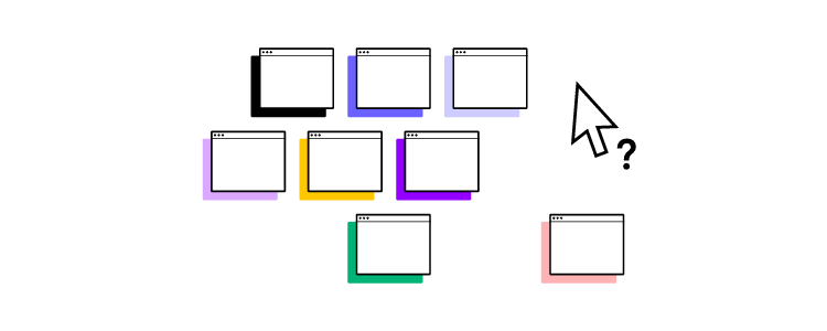
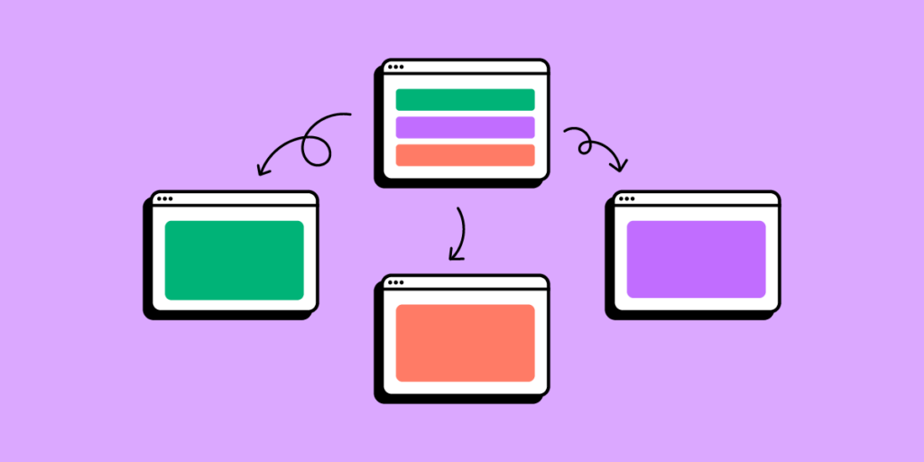
A service safari is a real-world research method where designers experience a product as a user–like mystery shopping. You can conduct a service safari on your product, competitors’, or both. The process works for physical products, services, and digital products.

During a service safari, team members complete various tasks to gain insights into the product’s customer experience.

A service safari is a valuable UX design research method because it’s inexpensive (for most digital products), and teams can complete the process without users.

A service safari ultimately provides a realistic look at the user journey and competition, helping design teams refine their products to deliver a better experience and capitalize on market opportunities.

Who Does a Service Safari?

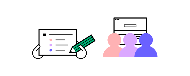
Usually, various team members from a design project participate in a service safari. Participating in a service safari gives team members valuable insights into the competition, but the process also provides an opportunity to empathize with users from a product-usage perspective.

When to do a Service Safari?

UX designers complete service safaris during the discovery phase of a design project when researching competitors or evaluating an existing product for a redesign. They use the results to identify opportunities and pain points that help guide the design process.

What is the Purpose of a Service Safari?

A service safari is a research activity where design teams observe and interact with competitor services and their own services from a customer’s perspective. By “walking in the shoes” of the end-user, teams gain valuable insights that can help inform product improvements, identify business opportunities, and refine the user experience. Here’s a breakdown of key reasons for conducting a service safari:

Understand the Competition and Their Services

A service safari allows design teams to study competitors’ offerings firsthand, giving them insight into how competing services are structured, marketed, and experienced. This competitive analysis can reveal what other companies are doing well, such as unique features, standout customer service practices, or pricing models. By understanding the competitive landscape, teams can identify gaps or strengths in their own service.

Determine the Quality of Service (Competitors and Internally)

Teams use service safaris to evaluate the quality of both competitor services and their own, helping them to objectively assess things like usability, accessibility, and customer satisfaction. Experiencing the service directly allows them to identify strengths and weaknesses in real-time, such as wait times, support responsiveness, or user interface design, allowing for a more nuanced understanding of service quality compared to traditional benchmarking.

Spot New Business Opportunities

Observing competitor services or even adjacent industry services can spark ideas for new offerings or improvements. By exploring the broader service environment, teams may spot trends or emerging needs that can inform future product features, services, or business models. This insight enables businesses to proactively innovate and stay ahead of market trends.

Identify User Pain Points and Areas for Improvement

Experiencing a service as a user highlights frustrations, barriers, or inefficiencies that might not be obvious in a traditional review. For instance, slow-loading pages, confusing navigation, or poor customer support are issues that teams can better address after experiencing them firsthand. This identification of pain points is crucial for teams looking to improve user satisfaction and optimize the service experience.

Gain a User’s Perspective to Empathize Better

Empathy is at the heart of good design. By immersing themselves in the service as if they were users, team members can better understand and relate to user emotions, expectations, and needs. This empathy-driven perspective helps design teams make decisions that prioritize user comfort and satisfaction, resulting in a more user-centered approach to product and service development.

Pros and Cons of a Service Safari

Pros:

  • Improves Empathy for Customers – Experiencing a service directly helps team members connect with user frustrations, challenges, and joys, deepening their empathy for customers. This firsthand experience is crucial for creating a user-centered design and for understanding the emotional journey users undergo during service interactions.
  • Gain a First-Hand Understanding of the Competition – By actively engaging with competitor services, teams observe what other businesses are doing well and where they might fall short. This type of direct observation provides insights that go beyond theoretical analysis, offering practical, detailed observations that can inform design and strategy.
  • Helps Validate or Complement Other Research – Service safaris serve as a practical validation tool, allowing teams to confirm findings from surveys, user interviews, or usability testing. Observing and interacting with services in real time can highlight details or patterns that may have been overlooked in other types of research, providing a fuller picture of the user experience landscape.

Cons:

  • Risk of Bias from Team Members Too Familiar with the Product – When team members who are deeply familiar with their own product undertake a service safari, they might unknowingly carry biases that influence their observations. This familiarity can make it challenging to view the service from an objective, user-centric perspective, potentially skewing results or insights.
  • Difficult to Fully Adopt a Customer’s Mindset – Knowing the product too well makes it hard to replicate a true user experience, as team members may anticipate certain steps or outcomes. This insider knowledge can prevent participants from genuinely experiencing the challenges, confusion, or excitement that a first-time user would feel.
  • Ambiguity Without Clear Objectives – Service safaris require well-defined goals to yield actionable insights. Without clear objectives or a structured plan, the data collected may be too broad or scattered, making it challenging to draw specific conclusions or identify actionable steps for improvement.

5 Steps for Conducting a Service Safari

scaling process up 1

The level of planning for a service safari will depend on the product or service you’re evaluating. For example, a travel booking app will require taking a flight, while a productivity app you can experience from the office.

Step 1. Meet With Team Members & Stakeholders

Meeting with stakeholders before a service safari is essential to agree on the approach, budget, business goals, timeline, and deliverables.

Next, you want to meet with the team taking part in the safari, create a plan, define the methods, outcomes, and assign tasks. Your team will also need to gather the necessary tools and materials like stationery, devices, tools, etc.

Step 2. Set Clear Objectives

Setting clear and actionable objectives is crucial in planning a service safari. These objectives will ensure team members understand each task and its outputs/deliverables.

Design Principal at ustwo in the UK, Hollie Lubbock, recommends pairing a research question with a goal to create a clear objective mission statementobjective = research question + goal.

For example:

  • Question: “How do we open a new bank account using a competitor’s app? What are the current options, hacks, and issues with achieving this goal?”
  • Goal: “Understand the highs, lows, and friction points in this experience.”

Step 3. Define the Documentation Process and Deliverables

How do you want team members to document their service safari experience? Some examples include:

  • Notes (written, voice, etc.)
  • Screenshots/screen recordings
  • Photos and videos

Hollie Lubbock recommends you outline “key areas to document.”

  • The experience over time: Pre/during/post
  • What or who you encounter: People/processes/objects/ environments/places/communications

Hollie also gets team members to gather their general impression of the experience, like:

  • How much time does it take to complete the task?
  • Is it easy to complete?
  • Are there clear instructions or options?
  • Did you hit any dead ends? Or experience any errors?

Answering these questions provides valuable insights about the product and enables team members to empathize better when developing a solution later in the design process.

Step 4. Conduct the Service Safari

Depending on the product, a service safari could take a few hours or several weeks. Kate Greenstock’s service safari of Jelf Insurance Brokers’ UK offices took eight weeks to complete.

The most important part of running a service safari is documenting the process according to your objectives. We recommend taking lots of notes, screenshots, recordings, etc., so you don’t miss anything.

Hollie Lubbock created this free Google Doc for documenting your service safari. 

We also recommend checking out Preety Naveen’s Service Safari With Skycash–a Polish-based payment service. Preety created a three-step process for each step of her Skycash service safari:

  • Actions: The actions she took in each step
  • Problems: The problems resulting from each action
  • Recommendations: Suggestings to improve each step

A service safari aims to experience every touchpoint from a user’s perspective. Sutherland Labs’ service safari gives an example of exploring touchpoints for a train booking service:

  • Booking website/app
  • Visiting the station, getting on the train, etc.
  • What happens at the turnstiles?
  • What’s the physical ticket office like?
  • Physical artifacts (tickets, maps, etc.)

The team from Sutherland Labs also takes the opportunity to speak to people, including staff and customers, to get different perspectives. For example, if you’re designing a train booking app, how do people with disabilities experience the service? What are their pain points?

While a service safari is primarily about you experiencing the service, it’s ultimately about finding a solution for customers, so take the opportunity to speak to other users and ask questions. This inquisitive approach could provide valuable usability and accessibility insights.

Step 5. Synthesizing the Results

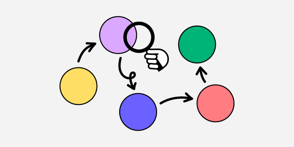
An affinity map works best when analyzing notes from a service safari. You’ll need a whiteboard (or digital alternative for remote collaboration) and sticky notes.

  1. Create headings for each step in your service safari–i.e., open the app, create an account, etc. If you’re analyzing products from several competitors, these steps might differ.
  2. Write your raw notes for each step onto sticky notes and paste them under the relevant heading.
  3. As a group, identify patterns, key issues, and opportunities.
  4. Create a journey map to visualize your results and guide your next decisions.

It’s important to note that you must never use a service safari as a standalone piece of research. Design teams must cross-reference the results with other data or use it to guide and validate further user research.

Using Service Safaris to Prototype in UXPin

collaboration team prototyping

Building prototypes is an excellent way to test recommendations and hypotheses after a service safari. UXPin’s built-in design libraries, like Google’s comprehensive Material Design UI, enable designers to build prototypes, test ideas, and iterate fast!

Instead of presenting just a customer journey map or report to stakeholders, designers can build a quick prototype in UXPin, and use it to get buy-in for their solution.

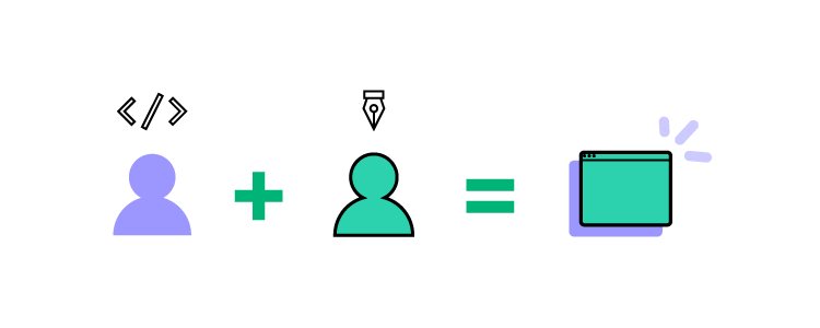
Enhanced Collaboration

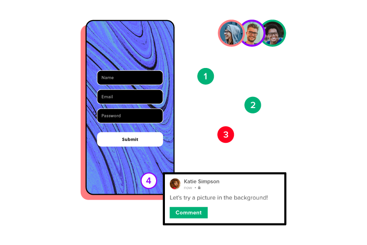
Whether you’re working in the office or part of a remote team, UXPin’s Comments enhance collaboration between design teams. Multiple designers can simultaneously work on the same project to design wireframes, mockups, and prototypes.

Adding Stakeholders and Collaborators

Did you know you can share your UXPin projects with stakeholders, experts, consultants, and other collaborators who don’t have a UXPin account?

These stakeholders can view your designs and prototypes, leave comments, and approve from anywhere–perfect for today’s remote work environments. You can even include a message with your approval, so stakeholders know what they’re reviewing for approval. UXPin also integrates with Slack and Jira, allowing you to discuss projects in one place.

Streamlined Design Handoffs

Design handoffs are a stressful time for designers and engineers. Miscommunication, lack of documentation, and poor-quality prototypes cause friction between teams. 

Because UXPin is a code-based design tool, designers can replicate code-like functionality and fidelity, while Spec Mode gives engineers context and documentation to begin the development process, including:

  • Inspecting Properties: Inspect the properties of any element or component, including its size, grid, colors, and typography.
  • Distance Measurement: Measure distances between elements or the canvas edges.
  • Style Guide: Details about the project’s styles, including colors, typography, and assets.

Designers can also create documentation with labels for each element to provide engineers with context and explanations–no more external PDFs or attachments!

If you’re still using outdated image-based design tools to design, prototype, and test, it’s time to switch to UXPin–the world’s leading code-based design solution. Sign up for a free trial and start designing better user experiences for your customers today!

Django vs Laravel – Which is the Best Backend in 2024?

Django vs Laravel

Django and Laravel are two popular web frameworks used for building web applications, each with its own set of features, benefits, and trade-offs.

Django is built using Python while Laravel is created with PHP. Python is known for its readability and simplicity, which often makes Django easier to learn for beginners. Laravel, on the other hand, is more flexible and expressive, allowing developers to structure their applications as they see fit. Let’s compare both of them.

Build UI for your Laravel or Django application with React components. Design fully customizable, code-backed prototypes in UXPin Merge and copy the code off your design with one click. Try UXPin Merge for free.

Design UI with code-backed components.

Use the same components in design as in development. Keep UI consistency at scale.

Django vs Laravel – Definition

What is Django?

Django is a powerful web framework that accelerates web development while maintaining a clean and pragmatic design. It empowers developers to build robust and scalable web applications efficiently, with a rich set of tools and features that promote best practices in code organization and security.

Django is widely adopted by various companies, organizations, and developers for building a range of web applications, from simple websites to complex, data-driven platforms. Notable users include NASA, Spotify, Pinterest, and more.

Django was created in 2003 by Adrian Holovaty and Simon Willison while they were working at the Lawrence Journal-World newspaper in Lawrence, Kansas. The framework was initially developed to meet the fast-paced requirements of a newsroom, where the need for rapid web development was paramount.

The main objectives behind Django’s creation were to:

  • Speed Up Development: Provide a high-level framework that allows developers to build web applications quickly without compromising on quality.
  • Ensure Reusability: Create reusable components to avoid repetitive code and promote best practices.
  • Maintain Security: Integrate security features to protect applications from common vulnerabilities.

Django was released publicly under an open-source license in July 2005, making it available for developers worldwide to use, contribute to, and improve. Since then, it has grown into a powerful and widely-used web framework supported by a large and active community. The Django Software Foundation (DSF) was established to support the development and maintenance of Django, ensuring its continued growth and adherence to its founding principles.

What is Laravel?

Laravel is a robust web framework designed to streamline web development with elegant syntax and comprehensive features. It provides developers with the tools needed to build modern web applications efficiently, promoting best practices in code organization, maintainability, and security. Laravel’s modular architecture and extensive ecosystem make it a preferred choice for developing dynamic and scalable web applications.

Laravel is widely adopted by numerous companies, organizations, and developers for various web applications, ranging from small websites to large-scale enterprise solutions. Notable users include BBC, About You (eCommerce store), 9GAG.

Laravel was created by Taylor Otwell in 2011 as an attempt to provide a more advanced alternative to the CodeIgniter framework. Otwell aimed to create a framework that included built-in support for user authentication and authorization, features that were lacking in other PHP frameworks at the time.

The main objectives behind Laravel’s creation were to:

  • Enhance Development Speed: Offer a framework that allows developers to build web applications quickly and efficiently with less boilerplate code.
  • Promote Elegance and Readability: Ensure that the codebase remains clean, readable, and expressive.
  • Ensure Modular Architecture: Provide a modular structure that makes it easy to extend and customize the framework.
  • Improve Security: Integrate robust security features to protect web applications from common vulnerabilities.

Laravel was released under an open-source license, encouraging developers from around the world to use, contribute to, and enhance the framework. Since its inception, Laravel has grown rapidly in popularity, supported by a dedicated community and a rich ecosystem of packages and tools. The Laravel ecosystem includes a range of products such as Laravel Forge, Laravel Vapor, and Laravel Nova, all designed to improve the developer experience and facilitate the creation of high-quality web applications.

Differences between Django and Laravel

Language and Syntax

One of the primary differences between Django and Laravel lies in the programming languages they use. Django is built on Python, known for its readability and simplicity, making it an excellent choice for beginners and those who appreciate clean and concise code.

On the other hand, Laravel is based on PHP, which has a vast history and is widely used for web development. PHP has a more complex syntax compared to Python, but Laravel’s elegant syntax and expressive code help streamline the development process.

Development Speed and Features

Django adopts a “batteries-included” philosophy, providing a comprehensive set of built-in features such as an admin interface, authentication system, ORM, and more. This approach accelerates development by reducing the need for third-party packages and integrations.

In contrast, Laravel also offers a rich set of features out of the box, including Eloquent ORM, Blade templating engine, and built-in authentication. However, Laravel’s modular nature allows developers more flexibility in choosing and integrating packages as needed.

Performance and Scalability

Performance and scalability are crucial considerations for any web framework. Django, with its efficient ORM and Python’s execution speed, is well-suited for handling high-traffic applications and complex data operations. It is designed to scale efficiently and manage large workloads.

While Laravel performs well for many applications, it may require more optimization efforts to achieve the same level of performance as Django, especially for very high-traffic sites. Proper use of caching, database optimization, and other performance-enhancing techniques can mitigate these differences.

Ecosystem and Community

Both Django and Laravel have strong ecosystems and active communities, but they differ in their focus and resources. Django benefits from the broader Python ecosystem, which includes powerful libraries for data science, machine learning, and scientific computing. This makes Django a versatile choice for applications that might extend beyond web development.

Laravel, supported by a vibrant PHP community, offers a rich ecosystem with tools like Laravel Forge, Vapor, and Nova, which simplify development and deployment. Both frameworks have extensive documentation and community support, making it easier for developers to find help and resources.

Security and Best Practices

Security is a key consideration in web development, and both Django and Laravel emphasize best practices.

Django has built-in protections against common security vulnerabilities like SQL injection, XSS, and CSRF, with a strong focus on providing secure defaults. Laravel also offers robust security features and built-in protections, along with tools to facilitate secure coding practices.

The choice between Django and Laravel may come down to the specific security needs of the project and the developer’s familiarity with implementing security measures in Python or PHP.

Is Django better than Laravel?

Choose Django if you prioritize scalability, security, and rapid development, and if you are comfortable with Python or willing to learn it. Choose Laravel if you prefer PHP, value elegant and expressive syntax, and want to leverage Laravel’s rich ecosystem and tools.

Ultimately, both frameworks are capable of building a robust, scalable web application. The best choice depends on your specific needs and existing expertise.

Django Advantages

  • Rapid Development: Django’s “batteries-included” approach offers many built-in features, such as an admin panel, authentication, and ORM, which speed up development.
  • Security: Django emphasizes security, with protections against common web vulnerabilities built into the framework.
  • Scalability: Designed to handle high-traffic sites efficiently, making it a good choice for large-scale applications.
  • Readable Code: Python’s readability and Django’s clean architecture make maintaining and scaling your application easier.
  • Community and Documentation: Django has extensive documentation and a large, active community, which can be very helpful for new developers.

Laravel Advantages

  • Elegant Syntax: Laravel offers a clean and expressive syntax, making it easy to write and maintain code.
  • Rich Ecosystem: Includes a wide range of packages and tools (e.g., Laravel Nova, Laravel Forge, Laravel Vapor) to streamline development and deployment.
  • Blade Templating Engine: Laravel’s Blade templating engine is powerful and easy to use for creating dynamic web pages.
  • Authentication and Authorization: Built-in support for authentication and authorization, making it easier to manage user access.
  • Eloquent Object-Relational Mapping: Simplifies database interactions with an intuitive and powerful Object-Relational Mapping system.

Django’s Weak Spots

  • Opinionated Structure: Django’s opinionated nature might limit flexibility if you want to deviate from its conventions.
  • Templating Engine: Django’s templating engine is powerful but might not be as flexible as Blade for some developers.

Laravel’s Weak Spots

  • Performance: Laravel comes with a lot of features out of the box, which can add overhead. While these features enhance development speed and ease, they can impact performance if not managed properly.
  • Learning Curve: PHP and Laravel’s conventions might have a steeper learning curve for those unfamiliar with the language.

Should I Learn Laravel or Django in 2024?

Deciding whether to learn Laravel or Django in 2024 depends on the type of projects you aim to work on. PHP that Laravel is built on remains one of the most widely used programming languages, and Laravel is one of the most popular PHP frameworks. This can translate into good job opportunities, especially for web development roles.

Django is used in a variety of applications beyond web development, including automation scripts, data analysis tools, and more, making Python skills broadly applicable.

Ultimately, both frameworks are powerful and capable. If possible, gaining some familiarity with both can make you a more versatile and in-demand developer.

FAQ: Laravel or Django

Q1: Which is easier to learn: Django or Laravel?

Both frameworks have active communities and excellent documentation, but Django is often considered easier for beginners due to Python’s straightforward syntax and Django’s “batteries included” philosophy, which provides many built-in tools. Laravel, however, is also accessible for those familiar with PHP and offers elegant syntax that simplifies many web development tasks.

Q2: Is Django faster than Laravel?

Django is generally faster for data-heavy applications due to Python’s efficiency and Django’s ORM (Object-Relational Mapping) system, which is optimized for performance. Laravel can be optimized as well, but for extremely high-traffic sites, Django may have a performance advantage out of the box.

Q3: Which framework is more scalable: Django or Laravel?

Django is often seen as more scalable, especially for handling large-scale applications and high-traffic environments. Its Python core and compatibility with scientific libraries make it suitable for big data applications. Laravel can also scale, but it may require more custom configurations and caching solutions for optimal performance in high-scale deployments.

Q4. Does Django have better security than Laravel?

Django has robust, built-in security features by default, such as protection against SQL injection, cross-site scripting (XSS), and cross-site request forgery (CSRF). While Laravel also includes security measures, Django’s security features are considered more comprehensive for preventing common web vulnerabilities.

Q5: What types of projects are Django and Laravel best suited for?

Django is ideal for data-intensive applications, scientific projects, machine learning integration, and any project that benefits from Python’s extensive ecosystem. Laravel is better suited for traditional web applications, e-commerce sites, and projects where PHP’s extensive library support and integration with content management systems (CMS) are advantageous.

Q6: Which has a larger community: Django or Laravel?

Both frameworks have strong communities, but Laravel’s PHP-based community tends to be larger and more diverse due to PHP’s extensive use in web development. Django’s community is smaller but robust, with a strong presence in scientific and data science sectors.

Q7: Can Django and Laravel be used for mobile app backends?

Yes, both frameworks can serve as backends for mobile applications by providing APIs that mobile apps can interact with. Django REST Framework (DRF) is particularly popular for building APIs in Django, while Laravel offers Laravel Sanctum and Passport for API authentication and management, making both frameworks effective choices for mobile backends.

Q8: Do Django and Laravel support RESTful APIs?

Yes, both frameworks have strong support for RESTful API development. Django has the Django REST Framework (DRF), which is widely used and provides extensive tools for building and managing APIs. Laravel includes built-in support for API development, making it easy to create RESTful APIs with routes, middleware, and authentication.

Q9: Which framework has better support for deployment and hosting?

Django works well with many cloud platforms, including AWS, Google Cloud, and Heroku. It also integrates seamlessly with Python-based services and tools. Laravel offers Laravel Forge and Laravel Vapor, which simplify deployment and scaling on various cloud providers, particularly for PHP-focused environments.

Q10: Is Django or Laravel better for e-commerce?

Laravel is often preferred for e-commerce due to its PHP base, which is compatible with popular CMS platforms like WordPress. Laravel packages such as Laravel Cashier and Bagisto also offer features tailored for e-commerce sites. Django can still be used for e-commerce, especially for data-intensive stores, but it may require more custom solutions.

Q11: Which framework has better templating: Django or Laravel?

Laravel’s Blade templating engine is known for its elegant syntax and ease of use, making it popular among developers for creating dynamic content. Django’s templating engine is simpler and effective for many applications but lacks some of Blade’s advanced features, such as direct logic implementation within templates.

Build a Layout for your Django or Laravel App

Both Django and Laravel are capable of serving as excellent backends for a React application which you can quickly build with UXPin Merge. Drag and drop React components and create fully functional layout that you can open in StackBlitz or copy to any other IDE. Try UXPin Merge for free.

How Does React Work?

How does React work

React is a JavaScript library used for building user interfaces, especially for single-page applications where the user interacts with the web page without requiring a full page reload. Developed and maintained by Facebook, React has become popular for its declarative approach to building UI components and its efficient rendering through a virtual DOM (Document Object Model).

Build React app prototypes that are ready for development with one click. Drag-and-drop UI components that come from best open-source React libraries like MUI, Ant design, React Bootstrap or bring in your own React components. Try UXPin Merge.

Design UI with code-backed components.

Use the same components in design as in development. Keep UI consistency at scale.

What is React?

React, also known as ReactJS or React.js, is a JavaScript library for front-end development. It was originally developed by Facebook and is now maintained by Facebook and Instagram developers, along with contributions from the open-source community.

React is widely used for creating interactive and dynamic web applications and websites, and it has been employed in the development of some major websites and apps such as PayPal and Netflix.

React simplifies the process of building user interfaces by offering a declarative and component-based approach, leveraging the power of JavaScript, and optimizing performance through features like the virtual DOM.

It’s often confused with React Native — a JavaScript framework, whereas React is commonly referred to React js — a React library. Learn about the differences between React js and React Native here.

What is React often compared with?

React is often compared with other JavaScript libraries and frameworks, such as Angular, Vue or Svelte.

Angular is a JavaScript framework. While both are used for building dynamic web applications, React is a library focused on the view layer, providing more flexibility in terms of integrating with other tools. Angular, on the other hand, is a comprehensive framework that comes with an opinionated structure and a set of tools for building large-scale applications.

When it comes to Vue, it is a progressive JavaScript framework that shares similarities with React in terms of being component-based. Vue.js is often considered more approachable for beginners due to its simplicity, while React is favored for its flexibility and a larger ecosystem of libraries and tools.

Lastly, Svelte is a newer approach to web development that shifts much of the work from the browser to the build step. Unlike React, which works with a virtual DOM, Svelte shifts the work to compile time, resulting in smaller, more efficient code at runtime. React’s virtual DOM approach is often contrasted with Svelte’s compile-time approach.

How React works?

React works by combining several key principles and features that contribute to its efficiency and flexibility in building user interfaces.

Imagine you’re a cook in a bustling kitchen, and React is the set of rules that keeps everything organized and running smoothly. Let’s go through a day in your kitchen to understand how React works.

The Setup: Component Ingredients

You start with components—the ingredients for every dish you’ll make. In React, components are like recipes that define how specific elements of your dish (or UI) should look and function. For instance, you have a component for a button, a header, or a form field. Each one is like a recipe card: reusable, independent, and designed to serve a specific purpose.

Components in React can be of two types:

  • Functional Components: Quick, no-fuss recipes that get the job done with minimal ingredients.
  • Class Components: More elaborate recipes with extra steps for more complex outcomes.

The Main Dish: JSX—Combining Ingredients into a Meal

To assemble a dish, you need to combine ingredients. In React, this is done through JSX (JavaScript XML), which allows you to write HTML-like code inside JavaScript. Imagine JSX as your ingredient list, telling you what elements (components) to put together and how they should look. For example:

function App() {
return (
<div>
<Header />
<Button />
<Form />
</div>
);
}

Here, App is the main dish, pulling in Header, Button, and Form components, just like you’d pull ingredients together for a complex recipe.

Keeping It Fresh: State and Props

In a busy kitchen, dishes are often customized based on diners’ preferences. In React, these customizations are managed by state and props:

  • Props: Think of these as the ingredients each dish needs to function—like adding salt, pepper, or spice levels. Each component gets specific props to create a tailored experience, such as passing “Submit” as a label for the Button component.
  • State: This is the fresh produce. It’s dynamic and can change, just like fresh ingredients that are updated throughout the day. State keeps track of what’s happening in your kitchen at any given moment. For instance, if a customer wants a dish without salt, you’d adjust the state to reflect this preference in real-time.

React’s Secret Sauce: Virtual DOM

Imagine you’ve just plated a dish, but the diner changes their mind and wants extra sauce. In a typical kitchen, you’d have to redo the dish. But React uses a Virtual DOM—a magical, behind-the-scenes process that allows you to update only the parts of a dish that need changing. The Virtual DOM compares the old version of your dish with the new one and applies only the specific changes. This is reconciliation—React’s way of efficiently updating your UI, making changes quick and resource-friendly.

Finishing Touches: Lifecycle Methods

Every dish has stages: prep, cook, plate, and serve. React components also go through a lifecycle, with methods to control how they’re created, updated, and removed. Here are some examples:

  • componentDidMount: When the dish (component) is plated (mounted), this method runs.
  • componentDidUpdate: If something in the dish changes (props or state), this method runs again.
  • componentWillUnmount: When a dish is done and removed, React handles the cleanup.

With these lifecycle methods, React keeps your kitchen running smoothly, efficiently serving dishes (rendering components) based on orders (user actions).

Serving the Dish: The Renderer

Finally, the meal is ready, and it’s time to serve it up. React does this with ReactDOM.render(). It’s like placing the completed dish in front of the customer (the browser), allowing them to experience the final presentation of your carefully crafted components.

And that’s React! Just like a well-run kitchen, React keeps everything organized, efficient, and able to adapt to last-minute changes, ensuring a seamless and enjoyable experience for the end user.

An overview of how React works

Here’s an overview of how it works:

  1. Declarative views — React adopts a declarative approach, where developers describe how the user interface should look based on different states and data. When the underlying data changes, React efficiently updates and renders only the components that are affected, simplifying the development process and enhancing the user experience.
  2. JavaScript code and JSX — React is written in JavaScript, one of the most widely used programming languages. JSX, a syntax extension for JavaScript, allows developers to write UI components in a format that resembles XML or HTML. This makes the code more readable and expressive, contributing to a more efficient development workflow.
  3. Component-based architecture — React applications are structured using a component-based architecture. Components are modular, self-contained units of code that represent different parts of the user interface. This modularity promotes code reusability, making it easier to manage and maintain large codebases. React has functional components and class components.
  4. Hierarchical arrangement of components — One of the key advantages of this architecture lies in the relationship between parent and children components. In React, components can be arranged hierarchically, with some components serving as parents and others as children. The parent component encapsulates the logic or functionality that is common to its children, promoting a structured and organized codebase.
  5. Virtual DOM — React uses a virtual DOM (short for Document Object Model) to optimize the manipulation of the actual DOM. Instead of directly updating the entire DOM when data changes, React first creates a virtual representation of the DOM in memory. It then calculates the most efficient way to update the actual DOM, reducing the need for full page reloads and improving performance.
  6. JavaScript libraries integration — React’s open-source nature and popularity make it compatible with a variety of JavaScript libraries. These libraries, developed by the community, offer pre-written code for various functionalities. Integrating these libraries into React applications helps save development time and effort, allowing developers to leverage existing solutions. Here you can find examples of those libraries based on their popularity.

How to make React work

React developers usually set up a React project to make it work. The process consists of several steps that provide a basic setup for a React project. First, they install Node.js and npm. After this, they create React app. They open a terminal or command prompt and use the create-react-app command to create a new React app. This command creates a new directory called my-react-app with the basic structure of a React app.

Try this yourself if you want to learn React. Install Node.js and npm with this command:

npx create-react-app my-react-app

Then, move into the newly created project directory with this:

cd my-react-app

Start the development server to preview your app locally by typing in:

npm start

Familiarize yourself with the project structure. Key directories include src (source code), public (static assets), and various configuration files such as package.json and src/index.js. React applications are built using components. Open the src/App.js file to see the default component. JSX, a syntax extension for JavaScript, is used to define the component structure.

If you need more resources, check out this simple article: Create your first React app.

Instead of adding or editing components in code, you can use a UI builder like UXPin Merge to build a React app’s user interface and copy the code from the design directly to Stackblitz or other dev environment to set up data structures and deploy your React project.

UXPin has built-in React component libraries, such as MUI, Bootstrap or Ant design and it works by dropping the components on the canvas to arrange an app layout. You can build any layout you want with React elements that are on your disposal, be it an employee portal or a podcast app. And you can bring in your own library of React components if you have one. The components are fully customizable and functional, so you can see how your app would work before deployment. Try UXPin Merge for free.

Why use React?

React, a powerful JavaScript library, offers a multitude of compelling reasons for its widespread adoption in the development community.

  1. Open Source — React is an open-source library, maintained by both Facebook and Instagram developers, along with a large and active community. This community contributes to the ongoing improvement of React, develops additional libraries (e.g., Redux for state management), and provides support through forums and documentation.
  2. Individual component editing — React follows a downward data flow, meaning that changes in a component do not impact components higher in the hierarchy. This enables developers to edit and update individual components without affecting the entire application, resulting in more efficient development and easier maintenance.
  3. Fast and consistent user interface design — React excels in building rich user interfaces, transcending mere aesthetics. Its components act as building blocks, enabling the creation of intuitive and visually stunning UIs. Each interaction, button, and visual element can be meticulously crafted and customized, ensuring an engaging user experience. React is a foundation of many design systems.
  4. Reusable components — Once you create a component, you can reuse it in multiple parts of your application without having to rewrite the same code. This reduces redundancy, making your codebase more concise and easier to maintain.
  5. Flexibility — With the ability to create anything from static websites and desktop applications to iOS or Android mobile apps, React adapts to diverse project requirements. This adaptability is bolstered by its extensive community, which over time has developed a myriad of tools, libraries, and extensions.
  6. Great user experience — React’s prowess in facilitating instant updates without reloading the entire page is a game-changer. This feature provides a smoother and faster user experience, exemplified by actions like ‘liking’ a post on Facebook, where changes occur seamlessly without the need for a full page refresh.
  7. Community — The sheer size and activity of React’s community further solidify its standing. With over 460,000 questions on Stack Overflow’s ‘React.js’ thread and JavaScript’s extensive support, developers can find a wealth of resources and solutions, making React an accessible and well-supported technology.

What can you build with React?

React is a versatile and popular JavaScript library that can be used to build a wide range of React projects.

React is well-suited for creating Single-Page Applications where a single HTML page is dynamically updated as the user interacts with the app. Examples include social media platforms, project management tools, and real-time collaboration apps.

React can also be used to build eCommerce sites. React’s ability to efficiently update the user interface makes it ideal for this type of project. You can create dynamic product listings, shopping carts, and seamless checkout experiences.

Just check out our pre-built eCommerce templates that we include in our tool, UXPin Merge. Those templates are perfect examples of what can be created as a React project. We have a React shopping cart, product page, and product listing. You can quickly copy them to your workflow.

React is great for building data dashboards that require real-time updates. This is particularly useful for analytics tools, monitoring systems, and business intelligence applications that need to streamline internal operations.

What’s more, React can be integrated with mapping libraries to create interactive and dynamic maps. This is useful for applications that involve geolocation, such as travel apps or location-based services. It’s also great for weather apps that utilize maps and location.

Applications that require real-time collaboration, such as messaging apps, collaborative document editing tools, learning management systems (examples), and video conferencing platforms, can benefit from React’s ability to efficiently update the user interface.

Build your app layout with React components

In this article, we explored how React works, its basic features, and give you an idea of what you can build with React components. If you want to experiment now, let’s head on to UXPin and test React by creating a simple app interface. Set up a UXPin trial account and create a new project. Choose MUIv5 library from Design System Library (use keys Option + 2 to open it) and move components onto the canvas. It’s as simple as that.

You can build whatever you want and if you need to access documentation, just click the component and see it linked on the right. Build your first React-based user interface today. Try UXPin Merge.

The Future of Product Design – Top 2025 Predictions

The future of product design

We’ve looked at various trends and technology to make predictions for the future of product design. Rather than put on a tinfoil hat and talk about flying cars, we’ve focused on how current tech will evolve and identified some real opportunities for product designers and developers to innovate.

This article explores six key topics: AI, voice user interfaces, code-to-design innovation, humanity-centered design, and smart cities. The opportunities for product designers are immense, with fully interconnected cross-device and platform systems required for the next decade and beyond.

Code to design is the future of product development–and it’s already here. Bridge the gap between design and development with a single source of truth from UXPin Merge. Visit our Merge page for more details.

Reach a new level of prototyping

Design with interactive components coming from your team’s design system.

AI-Driven Design Systems

AI will become integral to design systems, allowing teams to automate processes, optimize user flows, and create smarter interfaces. By 2025, design systems will incorporate AI to facilitate dynamic component generation. UXPin’s AI Component Creator, for example, already allows designers to generate custom UI components based on high-level design briefs or even user data, speeding up prototyping while maintaining accuracy and consistency with the system’s code.

AI will assist with generating and managing components, ensuring they adhere to brand guidelines and usability principles. Designers can focus on high-level strategy while AI fills in the details, making processes more efficient.

Multimodal and Voice Interfaces

By 2025, designers will need to focus on multimodal interfaces that seamlessly integrate voice, gestures, and touch. Voice User Interfaces such as those in Google Assistant and Amazon Alexa will become even more advanced, allowing for more complex interactions that go beyond simple commands.

Designers will have to blend traditional visual UIs with voice and gesture-based systems, ensuring smooth user experiences across multiple interaction modes.

VUIs will be particularly important in industries like healthcare and automotive, where hands-free interactions are becoming standard. AI-powered voice interfaces will also offer more personalized user experiences, adapting based on user habits and preferences.

AI-Assisted Prototyping and Testing

Prototyping and usability testing will benefit from AI-powered automation. Tools like UXPin Merge and Maze already leverage AI to streamline the design-to-development process, helping with theming, customization, and code-backed component generation.

In addition to automating prototyping, AI will also assist in usability testing. Tools like Maze, which use AI to analyze user interactions, will provide immediate insights and suggest design improvements. Designers will have access to real-time feedback, enabling faster iterations and more user-centered solutions.

Advanced Personalization with AI

Personalization will go beyond tailored content to offer more profound user-specific experiences. Designers will use AI to create custom UI components based on real-time data and user behavior. This will allow product teams to deliver personalized experiences at scale, where interfaces can adjust to individual preferences in real time.

This level of AI-driven personalization will ensure that products feel intuitive and engaging for diverse audiences. Design tools will harness AI to dynamically change layouts, navigation, and other key elements based on how users interact with the product, ensuring a seamless and adaptive experience.

Ethical and Sustainable Design Practices

By 2025, ethical design and sustainability will be non-negotiable components of product design. Tools like Adobe’s Sustainability Toolkit and platforms promoting ethical AI will guide designers in making responsible choices, from minimizing carbon footprints to ensuring inclusivity. AI tools can assist in flagging design decisions that may lead to ethical concerns, such as bias in algorithms or lack of accessibility in interfaces.

AI will also help teams make sustainability-driven decisions by optimizing design resources and reducing data-heavy interactions. Designers will have the tools to balance innovation with responsibility, ensuring their products contribute positively to both users and the environment.

Immersive Experiences with AR and VR

Augmented reality and virtual reality will continue to grow in importance by 2025. Tools like Unity and Blender will be essential for designers looking to create immersive 3D experiences for industries ranging from retail to healthcare. Apple Vision Pro and Meta Quest are pushing the boundaries of what’s possible, and designers will need to adapt by learning new skill sets for creating interactive, multi-dimensional experiences.

AR/VR interfaces will become more intuitive as AI enhances interaction design, making these experiences feel more seamless and natural. These technologies will be integrated into everyday products, from virtual shopping apps to immersive training platforms, creating new avenues for user engagement.

Future Product Design With UXPin

uxpin merge component sync

Traditional UX design methods and workflows are slow and cumbersome. The design-to-code process is inefficient and doesn’t facilitate the speed and accuracy required to meet modern technologies and demands.

UXPin Merge and code-to-design are the future of product development. The streamlined design methodology enables anyone from inexperienced solopreneurs to multinational enterprises to prototype and test ideas with code-like fidelity and functionality.

Reasons why code to design enhances product development:

  • A single source of truth between designers and engineers from a centralized repo reduces the inefficiencies and challenges of design-to-code workflows.
  • Realistic prototypes improve testing so product teams can identify better opportunities and solve more problems during the design process.
  • Realistic, interactive prototypes mean stakeholders can accurately visualize the final product resulting in meaningful feedback and increased confidence in the design process.
  • Code to design results in faster time-to-market with better quality and fewer usability issues, allowing startups to compete with enterprise organizations.

Take your product design process into the future with the world’s most advanced end-to-end design tool. Visit our Merge page.

What is Interaction Design?

Interaction design is one of the most critical facets of user experience design. It makes the product’s interface respond to user’s action, aiding in human-to-computer interaction.

Key takeaways:

  • Interaction design is a multidisciplinary design field that focuses on the interaction between users and digital products, systems, or interfaces.
  • It involves designing how users engage with and experience a product, with the goal of making that interaction intuitive and efficient.
  • It’s often abbreviated as IxD.

It’s one of the most challenging stages of UX design process. UXPin’s code-based design tool reduces those challenges by allowing designers to build functional prototypes with extreme fidelity and interactivity. Deliver better customer experiences today. Sign up for a free trial.

Build advanced prototypes

Design better products with States, Variables, Auto Layout and more.

Try UXPin

What is Interaction Design?

Interaction design is a process of making human-to-computer interfaces (HCI) feel human-like. Interactive digital products create this “human” connection by giving feedback to the end-users. The feedback can be through a scroll-provoked animation, clicked state of a button or transition to another page.

Often shortened to IxD, interaction design uses appropriate interactive elements, such as transitions, microinteractions, animation, but also text, color, visuals, and layout impact users’ feeling and behavior–allowing them to design interactions strategically to elicit the appropriate response.

A good use of interaction design successfully leads to positive user experiences, including:

  • Greater product satisfaction
  • Deeper usability comprehension
  • Faster learnability
  • A deeper personal connection
  • Increased likelihood of repeated use

Interaction Design in HCI

Interaction design in HCI, which stands for Human-Computer Interaction, is designing the interactive elements of a product, such as buttons, menus, and other interface components, to ensure they are intuitive, user-friendly, and responsive to user actions, and facilitate good communication between the user and the system.

The goal of interaction design is to create an engaging user experience that facilitates seamless interaction with the technology. It encompasses understanding user needs, behaviors, and expectations to design interfaces that are not only functional but also enjoyable to use.

By focusing on how users interact with technology, interaction design in HCI aims to enhance usability, accessibility, and overall satisfaction.

Interaction Design vs UI Design

Interaction design focuses on human-computer interaction, including animations, microinteractions, transitions, search, and other motion-based designs. They decide, for example, what happens when a user taps an element.

User interface design focuses on visual design and aesthetics, including color, fonts, iconography, layouts, etc. They decide what a user interface must look like.

To summarize:

  • Interaction design is about Interactions and movement
  • UI design is about visual design and aesthetics

In smaller companies and startups, a UI designer is often responsible for both tasks, while the roles are separate in larger organizations. Like anything in digital product design, the roles and responsibilities can synergize. It all depends on the company, product, and organizational structure.

Interaction Design vs UX Design

Interaction design is a specialized discipline within UX design. Where UX looks at the entire user experience and how everything ties together, interaction designers focus on user interactions and motion.

User experience designers apply UX fundamentals like design thinking, human-centered design, and user research to make decisions. They’re specifically concerned with a user’s tasks, actions, and environment, while interaction designers focus on making the digital product respond to user actions in an appropriate way. They tend to think about what happens when a user clicks a button, types a phrase into a search bar or hovers over an image.

What are Interaction Design Principles?

We’ve chosen our favorite IxD principles from Don Norman’s (co-founder of the Nielsen Norman Group) book, The Design of Everyday Things.

Visibility

With many features and limited space, prioritizing visibility is a significant design challenge. Don Norman’s theory is that the more visible something is, the more likely a user sees and interacts with it. Interaction designers must balance visibility prioritization based on user needs and business goals.

A typical example of visibility is prioritizing navigation links on mobile devices. What links are visible via the app bar, and what do designers place in the navigation drawer behind a hamburger menu?

Feedback

Feedback is how a digital product or system communicates with users. Interaction designers have several ways to express this feedback, including motion or animation, tactile, audio, copy, etc.

testing user behavior pick choose 1

They must also consider accessibility and how products relay feedback to all types of users and assistive technologies.

Constraints

Cluttered UIs with too many possibilities confuse users and create usability issues. Good interaction design limits (or constrains) user actions to guide them through the product more efficiently.

We see these constraints most commonly with landing pages. Designers strip away navigation, links, and anything else that might tempt users to leave the page, leaving only a prominent button CTA or form. Constraining users to a single action allows them to focus on the content that leads to a conversion.

Mapping

Interaction designers must create a clear relationship between controls and their effect on a digital product. The idea is to map these relationships to feel natural to users.

For example, the top button on an iPhone increases the volume while the lower one decreases. This intuitive layout means users don’t have to think about which button performs which action.

The more intuitive and obvious a product is to use, the easier and more enjoyable the experience.

Consistency

Consistency is vital for interaction and UI design. Inconsistency can confuse users and create usability issues. Designers not only have to design consistent UIs and interactions but also consider consistency across multiple screen sizes and devices.

Many organizations build a design system or adopt an open-source component library to increase consistency with approved UI patterns and interactions. When designers don’t have to think about these choices, they can focus on the user experience and apply the appropriate pattern to help users achieve the desired result.

Affordance

Affordance tells users how to use something or perform an action. It’s an interaction designer’s job to ensure that it’s obvious to users how to complete tasks using UI elements.

button interaction click hover

For example, a submit button’s disabled state tells users to complete a form’s required fields before submitting. Using a different color and underline for links tells users which text they can click.

Cognition

Interaction designers must have a basic understanding of cognitive psychology in UX design–attention and perception, memory, problem-solving, and creative thinking. The aim is to design products and experiences that don’t overload these mental processes.

Cognition deals with several design psychology principles, including:

  • Gestalt principles: how the human brain perceives visuals to create familiar structures.
  • Von Restorff effect: predicts that in a group of objects, the one that differs stands out or is most likely to be remembered.
  • Hick’s Law: the more choices you give someone, the longer it’ll take them to make a decision.
  • The Principle of Least Effort: users will make choices or take action requiring the least amount of energy.
  • The Serial Positioning Effect: humans are most likely to remember the first (primacy effect) and last (recency effect) items in a list, sentence, or piece of content.
  • The Principle of Perpetual Habit: people rely on familiar routines and habits–which is why it’s crucial to use universal design patterns.
  • The Principle of Emotional Contagion: humans will mimic or empathize with the emotions and behaviors of others, including animals and animations–which is why designers use faces (even emojis) to emphasize feeling and emotion.
  • Fitts’s Law: the time required to move to a target area is a function between the distance and the target’s size.

Dive deeper into cognition in this article: UX Design Psychology Tricks for Design Excellence and this one: A UX Designer’s Guide to Improving Speed of Use. These principles apply to all UX disciplines.

Interaction Design Checklist

We found this helpful interaction design checklist from the US Government’s Technology Transformation Services website, usability.gov. The checklist includes several questions to consider when designing interactions.

task documentation data
  • Define how users interact with the interface – click/tap, push, swipe, drag & drop, keyboard controls, etc.
  • Give users clues about behavior before they take action – correct labeling, different colors for links, using consistency for clickable UI elements, etc.
  • Anticipate and mitigate errors – how do you prevent errors while providing helpful messages to correct problems?
  • Consider system feedback and response time – what happens after users complete an action, and how soon does that feedback appear?
  • Strategically think about each element – have you chosen the appropriate element/pattern? Is there enough space between clickable elements to avoid errors? Have you followed design psychology principles (mentioned above)? Scrutinize every decision from a user’s perspective.
  • Simplify for learnability – make user interfaces and tasks as simple as possible, use familiar patterns, and minimize cognitive-draining tasks and features to simplify the user experience.

Also, check out the IxD Checklist from Aaron Legaspi and Amit Jakhu.

Interaction Design Resources

What Interaction Designers Do?

An interaction designer’s role focuses on how users interact with products, particularly digital ones like websites, apps, or software interfaces. Their job is to ensure that these interactions are intuitive, seamless, and enjoyable.

Here’s a breakdown of what interaction designers do:

1. Understand User Needs

Interactive designers spend a lot of time researching who the users are and what they need. This includes conducting user research, interviews, and analyzing data to figure out the problems they face and how the product can solve them. Understanding these needs is crucial to designing interactions that make sense for the user.

2. Create User Flows

Once interaction designers know what users need, they design user flows, which are basically maps that outline the steps a user takes to complete a task in the product. For example, in an e-commerce app, the user flow might be from adding an item to their cart, through the checkout process, to receiving a confirmation. The goal is to make these steps as easy and efficient as possible.

3. Design Interactive Elements

This is where interactive designers focus on buttons, navigation, and forms—all the interactive elements users click, tap, or swipe. They design these elements to be clear, functional, and accessible. They’re always thinking about things like: “Does this button stand out? Will the user know what happens when they click it?”

4. Prototype and Test

Interactive designers build prototypes—early models of the product—so we can test how people actually use it. This stage is all about testing assumptions. They gather feedback from users and stakeholders, see what’s working and what’s not, and refine the design based on that.

5. Collaborate with Other Teams

Interactive designers work closely with UX designers, developers, and product managers to make sure the designs are feasible and meet business goals. Developers need to know exactly how interactions should work (like what happens when you hover over a button), and I’m there to clarify and iterate as needed.

6. Ensure Consistency

A big part of their role is making sure the design is consistent across the entire product. Users should feel familiar as they move through different sections. That means sticking to the same design patterns for similar tasks and interactions.

7. Balance User and Business Needs

While their main focus is the user experience, interactive designers also need to align the design with business objectives. For example, if the goal is to increase sign-ups, they might design an interaction that nudges users towards the registration page without feeling pushy or disrupting the user journey.

8. Stay Updated

Finally, interaction designers keep up with design trends, tools, and best practices. Interaction design evolves quickly, and it’s important to stay ahead to ensure the product remains competitive and user-friendly.

In essence, They’re here to make sure the product not only looks good but works in a way that’s easy and satisfying for users. Their focus is always on improving the interaction between the user and the product.

UXPin–The Ultimate Interaction Design Tool

A lack of fidelity and functionality is a significant problem for interaction designers when prototyping and testing using traditional image-based design tools.

Interaction designers must create multiple frames to replicate basic code functionality, which takes considerable time and effort. With UXPin’s code-based design tool, designers can achieve significantly better results with less effort. Here’s how:

States

UXPin enables designers to create multiple States for a single component. For example, you can build a button with default, hover, active and disabled states, each with separate properties and triggers.

UXPin’s States also allows designers to create more complex UI patterns like carousels, accordions, dropdown menus, and more using a single frame. These UI patterns behave like code, giving interaction designers accurate results and feedback during testing.

Interactions

With UXPin Interactions, designers can build immersive, code-like experiences far beyond the capabilities of image-based design tools. UXPin offers a wide range of triggers, actions, and animations to create fully functional, animated prototypes.

Conditional Interactions allow designers to take prototypes a step further with Javascript-like “if-then” and “if-else” conditions to create dynamic user experiences. 

Variables

In UXPin, form fields look and function like the final product. Variables allow designers to capture user inputs and use that data elsewhere in the prototype–like a personalized welcome message after completing an onboarding form.

Expressions

UXPin Expressions take prototyping to another level with code-like functionality, including form validation and computational components (updating a shopping cart). When combined with States, Interactions, and Variables, Expressions allow designers to build prototypes that function like the final product.

These powerful features mean interaction designers don’t have to learn code or rely on engineers to build fully functioning prototypes for accurate testing. With UXPin, designers can build, test, and iterate faster and achieve significantly better results.

Tired of asking usability participants and stakeholders to “imagine” something happening? Switch to UXPin and start prototyping with the world’s most advanced code-based design tool. Sign up for a free trial today.

AI Personas – How to Use ChatGPT to Create Personas

ai personas

Using LLM like ChatGPT to create AI personas for UX design is an emerging practice that can enhance the persona development process, making it faster, more data-driven, and adaptable. Here’s how it works and the potential benefits.

If you’re a fan of AI in design, Merge AI is sure to catch your attention. With UXPin’s design tool with AI features, you can combine the power of code-based design systems with AI-driven component generation for more consistent UI and faster design decisions. This innovative tool bridges the gap between designers and developers, ensuring that what you design is exactly what gets built. Test Merge AI for 14 days on trial. Try UXPin for free.

Build advanced prototypes

Design better products with States, Variables, Auto Layout and more.

Try UXPin

What Are AI Personas?

AI personas are simulated user profiles created with the help of artificial intelligence. These personas are designed to represent different user segments based on data and insights. Traditionally, personas are crafted through user research, interviews, and surveys. With AI, personas can be generated or enriched by analyzing large sets of user data, behaviors, and preferences, allowing for more dynamic and up-to-date user representations.

How to Create AI Personas with ChatGPT

AI personas can transform the traditional UX persona development process by offering dynamic, data-driven profiles that evolve with real user behaviors. ChatGPT can assist UX designers in creating, refining, and updating personas quickly and efficiently. Here’s a comprehensive guide on how to leverage ChatGPT for creating AI personas.

Step 1: Understand Your Target Audience and Gather Initial Data

user search user centered

Before using ChatGPT to generate personas, it’s essential to collect or define the data sources that represent your users. AI personas should be grounded in real information to be truly effective. Some sources include:

Once you’ve gathered your user data, you can feed relevant details to ChatGPT to help generate more accurate personas.

Step 2: Start with Basic Prompts to Generate Persona Outlines

To create AI personas with ChatGPT, you’ll need to start by defining the basic traits that make up a persona. You can use ChatGPT to generate these traits by providing a simple prompt. Here’s an example prompt to begin creating an outline:

Prompt Example: “Help me create a UX persona for a young professional who uses mobile apps to manage personal finances. Include details like age, occupation, goals, pain points, and preferred technology.”

chatgpt in design

ChatGPT will then generate a persona with a specific user profile based on the information provided. You can adjust this as needed by asking more detailed follow-up questions or refining the initial prompt.

Example Output:

  • Name: Emily Jones
  • Age: 29
  • Occupation: Marketing Manager
  • Goals: Track monthly spending, build savings, plan for retirement.
  • Pain Points: Struggles with overly complex finance apps; concerned about data privacy.
  • Technology: Uses mobile apps on iPhone, prefers clean, simple UIs, syncs with banking apps.

Step 3: Expand Persona Details with Specific Prompts

Once you have a basic persona outline, you can use ChatGPT to enrich it with more specific details, such as motivations, behaviors, or even the type of content they prefer. Here are prompts to expand the persona:

  1. Goals and Motivations: “What are the main motivations for Emily Jones to use a personal finance app?”
  2. User Behavior: “Describe how Emily typically interacts with personal finance apps on her mobile device.”
  3. Pain Points: “What are the biggest pain points for users like Emily when it comes to managing personal finances through mobile apps?”
  4. Daily Routine: “Describe Emily’s daily routine and when she is most likely to interact with financial tools or apps.”

This iterative process allows you to build detailed, well-rounded personas by continuously refining the responses ChatGPT provides.

Step 4: Create Multiple Personas for Different User Segments

UX projects often need multiple personas to represent different user segments. You can use ChatGPT to create additional personas by altering the input criteria. For example:

Prompt Example: “Create a persona for an older adult who is less tech-savvy and needs an intuitive mobile app for tracking retirement savings.”

This will generate a persona for a different demographic, and you can repeat the process to capture a variety of user segments (e.g., tech-savvy millennials, older users, or small business owners).

Example Output:

  • Name: Richard Cooper
  • Age: 62
  • Occupation: Retired
  • Goals: Simplify budgeting for retirement savings.
  • Pain Points: Finds most apps too complex, worried about making financial mistakes.
  • Technology: Uses Android but prefers apps with large text and straightforward navigation.

Step 5: Use Data to Refine and Validate Personas

After generating initial personas with ChatGPT, you should validate these personas with actual data and feedback. Here’s how you can do it:

  1. Validate with Real User Feedback:
    • Compare AI-generated personas with real user feedback from interviews or surveys to ensure they align with actual behaviors and needs.
  2. Refine Personas Using Additional Data:
    • Use analytics data (such as app usage patterns, popular features, or common drop-off points) to refine personas, updating pain points, goals, or behaviors based on real-world insights.
  3. Iterate Based on Testing:
    • During usability testing, gather more feedback on how users like “Emily” or “Richard” interact with your product. Use this to fine-tune the personas further.

Step 6: Create Scenarios and Journey Maps Using Personas

image 12

Once you’ve created your AI personas, you can prompt ChatGPT to create specific user scenarios or journey maps for each persona. This will help you visualize how each persona interacts with your product.

Scenario Prompt Example: “Create a user scenario for Emily Jones using a new feature in a personal finance app that helps her track her spending habits.”

Example Output:

  • Scenario: Emily opens the personal finance app at the end of the week to review her spending. She navigates to the “Weekly Summary” feature, where she sees a breakdown of her spending by category. Emily uses the feature to spot an increase in dining out expenses and sets a goal to reduce that spending next month.

You can also generate full user journey maps for a persona by prompting ChatGPT to outline the steps a user might take during a specific interaction, such as signing up for the app or achieving a specific goal.

Step 7: Use Personas for Cross-Team Collaboration

designops picking tools options

Share AI-generated personas with your team to ensure everyone is aligned. Personas can help:

  • Developers understand key features and usability needs.
  • Marketers tailor communication and campaigns based on user motivations.
  • Designers craft user-centered interfaces that address personas’ pain points and goals.

By integrating AI personas into the workflow, cross-functional teams have a common understanding of the target users, leading to more cohesive decisions.

Step 8: Continuously Update and Improve Personas

designops efficiency arrow

One of the key benefits of using AI-generated personas is their ability to evolve. As you gather more data, continue using ChatGPT to update the personas with new insights. This dynamic approach ensures that your personas stay relevant and reflective of real user needs over time.

Update Example: “Based on recent feedback, Emily’s financial goals have changed. Update her persona to reflect a greater focus on long-term investment planning.”

Best Practices for Using AI in Persona Development

  1. Combine AI with Qualitative Research: While AI like ChatGPT can speed up persona creation, always supplement personas with qualitative user research (interviews, surveys) to ensure depth and accuracy.
  2. Validate AI Personas with Real Data: Use analytics and real user interactions to refine and confirm the personas created by ChatGPT.
  3. Keep Personas Dynamic: Don’t treat personas as static. Continuously update them with new data and insights as user behavior evolves.
  4. Collaborate with the Entire Team: Share the personas across all teams—development, marketing, and design—so everyone works from the same understanding of your target users.

Advantages of Using AI Personas

  1. Speed – AI can dramatically speed up the persona creation process. Instead of weeks of research and manual creation, AI can help you generate personas in a matter of minutes by processing large datasets or using existing insights.
  2. Data-Driven Insights – AI personas can be based on actual user behavior and real-time data rather than relying solely on assumptions or limited qualitative research. This makes them more representative of current user needs and trends.
  3. Scalability –AI can generate personas for multiple user segments quickly, which is useful for large projects or products that target diverse audiences. You can also create dynamic personas that evolve as new data comes in.
  4. Consistency –AI ensures consistency across persona creation, reducing the subjective bias that can occur when different team members manually create personas. ChatGPT can be programmed to follow specific guidelines or criteria, maintaining uniformity.
  5. Adaptability – Unlike traditional personas that can become outdated over time, AI personas can be updated easily by feeding new data into the system. This adaptability allows designers to keep pace with changing user needs and market conditions.

Challenges and Considerations

  1. Accuracy and Depth – While AI like ChatGPT can analyze and generate personas based on available data, it may lack the depth of insights gained from direct user interactions. AI personas should be supplemented with qualitative research to ensure they capture the emotional and psychological nuances of users.
  2. Ethical Concerns – AI-generated personas rely on data, which raises ethical considerations about data privacy and bias. Care must be taken to ensure that data used is representative, unbiased, and complies with privacy regulations.
  3. Over-Reliance on AI – AI should not replace human intuition and empathy in the persona creation process. While AI can assist, it’s essential for designers to remain engaged with users through interviews and research to fully understand their needs.

Are AI Personas Any Good?

AI like ChatGPT can be a powerful tool for creating or enhancing UX personas. It speeds up the persona development process, allows for dynamic updates, and provides more data-driven insights. However, it’s important to combine AI-generated personas with traditional user research to ensure depth, empathy, and ethical integrity in your design process. By using AI personas, UX designers can save time, focus on more strategic tasks, and create more accurate and adaptable user profiles.

UXPin’s Merge revolutionized how teams design by allowing them to create fully functional, code-based components directly in the design tool. Now, with the power of AI, UXPin takes your design process to an entirely new level. Imagine the seamless integration of design systems and AI component generation that fits your design system perfectly. Test Merge AI for 14 days on trial. Try UXPin for free.

UX Process Cheat Sheet for Busy Teams

UX Process Cheat sheet

A cheat sheet is a concise reference guide that provides quick, essential information about a particular topic or process. It’s designed to simplify complex information into easy-to-follow steps without having to sift through large amounts of content.

In the context of UX process, a cheat sheet might outline the steps in the design process It acts as a quick, structured tool to guide you through each step, ensuring that important tasks are not overlooked and that the design work remains organized and efficient.

If you’re working in a large team, use UXPin to streamline your entire UX process and improve collaboration across departments. UXPin offers an all-in-one design tool that allows designers, developers, and stakeholders to work seamlessly together. With UXPin, you can create high-fidelity prototypes with real, interactive components—no need for switching between multiple tools or handoffs that lose important details. Try UXPin for free.

Build advanced prototypes

Design better products with States, Variables, Auto Layout and more.

Try UXPin

Why Should You Follow This Cheat Sheet?

The cheat sheet transforms chaos into clarity, giving your team the tools to succeed from day one. It not only helps you stay on track but also elevates your work, turning good designs into great user experiences. With it, you’re not just completing a project—you’re crafting a product that truly solves problems, delights users, and exceeds expectations.

With this cheat sheet, you know exactly where to start: gathering insights from stakeholders, mapping out user journeys, and conducting solid user research. As you move from ideation to prototyping and testing, the cheat sheet ensures no steps are overlooked. It keeps the team aligned, helps you avoid mistakes, and provides a roadmap for each member to follow.

This cheatlist becomes handy when dealing with stakeholders. They can see the process is professional and methodical, and they trust the final product will meet user needs because you’ve built it around research and continuous iteration. Every decision you make is backed by data and user feedback. Instead of feeling lost, you’re confidently delivering a product that’s been validated at every step.

UX Process Cheat Sheet

Here’s a UX Process Cheat Sheet that provides an overview of key steps in a typical UX design process. This cheat sheet can help teams streamline their workflow and ensure a user-centered approach.

1. Discovery (Research Phase)

  • Goal: Understand the problem space, users, and business objectives.
  • Action Steps:
    1. Conduct stakeholder interviews to define business goals, project scope, and success metrics.
    2. Perform user research through interviews, surveys, and contextual inquiries to understand user pain points, behaviors, and motivations.
    3. Analyze competitors by identifying market gaps and opportunities.
    4. Review user data and performance metrics to uncover trends and identify areas for improvement.
    5. Conduct a SWOT analysis to evaluate strengths, weaknesses, opportunities, and threats for the product.
    6. Document detailed user personas and user journey maps.
    7. Compile a competitive analysis report, highlighting key findings.
    8. Draft a preliminary PRD that outlines product goals, constraints, and user requirements.

2. Product Definition (Define Phase)

  • Goal: Establish a clear product vision that aligns with user and business needs.
  • Action Steps:
    1. Organize a product kickoff meeting to align all stakeholders on the product vision, roles, and responsibilities.
    2. Define value propositions, customer segments, and strategic goals.
    3. Conduct a technical feasibility assessment to ensure the product concept is achievable.
    4. Perform a risk assessment to identify potential roadblocks and how to mitigate them.
    5. Create a product vision document that defines the long-term strategic vision.
    6. Create a detailed Functional Specification Document (FSD) to outline technical requirements such as supported platforms, input fields, error messages, and system behaviors.

3. Ideation (Creative Phase)

  • Goal: Generate creative solutions that address user needs and business objectives.
  • Action Steps:
    1. Facilitate brainstorming and design thinking workshops to generate a range of possible solutions.
    2. Conduct assumption mapping to identify and validate key assumptions about users, the market, and technical constraints.
    3. Create service blueprints to visualize the ecosystem and interactions users have with the product.
    4. Organize and prioritize features using card sorting exercises and a user task matrix.
    5. Develop rough sketches and low-fidelity wireframes to visualize key concepts.
    6. Prioritize the feature list based on technical feasibility, business impact, and user needs.

4. Prototyping (Design Phase)

5. Testing (Validation Phase)

6. Build (Implementation Phase)

  • Goal: Translate the validated design into a working product through collaboration between design and development teams.
  • Action Steps:
    1. Prepare and deliver design specifications and assets to developers using tools.
    2. Plan development sprints using an Agile methodology, ensuring continuous feedback loops with stakeholders.
    3. Integrate automated testing tools for functionality, performance, and security to ensure code quality during development.
    4. Implement design QA processes to ensure the final build matches design specifications and functions as expected.
    5. Use bug tracking software (e.g., JIRA) to monitor, document, and resolve issues as they arise.
    6. Perform dogfooding (internal testing) by having your own team use the product to find bugs and usability issues.
    7. Document technical details for future reference and maintenance.

7. Iteration & Continuous Improvement

  • Goal: Continuously refine and improve the product based on real-world data and user feedback.
  • Action Steps:
    1. Set up feedback loops with customer support, sales, and other customer-facing teams to collect real-world issues and suggestions.
    2. Monitor analytics and performance metrics using tools like Google Analytics or Hotjar to identify friction points or areas for improvement.
    3. Conduct post-launch A/B testing and usability testing to further optimize the product experience.
    4. Use feature flagging to release new features incrementally and gather feedback from specific user segments.
    5. Update the product roadmap based on feedback, performance data, and business priorities.
    6. Iterate on key features based on insights from post-launch analysis.

Supplemental Tools and Documentation:

  • Action Steps:
    1. Create a Functional Specifications Document (FSD) with precise technical details, including data input fields, validation rules, and interaction behaviors.
    2. Develop a Design Specification Document that includes detailed typography, spacing, grids, colors, and reusable components.
    3. Draft a QA Test Plan outlining the steps and criteria for testing the product’s functionality, usability, and performance.
    4. Implement a Content Strategy Document to plan and manage content structure, governance, and updates.
    5. Maintain a Product Roadmap that outlines future features, updates, and iterations based on feedback and performance data.

How to use UX Process Checklist?

To use this checklist effectively in your UX process, follow these steps:

Set Up at the Start of Your Project

Begin by reviewing the checklist before you start the project. Identify which phases of the UX process are most relevant to your current project and align them with your goals, team structure, and timeline.

Integrate into Your Workflow

Break your project into stages that mirror the checklist’s phases: Discovery, Product Definition, Ideation, Prototyping, Testing, Build, and Iteration. Assign team members to each phase and ensure they understand their responsibilities.

Track Progress

Use the checklist as a progress tracker. After each phase is completed, review the corresponding steps in the checklist to ensure nothing has been overlooked. Check off completed tasks and revisit areas where refinement or additional work may be required.

Collaborate with Your Team

Share the checklist with your team so everyone has a clear understanding of the process. Use it as a guide in meetings to set expectations, discuss progress, and resolve any blockers.

Adapt and Iterate

Not every project will follow the exact same path. Adapt the checklist as needed for specific projects—add tasks for unique requirements or skip phases if they don’t apply. Remember to review and iterate on the checklist itself after each project to improve its relevance for future work.

Maintain Accountability

Use the checklist as a source of accountability. Keep it visible to track what has been done and what’s next, ensuring that the entire team stays aligned and responsible for delivering on time and meeting the project’s goals.

Use UX Process Checklist to Track Your Projects

By using checklists effectively, you can ensure a smooth, structured, and user-focused design process, leading to high-quality products delivered on time.

When it comes to delivering exceptional design and streamlining project workflows, UXPin stands out as the ultimate tool for UX designers and teams. UXPin brings everything you need—design, prototyping, and collaboration—into one platform, making it easy to manage the entire design process from start to finish.

UXPin is your all-in-one solution that saves time, reduces friction, and ensures that every design decision is validated and user-centered. If you’re looking for a tool that makes designing smarter, faster, and more collaborative in real time, UXPin is the best choice for any team. Try UXPin for free.

Design System Checklist for 2024

Checklist what to do after launching a design system

A well-structured design system checklist guides your team through each essential step of creating a design system, ensuring that nothing gets overlooked—from auditing current design patterns to standardizing elements like typography, color palettes, and spacing. It serves as a roadmap that helps you prioritize what’s most important, streamline collaboration between designers and developers, and ensure that the design system evolves as your product grows.

By following a checklist, you can avoid common pitfalls, maintain consistency across your UI, and create a system that is scalable and adaptable to new challenges. A design system checklist is not just a to-do list—it’s a strategic tool that helps you build a robust, sustainable design system that empowers your team to work more efficiently and deliver high-quality user experiences every time.

Manage your design system with UXPin’s code-to-design solution. Share your design system easily, document on the fly, and create advanced prototypes with interactive components. Discover UXPin Merge.

Reach a new level of prototyping

Design with interactive components coming from your team’s design system.

Checklist for Building an Effective Design System

Here’s a structured 14-step checklist that ensures you build an efficient, consistent, and scalable design system.

1. Create the Patterns Inventory

A patterns inventory in a design system is essentially a collection of all the design patterns or UI elements used across a product or set of products. It’s like a catalog or checklist that helps teams identify, organize, and evaluate the consistency of the various components within the interface. These patterns can include things like buttons, form fields, navigation elements, typography, colors, icons, and more.

The goal of this process is to create a foundation for building or refining the design system, ensuring that every component is accounted for, standardized, and reusable. It also serves as a reference point for designers and developers to maintain consistency across the product as it evolves.

Here’s a design system checklist for running patterns inventory:

  • Collect Design Patterns: Take screenshots of design patterns or collect them directly from design project files.
  • Organize Patterns: Categorize patterns based on your frontend architecture, if available. Common categories include elements, modules, and components.
  • Consult Developers: Check if the frontend architecture is modular, and use it to organize patterns into categories.
  • Categorize Without Modular Architecture: If there’s no modular architecture, manually categorize patterns (e.g., buttons, form fields, etc.) to identify inconsistencies.

2. Create the Colors Inventory

A color inventory in a design system is a comprehensive audit of all the colors used across a product or set of products. It involves identifying and cataloging every color used in the user interface, including variations in shades, tints, tones, and any color variables defined in the code (like in CSS or design tokens).

Here’s a design system checklist for color inventory:

  • List All Colors: Traverse code files and list all the color variables or colors used in CSS.
  • Organize by Common Denominators: Group colors by hue, shades, tones, or similarity (e.g., grays, reds, greens).
  • Identify Anomalies: Take note of anomalies, like too many shades of gray, and streamline the palette.

3. Create the Typography Inventory

A typography inventory is an essential step in ensuring that your design system maintains a consistent, scalable approach to text styles across your product or projects.

Here’s a design system checklist for typography inventory:

  • Review Text Styles: Walk through the UI, checking all text styles through the browser console.
  • Form a Typographic Scale: Organize text styles by their importance (e.g., from H1 to small text). Create multiple scales if necessary.
  • Match Code with Styles: If CSS preprocessors (e.g., Sass) are used, note mixins and variables used to generate text styles.

4. Create the Icons Inventory

An icons inventory in a design system is a comprehensive audit and cataloging of all the icons used across a product. It is designed to assess the consistency, quality, and relevance of the icons in the UI and to ensure that the icons adhere to the brand’s visual guidelines.

Here’s a design system checklist for icons inventory:

  • Inventory Icons: Identify all icon libraries used across the product.
  • Mark Inconsistencies: Look for mismatches (e.g., different icons for the same action or mismatched icon families).
  • Review Implementation Methods: Understand how icons are implemented (e.g., inline SVG, icon fonts) and note inconsistencies.

5. Create the Space Inventory

A space inventory helps standardize and streamline how space is used in the UI, making designs more consistent, scalable, and easier to maintain. It creates a solid foundation for your design system’s layout, ensuring that spacing remains predictable and intentional throughout the product.

Here’s a design system checklist for space inventory:

  • Document Grid Systems: List and document grid systems used across the product portfolio.
  • Check Padding and Spacing: Analyze container padding to spot inconsistencies.

6. Get the Support of the Organization

  • Team Presentation: Explain the inventory process, highlight key inconsistencies, and present the design system as the solution.
  • Stakeholder Presentation: Focus on how inconsistencies affect costs and development speed. Highlight measurable data (e.g., 62 shades of gray) to demonstrate the need for a design system.

7. Build a Multidisciplinary Systems Team

  • List Skills Needed: Identify the necessary skills for fixing inconsistencies and managing the design system long-term.
  • Allocate Time Realistically: Ensure that team members can allocate time to work on the design system, even if part-time.
  • Clarify Roles and Sprints: Define roles, decision-making processes, and the length of sprints (e.g., one or two weeks).

8. Make Key Decisions and Establish Rules

  • Decide on System Foundation: Choose whether to build the system from scratch or use an existing product as the foundation.
  • Technology Stack: Decide whether to use the existing tech stack or introduce new technology.
  • Define KPIs: Set measurable goals for the design system, such as improving consistency or speed of implementation.
  • Formulate Design Principles: Define shared values for the design system, such as consistency, craftsmanship, or accessibility.

9. Build the Color Palette

  • Unify Colors: Use the color inventory to create a consistent color palette, ensuring no redundant or unused colors.
  • Naming Conventions: Choose between abstract, actual, or functional names for colors (e.g., pigeon-gray, silver-base).
  • Test the Palette: Ensure the palette works well across the UI and follows accessibility standards (WCAG).
  • Implement and Present: Implement the palette in CSS, test the changes, and present it to designers for feedback.

10. Build the Typographic Scale

  • Create a Consistent Typescale: Build a typographic scale that includes font size, weight, line-height, etc.
  • Test and Implement: Test the new scale across the UI, then implement it in CSS. Involve designers in the feedback process.
  • Finalize and Document: Finalize the scale, document it, and make it available in design tools (e.g., UXPin, Sketch).

11. Implement the Icons Library

  • Finalize the Icons: Decide which icons to include and how they’ll be implemented.
  • Test and Review: Thoroughly test icons on a test server and ensure consistency across the product.
  • Document and Deliver: Add icons to design system documentation and make them accessible in design tools.

12. Standardize Other Style Properties

  • Standardize Grid, Space, and Styles: Apply the same standardization process used for color, typography, and icons to grid systems, spacing, and other style properties.
  • Test and Implement: Ensure everything is tested and reviewed before finalizing and communicating to the company.

13. Build the First Design System Pattern

  • Decide on Pattern Architecture: Choose an architecture for your patterns (e.g., Atomic Design, modular components).
  • Build and Test: Implement one pattern (e.g., buttons), test it with developers and designers, and iterate based on feedback.
  • Finalize and Document: Add the pattern to the design system documentation and make it available in design tools.

14. Run a Sprint Retrospective

In the context of a design system, the retrospective focuses on assessing how the team handled the specific tasks related to the system’s development, such as creating new components, documenting guidelines, testing implementations, or aligning design with code.

  • Review the Sprint: Summarize the outcomes and KPIs from the sprint and reflect on improvements for future sprints.

What if You Need a Design System Fast?

If you need to create a design system fast and can’t afford to create a design system team, here’s what you can do.

Take advantage of the pre-built component libraries in UXPin, like the MUI kit, Ant Design kit, or Tailwind kit. These libraries are integrated directly into UXPin and offer a great way to get started. They’re fully coded, so you can share them with your devs. They are well-documented, so you don’t need a design system documentation right away. And they’re fully customizable, so you can match them with your style guide.

Your team will be able to share the same components and they will be able to use components right away, and you can focus on making sure everything fits your brand’s style, like colors and typography. UXPin also allows you to apply themes to these components (with the use of AI), which means your designs can start looking like they belong to your product without a lot of heavy lifting.

If time’s a factor, you don’t have to redo everything at once. You can instruct developers to use existing components with specific properties, and since UXPin keeps everything dynamic, any changes you make later will automatically update across the system. This saves a ton of time down the line.

I’d also recommend focusing your energy on the style guide—getting your colors, typography, and visual feel in order. These are the foundations that will tie your system together. Plus, understanding how these libraries work will help you ensure everything fits nicely with how your product is built.

In the end, design systems can be tricky, but using UXPin’s pre-built libraries makes the whole process a lot more manageable. It’ll give you more room to focus on the fun part—actually designing great products.

Empower Your Team with a Robust Design System

Creating a design system might seem like a daunting task, but with the right approach, it becomes a strategic investment that will enhance collaboration, ensure consistency, and improve scalability across your product. By following the checklist outlined above—from building a patterns inventory to standardizing spacing, typography, and iconography—you can ensure that your design system is well-organized, effective, and aligned with both design and development needs.

One of the key elements to making this process smoother is using a powerful tool like UXPin Merge. With UXPin’s built-in code libraries (MUI, Ant Design, React-Bootstrap or Tailwind kits), seamless integration with design and development workflows, and dynamic components, your team can create a design system that’s not only cohesive but also adaptable to future growth.

By taking incremental steps, focusing on key priorities like style guides and component libraries, and leveraging UXPin to align your design and development teams, you can build a system that ensures long-term success. So, don’t wait—start building your design system with UXPin today, and empower your team to create scalable, efficient, and beautifully cohesive products! Request access to UXPin Merge.

Product Design Guide – How to Create a Product Design?

Product design pillar page 1 min

Ever wondered why some digital products feel intuitive, while others leave you lost and frustrated? The key is effective digital product design.

In this comprehensive guide, we’ll demystify the process of designing digital products, emphasizing the importance of user experience, prototyping, and iterative development. We’ll also highlight common pitfalls to avoid in product design.

Key takeaways:

  • Product design is a process of creating an interactive interface of a digital product that aligns with user needs, business requirements, and technical constraints.
  • Product designers are people in charge of creating the design of a product. To do this job, they can get a degree, attend courses and/or read books about product design.
  • Product design has 5 distinctive steps, but it’s not a linear process; product designers may go back to certain steps if they uncover new insights.
  • One of the step is prototyping – creating an interactive mockup of a product that shows behaviors and user journey prior to building the product in code.
  • Successful product design puts emphasis on UX writing, manages errors, keep users in the center, and takes iterations seriously. An example of successful product design is Apple.

Our goal is to provide a definitive resource for anyone passionate about creating digital products that truly enhance people’s lives.

Design products 10x faster with our revolutionary Merge technology. Drag and drop interactive components to build a fully functional prototype that behaves like an end-product and follows your design system. Discover UXPin Merge.

Reach a new level of prototyping

Design with interactive components coming from your team’s design system.

What is Product Design?

Designing digital products is all about creating a solution that addresses a particular need or problem that people have. To do this, designers should follow this product design process:

  • Learn about target users – who are they? How do they behave? What do they like and dislike?
  • Identify challenges that users face.
  • Brainstorm potential solutions to these challenges.
  • Figure out how your product might fit into the audiences’ lives.
  • Test your design, gathering feedback from people who might end up using it. 

To gain a deeper understanding of product design and discover the steps involved, read our dedicated article: What is Product Design? 

Product Designer vs UX Designer

Product designers and UX designers both have important roles in the development of a digital product, but while they share some common interests they’re quite separate functions. 

A UX designer is mainly focused on how the product feels to the user. In the early stages of a design project, they study users’ behavior and try to understand their needs and motivations

A UX designer’s goal is to create a seamless and intuitive user journey, so they think carefully about how each step flows into the next. They want to ensure the user can accomplish their goals in the easiest way possible. They even incorporate principles of cognitive psychology into their designs to make digital products more usable. 

On the other hand, a product designer has a broader role that includes not only the user experience but also the business goals and technical constraints.

They are involved in all aspects of product development, from the initial idea to the final implementation. They look at the bigger picture, thinking about how all the pieces fit together to create a coherent whole. This includes how the product looks (user interface), how it works (interaction design), and how it fits into the larger market.

In short, while UX designers focus on the user’s journey and experience, product designers consider the entire product from a holistic perspective, including the business and technical aspects. They both aim to create products that users love, but their approach and focus areas are slightly different.

To learn more, read our comparative piece on the specificity of a UX designer’s and product designer’s work. if you are interested in a role of product designer, check out how to become a product designer.

How Do You Create a Product Design?

Here are five steps you can take to create your product design.

Step 1: Empathize with your users

This is arguably the most important step in product design. Understanding your users goes beyond knowing their demographics; it’s about empathizing with them. This means finding out about their needs, habits, frustrations, and desires as these all relate to your product. 

To do this, conduct interviews, surveys, or observe users in their natural environment. The more you know about your users, the better equipped you are to design a product that fits seamlessly into their lives.

Step 2: Identify the problem

Once you understand your users, the next step is to identify the problems they face, which your product could help solve. 

This is where you convert the insights you gained from empathizing with your users into a clear problem statement that captures the main issues your users are experiencing. 

While the statement needs to be clear and specific enough to provide guidance, it shouldn’t be overly prescriptive – it’s essential to allow room for flexibility and creative thought. 

Step 3: Ideation

This product design step is all about brainstorming as many ideas as possible. No idea is too wild or too mundane. Let your creativity flow, and try to think of every possible way to solve the problem you identified. 

Tools like mind maps, sketches, or storyboards can help visualize these ideas. And don’t worry about practicality or feasibility – the goal is quantity, not quality. The more ideas you have, the more raw material you have for the next step.

Step 4: Prototyping

Now it’s time to turn some of those ideas into tangible, testable, mini-versions of your product – also known as prototypes

Start with paper prototypes such as rough sketches. These let you quickly see how your product might work without investing too much time or resources. 

Once you’re satisfied with the basic function, you can progress to high-fidelity prototypes. These are more detailed and interactive, and they give a better representation of the final product.

Step 5: Testing

The final step is where you’ll see if your product actually solves the problem it was designed for. 

Give your prototypes to actual users, watch them interact with your product, and listen to their feedback. 

Remember, this step is about learning and improving, not about proving that you’re right. Don’t be discouraged if there are issues; instead, see them as opportunities to refine your product.

Check out our “How to Design a Product in 5 Steps” article to learn more about this topic.

Best Tips on Product UX Design

These pointers should help to enhance the user experience of your product.

Don’t ignore UX writing

UX writing creates clear, useful text for digital products. It helps to reduce confusion and enhance navigation. Here are five essential UX writing tips:

  1. Keep copy short and simple: the aim is to convey the necessary information in as few words as possible.
  2. Prioritize accessibility: make sure your text is easy to understand for all users – avoid jargon or colloquialisms. 
  3. Use visuals and formatting for clarity: If images can explain your ideas better than words, use them instead. Also, break up large chunks of copy into shorter and more scannable lists. 
  4. Use an active voice: it makes your writing easier to understand. 
  5. Play it straight: try not to be too clever or humorous.

Test your designs – always

It’s essential to always test your designs. This ensures your product not only looks good but performs well and meets user expectations. 

You can use a variety of testing methods. Gather feedback from users representing your target audience, use online platforms to gain access to lots of remote users, or conduct in-person panels for detailed insights. 

Early testing catches issues when they’re still easy and cost-effective to fix. Just as importantly, it helps you stay laser-focused on delivering an excellent user experience, ultimately leading to a product that users will appreciate and love.

Regularly observe user behavior

As a designer, it can be tempting to assume users will intuitively understand your product. To avoid making this mistake, observe their behavior consistently. Monitoring users’ interactions can uncover unexpected behaviors or misunderstandings, which act as a reality check.

Tests don’t have to be extensive. You can run sessions with as few as 5 users to spot 75% of issues. But ultimately, testing will improve your product’s intuitiveness and user-friendliness.

Deal with user errors

Product design involves two key steps in addressing user errors:

  • Helping users when they make a mistake.
  • Analyzing these errors to fine-tune the user experience – For instance, if a user misses a required field when completing a form, a clear error message should guide them. But if many users can’t recover from a given mistake, the design needs revisiting.

Remember, users have varying tech skills and devices, so a minor hiccup for one might be a major obstacle for another. The designer’s role is to minimize these barriers, ensuring a seamless experience for everyone.

Introduce changes gradually

When you have several changes or improvements to make to a product, it’s best not to introduce them all at the same time. 

This is because if you make too many alterations at once, it can be hard to determine which changes are successful and which ones may need further tweaking.

To put it another way, if you adjust just one or two things, you can observe whether these changes fix the issues they were intended to resolve and if users understand and find them beneficial. This approach gives you a clear picture of each change’s effectiveness.

We’re discussing more tips on product UX design in our dedicated article. Give it a read: Best Tips on Product UX Design.

Best Tips on Prototyping for Product Design

A prototype is a simple model of your product that shows its basic functions and can help turn your product ideas into reality. Here are some tips to make the most of this important design stage.

Decide what to show with your prototype 

Before you start designing your prototype, follow these important steps:

1. Agree on what features your prototype needs to have.

2. Get a clear understanding of what the key stakeholders expect to see from your prototype. 

3. Discuss the product features with developers and identify any potential technical issues.

4. Think about whether the prototype can realistically be made into a full product and if it could be a real business opportunity.

Gathering this information upfront can give clarity to your prototype designs, saving time and resources. 

Turn to rapid collaborative prototyping if you’re under time pressure 

If you’re working to tight deadlines, rapid prototyping can help you get to the testing stage much quicker. 

The idea is to create a workable model of the product in as little as a day. While the resulting prototypes are usually simpler and less polished, the emphasis is very much on iterative design – the cycle of building, testing, refining, and repeating. 

It helps if team members work together using a digital whiteboard and a collaborative product design tool like UXPin with its Merge technology, which lets you prototype with reusable components. This makes it easier to bounce ideas off each other and come up with a workable design much quicker. Discover UXPin Merge.

Select your fidelity

When deciding how detailed and close to the final version your prototype should be – a characteristic known as ‘fidelity‘ – you need to consider who you’re showing the prototype to and what stage of the design process you’re at.

Low-fidelity prototypes, like simple sketches or basic wireframes, are sufficient for an internal design team review. They’re usually enough to help your colleagues visualize ideas and spark discussion.

High-fidelity prototypes are more polished – how they look and behave is closer to the final product. These are more suitable for gathering feedback from your target users.

Mid-level fidelity prototypes can be shown to stakeholders or team members who are neither part of your design team, nor target users. The level of detail these prototypes contain is somewhere between low and high fidelity. 

Test your prototypes with actual users

Testing functional designs with your colleagues can be helpful, but there’s a real chance they might miss issues that actual users would face.

That’s why it’s essential to test your prototypes with the people who’ll end up using the finished product. 

As we mentioned in the previous section, before testing, you need to decide whether you’re using a basic, low-fidelity prototype or one that’s more detailed and closer to the final product. This decision influences what kind of feedback you’re looking for and what you want to learn from the test.

It’s also helpful to identify your end users’ personas and the scenarios in which they might use your product. This helps you understand the context of use and plan your tests accordingly.

You can test in person, which allows for more detailed feedback as you can observe users’ reactions and ask questions. Or you can use online platforms that allow you to reach a larger number of potential users.

To learn 5 more prototype product design tips, check out this article: Prototype Product Design – 9 Tips.

Best Examples of Digital Product Design 

Apple

Apple stands out as a shining example of a company that designs with diverse user needs at heart, constantly refining its products for increased accessibility and usability.

  • For people who have vision problems, Apple provides features like voiceover, zoom, and Braille support. These help users understand what’s on the screen or in the environment around them.
  • Subtitles are made available for those with hearing impairments, covering everything from videos to conversations. Apple also produces bespoke devices aimed at helping these users hear better.
  • Apple has features like voice navigation and devices that can be controlled with eye movements to help individuals with limited mobility. This means users can navigate their devices without touching them.
  • Cognitive challenges are met with thoughtful designs that help filter out distracting background noise and visuals.
Image source: Apple

Discord

The communication platform Discord was initially designed to make it easy for gamers to interact. It’s since expanded and now allows users to discuss a range of topics, helped by a design that’s simple enough to use without distraction, while also offering enough depth to cater to specific user needs. Features include:

  • The ability to join or create ‘servers’ or chat rooms. These can be large, public groups, or smaller, private ones.
  • The creation of ‘channels’ within servers. This helps keep discussions on different topics separate and organized.
  • Direct messaging and ‘pinging’ (notifying) individual users for quick, private communication.
  • Users can choose to communicate via voice or text.
  • The customizable user interface allows you to personalize text, emojis, usernames, and icons to reflect your preferences.

TikTok

The hugely popular social media app has revolutionized the user experience with its unique design. 

This includes a full-screen feed for immersive viewing, clear interactive features, an endless stream of short, personalized content, and features that support diverse user needs. 

These design elements, combined with added accessibility options like auto-captions and photosensitivity warnings, have made TikTok a globally popular and user-friendly app. And its success underlines the importance of thoughtful product design.

We’ve only discussed 3 out of 5 best product design examples, you can find the remaining ones here. 

Reasons for Bad Product Design with Examples

Aggressive popups

Popups that appear immediately on a website can be a big turn-off for users. Before they’ve even had a chance to explore what’s on offer, they’re being asked to sign up for a newsletter or download something, which can be disruptive and off-putting.

It’s important to remember that people visit your site seeking answers, often with limited time and attention. Being bombarded with popups can quickly ruin their experience and lead them to seek alternatives. 

Of course, that’s not to say all pop-ups are bad – just that timing is crucial. It’s better to let users engage with your content first before trying to persuade them to sign up for additional services or promotions.

An overly complex navigation

Amazon Web Services (AWS) is a popular platform that provides a wide range of cloud computing services, but it’s really difficult to navigate.

When you click on their products tab, you’re hit with a ton of choices which can feel overwhelming, especially on a mobile where you have to keep scrolling. This can frustrate users, making it hard to find what they need. 

Even though AWS’s design is aesthetically pleasing, the tricky navigation could be improved to enhance the user experience. This would stop visitors from leaving the site in a huff because they can’t find what they’re looking for.

Source: AWS

Stigmatizing certain user groups

Product design can unintentionally stigmatize certain user groups, particularly older people. 

Take walking canes for example. Once upon a time, these were carefully crafted to look like fashionable accessories – as well as being sturdy and functional. But today, devices for seniors often look unattractive, signifying frailty. This can discourage people from using them.  

Large-button phones for visually impaired people feel similarly outdated. Rather than designing ‘special’ products like these that make particular groups feel ostracized, we should make all products more inclusive, allowing for customizations like adjustable font sizes. That way, everyone will feel comfortable using them. 

We share more bad product design examples in a dedicated article: Bad Product Design

Product Design Degrees that Help you Land a Job

There are three main avenues that lead to a career in design, including product and UX design roles:

Bachelor’s Degree at a University

Studying for a design degree at a university can give you an advantage over others in this competitive field. 

Universities offer comprehensive courses on all sorts of specialisms, including color, typography, layout, and idea communication. They also foster skills in giving and receiving feedback, which are highly valued in the professional world. 

You could also consider degrees in programming as they allow you to understand the technical constraints that could influence product design.

One of the main benefits of a design degree is that it can potentially lead to higher pay.

But it’s worth saying that to get on a course you’ll need to have built a solid portfolio of work. Other potential obstacles include the fact that design degrees are expensive and take a long time to complete – often between two to four years.

Do-it-yourself

Self-learning can be a viable and flexible route – as long as you have plenty of discipline! 

Books like Don Norman’s ‘The Design of Everyday Things’ provide essential insights into human-centered design. But product design is complex, and involves more than just reading; learning from industry experts through mentorship, internships, or online courses can be invaluable. 

Networking is also key. Be sure to maintain connections with classmates and industry contacts, as they might prove helpful in the future.

Some helpful resources include:

Bootcamp Courses

Design bootcamps offer a fast-tracked learning experience in your chosen field. 

These programs can be undertaken in-person, online, or through blended learning, and some even offer scholarships or deferred payment options. 

Whether you’re a recent graduate or a professional seeking a career shift, bootcamp courses can effectively introduce you to the field and bridge knowledge gaps.

Here are some courses you can look into:

For more detailed guidance on product design careers, read our article on product design programs.

Top Books about Product Design

These four titles are essential reading for anyone interested in the field of product design.

‘Hooked: How to Build Habit-Forming Products’ by Nir Eyal

Eyal’s book offers valuable insights into creating products that attract and retain users, focusing on his four-step Hook Model used in many successful products.

‘Lean Startup’ by Eric Ries

Ries’ guide to creating value-driven products is a must-read for designers, teaching them to rapidly prototype, test, and iterate designs for optimal alignment with business strategy and user needs.

‘Laws of UX: Using Psychology to Design Better Products & Services’ by Jon Yablonski

Yablonski’s book stresses the role of human psychology in UX design, offering a practical guide on applying psychological principles to build intuitive products, illustrated with examples from popular apps.

‘Continuous Discovery Habits: Discover Products That Create Customer Value and Business’ by Teresa Torres

Torres’s book highlights the importance of ongoing innovation in design to ensure that products and services remain relevant and valuable to users.

Read detailed review of those books and others here: Product Design Books that Will Push Your Skills Forward.

Master the Art of Designing Digital Products

Designing digital products balances functionality, aesthetics, and user needs, making it a diverse and complex field. 

In today’s digital era, the importance of designing intuitive, engaging products can’t be overstated. As a designer, every detail of your work could impact someone’s life. 

Hopefully, this guide has given you plenty of insight into digital product design, empowering you to create digital products that aren’t just useful and nice to look at, but lead to truly enriching experiences. 

Use UXPin with its Merge technology to build a realistic and clickable prototype of your product. UXPin Merge allows you to use a single source of truth for designers and devs, so it makes product design collaborative from the start. Release products faster with Merge. Discover UXPin Merge.

Retool vs Bubble vs UXPin Merge Comparison

Product Page

Teams compare UXPin Merge, Retool vs Bubble because they all serve similar high-level goals: enabling teams or individuals to build functional, interactive applications or tools without the need for extensive front-end development. However, they approach this goal from different angles and are tailored to different types of users. Let’s explore that!

Build unique React interfaces with UXPin Merge. Pull UI components from Git repositories, npm packages or Storybook and use them to create production-ready prototypes. Increase alignment between designers and developers and launch products faster. Request access to UXPin Merge.

Reach a new level of prototyping

Design with interactive components coming from your team’s design system.

Retool

Retool is a platform for building internal tools quickly, allowing developers to connect to databases and APIs to create dashboards, admin panels, and other internal applications with drag-and-drop ease.

Who uses Retool?

Developers and teams who need to build and maintain internal tools (e.g., dashboards, CRMs, admin panels) quickly and efficiently.

What is Retool best for?

Retool is best for building internal tools to manage data, track metrics, or run operations efficiently. That’s why startups, small businesses, or enterprise teams love it.

Key Features

  • Pre-built Components: Retool offers a library of pre-built UI components like tables, buttons, and forms that can be dragged and dropped into apps.
  • Integrations: Easily integrates with APIs, databases, and third-party services (Postgres, REST APIs, Firebase, etc.).
  • Custom Scripting: Developers can add custom JavaScript to enhance logic, making Retool highly flexible for custom use cases.
  • Data Management: Retool excels at building tools that need to interact with various data sources, pulling and pushing data to manage workflows.

What are Pros and Cons?

  • Pros:
    • Quick prototyping of internal tools without needing a dedicated front-end team.
    • Powerful integrations with third-party services.
    • Flexible, developer-friendly environment that balances drag-and-drop ease with coding flexibility.
  • Cons:
    • Primarily focused on internal tools rather than public-facing applications.
    • Limited in creating more complex or highly customized UIs compared to full development environments.

Bubble

Bubble is a no-code platform that allows users to build fully functional web applications, from simple landing pages to complex SaaS platforms, without writing code.

Who uses Bubble?

Entrepreneurs, startups, and non-technical founders who want to build and launch web applications without needing a development team.

What is Bubble best for?

Bubble’s best for entrepreneurs or startups looking to quickly launch web applications without relying on a developer. It’s perfect for building MVPs, SaaS platforms, or customer-facing applications.

Key Features

  • Visual Development: Bubble allows users to build both the front-end and back-end of applications with a visual editor.
  • Database Management: Bubble includes a built-in database, allowing users to manage data without external services.
  • Workflows: Users can create complex logic and automate workflows without writing code.
  • Plugin Marketplace: A robust plugin ecosystem provides additional functionality (e.g., payment gateways, social logins).

What are Pros and Cons?

  • Pros:
    • True no-code solution—perfect for non-developers.
    • Allows for building both front-end and back-end without writing a single line of code.
    • Scalable for creating MVPs, launching products, or testing ideas.
  • Cons:
    • More limited in terms of performance and customization compared to fully coded solutions.
    • Can become complex for advanced functionality, despite being no-code.
    • Scaling a Bubble app for high performance in production environments can be challenging.

UXPin Merge

UXPin Merge is a design and prototyping tool that allows teams to build fully interactive prototypes using real production components. With Merge, designers and developers collaborate more effectively by working with the same code components in both design and development environments.

Who uses UXPin Merge?

Primarily designers and developers working in close collaboration. Merge is ideal for teams using a design system who want to reduce handoff friction between design and development.

What is UXPin Merge best for?

The tool is ideal for product teams focusing on high-fidelity prototyping with code components, or large enterprises wanting to leverage design systems for consistency across products.

Key Features

  • Design with Code Components: Merge allows you to import React components directly into UXPin, enabling designers to create fully functional prototypes using production-ready elements.
  • Real-Time Collaboration: Teams can work in sync using the same components, minimizing the gap between design and development.
  • Scalability: Merge is perfect for large organizations with established design systems that need to maintain consistency across multiple products.
  • Component Libraries: Seamlessly integrates with design systems like Material UI or custom React components.

What are Pros and Cons?

  • Pros:
    • Ensures design consistency with production code.
    • Reduces the gap between design and development, improving collaboration.
    • Allows for highly interactive, realistic prototypes.
  • Cons:
    • Requires some knowledge of coding (React) to experience full features.
    • Best suited for teams using React; may not be ideal for non-React projects.

Are all those tools drag and drop?

Yes, all of those tools incorporate drag-and-drop functionality. When compared, UXPin Merge is more advanced in terms of integrating code components, Retool combines drag-and-drop with coding for internal tools, and Bubble focuses on enabling non-developers to build apps entirely visually.

UXPin Merge

  • Drag-and-Drop: Yes, UXPin offers a drag-and-drop interface for designing prototypes. However, UXPin Merge goes beyond basic drag-and-drop functionality by allowing designers to use production-ready components (such as React components) within the design interface. So, while you can drag-and-drop components, setting up and managing these components may require some development knowledge, especially when importing code components from design systems.
  • Advanced Features: The drag-and-drop interaction is enhanced by the integration of real code, making it more powerful for high-fidelity prototyping.

Retool

  • Drag-and-Drop: Yes, Retool has a drag-and-drop interface for building internal tools. You can place pre-built UI components like buttons, forms, and tables on a canvas, and configure their properties via an interface.
  • Advanced Features: Retool also requires some coding for more complex logic and data management. Developers can write custom JavaScript to handle workflows, but the core UI elements are easily manipulated through drag-and-drop.

Bubble

  • Drag-and-Drop: Yes, Bubble is a fully drag-and-drop no-code platform for building web applications. You can visually construct both the front-end and back-end of your application by placing elements like text, buttons, and forms on the page, then linking them to workflows.
  • Advanced Features: Despite its drag-and-drop simplicity, Bubble allows for a lot of customization via its visual interface for creating workflows, data structures, and more advanced behaviors without coding.

Summary of Drag-and-Drop Functionality:

  • UXPin Merge: Drag-and-drop design with real code components for high-fidelity prototyping.
  • Retool: Drag-and-drop internal tool building, with custom logic via JavaScript for advanced functionality.
  • Bubble: Full drag-and-drop interface for building entire web applications, without any coding needed.

Why Would You Compare UXPin Merge vs Retool vs Bubble?

UXPin Merge, Retool, and Bubble serve similar high-level goals: enabling teams or individuals to build functional, interactive applications or tools without the need for extensive front-end development. However, they approach this goal from different angles and are tailored to different types of users. 

No-Code/Low-Code Movement

design system abstract

All three tools are part of the broader no-code/low-code movement, which aims to make application development more accessible by reducing or eliminating the need to write code. People comparing these tools are likely exploring solutions to reduce development time, improve collaboration, or empower non-developers to participate in building digital products.

  • Bubble is a pure no-code platform for building entire web applications.
  • Retool allows teams to quickly build internal tools with minimal front-end development.
  • UXPin Merge enables designers to prototype with actual code components, reducing the time spent on handoff between design and development.

Rapid Prototyping and Development

designops efficiency arrow

Users interested in quickly going from idea to functional product may compare these tools because each supports rapid prototyping and development in different ways.

  • UXPin Merge offers high-fidelity prototyping with real UI components, which can be quickly transformed into production-ready products.
  • Retool helps teams quickly create functional internal tools, like dashboards, without needing to build everything from scratch.
  • Bubble allows non-developers to build fully functioning web applications, making it ideal for rapid MVP development or testing ideas.

Collaboration and Workflow Integration

design and development collaboration process product

All three tools aim to improve collaboration and workflow efficiency, particularly for teams where design, development, and data management must come together:

  • UXPin Merge is great for design/development collaboration, as designers work with real components from the codebase.
  • Retool makes it easy for developers to integrate with APIs, databases, and services for internal applications without needing a full front-end development effort.
  • Bubble allows non-developers to collaborate on application creation, enabling teams with diverse skill sets to work together on building an application.

Which is Best – Retool vs Bubble vs UXPin Merge?

While UXPin Merge, Retool, and Bubble serve different specific purposes, people compare them because they all enable faster, more accessible digital product development. They differ in their focus—Bubble on fully no-code applications, Retool on internal tool creation, and UXPin Merge on bridging design and development workflows with production-ready code—but all reduce the complexity of creating functional applications. This makes them relevant for product teams, startups, and organizations looking to streamline app or tool creation processes.

Bubble and Retool simplify app-building, but both lack the power to connect your designs directly to production code. UXPin Merge lets you import actual React components from your design system, meaning your prototypes are 100% production-ready from the start. Request access to UXPin Merge.

How to Design a Product in 5 Steps

How to design a product

The quality of design is about more than offering a visually-appealing interface; it has a direct impact on the product’s commercial success. According to McKinsey & Company, using design thinking methods leads to a 35% increase in revenue. It also prompts a 56% increase in return compared to businesses that put product design in the back seat. But what does it take to get product design “right”? This is what we’re going to cover in this part.

Release products 10x faster with powerful design technology – UXPin Merge which makes it easy for designers to prototype with ready-made UI components that are fully interactive. Discover UXPin Merge.

Reach a new level of prototyping

Design with interactive components coming from your team’s design system.

How to Design a Product? – 5 Steps of Product Design

Irrespective of your design process, you must ensure it circles around usability. Below are the five steps of product design that you should follow as you roll out solutions. 

Bear in mind that – while it’s divided into stages – design isn’t an iterative process, so you engage in all of these actions on an ongoing basis as you refine your product.

Step 1: Empathize

Showing empathy is the first and, arguably, most crucial step of product design. It requires a deep understanding of your users, their experiences, and their needs. Essentially, you and the design team set aside your own assumptions and personal biases.

There are plenty of methods you can use to learn about your target users. For instance, you can collect qualitative data directly by asking them questions in surveys or interviews. Alternatively, you can decide to ‘sit back’ and observe how users interact with the product or service uninterrupted, in their natural environment. This can be done through unmoderated usability tests.

image

What to do if you’re designing for a group of users who seem inaccessible? Talk to experts in the field who can help you better understand the most common needs and problems in the niche. It’s not uncommon for designers to pair up with psychologists, sociologists, or even anthropologists. By doing so, you learn about the social and cultural background of the users, making your solution even more user-friendly.

Useful Tools and Resources:

Step 2: Define

The second step in learning how to design a product is creating a clear problem statement. At this stage, you use the insights gathered during the ‘Empathize’ phase and define the challenges you seek to solve with your product.

The statement needs to be:

  • Human-centered. Focus on the user’s perspective, emphasizing their needs and goals. The statement should resonate with the target user.
  • Balances between specificity and flexibility. While it should be specific enough to provide guidance, it must also guarantee enough flexibility to encourage creativity and innovative solutions. This helps designers have a clear direction without constraining their ability to generate ideas.

Problem statements can be short or take on a descriptive form. Some teams use the Point of View Madlib, which is a sentence that follows the template:

[User X] needs to/does [explanation of the action] because [the insight]. 

Others use 2-4 sentences to define the challenge and any unique circumstances. 

Here are some examples of well-defined problem statements:

  • We’re seeing an unexpected increase in people abandoning the signup process. Customers say that they’re frustrated with the number of forms they need to fill in to create an account. We need to streamline the sign-up process.
  • New customers say that they can’t understand our pricing scheme without asking customer support for help. The “pricing” page has a significant bounce rate because they don’t know how to easily compare features between tiers.
  • Streaming platform users say that they are missing a filtering option or – if it exists – they can’t find it. They can’t eliminate movies that have an IMDb score lower than 7/10 and have to check each rating movie by movie, on their phones. 

So, the Define step of product design zeroes in on a specific, user-centric issue statement. When designers grasp the issue they’re trying to solve, they’re more likely to create a solution that helps people.

Useful Tools and Resources:

Step 3: Ideate

Ideation, the third step in product design, inspires new ideas. The prior two stages—empathizing and defining—provide a solid basis for this phase. With this information, designers can question preconceptions and explore alternate problem-solving techniques.

Sketching facilitates this process, allowing designers to visualize ideas and iterate on concepts. 

It’s a good idea to turn to techniques like Google’s Crazy 8s and the 4-step Sketch exercise. They set time limits for each brainstorming session, which boosts your team’s focus (and, ultimately, productivity). 

image 2

After developing ideas and exploring them, you start eliminating those that aren’t viable. By the end, you’ll agree on the one idea to proceed with next. 

Next, you frame it as a user story. It’s quite similar to the previously mentioned Madlib problem statement, and follows the template below:

As a [user], I want to do [X], so that [Y].

For example:

“As a customer, I want to pay through the app, so that I don’t have to reach for my credit card every time I complete an order”.

It helps articulate the goal and defines an actionable task. Knowing the ‘what’, designers can now focus on the ‘how’.

As you can see, designing a successful product comes up to a lot of preliminary research, way before you create the first wireframe. The product design process lets you discover industry-changing breakthroughs by challenging the status quo. Tried-and-true methods like user stories help design teams create a clear roadmap for the prototyping step, discussed next.

Useful Tools and Resources:

Step 4: Prototype

In the product design process, the prototyping stage helps turn ideas into the first tangible, testable collateral. By developing scaled-down prototypes, design teams can check potential solutions and identify any limitations or problems the product might face. This step ensures the end product meets user expectations. 

Prototyping can be divided into two types: low-fidelity and high-fidelity.

Low-Fidelity Prototypes

Low-fidelity prototypes are simple, hand-drawn, or basic digital wireframes without color or content. They enable UX teams to visualize screen layouts, test navigation, and assess user flows. For example, a typical eCommerce checkout flow with a cart, delivery, and payment module can be represented as a low-fidelity prototype. 

According to the Nielsen Norman Group, low-fidelity prototyping helps designers iterate faster and facilitates stakeholder buy-in. Also, it encourages a focus on functionality rather than aesthetics.

High-Fidelity Prototypes

High-fidelity prototypes incorporate color, content, interactions, transitions, and animations. This assists in creating a more immersive user experience. In essence, they closely resemble the final product. And since they’re more relatable to users and stakeholders, they’re also likely to make the design feedback you collect more valuable.

What’s more, high-fidelity prototypes are great at pointing out usability issues. Remember that they might be missed or unaccounted for in low-fidelity versions. 

One powerful tool for creating high-fidelity prototypes is UXPin Merge. It enables designers to work with coded UI components, which can be imported from Storybook, NPM, or Git repositories. Using UXPin Merge, even small design teams can create life-like prototypes that adhere to design system guidelines. The imported components look and function like those in the final product, which helps streamline the prototyping process.

Useful Tools and Resources:

Step 5: Test

The fifth and last step in successful product design is the testing phase. Designers or evaluators rigorously assess the efficacy and viability of the product. This stage is a key ingredient of iterative design thinking, letting designers spot problems and brainstorm how to refine them.

The main goal of the testing phase is to determine how well the prototype solves the identified issue. It doesn’t involve implementing or synthesizing research. Instead, the focus lies on employing the most appropriate research methods. These approaches help gather detailed feedback, insights, and document findings.

image 1

While various usability testing methods exist, they can be roughly narrowed down to two categories:

  • Moderated tests. These involve direct interactions between the facilitator and the participant. Users are asked to complete a task, like downloading a PDF report from the user panel. They might either be asked to comment on what they’re doing at each step, or asked questions by the facilitator.
  • Unmoderated tests. These exclude the facilitator’s presence, but the participants still get a list of instructions they are to follow. 

The good news is that usability testing doesn’t require a large investment. According to Jakob Nielsen of the Nielsen Norman Group, you can spot as many as 85% of all issues by testing with just five users

Better yet, evaulating your product design doesn’t have to be limited to structured usability testing sessions. You can also do so asynchronously, for instance, by sharing a prototype and asking users and stakeholders to comment directly on the design.

They can place a pin on any elements that they want to comment or ask about. This makes it easy for users to comment either on the overall user experience and product ‘feel’, or zero-in on details like buttons or images.

This is possible with a tool like UXPin, which lets you design and collect specific user feedback directly on the prototype. This means fewer errors in the final product.

Useful Tools and Resources:

Getting the Product Design Process Right

There isn’t a single, one-size-fits-all answer to the question of how to design a product. Each product enters the market at a different time, and its target users have their own, unique challenges and goals. Still, regardless of any external factors, the key lies in following a well-thought-out product design process. 

Creating the right solution is about diving deep into the needs and emotions of your users. Before you create a first wireframe – even the most simple one – it’s important that you clearly define your users’ goals and know how to best serve them.

Also, remember that product design is a collaborative process. A large part of your success depends on whether your fellow team members – designers, product managers, and developers alike – can all work towards the same objective. Here’s where using prototyping tools like UXPin will do wonders, allowing you to design, collect feedback, and handle developer handoffs all with a single tool.

Powering UXPin with its Merge technology will speed up prototyping for you for about ten fold. Why? It makes it simple to bring your dev’s component library to UXPin and build prototypes that are fully interactive and easily translated to code. Discover UXPin Merge.

Stages of the Design Thinking Process

Stages of the Design Thinking Process 2

Design thinking is the foundational process for UX teams to identify user problems and solve them with digital products. Design thinking encourages collaborating and a human-centered design.

The five stages of the design thinking process include:

  1. Empathize – Discover what your users need
  2. Define – Determine the problem you want to solve
  3. Ideate – Develop possible solutions to users’ problems
  4. Prototype – Create prototypes
  5. Test – Test your prototypes with users & stakeholders

There are no rules to follow these sequentially. Often UX teams prototype and test during the define stage while sharing ideas. Or, empathize with participants during usability testing. 

Design thinking is an iterative process, where UX teams continually move through the five stages, testing and refining their designs.

The purpose of the five stages of design thinking is to get UX teams into a user-centered mindset, so they build products with tools and features based on user research—rather than designing on guesswork and assumptions.

UX designers use UXPin at every stage of the design process, from simple wireframes to complex, high-fidelity prototypes. Designers collaborate using UXPin’s comments function to develop ideas and solve user’s problems. Sign up for a 14-day free trial to build products your users will love with UXPin!

Build advanced prototypes

Design better products with States, Variables, Auto Layout and more.

Try UXPin

What is Human-Centered Design?

The five stages of design thinking focus on the people designers are creating products and services for—also referred to as human-centered design.

Human-centered design replaces the term user-centered design, which some designers believe creates a disconnect. By focusing on the user’s point of view, designers tend to get lost in data and analytics, forgetting that they’re trying to solve human problems.

Without a human-centered approach, UX teams can get lost designing features, and products people don’t need or won’t use. This is why design thinking is essential; it gives design teams a better understanding of the user.

Innovative solutions don’t come from designing revolutionary technology; they come from finding possible solutions to difficult human problems.

Empathize

The empathize stage of design thinking is essentially a user and market research exercise. In this first stage, the goal is to find complex problems—preferably that no one else is solving.

A design team often sets out to solve problems that they don’t necessarily experience. Therefore an empathic approach helps UX designers see the world through the eyes of the people they’re trying to help.

During the initial empathize stage, it’s better to see those you’re trying to serve as humans rather than users. UX designers are trying to solve a human problem. They only become users when they start interacting with prototypes, and eventually, the final product.

UX designers must also consider a diverse group of people to eliminate any bias. For example, people over 60 don’t use mobile apps, so we don’t need to consider this demographic.

To get inside the user’s head, designers often use an empathy map. Empathy maps place the user center with four sections:

  • Says – what does the user verbalize while trying to reach their goal?
  • Thinks – how does the user think?
  • Does – how does the user interact with a product or move through their environment to reach a goal?
  • Feels – what emotions does the user feel—anger, frustration, joy, etc.

To create an empathy map, designers will analyze data and observe users. Some methods UX teams might use during the empathize phase include:

  • Analyzing data & analytics
  • Reviewing relevant market research
  • Conducting interviews with the people they’re trying to help
  • Consulting with relevant experts
  • Conducting surveys
  • Observe users in the environment where they’ll use the product

UX designers often take many notes during the empathize stage to create user personas, journey maps, and user stories.

Define

UX designers define the user’s problems during the second stage of the design thinking framework. Analyzing notes and data from the empathize stage, a design team looks for common themes or challenges. 

UX teams create several tools to help understand their users better.

  • User personas – a representation of a group or demographic of users
  • User stories – a brief story explaining what the user wants to achieve
  • User journey maps – a visualization of the steps users take to achieve a goal (including their environment and how they feel)
  • Problem statement – A one-sentence summary of what the user needs to solve their problem

Developing problem statements is a crucial part of the define stage. Problem statements align a product to the user’s needs rather than the company’s goals.

During the define stage, UX designers can list features and functionality to solve the user’s problems.

Ideate

The ideate stage of design thinking is where things get exciting. UX teams (and sometimes members from other departments) develop ideas for solving the user’s problem statement.

The ideation phase is a collaborative effort (and often energic) where designers brainstorm ideas. They ask “how might we” questions in an attempt to solve the user’s problems.

Conversely, teams also use the “worst possible idea” exercise to encourage out-of-the-box thinking and let designers feel comfortable expressing an idea they might be afraid to share otherwise.

During the ideation stage, there are no rules or boundaries. No worrying about budget constraints or scalability. Brainstorming wild and crazy ideas is encouraged to get the creative juices flowing. The aim is to explore lots of ideas rather than coming up with the best solutions right away.

Designers might sketch screen layouts or create paper prototypes to visualize their ideas using pen and paper. Teams may even conduct quick tests internally to build and expand concepts—breaking the seemingly linear design thinking process.

Prototype

The prototyping stage of the design thinking process is where ideas come to life. UX teams often prototype, test, repeat as they scale designs, add fidelity and functionality.

UX teams build two types of prototypes:

  • Low-fidelity (lo-fi) prototypes
  • High-fidelity (hi-fi) prototypes

During this part of the design thinking process, designers rely on a design tool like UXPin for creating prototypes. 

Using pre-made form fields in UXPin, designers can quickly create wireframes to make up lo-fi prototypes. As wireframes evolve into mockups, designers can use UXPin’s pre-installed libraries to build hi-fi prototypes.

Low-Fidelity Prototypes

Teams use low-fidelity paper prototypes to test concepts and ideas. Using only a pen and paper, UX designers can create prototypes at every stage of the design thinking process to visualize ideas—even while observing users during the empathize phase.

High-Fidelity Prototypes

High-fidelity prototypes are fully functioning models of the final product. High-fidelity prototypes are fantastic for testing the user experience. These hi-fi prototypes feature color, content, clickable elements, microinteractions, and other functionality in preparation for user testing.

When the design process is complete, UX designers hand off their high-fidelity prototypes to engineers to begin development.

With UXPin Merge, designers can use fully-interactive and production-ready components for high-fidelity prototypes that look and behave like the final product. Design libraries sync with Git repo or Storybook so designers can start building right away.

Test

The Testing phase is the final stage of the design process and arguably one of the most important. Here design teams interact with real users to gather insights and meaningful feedback. There’s a saying in UX design, “test early, test often.”

The user-centered design follows this testing principle to build features and products your end-users need, rather than assuming your prototypes are correct.

UX teams usually test high-fidelity prototypes in usability studies with a target audience aligned with the personas they created during the empathize phase. 

These usability studies validate the work and ideas designers complete during the previous stages of the design thinking process. It can also expose design flaws, forcing designers back to the empathize phase with valuable insights to start again.

Non-Linear Design Thinking

Design thinking is a non-linear process where designers often jump around the five stages, applying a suitable methodology to answer questions.

For example, designers might go between the empathize and define phase several times before moving to the ideate phase. UX teams might return to the define stage to solve a usability issue. And, prototypes could ignite new ideas for designers to build on through another round of ideation.

As mentioned at the beginning of this article, there are no rules, and the design thinking process doesn’t always progress sequentially.

Design Thinking Workshops

A design thinking workshop is an opportunity for UX teams to come together to develop user-focused solutions to design problems. Sometimes designers will meet to solve a specific user issue or build a new product or feature.

Teams often meet in person, but these problem-solving workshops also work in a video conference environment. Planning is crucial to outline the design thinking workshop’s agenda and objectives so teams can maximize the time and resources.

Design thinking workshops draw inspiration from the design thinking framework, except its three stages instead of five:

  1. Empathy
  2. Ideation
  3. Prototyping

A successful design thinking workshop is a collaborative effort, encouraging participation from all team members—which is why it’s best to meet at a venue where people can brainstorm and interact rather than connecting remotely. 

Applying Design Thinking With UXPin

UXPin is a versatile design tool designers can use at every stage of the design process. You can use built-in design libraries like iOS, Material Design, or Bootstrap to build prototypes fast!

Once designers have built their lo-fi and hi-fi prototypes, they can empathize with users during testing, taking notes using UXPin’s Comments feature.

UX teams can review comments and collaborate to define usability issues, and ideate to find creative solutions. Designers can make adjustments to prototypes in UXPin based on those solutions.

Lastly, research teams return to the testing phase using UXPin’s Preview and Share feature and repeat the design thinking process.

Better Prototypes With UXPin Merge

Merge is what sets UXPin apart from other leading design tools. With UXPin Merge, designers build high-fidelity prototypes using code components.

Designers can manipulate each component’s data to align with testing, giving usability participants an accurate, fully functioning prototype that looks and behaves like the final product.

Try UXPin for Free

Got an idea? Why not design your next design project in UXPin? Sign up for a 14-day free trial to experience advanced prototyping and testing with UXPin.

Problem Statement – How to Write One?  [+Template]

Problem Statement

A problem statement is a critical component of UX design that defines the user’s key challenges and helps guide the design process. Crafted early in the project, it ensures that the team is aligned and focused on solving the right problem. Without a clear problem statement, design solutions can become scattered or misaligned with user needs and business goals.

In this post, we’ll explore what a problem statement is, when it should be formulated, and why it’s essential for successful user-centered design. Build interactive prototypes that help you inspect your problem statements and find the perfect solutions through user tests. Try UXPin for free.

Build advanced prototypes

Design better products with States, Variables, Auto Layout and more.

Try UXPin

What is a Problem Statement?

A problem statement is a clear, concise description of the issue or challenge that needs to be addressed. It defines the gap between the current situation and the desired outcome.

In UX, a problem statement explains what’s preventing users from achieving their goals and highlights the significance of solving the problem for both users and the business. It serves as a foundation for the design process, ensuring the team remains focused on addressing the user’s needs and business objectives.

When to Formulate a Problem Statement

Problem statements are typically formulated early in the design process, often after conducting initial user research. During this phase, UX designers gather insights from methods such as user interviews, surveys, or usability testing to understand user pain points.

Once the research reveals a clear challenge or unmet need, the problem statement is crafted to define this issue clearly. It serves as a guide throughout the design process, ensuring the team’s solutions are focused on solving a specific, well-defined user problem.

Why Do We Need Problem Statements in UX?

We need problem statements in UX design because they provide a clear and focused definition of the user’s challenges. They help:

  1. Align the team: Ensures everyone on the project understands the core issue being addressed.
  2. Guide the design process: Keeps the team focused on solving the right problem.
  3. Support decision-making: Helps prioritize design solutions and features that directly address user needs.
  4. Measure success: Establishes a clear outcome to evaluate whether the solution solves the problem effectively.

This clarity ensures efficient, user-centered design solutions.

What is a Good Problem Statement vs Bad One?

Here are good and bad problem statements side by side. Take a look at them before moving further:

  • Good Problem Statement: “Users are abandoning the checkout process because it’s too complex, resulting in lost sales.”
  • Bad Problem Statement: “We need a better website.”

A good problem statement is clear, specific, and focused on the user’s challenge. It directly identifies the problem, its impact on users, and why solving it is important. It should guide the design process and align with business goals.

A bad problem statement is vague, lacks focus, and doesn’t address a clear user need or business outcome.

Problem Statement Examples

Here are problem statement examples based on popular products. Each statement in the “Good” examples is specific, user-focused, and highlights the problem’s impact on both users and the business:

Apple

  • Bad: “Our operating system needs improvement.”
  • Good: “Users find it difficult to navigate privacy settings on iOS, leading to confusion about data-sharing permissions.”

Spotify

  • Bad: “We need better playlists.”
  • Good: “Users struggle to discover new music aligned with their preferences, resulting in lower engagement with personalized playlists.”

Airbnb

  • Bad: “We need more bookings.”
  • Good: “Hosts find it challenging to communicate with guests effectively, leading to cancellations and reduced bookings.”

Amazon

  • Bad: “The checkout process is too slow.”
  • Good: “Customers are abandoning their carts during checkout due to a lengthy and complex payment process, causing lost sales.”

What is the Structure of a Problem Statement?

The structure of a problem statement typically includes:

  1. Current Situation: Describes the current state or context where the problem occurs.
  2. Problem: Clearly identifies the specific issue or challenge users face.
  3. Impact: Explains the consequences of the problem for users and the business.
  4. Goal/Desired Outcome: Defines what success looks like and what the ideal outcome would be after solving the problem.

This structure ensures the problem is well-defined, actionable, and aligned with user and business needs.

How to Write a Problem Statement

A well-crafted problem statement ensures your design process stays focused on solving the right problem. Here’s how to write one:

Step 1: Identify the Problem

The first step is to clearly define the issue that users are facing. Be specific about what’s preventing users from achieving their goals. This can come from various sources, such as user research, usability testing, or feedback. Focus on what frustrates users and where they encounter obstacles in completing tasks.

Example: “Users are abandoning the product discovery process because the search function is not returning relevant results.”

Here, you’ve zeroed in on a specific problem—irrelevant search results. Avoid general or vague descriptions like “The search function needs improvement.”

Step 2: Explain the Impact

Next, describe how the problem is affecting users. How does this issue create frustration, inefficiency, or lost opportunities for the users? Explain the emotional or practical toll the problem takes on them. This helps illustrate the severity of the problem.

Example: “As a result, users are spending excessive time filtering through unrelated products, causing frustration and a drop in conversion rates.”

Explaining the problem’s impact on both users and the business highlights why the issue is important to resolve.

Step 3: Contextualize the Business Goal

Align the problem with the company’s goals or broader business objectives. It’s important to show why solving this problem is critical for both the user experience and the business. Whether it’s increasing conversions, reducing churn, or improving engagement, tying the problem to a tangible business metric strengthens its importance.

Example: “Improving the relevance of search results could reduce abandonment rates and drive up sales, aligning with our business objective to boost product discovery efficiency.”

This part of the statement highlights the potential business benefits of solving the problem, showing that it’s not just a user issue but also affects the company’s success.

Step 4: Keep it Concise and Actionable

A good problem statement is focused and concise, avoiding unnecessary details or jargon. Aim for a short, clear statement that captures the essence of the problem. You want it to be easy for everyone—designers, developers, and stakeholders—to understand. Don’t overload it with too much information. The purpose is to lay out the problem in a way that sets the stage for ideation and solution-finding.

Example: “Users are abandoning the checkout process because it requires too many steps, leading to lost sales.”

This statement is concise, specific, and actionable, giving a clear problem that the team can work to solve.

Tips on Writing Problem Statements

To improve a problem statement, follow these steps to go from a bad one to a good one:

  1. Be Specific: Instead of vague goals like “We need a better website,” specify the actual issue. For example, identify a user pain point: “Users struggle to find product details, leading to high drop-off rates.”
  2. Focus on the User: Center the statement around the user’s challenges, not just the company’s goals.
  3. Clarify the Impact: Highlight the consequences of the problem for users and the business.
  4. Add Context: Include details from user research to support the problem statement.

This process is very similar to how clarity and specificity improve paper writing – where vague theses and lack of focus can weaken arguments, well-defined problem statements strengthen the design narrative and guide the UX process toward more effective solutions.

By incorporating these elements, your problem statement will become clearer and more actionable.

Problem Statement Template to Copy

We’re giving you a template that ensures that problem statements are specific, user-focused, and aligned with business objectives.

  1. Current Situation:
    Describe the current state or context of the issue (e.g., a product, feature, or process).
  2. Problem:
    Clearly define the specific issue users are facing. Be user-centric and focus on what’s preventing them from achieving their goals.
  3. Impact:
    Explain how this problem affects users (e.g., frustration, inefficiency) and its business impact (e.g., drop in conversions, increased churn).
  4. Goal/Desired Outcome:
    Describe the ideal solution or what success looks like after solving the problem.

What Your Problem Statement Will Look Like with this Template?

  1. Current Situation: Mobile users have difficulty completing the checkout process.
  2. Problem: Users are abandoning their carts due to too many steps in the mobile checkout flow.
  3. Impact: This has resulted in a 15% drop in mobile conversions and increased frustration for users.
  4. Goal: Streamline the checkout process to reduce abandonment and improve conversion rates.

Test your UX or UI Problems with UXPin

Problem statements are crucial because they define the issue that users face and give direction to the design process. By clarifying user challenges and their impact on the business, problem statements keep the team focused on solving the right problem. They are especially helpful in the early stages of a project, after user research, to ensure the solution is user-centered.

In the bigger picture of UX, problem statements are part of a larger effort to understand user needs. They allow designers to prioritize solutions that address real issues, leading to more effective and impactful designs.

UXPin prototypes allow you to test problem statements by creating interactive, high-fidelity prototypes that simulate real user interactions. This enables you to validate whether the design addresses the problem effectively. By testing prototypes with users, you can observe how they interact with the design, gather feedback on usability, and identify if the solution solves the stated problem. Try UXPin for free.


UX Case Study – Step-by-Step Guide [+Template]

how to write a ux case study


Would you believe that a good user experience case study has the potential to get your job application noticed in the eyes of recruiters in case you get that job interview? If you are all set to share your portfolio with the hiring managers, why not take the final plunge and include the element that can transform your overall impression as a candidate entirely? 

Case studies lay out a quick roadmap in front of your recruiters that lets them get a sneak peek into your analytical and creative mind. Reading a UX case study is like your hiring manager taking a walk with you through the design problem at hand. You get to explain the process that you followed to curb the user pain points with your unique design thinking process, which also captures the essence of what is a user-centered design.

Try UXPin. One of the best prototyping tools that allow users to create high-fidelity prototypes with real HTML, CSS, and JavaScript, making designs highly interactive and closer to the final product. Build prototype that you can share in your UX portfolio as a case study to hiring managers. Try UXPin for free.

Build advanced prototypes

Design better products with States, Variables, Auto Layout and more.

Try UXPin

What Are UX Case Studies?

A UX case study is a story that explains how you solved a design problem. It shows your design process step-by-step—from understanding user needs to creating solutions.

n a case study, you’ll typically explain the problem you faced, the research you did, the ideas you explored, how you tested your designs, and the final outcome. It’s a way to show your problem-solving skills and thinking as a UX designer, often used in portfolios to land jobs or impress clients.

Why Case Studies Should Be in Your Portfolio?

Case studies should reflect a curious and creative thinker within you. They should also let you demonstrate your ability to turn research and relevant insights into something concrete for design.

When you’re interviewing for an analytical position such as a UX role, you’re showing off your problem-solving skills because UX is problem-solving first and design second. Your case study should demonstrate not just your process but also your ability to tackle complex problems.

process

The Anatomy Of a Great UX Case Study

memorable UX case study explains in graphic detail the design process you follow throughout every stage of the design project. It pens out not only your research but also the reasoning for your ultimate design decisions while accentuating your design skills.  

Let’s begin with the structure you should follow to capture everything chronologically:-

Step-1: Start with “An Introduction”

Step-2: Familiarise with the “Process Followed”

Step-3: Lead with “The Research”

Step-4: Engage with “Design Iterations”

Step-5: Conclude with “Final Observations/Result”

The key here is to keep the content of the case study short, crisp and to the point for hiring managers and recruiters. No one’s going to sit there and sift through your case study for an hour. Reviewing case studies by experienced professionals means scanning them in mere minutes and knowing whether you have what it takes or not.

Also, make it a point to give each section an equal amount of attention when crafting your case study. You never know when recruiters and hiring managers might take notice of something you avoided.


How to Write a UX Case Study for Portfolio

UX Case Studies highlight challenges, research, ideation, prototyping, testing, and the final outcome. There are 5 steps that will help you write the best case study that you can include in your design portfolio.

Step-1: Introduction

If you don’t capture your reader’s attention in the introduction, they probably won’t continue reading. Make the introduction an engaging, concise way to set the stage for your article. Also, don’t forget to articulate the primary problem that you are aiming to solve.

Here are a few elements to include in the introduction that will make your content crisp and self-explanatory:-

i) Overview of the company: What is this company’s identity? What do they do, and what are their goals and mission statement?

ii) Challenge the company was facing: What was the pain point you decided to tackle? What was the ultimate question you were trying to answer? What difficulties do you encounter while addressing the problem at hand?

iii) How do you fit in the picture: What was your role in the project? What were the timelines? Were there any constraints that affected the project?

iv) Your Take: A methodology is a specified, systematic approach to solving problems or performing tasks. What methods did you use to comprehensively analyze your user data? What methods did you use to test your idea?

v) Conclusion: Elaborate on the conclusion for the end product and wrap up with a fully defined objective which you’ve completed and deliverables.

Reminder- Don’t go overboard with details in this section, we will get to it later.

Step-2: Process

When highlighting your process, make sure to be explicit about which UX research methods you used and how they helped influence your design decisions.

You should:
i) identify the UX design problems that you faced with a problem statement,
ii) show how you approached the project in terms of information architecture,
iii) show how you interacted with your users in order to gather relevant metrics and understand their needs through good ux
iv) show what research methods did you implement etc.

Explaining the methodology you used to accomplish a specific task is crucial for recruiters and hiring managers to know. 

testing observing user behavior 2

Step-3: User Research

Now is the time to walk everyone through your UX design case study process. It works like a hypothesis that can get approved or rejected based on your findings. So there’s no right or wrong answer to it. This gives you an opportunity to elaborate on the methods you came up with the former stage and bring action-oriented improvements to the process.  

The way to go about it is to briefly explain the design research techniques you used (card sorting, user persona, usability testing, etc.), why you chose these specific techniques, and what outcome you hoped to achieve. Ultimately, your research ends with how effective your UX design solution proved for the users.

What are research methods for UX case study?

When creating a UX case study, you’ll need to gather data to understand your users and the problem you’re solving. Here are a few research methods:

  1. User Interviews: Talk to real users to understand their needs, pain points, and goals.
  2. Surveys: Collect data from a larger group of users to spot trends.
  3. Usability Testing: Watch users interact with your design to identify areas for improvement.
  4. Competitor Analysis: Study competitors’ products to find strengths and weaknesses.

Each method helps you gather insights to create better user-centered designs.

Step-4: UX Design Decisions

When you start the design phase, you look back at your research and start thinking about how you could design to accommodate your findings. Use the results of your research to inform your design decisions. This is an important part of user-centered design. Take the findings from your user research and apply them to your designs.

If your project is to build a new website or landing page, make sure each iteration includes visual design mockups. You can include steps such as:

  • Sitemaps: A visual representation of a website’s structure, showing how pages are organized and linked together.
  • User Flows: Diagrams that map out the steps a user takes to complete a task on a website or app.
  • User Journeys: Visuals that tell the story of a user’s experience with a product, from start to finish.
  • Paper Wireframes: Simple sketches of a layout, often used to brainstorm ideas quickly.
  • Medium/High-Fidelity Wireframes: Detailed digital versions of wireframes, showing more precise layouts and design elements.
  • Prototypes: Interactive models of a design that simulate how the final product will work, allowing for user testing.


uxpin design color mobile

Step-5: Result

Employers should be able to quickly and easily find the content that’s most relevant to what they want to know about. To show your final UX design, you can use any tool that suits your needs. It can be a wireframe, high-fidelity mockup, or even something more sophisticated like an interactive prototype. Don’t forget to link to the source and voila! You’re done! If you want to show off your skills and use an intuitive tool for that, try out UXPin. Take your interactive prototyping to a higher level.

How to Pick up a Topic for UX Case Study

These points will help ensure the chosen project showcases your strengths and thought process effectively:

  1. Choose a project that highlights your skills: Pick a project where you played a key role and can show the depth of your design thinking.
  2. Focus on challenges and solutions: Select a project that had clear problems and how your design process solved them.
  3. User impact: Choose a case where your design made a measurable difference for users.
  4. Relevance: Select a topic relevant to the type of job or client you’re targeting.
  5. Complexity: Choose a project that had multiple stages (research, ideation, testing) to show your full range of skills.
  6. Collaboration: Highlight projects where you worked closely with other team members (e.g., developers, stakeholders), demonstrating teamwork and communication.
  7. Personal Growth: Pick a project that challenged you and helped you learn new skills or tools.
  8. Scalability: Consider projects that evolved over time or could be expanded, showing your ability to think long-term.

UX Case Study Template

Here’s a UX Case Study Template to help guide your readers:

1. Project Overview

  • Brief description of the project
  • Your role and responsibilities
  • Tools and methods used

2. Problem Statement

  • What problem were you solving?
  • Why was it important?

3. Research

  • Research methods (e.g., user interviews, surveys)
  • Key insights gathered

4. Design Process

  • Ideation and brainstorming
  • Wireframes (low/medium/high fidelity)
  • Prototypes

5. Testing and Iteration

  • Usability tests and feedback
  • Changes made based on insights

6. Final Design

  • Overview of the final solution
  • Screenshots or mockups

7. Results and Impact

  • Measurable outcomes
  • How the design improved the user experience

8. Key Learnings

  • Challenges faced
  • What you learned from the project

Summary

By following these steps, you can turn a good case study into a relevant design portfolio piece that showcases your problem-solving skills while bringing your creative side to the table to achieve maximum harmony between functionality and aesthetically fine design work. At the end of the day, the whole point behind a case study is to establish expertise in the area of UX research and design and be perceived as a UX professional in the eyes of potential prospects. Use an intuitive design tool that will help you show your skills – sign up for a 14-day trial.