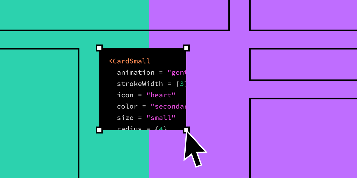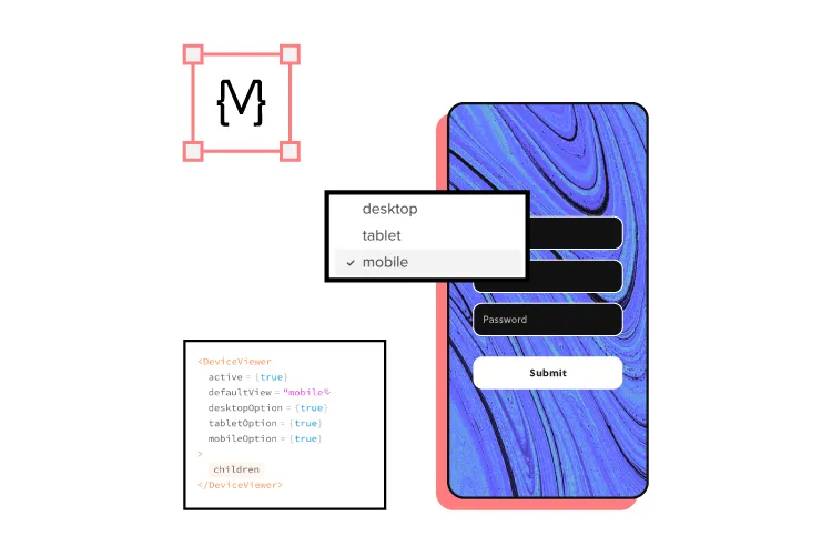
UXPin Merge lets teams design and prototype with the same production React components used in their products—whether from standard libraries (MUI, shadcn/ui) or an internal design system—so UI stays consistent, governed, and ready to ship without redesign-to-dev rebuilds.
Teams can compose screens manually or use Merge AI to generate layouts with approved components, accelerating iteration while maintaining design-system compliance.
In this guide you’ll learn:
– What design system governance is and how to choose a governance model
– Why design drift happens and how to prevent it
– A practical checklist + metrics DesignOps teams can use to measure adoption and consistency
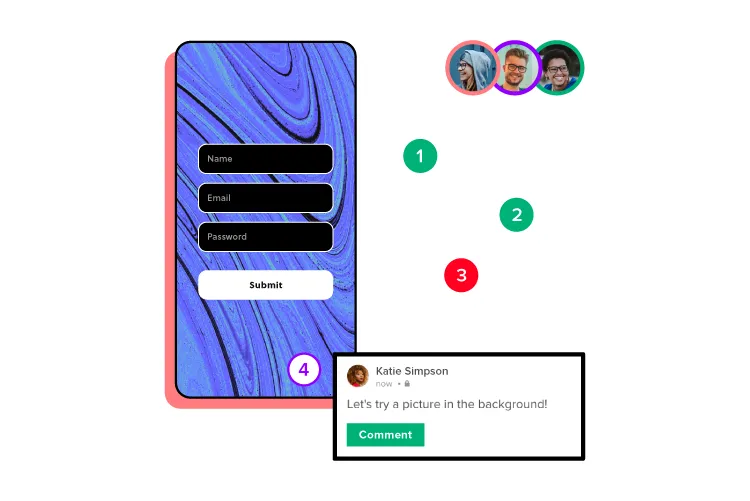
See how UXPin Merge can enhance your design system governance!
What is Design System Governance?
Design system governance is the process and protocols for maintaining and updating a product’s design system.
Even minor changes, like changing an app’s close icon from an X to a — must go through a multi-step approval and implementation process.
Design system governance fulfills several purposes:
- Maintain’s design and brand consistency
- Prevents poor design decisions—leading to usability issues
- Encourages team members to think creatively and try to solve problems with the tools on hand before attempting to make changes
- Ensures updates consider accessibility
- Keeps the entire organization informed of changes
- Updates digital product and design documentation
Without effective design system governance, editing and updating new components is a free-for-all that could create usability issues, inconsistencies and ruin the product’s reputation.
The Challenges of Maintaining a Design System
There are many challenges to maintaining a design system. Every organization must have a dedicated individual or team to manage its design system.
Here are six common challenges to maintaining a design system and why an effective governance model is essential!
Company Political Forces
Sadly, even successful design systems aren’t safe from power struggles within an organization. Team members might call on executive power to either push or block design changes, overriding the initial decision of a design system team.

Conversely, governance keeps executives and other stakeholders well informed on design changes and the reasoning, making it easier to get buy-in and approval.
Managing Input From Multiple Teams and Departments
A design system is not only for UX and engineering teams. Product teams and other stakeholders share ownership of the organization’s design system.
Managing all of this input can be challenging without a proper system of governance.
Design Systems are Often an Afterthought or Side Project
In many organizations, especially fledgling startups, the product’s design system isn’t a priority. It’s a side project a UX designer maintains in their spare time or over the weekend—feebly trying to maintain consistency with the demand for growth!
In this environment, a design system is prone to abuse and poor design decisions. Often UX teams have to undo changes to fix usability issues due to poor governance.
Poor Communication
Without proper communication between departments, teams, and individuals, a design system falls apart. For example, two teams might unknowingly work on the same task separately, or worse, crucial usability changes go forgotten because everyone thought “someone else was working on it.”

Design system governance fosters organization-wide communication, so everyone is updated and informed!
Reluctance from Team Members
When teams are reluctant to adopt the product’s design system, they choose the parts they like and develop a “better way” to design the rest. New team members or those not involved in creating the design system believe they can do better—thus undermining the hard work of others.
This reluctance can not only affect the product’s usability and consistency but create unnecessary conflict.
A governance model with multiple checks and balances prevents team members from hijacking a design system.

Reluctance to Change
Sometimes the opposite is true. Design system managers believe the system is fine the way it is, blocking any changes. A design system is never complete. It’s a work in progress that must evolve for the organization to grow.
The Single Source of Truth Dilemma
Many companies struggle with the single source of truth dilemma—working with a single dataset between all departments, primarily UX design, product, and engineering.
The UX team works with design tools, engineers with code, and the product team (often with limited technical know-how) uses all sorts of tools, including powerpoints, PDFs, and paper, to name a few.
With this scattered workflow, maintaining a single source of truth is challenging. Often requiring additional staff and resources to ensure everyone is up-to-date. Even with good systems of governance, the single source of truth dilemma is a constant challenge.
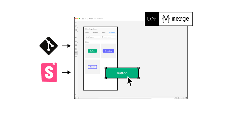
Global payment giant PayPal solved its single source of truth dilemma with UXPin Merge. PayPal uses UXPin Merge to build and maintain its design system for internal user interfaces with code components from a Git repository.
When developers implement new changes, UXPin’s design editor’s components update simultaneously, so designers and engineers always work with the same design system.
Establishing Design System Governance Standards
There are four primary scenarios where a design system requires changes or updates. These scenarios require a submission process where teams must ask a series of questions and tests before prototyping or requesting amendments.
- Introducing new elements – Establishing a workflow for adding new elements ensures design system integrity while providing every team member with an equal opportunity to make additions.
- Promoting patterns – Patterns fall into two categories: one-off or best new practice. Teams must test these new patterns against what’s currently available before promoting them.
- Reviewing and adapting patterns – Every design system must have a team (at least two members) to review patterns before release. This review process ensures new elements meet the standards and practices of the current design system.
- Releasing design system updates – Rather than releasing new updates when they’re ready, teams must establish a release schedule for updates. A strict release schedule ensures teams follow quality assurance and documentation processes correctly.
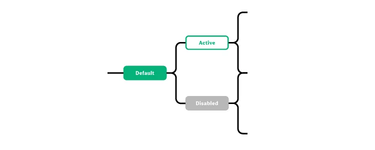
An effective way to manage this submission process is through a simple decision tree that maps every step a change must follow.
This excellent example from Inayaili de León shows how Canonical’s team adds new patterns to their design system following a simple decision tree—from concept to release.
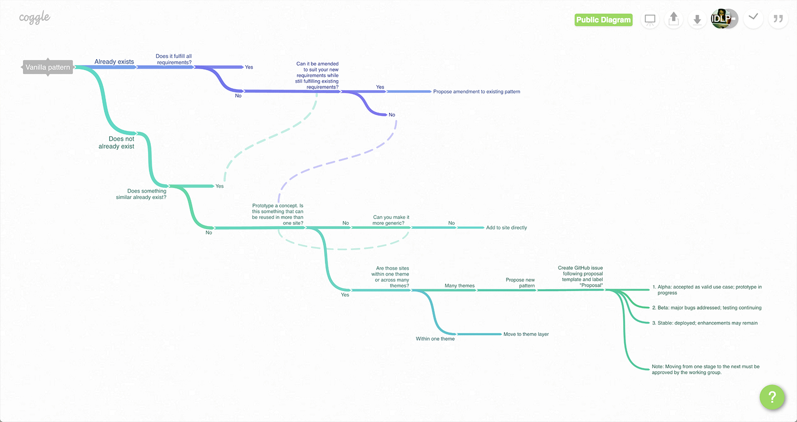
Inayaili admits that, like their design system, the decision tree is a work-in-progress that they update and refine as the product evolves.
Design drift: what it is, why it happens, and how governance prevents it
What is design drift?
Design drift is the gradual mismatch between your design system’s intended UI patterns and what actually ships in production. It shows up as subtle inconsistencies—different button styles, spacing, typography, states, and behaviors—across teams and products, even when everyone believes they’re “using the system.” Over time, drift erodes user experience consistency and increases rework for both design and engineering.
Why design drift happens
Design drift is usually a workflow problem, not a taste problem. Common causes include:
- Static mockups: Teams design “lookalike” components that don’t reflect real production constraints, states, or responsive behavior—so what’s reviewed isn’t what gets built.
- Rebuild handoffs: When engineers must rebuild UI from scratch based on designs, interpretation creeps in, edge cases get missed, and substitutes get made under time pressure.
- Variant sprawl: New “just this once” variants pile up across teams without a consistent review process, creating near-duplicates and inconsistent patterns.
- Token overrides: Local overrides to spacing, color, typography, or component props become normal, slowly fragmenting the system and making it hard to tell what’s truly “standard.”
Want the full playbook (checklist + metrics + examples)? Read Design Drift: What It Is, Why It Happens, and How to Prevent It at Scale.
How governance prevents drift
Good design system governance prevents drift by making consistency the default:
- Clear roles and decision rights ensure there’s ownership for approving changes, managing exceptions, and keeping standards current.
- A defined component lifecycle (propose → review → build → document → release → measure → deprecate) keeps additions and changes intentional, traceable, and reusable—not ad hoc.
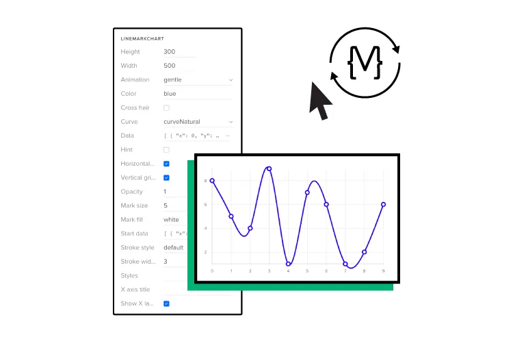
- System-first prototyping using real components reduces translation errors: when teams prototype with the same production components developers ship (from an internal library or standard libraries like MUI/shadcn/ui), reviews happen against reality, and the gap between “designed” and “built” shrinks dramatically.
Implementation checklist: design system governance that prevents drift
- Define your source of truth: identify the canonical component and token sources (internal library and any approved external libraries).
- Set decision rights (RACI): who approves new components, variants, and breaking changes—and who can grant exceptions.
- Standardize a component lifecycle: propose → review → build → document → release → measure adoption → deprecate.
- Create an exception path: a fast, logged process for one-offs with an expiry date or migration plan.
- Limit variants by policy: require evidence (use case + reuse potential) before adding variants; avoid “just this once” growth.
- Define token rules: when overrides are allowed, what’s forbidden, and how token changes roll out safely.
- Bake governance into reviews: add system compliance checks to design reviews and UI QA (not just visual polish).
- Enforce system-first prototyping: prototypes must use approved components (not lookalikes), so reviews reflect production constraints.
- Release with discipline: versioning, changelog, migration guidance, and a predictable cadence for updates.
- Run a monthly governance ritual: review adoption, exceptions, drift incidents, and the backlog of system improvements.
Next: Design drift guide (causes, metrics, and a 30–60 day checklist)
Metrics DesignOps should track to detect drift early
Rebuild / rework time: hours spent translating designs into production UI or fixing mismatches late in the cycle.
System usage rate: % of UI surfaces using approved components (or ratio of approved components vs custom UI).
Variant sprawl rate: number of component variants added per month (and how many are near-duplicates).
Override rate: frequency of token/prop overrides outside guidelines (a leading indicator of drift).
Exception volume + aging: how many exceptions exist and how long they persist without being folded into the system or removed.
Drift incidents found in QA: UI bugs or inconsistencies traced to system non-compliance or mismatched patterns.
When to choose UXPin Merge for design system governance
Choose UXPin Merge if you need:
Less waste from redesign-to-dev rebuilds—so handoff is alignment, not translation.
Prototypes built from the same production React components your engineers ship (internal library or standard libraries like MUI/shadcn/ui)
A workflow that reduces design drift by keeping prototypes aligned to real component constraints and states
A governance-friendly approach where teams can compose screens manually and optionally use AI to generate layouts using approved components
5 Different Design System Governance Models
Design system governance models refer to the frameworks and practices that organizations use to manage, maintain, and evolve their design systems. Effective governance is crucial to ensure consistency, scalability, and collaboration across teams, especially as design systems grow and evolve over time. Here are some common design system governance models:
1. Centralized Governance Model
In a centralized governance model, a single, dedicated team (often called the design system team or design system core team) is responsible for the development, maintenance, and updates of the design system. This team typically includes designers, developers, and product managers who collaborate closely to ensure the design system is aligned with the organization’s brand and user experience goals.
Key Characteristics:
- Unified Control: The design system team has full control over the design system’s direction, updates, and maintenance.
- Consistency: Centralized control helps maintain a high level of consistency across all components and design tokens.
- Streamlined Decision-Making: With a single team making decisions, changes and updates can be implemented quickly and efficiently.
Pros:
- Clear ownership and accountability.
- High consistency and quality control.
- Efficient decision-making and streamlined processes.
Cons:
- Can become a bottleneck if the team is small or overburdened.
- May lack input from various product teams, potentially leading to a less flexible or adaptable system.
2. Federated Governance Model
A federated governance model, also known as a decentralized or hybrid model, involves multiple teams contributing to the design system under a set of shared guidelines and standards. In this model, the design system team still exists, but other product or feature teams also have the ability to contribute components, patterns, or updates.
Key Characteristics:
- Shared Responsibility: Different teams contribute to the design system, fostering a sense of ownership and collaboration.
- Guidelines and Standards: The design system team provides overarching guidelines, but individual teams have flexibility within those guidelines.
- Cross-Functional Collaboration: Encourages collaboration across teams, promoting innovation and diverse perspectives.
Pros:
- Increased flexibility and adaptability.
- Encourages innovation and input from various teams.
- Reduces bottlenecks by distributing the workload.
Cons:
- Potential for inconsistencies if guidelines are not strictly followed.
- Requires strong communication and coordination among teams.
3. Community-Driven Governance Model
In a community-driven governance model, the design system is managed in a more open, collaborative manner, often with contributions coming from across the organization, including designers, developers, product managers, and other stakeholders. This model relies heavily on community involvement and collective decision-making.
Key Characteristics:
- Open Contribution: Anyone in the organization can propose changes, updates, or new components.
- Community Moderation: A committee or group of maintainers oversees contributions, ensuring they meet quality and consistency standards.
- Collaborative Decision-Making: Decisions are often made collectively through discussions, voting, or consensus.
Pros:
- Highly inclusive and democratic.
- Promotes widespread adoption and engagement.
- Encourages diverse perspectives and innovation.
Cons:
- Can be challenging to maintain consistency and quality.
- Decision-making can be slower and more complex.
- Requires a strong governance framework to manage contributions effectively.
4. Mixed Governance Model
The mixed governance model combines elements of the centralized, federated, and community-driven models, depending on the needs of the organization and the maturity of the design system. This model provides a flexible approach to governance, allowing teams to adapt based on specific circumstances, project requirements, or organizational culture.
Key Characteristics:
- Flexible Approach: Different governance styles are applied to different parts of the design system, based on complexity, importance, or other factors.
- Balanced Control: Centralized control is maintained for core components, while more flexibility is allowed for less critical elements.
- Adaptive Governance: The governance model can evolve over time as the design system and organization grow.
Pros:
- Balances consistency and flexibility.
- Can adapt to changing needs and contexts.
- Allows for experimentation and innovation.
Cons:
- Can be complex to manage and communicate.
- Requires clear guidelines to prevent confusion and maintain coherence.
5. Open Source Governance Model
The open source governance model is similar to the community-driven model but typically involves an external community beyond the organization. In this model, the design system is open to contributions from anyone, and the community helps drive its development and evolution.
Key Characteristics:
- External Contributions: Contributions come from a wide range of external developers, designers, and other community members.
- Open Development: The design system’s development process is transparent and open to public scrutiny.
- Community-Driven Decision-Making: The community plays a significant role in shaping the direction of the design system.
Pros:
- Leverages a broad pool of talent and ideas.
- Encourages rapid innovation and evolution.
- Promotes transparency and inclusivity.
Cons:
- More challenging to maintain quality and consistency.
- Requires robust community management and governance structures.
- Risk of diverging goals and priorities among contributors.
Choosing the Right Governance Model
Selecting the right governance model for your design system depends on several factors, including the size and structure of your organization, the maturity of your design system, and the level of collaboration and flexibility you want to promote. Some organizations may start with a centralized model and evolve to a federated or community-driven approach as their design system matures and adoption grows.
Ultimately, effective design system governance should align with your organization’s goals and culture, fostering collaboration, maintaining consistency, and ensuring scalability as your design system evolves.
A Step-by-Step Governance Model Example
There are many ways to approach design system governance, but here is a 10-step process inspired by design system guru Brad Frost:
- Use what’s available – Product teams must exhaust every effort to find a solution using the current component library. This means a design system must be well documented and accessible to everyone. If the current design system does not fulfill the new requirement, teams can proceed to step two.
- Contact design system (DS) team – Product teams contact the DS team to discuss the problem and the proposed changes. Again, the DS team and product team will work together to find an existing solution. With intimate knowledge of the design system, the DS team might uncover something the product team missed. If there is still no solution, teams proceed to step three.
- Determine if the change is one-off or part of the design system – The product team and DS team decide whether the amendment is a one-off (snowflake) or part of the design system. One-off changes usually fall on the product team, while the DS team handles design system changes. Either way, teams must prioritize and schedule the changes.
- Initial Prototyping – Teams prototype and test product changes.
- Initial Review Process – The DS team and product team review the results from prototyping and testing. If both teams are satisfied, they proceed to the next step. If they determine the changes are lacking, teams return to prototyping and testing.
- UX & Dev Testing – Once designs pass the initial review, they go to UX and development teams for further testing to ensure the changes meet user experience and technical requirements.
- Final review – The product team and DS team meet again to review the results of UX and dev testing. If both teams are satisfied, they proceed to the next step. If not, they iterate.
- Documentation and schedule release – Teams document the new changes, update the changelog (e.g., Github), and schedule the release.
- Changes released – Changes are released, product version bump according to versioning guidelines, all teams notified (Slack, Asana, Trello, Github, etc.).
- Quality assurance – Product teams review the final changes for quality assurance.
You can see how this 10-step process will mitigate all of the six common design system challenges we outlined earlier. With multiple checks and balances, a design system maintains its integrity while communicating changes to the entire organization.
While this process solves many design system challenges, checks and balances don’t eliminate human error. Teams need a tool to provide a single source of truth!
Using UXPin Merge to handle your Design System Governance
UXPin Merge bridges the gap between design and code, creating a single source of truth, so designers and engineers always work with the same tools.
Popular vector-based design tools don’t solve the problem. Designers and engineers must update and sync identical systems separately—an ineffective workflow prone to error.
UXPin is a code-based design editor syncing code components via Git or Storybook to allow product teams, UX designers, and developers to work with the same components—no need to update systems separately!
Lastly, because prototypes are code-based, product updates and design system changes are significantly quicker to engineer.
Ready to switch to the only design tool that fosters good design system governance? Discover UXPin Merge to get the most of your design system and keep all the design and code components up to date.
FAQ
What is design system governance?
Design system governance is the set of roles, rules, and processes that keep a design system consistent, adopted, and scalable—covering decision rights, component lifecycle, standards, and measurement.
What is design drift in UI design?
Design drift is when the shipped UI diverges from intended design patterns—often due to rebuilds, ad-hoc variants, token overrides, or prototyping that doesn’t reflect production constraints.
For more detail, see our Design Drift guide.
Why does design drift happen between design and production?
Most drift comes from translation: prototypes are static or “lookalike,” and engineering rebuilds the UI, introducing interpretation, constraints, and substitutions.
How do you prevent design drift across multiple teams?
Use a system-first workflow: standardized governance roles, a component lifecycle, explicit exceptions, and prototyping with production components so decisions happen on reality, not approximations.
How do you enforce design system compliance without slowing teams down?
Make the system the easiest path: clear standards, fast reviews, a lightweight exception process, and tools/workflows that let teams build prototypes using approved components.
How do you manage component variants and stop variant sprawl?
Define strict variant rules, require proposals for new variants, audit exceptions monthly, and deprecate duplicates with migration guidance.
How do you measure design system adoption and compliance?
Track a few consistent metrics: system usage rate, override rate, variant sprawl, drift-related QA findings, and rebuild/rework time.
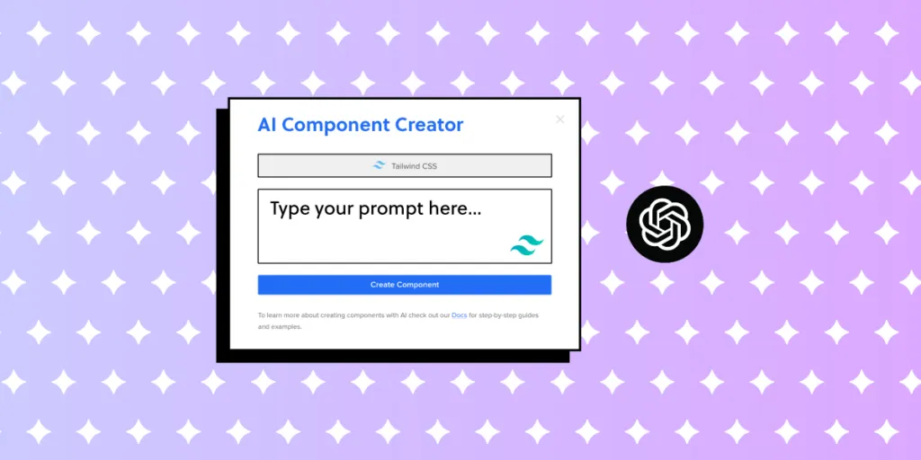
Can AI generate UI layouts that follow a design system?
Yes—when AI is constrained to your approved component library and tokens, it can generate layouts that remain on-brand and compliant instead of inventing off-system UI.
How does UXPin Merge help with design system governance?
It supports governance by enabling teams to design and prototype with production React components (internal or approved external libraries), reducing translation drift, and accelerating iteration with AI constrained to approved components.


")


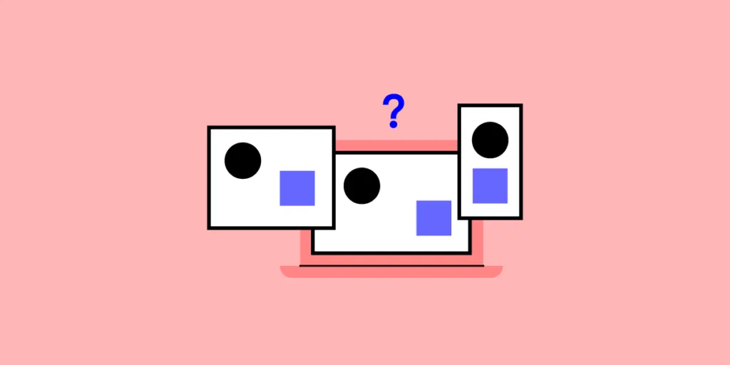
![Responsive Design vs. Adaptive Design: Best Choice for Designers [2025]](https://studio.uxpincdn.com/studio/wp-content/uploads/2021/03/Responsive-Design-vs.-Adaptive-Design.png.webp)


